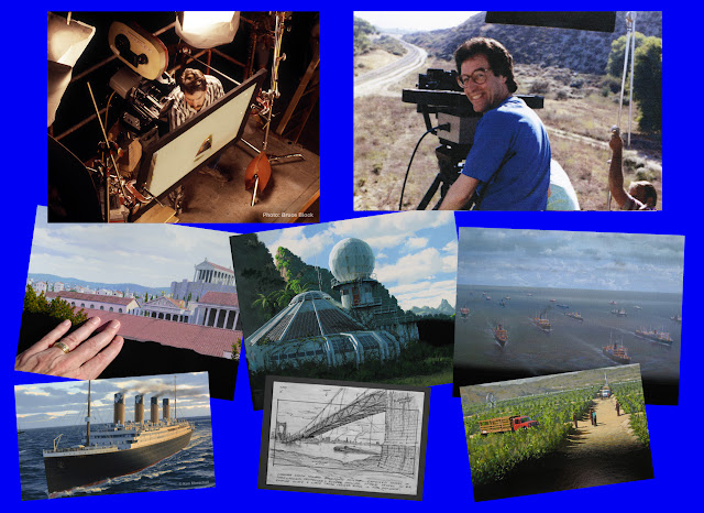
A Company Called Matte Effects
The Work of Ken Marschall & Bruce Block
Part Two
Welcome fellow matte painting enthusiasts to another edition of NZPetes Matte Shot, where today we will continue our in depth interview and tribute to the incredible and largely unheralded matte work of artist Ken Marschall and visual effects cameraman Bruce Block. I am sure those of you who found last month's article both fascinating and revealing will not in the least be disappointed with what I have in store for you here today. Once again we will be treated to scores of Ken's wonderful hand painted mattes that worked on screen so successfully thanks to Bruce's pragmatic camera savvy and strong adherence whenever possible to the 'original negative' methodology to bring Ken's exquisite art to life, largely unnoticed. The results speak for themselves.
 Today we will carry on where we left off with some astounding matte work from films such as James Cameron's THE TERMINATOR, Rob Reiner's coming of age classic STAND BY ME and many more trick shots that I am certain nobody ever realised were mattes. Gene Warren jr from Fantasy II Visual effects will be joining us as well for a frank discussion on the glory days at Fantasy II with Ken and Bruce. Also we will take a real life journey beneath the waves to the darkest of depths of the vast Atlantic ocean with Ken as he tells us about the coming to fruition of his lifelong passion for all things Titanic.
 Again I owe more than a debt of gratitude to Ken and Bruce for their generous input in bringing this article to fruition. To Ken I applaud not only his astonishing talents as an artist, but his sincere archival efforts which have seen the vast majority of his original matte art, along with conceptual sketches, layouts, 35mm trims and tests all stored safely for more than two decades. To Bruce I extend my thanks and appreciation for his remarkable knowledge of practically each and every matte shot made by the Matte Effects company over the years, even though there still remain a couple of mystery shots that baffle both gentlemen. This blog would not have been possible without Ken and Bruce's monumental input, where no 'ask' on my part was too great. On behalf of my readers and all interested parties, I thank you both.
Now, for the bad news. I had hoped to wrap up Ken and Bruce's story with this second part, but due to successive and unrelenting technical problems with Google Blogger's site I have no choice but to reserve the remaining interview material and imagery as an unplanned but now necessary 'Part Three' - depending of course whether the 'system' will cooperate. As much as I take a certain degree of pride and pleasure in writing these matte shot blog posts and sharing the wonderful world of 'hand made movie magic' with you, the technical web based process of actually bringing each blog to cyber-life has been an uphill battle. Just when I thought I had tamed the beast that is 'Google Blogger' - itself a vengeful and unforgiving behemoth of a publishing platform - the constant difficulties that arise when assembling and laying out these articles just makes the process less and less user friendly with each and every blog post. The reader would not believe the stumbling blocks faced by your humble editor just on the last few posts alone. It seems the Google Blogger platform is intent on having NZPete bodily hurl himself under a bus in a fit of sheer and utter hopeless despair, it's gotten that bad folks. Given the monumental issues I've experienced lately, this post may well be the last one and I may be forced to call it a day.
Pete
...............................................................................................................
 |
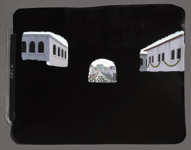
| One of a pair of unused matte shots from the Diane Keaton picture BABY BOOM. Your humble editor incorrectly added the wrong painting for this shot in part one, so here it is rectified. |
BB: We were able to avoid the age of the interfering visual effects supervisor. On all of the Fantasy II work, Gene was the supervisor and we saw eye-to-eye on everything. On non-Fantasy II shows I always worked directly with the director, producer, the DP, the production designer or art director. I had long-standing working relationships with them, they trusted me, and we never had a middle-level supervisor between us.
 | |||||||||||||||||||||||||||||||||||||||||||||||||||
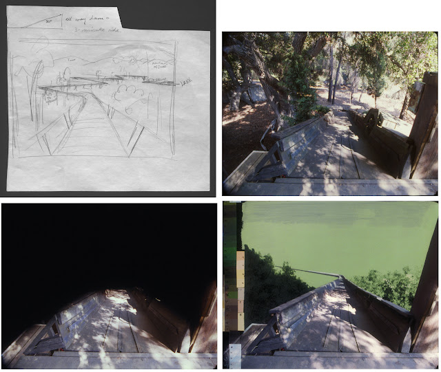
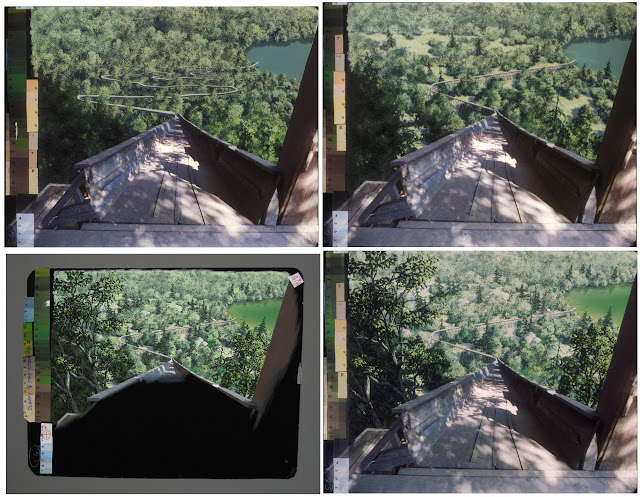
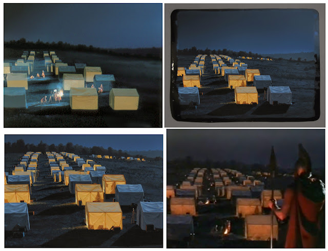
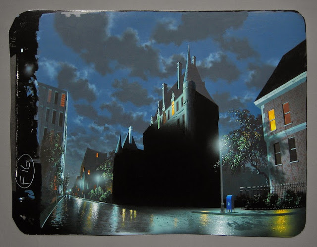
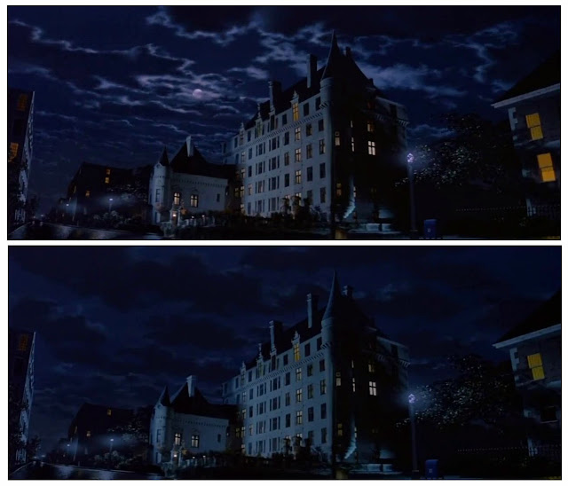
STAND BY ME: A series showing the development of the original-negative matte I did for this Rob Reiner film, all rather self explanatory. Unfortunately I have no image of the original scene before the matte was placed. The second image shows the first color test on November 11, 1985. The third photo shows the painting. And finally, the finished composite. I had to meet with someone at an editing facility to pick up information for this matte job, or perhaps run a test loop through through a Moviola, and Rob Reiner was there. I was about to meet Rob Reiner! I recall that this small editing room was next to his office or something. He seemed preoccupied with editing or talking with an editor and paid little or no attention to the matte artist who had arrived. My memory of that brief meeting, if he even acknowledged me (a sort of dismissive "And who are you?" comment), is that he struck me as a stern, grumpy guy. Maybe he was just having a rough day.
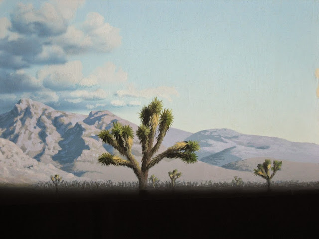
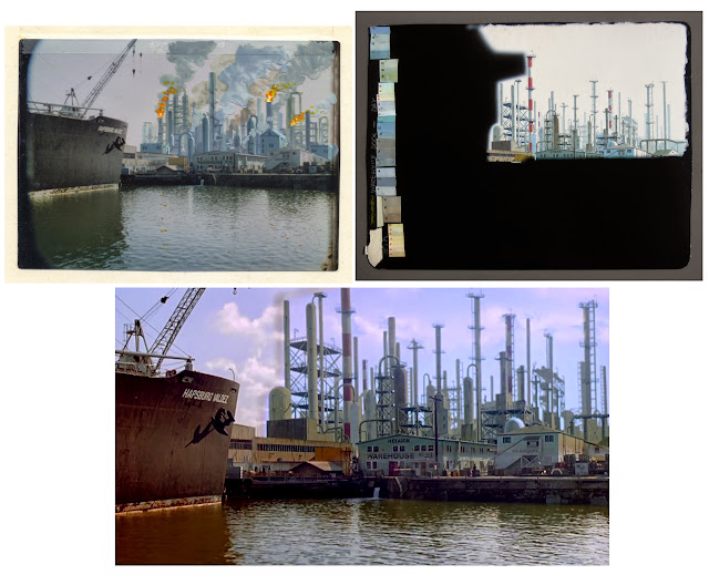
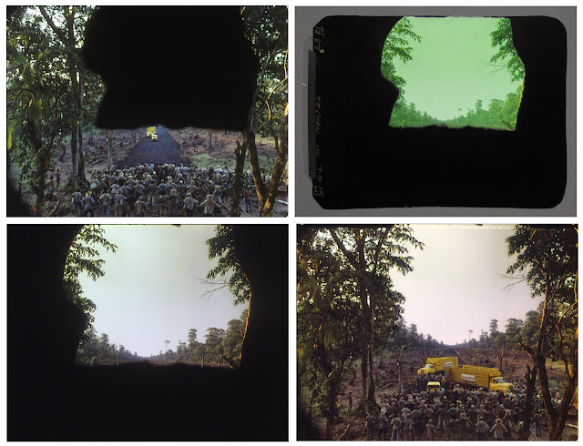
Q: I’m interested to know about the gags you employed to sell some of your mattes. Albert Whitlock was the master of adding in subtle soft splits with moving clouds and many other small gags to breathe life into his paintings. I’ve noticed some especially nice gags in some of your shots such as cloud movement in that lovelyfinal shot from THE TERMINATOR, smoke elements in those immaculately painted factories by the pier in the second NAKED GUN picture and so on. That cockroach crawling up the debris in the jaw dropping opening matte from the less than impressive Jean Claude Van Damme actioner CYBORG. There’s a great shot you did at the end of the marvellously insane KILLER KLOWNS FROM OUTER SPACE with the rollercoaster where the explosion flash interacts with your extensive painting. Can you describe your methods in achieving these effects. KM: The moving clouds in the TERMINATORscene were done with two layers in two separate passes. One layer of clouds was painted on thin Mylar and laid directly on the background painting, both exposed at the same time, of course. These mid-ground clouds were moved slightly over the background, frame by frame, by turning a wheel that was very down-geared so that turning it a notch moved the Mylar only afraction of a millimeter. You could hear the camera gate clicking, about one frame per second, so it wasn’t too hard to turn the wheel one slight notch every click (or every two or three clicks). As mentioned earlier, rubbing the Mylar with a soft cotton cloth before starting held the “cel” surprisingly snugly against the background art with no need for a platen. The static charge may have remained throughout the entire final production shoot, but Bruce might remember having to “recharge” it once or twice. I don’t think so, though; once the production take was rolling, you didn’t want to mess with the camera. You had to keep going, on the fly, until it was done.  Then, the film was rewound and DXed with lighter foreground clouds, drifting in front of all the others and moving at a slightly faster pace. These closest clouds were just airbrushed white painted on black. Testing had determined the best exposure and color filtration for them. We originally had two lightning bolts with corresponding glows/reflections in the clouds, but despite them looking quite believable, Jim Cameron opted against them during the testing. The overall painting, following a concept sketch he had done, was already rather out of context for a scene shot in the flat, featureless desert near Palmdale, California, on a cloudless day. No preceding scenes showed anything like the dramatic mountains and looming storm in that final shot of the film. So I guess Jim decided that the lightning was a bit too much of a continuity departure.

 The filming of this plate is described on Fantasy II’s website: The filming of this plate is described on Fantasy II’s website: “One day towards the end of filming THE TERMINATOR, James Cameron realized they needed a missing crucial wide shot of Sarah Connor’s jeep driving down the road to end the movie. He went to the outskirts of Lancaster, California, with VFX Supervisor Gene Warren, Jr., VFX DP Chris Warren, Producer Gale Ann Hurd, and Ms. Hurd’s secretary, along with the hero jeep to grab the shot guerilla-style. They were in such a remote location without traffic, the group even built scaffolding onto one lane of the road to capture the iconic drive-away scene. Moments before the first take, the first car to appear in 20 minutes was a California Highway Patrolman who stopped to inquire if they had a filming permit. Flustered, Gene told the policeman they were shooting a student film, and amazingly they got away with it, as long as they promised to move the scaffolding to the road shoulder! The shot (with the secretary doubling as Linda Hamilton) appears in the final cut of the 1984 movie –– composited with a brooding sky matte painting and blowing dust elements.” Returning to your original question about movement gags, we sometimes added undulations and sparkles to water and even simulated the effect of fluttering tree leaves or palm fronds, DXing using backlit moirés that were cranked along using thathat same motorized wheel. The moirés were positioned behind or in front of a black card which had areas of Mylar taped on and that were painted with the very opaque black Cel-Vinyl with the paint scratched away where I wanted waves, sparkles or leaves to shimmer in the front-lit painting. The refinery smoke in NAKED GUN 2 1/2 and the foreground debris with cockroach in CYBORG were added optically by Fantasy II. The explosion flash on the objects and the ground in KILLER KLOWNS was a simple DX job, a separate white-on-black painting for the reflected light of the explosion on the amusement park. It might have been added optically, as I don’t seem to have a test clip for it. (When I don’t have a final test clip, that usually means that when the artwork was finished we filmed it and handed the film over to the optical department, and I never saw it again.)

   Q: So it was very much a case of adapting tried and true gags to suit each requirement. BB: Yes, I’ve described these mechanical rigs already, but I had drawers full of all kinds of motors, gears, belts, pulleys, etc. that I’d use to build rigs to move moiré patterns, acetate sheets with artwork or other odd mechanical devices to animate the matte paintings. Since we never used glass, I had large, clear Lexan discs that would rotate and activate the moiré patterns. Depending on the pattern, we could add vertical, horizontal, diagonal or circular movement to anything.
 Q: What would be the average timeframe for one of your mattes from initial sketch through to final composite. I gather this would vary depending upon the complexity of the shot. KM: Oh sure, it was all dependent upon on the complexity of the artwork, animation (if any) and, rarely, even the vagaries of the processing labs. Once, a lab “ate” the test footage Bruce had dropped off the night before, so we had to redo the test. But if we were lucky, I think we might have had a few mattes done and shot in less than a week. Conversely, there were some that we worked on, then put aside for several weeks, then later finished off, taking two months or more.
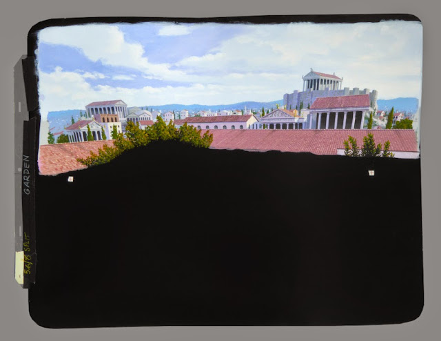
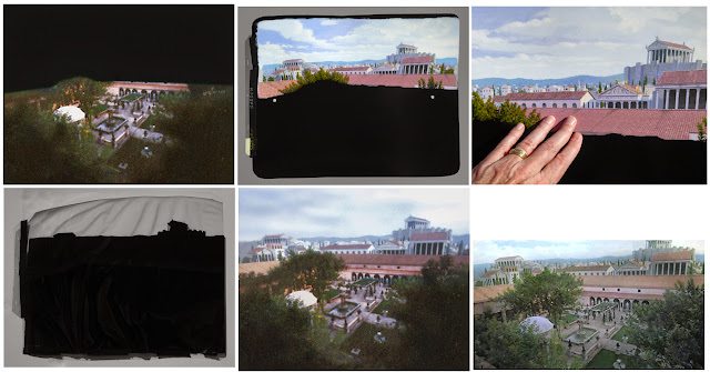
 Q: I’m always curious on this one; what would your dream project have been in as far as a traditional matte painted exercise. Perhaps a period picture or a certain historical timeframe – the Civil War perhaps - which you may not have had the opportunity to paint for on other assignments. I know as an example that Al Whitlock always wanted to paint mattes for Time and Again – a period novel with late 19th Century New York depicted vividly through glass shots. I even have a wonderful photo of one of Alberts’ mattes he’d done as a test for that never to be realised project. KM: I’m with Whitlock on this one –– definitely a scene from the past, not some mundane, present day fill-in. Although naturally more challenging, the more you can recreate something that is no longer there, the more valuable and memorable the scene. It’s important to a film, not just some throw-away fix or patch job. Of course, viewers will immediately be suspect of such shots. This goes with the territory. With anything out of the ordinary and unusual, which the audience knowscan’t be real, you have the ultimate challenge on your hands. Matte painting is supposed to be the “invisible art;” if your painting attracts attention to itself, you have usually failed. So, futuristic space cities and that sort of thing are obviously the ultimate hopeless causes. No matter what kind of a photorealistic miracle worker you may be, you just can’t win; viewers will always know it’s fake no matter how realistically you paint it. But with historical recreations you at least have a chance of giving an audience pause. With my interest in archeology I always hoped for a matte job involving ancient Egyptian, Greek or Roman architecture… Karnak or Abu Simbel in sunset light or at magic hour. Oh yeah. I finallygot to do a few Roman scenes for ATTILA THE HUN, among the very last mattes I did.

 
Q: So, was work steady throughout the 80’s and into the 90’s. At which point did ‘the craft’ of hand made matte shot production begin to lose favour with studios and producers. KM: We were kept almost continually busy during the ‘80s and ‘90s. There were times when we were working on two or more films at once, and I didn’t like that. I’m a very focused linear thinker, start to finish, not a multitasker. I much prefer not bouncing around from one project to another before finishing one first. Q: With the traditional techniques largely having been thrown out industry wide by the early to mid nineties, I was surprised to learn that you and Bruce were still making mattes using conventional hand made means as late as 2001. KM: Our old-fashioned paintbrush matte work dried up rather suddenly, really. Within about four years, 1997-2001, it was all over. The five mattes we did for ATTILA, July-October 2000, was just about the last hurrah. In early 2001 I did a painting for a European Visa commercial of a futuristic city and roadway on which cars were added digitally. I took the scene so far as a painting and then scanned it in sections on my desktop scanner, then mosaiced the pieces together and carried on, completing the scene digitally in Photoshop. In the end I replaced my own painted sky with a digital photo that made the scene much more believable, not that it was the least bit believable anyway, being an obviously futuristic vision. So that job was definitely sort of half painted, half digital. I knew right then that to try to do an old-fashioned matte painting entirely with paint and airbrush, having to clean out brushes and so forth, was hopelessly obsolete.
|


My last movie artwork was in 2006, a completely digital retouch of a house for THE HOLIDAY, done entirely in Photoshop. It appears on a character’s laptop or computer monitor as she’s searching potential real estate for a brief rental. Turned out great, but much of my work was cropped out around the sides, and it’s on screen for all of maybe 1-2 seconds.
 |
A comparison of the original image I was given (left) and the final widened and altered image, for THE HOLIDAY, completed in November 2006. My task was to make the Northern California house and location look much less appealing –– make the windows much smaller, add staining and dirt, make it winter, make the asphalt road all cracked and old, add ugly power lines, and so forth. I enjoyed it. No airbrush, no paint to mix or brushes to clean. Bruce would show the progress to Director Nancy Meyers and get back to me with further suggestions until it met everyone’s satisfaction. The whole thing was done via e-mail. |
BB: We worked almost constantly from the day we opened until we closed up. It was a great ride. Ken and I saw the end coming, and without any hysterics we told Gene Warren we were closing up shop.
Q: I raise the question because of first hand information I’ve had where producers in the early 90’s pulled the plug on some matte providers for using “old” methods whereas the mentality of “if it ain’t done on a computer then it can’t possibly be any good” seemed to pervade the business.
KM: I guess we were lucky for a while, or the producers who approached Fantasy II had used them before, knew the quality of their/our work and stayed with something they knew and were comfortable with.
 |
| We were called upon to do two mattes for DRUG WARS: THE CAMARENA STORY, a miniseries broadcast on NBC in January 1990. For this shot a plate was photographed in the Californian semi-desert with fake marijuana plants lining a dirt road. My painting considerably extended the limited location set into a vast Mexican drug plantation. Although admittedly this is a fairly simple, straightforward shot, I thought it turned out rather well. The painting and close detail is shown below. |
 |

 |
| The other painting is an aerial view of the marijuana crops. No matte for this scene, just a full painting. |
 |
| Close up detail of the above painting. |
 | ||
|
Q: Interestingly, I know of a couple of situations as we speak where a producer has approached a matte man specifically with the intent to use the “old” glass shots methodology. So do you see a future in conventional matte painting applications, or is it largely a forgotten dinosaur.
KM: I think we’ve crossed that bridge and burned it behind us. And then gathered up all the ashes and fired them into the sun.
I never liked doing glass shots. I don’t think I ever did any outdoors; they would have been nerve-wracking as hell because of the complete loss of control over lighting –– the sun angle and sky conditions are always changing, a hopeless, maddening situation for someone who doesn’t paint particularly quickly. Glass shots set up on a stage were far easier, but even then the painting, which is much larger and infinitely heavier than our usual “card” paintings, had to stay clamped in place throughout the whole process, and there was always the risk of someone accidentally poking a C-stand or something into it. Unlike on someone’s active sound stage, in our small matte room we exerted complete control.
The only application or benefit to using the old, cumbersome matte-painting or glass-shot methods would be to deliberately give a quaint, period look to a film. But even that is so much more easily accomplished today digitally. The painting could be done by hand with brushes, then digitally inserted with ease, especially if a film is shot digitally or has been transferred, of course. And at the rate cameras and theaters are not using film any more, it won’t be long before film is a very rare niche commodity.
I can hardly believe the rate of change we’ve witnessed. It reminds me of the sudden change we saw in trans-Atlantic travel during the mid-‘60s. After a century of passenger ships crossing the Atlantic, the arrival of the commercial jet age extinguished the reign of the great ocean liners within about half a decade. Just 15 short years ago every camera store offered a wide variety of films, optical printers were whirring away and multiple labs were cranking out negative and film. Now look at it. It’s all nearly as extinct as the buggy whip and rotary-dial telephones.
BB: There were a couple of commercial directors who contacted us after we closed. We did a lot of work for them in the ‘80s and ‘90s, and they preferred the older technique, but we were done, our equipment was packed up or sold, and it was over. I sold the matte camera to a private collector, and he’s got it sitting next to one of the original Paramount elephant-ear VistaVision cameras (and it is a fully working camera).
 |
For the made-for-TV/video JOURNEY TO THE CENTER OF THE EARTH, released in the U.S. in July 1989, one matte shot called for a wide view of a huge cavern interior. Here is the small bit of live action. Image 2 -- The painting. Image 3 -- Final composite, completed in Oct. 1987, with small, flickering, distant fires DX'd on a second pass. |

 |
Another scene in JOURNEY TO THE CENTER OF THE EARTH called for a wide view looking up at an underground city. At left is my basic layout for it. The full painting, also finished in Oct. 1987, is shown at right, which I believe was shot or timed much darker for the movie. |
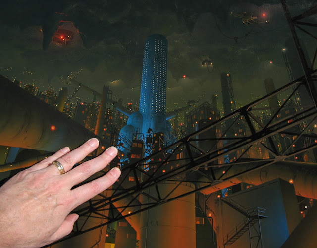 |
My hand touching the painting shows the scale of the artwork. We may have DX'd a few blinking lights or something, or perhaps hovering vehicles or other movement was added optically. I don't remember. |
Q: Did either of you gentlemen ever enter the world of digital matte shots. If so, your impressions please. I’m interested in how easily that realm was to adapt to for a traditionally trained brush & oils artist.
KM: I could have adapted well, I think, although it would have certainly been a learning curve. I’ve always enjoyed Photoshop and seem to spend most of my time at the computer these days, one way or another. But I’m only using a fraction of what Photoshop can do. I know absolutely nothing of Maya or other programs that digital effects techies use. I have understood the principles of stereo photography since I was in high school, having had much fun with it with friends and doing amazing things. But that’s another learning curve, having to be proficient in digital camera moves, etc. etc., to bring life to today’s effects shots. There’s no such thing as a stationary matte shot anymore.
If I were 25 years younger I probably would have graduated into the digital effects world. But while working on Jim Cameron’s TITANIC in ’96-’97 I saw how digital artists lived, the pressure they seemed to routinely suffer, and I didn’t like what I saw. I didn’t want to live like that –– the commute, the long hours, going days without sleep as deadlines loomed. I was used to working at home, setting my own hours… our little system with Matte Effects. Today, at age 64, such employment isn’t even an option. What company would hire someone my age when there are hundreds of young, computer-savvy effects buffs beating down their doors?
BB: In producing studio movies, I’ve continued to deal with visual effects houses for all kinds of shots. I adapted to CG effects and am comfortable using them in movies. I’m not interested in running a CG FX company, but the computer has obviously moved visual effects to areas that were once unattainable and even unimaginable.

KM: Sure, there are a bunch. Right out of the gate, the “day” scene of the huge underground facility in HANKY PANKY (1982) turned out very well, and since it was the first matte I ever did for a major motion picture, and you can see me working on it at left, I must say I was quite proud of it.
 |
The first of two mattes painted for HANKY PANKY in January 1982. Both were from the same camera location inside a large facility of some type, one scene with overhead lights on, the other dark. I had to make this place look like it’s gigantic and underground, extending endlessly off into the distance, cavern after cavern. The snapshot shows me working on it the painting, and the one with my hand on it illustrates the compact scale of the artwork. The overhead lights were DXed with backlight for greater brightness, and red lights were made to blink on and off over the red “Restricted Area” sign. The last image is the final scene. |

 |
Here’s the “lights off” version of the HANKY PANKY underground facility. The slate is prominent in the foreground of the first image. Lights are on in the far distant cave, and again an additional backlit element was DXed for this. |

Q: What other mattes stick in your mind Ken.
KM: TERMINATOR is memorable for three reasons: First, we had an oddly difficult time with the soft matte line. Every test came back with a slightly different alignment. The matte line first showed as a dark fuzzy line across the scene, then in the next test it was actually slightly double-exposed, and back and forth we went as I tried to get the thing to match up. There was no noticeable jitter between the live action and the painting when projecting test loops for Cameron. It must have just been my inexperience. Out of desperation I think I finally repegged the thing at one point, raising or lowering the whole painting by 1/8 inch or so. That was easier than repainting all along the matte line.
 Second, the length of time we dickered with it –– over two months. No director or art director we ever worked with was so intent and involved with a painting, and as the testing proceeded he wanted to see a change, then another, and then back again. He’s a perfectionist like myself, this was his first big feature, and today I fully understand it. But back then, in the late summer of ‘84, Bruce and I were pulling our hair out. Only so much test footage was shot on location for me to play with,and then two production takes were shot, as usual, so that one could be held as an insurance backup (in this case, the scene of a Linda Hamilton stand-in driving her jeep down the highway into the distance). Gene Warren shot the live-action plate. Bruce wasn’t there, so it’s possible Gene only shot 100 feet of test footage (Bruce always shot at least 200 feet).
 All the changes and adjustments we were making at Cameron’s direction were using up the available test footage, and if we didn’t settle for something very soon we’d have to eat into the first of the production takes, using that for further tests. And if the second production take had some unforeseen flaw in it (light leak or gate jitter), we were all screwed. This was fine with him; he was okay taking a chance on the quality of the second take. Fortunately that second take was indeed without any problems. But it was a close call. And it was my first baptism in how the man thinks and works. Twelve years later I would spend over a year serving as his visual historian on TITANIC, then participate in his GHOSTS OF THE ABYSS 3-D film project and Titanic exploration in 2001, his follow-up dives to the wreck in 2005 for Discovery Channel (LASTMYSTERIES OF THE TITANIC), the two-hour TITANIC: THE FINAL WORD for the National Geographic Channel, airing in 2012, and, the latest, working with him on a hefty coffee table book about his three Titanicexplorations, entitled Exploring the Deep: The Titanic Expeditions, published in 2013. In all cases that same intense focus and determination harked back to that first experience with him on TERMINATOR. The guy likes to take it to the very edge. His maxim: Set your goals higher than you think you can achieve; if you fall short, you’re still ahead of where you’d be if you had set a comfortable goal.
 |
Standing next to the massive 44-foot miniature built by Digital Domain in 1996 for James Cameron’s TITANIC, during the shooting of National Geographic’s TITANIC: THE FINAL WORD in October 2011. |
 |
The cover of the thick, heavy volume Exploring the Deep: The Titanic Expeditions, for which I did much image enhancement and mosaic work and contributed several paintings, including the dust jacket. It was published around June of 2013. |
And third, TERMINATOR is memorable because, having not read the script and knowing nothing of Cameron, I expected the film, just from the title alone, to be another typical, dime-a-dozen teen-pandering movie full of gratuitous violence and little substance. When I saw it in a theater shortly after its release, I was stunned. It was nothing like I had expected. There was a deeply involving story, taut writing and direction, not to mention gripping tension, great effects and the perfect score. It was an instant classic, a watershed film that launched Cameron’s career and, coming shortly after Bruce and I shared in an Emmy for THE WINDS OF WAR as part of Fantasy II’s visual effects team, was a huge feather in our caps. So, because of the painting’s long “pregnancy,” the classic that the film quickly became, and my enduring relationship with and respect for Cameron since, that matte means a lot to me today.
Q: Any other memorable mattes that you are able to recall from your 'golden era'.
KM: Of the other paintings and experiences that stand out, the two “stereo” ones for SPACEHUNTER (1983) are memorable, the first matte paintings ever created to appear in 3D, I believe. We placed various elements on Mylar layers and shifted them slightly left or right for each “eye.”
The following description of the mattes done for SPACEHUNTER, by George E. Turner, Nora Lee & Gene Warren, Jr., appeared in the July 1983 issue of American Cinematographer:
“There were two matte paintings in SPACEHUNTER done by Ken Marshal [sic] and Bruce Bloch [sic]. One depicted the silos –– the home of the Bat People –– and the other was a distant shot of the Graveyard City. [Gene] Warren explained that the matte paintings were done, in effect, twice. They were painted to match the right eye camera first. After the desired effect was attained and the right half of the shot was okayed, the painting would be altered slightly to reflect the perspective of the left eye. Some detailing would be added and other details would be removed.
“One of the matte painting shots is no mere matte painting. It contains at least two other elements, as well. It occurs in the last third of the picture as Wolff, Nikki and Washington are making their way to the Graveyard (a painting). Warren calls it a three way split screen. ‘On the left there was one of the icons, which I shot here [at Fantasy II] and split in on the left. The reason for that was the plate wasn’t shot the way we wanted and there wasn’t enough room on the top to do the painting. So we had to reduce the live action in order to get more room on the top to do the painting. But when you did that you lost the left so we had to split in the model. So it’s a three way spilt –– a painting across the top, the model on the left and the live action center and right.’  |
Mike Minor’s concept rendering for the “Graveyard” matte shot, followed by later renditions and Mike’s notes to me. |
 |
The “Graveyard” painting for SPACEHUNTER, from original photography (before the matte was added optically) to final composite. The 3-D effect was created by simply shifting the painting slightly laterally behind a black foreground matte. The sun and clouds were separate burn-ins. I can’t explain now, 32 years later, why the sun appears in two places and two sizes and the mountain “fortress city” is considerably different between the test clips. Maybe a drastic change was made to the entire concept, and I had to repaint almost the whole thing. But here’s the mystery: The final film, which can be found online, has the large sun, yet my final paintings have the small sun. The background painting and cloud DX art that I have today are obviously what we shot in the end; I don’t have two different sets of paintings. Very strange. In any case, the clouds were really needed on the right side to help confuse and hide the very hard matte line. That line was a bitch. |


Q: Yes, that looked great on screen in an otherwise tedious film.
KM: The painting of the collapsed Hoover Dam for CHERRY 2000 (worked on from 1985 to ‘86) was a big deal –– literally. It was a VistaVision shot, as were several in the movie, and the painting is among the largest I ever did (although no more than about three feet wide). We animated the waterfalls at the bottom of the dam and the flowing water in the river. I was quite proud of the results and still am. Although the scene was unfortunately flat-lighted with the sun directly behind the camera, it should have been a spectacular, classic matte shot. I never saw the finished film, which I think went straight to video, until recently online, as I mentioned earlier, and I was quite surprised and disappointed to see virtually the entire scene inexplicably cut out. Only a cropped optical close-up of a small area around the live action remains, and the colors of the
painting and live action don’t match at all. It’s ghastly. As I said before, I don’t know what happened. It looked fantastic when we turned it in.
painting and live action don’t match at all. It’s ghastly. As I said before, I don’t know what happened. It looked fantastic when we turned it in.
 |
Two concept sketches for the Hoover Dam scene in CHERRY 2000, done by another artist. The second one indicates an old vermilion-colored Mustang that would hang by a crane cable in the foreground. |
 |
Hoover Dam location reference photos mosaiced into a wide panorama; the original VistaVision plate, before matte; then the matted area; and the painting, showing the unusually “large” size. |
 |
A close-up of the painting, with my hand, to show the scale of the work; two backlight elements used to create water movement and faint sparkles; final composite; and the last image is a recent grab off YouTube showing as much of my painting as survives, at least in that edit. Not only is this disappointing, but to add insult to injury, the color of the painting and the action isn’t matched at all. Utterly baffling. |


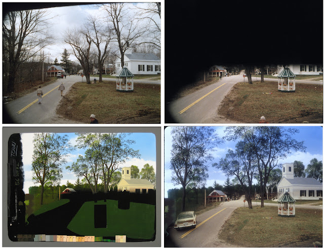
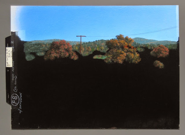
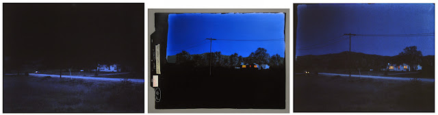
KM: ‘NIGHT, MOTHER, worked on from Feb.-June 1986, was interesting because, in addition to a few regular daytime mattes, we shot scenes at twilight that I had to turn into night and, amazingly, one scene at twilight that needed to appear like full daylight.
 |
| Above, a blueprint of a series of storyboards for a few of the matte shots for ‘NIGHT, MOTHER. |
 |
The images shown here from NIGHT MOTHER are self explanatory. In this scene the distant hills needed to be made lower and the trees changed to late fall. |
 | ||
|

 |
 Now, here’s a switch: Dusk photography needed to be turned into broad daylight. What original exposure the house had needed to be augmented and tinted warmer and the negative printed much lighter. I’ve added sun shadows against the house. |
 In this one, again missing the original photography, I just had to add the new upper part, lights in the windows and an extension on the house. |
 one where the background needed to be altered. Again, unfortunately I'm missing an image of the original plate one where the background needed to be altered. Again, unfortunately I'm missing an image of the original plate before the matte. |
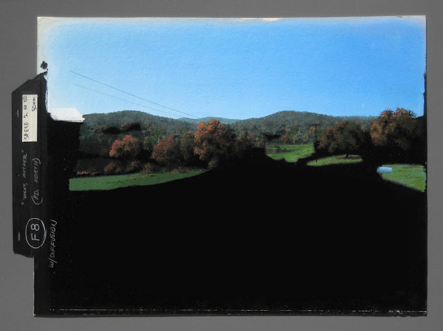  | ||
| For this scene dusk photography needed to be changed to a later time, skyline and trees altered, and glow added to the windows. Q: Those NIGHT MOTHER shots truly qualify as‘The Invisible Art’ – or as Albert Whitlock phrased it ‘the true special effect is one that nobody notices’. I do wonder why the production went to so much trouble in post production whereas those shots could easily have been achieved 'live'. What else can you share with us Ken. KM: The burned-out house for PSYCHO IV: THE BEGINNING was nice. I enjoyed that one. We presented the painting to the director.
|

 |
The matte painting, showing the original plate, the matte and the final composite. Light smoke drifts up from the burned- out house, added optically by Fantasy II’s optical department. The black and white image is a DX element to flash over a pre-fire plate to simulate lightning. I can see that although the house and trees appear to be at the exact same angle, there are no foreground steps in the painting, so I’m not sure what’s going on there. The paintings were done in July 1990. |


KM: I had fun doing the ROSWELL project, too, no doubt because of the subject matter.
 |
| For ROSWELL: A conceptual render, artist unknown, and instructions for the saucer. |
 |
We start with the original plate; then with the matte in place; my first color-chip test (notice the large white square to gauge pure white, which was standard); the painting, done in January and February 1994, and a closeup; the final composite; and below, another 2015 shot of me holding the painting to convey the size of the artwork. |


 |
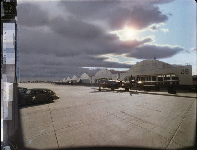
The initial concept render for the other matte shot I painted for ROSWELL (artist unknown) showing bombers parked on a tarmac, and a second copy of it with notes. |
 |
Here’s the progression of the final scene, beginning with the matte in place (I don’t have a frame showing the original location photography, sans matte). Next is the roto, traced on the back of the card stock used to do the painting. The matte line is drawn in green pencil here. Next is my first color test, followed by the painting. The last image is the final composite, with an extra burn-in for the sun. |

KM: And the “orange-base” paintings are memorable for their challenging and sometimes maddening nature.
Q: Yes, you outlined that quite complex process in Part 1. It reminds me of the difficulties that
Matthew Yuricich used to experience with Clarence Slifer back at MGM and later with Doug Trumbull at Future General/EEG with a similar photographic process that was anything but'artist friendly'.
 |
An orange-base painting for FLIGHT OF THE NAVIGATOR, done in mid-1986. As I remember, animated or stop-motion steps appear from nowhere and descend, one by one from the alien craft. |
 |
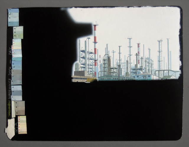
Another orange-base painting done for THE BURNING SEASON in mid-1994. Once again, I unfortunately don’t have an image of the original plate without matte. |

 |
| CYBORG: Director Albert Pyun's notes and a very preliminary diagram together with my proposal/concept rendering with Bruce's notes. |
 |
An orange-base matte was painted for CYBORG. The scene was to be an elevated view over a freeway, looking toward Atlanta, years after the apocalypse. Being orange-base (the odd green hues), the painting’s obviously intended to be an optical job of some sort, and Bruce’s note indicates that the artwork was to be extra tall to allow for a slow upward tilt. But the final painting doesn’t show any unusual height, so the tilt must have been a small one. The original plate, shot from the roof of Fantasy II looking across North Varney Street at the small area of live action set up in the parking lot opposite. The last two images are self explanatory. |


 |
A page in Bruce’s “Matte Log” binder details the extensive filmed tests for the CYBORG Atlanta freeway matte in the summer of 1988. |
 |
This painting for DANGER ISLAND, a.k.a. THE PRESENCE, and is all I have from this project. Not a single clip of test footage was found. We called it “The Habitat.” The last image is a low-res grab off YouTube showing the final composite with the action. The artwork was done in mid-1992. |

KM: I can only imagine that we were handling a large number of jobs at the time, were under pressure, and/or I was less interested. I don’t know why it wasn’t more memorable because the painting turned out really nice. I should have been proud of it at the time. Since I can’t seem to find any film test clips for that job, perhaps it was an optical situation, and I never saw the end result. I was probably quickly on to the next job, and the painting got filed away and forgotten.
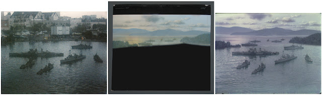 |
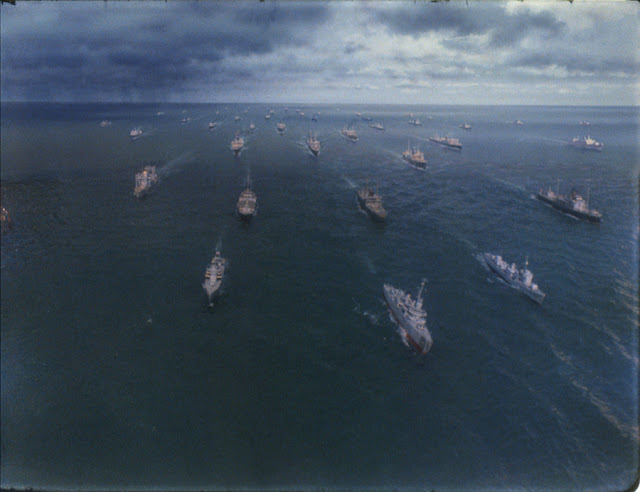
| Argentia Bay -- The original plate for a scene for THE WINDS OF WAR, shot in the miniatures tank at Paramount. The painting and final composite as completed on Sept. 1, 1982, and broadcast by ABC television in the mini-series in Feb '83. The "sun" reflection and vessel positions vary somewhat from the original plate, so perhaps the plate was for a different scene, but it's the best match I have for this matte shot.  |
 | ||||
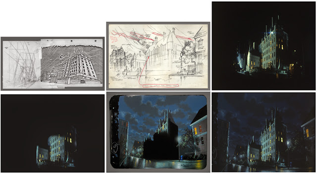
THE WINDS OF WAR - Image 1: Red Square Concept painting for scene where Robert Mitchum stands in a large archway with his back to us, then walks off into the snow-covered square below Spasskaya Tower. Barrage balloons float over the Kremlin. The original idea was to have clouds in the sky, but this was later changed to a clear sky. Image 2: Getting ready to shoot the archway which would be optically composited with several other elements. The date on the slate looks like Feb. 28, 1982. Image 3:A suitable building was dressed to represent the lower part of Spasskaya Tower, and all action was shot in this scene. Image 4: My rotoscope tracing of the relevant edges of the filmed building, upon which I drew my layout for the tower. Other distinctive Kremlin buildings can be seen in the distance behind the wall, evidently later dropped from the final painting.
|


 | ||||||
THE WINDS OF WAR - Convoy1 -- Horribly faded/color shifted after 33 years, here's a raw scan of a film clip showing a convoy of miniature ships, shot at the Paramount tank with a large painted sky backdrop. Convoy2 -- The same setup after color-correcting. The miniatures have moved closer to the camera.
|


 | ||
Convoy8 - Close-ups of the two lightning elements employed in the above matte shot which were backlit and DX'd during a second & third pass through the camera.
|
 | ||||||
1 -- The original scene, shot at the Paramount Studios tank in 1982, for the ABC television miniseries THE WINDS OF WAR (1983), with large miniatures of U.S. and British cruisers depicting the naval rendezvous in Ship Harbour at Argentia, Newfoundland, for the meeting between President Roosevelt and Prime Minister Churchill on August 10, 1941. This scan shows the very faded state of the 33-year-old film I had to work with, despite its having been carefully stored all this time in darkness and away from the elements. While many of the old film clips have turned magenta, others have not and remain remarkably stable. It has to do with the type of film and the chemistry used to process it, I'm sure. Using my Epson scanner, step number one was either to scan using its "Color Restoration" option or to manually try to shift and adjust hues and colors. Sometimes the Color Restoration setting performed miracles without much further color massaging, while at other times it produced an unacceptable result requiring complete manual adjustment instead. The adjustment settings in the scanning software get you in the ballpark, but the resulting scan must invariably be further adjusted in color hue, brightness and contrast. I sharpen the scan as far as I can before it takes on any "fringey" look. The film grain then becomes apparent, so I sometimes back off the sharpening a bit. I crop to the edges of the frame and clean the image of dust and scratches using Photoshop's Healing and Smudge tools. 2 -- The color-corrected, cleaned scan. 3 -- This, I believe, was an optical matte, and here we see the matte applied. Its edges formed an unexpected and disturbing "fringe" that was difficult to deal with. 4 -- The finished painting. During the numerous tests trying to make the matte line go away or at least be less obvious, a lot of airbrushed "fog" was added here and there to double expose over the original photography and help disguise the matte line or add to the atmosphere of the scene.
|


---------------------------
Gene Warren, Jr., head of Fantasy II Film Effects,
contributes the following:
“Bruce Block and Ken Marschall asked me if I wanted to offer any reflections of the almost two decades their company, Matte Effects, was based at Fantasy II in Burbank. First, let me say, the experience was one of the many highlights of my career. As I recall, I first met Bruce and Ken on a shot brought to us by Larry Butler. Then, not long after, also with a Butler connection, I/we (Fantasy II) and Matte Effects developed and cemented a long-lasting relationship while working on the eighteen-hour mini-series THE WINDS OF WAR.
 |
Gene Warren Jr. on the scaffold built to shoot one of the plates for the HBO movie THE BURNING SEASON in southeastern Mexico, 1994 (see matte painting earlier in this interview). |
“Sometime around then a 12 x 12-foot room was built in the corner of Fantasy II’s main
stage and remained there until I/we closed the optical department and that particular facility
in 2002. Bruce and Ken developed a unique system in that room. The camera (4 perf and
in 2002. Bruce and Ken developed a unique system in that room. The camera (4 perf and
8 perf capabilities) was fixed on a pedestal about six feet from a fixed stand where the paintings were mounted on an animation peg bar (male) and photographed.
Two baby spots (1000-watt quartz bulbs) were fixed about seven feet away at a 45-degree angle on both sides of the stand. The lights and camera lens were polarized.
Two baby spots (1000-watt quartz bulbs) were fixed about seven feet away at a 45-degree angle on both sides of the stand. The lights and camera lens were polarized.
“Ken’s photorealistic paintings (approximately 24 x 18 inches) were, to my knowledge,
among the smallest matte paintings ever used in the film industry. In the Matte Effects
era they were the smallest I ever encountered.
era they were the smallest I ever encountered.
“The paintings were rendered on glossy black, Exeter type card stock primarily with
acrylics. A cardboard animation peg bar (female) was taped on one side of the card stock
and slipped over the male peg bar mounted on the stand mentioned above. The other side
painting at home, and he and Bruce would meet about half way
of the painting was taped down at the corners. “Ken would use brushes, airbrushes,
fingers and anything else that delivered the desired results. He did almost all of the painting at home, and he and Bruce would meet about half way
between the beach where Ken lived and Fantasy II in Burbank where the paintings were
photographed. I would occasionally make the exchange when Bruce was busy or out
of town.
of town.
If there was a new film test, a clip was included in the drop when the painting was
returned to Ken for more work. He used a light table and loop at home to view the film
clip.
returned to Ken for more work. He used a light table and loop at home to view the film
clip.
 |
Examining a test for one of the matte shots we did for MOBSTERS in February 1991 using a small magnifying glass given to me by my maternal grandmother when I was a young teen. I used it constantly for every matte painting I ever did. Foolishly never writing down the family history of it, the best that I can vaguely recollect is that it may have belonged to her father who was also an artist and that it dates to the Civil War period or even earlier. My grandmother died in 1987 at the age of 95. As you can imagine, I am hugely disappointed in myself that I didn’t record the story when I had the chance. In any event, I treasure this thoughtful little gift from Grandma, and to this day it is never out of reach. |
The paintings were placed in a makeshift cardboard folder for protection during transport
because the shiny black card stock was floppy. If the tape stretched or something else
caused misalignment, Ken would travel to Burbank and study the error, and then with one
or two tests that took an hour two (a short piece of test footage [color] was developed in a
can), he would realign the painting. Bruce did the entire camera work and color film
development and probably realigned a few times himself. I know I developed a color test
negative in a can at least once.
“Of course, once the color pallet was determined and lab-printing lights were set, most
testfootage went to the lab. I mentioned all of the above only to point out that there were
sometimes multiple paintings at different stages being painted by Ken and photographed by
Bruce in the one small room on the same camera and matte stand.
testfootage went to the lab. I mentioned all of the above only to point out that there were
sometimes multiple paintings at different stages being painted by Ken and photographed by
Bruce in the one small room on the same camera and matte stand.
“I’ll end with five examples of the most amazing accomplishments of Ken Marschall and
BruceBlock:
BruceBlock:
“First, quite often, in order to maintain quality I asked Matte Effects to paint in IP colors
[the ‘orange-base’ process] and photograph the paintings on IP stock, which would then go
into one of Fantasy II’s optical printers to add the live action and then be taken to the lab
for development. The same cycle of testing, similar to original negative (latent image)
process was employed. I don’t have an exact count, but I think Ken did at least a dozen IP
paintings over the years. He had an incredible eye and color sense. Most often he found the
pallet and finished the paintings with only a few more tests than it took on original negative.
“Second, he rendered several anamorphic paintings, such as in FRIGHT NIGHT PART II.
I think they were both latent image original negative. A third anamorphic painting was a
retouched photographic print used as a background for a bluescreened falling werewolf.
I think they were both latent image original negative. A third anamorphic painting was a
retouched photographic print used as a background for a bluescreened falling werewolf.
 |
One of three anamorphic paintings I did for FRIGHT NIGHT PART II between Dec. 1987 and Feb. 1988, the frame seen below showing roughly how the image was projected at 2.35:1 ratio for cinema audiences. |

 |
The second anamorphic painting for FRIGHT NIGHT II. As this was so long ago, I cannot explain why the sky in what is obviously the final painting is entirely different from the final production shot. A moving cloud element must have been added, along with the moon burn-in. |
 |
| The final unsqueezed 'scope' matte shot(s) as seen in two separate cuts in the film FRIGHT NIGHT II. Two skies were painted to represent two different nights, one with a full moon and one without. For the one with the moon a moving cloud element was added, if I recall, along with the moon burn-in.. |
 |
This was merely a photographic print enlargement that I extended and retouched and was used as a background under a bluescreened falling werewolf. |
“Fourth, in order to save a generation on a very complicated and difficult shot, I asked Ken to paint in negative. He pulled it off brilliantly.
“Fifth, for the film BLUE STEEL I asked Ken to paint 8 frames (moving camera) in IP colors to remove a very visible handgun that flew out of a stuntman’s hand when a car hit him. In the next cut he still had the gun. This was before a computer solution (wire/gun removal) was possible. The director, Kathryn Bigelow, and her editor couldn’t figure out how we did it. I never told her.
“I hope this will to bring more attention and recognition of the amazing contributions of Bruce and Ken. Unfortunately, Matte Effects and Fantasy II were always busy doing the work and failed to blow our own horns. Maybe now we can partially remedy that lapse on our part and help update the historical record.”
Gene Warren Jr.
.........................................................................................................
Q: So Bruce, I understand you are these days tenured at a University. Are you involved with teaching cinema/media related courses.


BB: I’ve actually been teaching at USC since 1977. Besides producing movies and doing matte painting photography, I developed and taught courses in the relationship between the visual structure of a film and the story structure of the script. I wrote a book about it called The Visual Story. It’s published in seven languages and is used all over the world by working
professionals and film students. I’ve written a second book with Phil McNally who developed the 3-D techniques used at DreamWorks for their animated films. This book is called 3-D Storytelling and was published in 2013. Both books are available through Amazon.com. When we closed Matte Effects in 2000, I devoted more time to producing movies. I am tenured at USC and was also given the Sergei Eisenstein Endowed Chair in Cinematic Design by George Lucas.
Q: Sadly, in my ongoing research into this fascinating artform, it seems so much original matte art from the past has been lost or destroyed. It was common practice in many studios to scrape off old glasses and reuse these for other paintings, and some studios such as 20th Century Fox would routinely dump Masonite matte art into incinerators I’m told. So much has gone forever. Did you manage to save many of your own painted mattes.
KM: Oh yes, all of them except a few which we presented to directors or art directors. As a collector, and as an artist, of course, it’s very hard for me to put myself into the heads of those who ordered the destruction of so many of the classic old matte paintings. Of course they weren’t yet “classic” at the time. But it was, and still is to a certain extent, the mind set at the studios. Once a film was done, every aspect of its production was considered obsolete and irrelevant, little more than trash, from props to matte paintings.
One of the lecturers during that USC course I took told of how he was walking through a studio lot one day and heard what sounded like the deliberate shattering of glass. It was a man methodically breaking up old matte paintings and tossing the shards into a dumpster. He’d been told to do so. I believe the one relating the story said that he intervened and either able to put a stop to it or save a few paintings for himself. All of us in the class were aghast at the very thought, of course. At Fox Studios Baja in Mexico, after the full “ship” set (Stage 1) was no longer needed for TITANIC and only the forward part of the set remained to be filmed for the final sinking scenes, I was horrified, during a visit to the lot, to find that the whole aft (rear) part of the exquisite set had been dismantled and was in bulldozed piles of debris on the south side of the lot, awaiting transport to a landfill.
 |
| I had to paint a cavernous interior full of Cray computers, inside a large bank in New York, for REMO WILLIAMS: THE ADVENTURE BEGINS, released in Oct. '85. I don't have a clip showing the original scene without the matte in place, so this first view shows the matte, with the bank lobby in the foreground where the actors would walk through. 2 -- My rotoscoped layout for the painting. (The original working title for the project was REMO THE DESTROYER.) 3 -- My tracing of the layout, which I used to transfer it to the card stock before painting. |
 |
| REMO WILLIAMS -- The design for two massive Art Deco light fixtures that would hang above the marble lobby corridor. Right, the design for an elaborate Deco bronze sconce, drawn by someone else. |
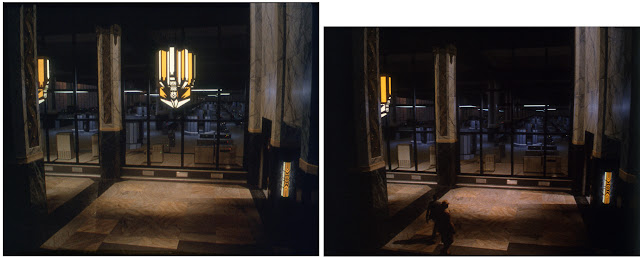 |
| At left a final (or late) test, undated. At right: I believe this is the last test, with two actors beginning to enter the scene at bottom, although I notice that most of the lights in the computer room are missing. These were added again in the final production shot. Obviously we have another mystery here: What happened to the prominent light fixture in the center? I remembered having to add the large chandelier -- or take it away -- at the art director's request, but it's there in the actual painting today, which is of course the final version that was filmed. So how the hell does it disappear in the movie?! As mentioned earlier, Bruce usually shot two production takes with the actors so that we had an extra one as insurance. Some 30 years later I can only guess that we shot (used) both production takes, one before I added the chandelier and one after, and the director ultimately decided against the light fixture and used the take without it. I double-checked the movie, and there is no center chandelier in the scene. It's just been too long since I worked on these projects; I have no memory of how some of these "mystery mattes" went down. In any event, this painting has always been a favorite of mine. I think the scene works wonderfully. |
 |
| The painting. The illuminated parts of the lights would be DX'd on a second pass, and various lights, some blinking, were DX'd in the computer room. |
 |
| REMO WILLIAMS - close detail view of art. |
 |
| REMO WILLIAMS composite |
 |
| The book Titanic: An Illustrated History, authored by Don Lynch, was inspirational to Cameron in the conception of his 1997 epic movie TITANIC |
End of Part Two.