Quantcast
Channel: Matte Shot - a tribute to Golden Era special fx
Viewing all 101 articles
Browse latest View live

The Art of the Painted Backing - Golden Era Scenic Art

$
0
0
BLOG UPDATE:  After being trapped in Queenstown, a picturesque resort town in the deep south of New Zealand for a number of days beyond my intended holiday due to the serious ash fallout all over NZ blown here from the Chilean volcanic eruption I'm a bit behind with some blog material.  I have just added a few more interesting pictures to my previous article Matte Artists at Work, including a great image of Harrison Ellenshaw painting a glass shot for Disney's NO DEPOSIT, NO RETURN (1976) as well as pics of Derek Meddings and Mike Trim painting for Gerry Anderson's fabulous THUNDERBIRDS tv show. 

I was going to include this selection of backings in the previous blog as many of the photos show the scenic artist at work, and a great many of these fellows eventually became matte painters such as Albert Whitlock, Peter Melrose, Emilio Ruiz, Brian Bishop, Jan Domela, Les Bowie, Cliff Culley and many more.

Although today's blog has some really interesting, and sometimes quite staggering imagery it's unfortunate that I can't place a title to many of these films, nor in most cases, authorship of the individual backings, most of which would have been joint efforts from large studio scenic departments.  My friend  and fellow matte shot enthusiast Domingo Lizcano has a wonderful site that many of you will already be familiar with, and among his archives is an excellent and well researched run down of many of the names and filmographies of notable scenic backing artists that is essential for those seeking more information on an area I'm not any where near as au fait with.  So with that in mind, what follows is a sample of some terrific old time painted backings and some behind the scenes pictures of the creative process.

I can't be sure but I think this is of the Warner Bros scenic backing department.
One of the 20th Century Fox backings, probably from the 40's.


The 1950 George Pal science fiction film DESTINATION MOON had significant input from highly regarded matte painter and astronomical artist Chesley Bonestell, who if I'm correct, actually painted this vast backing as well.


Backings to me have generally been something of a hit or miss affair, with so many awful ones over the years I'd tended to pretty much disregard the art form entirely, and it's really only in recent times I've come to better appreciate the art of the scenic painter, as many of these photographs will testify.
Rank's scenic dept furnished this backing for the Stanley Baker VistaVision road thriller HELL DRIVERS (1957)

Do my eyes deceive me??  A wonderful, though mystery studio backing, with artist.
George Gibson's cyclorama at MGM for FORBIDDEN PLANET.
MGM's vast and busy backings department, probably in the late forties.  Visual effects man Harry Walton recently told me of his visit to this department some years ago:  "When I was working at Sony Pictures Imageworks which was on the old MGM lot in Culver City, I visited the backing department which was the  called JC Backings. This was where all the huge painted backings were made for the MGM productions. I went into an elevator and went up 2 or 3 stories to where the main painting floor was.   A technician there showed me the operation, how these enormous paintings were raised up and down through a narrow opening in the floor so that the artist could easily reach all areas of the canvas. It was very impressive!    I wish I had taken some photos of the place".
Another example from Rank-Pinewood, from the film JACQUELINE  (1956)


An utterly sensational photo of these unsung heroes at work on an unknown film.

Either a backing or a process shot of a matte painting from the 1936 William Wyler film DODSWORTH.
Noted British scenic artist turned matte painter Brian Bishop painted this evocative backing for Derek Meddings vfx unit on BATMAN.  Pinewood matte cameraman Angus Bickerton recently told me: "Brian painted the big backing of Gotham City that was used as the BG to a FG miniature bridge with line light traffic and Black plastic sheet river and became the opening shot of Tim Burton's "Batman". He painted it on M stage at Shepperton with some assistance from Derek I think. As a man who used to paint all his own backings in the Gerry Anderson days, Derek had huge respect for Brian.   The design for the shot had come from a detailed pencil concept from Anton Furst. At least I always believed Anton Furst created the art but Nigel Phelps was then an Art Director for him and he may have been the artist.       Holes were cut into the canvas which I would estimate to be about 40' wide by 20' high and backlit for city lights.  As a junior I stood and watched as Derek's model unit shot this many times to get the timing right. Imight have had a hand in dragging the plastic sheeting. Then months later I duped the shot on our aerial image animation stand in the side building where Doug Ferris and Gerald Larn used to reside and supered the title "Gotham City". For more, click here.http://www.flickr.com/photos/stefansgallery/4470429400/

A wonderfully revealing look at the early block in of just such a huge scenic backing at MGM.Note the slot in the floor where the huge canvas sheet may be raised or lowered as the artist requires.

Rick Rische's painted backing adds much to a natural light Skotack brothers miniature set up for TREMORS (1990)
One of the most recognised backings of the 70's, and one so often wrongly credited - the Wilshire Blvd view from EARTHQUAKE (1974) which contrary to popular folklore was not painted by Al Whitlock but in fact is the work of Filipino artist and effects designer Benjamin Abelardo Resella.  Resella contributed scenic backings to hundreds of films, with a significant number in Hollywood through the 60's and 70's.  I find this EQ painting to be flawless, but sadly the perspective doesn't correlate properly with the staging of the foreground action.
Alfred Hitchcock's SPELLBOUND (1944) had numerous imaginative dream sequences courtesy of surrealist Salvador Dali (pictured above with Hitch and by camera) some of which were Cosgrove shots of Dali art while some views utilised large painted backings.


Another excellent view of the scenic method in progress, as documented in a 1940's issue of LIFE magazine.

The exciting 1956 Powell-Pressburger film BATTLE OF THE RIVER PLATE at Rank-Pinewood studios.

A large painted backing at the rear of the Sersen tank at Fox for the film CRASH DIVE (1943)

Universal's THE DEADLY MANTIS

Sensational photo realistic MGM backing from an unknown production.


Backing and set at Pinewood for the popular Dirk Bogarde-Brigitte Bardot comedy DOCTOR AT SEA (1955)


A large George Gibson backing as used for a special effects tank set up at MGM for A GUY NAMED JOE (1944)

Raymond Massey posing on the set at Warners of the visual fx extravaganza THE FOUNTAINHEAD (1949) as the scenic crew install the spectacular painted backdrop of New York City.  Great film and matte showcase.

Many matte artists started off as scenic painters, and these two gentlemen, Hans (John)  Bartholowski and Hans Ledeboer are shown here working on a backing for Paramount's THE VAGABOND KING  (1930).  Ledeboer would go on to be a matte artist under Jack Cosgrove at Selznick studios, while Bartholowski would paint mattes under Byron Crabbe at Warner Brothers with Chesley Bonestell and Paul Detlefsen.


Stop motion maestro Ray Harryhausen who himself is a highly accomplished artist, is shown here finishing off a backing for what could possibly be Ray's unfinished early film EVOLUTION?


MGM's scenic art department under the control of George Gibson, who may be the fellow shown at right?

Les Bowie, the multi talented father of UK special effects, is seen here at work on a backing for an outdoors miniature shoot on MOSQUITO SQUADRON, with the photos below further demonstrating the application.

Bowie, Kit West, Neil Swan and Brian Johnson shoot the WWII miniatures against Les's scenic backing.


An unknown studio and production.

An unknown tropical backing from a Rank-Pinewood production of the 50's.

For Hitchcock's wonderful NORTH BY NORTHWEST (1959) the United Nations interior comprised of a Lee Le Blanc matte painting for the most part with a George Gibson backing for the mid portion where actors mingle.

Another Hitchcock gem - the excellent ROPE (1948) was an entirely one set indoor drama with much manipulation of the NYC views to suggest the gradual passage of time.  The backing was extensive and at the time something of a marvel, with partial forced perspective miniatures, cloud simulations and lighting schemes.
MERMAID STORY -  a little known Rank-Pinewood film of the fifties.


Frank Capra's 1941 classic ARSENIC AND OLD LACE was notable for the really amazing and realistic backings - often with smoke, lights and even two dimensional trains rolling by.  I'd like to see a behind the scenes picture of this lavish set as much of the plot takes place in this setting.

George Pal's WHEN WORLDS COLLIDE which combined Ivyl Burks miniatures and Jan Domela matte set extensions with these painted backings for the 'Noahs Ark' rocket launch set piece.


NEXT BLOG     -      A TRIBUTE TO 20th CENTURY FOX

A salute to the 20th Century Fox special photographic effects dept.

$
0
0
I've written much here in the past on selected effects films such as the amazing THE RAINS CAME and IN OLD CHICAGO among others, produced under the headship of the legendary special effects pioneer Fred Sersen at Darryl F.Zanuck's flagship 20th Century Fox.   What follows is a photographic celebration of the creativity and inventiveness of the special photographic effects department at Fox from the twenties up into the seventies, by which time the effects department had closed and all such work was being farmed out to independent contractors and boutique effects houses.

The large and well staffed Sersen unit at Fox, 1938
My earlier blogs contain a fair amount of biographical info on the key players in the Fox photo effects dept, though I will briefly highlight some of them again for those interested readers who may only now have stumbled across my blog, as appears to be the case frequently, based on the correspondence I receive.
The matte and photographic effects department was for many years known as the scenic art department, and it was one of considerable size and wide ranging trick shot abilities.  As with all of the Hollywood studios of the day, trick shots were invariably labelled under the surname of the head of that unit - Selznick Studio had Cosgrove shots, thus named after Jack Cosgrove; MGM's camera effects work was recognised under it's Newcombe shots banner after the eccentric Warren Newcombe; Universal's mercurial John P.Fulton would lead on to Fulton shots and so on - so it was too for Fox with it's brand name Sersen shots.

According to an article in Perspective magazine, Joseph Serbaroli jnr, whose father and grandfather both painted under Sersen in the Fox matte department from the mid thirties onward, "Czechoslovakian born Fred Sersen was the soft spoken, cigar smoking head of the scenic art department for more than thirty years.  He joined Fox in 1918 in the silent era and was one of the giants in pioneering scenic (matte) special effects for many hundreds of films.  Sersen was a well known watercolourist and executed many of the paintings on the walls of the Fox studio commissary". A 1944 Los Angeles Times article on Sersen's department mentions: "Occasionally  Fred would close down his matte department early and take his artists on sketching trips to 'refresh their eyes and see how nature really looks'"  Such was Fred's gravitas that even after his retirement in 1952 he was engaged on a retainer as effects consultant with the studio for some years.  Sersen passed away in 1962 aged 72

Among the roster  of talent under Sersen at Fox was his key associate and right hand man, Ray Kellogg.  Like Fred, Ray was first and foremost a matte painter and would be principal painter on hundreds of films from the mid thirties right through to his assuming stewardship of the department upon Sersen's retirement in 1952.  The photo at left shows Sersen (l) with Kellogg (r) during the filming of the big Oscar winning effects extravaganza THE RAINS CAME in 1938.  The photo at right shows Ray at work on a matte for an unknown film around 1951.


A partial view of the old 20th Century Fox backlot and according to Ed Nassour:  "Here's a view of the vast Fox backlot in West LA circa 1940s showing the location of the original Serson tank at a time when the sky drop was being replaced which is why the scaffolding is showing.   Next to it was the Chicago Lake.  That long white structure was the scene dock.  Behind it you can see a smaller sky drop which was constructed next to a mock-up of an aircraft carrier flight deck used in A WING AND A PRAYER.  Behind that smaller backing was the huge train shed built for CENTENNIAL SUMMER".

Ralph Hammeras
Many artists, cameramen, editors, art directors and niche specialists made up the Fox matte department, as the crowded group photo at the top of this blog will testify - though Fox wasn't the biggest by far, with Warner Brothers' huge Stage 5 Effects Stage of the 1940's probably taking the prize there.  Among the names associated with the studio were pioneering visual effects cameraman and matte painter Ralph Hammeras - probably the most experienced of all in the field, even moreso than Sersen himself, and was regarded as one of the finest glass artists in the business.  Hammeras would assume an important role in Fox productions for several decades, often adapting his skills from matte artist, effects cinematographer or miniatures supervisor as the need arose.  Among his work are wonderful riverboat miniatures in DRAGONWYCK, much special photography for JUST IMAGINE and what is arguably Fox's grandest effects film IN OLD CHICAGO.

Emil Kosa senior painting gallery watercolours.
Many matte artists would come and go from the studio over it's golden years, with the following names being just a few that I know of:  The father and son team of Emil Kosa (jnr and snr) would be mainstays with Fox for much of their film industry lives, with Kosa snr also working in the Newcombe department at MGM for a time.  Kosa snr was a self taught painter and would become mentor to many younger Fox glass artists.


Emil Kosa jr
Emil Kosa junior began at Fox in 1933 and is widely credited as having designed the Fox searchlight logo.  He worked for the studio for more than thirty years, won an Oscar for CLEOPATRA in 1962 and passed away shortly after completing the now iconic closing matte shot for PLANET OF THE APES.
Additional names in the matte painting roster included Fitch Fulton - the painter father of genius Universal effects man John, who ironically tried all in his power to dissuade young John from entering the dodgy film industry in the late twenties, yet Fitch himself was coaxed into matte painting later on by his son, for such luminous matte heavy films as GONE WITH THE WIND and CITIZEN KANE.  Fulton snr would be on staff at Fox for a number of years.  

Menrad von Muldorfer (left)

Other matte painters included Menrad von Muldorfer, who was with the studio for well over thirty years, from such films as THE RAINS CAME through to VON RYANS EXPRESS in the mid sixties.  The only named screen credit I can recall was for the low budget Rabin-Block science fiction show KRONOS in the mid fifties.
The 1938 unit photo at left shows von Muldorfer watching another un named Fox matte artist at work on the early stages of a matte painting.


Max De Vega, Cliff Silsby, Gilbert Riswold, Clyde Scott, Hector Serbaroli, Joseph Serbaroli, Lee LeBlanc, Jim Fetherolf, Matthew Yuricich, Irving Block, Jan Domela and maybe Louis Litchtenfield were some of the other matte artists who featured anonymously  and unrewarded throughout the golden years.  Visual effects cinematographers would list several notable contributors to the artform of trick shots.  Charles G. Clarke, James B.Gordon, Al Irving, Til Gabbani, Paul Mohn, Harry Dawe, Wally Castle, L.B Abbott , Sol Halperin ,  Frank van Der Veer, Art Cruickshank and Clarence Slifer among them.  The photo at right (l to r) shows effects editor Wally White, head of dept Ray Kellogg, manager Bud Fisher and effects cameraman Al Irving with one of the large 3 strip technicolor cameras.

Lenwood Ballard (L.B)  Abbott
Visual effects cameraman and future head of the Fox trick department Lenwood Ballard Abbott, better known as 'L.B' or just plain Bill would prove himself to be a prominent force in the visual effects community was a true mainstay with the studio, and dedicated virtually his entire career to Fox.  
I hope to run a one off blog on Bill Abbott in the future as I've had contact from one of his staffers from the sixties, so I'm hopeful things will eventuate.  In the meantime here's a bit of a rundown on Bill:  he started as an assistant cameraman in 1926 on Raoul Walsh's WHAT PRICE GLORY and would move up through the ranks and into Sersen's trick department, with his first true special effects camera duties on the thrilling effects shots for IN OLD CHICAGO in 1938.  
After a brief sideways move back into production camera operation, Abbott resumed effects work as director of photography for the effects department in 1943 where he would remain until assuming the headship of the unit upon Ray Kellogg's departure in 1957.

Ralph Hammeras, Bill Abbott, Ray Kellogg, Emil Kosa jr, and Harry Dawes
In Abbott's excellent memoir, Special Effects - Wire, Tape and Rubber Band Style, he outlined the working methods of the Fox effects stage in the sixties:  "For a period of about three years we were producing 10 hours of tv a week and some 25 features a year.  Our personnel averaged 40 people.  The amount of equipment we utilised was impressive.  There were two 65mm optical printers and one 65mm matte camera; two Producer's Service triple head optical printers and three of their bench printers; three 35mm matte shot cameras, one home built scanning printer used to convert CinemaScope to flat television format; one Producer's Service contact printer used exclusively for the manufacture of separations for colour duping; a home built optical printer with a long bed used mainly for the conversion of flat to scope or vice versa; one vertical animation stand and two horizontal stands; four Mitchell high speed cameras with register pins in the viewing tube to allow for the use of film clips for lineup, and two Houston developing machines". 
Fred Sersen (centre) supervising in camera glass shots on the Fox lot.
In describing the actual special effects stage, Abbott wrote: "The dept. was housed in a building with the art dept. and the backing dept.  Our area was approximately 350 feet by 80 feet.  We had a stage 60 x 40 feet with a 16 foot ceiling.  The stage was in constant use for shooting miniatures, inserts and odd jobs"


A very early Sersen matte shot from an unknown film, circa 1927

Evocative silent era matte composite by Fred Sersen from THE RED DANCE

Another matte from THE RED DANCE - circa 1929


The excellent 1935 version of LES MISERABLES  was a beautifully told piece, augmented with minimal mattes.

Shirley Temple's 1937 hit HEIDI looked okay in original black and white, but avoid at all costs the abominable computer coloured version.

Some ceiling additions for the 1937 ON THE AVENUE
The phenomenal, jaw dropping visual effects from IN OLD CHICAGO (1938) which feature the best ever scenes of flaming inferno ever lensed in my book!!  Amazing stuff which still holds up today some 74 years later.This shot turned up elsewhere later on, such as the James Stewart thriller CALL NORTHSIDE 777.
Another exciting Sersen shot from IN OLD CHICAGO  (1937)

IN OLD CHICAGO.... for more, see my blog dedicated to this film.
The brilliant 1943 Henry Fonda film THE OX BOW INCIDENT  featured this curious matte split screen where the coachman's head is momentarily 'chopped off' by the matte line.

Two more mattes from THE OX BOW INCIDENT  (1943)


A Sersen shot from the thrilling and well deserved Oscar winning THE RAINS CAME (1939)

Matte artist Hector Serbaroli at work on one of the mattes for THE RAINS CAME (1939). For more on this film check out my special blog on it a few months back in the sidebar.


Gene Tierney's 1941 programmer BELLE STARR  featured this Ralph Hammeras photographic effect which involved live action, miniature and linking matte painting to tie it all together.

A very subtle blend brings together a limited set on the right side of the frame with a matte painted view of Monument Valley and the sky on the left hand side of the frame for MY DARLING CLEMENTINE (1946).  The join is a well disguised, irregularly drawn soft blend that Henry Fonda almost rides his horse through as the shot cuts away.

Definitely a split screen, but more than likely one to join two separate actual locations as the team of stampeding horses ride perilously close to the cliff edge.  From the Roddy McDowall film MY FRIEND FLICKA (1943)

Several painted mattes open THE MARK OF ZORRO (1940) depicting period Madrid.

More from THE MARK OF ZORRO.  Aside from these glass shots the film had several clever optical combination gags such as rotoscoping for a dramatic and dangerous looking horse jump from a bridge into a river, and some swordsmanship enhancement optical work.

Not a film one anticipates as an effects show, but there are a number of Sersen effects shots in the excellent LIFEBOAT (1944).  Some matted in painted skies and several excellent miniature-live action split screens (above left) which are terrific.

More process-miniature combination set ups from LIFEBOAT, with Sersens fx storyboards shown here too.

For years, Sol Halperin was in charge of Fox's process photography, much as Farciot Edouart was at Paramount, and these pictures show the technique at work in LIFEBOAT.
A Ralph Hammeras matte painting from CHARLEY'S AUNT (1941)
Tyrone Power's big 1942 swashbuckler THE BLACK SWAN was an excellent (and gorgeous looking) technicolor adventure with nice matte art and many excellent seagoing miniatures, some of which was re-used in subsequent pirate shows.
More matte work from THE BLACK SWAN
Sensational model work from THE BLACK SWAN shot in the Sersen tank, coupled with astonishingly well executed opticals with people added to the decks and even the mast of the ship by means of complex travelling matte - a trick that Sersen would repeat in other later films to equally good effect.
While MGM lead the industry in glamour puss musicals, and Warners did hard justice with gangster flicks, Fox were at the top of the game with big budget costume melodramas and period actioners.  Here are some subtle yet beautiful painted additions for CAPTAIN FROM CASTILLE (1947)


Fred Sersen won the Oscar for his effects in CRASH DIVE (1943) -  a film with alot of the aforementioned travelling matte work to insert actors onto burning miniature destroyers - all most effectively.  The upper left matte is an utterly invisible composite which adds the tree, top of the gateway, sign etc.  The matte on the right looks suspiciously like the original film elements were faulty in colour timing, possibly during the telecine remastering for DVD etc.

Some great frames from CRASH DIVE demonstrating the extensive use of travelling matted actors with model ships.


Some of the big conflagration scenes in CRASH DIVE also comprise actors safely matted against miniatures and matte paintings, with separate fire elements added. 

And here is Sersen picking up his Oscar with sound department head Roger Heman also recieving for audio fx.


The 1947 gothic melodrama DRAGONWYCK had alot of effects work, such as this not entirely effective painting of the cityscape, where perspective issues are numerous.  The shot at right is an uncredited  Ralph Hammeras miniature.

Two more mattes from DRAGONWYCK..  I'm a sucker for creepy 'haunted house' style matte shots.

Three more shots from DRAGONWYCK

Edward Nassour recently told me the following about the Sersen tank: "The Serson Tank was originally on the Fox lot in West LA at what is now Century City.  It remained there until it was dismantled after the vast backlot was sold to Alcoa.  That was back in 1961.  A brand new Serson Tank was constructed out at Fox's ranch in Malibu Canyon.  It was built sometime in 1962 and first used for CLEOPATRA.  Today a parking lot marks the spot where it was located.  This is a photo showing the original Serson Tank with its sky backing on the Fox lot.  That's Joseph Welch standing in front of it".

Another view of the Sersen tank at Fox, and by the looks of this photo Disney (who didn't have a tank) were in the midst of shooting the full scale submarine shots for 20'000 LEAGUES UNDER THE SEA (1954).  Not only did Disney use the Fox tank, but also the big and bulky Fox owned Bausch and Lomb anamorphic lenses to shoot in scope.

a good view of the size of the backing used in the Sersen tank.


The 1947 Rex Harrison comedy THE GHOST AND MRS MUIR

Ernst Lubitsch's classic HEAVEN CAN WAIT (1943)The 3 frames below left are mattes of the same street through different time periods in the film.  The middle frame was later used by Universal for the John Astin tv movie EVIL ROY SLADE (1972), which oddly, had mattes credited to Albert Whitlock!!


Lubitch's idea of 'Hell' as in HEAVEN CAN WAIT.


John Ford's HOW GREEN WAS MY VALLEY (1941) used painted mattes in several shots to try to disguise an otherwise tired and obvious Fox Ranch shoot, which in no way imaginable would pass for Wales.  Some wonderful skies added via soft blend splits, often barely above the heads of the actors at times.

An invisible Ralph Hammeras matte from HOW GREEN WAS MY VALLEY - the kind so prevalent throughout the thirties and forties where significant architectural detail is added by the matte artist without the audience ever being any the wiser.

Orson Welles' brooding 1944 version of JANE EYRE is a sumptuous, richly textured gothic love story.

More from JANE EYRE (1944)

Mattes to expand a minimal set from the 1943 SONG OF BERNADETTE


Sequential frames from a complex optical jigsaw which opens the Tyrone Power film THE RAZOR'S EDGE (1946) where the camera starts on a painted sky and moves on down through trees, pans across a multi plane type ocean behind bushes and into the porch of the actor - in one cleverly assembled continuous move.

Stunning matte art from the key moment of revelation, from THE RAZOR'S EDGE


The Sersen department's mattes were nominated for best special effects for WILSON (1940).

Another of the numerous Oscar nominated Fox effects films, A YANK IN THE R.A.F (1941) which had excellent effects work throughout, with this shot looking to me like a matte painting or model split screened with actors in a tank with a fire element and drifting smoke doubled over the top.  Ralph Hammeras was heavily involved with the effects work on this.

Ray Kellogg matte shots from A YANK IN THE R.A.F, nicely finished with doubled in explosion elements, aircraft dive bombing, smoke, fire and lots of pockets of live action.

Same film, some of the really good bomb run sequences with animated searchlights and much else to help sell the effect.

I'm not sure here, but it has the look of an effects shot - from Henry Hathaway's CALL NORTHSIDE 777 (1948)


Process shot with probable matte painted sky, from A WING AND A PRAYER (1944)

Classic Hollywood wartime miniature shot - also from A WING AND A PRAYER.
A true masterpiece of the genre - quite a few matte shots here with some where you'd least expect them.  The Times Square shot for example, upon close inspection, shows all the vehicles to be painted and matted in in sections - a trick used sevferal times in the film during the international 'time freeze' set piece'.  I've said it before and I'll say it again, music maketh the matte, and the great Bernard Herrmann has rarely bettered himself outside of this sensational score.
Also from THE DAY THE EARTH STOOD STILL  (1951).  Note the painted traffic at a stand still.

The very dull Gregory Peck in an equally dull biblical picture, DAVID AND BATHSHEBA (1951).

DAVID AND BATHSHEBA - An interesting and convincing effect from an otherwise uninteresting film - what I presume to be a nodal head pan across a foreground painting or miniature city (almost certainly the former).


The 1952 remake of LES MISERABLES had Ray Kellogg supervising mattes .  The mattes are quite nice though the film isn't a patch on the 1935 version.

Three more matte shots from the 1952 version of LES MISERABLES.

Rather good matte composite from ANNE OF THE INDIES (1952) which also re-used mattes from THE BLACK SWAN.

The three mattes seen in the Clifton Webb version of TITANIC (1952).

Gene Tierney's 1945 picture LEAVE HER TO HEAVEN had these mattes with a particularly good one top right with the painted country club beautifully sandwiched into an actual setting.  The lower left looks like a matte art split screened with a waterfall, and this in turn process projected behind Cornel Wilde.

Marilyn Monroe rarely looked as hot as she did in NIAGARA (1953).  These shots are from the murder sequence in the bell tower where the masses of bells have been painted in for both the downview and the tilt up shot.

Now these are really good in motion, also from NIAGARA, we get a series of great shots where the heroine's boat is loose in the rapids and ready to go over the falls in what appears to be a brilliantly matted together composite of the real locale with a barely detectable soft split adding the boat in, most probably, the studio tank.  Neat stuff and quite bold I thought.  The other frames are very effective rear screen shots, which in motion are quite thrilling.

Also from NIAGARA - a multiple component effects shot. Jean Peters clings to fake rock in front of bluescreen, raging rapids footage split screened with painted horizon, and a separately matted in sky with helicopter coming to the rescue.

Another dull film with a dull actor  - Gregory Peck again.... a major 1952 yawnfest.


I've always loved that full Fox Alfred Newman fanfare (almost as much as the Max Steiner Warner Bros fanfare) especially when the CinemaScope logo is included.....  The process came into widespread use via Fox in 1954 and the studio never looked back, with virtually all subsequent films being shot in the new widescreen process.  As good as it may have looked on the big screen (and it did) the process was a pain for cinematographers, editors and especially photographic effects men who had to contend with unforgiving levels of distortion and odd compression artifacts at the outer edges of the screen, which is still visible in older films.  Shooting and compositing mattes was fraught with problems, mostly with focal depth when shooting static art.  Matthew Yuricich was one noted painter who learned to master the art of painting to anamorphic, by designing and constructing his mattes to compensate for these anomalies.


Fox's big premier CinemaScope film was THE ROBE (1954) - and several grand mattes certainly livened up the affair. Matthew Yuricich was one of the painters on this film, along with Emil Kosa jr and othersThe lower matte of the river Tiber and the steps of the palace was recycled for the sequel.
A matte from the dire sequel DEMETRIUS AND THE GLADIATORS (1954) which is actually one of those from THE ROBE, though this time printed down and enhanced to give a night time effect.

Jules Verne's marvellous story JOURNEY TO THE CENTRE OF THE EARTH (1959) was a joy to watch, and a grand entertainment at that.  Many, many effects shots just sweetened the deal for the audience.  By now L.B Abbott was in charge, though many of the same artists and cameramen remained.  Emil Kosa jr and Ralph Hammeras were principal matte painters, while James B.Gordon and Walter Castle were effects cameramen. 
The film was nominated in the visual effects category though it lost to BEN HUR that year.

Although they were mere lizards, I recall being utterly enthralled by them on screen as a kid as they were just so 'real'.  Some nice split screen work here tying together miniature sets, location and matte art extensions.  All from JOURNEY TO THE CENTRE OF THE EARTH.  Once again the maestro Bernard Herrmann came to the party with a unique one of a kind score.

The grotto - matte shot from JOURNEY TO THE CENTRE OF THE EARTH.  I was in touch a while back with a fellow who said he owned some of these original paintings and was going to let me see them, but sadly nothing came of it.

Process set ups from JOURNEY TO THE CENTRE OF THE EARTH   (1959)

Only around two films were ever made in this variant on CinemaScope, using a new 55mm negative I believe, one of which was THE KING AND I (1956)

Beautiful miniatures of period Bangkok and a paddle steamer open the filmEffects supervisor Ray Kellogg.

Painted set extensions expand the soundstage for THE KING AND I


The taut Yakuza thriller HOUSE OF BAMBOO (1955) used matte art to present post war Tokyo (1955).

Several effects shots expand the vision of John Huston for HEAVEN KNOWS MR ALLISON (1957) such as squadrons of Japanese zeros in one shot and two views of distant ships off the bay.

Gary Cooper's 1954 western, with a great title by the way, GARDEN OF EVIL has heaps of matte shots in it such as this sweeping vista of a harbour and landscape as well as many shots of mountain passes and canyons, some added in to suggest more treacherous riding trails high on the cliff edge.

GARDEN OF EVIL again - and as with several of the shots differing painting styles tend to suggest multiple artists.

Two more of the many mattes from GARDEN OF EVIL.
Robert Taylor's 1956 wartime love story D-DAY, THE SIXTH OF JUNE had many matte shots, including ships at sea, bombers over London and this facsimilie of the English seaside town, comprised mostly of artwork.  The shadow of the vehicle vanishes under the matte line as it pulls up to the curb.

Among the many effects shots in D-DAY, THE SIXTH OF JUNE are several of these wonderfully convincing and very bold trick set ups where the entire ack-ack styled heavy artillery gun is painted in and the muzzle flashes are brilliantly executed animation.  Really impressive, with even bunker explosions done using this method in some shots.

More from D-DAY, THE SIXTH OF JUNE (1957).  Ray Kellogg was photographic effects supervisor.  Of course the most dazzling visual effect in this film would have to have been the exquisite Dana Wynter - as stunning a sight for the eyes as anyone....I think she passed away recently.


While we're at war, I must include the excellent James Mason film about Rommel, THE DESERT FOX (1951).  Many mattes and composites abound with these just being an example.  A terrific film, and a rare one where both Sersen and Kellogg received co-effects screen credit.


The unbelievably dry and tedious DESIREE (1954) was an opulent costumer about Napoleon, shot in CinemaScope, though my vhs grabs miss much of the grandeur.


One of Fox's early forays into the CinemaScope side screen process was the energetic PRINCE VALIANT (1954) which also had many grand painted mattes.  Matthew Yuricich recalled painting some of the mattes on this show, and also recalled the time somewhat later when he was ordered to scrape clean some of the glasses to allow re-use:  "it made me feel sick" said Yuricich to author Craig Barron.

More from PRINCE VALIANT  (1954)

One more spectacular matte shot from PRINCE VALIANT.

Two frames from THE RAINS OF RANCHIPUR - the 1956 remake of THE RAINS CAME
The popular 1958 Todd-AO extravaganza SOUTH PACIFIC featured some beautiful mattes of the mythical 'Bali-Hi'.  As with some other mattes discussed here I was in contact with a US collector who supposedly had one of these in his garage, though for whatever reason he was unable to produce a photograph...sadly.

In addition to the fabled 'Bali Hi' mattes, SOUTH PACIFIC also featured other less noticeable trick shots such as these depicting the US Navy off shore and squadrons of aircraft etc.

I only saw this for the first time quite recently and was surprised at how much I liked it.  Very catchy songs, and adorable female cast and stunning Emil Kosa cloudscapes.  Great show.

Bette Davis was extremely well cast in the under rated 1955 film THE VIRGIN QUEEN as Queen Elizabeth I.  An excellent film that is too short by far, with many exquisite mattes and some totally credible miniatures to boot.
THE VIRGIN QUEEN -  quite possibly an entirely miniature set up here, or perhaps a combined shot?

More from THE VIRGIN QUEEN - a film which suffered badly in old pan and scan tv prints.

Also from THE VIRGIN QUEEN
Ingrid Bergman's 1958 film INN OF THE SIXTH HAPPINESS may well have been a Fox release but I suspect that, as with others of that time, it was possibly a UK production, matte shots included.  The upper left frame was a  'fix it' glass shot (I think it was done in camera) needed to conceal modern hydro electric pipes and to add a village.  The mattes may have been carried out artists at either Shepperton, Pinewood or MGM-Elstree.

Michael Curtiz had done many a fine film for Warner Bros, though now he was temporarily over at rival studio Fox for the big budget THE EGYPTIAN (1956).  Although far from his finest hour the film was grand and had many, many matte shots
More mattes from THE EGYPTIAN.

Two epic scale mattes which work well for THE EGYPTIAN.

Again, THE EGYPTIAN - with Victor Mature doing his thing.

One of the many outstanding westerns to come out of the studio was this taut Spencer Tracy picture BROKEN LANCE (1954)

David O'Selznick's last film, A FAREWELL TO ARMS (1957) had some matte work in it such as this one of a WWII train station in Milan.  I suspect that the effects work may have been done in the UK or at Cinecetta in Rome?

Another excellent Fox psychological western, WARLOCK (1959) - the dream team of Fonda, Widmark and Quinn.  The top matte opens the film while the other is a later scene, that upon close examination, Fonda and Quinn are barely on the safe side of the very subtle matte demarcation line, so obviously the painting was configured to fit the location plate.
Another good, solid Fox WWII story, BETWEEN HEAVEN AND HELL (1956) takes the step through the matte line as Robert Wagner's helmet merges with the painted village in this shot.
Irwin Allen's 1960 THE LOST WORLD  was for the most part a laughable affair although I've not seen it in decades.

Another of Fox's biblical epics was the 1960 THE STORY OF RUTH.
Another matte from THE STORY OF RUTH (1960)
Irwin Allen again - and this time with the feature film of VOYAGE TO THE BOTTOM OF THE SEA (1961).  The firey skies are multiple layered opticals of a flame thrower and represent the destruction of the Earth's Van Allan Belt.
Another of Fox's British productions, 300 SPARTANS (1961) which I assume had UK based matte work.

John Wayne's 1960 western NORTH TO ALASKA had a few mattes such as these and some optical effects work of the northern lights for some scenes.
Irwin Allen would have a long association with Fox,  with this lightweight adventure FIVE WEEKS IN A BALLOON (1962) being one such.  A couple of nice mattes, decent blue screen work and some good miniature balloon footage.
And here is that aforementioned balloon model sequence.

The mega budget flop that almost broke the camel's back, as it were - CLEOPATRA (1963).  This magnificent shot is one of two in camera latent image foreground glass shots, with this view being that of the ancient port of Alexandria.  Emil Kosa took home the Oscar for this, though I've read differing accounts of who actually painted it - from Fox veteran Ralph Hammeras, former Percy Day matte artist Joseph Natanson to landscape artist Mary BoneThe vast width of the pan necessitated two giant plates of glass, united with a frame which was hidden behind the center statue.

Another wide panning glass shot from CLEOPATRA, with the join between the two angled glasses concealed by statue.

Doris Day's 1965 comedy DO NOT DISTURB matte extension by Emil Kosa jr.

Steve McQueen - now there's an under appreciated actor folks - in THE SAND PEBBLES (1966) which featured two or three mattes by Emil Kosa including the Chinese city and most of the scenery and structures in the second shot.

Fox television would call upon the L.B Abbott effects unit often, especially with their numerous Irwin Allen series.  I intend to do a one off special on Irwin Allen's effects shows in a later blog.  Top: LOST IN SPACE, LAND OF THE GIANTS.  Bottom: THE TIME TUNNEL.  That's Bill Abbott standing in middle.
A matte from tv's LOST IN SPACE (1966)
A credit listing so familiar to all of us film buffs who grew up in the 60's
With the complex effects showcase that was to be FANTASTIC VOYAGE  in 1966, effects head Bill Abbott found himself to be swamped with work and needed a right hand man.  Art Cruickshank in Bill's own words "filled the bill" and joined Fox after a very long career already at Disney, and stayed with Abbott until the department was wound up in the early 70's.  The top frames use Kosa matte art to simulate a deep liftshaft, while the other frame is a painted hypodermic needle with the miniaturised Proteus doubled in.  Despite some bleedthrough in some of the vast number of blue screen shots, the overall effects work is great for the time.
The Frank Sinatra WWII story VON RYAN'S EXPRESS (1965) made full use of the Fox effects department, with some painted mattes, some miniatures alot of pyrotechnics and this sensational little piece where the director wanted to show the smoke trails from air to ground missiles.  Bill Abbott wrote about this effect in his wonderful book whereby he enlisted the talents of veteran matte painter Menrad von Muldorfer, who as well as being a top flight matte artist was also an accomplished cell animator.  These 4 or 5 cuts took months to hand animate, with the aerial POV gags being the most problematic as the plate was free and not locked down.  The effect looks sensational to those of us who love old time cell animated gags.
A matte composite from the finale of VON RYAN'S EXPRESS.
In the popular spy movie trend of the 60's James Coburn made two back to back action comedies, and although my cataloging is a bit lacking, I think these are from the first one  OUR MAN FLINT (1966)
Again, terrific shots from OUR MAN FLINT.  I could never figure these out - partial miniature, paint and live action it seems, but just where one ends and the other begins I'm unsure.  Sensational stuff.
Two mattes from the sequel, IN LIKE FLINT (1967)
Fox were big time with biblical type epics and this Charlton Heston entry THE AGONY AND THE ECSTACY (1965) highlighted alot of nice effects work.  By this time, long time Paramount matte artist Jan Domela had moved on following the closure of the effects unit in the early 60's and was painting for a variety of other studios, Fox included.  This is one of Domela's several uncredited mattes for this film, painted under Emil Kosa.
Two more Jan Domela mattes depicting stages of the construction of the Sistine Chapel.
The moment of revelation for Heston - as the clouds form the idealised inspiration for his painted ceiling of the Sistine Chapel in THE AGONY AND THE ECSTACY  (1965)
Dino DeLaurentiis' critically thrashed film THE BIBLE (1966) had a few mattes, but not as I understand it carried out at Fox.  I think they were possibly done in Europe as the production was based there.
Fox had it's share of box office flops and DR DOLITTLE (1967) was no exception.  An altogether abysmal film with very little to recommend it.  The fact that it picked up the visual effects Oscar (up against Al Whitlock for TOBRUCK) leaves one speechless.
Painted island with live action group of natives on beach and separate ocean plate: DR DOLITTLE
Frank Sinatra's THE DETECTIVE (1968) had a painted seaside vista added to the foreground house.
L.B Abbott receives an arguably ill deserved Oscar from the lovely Natalie Wood for Dr DOLITTLE


Now, time for one of my all time favourite films - a film which has not lost it's edge one bit over the past 40 plus years.  PLANET OF THE APES (1968).  A brilliant script by Rod Serling builds upon an already years ahead of it's time novella by Pierre Boulle in a remarkable and unforgettable film.  Not heavy in visual effects, but perhaps more trick shots than one may have realised.  These opening shots of stellar bodies as seen from Taylor's command module have always tantalised me since I was a kid.  Not your usual starscape by any means, but more of a constantly shifting, swirling mass of stars and meteors, all simply achieved yet so effective.
Although the PLANET OF THE APES dvd audio commentary states this to be a matte painting, I tend to more think of it as a painted backing in a miniature tank shot.
Impeccably written and cast, APES is a winner all the way and is light years ahead of that abysmal Tim Burton 'reimagining' of recent times, with not even the always excellent Paul Giamatti being able to save the proceedings!  The shot here is one of the opticals featured during the first 30 minutes with strange skies and atmospherics courtesy of L.B Abbott.
Two matte painted shots which tend to elude many viewers from PLANET OF THE APES.  The top frame has had a new painted sky and ocean added to an otherwise landlocked location, while the lower frame occurs just before the climax where the beach has been extended, and possibly modern structures eliminated by Emil Kosa.
One of the most famous and iconic matte shots in movie history, and one that Kosa will always be remembered for, as he died shortly after this film was finished.  At top left is the original art directors conceptual drawing of the  big reveal, with other photos showing the original location plate and William Creber with the final effect composite.  The one failing of this shot is the awful, grainy, 'mechanised' optical printer zoom out which mars the effect considerably.
The immediate sequel BENEATH THE PLANET OF THE APES (1969) was loaded with visual effects shots and some of the most gruesome make up effects ever seen in a kids movie EVER!!  John Chambers not only supplied the simian appliances but also the truly nightmarish radiation scarred mutant make ups.  Once again L.B Abbott and Art Cruickshank were helming the photographic effects, with an uncredited Matthew Yuricich on matte painting.
Memorable photographic effects sequence from BENEATH THE PLANET OF THE APES which I've always liked.
Post apocalyptic New York city from BENEATH THE PLANET OF THE APES, courtesy of Matthew Yuricich.
More of Yuricich's APES matte shots.
George Roy Hill's super hit BUTCH CASSIDY AND THE SUNDANCE KID (1969) was one of those invisible matte shot films which Abbott had supervised over the years.  The script called for the two stars to jump off a 100 foot cliff into a raging river.  To achieve this Abbott designed a foreground glass set up in the lake at the 20th Century Fox ranch in Malibu.  The matte artist (unknown) painted the rock walls and trees onto the glass, from which Abbott lined up the painting with distant stuntmen high on a crane...
Stars Paul Newman and Robert Redford perform a small 3 foot leap with utmost safety while the two BUTCH CASSIDY stuntmen do the real deal from a very high platform.
The final in camera composite with foreground glass art merging perfectly and invisibly with the action.
Fox poured all their resourses into the huge, and outstanding TORA, TORA, TORA (1970) with many utterly deserving Oscar winning  special effects by Bill Abbott and A.D Flowers,  This frame is I think the only matte painting in the show, a Matthew Yuricich rendering of Pearl Harbour.
Incredible miniatures by Ivan Martin and Gael Brown, shot by Bill Abbott with mechanical effects by A.D Flowers, and as good as the miniatures were, they really played second fiddle to Flowers' jaw dropping full scale mechanical effects - some of the best ever achieved for the genre.
The miniatures tank on the Fox ranch during the TORA effects shoot.


Irwin Allen's 1972 mega bonanza THE POSEIDEN ADVENTURE virtually saved Fox overnight, despite what the critics said.  Lots of full size physical effects and miniatures, plus this sole Matthew Yuricich matte painting  won the OscarI'm not sure whether the in house effects department was still functioning by now, with, in all likelihood effects work as well as all other technical jobs being farmed out to contractors on a film by film basis.
As if the thundering success of POSEIDEN wasn't enough (I'm one who firmly believes that if you've got enough to get by with, leave it at that!) Irwin Allen hammered out yet another blockbuster, THE TOWERING INFERNO (1974) - and one hell of a show if was too.  Terrific cast, excellent effects work throughout and damned exciting from start to finish.  Here's the huge 110 foot model in the now emptied out Sersen tank at the Fox ranch, with Bill Abbott manning the camera.  Once again A.D FLOWERS handled all physical effects as he did with TORA, PATTON, POSEIDEN and others.

The first vfx shot in THE TOWERING INFERNO (1974) is this stunning reveal as a flawless Matthew Yuricich matte painting that ties in perfectly with the actual cityscape.  The shot is sold by the inclusion of a real time helicopter which flies across frame and is momentarily rotoscoped to fly in  front of Yuricich's skyscraper(s)... to perfection.


Further Yuricich matte shots from THE TOWERING INFERNO with some being quite low key and un noticeable.

The fourth APES film CONQUEST OF THE PLANET OF THE APES (1973) had a cheap look about it which not even this Yuricich painting and a later miniature split screen could disguise.


The fifth and final APES film, BATTLE FOR THE PLANET OF THE APES (1974) again utilised the services of Matthew Yuricich and his post apocalyptic paintbrush.

The second of two BATTLE FOR THE PLANET OF THE APES mattes.


Although Fox had long since halted it's own in house special effects department the odd Fox film cropped up which required matte shots such as this one, the wonderful Gene Wilder comedy SILVER STREAK (1976).  This matte was actually painted by Louis Litchtenfield and composited by former Fox optical cameraman Frank Van Der Veer at his own independent operation Van Der Veer Photo Effects.

Another outside job, and this for DAMNATION ALLEY (1977) whereby Matthew Yuricich painted more post apocalyptic views, this time of Las Vegas.  Some of the mattes were actually oil paint touch ups over the top of large photo blow ups, a technique Yuricich had learned from Lee LeBlanc at MGM in the fifties.  Budding artist Rocco Gioffre mentioned once how when he was doing his apprenticeship with Matthew in the matte room on CE3K for Columbia and the pair of them would be secretly working on the Fox DAMNATION ALLEY paintings when Doug Trumbull wasn't around!

Fox had long since shut up it's effects shop by the time George Lucas's STAR WARS came along.  As we're all aware Lucas set up his own specialty effects house, ILM to handle all effects... well not quite all as they were not equipped for matte painting, so all of that side was subcontracted out to Harrison Ellenshaw over at Disney.

By the time EMPIRE STRIKES BACK came around in 1979 ILM had it's own in house matte painting division, headed by Harrison Ellenshaw with Ralph McQuarrie and Mike Pangrazio on staff.

Ralph McQuarrie at work on one of his EMPIRE STRIKES BACK mattes.

Lastly, here's an ILM matte from Fox's RETURN OF THE JEDI (1983) which, as with the previous 2 films I've simply included here as a means to illustrate the timeline and the shift to alternate means to supply an fx shot to Fox films.


COMING UP SOON - WALTER PERCY DAY: MERCHANT OF MAGIC.


Walter Percy Day - the master of the matte

$
0
0
*Many of the images in today's blog are frame grabs from the excellent feature length video documentary by UK based film maker and special effects man Dennis Lowe and are used here with his kind permission.  Click here to go to Dennis' site where the extensive  and utterly fascinating interview with Susan Day, Percy's grand daughter is just one of the many worthwhile treats to be foundSusan's own meticulously researched website on Percy with much background detail on the man and his long list of film titles may be foundhere.
Walter Percy (Poppa) Day, RA:  1878-1965

One of the most important names in any historical survey of matte painting and special photographic effects development from the silent era of the early twenties right on through to the technicolor period of the mid fifties must be that of noted British artist and cinema pioneer Walter Percy Day.

A popular misconception among authors and filmographers is that Day was French - quite a popular misconception due in part to his long involvement as something of a celebrated cinematic svengali in the highly productive silent film industry in France throughout a significant period of the 1920's and early 30's.

As with other notable matte painters from the formative days of the medium, Day was first and foremost a fine artist - and a highly regarded one at that who's works would later hang 'on the line' (which in itself was no mean feat) at the Royal Academy in London.  An outstanding oil painter of the much admired (especially by this author) school of Orientalism, Day would in fact reside for several years in Tunisia as part of an active artists colony - a popular route for budding painters to follow in the 19th and early 20th century where many would find their artistic expression in London, Paris, Rome, Florence and Venice being the most popular for practically all painters of note, with Egypt and North Africa the place to be for those with an Orientalist bent. 

Pop all-a-smiles, a rare event according to Peter Ellenshaw
As far as I can ascertain, largely from Susan Day's comprehensive biographical information, Percy's first involvement in the world of film came about in 1919 when he was approached to work for a time at Ideal Films at Borehamwood, near London.  The early photographic effects techniques employed to enhance or extend  sets were either in camera foreground glass painted shots with had been around since 1905 or the popular  alternative Hall Process technique, devised by British art director Walter G.Hall whereby painted cutouts on board were mounted strategically in front of the camera and married up with the set - an extremely effective method which, notably would later be adapted and used extensively and invisibly by Spanish matte effects maestro Emilio Ruiz for the majority of his career up into the 2000's, among others.

Poppa - a truthful self portrait in oils.
According to Susan Day's research, the British film industry went into a bit of a nose dive around this period, whereas the French film industry across the English channel was booming.  Percy saw an opening to utilise his newly found talents to the maximum and took advantage of the calling.  Day's talents in creating the impossible were highly regarded in the French film industry and he found himself called upon to execute many outstanding and elaborate glass painted effects shots (and even a few on screen acting cameos) on a variety of pictures, such as Abel Gance's NAPOLEON (1925) and THE THREE MUSKETEERS (1932).
It's likely that both of Day's sons, Tom and Arthur, were already starting to work (unpaid) for their father on films from the late 20's - roles they would continue well into the late 1940's.

In an effort to  circumvent costly delays on set where the whole production would grind to a halt while Day would create his  glass painting, Percy would adapt his matte methods to utisise the held take method where the initial live action plate would be photographed with appropriate black masking in place for the later addition of the painted matte as a separate exposure.  The latent image composite would be the mainstay for many practitioners in the international film industry for several decades, though as fate would have it, the steady sprocket to pin registration in the gate of the silent era 35mm French built cameras was not  achievable with the advent of sound and the new, 'improved' Debrie cameras where pin registration was inadequate, resulting in unstable  frame jiggle and, ultimately unusable matte composites - unlike the British made Bell and Howell counterparts which were rock steady workhorses ideal for such specialised requirements.


The year 1933 would see Day return to the British side of the English Channel and never look back.  The Hungarian movie mogul family, The Korda's were setting up shop at the enormous Denham Studios. The ambitious Alexander, Vincent and Zoltan would be the veritable Louis Mayer, David Selznick and Sam Goldwyn equivilants of the United Kingdom film industry with many grand and critically well received productions coming forth - almost all of which would enlist the services of Pop Day.  From initially humble and makeshift premises within Percy's very house, the little homegrown special effects operation picked up speed within a short space of time and quickly outgrew the very basic Day cottage.


Korda's London Films painted logo.
Around this time to ease the ever increasing workload, Day would take on an eager young assistant by the name of Peter Ellenshaw.  Ellenshaw himself would of course in time become a legend of the painted medium - both in film special effects and in gallery fine art, and would always make the point of acknowledging the importance of Pop Day's influence in his own success "without whom, I'd still have been an angry young man with no sense of direction" as Peter said in his wonderful memoir 'Ellenshaw Under Glass'.

SIXTY GLORIOUS YEARS (1938)

Among the influential films which Day played an important part in  over this period were THINGS TO COME (1936), SIXTY GLORIOUS YEARS (1938),  FIRE OVER ENGLAND (1936) and MAJOR BARBARA (1940), THIEF OF BAGHDAD (1940), LIFE AND DEATH OF COLONEL BLIMP (1943),  BLACK NARCISSUS (1947)  and ANNA KARENINA (1948) to name but a few.  Day's crew would by now primarily include Ellenshaw as assistant matte painter, Tom Day as camera operator, Arthur Day as draftsman with Wally Veevers as visual effects cameraman on several shows along with Douglas Hague as optical cameraman. Veevers told author John Brosnan in 1974"...I joined Mr Percy Day - known as Poppa Day to many people in the industry - who was a matte painter for Korda at Denham Studios.  I went to to work for him for two days but we got on together so well that I stayed with him for years.  Eventually he retired when he was about 84 and I took over the department, which by that time had moved to Shepperton."
Wally Veevers
Percy would take on a number of trainee matte painters once Ellenshaw joined the RAF during the war years, with Ivor Beddoes, Joseph Natanson, Albert Julion, Judy Jordan, Joan Suttie, George Samuels and Les Bowie among them.  It's long been debated as to whether Albert Whitlock ever trained under Day.  Some people in the know say "yes" while others say "no".  Bill Taylor maintains that Albert never worked with Day.  Whitlock himself, when asked this question by author Craig Barron, responded with "I never met him (Day)" - yet several interviews with Whitlock conclude with clear statements that he did paint under Pop with Les Bowie - with one interview stating "..Day was a better painter than any of us, though his mattes tended to be far too detailed and drew attention to themselves".

Peter with Poppa - circa 1944

Such was the sense of intense competiton between Day and former protege Ellenshaw that the pair parted ways shortly after Peter returned from the second world war, with Peter headed to MGM's British base of operations and Day continuing on for a while at Denham until moving to Shepperton Studios (possibly via Highbury for a period?) in 1946 with several of his group including Wally Veevers and several of the matte painters.

The late Les Bowie who learned the matte process from Day described his time with Poppa Day to author John Brosnan in the indispensible special effects book Movie Magic -
Ellenshaw in the old Denham matte dept.
..."I had worked with Poppa Day at Shepperton just after the war.  This was when he would have been the only one in the country doing matte painting.  He tended to make a great magic out of it and while I was there I realised there must be a quicker way of doing it.  His method was to use a number of girls who would paint and do only what he told them.  Firstly they would trace off a drawing of the original set onto a sheet of clear glass with wax pencil, then they would add onto it with slow drying paints.  It was a painstaking process that would take anything up to a month to complete...... there were endless tests to make sure that the colours matched etc."


Day protege Les Bowie paints a matte
The vast list of credits attributed to Pop Day make for interesting reading, with some being inaccurate and some downright perplexing.  Powell and Pressburger's beautiful film THE RED SHOES (1948) has long been attributed to Day and Ellenshaw but the pair had nothing to do with that film, based on the comments by Peter himself ,as well as those by matte cameraman on that film Leslie Dear who confirmed that Joseph Natanson, Ivor Beddoes and Les Bowie were matte artists.
MIKADO - before after

Other odd credits I also doubt too, such as John Ford's HOW GREEN WAS MY VALLEY (1941), William Dieterle's HUNCHBACK OF NOTRE DAME (1939) and Alexander Korda's 1941 JUNGLE BOOK - all of which were American based studio films that wouldn't need to contract out matte work across the Atlantic to my thinking.  I'm also sure that Day had nothing to do with two David Lean pictures - OLIVER TWIST (1948) and GREAT EXPECTATIONS (1946) as both were Rank films with Les Bowie and fellow Pinewood based artists such as Joan Suttie
The layout of Pop Day's Shepperton's matte dept, unchanged in 1964.


.

Percy would continue on as head of the special effects department at Shepperton, and even lived in a cottage on the actual lot for another six or seven years with his second wife, who happened to be Ellenshaw's mother. Filmwise, Wally as his principle effects cinematographer, George Samuels as key matte artist and designer with George's brother Ted as physical effects chief.  Matte painters Ivor Beddoes, Judy Jordan and Joseph Natanson remained with Pop until his retirement in 1952 and would themselves go their own ways within the next year or two respectively carrying on their matte artistry for other studios. 

Percy would be rewarded in 1948 with the OBE (Order of the British Empire) for services to the film industry.  From what I've gleaned on Day, he always tended to downplay his 'movie magician' moniker and, as with many in that field, just tended to see it as a job with some creative challenges occasionally, though pure painting was his true passion.  Though the relationship between Day and Ellenshaw was apparently a strained one by all accounts (Day was a notoriously temperamental and oppressive figure at the best of times, even frightening, according to Peter), Percy and wife, Adeline would eventually 'pull up the tent pegs' and , in 1959, would move across the world to California to be with Pop's one surviving son, Thomas, and later on moved again to live out their years near the Ellenshaws. Walter Percy Day passed away in May of 1965 - not long after his former apprentice Peter Ellenshaw was rewarded with an Academy Award for his beautiful matte work on Disney's MARY POPPINS...... I wonder if the old man felt a sense of pride in the creativity and eye to translate the artist's vision to the silver screen which he had passed down to young Peter.  I reckon so.


A selection of glass painted shots from some of the many films Pop Day painted on while associated with the French film industry in the 1920's.


More Day mattes from numerous silent French features of the twenties.  As was common in the day, many of these mattes were invisible top up shots where ceilings and ornate architectural detail was added, generally as foreground glass shots.

French cathedral glass shot - film unknown.

Silent French classic Percy Day glass shots - this time identified by title.

The 1925 French picture LA TERRE PROMISE.

Abel Gance's NAPOLEON which featured Day's talents behind and in front of the cameras.

Assorted Day glass shots from French cinema, except for the bottom right which is from Hitchcock's THE RING (1927)
Before and after frames from two early Day features - left film is unknown but the right ballroom shot is LE BOSSU (1932)
A very early example of Day and Ellenshaw's effects work, the 1936 THE GHOST GOES WEST which tends to look more like miniatures than pure glass art to me.
Day's first technicolor film, THE DRUM (1938) and according to some sources, possibly the first picture to utilise the matte process in colourBottom picture shows Day's matte camera set up on location in Wales with masking in position to allow later doubling in of painted cliffs and mountain range to simulate the Indian setting.

More from THE DRUM  (1938)
Glass shots from FIRE OVER ENGLAND  (1937)
The matte department (at left of picture) at Denham Studios, near London where Day and Ellenshaw would paint and composite mattes for many years as a team, and would serve as a solo operation later on for Ellenshaw's British Disney films after Day had moved over to Shepperton

Zoltan Korda's THE FOUR FEATHERS (1939) had several mattes such as the ceiling and walls in the banquet hall, some mattes of the fort and one of a street with everything above the first floor painted in by Day.


Ellenshaw and Day at work on the Korda picture STORM IN A TEACUP (1937)

Alexander Korda's 1936 visionary classic THINGS TO COME had many incredible foreground miniatures and perspective shots courtesy of Ned Mann and his American crew, with Percy Day and Wally Veevers providing several matte painted shots to excellent effect.  Ellenshaw assisted Day on these mattes, though by his own admission did nothing creative, and "I was justthe boy... Day's helper".

More Poppa Day-Peter Ellenshaw matte effects from Korda's landmark THINGS TO COME

Mattes from Charles Laughton biopic REMBRANDT (1936) which also had numerous hanging miniatures by Ned Mann.

Probably a complex Ned Mann foreground miniature with painted backing from THE SCARLET PIMPERNEL (1934).  According to veteran British effects man Cliff Richardson, who was part of the Ned Mann miniatures crew at London Films, there existed at this time an immense amount of antagonism and feudal in fighting between Day and Mann, as to who should control the effects requirements on the numerous shows, with Richardson stating ..."Ned looked upon Pop as an old fashioned man whose ideas were out of date - though I didn't agree with him - and Pop looked on Ned as the interloper who wasn't even necessary, so there was this sort of unfortunate atmosphere. I was about the only one in Ned's crowd who was allowed into Pop Day's department."


Two Percy Day shots from a film packed with impressive and inventive miniatures and Ned Mann trick shots.

Alfred Hitchcock's JAMAICA INN (1939)
Day's censorship fix.... to conceal the manhood of a stone idol for ELEPHANT BOY (1937).

DARK JOURNEY (1937)
Emily Bronte's timeless classic WUTHERING HEIGHTS (1939) with Laurence Olivier.


Blu-Ray frame of Day's ornate painted pagoda for THE MIKADO (1939)

The 1942 British wartime thriller SECRET MISSION.

The Oscar winning effects movie THIEF OF BAGDAD (1940) was an all out visual fx showcase, with Lawrence W.Butler receiving the statuette.

Rare before and after matte shots from THIEF OF BAGDAD with these mattes being multiplane set ups with slowly moving clouds and sky painted on a separate glass.

More wonderfully subtle before and afters, some where you'd least expect them.

Shot initially in the UK, production was forced to move to the USA due to wartime restrictions and problems.

Rare alternate matte composites from THIEF OF BAGDAD (1940)

Mattes from David Lean's THIS HAPPY BREED (1944).

Several dazzling matte shots are seen in the David Lean-Gabriel Pascal picture MAJOR BARBARA (1941)The frame at the right may be a partial miniature with moving cars etc and artwork added beyond nearest set of buildings.

Pop Day with cast and crew of MAJOR BARBARA with Day's matte camera anchored for a locked off split screen shot.

More tremendous mattes from MAJOR BARBARA (1941)

Another of the many Powell and Pressburger films Day would paint on and oversee the photographic effects.


I'm not sure whether Day had any connection here - Korda's 1941 American shot THAT HAMILTON WOMAN.

The excellent 1948 Ralph Richardson drama THE FALLEN IDOL which had this matte painted by Judy Jordan under Pop Day's supervision.  There are supposed to be more mattes but I could never spot them.

THE LIFE AND DEATH OF COLONEL BLIMP (1943) used many matte shots, a number of which were invisible ceilings and set extensions.  This shot was a full frame painting for a key setpiece, which was surprisingly effective on screen as the illusion of wind, rain and a running stream were achieved purely without any animation or effects overlays and  just through sound effect editing and a slight camera move across the painting.

Before and after - LIFE AND DEATH OF COLONEL BLIMP

One of the many undetectable mattes that fill in ceilings and walls for various shots in COLONEL BLIMP.

Bombed out ruins of wartime London according to Pop Day for COLONEL BLIMP.

The duelling hall sequence with entire setting painted in by Day and co for COLONEL BLIMP.

Two more COLONEL BLIMP matte paintings.

The fairly tedious CAESAR AND CLEOPATRA (1945) was an astounding exhibition of Pop day's mastery with the brush and compositing techniques as seen here.  Beautiful work!

Exquisite matte composites from CAESAR AND CLEOPATRA though I'm not sure whether the lower frames are matte art or large scale miniatures... though the matching of angle and perspective is superb.

More impressive matte shots from CAESAR AND CLEOPATRA (1945)


Korda's big budget 1948 version of ANNA KARENINA had numerous clever effects shots, mattes and miniatures such as this train station shot where a Percy Day painting of St Petersberg has been split screened with actors on a set, and this in turn used as a rear process plate behind a separate foreground miniature by Cliff Richardson of a train pulling into the platform.

Before and after Day composite matte from ANNA KARENINA

More matte work from ANNA KARENINA with Wally Veevers on effects camera.

Some interesting shots from ANNA KARENINA with the top right being an elaborate miniature set rear projected behind gondola, and lower right shot looking upon repeat viewing to be mostly an actual view of the Venitian Grand Canal but with Day's addition of a moving painted sky matted in. The point where the sky passes 'behind' the two central domes is apparent as a somewhat larger matte than the actual dome, thus lending a curious 'blank' circumference where clouds are wiped prior to reaching the structure.

Laurence Olivier's Oscar winning HENRY V (1944) featured a number of mattes, all painted to the specific request of Olivier and art director Paul Sherrif that the mattes retain the highly identifiable look of 16th century tapestries, thus the theatricality in the final shots.

The vast opening miniature shot of 16th century London from HENRY V (1944) which may have been executed under Day's supervision.  Much of the background city area appear to be painted cut outs to me.

An extremely rare collectible - an original signed HENRY V glass painting which resides in a private collection today.  Former Shepperton matte artist Gerald Larn told me how this classic painting (along with several others) was in the Shepperton matte department when he started, some 20 years after the film's release, leaning against a wall (a picture of which is in my previous blog 'matte artists at work'). Gerald told me of how, at the suggestion of matte cinematographer John Grant that he grab a brush and pretend to be finishing off this magnificent piece, which was jokingly photographed for posterity.

Day, seen in his studio painting the winter view of Henry's castle.

A last minute fix up job from HENRY V where star and director Laurence Olivier needed one last shot for which Day added an eerily atmospheric horizon and sky.


Pop Day on the set of BLACK NARCISSUS with star Sabu.

The glorious opening title paintings for BLACK NARCISSUS (1947) which were the work of Peter Ellenshaw.

I've always been mystified as to why those nuns never put up safety railings around the mountain top monastery!

Art director Alfred Junge's drawing and Day's final matte composite for a magnificent shot in BLACK NARCISSUS.

One of the original backlot sets at Pinewood, with Day's painted scenery matted in.  Oddly, the final cut used includes a flock of birds seen flying directly right to left and vanishing through the matte line.  I don't know why Powell or Day didn't select another take as that slip up stands out like a sore thumb.

The Pop Day matte shot of movie legend, bar none.... the stunning bell ringing scene from BLACK NARCISSUS.

More wonderfully evocative mattes from BLACK NARCISSUS which fooled so many critics and viewers alike into actually believing the production went to India whereas the whole deal was a backlot Pinewood affair, aside from one or two second unit shots for the much censored Kerr flashback.  As someone with a perpetual fear of heights these shots on the edge of the precipice still give me the willies!!
Now, everyone remembers Bob Hope and Bing Crosby in BLACK NARCISSUS........... well... don't they?  Actually the duo's 1962 comedy THE ROAD TO HONG KONG required a number of mattes, some of which Wally Veevers adapted from Pop Day's BN glasses still stored at Shepperton, with additional elements added such as an overlay of falling snow into a cropped in view and a subsequent shot where the full painting was extended even further either by an additional painted glass or stage dressing, with the comic duo added via blue screen composite.

The top left shot is only seen in the theatrical trailer and not in the film.  The top far right shot is a miniatureJust love that lower right matte with the mist shrouded valley floor far below.

Rare out takes of an unused Pop Day matte shot from BLACK NARCISSUS

A beautiful high resolution blu-ray grab which reveals much detail hithertoo unseen in this dizzying matteshot.  The top images are a glimpse inside the many albums of Pop's before and after mattes carefully archived by Susan Day.

Carol Reed's classic THE THIRD MAN (1949) used Day's skills to add to the cavernous sewer chase sequence.

Two mattes from the 1948 David Niven film BONNIE PRINCE CHARLIE which would turn up again later on in the 1953 Errol Flynn Warner Brothers picture MASTER OF BALLANTRAE.  I'm reliably informed that Judy Jordan probably painted these with Les Bowie, under Day's steely gaze of course.
One of Percy's last films was this big budget adventure THE BLACK ROSE (1950) with Tyrone Power - and a tremendous matte showcase it was at that with excellent artwork and integrated visual effectsWally Veevers was visual effects cinematographer here and would have been responsible for the tremendous flaming city composites which really look first class.

More mattes from THE BLACK ROSE.  Wally Veevers was Day's cameraman, and in all likelihood artists Albert Julion and George Samuels worked on the many paintings.  Sadly, the film isn't as good as the mattes would like you to believe.
The 1950 David Niven adventure THE ELUSIVE PIMPERNEL.


GONE TO EARTH (1950) was probably the last film Day would work on, though he still lived another 14 odd years.

THE HINDENBURG - Whitlock retraces history

$
0
0
I miss the disaster genre as it made such an impact upon me during the 70's - as I'm sure it did for thousands of visual effects fans and no doubt some VFX practitioners as well.  In that decade I'd live for these things and loved 'em all - at least until they turned utterly dire with mind numbingly shoddy FX showcases as METEOR (1979).  I read in an interview that future ILM'er Dennis Muren was keen to get on board the photographic effects teams of EARTHQUAKE and some others in the mid seventies but couldn't get his foot in the door, though in his words, these big effects shows were largely "in house" affairs with "tried and true" veterans controlling the visuals, so it was always more or less, a closed shop.  Well, Dennis finally got his "go" with another little effects film a year later, and would unquestionably be all the better for it.

Well, I rather liked THE HINDENBURG.  Having taken another look at this 1975 epic yesterday I still think it holds up well as an intelligently written, very well edited and directed espionage thriller with a heck of a good pace with not too many wasted moments, and even without the Whitlock effects would still make a great movie.  The film benefits enormously from Nelson Giddings' excellent screenplay which offers a genuinely fascinating take on what may or may not have occurred on that fateful day May 6th 1937.  The Robert Wise helmed show as much a detective thriller as a disaster picture, with the always outstanding George C.Scott perfectly cast opposite the under rated William Atherton and the wonderful Charles Durning, with each of these three key characters being unusually well drawn beyond the normal disaster cliched characters we generally get.

Bill Taylor
Albert Whitlock
As a special effects film THE HINDENBURG, is a treat to behold.  Being a Universal production it came fully loaded with resident movie magician Albert Whitlock and his dedicated team - several of whom were to mark this film as their first film in Whitlock's esteemed workshop.  
Matte cinematographer Bill Taylor (who is credited as William Taylor here) had known Whitlock personally for many years since the mid sixties and was seen by Al as the ideal replacement for career Universal matte cameraman Roswell Hoffman who retired after EARTHQUAKE.  
Syd Dutton also came on board for HINDENBURG - his first film - as Whitlock's assistant and apprentice matte painter.  Dennis Glouner would also join the team shortly afterward as matte and optical cameraman.

THE HINDENBURG would be Whitlock's biggest film. with over 70 mattes and complex blue screen composites required to realistically present the true events as credibly as possible.  Aside from the many matte paintings were several classic Whitlock gags such as moving painted skies, animated shadow overlays across the zeppelin, lightning effects and even a rainbow gag.  I'll outline these as they crop up as best I can below.  The special mechanical effects also played a major part in the film.  MGM veteran Glen Robinson who had just won an Oscar for his excellent miniature work in EARTHQUAKE was in charge of the model construction, with fellow EQ Oscar winner Frank Brendel on physical effects with Andrew Beck.  Veteran visual effects cinematographer Clifford Stine who worked as far back as on the Willis O'Brien KING KONG in the thirties, would take charge of the miniature shoot, as he had done so brilliantly the previous year on EARTHQUAKE (1974).  Both Robinson and Whitlock would be honoured at Oscar time (along with sound editor Peter Berkos) for the effects work on HINDENBURG, and the work was deserving on all counts.

Whitlock wrote of his utmost admiration for director Robert Wise on this (and other projects) as being "the kindest, most appreciative man I've worked for in the whole history of my very long career.  He was understanding of our problems, patient about the delays and tremendously appreciative when we finally - if ever - did come up with something which he felt was good for him."

A note on the imagery here:  my disc is an NTSC region 1 import edition - and an utterly appalling transfer it is at that! Abysmal, grainy, scratches, dirt, colour fluctuations and artifacts galore.  The PAL region 2 Universal edition from Europe is much cleaner and anamorphic, BUT, as with several similar region 2 pressings on this label, the film is severely cropped down from 2.35:1 to 1.77:1 - thus losing alot of the (scope composition in the process.  The John Badham DRACULA (1979) suffered under similar circumstances, and I can't understand why the same company releases different aspect ratio editions of the same film in different territories??  Most of these frames are the 'manky' 2.35:1 American transfer just for the sake of including the full cinemascope frame as intended.

*Many thanks is due to Bill Taylor for answering numerous questions I had on the matte effects.


Albert Whitlock's matte department at Universal.  The top left is either a photo cut-out or a Whitlock oil rendering mounted on glass which would be moved multi-plane style in front of a rear glass painting of sky etc.  Whitlock would resort often to photo cut outs of the miniature Hindenburg as a time saving measure as, in his own words, "repeatedly painting the damned thing from scratch would have been just so tedious".  Just out of interest, on the bottom left picture, Bill Taylor told me recently that the majestic MAN WHO WOULD BE KING painting has vanished and nobody seems to know what happened to it!


The vast internal metal skeleton of the airship - a large glass painting with live action insert in foreground and a second small insert further back with guy climbing ladder.


An example of one of Whitlock's new three dimensional cloud gags, created as I understand it primarily during the making of this film.  Bill Taylor would integrate elements of light coloured smoke shot against black velvet and doubled into composite painting vistas.  Shadow gag effects as clouds passed by the airship cemented the realism of the shots.

A before and after Whitlock composite of the airship on the ground at Frankfurt.

A tremendous effects shot.  Substantial painting with moving truck rotoscoped as it moves across frame.  Bravo!

Another wonderful example of the multi-layered cloud effects and such a beautiful painted sky to boot.

Two early shots - one of Milwaukee 1937 and the other Washington DC - which may (or may not) be Whitlock enhanced shots.  The shot at right was re-used by Spielberg I think in the third INDIANA JONES picture.  Bill has since told me that no, these were not effects shots.

Real hanger with painted airship, sky, people in distance.

Whitlock with original painting before and afters.  The painting itself is incredibly loose and freehand, with no detail whatsoever.  The actual Hindenburg is in fact a photo cut out glued onto the glass.

Another before and after - and not one the audience would ever suspect either.

Liftoff time from Frankfurt, Germany.

Classic Whitlock skies, with foreground laterally drifting cloud element added.

Miniature probably doubled into Whitlock sky.

Syd Dutton's brilliant idea, realised on film.  Whitlock was mulling over just how to represent the lights of Amsterdam as seen through through the clouds from The Hindenburg when new assistant Dutton proposed they try using sugar!  Large granules of confectioners sugar were then laid out on black velvet, carefully arranged in straight lines with a metal ruler and then illuminated.  Albert was overjoyed with this bright idea and the end result is superb with the cloud layer and windows.

Thunderstorm - something that Albert did so well in so many old films, with my favourites being in many westerns such as THE TRAIN ROBBERS, CAHILL U.S MARSHALL, BIG JAKE, THE WAY WEST and many more.

Gorgeous, temperamental skies which show much influence from Peter Ellenshaw to me.

Exquisite multi-layered clouds.
Utterly convincing multi element composite.
Airship and icebergs:  nice shots except that the sea passes under the bergs and doesn't break on the ice.


Zeppelin making good time.  It wasn't all 'peaches and cream' at the effects camera side of things as I found out from Bill Taylor on the subject:  "I was determined to shoot the miniature airship in sunlight; no phoney stage lighting for me!  I experimented with an odd scheme for matting the miniature that I thought would work in daylight that in retrospect sounds 'Fultonesque'.  (In those days a day-lit blue screen was not saturated enough to give a good result.)  I shot the model airship against black velvet, with the sun as the key light.  I filled in the with a row of arc lights with deep blue filters, balanced so that viewed through a blue filter the ship appeared to be flat lit. Black detail like the swastica was painted blue.

My intent was to print a silhouette matte from a  blue positive separation,  which I hoped would have uniform density throughout. Then the foreground detail would go on with the green separation used twice, through blue and green filters, and with the red separation. This of course was a sort of simplified Vlahos color-difference dupe. The highlights and shadows and the red patch around the swastica reproduced normally on the green and red seps.  Don't think anything like this had been tried in color.


Clever scheme, eh?  In practice, a disaster!   The grey airship just soaked up the blue light, and even with arc lamps cheek by jowl, it proved to be impossible to light the shadow side uniformly enough so there were not translucent areas in the matte.  To try to get the sun intensity in balance with the arcs. I had the grips hang a net over the airship.  If there was more than one layer of net, there were beautiful moire patterns cast on the ship.  There was a little wind on the back lot on one day, which ripped the net, and down it came, where the arc lights burned holes in it.

 It was thanks to Al Whitlock's enormous clout at the studio that I got to try this in the first place, and did not get fired as a result!

I began to re-think shooting the miniature against blue screen on the sound stage, which we finally did.  On Universal's biggest stage,stage 12, which was right outside our door, I could back the single key light 200 feet away to get really hard, parallel shadows.  (I loved those old arc lights, which were close to being point sources of light.)   A great big wrap-around diffuser produced shadowless fill and a ground cloth produced the appropriate bounce from land, water or lower clouds.  We dollied the camera on rails which rested on a carefully screeded sand bed, so the camera move was dead smooth"
.

I'm not entirely sure here, but I suspect the NYC Police Dept was augmented with an upper painting maybe?  So, I asked Bill Taylor on this:  "Only the  building has been worked on (think it's somewhere in DC), to eliminate non-period signage, streetlights, etc. The patches are badly mis-matched, one of several shots I would have given good money to go back on.  Another is the iceberg shot with the giant matte line!  We must have been in a great hurry".
A fine frame by frame example of Whitlock's drifting cloud layers, done with white smoke against black, and then bi-packed (and sometimes tri-packed) using 35mm colour wedges to maintain an opaqueness of certain clouds over zeppelin matte footage for great effect.

"Iceberg...dead ahead"... oops, wrong disaster movie quote.Some of the water is real plate footage while some is fabricated 'painted' water manipulated with a ripple device - an old Whitlock trick used in dozens of films such as SHIP OF FOOLS, MAME and HISTORY OF THE WORLD to name three.

The rescue of Atherton atop zeppelin accomplished with small set and  many mattes.  Skies moving by Whitlock's tried and true soft split screen technique where successive bands of sky are exposed being moved at different speeds according to distance from camera to give illusion of great distance.

The actual set at left, with the Whitlock composite at right.

Note the shadow animation passing over The Hindenburg
The best trick shot in the movie... note how the sun 'wraps' around the tail of the zeppelin as it moves across frame.

A strange one this one - a tilt down rainbow matte shot with what looks almost like the top of the painting/easel visible at top of the frame.

More clouds and atmosphere...

Lakehurst, New Jersey: preparing for the grand arrival.  The Whitlock skies have more than a hint of foreboding.

The mooring mast at Lakehurst - almost all painted.


Hindenburg cruises above New York City, 1937.  Actually a large photo blowup of the city with substantial repainting and touching up by Whitlock.  The airship is a separate rendering on a foreground glass and is moved frame by frame right to left.  Cloud elements also added by bi-pack to compliment the effect.
Subsequent blue screen shot as seen through the windows, with more cloud movement shown.
She appears...with grace and beauty from the Whitlock sky.
Full painting with small live action crowd insert and classic Whitlock sun coming out across the airfield overlay.

A quartet of matte shots which effectively add amazing production value to the impending climax.

A slightly tighter Whitlock shot with more claustrophobic skies setting the scene.

A good quality, though inaccurate aspect ratio frame of one of the previous matte shots.  The region 1 NTSC disc has astonishingly bad colour grading whereas this frame from region 2 PAL disc is crisp and well balanced.


"Welcome to Lakehurst....we're nothing could possibly go   w o r n g " (sic)

Coming in to dock..... the tension rises.  These scenes when intercut with the dramatic narrative going on inside the ship are brilliantly realised by director Robert Wise.


Blue screen shots by Bill Taylor.
The big bang!  George C.Scott's bomb disabling technique wasn't as good as he thought.  A superb sequence with nail biting build up - the actual detonation shot is an amazing optical combination which neatly diffuses colour from the film, leading us into the original black and white newsreel footage climactic set piece.  I was most intrigued by this great effect and asked visual effects cinematographer Bill Taylor about just that:  "George Scott did not want to be hung from wires against a blue screen, and I can't say I blamed him.  So we put him on a bicycle seat, leaning against a tilting rig covered in black velvet.  He  could lean back in some comfort, move his arms and legs freely, and so on.  We lit his highlight side with a white key light, the shadow side with blue light, gave him a blue necktie, blue socks and painted his black shoes blue.  He found this all exceedingly mysterious.  "I don't know what they're doing," he told a visitor, "but it's got something to do with the blue tie and the blue shoes." We zoomed him back with a 20-1 zoom lens.  The background consisted of artwork, pyro elements and a fire extinguisher discharged at the camera.   I knew there would be holes in the matte in the shadows of his jacket and so on, but the thought was to fill in the holes with roto. Everyone liked the quick pre-roto test where the holes in the matte gave more definition to the silhouette.  So we declared victory and moved on to the next shot".
Universal's explosion, which according to Whitlock's article in American Cinematographer: "The explosion was shot in the high reaches of the Universal backlot against a night sky, which served the same purpose as a black velvet backing.  The special effects man made up a bag of explosives which had everything in it, including gasoline.  The problem lay in the fact that you were trying to reproduce an effect on an enormous scale from an explosion that was not more than ten feet across". Whitlock went on to say:.."The scene was shot at five times the normal speed, which is about as far as you can push a camera without risk of a camera jam that would ruin the whole thing [...] so it was necessary to put the scene into an optical printer afterwards and make a three times extension, in other words, each frame printed three times in order to extend the scene and slow down the action by a factor of three".  I asked matte cameraman Bill Taylor about the shot which had perplexed me for decades, and here is what he said;  "The  miniature explosion was shot at 120 FPS, then the highest rate that could be had from a reliably pin-registered camera owned by Universal. Photosonics 4E cameras were available for outside rental that could have gone 360 FPS,  but they were very expensive to rent and somewhat temperamental.  The explosion that Glen and Frank created for us was gigantic, and we were convinced that 120 would be fastenough.  It wasn't.   The slow-down was created by a primitive form of frame blending, a staggered triple exposed series of dissolves from one frame to the next.  There was no need for a roto matte; a luminance mask was easy to get off the explosion.  Of course these days we could interpolate the extra frames digitally.  We also shot a big black cloud explosion in daylight to back up the night explosion, but I don't think the shot ever got far enough for the black smoke to show.
 

The other elements are: live action foreground with the actors shot on marks in overcast and in backlight to give the illusion that they are lit by the explosion, painted sky and upper portion of the mooring mast, and a retouched still of the miniature mounted on an oversize foreground glass.  The oversize glass was eccentrically pivoted so that the airship would seem to fall from a point within its own mass.  The pivoting action was driven by a lead screw maybe 24" long, which had a pointer attached to the traveller and a scale on the body.  The lead screw was driven in stop motion by a hand crank from a calculated move on a count sheet, a certain number of turns per frame.  By counting turns accurately to reset the pointer, we could repeat the move perfectly.

Attached to the pivoting glass was an animation peg bar.  I can't now remember whether the peg bar was simply out of frame or behind the mattes on the matte camera that were used to make the sky move (also in stop motion).  There were cell overlays on the peg bar (I think there were three overlays) on which Al painted the progressive damage to the envelope.  As the airship fell, we dissolved on the overlays one after another (thus the importance of a repeat move)".


Combination miniatures, matte art, live action, blue screen conflagration effects. The falling man in flames was rotoscoped frame by frame.

Shooting the full scale physical effects for later intercutting with the newsreel footage.

I feel it's essential to include some frame blowups from the original on the spot newsreel account as used in the film, to demonstrate the sheer ferocity and speed of the hydrogen fed inferno....images which are truly heart stopping, even 80 years later.  It's easy to appreciate why Wise decided to forego a visual effects interpretation of the moment and to go with the actual eyewitness account.
The aftermath - invisible matte additions.


Art director Edward Carfagno, director Robert Wise  and George C.Scott with the miniature airship.
Miniature shoot on the Universal stage.
Effects cinematographer Clifford Stine preparing a miniature shot on stage.

The original 25 foot miniature, now on display I believe at the Smithsonian.

A selection of Whitlock before and after frames.


For those interested in disaster movies, I heartily recommend Jim's amazing site dedicated to these great (and sometimes not so great) epics.... well worth the visit.


DICK TRACY - from comic strip to matte painted wonderland

$
0
0
Well, I'm back home here in New Zealand after a really great 3 weeks in Vietnam and Singapore with my wife which proved to be the ideal getaway from an unusually cold NZ winter which, during our absence saw a couple of dustings of light snowfall (some claimed it as just soft hail) in Auckland for the first time ever...... very unexpected for this part of the country though certainly not on a par with the sorts of blizzards some of my correspondents and friends encounter in the Northern Hemisphere.

----------------------------------------------------------------------------------------------------------


Well, those who know me know that I'm not at all enthused about 'new' effects driven pictures, and generally avoid them like the bubonic plague as the material on offer simply doesn't interest me entertainment wise, let alone the migraine inducing out-of-control overindulgence of 'technique' over substance.  In saying that though I couldn't resist the temptation while in Singapore to see the new offering in the popular PLANET OF THE APES  series, especially seeing as the first Franklin Schaffner film is one of my all time favourite pictures (the less said about the excrutiating Tim Burton farce the better).   Well the new RISE OF THE PLANET OF THE APES surprised me and as it turned out is a cracking good, well paced science fiction film with utterly gob smacking visual effects work which left me speechless.

I can't speak highly enough of the incredible work of (arguably the worlds best) mo-cap actor Andy Serkis and the amazingly convincing CG interface where human-simian-computer have worked so well in giving us not just beautifully nurtured and subtle screen primates, but on screen material which 98.8% of the time doesn't cheat in the delicate balance of the often problematic domain of physics of weight and motion of the final action where so often this technology fails in other projects.


I'll bet a kidney that this work will shine at next year's Oscars and will more than likely snatch yet another Oscar for WETA, and I'm hoping, long overdue recognition for the unique talents of Andy Serkis, who, if not recognised for his one of a kind abilities in the supporting actor category, should possibly share the limelight of the inevitable best visual effects Oscar lineup.  I think Pierre Boulle, Roddy McDowell and Rod Serling would approve.....highly recommended.


 ______________________________________________________________________________


DICK TRACY - From comic strip to matte painted wonderland

 *I'd like to express my gratitude to matte painter and visual effects supervisor Harrison Ellenshaw for very kindly sharing photographs from his album from DICK TRACY and other Disney shows.

Now the 1990 Warren Beatty picture DICK TRACY is a film which you either love or hate.  I actually liked it, as much for the phenomenal production design and dazzling matte wizardry as for the escapist pulp fun of the endeavour as a whole.  I've had discussions with some matte pals where I seemed to be in a minority inasmuch as loving the matte effects myself, whereas some viewers seemed to be totally off put by the garish, arguably 'unreal' aspect of the many  many painted mattes.
For my money the visual effects work, along with the cinematography and art direction in DICK TRACY is tremendous, both in it's technical execution and it's unique screen look - a look which went through numerous incarnations throughout pre-production, shooting and post production.  Although I'm not a reader of comic books nor am I familiar with the original pulp graphic novels, I'd like to hope the cinematic rendition compliments the Chester Gould comic strip of old.  The special photographic effects of DICK TRACY rank as the high water mark in my book for the in house Disney fx operation Buena Vista Visual Effects.
  
Matte artist and co-effects supervisor Michael Lloyd
Initially, Disney matte painter Michael Lloyd was enlisted to oversee the mammoth effects project - a project which would encompass some 50 some matte paintings along with complex miniature set ups and a one off dusting off of the company's tried and true sodium vapour travelling matte set ups.  The scale of the project was so immense that it became all too clear to visual effects supervisor Lloyd (who in addition to overseeing the trick shots also painted a number of the many mattes himself) that the effects workload simply had to be divided with a another effects veteran in order to crank the many shots out in time for the release deadline.
Co-supervisor Harrison Ellenshaw
Called in as co-effects supervisor would be matte painter and visual effects man Harrison Ellenshaw - himself a Disney icon who, following in his esteemed fathers' footsteps, would run the Mouse Factory matte department for close to a decade as well as providing mattes for two Lucasfilm epics and several other shows.  So vast a show was the Warren Beatty helmed and starring film that Ellenshaw and Lloyd would need to enlist the services of 7 other artists to produce the look as dictated by director Beatty and production designer Richard Sylbert.

Primary matte painters would be Michelle Moen - experienced in the medium though herself a newcomer to the Mouse Factory matte department - as well as a trio of artists who did indeed have Disney connections - Paul Lasaine, David Mattingly and Harrison's dad, the legendary Peter Ellenshaw himself.  Additional matte painting was shared with Tom Gilleon and Leon Harris, whereas Lucy Tanashian would act as matte assistant.  Matte camera duties were principally the domain of Peter Montgomery.  Bill Neil was in charge of the motion control miniature shots of the Mark Stetson models.


I've always felt that DICK TRACY should have have been at least considered in the visual effects category for the 1990 Oscars, as the work is fresh, supremely well executed and a welcome reprieve from ILM hogging the ceremony year after year - although in saying that, it was Dream Quest Images who took home the statuette that year for TOTAL RECALL - a questionable decision in my book.

The DICK TRACY title sequence is  a tour de force of matte art, miniatures, live action and atmospheric elements all combined via motion control.  Seven matte painters worked on this vast mural sized matte and it's a wonder to me that the finished piece has any sense of uniformity with so many 'hands' in the mix - but it looked great despite all of that.

Detail from the central area of that mighty painting with those oh so controversial billboards and advertising hordings painted in after director Beatty initially wanted name logos, then after painting, wanted no adverts at all, then changed his mind and wanted anonymous generic logos..... and so on!  I believe this chopping and changing drove Ellenshaw and Lloyd to distraction to say the least.  Thankfully, the fx supervisors elected to not persue original negative matte compositing and instead went with VistaVision rear process or bi-pack comping to allow for the continual lack of concise decision making on the part of the film's director/star.


Paul Lasaine at work on the grand opening painting.
Frames from that very tour de force effects sequence where the camera pans up and across TracyTown past (miniature) smoking smokestacks and foreground structures.  Effects cameramen Bill Neill, David Hardberger and Glen Campbell.


Frame from the title panoramic sequence with lens flare elements and foreground miniatures .

The shot finishes on the kid in the alleyway.  Sadly, this time consuming and very expensive set piece was marred by Beatty's insistence that the footage be skip framed in optical - substantially - in order to quicken the pace and fit more in with the opening music score - with much detail and carefully assembled visuals being lost due to the sheer speed of the shot.


Another classic behind the scenes photo of the grand matte vista in progress - with from left to right Michelle Moen, David Mattingly and Peter Ellenshaw shown here at work.
Production designer Richard Sylbert's garish colour schemes as translated to matted set enhancements.


Tracy at the opera - with two major matte art set extensions by Michelle Moen and compositing of actors into the painting by way of Disney's tried and true sodium vapour travelling matte system due to the blue colour schemes in the composition, under the supervision of Phil Huff and Kevin Koneval.

One of the wonderful TracyTown night time cityscapes, possibly from the brush of Paul Lasaine or Michelle Moen.

Before and after matte with Paul Lasaine's El-Train and cityscape added to Universal Studios backlot set.

The amazingly talented and experienced Michelle Moen - a protege of the legendary Matthew Yuricich.

I'd imagine this show to be a joy for the artists and designers, through and through.

Lots of effects animation for the flickering neon signs and so forth with up to 16 camera/optical passes for twinkling stars and lights.

Harrison's dad, the great Peter Ellenshaw at work on the block in of a second vast sweeping panoramic matte.


Frames from this broad citywide pan, beginning on one area of rear projected live action and finishing off on a second rear process element on the other side of town.  Beautiful.

The closing frame of that sweeping panorama with process plate in centre area for live action.


Frames from the shantytown shack matte shot

A great before and after painted matte.

At left, a subtle painted set extension, while at right a painted cityscape-travelling matte combo.

Matte line demarcation with final composited painting by Paul Lasaine.

Under Paul Lasaine's watchful gaze, Michael Lloyd airbrushes in a preliminary acrylic painting which will serve as the basis for one of the several matte shots used in the train shunting yard chase sequence.

The early stages of one of Michael Lloyd's shunting yard mattes with rough block in and perspective lines deliniated.


The chase sequence, with substantial Paul Lasaine matte art, a large gauge miniature locomotive and wagons all beautifully composited into a tiny piece of bare earth backlot.

An entirely visual effects fabricated environment with very large scale miniature train, fully painted location and rotoscope footage of the boy - supplemented with interactive on set light effects.

Reverse angle, again with large scale miniature train from a private collector, minimal live action and much matte art.

I seem to recall reading that extensive rotoscope work was needed for part of this sequence to allow brief cuts of the kid to run in front of the model train in a wholly manufactured fx environment.

Miniature and matte art combo.

Split screen matte shot with minimal set and significant painted additions added.

Harrison Ellenshaw matte painted TracyTown

An almost full Michelle Moen painting with very narrow band of live action. In the Cinefex issue dedicated to this film Michelle, who's experience up until then was primarily in oil painting commented upon the need to quickly retrain in acrylics to work within the Disney established style; "It caused problems for me at first.  Acrylics looked and felt harsh compared with oils. Oil based paints have a softer, fluid feel - both in appearance and application - so I had to learn to play with acrylics.  There were some nice things about it though.  For large areas I could use an airbrush for blending, which I did not use in oil...that helped alot. There were other advantages as well.  As paints dry they change colour.  Since acrylics dry right away, you know what the colour shift is going to be within a minute or two, so you can account for that".

Universal backlot is transformed into Chester Gould's comic strip wonderland by Buena Vista Visual Effects.

The fifty five painted matte requirements on DICK TRACY were spread between the numerous artists with both Michelle Moen and Paul Lasaine taking the lion's share with some 22 mattes each - a quite considerable number in anyones book.  David Mattingly executed two paintings, Lucy Tanashian provided two small renderings with six  sizable paintings from co-effects supervisor Michael Lloyd.  Although he was too busy to paint any complete mattes himself, co-supervisor Harrison Ellenshaw worked on a number of the other mattes and painted in conjunction with Lloyd and Lasaine on some shots.

Although unsure, I think this shot is one of Paul Lasaine's painted mattes.

Michael Lloyd painted matte
Exterior of the tram yard as depicted with an extensive Michael Lloyd painting with tiny live action rear projection.

The interior of the tram barn, as painted by Michelle Moen and added to a virtually non existent set.

A frame from the second extensive panoramic panning shot across TracyTown- a vast 15 foot painting which looked great with the added passes of lights blinking and an El train.


A combined Harrison Ellenshaw-Paul Lasaine matte painting.


A double piece of trickery where not only is the shot mostly painted by Michael Lloyd - including part of the pier in the foreground - but also some ingenious split screen work was employed to re-employ part of the same Madonna live action walk on footage to provide more bredth to the shot.

A shot from the finale which is part miniature-part Ellenshaw painted matte.

Harrison Ellenshaw at work on the above matte shot.

Before and after frames from a Paul Lasaine matte.

Two mattes seen as very quick cuts

The Disney matte room with (from left) Paul Lasaine, Lucy Tanashian, Michelle Moen and Michael Lloyd.

Yet another of the 60 odd mattes, many of which occur in the last 10 minutes of the show.


Another well blended matte composite from the chase on foot.

Miniature-matte-live action combination
Tracy Town - I'd prefer it over Gotham City or Metropolis personally.


Gorgeous birds eye view night effects shot.

A beautiful and large sized acrylic matte painting by Michael Lloyd fittingly closes the film, and the last effects shot completed - just one week before the film's premier.


Coming up next........     SHEPPERTON STUDIOS - THE FLAGSHIP OF U.K SPECIAL PHOTOGRAPHIC EFFECTS


Shepperton Studios

$
0
0

              A salute to Shepperton studios 
     special photographic effects department
                                 
A mere handful of memorable productions requiring special visual effects from Shepperton's resident wizards.


*The following article would not have been possible without the many memories, anecdotes and pictorial contributions from former Shepperton matte painter Gerald Larn, to whom I am most grateful.
Gerald’s reminiscences were not only filled with technical detail but often quite amusing and highly entertaining and form the primary backbone of this retrospective. Some of Gerald’s comments originally appeared on the matte painting thread of stopmotionanimation.com and are reproduced here along with more recent discussions we’ve shared….. thanks Gerry.

I’d also like to acknowledge visual effects historian Domingo Lizcano for portions of his interviews with matte artist Bob Cuff and cameraman John Grant, and also the always generous Dennis Lowe for sending me a healthy truckload of images from the collection of Joy Cuff, John Grant and Doug Ferris.
The Shepperton Studio and lot, circa 1965


The British film industry is, rightfully a proud one, with hundreds of classic, time tested pictures over the decades leaving a profound mark upon the international film viewing community. Often overshadowed by the gloss and glitter of their brash cigar chomping American ‘cousins’, the British film maker was often working within unbelievably adverse conditions and budgets, particularly during the war years, yet masterpieces were made, a great many of which still stand the test of time.  So many wonderful actors, directors, cinematographers, designers and technicians over the ninety years of UK cinema. 

As my ‘reason for being’ is traditional era visual effects I’ll concentrate on this fascinating aspect.  I have already covered in detail notable British effects artists such as Walter Percy Day, Albert Whitlock, Leigh Took and Ray Caple in their own extensive articles and have touched upon others as well, such as the great Derek Meddings, Peter Ellenshaw, and Cliff Culley.  I have waiting in the wings a special Rank-Pinewood retrospective soon as well as a Hammer Films retrospective. It’s all go in NZPete’s matte world, though as I’ve often said, I’m never sure if more than a couple of dozen people on the planet share my passion (and you know who you are: ‘Stix’,’ McTodd’,’ Domingo’, ‘Thomas’ and about  a dozen other die hards scattered about the world….)

Percy Day mattes produced at the studio for ANNA KARENINA (1947)
With this article I hope to finally shine a well overdue spotlight upon what was arguably the biggest and busiest of the UK studio special effects departments, Shepperton studios.


For a complete ‘run up’ to Shepperton’s effects department achieving top rung status, the reader may care to check out my Percy Day blog at the link above.
whereby a considerable backstory of the origins of Britain’s foremost visual effects pioneer and first ever internationally recognised ‘name’ in the medium of cinematic trickery. 

Walter Percy Day
I’ve never been able to ascertain just who made up the Shepperton effects department prior to Day’s arrival in 1947.  It all seems lost in history, as a number of principle effects staffers came as part of the package deal with Pop Day when he moved his set up from the enormous Denham Studios.  It’s certain that Day brought with him his key associate and collaborator, effects cinematographer Wally Veevers – an important name which would become a mainstay in feature film credits for the next 35 years.

ANNA KARENINA
The enormously talented, though notoriously curmudgeonly Pop Day would actually reside on the Shepperton lot in a delightful Edwardian cottage with his second wife, the mother of Day’s protégé Peter Ellenshaw -  himself an iconic visual stylist in the Disney stable.    Among the many, many matte painters who would work under Day at Shepperton at different periods were Albert Julian, George Samuels, Ivor Beddoes, Judy Jordan, David Hume, Joseph Natanson and Bob Cuff.  According to Doug Ferris,  Peter Ellenshaw also painted there, with both Gerald Larn and John Grant confirming this, though I’m curious as to when this might have occurred as once Peter left the Day fold at Denham he moved to the British arm of MGM under Tom Howard.  Peter’s four UK made Disney pictures made extensive use of mattes, though as far as I know those were painted back at Denham in the same old matte room that he’d once learned his craft from Percy Day.   


The mystery deepened as Gerald pointed out a glass painting of Westminster Abbey up on the wall behind his own matte stand in 1964 which he informed me was an Ellenshaw matte.  Well just as this article was going to ‘press’ as such, a kindly correspondent sent me a photo of what indeed appears to be Ellenshaw (presumably at Shepperton) painting that very foreground glass, for the 1962 Don Chaffey directed Disney telemovie THE PRINCE AND THE PAUPER, for which Wally Veevers was credited for photographic effects.   Shown here is a rare photo (thanks Stephen) of that glass being painted by Ellenshaw, and below is the final in camera composite.


Odd that Ellenshaw would be sent all that way when a stable of skilled matte artists were readily available??  I read an interview with matte legend Albert Whitlock whereby he too worked for a brief time at Shepperton, maybe in scenic art or title lettering – a Whitlock specialty prior to entering matte work, though most of his UK work was carried out at Gainsborough and Rank-Pinewood prior to venturing across the Atlantic.


Percy Day matte composites from one of his last features, OUTCAST OF THE ISLANDS (1952).


Judy Jordan matte-THE FALLEN IDOL
Not a lot had changed to the old Pop Day department by all accounts when painter Gerald Larn started in 1964.  Still present were the original dusty green filing cabinets jam packed with seemingly tons of reference material, collected over the years by Day and primary matte artist Albert Julion, and dating back to the early years of the 20th century in fact - mostly pages torn from copies of 'Illustrated London News' and later on from 'Picture Post' under the directive of art director Vincent Korda. A virtual encyclopaedia of fifty years reference material.

Of course, Wally Veevers was legendary in the United Kingdom film industry – having been closely involved since his early twenties with Korda at Denham Studios.  In the outstanding book, Movie Magic, by John Brosnan, Wally described his background: 
I spent two years at the Regent StreetPolytechnic learning all about cinematography.  That’s what started me off in the business.  Luckily for me, just as I finished the course the Korda’s came along requiring some students to be taught special effects.   
Bob Cuff - DEVIL GIRL FROM MARS
They were about to make THINGS TO COME (1936) with American effects expert Ned Mann.  They had brought over twelve Americans to work on that picture and the Board of Trade would only allow them work permits provided they agreed to train some of us while they were in this country.  Out of the twelve students who went for the interview,  only four were chosen by Ned Mann – and I happened to be one of them”.
 
Percy Day and Judy Jordan - BONNIE PRINCE CHARLIE


Veevers also described how he became involved with the legendary Walter Percy Day-  “I was in the miniature department at Denham for about three years then I left to go freelancing.  After that I joined Mr Percy Day – known as Poppa Day to many people in the film industry – who was a matte painter for Korda at Denham Studios.  I went to work for him for two days, but we got on together so well that I stayed with him for years.  Eventually he retired when he was about eighty four and I took over the department, which by that time had moved to Shepperton”.

George Samuels matte painting of Paris with a stop motion animated car by Doug Ferris: DAY OF THE TRIFFIDS

Wally Veevers - circa 1967
Wally, by all accounts, was a larger than life character, and was described by Gerald Larn as “a once encountered, never forgotten character”.  Gerald elaborated thus:  “Wally wasn’t tall, but he had large features and was in fact clearly overweight.  Wally always appeared to be attempting to perfect the art of ‘economy of speech’.  He would briefly address you in a gruff, monosyllabic manner, then he’d depart.  However, his struggle to accomplish even the most simple communication would sometimes leave him the colour of boiled beetroot!  I’m sure hypertension must have contributed to his demise sometime in the eighties.  Nevertheless, I had a great deal of affection as well as respect for Wally.  I regard his near iconic special effects status to be thoroughly merited”. 

Visual effects cameraman John Grant would describe Wally to interviewer Dennis Lowe as:  "When I first met him he was such a large character who reminded me sort of...'Taras Bulba'.!   I could always see him as some sort of Mongolian bandit... though he was always very well dressed, but always very gruff".  According to matte painter Doug Ferris, Veevers favourite catchphrase while examining the various mattes in progress each morning was "Look at your reference!"
An uncredited matte from THE COLDITZ STORY - probably painted by George Samuels or Bob Cuff.The castle painting would hang on the wall in front of matte painter Gerald Larn for some years and prove a source of inspiration:  "I have nothing but admiration for that work.  I became very familiar with it and never lost my admiration for it".


 Other craftsmens' accounts on Wally concur, with many similar stories from people such as John Grant, Doug Ferris and Dennis Lowe.  In fact Dennis’s first foray into special effects work was for Wally in the mid seventies:   “I did work for Wally Veevers when I was starting out in the early 70's and remember quite well how grumpy he always was when it came to criticising my painting ( I worked for him on the 1977 'Prince and the Pauper' for a short while) - my job was to paint out the chandeliers from and huge blow up photo of Westminster Abbey.  
Three mattes from THE COLDITZ STORY (1957)
 I remember that I just walked in to Wally's studio/workshop in Shepperton looking for a job with my portfolio under my arm and he gave me a job (which lasted about 3 weeks) painting out those modern chandeliers for his recent film PRINCE AND THE PAUPER (1977).  He had just had printed up some colour blow ups he took in Westminster Abbey from an 8" x 10" plate camera and they must have been around 10 feet wide".


PANDORA AND FLYING DUTCHMAN
"What sticks in my mind was that it happened to be in a really hot summer and Wally insisted that I use acrylic paint (as opposed to oil) and as soon as the paint hit the surface it dried immediately and there was no time to blend the colours, I asked if I could use oils as it would give me some room to work but he still insisted it had to be acrylic".


"I remember Doug Ferris sympathising with me in private as he was working on the same project - I believe he was painting an ornate garden for one of the scenes on glass at the time - he was using oils. It was all a bit of a scramble I seem to recall.  It wasn't my intention to become a matte artist but we had just come out of a recession and anything was welcome in terms of work and I saw this event as a stop gap until I had the chance to work with Nick Allder and Brian Johnson and get involve with the physical and camera side of effects shooting.  I remember years later when I spoke to Doug about that encounter on 'Prince' and he mentioned that after I left he reworked the painting in oils!”
On the 1963 film DAY OF THE TRIFFIDS Doug Ferris would have his first assignment in the effects department, working on interactive light animation gags and rotoscope work to compliment the many Bob Cuff and George Samuels matte paintings.  Interestingly, the top left 'daylight' frame can be seen in the film's trailer only, and not in the finished film.
.What isn’t commonly reported was Wally’s skills as an engineer.  He had a complete engineering workshop at his home and would often manufacture various camera apparatus and devices such as the so called ‘sausage machine’ camera rig used on both 2001 and BATTLE OF BRITAIN.  FX cameraman Martin Body spoke very highly of Veevers mechanical and camera savvy.  Reportedly Veevers was a country and western music afficienado as well and was supposedly nicknamed ‘Picnic’ by painter Bob Cuff, which left Gerald Larn speechless in stunned disbelief when I relayed this information to him recently!!!


Among the cameramen employed in the department at various times were John Mackie who was a guiding force in the development of matte process photography.  Peter Harman, John Grant and Bryan Loftus would also play important roles in the camera side.
Pictured here, at left, is veteran effects cameraman Peter Harman standing at the doorway to the fx stage - while at right is a very young trainee matte camera assistant, John Grant - freshly arrived from Kodak, UK where he had been successfully accepted for a five year apprenticeship.  John's father was noted production lighting cameraman Arthur Grant.


Bob Cuff scenic mattes painted for Laurence Olivier's 1955 production of RICHARD III
Bob Cuff - matte painter

Matte painter Bob Cuff told Domingo Lizcano of the atmosphere in the effects unit when he started there in 1952:  “I joined Shepperton Studios in 1952 after four years at the Camberwell School of Art, I, along with David Hume, was hired as trainee matte painter by (art director) Vincent Korda.  The Matte Department was then called the Special Effects Department.   
Wally Veevers was Head of Department and his name appeared on most credits – which was usual practice at the time.  George Samuels was principal painter and constructor.  Albert Julian was also a brilliant painter, much loved by Vincent Korda.  Matte artist David Hume left Shepperton after a couple of years to become a scenic painter at ABC Studios at Teddington". 
Fellow effects staffers John Grant and Doug Ferris both concur in statements that "Bob was a quiet man who never blew his own trumpet". In an interview with Dennis Lowe, Doug Ferris said that while he tried to paint as little as possible to get an effect, "Bob, like some of the others of his time, was the kind of artist who would paint absolutely everything" with cameraman John Grant commenting: "Yes... Bob would dot every 'i' and cross every 't'".  Having seen many Percy Day matte paintings over the years I can assume that the slow, meticulous Day method that Pop stood by was passed on down to Cuff, Julion and Samuels.

One of the many Boulting brothers comedies which would utilise the services of the matte department - HEAVENS' ABOVE (1963) featured a number of great mattes and miniatures, including some with camera moves.  Note the billboard!

 
Doug Ferris begins a painting, circa 1964.
Bob Cuff:  "Also working as painters were Polish born Joseph Natanson (one of Pop Day’s team), who went to Rome eventually to work in the Italian film industry.  Judy Jordan (another original Pop Day trainee) left the studio about 1954 to work under Tom Howard at MGM-Elstree.  Ivor Beddoes eventually went freelance, while Alan Maley (after a brief Shepperton tenure) went to Disney Studios, Hollywood.  There were others whose names I have forgotten.  The team worked very closely together, with paintings being frequently passed from one artist to another, and there were a variety of other effects that we all worked on. 
I left Shepperton in 1963 (to be replaced by Gerald Larn) to work for Les Bowie on Charlie Schneer’s FIRST MEN IN THE MOON (and many others).  Ray Caple was already working as Les Bowie’s matte artist and had been trained by him from an early age (fifteen).  Les Bowie was a brilliant painter, though had virtually stopped painting by the time I went to work for him.   Effects cameraman John Mackie also left Shepperton about a year later (1964) to join us and help with the camera and optical work.  John and I worked together for many years”.

The outstanding psychological military drama, TUNES OF GLORY (1960) with John Mills and Alec Guinness.  According to director Ronald Neame, the top brass took exception to the use of the actual Scottish location, with the studio forced to resort to extensive matte painted views of the castle - to excellent effect.  Painters probably George Samuels, Bob Cuff and maybe Albert Julion, if he was still alive?
SILENT ENEMY split screened model ships into real sea.
Doug Ferris was someone who always wanted to be part of the film industry.  Initially Doug started off  by pursuing a career in art direction, mainly due to his love for architecture.  After a stint at Rank Screen Services - a commercials company - Ferris found himself in the employ of the man many consider to be 'the father of the British effects industry' - Les Bowie. 

Bowie and his team, which included Ray Caple, Brian Johnson, Ian Scoones and Kit West were working out of Prospect Studios on what would turn out to be an excellent little science fiction piece called THE DAY THE EARTH CAUGHT FIRE (1961) whereby Ferris would watch and learn and pick up a variety of special effects skills that would come in useful later on.

In 1962 Wally Veevers was looking for talent to work on the big effects project, THE DAY OF THE TRIFFIDS, and Doug was taken on, in a visual effects assistant capacity at first.  On that show Doug would carry out a number of duties, namely the stop motion sequence (which nobody ever picks up on) where the hero drives through a wrecked Paris (in fact a series of George Samuels and Bob Cuff matte paintings).  Ferris would also work on the meteor sequence where multicoloured fireballs are bombarding London - a wonderful set piece in CinemaScope.

A pair of George Samuels matte shots from THE BEGGAR'S OPERA  (1953)


Staff matte painter Gerald Larn told me of how he came to be involved with the Veevers operation"I spent 3 years studying at FarnhamSchool of Art  where I specialised in painting. In my final year I won a competitive scholarship to the SladeSchool of Fine Art, UniversityCollege, LondonUniversity.  After leaving the SladeSchool, I exhibited paintings in London at the Temple Gallery, Redfern Gallery and SelfridgesArtGallery
Ted Samuels with the Korda logo.

In 1964 (age 32) I met  Bob Cuff.  He was on the point of leaving Shepperton to join forces and form a Special Effects company with John Mackie.  He asked if I would be interested  to step into his shoes and fill in the gap he was leaving in the Effects department at Shepperton. After discussing the matter with Head of Department Wally Veevers, and showing him some of my work, it was agreed I should fill the vacant Matte Artist position. Later, following the departure of Wally Veevers, I remained working in the Special Effects Department under Ted Samuels until the break up of the Studio in 1975."


An exceptionally rare original full painting from the film DON'T PANIC CHAPS (1959).  Filmmaker Dennis Lowe told me how Doug Ferris came by this fragile, yet well cared for classic glass painting:  "Doug thinks that the painting 'Don't Panic Chaps' (1959) was painted by Alfred Julion (he's not sure though) and it was one of the paintings that was around the roof of Wally's place when he moved in to take over - Doug was offered any one of the paintings before they got rid of them and he picked this one".

Two of several mattes by Bob Cuff from the utterly hilarious Peter Seller's-Terry Thomas satire "I'M ALRIGHT JACK" (1959) which as well as having great trick work, is a scathing indictment of overzealous trade unionism - a feature which would stifle and suffocate Britain (and her colonies...NZ included) for many years, unfortunately.


Matte painter Gerald Larn - 1965
The highly regarded Wally Veevers run effects department would be housed on the lot in ‘M’ Stage, which had a large matte painting studio employing several full time matte painters, plus a model shop run by engineer Bill Jarratt.  Gerald Larn told me of Bill’s creative skills:  “I saw one of the Boulting Brother's comedy productions at rushes one morning I was impressed by some model action that had been shot on our stage the previous day. It concerned the actions of a beautifully built radio controlled WW2 tank which came crashing through sections of balsa wood buildings accompanied by just the right amount of Fullers Earth being blown around beside and underneath it. It remains in my memory as one of the most convincing pieces of model work I've ever seen. 
During previous weeks I had watched the building of the scale model tank. It was the handiwork of our most skilled engineer Bill Jarrat.   If ever there was an unsung (and of course also uncredited) hero of the Shepperton Efx department it was he. On so many projects it seemed his consummate craftsmanship was just taken for granted”.


Mitchell NC matte process camera set up.

The physical effects, or as the Americans term it, mechanical effects side of things were under the control of Ted Samuels – the brother of chief matte painter George Samuels, with Alan Bryce and Ernie Sullivan as effects assistant and gaffer respectively.  Peter Harman was chief effects cameraman with John Mackie as second cameraman.  John Grant, Bryan Loftus and Geoff Stevenson were camera assistants. Loftus would go on to work with Derek Meddings on THUNDERBIRDS and then became part of Veevers’ effects crew on Kubrick’s landmark 2001: A SPACE ODDYSEY and later moved into production lighting cameraman.

Two Bob Cuff mattes from the excellent Charles Chaplin film A KING IN NEW YORK (1957)


Sprocket-movement of matte camera
Gerald Larn-BEST HOUSE IN LONDON
 According to Gerald Larn, “At some point, around 1966, a young Geoff Stevenson was brought into the department by Wally.  He was regarded as a trainee and he helped out in the camera department, but he didn’t stay with us for long – only a few months”.  
The unit possessed two Mitchell NC matte cameras, in addition to a pair of high speed Mitchell cameras for assorted miniature shoots with the camera boys often pulled into 2nd unit work and insert shots


Sprawling matte painting from the big Samuel Bronston Super-Technirama spectacle CIRCUS WORLD (1964)


 Doug Ferris would join the matte department around 1962, providing stop motion animation and roto work for THE DAY OF THE TRIFFIDS as well as assisting George Samuels and Bob Cuff with gags for many of  the matte shots the film required.   Samuels would pass away soon after, with Ferris advancing into matte painting alongside Cuff.


Shortly thereafter other artists would join the fold, with Gerald Larn in April 1964  as primary matte artist with Bryan Evans, Peter Melrose and former movie extra Ron Dobson as companion painters at various times shortly thereafter.  In fact Melrose was already engaged as a scenic painter at the studio and would often be called upon to paint mattes as well alongside Larn and Evans in a semi formal arrangement.


Four mattes from the 1956 CinemaScope epic ALEXANDER THE GREAT probably by Bob Cuff and George Samuels.


Bob Cuff's original glass painting and final composite.
A great many productions would file through the doors of the special effects department throughout the sixties, with Oscar winning effects work in THE GUNS OF NAVARONE being a proud moment, even though none of the Veevers unit were included in the nomination, despite a number of matte shots being furnished by Bob Cuff.  Physical effects supervisor on that production, Bill Warrington (long time Rank fx chief, now independent contractor) was sole award recipient – but don’t get me started on Academy Award injustices over the years.

The second of two mint condition Bob Cuff GUNS OF NAVARONE mattes in the care of one of his sons.  This beautiful matte was a wasted shot as the finished scene (not the test frame shown here) was printed down so dark and muddy that all was lost on screen... though the whole film had a grainy, murky look to it in all formats I've seen.


Among the other films which are noteworthy from this period were the science fiction thriller SATELLITE IN THE SKY (1956) with much miniature and painted matte effects, ALEXANDER THE GREAT (1956) given a broad sweep with a number of epic matte paintings of the ancient world, and a chance for Veevers to again utilize his ingenious methods of creating a convincing illusion of correct scale for sea going miniatures by carefully split screening model ships into live ocean plates – a trick he had perfected over the years with war films such as THE GIFT HORSE (1952) and SILENT ENEMY (1958) to excellent effect.
ALEXANDER THE GREAT - models matted into real sea.


SILENT ENEMY-animated explosion.


The skills of the Shepperton effects department should not be overlooked in the field of cell animation either.  For the excellent effects packed WWII film THE SILENT ENEMY  several exciting shots of underwater mines exploding on enemy vessels were entirely cell animated artwork - with several examples demonstrated here, in a most unique frame by frame analysis of the creativity involved by unknown artists.  On screen at 24fps, these shots look sensational.

SILENT ENEMY matte shots


I've never really seen effects like these before, and mention must be made of the many matted in ships and optically enhanced 'flashes' on ocean and so forth.  Great stuff Wally.


Mattes supervised by Percy Day from the 1950 Tyrone Power film THE BLACK ROSE.

The awesome closing pullout shot from THE VICTORS.  Matte painters Bob Cuff and Doug Ferris.


Opening visual effects set piece supervised by Wally Veevers.
In an interview with author Tony Earnshaw, visual effects cameraman John Mackie told of his unique connection with the studio whereby through his friendship with big time Hollywood writer-producer Carl Foreman, Mackie was instrumental in bringing many of Foreman’s blockbusters such as GUNS OF NAVARONE and THE VICTORS) to Shepperton for special visual effects work.  Mackie was described as having a keen eye for special effects on a string of big budget pictures.  He would later move on from the studio and work on many high profile films such as Kubrick’s 2001 and the huge MACKENNA’S GOLD – another Carl Foreman production - by which time he had set up an independent effects house, Abacus Productions with Bob Cuff and Les Bowie.
Carl Foreman's THE VICTORS post war Berlin matte painting.
 Bob Cuff described this arrangement to Domingo Lizcano:  “Les Bowie and myself formed a company, Abacus Productions, to make tv commercials.  Bowie did not want to be involved with commercials and acted as ‘sleeping partner’, renting his premises and equipment to the offshoot company”.

A frame from the aerial pull out matte, and a pair more at lower right,  from THE HORSE'S MOUTH (1958)

Gerald Larn mentioned to me: “Bob Cuff and John Grant were widely acknowledged to be a great double act and it was for that reason in 1964 they decided to leave Shepperton and join forces to form their own FX company”.  He added: “But before leaving Shepperton Bob suggested I should speak to Wally and apply to fill the vacant position of resident matte artist”.

I WAS MONTY'S DOUBLE (1958)
With regard to the practice of film assignments, according to author Tony Earnshaw, “the effects team at Shepperton wereguns for hire – lending their expertise to a range of films, both large scale and small scale, over the years.  It was standard practice for most of them (the technicians) to go unrecognized, with only Veevers (or later on Ted Samuels) as head of the department, receiving a credit on the released film”.


Totally fabricated dogfights, complete with smoke trails.
 Effects cameraman John Mackie, in an interview in the book ‘Beating the Devil,’ would reiterate this: “At Shepperton they would never put us on the credits because they’d always put the HOD on, even if they weren’t involved.  That was Wally.  It was the same with all the departments at Shepperton.  Elstree was the same at that time.  The reason they did it was so that you didn’t get too well known and get too many offers”

Judy Jordan and George Samuels mattes from John Huston's MOULIN ROUGE (1952)


There were a mere handful of situations whereby the backroom boys did gain a screen credit, though these were rare.  The 1952 WWII Naval picture THE GIFT HORSE saw George Samuels receive a co-‘trick photography’ screen credit with Wally, and even saw veteran travelling matte exponent Bryan Langley’s name on screen too.  A few years later Bob Cuff received one of his rare on screen credits (albeit in a smaller font under Wally’s name) for the wonderful 1957 Peter Sellers comedy THE SMALLEST SHOW ON EARTH (as ‘R.Cuff’). 
A rarity indeed!

Effects assistant and gaffer Ernie Sullivan surprisingly even got his name up in lights with Veevers during the credits of DIE MONSTER DIE (1965).  To the best of my knowledge none of the others named here have had the good fortune of being officially credited – but as we’ve learnt this was pretty much a sign of the times, not just in Britain but in the US industry as well. 
Gerald Larn told me:  “Throughout the eleven years I worked in the Shepperton matte studio, to my knowledge not one of us was ever credited for the work produced. Special Effects credits seemed to be recorded as either "Wally Veevers" (later, Ted Samuels) or simply stated as "Shepperton Studios".

HOBSON'S CHOICE - Bob Cuff matte
The vaguaries of the credit decision making process is shown in the 1975 masterpiece THE MAN WHO WOULD BE KING  where Veevers received ‘visual effects’ card and Albert Whitlock got ‘matte artist’ card – even though Whitlock painted just one shot while Doug Ferris, although uncredited,  painted some half dozen mattes.


The 1962 Lewis Gilbert maritime adventure DAMN THE DEFIANT (aka HMS DEFIANT) featured a number of matte shots, with these being a few.  The middle frame of the street is very clever, with all the buildings (and even the barrels) on both sides of the street being added by the matte artist - possibly the right ship as well.


Gerald with BEST HOUSE IN LONDON paintings visible.
So, let us look at the set up of the photographic effects department at Shepperton.  The best way to appreciate it is through Gerald Larn’s detailed description:  “Yes, the Special Effects stage did have a number of models and such on display, but the real visual feast could be experienced in our adjacent matte painting studio. The room was long and fairly narrow with four well spaced easels positioned side by side down its length. Each easel was permanently fixed to the floor and the up and down motion of the painting (the framed matte glasses were heavy) was counterbalanced by weights that ran up and down in a boxed-in channel - rather like our old sash windows. 
So the real attraction for our regular visitors (apart from admiring any work in progress) was the array of a dozen or so glass paintings which adorned two walls of the studio, and these photos may convey an idea of the studio and our working environment during the sixties and seventies".

Larn completing a Peter Melrose MOLL FLANDERS matte.
 "In the later years up to 1975, of course, I had the whole studio to myself as the only artist remaining on the payroll. Fellow painter Bryan Evans had departed some while earlier. In 1975 when the Studio finally closed down and all the permanent staff were made redundant items from the Property Store, Drapes, Camera Department, Lighting Department, Special Effects were all auctioned off. This included all the glass paintings remaining in the studio of course. Regrettably, I have no idea of the fate of any of them”.


An ambitious mid fifties 'space race' sci fi vehicle with many special effects - some good, some so-so and some plain awful.  Many mattes are to be seen here, with reference material indicating Julian Kay was one of the matte artists.
Effects cinematographer John Grant added: “My early days at Shepperton were a very happy time with the large matte painting room’s walls displaying many matte paintings and models from earlier films, sadly most lost today”.
Pictured at left is matte painter Alan Maley who would have a short tenure with the department, painting on such films as DR STRANGELOVE and BECKET, before being seduced by the Disney Corporation to set up with Peter Ellenshaw in California.


MISTER MOSES - Gerald Larn's first ever matte
Gerald Larn: “You may recall that back in 1964 my first assignment in the department was to paint the Dam matte for MISTER MOSES. At that period I was each day working pretty well on my own in the painting studio while Doug, as ever, was busy on other matters in the optical room. I had yet to begin any tests on the painting when Wally brought Ron Dobson into the studio and told me there was now an additional matte required for the production and Ron would be painting it. 
Nevertheless, I don't recall his work even being filmed. To cut a long story short, Wally retained Ron's services for a year or so, and in similar fashion I do remember him being employed to produce a painting of the Great Wall of China for GENGHIS KHAN, but it was never used. Thereafter I returned to working for long periods largely on my own in the studio until a couple of years later when Bryan Evans eventually joined the department on a full time basis. 
An unbalanced test for HIGH WIND IN JAMAICA
Although during that earlier time Peter Melrose occasionally worked in the studio. Peter was a well established and regularly employed freelance scenic painter who occasionally undertook the painting of a matte for one of the Productions he might be working for”. 


I'm not sure who did these MYSTERIOUS ISLAND (1961) shots as different sourses credit different people.  Ray Harryhausen himself stated that Wally Veevers' matte department created them at Shepperton, while author Mike hankin, of the definitive Harryhausen tome, Master of the Majicks, claims that Les Bowie painted them?


The master director David Lean would call upon the Veevers unit for two films – LAWRENCE OF ARABIA (1962) to supply ‘into the blazing sun’ pov opticals and again on DR ZHIVAGO (1965) where several subtle matte paintings were added (which nobody ever noticed) to expand snowscapes and atmospheric wintery skies, as Gerald Larn explains:  “For the moment I can only think of one occasion when I became involved in working on original negative.  That was on Dr. Zhivago. Both Bryan Evans and myself worked on half a dozen shots. 
There was a long shot of the sleigh travelling towardthe house that I remember doing some work on.  Some were simply adding more snow to barren areas of distant landscape (I seem to recall the location had been Spain)!! Others included creating 'interesting' cold winter skies in a couple of long shots. I also became involved in increasing both the amount and intensity of snow on and around the 'Ice House' - a prominent feature towards the climax of the film”.

I asked Gerald about the technical aspects of these shots:  “I certainly spent a long time working on the additional snow for the ‘Ice House’.  The technique was to airbrush layers of white poster colour onto one of our 6ft x 3ft clear glasses.  The scene was projected behind the glass and the sprayed paint was either added or worked on with hogs hair brushes to remove or create varying densities of white.  Many tests were made to ensure the technique was working successfully and the image was finally double exposed onto the original negative”.
 

Matte composite from THE SPY WITH THE COLD NOSE  (1966)


Stages of a split screen: WHERE'S JACK?
As we all know, it was common practice for studios throughout the decades to dispose of such ‘expendable’ items as painted glasses, as once they were utilized for the intended film and served their purpose (all five seconds of it), they were generally considered worthless and either scraped clean for re-use or simply thrown away willy-nilly.  The many mattes visible up on the walls of the effects studio indeed suggested a potential centralized studio repository for such artifacts – though sadly this was not to be as I found out from Gerald:  “I have nothing but admiration for all that work.  I must add that during my early years in the studio, the major COLDITZ establishing shot occupied a place on the wall immediately in front of my easel. I became very familiar with it and never lost my admiration for it.  At some point it disappeared to be replaced by a painting produced for ALEXANDER THE GREAT.  Over the years, and on a daily basis, I also became very closely acquainted with that painting too".

The three frames at left from the 1970 film WHERE'S JACK?, beautifully illustrate the use of a three part split screen to increase the numbers in the crowd by a factor of three.  Also, a painted skyline of London has been added to complete the effect.


A Peter Melrose multi plane moving cloud glass painted effect which turned up on screen recycled  in several Hammer films such as TASTE THE BLOOD OF DRACULA and DRACULA HAS RISEN FROM THE GRAVE  to great effect.


Gerald Larn:  "While Wally was in charge there were occasional movements of paintings in and out of the studio. For instance, when I first joined the studio I remember there were two large glass paintings about 5 x 4ft leaning up against a cupboard. They were foreground glasses that had been produced years earlier by Poppa Day for one of the classic Shepperton Shakespeare epics - either Henry 5th or Richard 3rd.   John Grant got me to grab a brush and appear to be painting the glass. After a few weeks both paintings disappeared never to be seen again. But there was no evidence of a storeroom containing past pieces of work or anything of that sort. It may be that Wally just had them all piled up under his bed” !!


The original Spanish location for VALLEY OF GWANGI  and the final shot with Gerald Larn's painting matted in plus real sky burnt in as well.
Fans of Ray Harryhausen’s mythical adventures would recall the prehistoric valley matte shot from VALLEY OF GWANGI (1967) – a film that would have benefited immensely by having more matte shots to broaden the canvas.  Gerald fondly recalled the working relationship with Ray:  “There is really not much to tell about the GWANGI painting.  It was of course great to work with Ray, although apart from providing me with lots of reference photos of Monument Valley in Utah, he left me to my own devices with regard to the composition of the painting.  I remember he had his own small animation studio/workshop in a building tucked away in a far corner of the studio complex and I paid him a couple of visits while he was at work.  
Doug Ferris split screen work
 I found Ray to be a remarkably modest man and thoroughly ‘sympatico’.  Later on in my teaching career it gave me great pleasure to meet up with him again in the 80’s.  I enjoyed inviting Ray to come and give his talk and film presentation.  He enjoyed it too”.  In addition to the Larn matte was some complicated split screen optical work by Doug Ferris for the arena sequence to multiply the crowds and add a large hot air balloon above the giant cage.


For this shot in DALEKS INVASION EARTH (1966) Gerald was assigned to produce a matte shot of the crashed saucer: "At that point, the flying saucer model which was later to be filmed on our effects stage, had not yet been made.  The only saucer reference I had to work from was a selection of scale drawings being prepared for construction of the model.  I can remember it being a tricky operation trying to design the craft from those drawings, and at the same time ensure the saucer sat convincingly on the circular underbelly built on the set.  It ended up being a series of compromises with which I was never entirely satisfied".


Alan Maley's matte work for BECKET (1964)
Although Wally was involved in other Harryhausen pictures such as MYSTERIOUS ISLAND (1962) I’ve read conflicting accounts as to who did the mattes for that show.  Ray himself credits the Veevers department for them, while author of the utterly incredible book 'Master of the Magicks', Mike Hankin credits Les Bowie for effects while Veevers and Ray Caple are jointly credited for matte shots - a most unlikely scenario in my opinion. 
A glorious classically painted view by Alan Maley for BECKET
Certainly on later Harryhausen pictures such as FIRST MEN IN THE MOON (1964) and ONE MILLION BC (1966) Bob Cuff was already in the employ of Les Bowie and did paint mattes with Ray Caple.

The curious and overblown big budgeted Bond spoof CASINO ROYALE (1967) was another film with odd credits which lists Les Bowie under ‘special matte work’ yet features among the titles on Doug Ferris and John Grant’s filmography.  It was a Shepperton production so the real story is anyones guess.

A very rare test frame of the full sized aspect Alan Maley painting from BECKET prior to it being optically reduced with a pseudo camera move travelling down from the castle at top left to the smoke at lower right as it appears in the final film.

Larn at work, an early test lineup, and final version.
The beautifully told Richard Burton-Genevieve Bujold period piece ANNE OF A THOUSAND DAYS (1968) was a superb film with one memorable matte shot of the Tower of London – which remains one of Gerald’s most satisfying effects shots over the eleven years spent in the department.  “As it happens, two of my three most enjoyable matte paintings have already been featured here. They are my Tower of London matte painting for ANNE and the painting produced for the GWANGI  valley establishing shot. The other favourite painting would have to be The Great Wall of China establishing shot on GENGHIS KHAN.   There was another element of satisfaction for me in the case of The Tower of London Matte for ANNE. The location shoot was set up by cameraman Peter Harman and myself and although assistant producer Dick McWhorter was also present, he didn't interfere all that much. I established the matte area by positioning a foreground glass to which black card was added. So, from the outset I was able to be in control of all aspects of the matte shot. I wonder who in their right mind wouldn't find that a very satisfactory experience ??  While I was working on the painting, Doug Ferris was busy putting together a miniature set of the interior of that part of the tower which was to be split screened into the Traitor’s Gate area I had reserved on my painting”.
Top - an unbalanced test frame with John Grant's inscribed date and filter type used (20 green) where blend and exposure have still to be corrected, and  below the final screen composite of  Gerald Larn's painted ceiling for the 1972 film MR FORBUSH AND THE PENGUINS


GENGHIS KHAN - Gerald Larn matte shot
So, naturally, I asked Gerald ‘what constitutes a good matte shot’, and his answer was pretty much what one would anticipate:  “It's a mixture of things that make these paintings favourites for me.  There's nothing quite like seeing the work looking really good on the screen at an early stage of testing at rushes. In this regard, I have good memories in all three of these instances. 'Looking good' means that all the decisions you have made concerning painted colour and texture matching the live action are amply vindicated for example. Also, when it's clear that there's little or no work needing to be done to disguise 'the join'............again, a great feeling. 

So, as you then move forward, making small improvements to the painting, you have in mind that the matte shot is well on the way to being 'all of a piece'. What then matters, is how close you finally come to believing that most, if not all, will doubt any visual trickery has taken place at all”.

The photo at right shows Larn in front of the miniature Eiffel Tower built for THE BEST HOUSE IN LONDON (see below for composite)


Location plate photography transformed into Victorian London with Gerald's perfectly blended painted buildings from the film THE BEST HOUSE IN LONDON (1968)


BEST HOUSE IN LONDON (1968)
Although the frames can’t be located, Gerald has very fond memories of the zeppelin hangar mattes he and Bryan Evans executed for the film THE BEST HOUSE IN LONDON (1968)  “I must confess to having a particular fondness for the painting of the strangely shaped airship under construction. I well remember the painting almost filled the frame and the live action was confined to a small area at ground level. But the project is remembered most vividly because, throughout all my time at Shepperton, it was the only occasion when a piece of my work combined with the live footage absolutely perfectly at the very first test. There was no need to colour correct the 'masters'. Neither was there at any stage the need to apply filters to the work or to become involved in any repainting. There was even no further work needed on the 'join'. This gave me a great deal of satisfaction at the time because it was pretty well an unprecedented event in the department.
THE FAMILY WAY (1966)
However, despite all my searching I seem to have lost the only single frame of that painting that was in my possession.  I have to confess never to have seen the BEST HOUSE film, so I have no idea if my 'triumph' may finally have ended up on the cutting room floor”.  


A dramatic tilt down effects shot from the Peter Sellers comedy HEAVENS ABOVE (1963 which may be a model shot.


Another pair of Richard Burton literary films came along – both in 1967 - which kept the matte department very busy – DOCTOR FAUSTUS and TAMING OF THE SHREW – where the latter film was a standard matte painting assignment, the former was an arduous, fiddly task which proved somewhat exhausting for Larn and Evans.  On SHREW Gerald commented: “Yes, five of those shots were indeed mattes we produced in the department. I did a couple and I remember enjoying painting the castle in the snow establishing shot. Bryan Evans and Doug Ferris were involved with the others".


"The TAMING OF THE SHREW and DOCTOR FAUSTUS were an interesting and unusual couple of back to back projects filmed in Italy. They had been planned by Richard Burton and Liz Taylor (they were of course the leading characters in both stories). The occasion allowed Peter Harman to enjoy his one and only foreign film location as SpEfx cameraman. I seem to remember Franco Zefferelli was either Director or Product Designer on both films and finally we were amazed at the mass of work Peter brought back for the department.  I produced two matte paintings for "FAUSTUS" and there were a number of opticals of different sorts.    
There is one section of the film where Burton's head is large on the screen for at least 30 seconds as he delivers a 'captivating' night time open air soliloque. We created a starlit night sky to fill the screen behind his head (via blue screen) while he remained in extreme close up throughout the speech. When we came to put things together we realized there were all manner of  'sparkling' things happening in and around his hair (which was being blown by a breeze). There was nothing for it but to produce animated mattes of Burton's head (and mobile hair) for each and every frame of the action!!!
Gerald busy with non matte related film work.
So for a number of days Bryan Evans and myself were incarcerated in the blacked out optical room, taking it in turns, as frame by frame we accurately drew the outline of Burton's head to of course include each strand of moving hair. Every outline image, drawn on 2ft square acetate, was then painstakingly filled in with black emulsion paint and put flat to dry.   If the sequence was in fact only 30 seconds long, at 24 frames a second we would have been trying to find flat areas in the department for something like 700 to 800 separate cells to dry !!

I certainly remember the whole department day after day festooned with drying cells - and I retain a suspicion that the sequence was in fact more than 30 seconds long !!
After a number of tests, finally the black mattes did the trick. But it was a never to be forgotten episode in the department”.


A far better film than it's title might suggest, DIE MONSTER, DIE (1965) was a gripping little H.P Lovecraft tale (not nearly enough of his books were accorded screen adaptation).  Nice matte shots, though the above shots were a bit of a mystery to staff matte artist Gerald Larn when I asked him as to who painted them as he couldn't recall the paintings, aside from two shots shown below.  It's possible that maybe Peter Melrose or Doug Ferris may have worked on them.  Oddly, the film's credits list both Veevers and departmental electrician Ernie Sullivan with a joint 'special effects' credit.

Two Gerald Larn shots from DIE MONSTER, DIE - with painted additions and precise fire elements doubled in.


LORD JIM miniatures
During the decade, Peter Melrose would make semi-regular guest appearances in the effects department, with large scale 70mm shows such as Richard Brooks’ LORD JIM and occasionally as an independent fx contractor who would lease the space and facilities to produce mattes for his own projects such as DRACULA HAS RISEN FROM THE GRAVE (1968) and others.
Peter would detail his background to interviewer Al Taylor in 1988 for the splendid Hammer Films fan journal ‘Little Shoppe of Horrors’:  "I knew from a very early age that I wanted to be an artist, and, eventually, against strong opposition from my parents who were against the idea of art as a career, I took the entrance examination and went to Art College.  At that time I had absolutely no idea of a career in films - in fact I was aiming very much towards a career in advertising.  But as luck would have it, towards the end of my art course my work was noticed at an exhibition by a man who worked in films, and he offered me a job.  He ran what was really a small SPFX department producing main titles for films, which was part of the J.Arthur Rank organisation.  In those days, a main title was nearly always a special effect.  The title appeared 'out of the sea', 'blew away in the desert sands' or 'spun out of the sky' - or something like that.  So in a way, I learned the rudiments of producing visual effects and about cine cameras because it was one of my jobs to load and unload the cameras".
Melrose sky from JESUS CHRIST SUPERSTAR (1972)
Peter would spend around two years in the titles department before venturing forth into the scenic art and eventually the special photographic effects department alongside such up and coming luminaries as Albert Whitlock and Cliff Culley.   
"I felt a need to broaden my artistic horizonsand transferred to the scenic artists department.  It was here that I met Albert Whitlock, the well known matte artist now working for Universal.  It was quite common in those days for an artist to paint both scenic backgrounds  foreground glasses and matte shots, and I remember on many occasions assisting Al to paint foreground glasses - sometimes three or four deep - one in behind the other, building up the various planes of the picture.  It seems now that in those days every film had far more of that sort of work in it than in more recent years.  However, after about eight years working at Pinewood under contract to Rank, I decided to go and work freelance"
Peter Melrose's first matte for Shepperton:  LORD JIM
In that extensive interview  Melrose also described  how he came to be in Shepperton’s matte unit:  “I met with Wally Veevers while working on a film at Shepperton Studios […] George Samuels and Albert Julion, two superb painters, had recently died.  Wally asked me to come and paint the mattes for a film called LORD JIM (1965), and I accepted with some trepidation since the film, being shot in 65mm Ultra Panavision, called for some very exacting work.  The first matte I had to paint for LORD JIM  was, in fact, the opening shot.  It depicted a coast guard tower in the Hong Kong harbour, but it wasn’t quite as straightforward  as that since a lot of work on the background to eliminate modern looking buildings was required also.  When it was shown at rushes (or dailies as you say), Freddie Young, the lighting cameraman on the film, was heard to say ‘I don’t remember shooting that building’.  Wally was delighted that even the DOP hadn’t recognized the shot as a painting, and so, of course, I was in!”.

The studio only had the use of the one 65mm camera for the film, and as it was in use daily, the visual effects unit could only access it at night to shoot Melrose's mattes.  The camera would often be soaking wet as a result of an extensive miniature tank storm sequence, with camera assistant John Grant having to spend significant time drying out the huge camera and freeing up the water stiffened lens movement.  According to Grant, steadiness was always an issue when shooting on 65mm film stock, and on later assignments, just getting the rushes processed would prove to be a headache due to decommissioning of 65mm processing facilities at Technicolor, UK.

FEARLESS VAMPIRE - matte
Melrose truly made his mark in the unit with his jaw-droppingly complex opening pullback for Roman Polanski’s THE FEARLESS VAMPIRE KILLERS (1967) which is also known as DANCE OF THE VAMPIRES.  That gigantic pull out shot begins on an extreme close up of the moon and pulls back to reveal snow capped mountains and valleys, finally settling on a horse drawn sleigh hurtling through a snow covered road.  A magnificent visual effect which is not only spectacular, but possesses a remarkably pristine, almost first generation look – quite an achievement for the time this film was made.  Truly sensational, and possibly the best single matte effect produced by the studio.


Peter Melrose's magnificent opening matte jigsaw from FEARLESS VAMPIRE KILLERS aka DANCE OF THE VAMPIRES - a high water mark for the department, for which a pat on the back is long overdueThe cell animated bat is used well to hide the transition from one painted glass to another.  Doug Ferris would work on the blending issues - a special area of expertise he had - in bringing the shot together as a very successful whole.   ILM, eat your heart out!

More Peter Melrose shots from FEARLESS VAMPIRE KILLERS (1966) - with beautifully clean looking composites - so rare in Hollywood at the time but coming up first rate here.  In the lower left frame the horses all vanish as they trot behind Melrose's painted tree and never come out the other side!!
Peter Melrose detailed this amazing effect for interviewer Al Taylor:  “I suppose the matte paintings I have enjoyed doing most of all, and would also include the most challenging, were for Roman Polanski’s DANCE OF THE VAMPIRES. For the opening shot, Roman wanted the longest zoom ever attempted.  A fairly complicated shot to achieve.  I started by shooting close up on a 6 foot diameter model of the moon, revolving slowly, and tracked back and zoomed back, simultaneously stop framing for a smooth shot.  I then repeated the process with a 1 foot diameter model of the moon and combined the two shots so as to appear as one very long zoom back from the moon.
To obtain the effect of coming over the mountain tops, I painted a series of glasses – each depicting a perspective plane, ie: distant mountains, near mountains, trees and snowy landscape – with each glass behind the other.  Running the film through the camera in reverse, I tracked up to the first glass, then removed it, in order to track up to the next one, and so on with all the painted glasses.  With the film running normally, this gave the effect of coming back over the mountains and through the tree tops.  This, all combined with a painted matte to marry in the original plate of the horse and sleigh, produced what must be the longest zoom shot in the world”.
According to Doug Ferris, Polanski had originally shot some second unit material in the 'flat' 1.66:1 ratio but then decided to change to 'scope' 2.35:1, thus requiring mattes to expand some existing shots on either sides of the frame.

Slim Pickens straddles 'The Bomb' at the conclusion of Kubrick's masterpiece DR STRANGELOVE: OR HOW I STOPPED WORRYING AND LEARNED TO LOVE THE BOMB.  Alan Maley painted the enormous Soviet ground zero with Veevers camera team producing a fluid 'freefall' camera move into the painting.  Pickens was suspended in front of a blue screen and the travelling matte was supervised by Vic Margutti, to great effect.  Other shots in the film included the airfield with bomber on runway at night, as painted by Doug Ferris.


I asked Gerald about this old photo I'd discovered:  "Yes, you are correct about the paint studio photo. The two individuals are Bryan Evans (foreground) and Peter Melrose. I happen to remember the shot being set up. It was completely phoney. I seem to recall it being arranged by Wally - I never knew for sure - but I think for someone in the production team on DRACULA HAS RISEN FROM THE DEAD   “At the time, both of the paintings featured in the photo were in fact in the process of being executed by Peter. My old friend Bryan was drafted in to appear to be tackling the glass in front of him. Bryan's easel and personal painting position in the studio was established far to the left, and was the last in our row of four easels side by side. I worked on his right at the easel next to him. Then there was a gap of perhaps 6 feet or so before the position of the third easel (which for the most part remained unoccupied throughout all my years at Shepperton.) However, when Doug Ferris had some work to do on a glass, he would use that third easel. Doug had made a speciality of working on split screen shots, awkward matte joins and other subtle technical issues. In fact he only worked intermittently in the painting studio. He was more usually found in the optical room working with Peter Harman or John Grant. The fourth and final easel (occupied by Bryan in the photo) was also hardly ever in use. It seems well recorded that Peter Melrose was a freelance scenic artist. Throughout  Wally Veevers' regime (and even later under Ted Samuels) Peter was only very occasionally engaged to produce matte paintings and he would be found working at that fourth matte painting position on only a very few occasions during my eleven years of studio occupancy”.


The particular Hammer film mentioned above was DRACULA HAS RISEN FROM THE GRAVE  and featured a number of expansive matte shots by Peter Melrose, as he detailed in 1993: "At the time I painted the mattes for Dracula, I was freelancing again, but in the happy position of being able to take the work into the Special Effects at Shepperton Studios and hire the facilities; this worked well for both of us. The budget and time schedule was extremely tight, maintained by the eagle-eyed surveillance of Mrs. Aida Young. Under the circumstances, I found her criticisms less then helpful. She kept describing the castles I painted as Gibbs castles - a Gibbs castle being the well-known trade mark of the toothpaste manufacturer"!
Expansive mattes by Peter Melrose which add considerably more scope to this Hammer production above most others.
 
AMOROUS ADVENTURES OF MOLL FLANDERS (1964)
 Peter Melrose: "Notwithstanding this, the shots were rushed through without problems, the most difficult shot being the one where a set of the castle was shot with a 9.8mm lens making all the lines of the architecture curved and difficult to follow through into the painting. The matte castle paintings were all done on glass; it’s the most rigid material you can use. When photographing the painting what we did in order to get the matte or mask was to light the painting in silhouette against a tight background and with that we actually get a mask to put in our optical printer.  When it comes to research and reference material, which is very important, I had to do my homework. The production designer, Bernard Robinson, was a very talented designer for many of the Hammer Films, so to match the high quality of his sets I needed to put in the same kind of research. He loaned me his reference materials so I could get the architecture of my matte paintings as correct as his sets, that nice Gothic style".
     "Some of the matte paintings for Dracula were extremely ambiguous because the paintings in a number of them practically filled the screen. Several shots of the castle, there's hardly any real building in the shot, it's nearly all painting. There was also one or two full-frame paintings where the frame is filled with a complete painting not a matte shot at all."

Gerald Larn's moonscape from the first of the two DR WHO pictures.


THE GIFT HORSE - George Samuels
Artist Peter Melrose described his preferred process for matte production:  “We always paint on glass, because not only is it the most rigid material one can get, but also is used to create the mask for the matte.  We photograph the painting in sillouette against a light background.  This produces a light image in the clear parts of the matte image and a dark image where the matte will eventually be seen on the final film.  
I always do my matte paintings with artists’ oil colours.  This is the only medium, in my opinion, which gives you the depth of colour that is required for any type of scene.  I find that acrylic paint tends to have a lack of ‘depth’.  It can be used sometimes, but it just depends on the subject”

The fatally over indulgent Bond spoof CASINO ROYALE (1967) had five different directors - and it showed - amid a huge cast of 'A' listers.  Confusing as to the provenance of the matte shots as film's credits list Les Bowie under 'Special Matte Work' - yet both Doug Ferris and John Grant - as well as Bob Cuff - list it on their filmographies.  Who knows?


Gerald Larn completing Peter Melrose's MOLL FLANDERS

Compared with some studio behind the scenes photos I’ve seen from that period, (Elstree for example) the glasses used at Shepperton appeared to be unusually large – no doubt a hangover from the Poppa Day era where he tended to paint double the standard size needed for matte shots (according to Peter Ellenshaw).  Gerald’s view was thus:  “As for the size of the painting, most CinemaScope mattes at Shepperton were produced on glass that was 6 ft x 3 ft.  It was a size that had been established by Wally Veevers even before I had arrived in the department.  It was certainly ideal for matte paintings that were to include both model shots and other opticals as well as live action, and this was of course the situation confronting us with the Tower of London shot from ANNE OF 1000 DAYS”.

The utterly delightful Peter Sellers-Virginia McKenna comedy THE SMALLEST SHOW ON EARTH (1957) featured not only some nice Bob Cuff matte paintings of the fictional 'Grand Cinema' in good times and bad times, but also saw Cuff actually receive name screen credit under Wally Veevers - a very rare situation for a mere matte painter!!


How about the actual photographic processes utilized to composite the standard matte shot?  “But in answer to your question, at Shepperton we invariably employed the dupe neg system using Technicolor's type 8 separation masters. This gave us a wide range of control over virtually every component of the finished piece of work. 

This method had been established by Wally and was standard practice at Shepperton. It did however mean that our dedicated camera/optical printer was often engaged for very long periods printing these masters for a shot.  Peter Harman or John Grant (sometimes both) would often need to be incarcerated for long periods in the blacked out matte camera room!"


"At this point I should point out that Wally's reputation, coupled with the facilities available at Shepperton, had created a seriously unrivaled situation for our Special Effects department within the industry - certainly throughout the '60's. There was always a quantity of work being undertaken. Of course we heard from time to time that Tommy Howard over at MGM at Boreham Wood was doing something or other. Or perhaps Cliff Cully at Pinewood was producing some matte work for some film or other, but we knew that we 'commanded the high ground' without doubt”.

Top two frames are Gerald Larn glass shots, while the remainder are Doug Ferris and John Grant optical composites - from the 1972 ALICES' ADVENTURES IN WONDERLAND.
  
Unfinished temp optical test frames with bleed through.
The lavish 1972 flop ALICE'S ADVENTURES IN WONDERLAND would utilise much of the department talent to tell a 'swinging 70's' adaptation of the beloved Lewis Carrol classic.  Doug Ferris had his hands full with optical effects while Gerald Larn painted mattes:  "Yes, I did a fair amount of work on ALICE.  Michael Stringer was the art director and he commissioned me to painta couple of foreground glasses for use on the set.  More important was the full frame painting I was to produce as an establishing shot for the 'Queen of Hearts' garden.  The painting was a full screen view that Alice sees when she looks through the keyhole of the garden door.  I was also involved in painting bits and pieces of props and even costumes.  I well remember painting Ralph Richardson's costume.  He played the part of the 'spaced out' Caterpiller perched on a mushroom.  His torso was concealed within coils of sponge-plastic painted with bright blue and yellow rubber paint.  ALICE was a fun film to work on, although I recall it being panned by the critics.  Doug Ferris did all of the opticals involved in Alice's fall down the rabbit hole,and he also produced the shots where Alice shrinks in size (and vice-versa)".

ZEPPELIN (1970) had many good miniatures and alot of blue screen.


Not all of the big roadshow pictures would require alot of input from the effects department, and one such film which all expected to be a bonanza of photographic effects work only to be surprised at the lack of effects input was the popular musical OLIVER (1968).  Gerald remembers this occasion vividly:  "I remember being very surprised there were no matte paintings coming our way while the OLIVER crew dominated all of our stages at Shepperton.  However I do recall Doug Ferris around that time working on an optical involving the animating of a train on a distant railway bridge in a London street scene.  That's the only possible connection I can make between our department and OLIVER".

Two George Samuels matte shots from the popular George Cole series PURE HELL AT SAINT.TRINIANS (1960)

Doug Ferris has been widely acknowledged by effects cinematographers such as John Grant and Martin Body for the development of the ‘soft matting technique’, which longtime associate and friend John Grant described to Domingo Lizcano as thus:  “Doug must be credited with the introduction of the ‘soft matting technique’, because in the early days, the painting was used as it’s own matte, and this made it very hard for the camera crew as they had to wait for the artist to finish painting before they could start the photographic work.  The introduction of the independent soft mattes made it possible to carry out much of the photographic work before the painting had to be photographed.  It also made joining the original scene and painting easier as one did not have to contend with hard join lines, and it also helped with any camera unsteadiness.  This was a great step forward and I don’t think Doug was truly given the credit for it”. 


Bob Cuff mattes from HEAVEN'S ABOVE (1962)
Gerald Larn concurred:  “I have found a soft matte to be a great advantage in some situations when dealing with architectural subjects. When the matte line is able to follow clearly defined horizontal or vertical architectural features that are evenly lit it's a different matter of course and it is certainly difficult to visualise the nature and extent of the location, the painted backing, or the built set that existed behind the live action. Working with a soft join requires a great deal of sensitivity on the part of the painter. If the subtle painted graduations in the region of the matte line are not carefully controlled there is always the possibility of double exposure”..


The frames shown at right are from HEAVENS ABOVE, and are painted by Bob Cuff.  Doug Ferris had one of his earlier assignments here creating a series of 'waves' breaking at the blend of painting and live action plate.
A Doug Ferris matte from THE FOUR FEATHERS - which is most likely to be the 1978 version.


Wally Veevers left Shepperton in 1967, principally to work again for Stanley Kubrick, with whom he had formed a good relationship with on DR STRANGELOVE some years earlier.  This time though the project was mammoth – arguably one of the biggest photographic effects showcases to that time – Arthur C.Clarke’s near unfilmable 2001-A SPACE ODYSSEY, upon which Veevers would be overall photographic effects supervisor, though would eventually be in command of all model building and photography.

As the project grew in scale and technical requirements other effects supervisors would be appointed to specific areas of responsibility.  Tom Howard from MGM-Elstree would design and oversee the incredibly photo real reflex front projection sequences.  Douglas Trumbull, a virtually unknown American fx artist would come on board to conceive and build the now revolutionary slit scan flat art animation stand for the all important star travel set piece, while Trumbull’s Canadian partner, Con Pederson would assume various optical camera set ups. 


With Veevers now gone, the old Shepperton unit pretty much carried on as per usual, with physical effects man, Ted Samuels now in charge of all effects assignments.  Although I can't confirm KRAKATOA EAST OF JAVA (1969) as being an actual Shepperton effects job, I can confirm that both Bob Cuff and John Mackie - former Veevers fx men - did work on the effects sequences.


Roman Polanski would return to Shepperton to film his rather good version of MACBETH (1971) - a film which would necessitate several low key mattes and opticals.  Larn recalled the assignment:  "My work on MACBETH  was interesting.  Roman asked me to design MacDuff's castle for an exterior shot that was only going to appear just once in the film - and even then the building was only going to be seen at some distance.  I had to produce a number of drawings, but all were rejected as not having the characteristics Roman had in mind.  He finally accepted an offering looking more like a fortified manor house than a castle".  

"In the film, the castle occupies a very small area of the frame and is perched on a very distant hill.  There were a further couple ofgloomy night time close up paintings of MacBeth's castle that I carried out".
Doug Ferris also painted on this film, and he told Dennis Lowe of the novel technique he employed for one or two shots:  "For the shots of the castle in the mist, I  painted directly onto the 'printing glass', making it possible for just one run through the matte camera".  Matte cameraman John Grant concurred:  "It makes it so much easier for me".
Gerald Larn matte painted shots from MACBETH  (1971)

Ferris animation: MACBETH
Wally would continue on after the Kubrick film (even though he and the other three fx supervisors were ‘robbed’ of what should have been a thoroughly deserved Oscar by Kubrick himself!) with his own effects company, specializing primarily in optical work. Eventually moving into the old Hammer Studio base, Bray and setting up shop in the early seventies.  Old Shepperton personalities would soon join Veevers at Bray, including matte painter Doug Ferris and effects cinematographer Peter Harman.

THE VAMPIRE LOVERS (1970)
The old Shepperton department was still operating, though by now, on a skeleton staff – basically consisting of John Grant, Peter Harman, Gerald Larn and Ted Samuels as described by Gerald:  “During the last four or five years when work was thin on the ground (around 1970) and Bryan's contribution as a permanent member of staff was no longer required, I became virtually the only person working in the studio. This of course was even more acutely the case when Doug later departed to join Wally's new set up in the period prior to the closing down of all film production at Shepperton”.  Before moving on, Ferris would work on a number of patch up opticals on films such as CROMWELL (1970) whereby it wasn't the matting 'in' of scenery this time, rather the painting out of unwanted high tension power pylons which dotted the landscape in a couple of shots.


Gerald Larn's epic matte from THE LAST VALLEY (1970) plus an early test frame from the original 'red record' negative.

.
 Unusually, a few projects bounced back from Veevers to Larn and Grant to complete, such as the fine Michael Caine-Omar Shariff picture THE LAST VALLEY (1970): "It must have been '70 or perhaps '71 when Wally left to us to work as a freelance. From that point onward the department was headed by Ted Samuels. Old stalwarts such as Bill Jarrat, Ernie Sullivan, Les Giles (electrician) Tommy Gibbon and one or two others all remained on the payroll until the bitter end. In the painting/optical area of the department, Doug, John, Peter Harman and myself all continued working under Ted Samuels - some more reluctantly than others it must be admitted - but I'm sure less said about that the better !!"

"We all saw very little of Wally throughout that final four or five years and it was only in the dying last months of the Studio's life that John, Peter and Doug finally jumped ship to join him in his new set-up.
  As for THE LASTVALLEY, I do remember the painting very well. Wally Veevers had already left the Studios and had been working in a freelance capacity for some while when he unexpectedly turned up and presented me with some night time model footage, produced elsewhere, which already had a lot of fire effects 'burnt on'. I had to paint a large area of foreground and also extend areas of the city walls both left and right".
Gerald and ALEXANDER THE GREAT painting

"I remember adding bits and pieces of castle wall to a couple of additional shots on THE LASTVALLEY. I have managed to find a frame of test footage of one of the paintings and I include it here. Mention of the film reminds me of the fact that a few days after the main painting had been completed and filmed in our optical room, Wally asked me to bring the glass back into the studio and paint a battle scene taking place on the bridge across the moat leading to the main gate of the castle. He cannily refused to answer any of my questions as to why he wanted such a thing to be done. Needless to say, l dutifully complied. Then as now, I can only surmise he may have hoped to offer some of the images to the publicity department as poster material for the production”.


The deceptively simple looking main titles..... read on!
The excellent 1971 Franklin Schaffner historical epic NICHOLAS AND ALEXANDRA presented an interesting set of circumstances to the matte department – and all for the sake of one straight forward glass shot and a troublesome main title sequence, with most amusing payoff, as Gerald explains:  “I'm delighted to rediscover the one matte shot that was painted for that production. A civic building somewhere in Spain (I think in Madrid) was employed on location to double as the Russian royal residence. The matte wasn't a large scale assignment. I simply had to paint sections of the roof with snow in evidence and also light some of the upper story windows of the building. Additional snow was also needed on some other architectural features as I recall. It was a fairly straightforward day for night location shot which needed to be balanced to suggest late evening".


"However, in addition to the one matte painting, I was kept pretty busy solely working with matte cameraman Peter Harman on that production.  The opening title sequence involved a lengthy single frame tracking shot with the camera mounted on a dolly. Each movement of the camera had to be carefully measured and recorded. It was a laborious business. We had to make several attempts before we had sufficient acceptable footage available to burn on my "hand done" typographic titles. The opening title sequence was considered to be especially important in that film because initially nothing more than tracking in on a flickering candle flame was to be the introduction to some crucial live action (via our 24 frame slow dissolve as I recall.) 
Matte painter Bryan Evans
Bryan Evans thankfully helped me out with all the typography for the making of the end rolling credits. This film was particularly memorable for me because it was always a pleasant experience to liaise with Production Designer John Box. I had worked with him on two previous occasions (DR ZHIVAGO and SCROOGE.) and I retain a great deal of respect for his work".

"The final episode in my NICHOLAS and ALEXANDRA story had all the elements of an event more likely taking place in '40's Hollywood.!!  When all my work on the title sequence had been finally put together (also with the dissolve into the opening piece of action) the footage was sent off to
Columbia Pictures. A few days later we (Ted Samuels, Peter Harman and myself) unexpectedly found ourselves being transported by chauffeur driven limo to some unknown destination in central London. We were finally deposited in front of the Haymarket Theatre.   When we entered the darkened and seemingly empty huge space, to our surprise, we found ourselves being introduced to none other than the legendary American Producer of the film Mr Sam Spiegel.  With fat cigar firmly clamped between his teeth we sat with him as our silent footage (no soundtrack at this stage) was projected on to the gigantic CinemaScope screen.  Following the one showing of the sequence, and after a short silence. a grunt issued from behind the cigar - which I took to mean all was satisfactory - so we were then ushered out into the waiting limo to be transported back to the Studio!"


 "This had been an unprecedented event because the long established normal procedure was for Directors, Producers (or whoever) to join us to see completed work in one of our small theatres at Shepperton where we habitually viewed our daily rushes". 


Very Hogarth-esque and effectively so...

ASYLUM mood drawings by Gerald Larn


An original 'yellow record' frame matte: DIE MONSTER, DIE
With the quantity of matte work becoming less and less in demand, the technicians in the effects department would find themselves being assigned other, non matte related projects.  The 1970 film ASYLUM was one of several of the popular anthology pieces from Amicus, a successful rival of Hammer Films, which would come through the studio.  Gerald Larn was given the assignment of producing some terrific mood setting original artwork, of a very Hogarth styling, for the effective opening sequence with actor Robert Powell. Larn was also assigned a means of somehow producing 'murderous marionettes' for the show, and although various ideas were suggested, none of those were taken any further as Gerald remembers it.

Classic Shepperton matte shots - from the unforgettable film THE COLDITZ STORY (1957)


Doug Ferris - CHARLEMAGNE
Although Gerald can’t recall the particular film on a separate occasion:  “I also recall Doug Ferris spending hours and hours in the camera room trying to animate the dissolving of a polystyrene face by adding more and more (toxic) acetone to it…but I don’t recall ever seeing the outcome at rushes”.

At one point Larn was even commissioned to produce conceptual watercolour sketches of proposed matte shots for the Jim Danforth film WHEN DINOSAURS RULED THE EARTH (1970) from which Ted Samuels was to use as speculative attempts to obtain work on that film.  This didn’t come to pass, with the matte side of things eventually going to Les Bowie and Ray Caple.  (As a small but interesting aside -  so happy was Danforth with Bowie’s mattes that Les was asked to re-paint over some of Jim’s very own glass shots as he much preferred what Les had done with the light in his renderings).


The misunderstood 1972 thriller THE ASPHYX posed more than a few head scratching moments for the visual effects team, as Gerald points out:  “THE ASPHYX was a pretty weird project.  I designed not only this unbelievable human ‘Asphyx’ but also it’s guinea pig counterpart".  
"The sculpture and modeling department made 3-dimensional clay models of both ‘objects’ from my drawings.  Flexible moulds were then made and passed over to ‘Bendi-Toys’, a local toy manufacturer which the department used quite frequently.  When the foam plastic models were returned to me, with flexible metal armatures inside, they were painted to suggest ripped and rotting flesh etc.   
Ted Samuels did all the animating of the ‘objects’ on the set, and at the first rushes I clearly recall everyone – except Ted – holding their sides and rolling in the aisles as this grotesque ‘object’ danced around, doing it’s thing!”
 
Another Amicus anthology show was TALES FROM THE CRYPT, which Doug Ferris painted this view to hell (!) and oversaw the compositing of the actor falling in.


Two of the last matte shots painted by Gerald and assembled by Peter Harman at the now 'wound up' studio.
To the best of Gerald’s memory, the last effects project the special effects department was to work on was the ironically titled Robert Fuest science fiction thriller THE FINAL PROGRAM (1975).  “In 1975, the very last burst of optical effects activity at our studio involved  work on THE FINAL PROGRAM. Even at the time we were all well aware of the prophetic nature of the film's title!  Rumours concerning the break up of British Lion Films and the Studio's immanent demise had been circulating for some while. The film clip you have sent is a split screen that I set up and put together with our cameraman Peter Harman  (I think Doug had already left to rejoin Wally Veevers by this time). Among other things, the project involved a location shoot in Trafalgar Squareas I vividly recall. I also painted a couple of mattes for this low budget film. One of which I remember was a near full frame night time establishing shot of an 'futuristic' building exterior seen on the distant shore of a lake”.


An extremely rare test frame of an ANNE OF THE THOUSAND DAYS matte extension

Meanwhile, artist Doug Ferris and cameraman Peter Harman would continue onproducing mattes and a wide variety of other effects for many films with Wally Veevers, with a new base at the former home of Hammer Films, Bray Studios.  Among the work they turned out while at Bray were a number of superb mattes of castles and forts for the Richard Lester adventure THE FOUR MUSKETEERS (1974).  
 
What made this a particularly tough assignment was the fact that the mattes had in fact already been done elsewhere, though these failed to convince the director, so Ferris was enlisted, literally at the eleventh hour, to paint and composite four new mattes under a rushed three week deadline.... with excellent resultsthat fool even the most observant viewer, as is evident in the frames shown here.


Among the many other shows that Doug and Peter worked on together for Wally was the surprise hit musical THE ROCKY HORROR PICTURE SHOW (1975)  upon which Ferris would provide opticals and the exterior of the manor house which blasts off into space., shots that were made all the more difficult as Veevers wasn't there, as he was in Morocco and the French Pyrenees shooting plates for THE MAN WHO WOULD BE KING.  According to Doug: "We just had to invent things on the spot". The effect was made with a small painting of the house on glass, and animated frame by frame upward, while a mass of smoke was doubled in to conceal the cheapness of the trick.  FX cameraman Peter Harman was less enthralled, describing the film as: " a load of bloody rubbish". Little did they know of the cult following to come.


In 1973 Universal financed a rather good (as I recall it through the mists of time) rendition of the Percy Shelley fable, FRANKENSTEIN - THE TRUE STORY whereupon a number of matte paintings would be needed to flesh out the narrative.  Peter Melrose was given the task of painting these shots and the results are impressive, with Melrose himself reportedly very pleased with the finished shots.  As a freelancer, I'm assuming Melrose executed these mattes with lease of the Shepperton studio and camera equipment, as he had done on numerous occasions in the past.


Stages of Doug's FOUR MUSKETEERS castle addition.

In 1976, the Bray based Veevers operation would pack up their gear and move back into a disused stage at Shepperton – just across from the historic ‘M’ special effects stage of old.  By this time however, the studio had suffered through a bad recession (as did much of Britain) and had gone what is termed ‘four wall’, where NO permanent staff are retained, purely the facilities, stages, equipment and such – all for hire.  Prospective production units needing the studio’s facilities would rent space ‘as is’ and supply their own crews, technicians and such, as Gerald explains:  “In 1975, British Lion Films – the parent company of Shepperton Studios Ltd, ceased to exist, and ALL members of staff were made redundant.  The studio became a ‘four waller’… that meant it offered to filmmakers studio space only.  All other facilities such as lighting, camera, carpenters, sound, SpEfx etc had to be hired in by the production company as required.   My work in film production came to an end from the moment of being made redundant.  Nevertheless, since that time I continued to be engaged in a wide range of creative activities.  In 1993 a large and very successful retrospective exhibition of my subsequent 'semi abstract' work was put together at the Gagliardi Gallery in the Kings RoadLondon.  Since then I have again exhibited paintings in London on several occasions and this 'experimental' work continues unabated”.


An extremely rare original test frame of one of Doug Ferris's grandest matte shots - from the classic Michael Caine-Sean Connery adventure THE MAN WHO WOULD BE KING (1975).  Note the edges of the raw camera footage still show part of Doug's easel - an area that will be cropped down somewhat in the final release print.
.

Although the official Shepperton Special Effects Department had now ceased to operate, the Veevers company (Vee Films)  were leasing space and continuing on to a great extent in a familiar tradition, and would do so for several years,  with a number of high profile projects coming their way, such as the John Huston masterpiece THE MAN WHO WOULD BE KING (1975).   It’s been widely reported that the matte work in this show was problematic and failed to live up to director Huston’s expectations, despite repeated attempts to render one particular key narrative painting by several artists.  
The story goes that the frustrated director rejected every glass painted rendering of the Holy City atop the mountain and eventually turned to US based British ex patriot Al Whitlock to supply the said shot, which did meet his expectations.  I read that up to five UK artists supposedly painted versions of this shot – with all being rejected – though I don’t know how true that is.  What isn’t widely known is that the film has several excellent matte shots, painted by Doug Ferris and Peter Wood - a sometime scenic painter and noted maritime artist. Some of these shots come complete with  snow falling and brilliant animation of huge ice 'bridges' collapsing and so forth – really impressive work, which is usually assumed (wrongly) to be Whitlock’s work, as he received sole ‘matte artist’ credit (though it should be noted that Whitlock did do a few more shots which never made the final cut, so Bill Taylor tells me.... I'd love to see 'em!)

Veevers would oversee the visual effects on Richard Attenborough’s huge budgeted war extravaganza A BRIDGE TOO FAR (1977) with Doug Ferris and John Grant on matte assignment to produce airstrips filled with planes and to add more in the skies over Holland.  Dennis Lowe mentioned how impressed he was when he watched Doug work on some of these shots in his studio:  “It was a great moment when Doug showed me his glass paintings he did on A BRIDGE TOO FAR - all those paintings stacked in line at the other end of the workshop, he was a very impressive painter and very unassuming too”.
Airstrips filled with painted planes for A BRIDGE TOO FAR (1977) courtesy of Doug Ferris' paintbrush.


A number of projects would follow, loosely under the Shepperton banner until the primary participants went their own way.  Doug and John would achieve some outstanding results on the 1977 remake of THE PRINCE AND THE PAUPER with astonishing split screen twinning effects shots whereby star Mark Lester not only meets his 'twin' but circles him flawlessly in some shots.  In addition to the split screen gags, Ferris would supervise the problematic use of vast foreground hanging mattes for scenes set in Westminster Abbey.  

Effects man Dennis Lowe worked on these shots too and recalled the  problems - as mentioned earlier in this article.  The foreground 'mattes 'were in fact huge photo cut outs of the present day interior, which Lowe and Ferris had to alter to remove all modern aspects and bring it back to the accurate historic time period, with the resulting effects being shot 'in camera' (in Hungary of all places) and retaining first generation quality, even with nodal head pans and tilts.

One of a pair of original negative Ferris mattes from THE MESSAGE (aka MOHAMMED, MESSENGER OF GOD)

Veevers, Harman and Ferris would all work on the first SUPERMAN picture (1978) – with Wally in charge of flying rigs, Doug concentrating on roto wire removal work and Peter as matte cameraman for Les Bowie.  Fellow Shepperton artist Gerald Larn caught up with Ferris briefly during this period:
“I  recall an occasion some time (likely to have been in the late 80's) when I paid a visit to Roy Field at Pinewood. I was then functioning as Head of LeicesterPolytechnic's Audio Visual Graphics Department and was exploring Summer work placement possibilities for those of my third year degree students eager for any experience whatever of feature film production. I encountered both Doug Ferris and Peter Harman who were working there at the time. On that occasion Doug was busily employed in painting out frame after frame of suspension wires that were a major feature on the current SUPERMAN epic”.
Oddly, Doug was screen credited as 'matte artist' on SUPERMAN, though, as he told Dennis Lowe, he didn't actually paint any, but moreover was seconded to do tedious wire removal roto work and some optical work.


Wally Veevers would pass away suddenly in 1982, at the relatively young age of just 65.  It was midway through the misguided jumble of a monster flick THE KEEP that the world lost one the great effects men.  Wally, being Wally, apparently never wrote down his effects schedule nor plans on that shoot.  

Doug's magnificent SEVEN YEARS IN TIBET painting, still in storage.
His sudden death was naturally a cause for panic as I’m told, nobody on the fx crew had any idea what Wally had in mind to complete the shoot!  Frantic meetings eventually brought in Bond series optical effects cameraman Robin Browne to try to bring the project back to life, although, having seen the show a couple of times I can’t see what the problem was as the fx work was pretty minimal – a few Doug Ferris mattes – one big matte pullout – and a few sundry monster glowing eyes opticals…..  none of which looked terribly impressive.... nor, for that matter was the film!


Doug Ferris (left) and John Grant (right)
Although, Doug and John would go on to amass an impressive list of credits working elsewhere – and enough to warrant a review of later Ferris/Grant effects work as a stand alone blog (and I have a lot of material), I’ll end here with just a few mattes, most of which have no link to Shepperton, followed by an album of selected old time Shepperton matte shots.
Ferris matte shot from John Boorman's masterful epic EXCALIBUR (1980)

 In a very recent September 2011 documentary interview by Dennis Lowe, both Doug and John were full of reminiscinces of not only their beginnings in the business, but also the substantial work undertaken independantly right up into the nineties.

The stages of a matte shot - a Doug Ferris composited from SANTA CLAUS - THE MOVIE (1984)
One of several, mostly invisible mattes that Doug painted for the exquisite French film THE LOVER (1992)

Revealing before and after frames from Terry Gilliam's hopeless ADVENTURES OF BARON MUNCHAUSEN (1990)

Ferris posing with one of his beautiful mattes from the abysmal ERIK THE VIKING (1989)


 A SCRAPBOOK OF SOME MEMORABLE MATTE EFFECTS FROM SHEPPERTON STUDIOS


Kubrick's timeless masterpiece DR STRANGELOVE featured much effects work, with shots such as this being miniatures in front of a process screen, often with additional smoke trails burnt in.

Three very effective mattes from the science fiction drama SATELLITE IN THE SKY (1957)

Matte from the 1970 film of the Checkov play, THE THREE SISTERS

An interesting pair of matte shots - from different scenes in the same film - where evidentally the same plate of the roadway has been used in two different matte shots - one of Hong Kong and the other of Bombay.

The huge and seemingly 'out of control' crazy as hell CASINO ROYALE (1967)


CAPTAIN'S PARADISE (1953) which would again use the tried and tested Wally Veevers method of matting miniature ships into actual ocean footage, thus eliminating scale issues with 'miniaturised' water.


Three terrific Doug Ferris matte shots from THE MAN WHO WOULD BE KING (1975)

Two mattes from the 1968 film HOW TO STEAL THE WORLD

More HMS Naval effects shots from the Veevers unit, this time from THE VALIANT (1962)

Combination paintings and miniature shots from THEY WHO DARED (1954)

Quite possibly my all time favourite film - the utterly electrifying Cold War thriller THE BEDFORD INCIDENT (1964). A bona fide masterpiece of uneasy, perspiration inducing tension bar none.  Along with a brilliant Richard Widmark, Sidney Poitier and Martin Balsam we have lots of tank miniatures and eerily effective travelling matte use at the end!

A pair of early Percy Day technicolor mattes from BONNIE PRINCE CHARLIE (1948)

Two matte painted shots from DAMN THE DEFIANT (1962)

Some of the many trick shots in DAY OF THE TRIFFIDS (1962) with paintings by George Samuels and Bob Cuff, and animation effects by Doug Ferris.  Effects cameraman John Mackie,  miniatures by Bill Jarrat.

More mattes and effects from DAY OF THE TRIFFIDS.

A Gerald Larn matte from DR WHO AND THE DALEKS (1965)

One of the miniature factories from HEAVENS ABOVE (1962)... note the billboard!!
Miniature lift off from SATELLITE IN THE SKY
Although I'm not entirely sure, I seem to recall reading somewhere that the time travel effects sequence from the 1979 THE FINAL COUNTDOWN was filmed and composited at Shepperton as a miniature under the supervision of renowned 007 title maestro Maurice Binder.

MAN WHO WOULD BE KING matted set extension by Peter Wood.

Some of the Cuff and Samuels mattes from Oscar winning THE GUNS OF NAVARONE (1961)

HEAVENS ABOVE atmospheric Bob Cuff skies and lightning animation.

Two Bob Cuff mattes as seen in the brilliant I'M ALRIGHT JACK (1959) with the right frame depicting all of British industry on strike and at a standstill.  An absolute classic.

Harryhausen's MYSTERIOUS ISLAND - possibly not a Shepperton job as various accounts differ??

Bob Hope and Bing Crosby's ROAD TO HONG KONG (1962) recycled two original Percy Day paintings safely stored since BLACK NARCISSUS for newly composited scenes.


Excellent effects cinematography as seen in THE SILENT ENEMY where miniature battleships have been matted into actual sea footage, with explosion optically doubled in to terrific scale and final effect.  What really sells this shot is Veevers has had the model ships rock dramatically as the blast goes off.  All in all, outstanding effects work

More fx from THE SILENT ENEMY with beautifully split screened in explosion element over either a painted or model ship matted onto real ocean.  The kicker is the wonderfully meticulous optical of the flash as reflected on the separate ocean plate.... great stuff.

Same film - good example of miniature pyrotechnics.
Same film again - miniature on wires, split screened  into real sea, with explosion element added.


Carol Reed's moody film noir classic THE THIRD MAN had this Pop Day matte shot in the sewer chase.

The opening prison exterior from TWO WAY STRETCH (1960)
The 1955 feature A KID AND TWO FARTHINGS

Seemless composite shot from WAR OF THE SATELLITES (1957)

The big effects Oscar winner of 1961, THE LONGEST DAY, had a large multi-national effects team, with the Veevers team handling the matte paintings of the Allied Invasion.  matte painter was Bob Cuff.


TORA, TORA, TORA: Oscar winning expertise recreates day of infamy at Pearl Harbour

$
0
0
I've been a bit slack of late, and somewhat lacking in matte motivation, which given my temperament isn't a surprise for anyone who knows me personally.  Lots of posts on the back burner and some more or less ready to go, but I'm the sort of fella who always puts off till 'tomorrow' what might be better carried out 'today' - that is until the proverbial 'stars are in alignment' and the kama is tuned (!), and all the so called creative juices flow like the Japanese Tsunami (maybe that's a bad example... but I'm sure readers will get my drift).  I find that those big articles can be trying at the best of times, especially with the 'Blogger' machinery which is very unreliable and simply cannot be relied upon to always save the material during it's preparation.  Drives me to distraction!  :(

I'm very happy with the feedback I received from my recent Shepperton mega blog - and as always I'm grateful to those dedicated fellows out there who send me amazing material (from where, I've no clue!).  Well what's on the agenda today?..... Well, shock of shocks, today's big effects extravaganza retrospective barely falls within the matte category, with just one major matte shot and a small second 'top up' shot comprising all there is paint on glass wise.  It's not that I've run low on matte material (you wouldn't believe how much I have.... (over 80 GB of just images alone) but often I feel justified in examining effects shows that I love and as with today's film, were entirely justified in achieving FX Oscar status.

For matte afficienados I must wholly recommend  the excellent 90 minute documentary my pal Dennis Lowe has produced on the careers of long time British matte team Doug Ferris and John Grant.  Plenty of great stories and behind the scenes info which is a must for fans of the British matte industry.  Click here for that.


My Dad took me to see TORA, TORA, TORA back in it's initial release in 1970 - where I'm fairly sure it was a 70mm release - at the now deceased Cinerama theatre in Auckland, on the giant curved screen - a relic from the short lived  3 projector system of the early 60's.  As a lad who loved war films and play acting war scenarios with my mates in the dense bush near our house, where camoflage and guerilla style jungle warfare was our kick (though none of this in any way pertains to TORA's naval scenario).  But these were the days when TV was black and white, movies were double bills, kids got covered in mud and scratches and the dreaded PlayStation style of 'living room combat' was still a quarter of a century (or more) away. ...as usual, I digress.

Damn..........did TORA make an impact upon me!  I loved it.  Even on extraordinarily bizzare 1 o'clock Saturday double bills (paired inexplicably with Adam West's BATMAN or Jerry Lewis' THE DISORDERLY ORDERLY (!!) more often than not at the luxurious - and sadly now gone Mayfair cinema in suburban Sandringham, Auckland) I'd  always try to catch it, even if it meant wandering out into the late afternoon daylight after it all with bloodshot eyes and stiff neck from sitting too near to the screen -  with the oddly paired feature films sometimes turning up in freaky dreams: "I'm confused....what precisely did Batman have to do with the sinking of the US Arizona now?...".

Anyway.... on with my TORA, TORA, TORA photo tribute to a sensational true life bio-pic which still holds together 40 years down the track, largely due to it's one of a kind narrative where both the Japanese and the Americans worked on their own individual segments and brilliantly tied them together as a surprisingly coherent final product.  The decision to NOT use any 'name stars' was a wise one.  Superb character actors such as the always effective Martin Balsam and real life WWII hero Neville Brand just added to the sense of authenticity.  The picture, despite it's two and a half hour length actually manages to rush along at breakneck pace - with facts and actual events never being sidelined by subplots or unnecessary padding - unlike so many epic war pictures.  The Richard Fleischer helmed show is a tribute to this director - with his obvious talent in semi-doco features previously scoring bullseye with the excellent Tony Curtis film THE BOSTON STRANGLER  a few years prior, Fleischer succinctly pulled off, what could easily have been a 'dud' in the wrong hands (think of just how many great films could have been a disaster in the wrong hands?) 

Bob McCall advertising artwork
While Fleischer's US unit tackled the immense Pearl Harbour and Washington sequences involving dialogue and drama, the Japanese based sequences were under the control of Toshio Masuda and Kinji Fukasaka (after the departure of Japanese icon Akira Kurosawa due to that old bugbear 'artistic differences').  I can only imagine the difficulties of coordinating not only a singular feature film technically in this way but even more so the vast, arguably 'different' points of view of the events as seen by the Japanese who at the time  this production was greenlit were still not acknowledging the horrors their military might inflicted upon millions of innocent civilians in the Asian region.  
In addition to Fleischer, Masuda and Fukasaka, mention must be made of second unit action director, Ray Kellogg.  I've written much about Kellogg in previous blogs, so for anyone unfamiliar with Ray's background, he had an almost lifelong association with 20th Century Fox - firstly as chief matte artist under Fred Sersen and later as Sersen's right hand man in the photographic effects department.  Kellogg would take over the role upon Sersen's retirement and oversee the effects on many, many Fox films before eventually going solo as a director (of unbelievable bad 'B' monster flicks) and finally as a much in demand and highly respected second unit director on alot of huge pictures of the 60's and early 70's.  All of the phenomenal physical effect and stunt sequences were coordinated by Kellogg, and still today are utterly jaw dropping in their realism and toe curling sense of near death peril for all involved in the camera viewfinder (and behind it).  I'll demonstrate some of these staggering physical effects in the article which follows.
  
The Fox tank at Malibu for TORA - all systems 'go'!
In fact, Kellogg's action cameraman Michael Butler, and son of legendary Columbia effects veteran Lawrence W. Butler, said in an interview that several of Kellogg's stunt gags were just too much and a stop was put to them before they got off the ground.  I'd love to know what they were, because what's in the film is 'dynamite' - literally!!!
 The complex miniature work was supervised by Fox 'lifer', Bill Abbott - of whom I have written much in previous blogs such as my Fox tribute and many one off retrospectives found elsewhere in my blog.  For excellent detailed info on the actual aircraft replicated for use in the film, click here and here for even more.


Bill Abbott and A.D Flowers - 1970Oscar recipients.
This film, and many others like it could not have been half as effective in my view without the genius of mechanical effects and pyrotechnics expert, the late, great A.D Flowers.  
Flowers (whose forenames I've never been able to establish) started in the MGM effects department with Arnold Gillespie and among his many, many, many credits were the mindblowing miniature explosions as seen in the brilliant Oscar winning THIRTY SECONDS OVER TOKYO (1944) and later trendsetting squib mayhem in the GODFATHER series (including some in conjunction with make up maestro Dick Smith where bullet hits were detonated  actually on Sterling Hayden's forehead - a cinematic first) - and of course the monumental pyro work he oversaw for the incredible APOCALYPSE NOW.  Flowers was a one of a kind, with his work on Speilberg's 1941 being, in his words, a career high, and the toughest assignment he'd ever worked on.  An amazingly resourceful technician and collaborator, Flowers passed away in 2001.

Much of the TORA fx footage would reappear over the years in films such as THE BATTLE OF MIDWAY (1976) and others, such was the quality of the footage.  I should make a mention here I suppose of the more recent 2001 Michael Bay take on this event, PEARL HARBOUR.  As battered by the critics as it was, I actually liked the show.  In no way can it compare to TORA inasmuch as a vivid historical document, but in itself (once it get's around to the issues at hand that is) is pretty darned exciting.  I'd also go so far as to name it as ILM's finest hour since the Lucas factory went computerised.  For the most part, Bay tries to avoid the ludicrous fx design which so often defy gravity, laws of physics and just plain common sense (think THE AVIATOR) and sticks with CG fx shots we can believe (I'll forgive that armour piercing bomb POV that ploughs through the ammunition magazine of the Oklahoma... but just this once).  In closing, I should do a blog on BATTLE OF BRITAIN (1968) some day, as that was severely overlooked as a potential Oscar contender in the special effects stakes - which were top rung all the way.


Special Photographic Effects - L.B Abbott, ASC and  Art Cruickshank, ASC
Special Mechanical Effects Supervisor - A.D Flowers
Second Unit and Action Director - Ray Kellogg
Second Unit and Aerial Cinematographer - Michael Butler: Vision Photography Inc.
Aerial and Action Unit Camera Operators - Tony Butler, David Butler and John Fleckenstein
Matte Artist - Matthew Yuricich
Visual Effects Cameraman:  American sequences - Edward Hutton
Visual Effects Cameraman:  Japanese Sequences - Masamichi Sato
Miniatures Supervision - Gail Brown and Ivan Martin
Miniatures Consultant - Howard Lydecker
Special Mechanical Effects - Johnny Borgese, Glen Robinson and  Greg Jensen


Terrific Bob McCall ad art which drew young lads like me to the cinema back in the day.  They don't paint 'em like this anymore, with today's so called ad campaigns as dismal as most of the films they pretend to promote.


...and coupled with Jerry Goldsmith's sudden 'intrusion' of orchestra the title card is memorable indeed!

The familiar Fox SFX trio of Abbott, Cruickshank and Kosa was one man down for TORA, as matte artist Emil Kosa jr had died the previous year.  Matt Yuricich would fill Kosa's shoes from here on in - always uncredited.

A somber and simple text overlay says it all

Matthew Yuricich's extensive, sprawling matte painting - one of just two in the film.

The second of just two mattes - with this a minor top up adding distant planes and airstrip hangers.

Solid character actor James Whitmore, (unrecogisable in the year before in Fox's fantastic PLANET OF THE APES) - composited by Art Cruickshank  into an utterly convincing tank miniature set photographed on the Fox Ranch at Malibu.


One of the first miniature shots - and probably the least effective due to height of camera point and choice of lens. For shots such as this, some of the models were equipped with their own mini golf cart engines, though for the heavy storm sequences the ships were attached to underwater cables and winched across the tank (see below).

Abbott was in general, a genius at 'miniaturising' water with clever use of large aircraft fans and many smaller studio fans to create whitecaps and the use of chemical agents to reduce 'surface tension' as well as his unique 30 degree angled sloping sides of the tank which prevented manufactured waves from 'echoing' back into the shot.  The water was dyed with a blue vegetable dye to lend an opaque quality, partly to obscure the underwater mechanisms used to propel the ships, as the tank was just 3 feet deep.  The majority of TORA's tank shots look terrific.

Convincing composite of set and miniature tank.

One of my favourite miniature marine shots in the film.  Outstanding 'ocean' and a very convincing sense of weight to the Japanese carrier as it negotiates heavy seas.  Great shot.

Again, a phenomenal miniature by Gail Brown's team, and expertly 'lit' and shot by L.B Abbott - sensational!  The entire miniature effects shooting schedule was around 40 days

Varying scales of model Japanese vessels (19 in all were built) adds much to diminishing perspectiveA three quarter scaled mock up of the Japanese battleship, The Akagi, was actually constructed in part, for deck and bridge sequences where the beach construction zone allowed for excellent real time ocean backgrounds.

Without a doubt, the key to miniature success is use of natural light and phenomena wherever possible.

Fleischer's pace and intercutting establishes one hell of a sense of foreboding tension as the clock ticks by...

The gloves are off!  The rug is pulled from under the American's feet. 

Battleship Row conflagration aerial view.     The miniature effects budget alone was $1'250'000

Torpedo strike.  'Miniaturised' water is especially convincing.


The scale tends to show through in this shot, but intercut with the live action, it holds up well enough.


As I mentioned, it was the full scale physical effects which to this reviewer truly stole the show.  None of that lily livered greenscreen CG virtual bullshit here.  It's all pure A.D Flowers and Ray Kellogg.... like kids in a candy store..... give them a camera, some TNT, a team of stunt men and alot of film and just wait for the results!

Now check this out - one of the most harrowing action sequences ever filmed (see below too) where P40 taxi to runway is blasted by Zero, the result of which severs the driveshaft of the propellor, whereby the prop - now with a life of it's own - spins at full rev across the airstrip with stunt guys diving for cover!!!    Jesus! 

The P40 propellor careening out of control.  Apparently an accident which some reports claim resulted in loss of life - and other accounts state no death occurred.  Whatever the truth, a monumental action set piece.

Brilliant action camerawork by Michael Butler, under Ray Kellogg's direction - with A.D Flowers chillingly convincing fx- check out those stunt guys right there in the thick of it!  Sensational stuff!

All action set pieces were multi-camera affairs - and often "one take is all we've got" deals.
Long focal length scope cinematography and multi angle cuts adds considerably to fx sequences.

I'm not sure, but I think I read that much of this set piece comprised of miniatures - although if so they are remarkably convincing and suggest vast scale if it is the case. The aerial view most probably is, but the interior may be actual hangar.

The outcome of the kamikazi direct hit as shown above - possibly miniature?.


All the flying sequences were carefully choreographed actual replica WWII fighters flown by expert pilots, with just the close ups as shown here portrayed via mock ups in front of a front projection process screen (seen at right).

Neville Brand's immortal line: "Do you still want your confirmation, sir?"


More of Abbott's tank work.  Apparently much more great work was shot but never made the final cut.

Pyro down scaling here is very good.

Torpedos amok!

The scruffy painted sky backing tends to show through in some shots.


A rare view of the tank, painted backing and some of the miniatures at the Fox Ranch.
Effects technicians in wetsuits preparing model ships.


A close view of the painted sky backing and some of the miniature dock area.
Abbott and producer Elmo Williams with high speed camera set up.

TORA Miniatures built under the supervision of Ivan Martin and Gail Brown.

The technician lends a sense of scale to the set.
Miniature USS Arizona mid capsize.

Some of the ten US ship models, temporarily in 'dry dock' awaiting the go ahead.
In American Cinematographer 1971, Abbott wrote extensively about the making of this film and spoke of the capabilities of the Photosonics High Speed Camera which could be cranked up to 15 times normal frame rate, though this very high speed wasn't always needed.  The blowing up of The Arizona was one occasion where maximum frame rate was used.

Effects chief Lenwood Ballard Abbott and producer Elmo Williams.

Some of the original TORA miniatures (along with others such as one from the 1953 TITANIC) shown here as part of an auction sell off of many models and props, probably in the mid 70's.

Life size partial mock up of the USS Arizona.
Abbott and his camera crew with Photosonics camera.

80 foot camera crane achieves POV down view of Battleship Row miniature set as seen by attacking Zero's.
It must be in the blood.... three sons of legendary, iconic special effects wizard Lawrence W.Butler were responsible, with their own independent crew,  for all of the aerial, stunt and daredevil physical effect sequences - to jaw dropping effect.  The team were initially contracted just to provide background plates for the aerial composites but soon found themselves recruited by Ray Kellogg to shoot all of the explosions and extremely hazardous material as Butler said in the excellent American Cinematographer article:  "Ray Kellogg decided, late at night, as he usually did he wanted to get a shot of a B17 plane hitting the runway and bouncing over the camera.......I'm not so sure I'd ever do something like that again...but the enthusiasm was so terrific at the time.  I have great respect for Ray and I liked him very much, and he liked me, so when he said "C'mon kid - we'll do it" and I said "okay"....and everybody looked at me as if I was crazy...and I probably was".
Cable guided compressed air torpedos are launched.
TORA miniatures - now what 12 year old boy wouldn't want one of these?  Nowadays, probably NONE!


The trailer promised.... and the film delivered.

11x14 Lobbycards - now that's something you don't see anymore.  I've got a basement full of old stills, one sheets etc.

The excellent 1971 special on TORA

It actually means: "Tiger, Tiger, Tiger" and was the Jap codeword.


MGM Redux - The Lion Roars Again

$
0
0


I've published several blogs on specific MGM effects films in the 18 months since my blog has been operational, with special editions on such iconic Metro visual effects films as FORBIDDEN PLANET and the still amazing THIRTY SECONDS OVER TOKYO  among others.  I probably love the golden era Metro Goldwyn Mayer matte art above all of the other production houses, with something of a 'A Grade' seal of approval always seemingly part of the deal with the matte paintings from that great studio.  That's not to say that MGM were the boldest nor ingenious when it came to pulling off magic. That honour would have to go to the incredibly resourceful and imaginative Warner Brothers Stage 5 effects department who, in my book, remain unsurpassed throughout the 30's and 40's (though they dropped the ball all too often in the fifties, sadly), even under the miserly penny pinching rule of studio head and founder, Jack Warner... though as usual, I digress! 

I feel honoured to own a pair of original MGM Newcombe mattes from the 30's and early 40's respectively, and these take pride and place on my living room walls (between much of my own mediocre artwork) and I never lose a sense of engaged fascination as I look up at them and think about the illustrious 'magic kingdom' from whence they came.  Even the old, musty smell - akin to that one would encounter when browsing the old hardcover first editions section of a long established second hand bookshop - incidentally an aroma I enjoy so much (let's see these Apple I-Pad gimmicky things achieve that sensory delight).


Today's blog is - for the most part all new material - with a handful of previously blogged mattes added in as I'm especially fond of them.  Only a few of these appeared in my previous MGM blogs: 'Up in Lights' - the Art of the MGM Musical' and 'MGM's Lesser Known Mattes'.  I'm always conscious of some of the more rare or important images just getting lost to newcomers to my blog in the sheer clutter of so many frames, articles and what have you. 
  
Warren Newcombe - 1947 Oscars
My early blogs go into some detail as to who was who at Metro, special effects wise, with, in the early days all effects coming under the broad umbrella of Cedric Gibbons' Art Department.  In the early 30's Englishman James Basevi would take charge of all special miniature, process and mechanical effects, with his right hand man, Arnold Gillespie eventually filling that role when Basevi moved into art direction and later visual effects for Samuel Goldwyn Pictures in the latter part of the thirties on effects films such as Gary Cooper's THE ADVENTURES OF MARCO POLO (1938).
  
Insofar as matte painting went at MGM, the name Warren Newcombe will be familiar to all who have stuck with this blog over time.  Newcombe - one of the more eccentric personalities ever to feature in the realm of special effects was an illustrator who would paint pastel mattes at the studio, probably as early as the  mid  twenties on silent pictures such as AMERICA (1924) under Gibbons' art department.  The argumentative Newcombe would assume command of the matte art department in the mid thirties - a position he would hold until his retirement in 1957.  Pictured at right is Newcombe receiving his 'best visual effects' Oscar in 1947 for the picture GREEN DOLPHIN STREET.


POSTMAN ALWAYS RINGS TWICE (1946)
It's uncertain just how much actual hands on painting Newcombe did, as many interviews suggest he did practically none - at least since becoming head of department in the mid thirties.  Former Metro matte artist Irving Block would later state:  "Warren Newcombe never touched a brush.  He was my friend and I worked for him, but Warren never did anything.  He sat in his office and played around with his shortwave radio calling all his friends to play chess".  Apparently, Warren would spend a great deal of time mastering the sport of Ping Pong - in the matte studio no less- with the constant 'click, clack' of Ping Pong ball's reverberating from his locked down, closely guarded little fiefdom. 


GO FOR BROKE (1951)
Newcombe's successor, Lee LeBlanc had interesting dealings with the man too.  According to LeBlanc's daughter, in the biography of her father: "Dad finally landed the position as head of the matte painting department at MGM, where Warren Newcombe - a most eccentric man - was about to retire.  Dad ordered Newcombe's office fumigated before he would move in, because Newcombe would take a cup of coffee, if it had grown cold, and just fling it across the room!  The walls and floor were stained with splashes of old coffee, and the place was a mess.  Newcombe also had the strange habit of keeping dozens of pairs of brand new white socks in his bottom desk drawer.  He would take off the two pairs he was wearing, throw away the ones that had been next to his skin, put back on the ones that had been on top, and then put on a brand new pair over those". 

THE MERRY WIDOW (1952)
A recent account of Newcombe I read would detail his ritualistic dining table habits which included soaking the table cloth in water and washing his hands, face and neck with it - no matter who was present.
As if that weren't enough, even Matthew Yuricich would tell author Craig Barron of Newcombe's bizarre behaviour which extended to conducting imaginary orchestras to a full blast hi-fi, dabbing black shoe polish in his hair and taking to wearing an oddball assortment of ear rings to ward off evil spirits.    I have heard more stories, but we're getting off track......There certainly was nobody else around like Warren Newcombe.

Mark Davis and Warren Newcombe
A great number of fine painters would work throughout the decades under Newcombe, and it's certain the high success rate of trick shots is due to Warren's eagle eyed supervision and sense of motion picture savvy of instinctly knowing where and when a glass shot should be used, which, despite his many idiosyncracies, would see Warren regarded somewhat as Metro's golden boy and generally left alone to his own devices.


Among the names who would feature, uncredited, in the Newcombe Department were artists Clyde Scott, Otta Kiechle, Henri Hillinick, Jack Shaw, Jack Robson, Stanley Poray, Oscar Medlock, Albert Ashworth, Norman Dawn, Candalario Rivas, Rufus Harrington, Joe Duncan Gleason, Irving Block, George Chittenden, Louis Litchtenfield, Vernon Mangold, Matthew Yuricich(pictured below), Jack Rabin, Hernando Villa, Emil Kosa snr, Sig Nesselroth, Howard Fisher and Lee LeBlanc among others, with former 20th Century Fox artist LeBlanc being given the job of head of department following Newcombe's departure.  Many of these personalities had, or would have successful gallery careers in fine art outside of the film industry.

Lee LeBlanc in later years.
After a long career at 20th Century Fox, Lee LeBlanc would only remain with the Metro studio for a few years and around 1963 left to pursue a career in fine art. There are still a handful of original matte paintings on display at LeBlanc's memorial art gallery, including one from BEN HUR and another from GREEN MANSIONS.   

Metro's matte department, unlike pretty much all other studios, were gung ho in the use of pastel crayons for the creation of their matte paintings. 
For several decades this was the tried and true method for the Newcombe artists, with the only other matte painter using - or in fact pioneering this method being the great Norman Dawn, who started the whole matte process around 1910.  Interestingly, Dawn would work for Newcombe throughout the forties on numerous films, some of which I have examples from below. 

Intrigued as I am about the seemingly unusual choice of pastel as a medium, I asked author, historian and owner of Matte World, Craig Barron about this:  "All the matte paintings I have seen from MGM’s Newcombe department were pastels – film stocks were softer back then and the technique was good at blending into the live action. I don’t know if it was mandated but I would guess it was as Newcombe ruled with an iron hand and I have not seen other matte departments (like Selznick) using it". 

"When Newcomb left MGM and Slifer and Yuricich were doing films like Ben Hur they were using oil paints – unfortunately they were also developing that IP process that required the paintings to be painted in weird colors and contrast that looked correct when photographed with the IP film stocks – they also did not always have c-scope lenses on the matte cameras so wide screen matte paintings were often painted squeezed. That’s why the later era MGM matte paintings don’t always look so great in person when they are on display".

"Early MGM and American studio style matte paintings of the era were like technical illustrations. That changed later with the Pop Day, Peter Ellenshaw and Al Whitlock method that really pushed the paint around in order to refine and develop “the look” through building up an illusion from a very impressionist start".


Matte artist Matthew Yuricich - 1955

Director of effects photography was the multi talented Mark Davis, who as well as being a top notch matte cinematographer and key collaborator, but also a sometime matte artist himself.  The picture above shows Davis on rostrum with Newcombe posing in front of his matte camera - probably taken in the thirties.  Davis worked at the studio from 1930 until 1956, whereby he went freelance and worked on many films such as Columbia's THE DEVIL AT 4 O'CLOCK (1961).  In addition to Davis, the Metro matte department would benefit significantly from the early fifties onward with the skills of veteran effects cameraman Clarence Slifer, who's career had started with Willis O'Brien on KING KONG as well as Jack Cosgrove on GONE WITH THE WIND.  Former MGM effects head, Buddy Gillespie would rate Slifer as one of the true greats in visual effects photography.  Other matte effects cameramen were Tom Tutweiler, Dick Worsfield , Dwight Carlisle, Cliff Shirpser, Don Jarel and Winton Hoch.

Visual effects designer J.MacMillan Johnsonin matte dept.
Former art director, conceptual artist and  visual effects designer J.MacMillan Johnson (pictured at left) was to oversee the matte and  special visual effects department upon LeBlanc's move away from the movie industry.  Johnson, known among his peers as 'Mac' Johnson, although not a matte painter himself, did have a considerable pedigree in visual effects and design, having painted watercolour conceptual art for GONE WITH THE WIND 's many matte shots, and several other Selznick pictures, including his Oscar winning visual effects work for PORTRAIT OF JENNIE in 1948.  Johnson would work on many MGM films in a design-storyboard capacity such as THE WIZARD OF OZ.  'Mac' would be frequently credited for 'special visual effects' from 1963 up until 1971 on films such as ICE STATION ZEBRA and would be nominated, deservedly, for the astonishingly beautiful matte work in the epic scaled THE GREATEST STORY EVER TOLD (1965) - which, as we know, lost out that year to the penny dreadful effects work in the remarkably pedestrian Bond film THUNDERBALL.... but don't get me started on bloody Oscar injustices.


Matte painter Matthew Yuricich at work on MGM's tv series LOGAN'S RUN
In addition to the matte department, the studio had a busy optical effects department  run by Irving G.Ries from as far back as 1927, with thousands of opticals in many hundreds of films - an example being many amazing mobile invisible split screens being used in the Johnny Weissmuller TARZAN pictures of the thirties to combine wild animals with the cast.  (I'll cover the TARZAN effects in a separate blog.)  Ries worked hard right through to his retirement in 1958, with his highpoint being the wonderful 'Dancing Shoes' set piece from Fred Astaire's THE BARKLEY'S OF BROADWAY (1949) and the astounding Tom and Jerry live action combo for Gene Kelly's ANCHOR'S AWEIGH.  Ries' longtime assistant in the opticals unit was second cameraman Robert R.Hoag, who would take control of the department after Ries' retirement  in 1958 on through to the seventies on films such as  SOYLENT GREEN (1972) being responsible for not only opticals but overall mattes and visual effects once Mac Johnson stepped down.

The MGM matte department - circa 1949.  Photo courtesy of Craig Barron

Matte artist Rufus Harrington in foreground, works on an unidentified matte shot in this 1939 photograph.


The popular 1950 musical ANNIE GET YOUR GUN featured beautifully saturated technicolor photography, with gorgeous matte, miniature and process shots to match.  Upper right is a Marcel Delgado miniature train, constructed in Donald Jahraus' gold standard miniatures department.  The two lower frames are Irving Ries blue screen travelling matte shots combining cast with a cleverly devised multi plane painting of the setting sun and landscape created by cameraman Mark Davis in the Newcombe department to wonderful effect.

Three more  mattes from ANNIE GET YOUR GUN - with upper left a stage set matted into either an ocean plate or a miniature tank plate.  Upper right is an full frame painted example of what I love most about Metro's mattes.... the glorious and glittering neon signs and theatre frontages - one of which I am happy to own.  Lower frame is indoor stage augmented with painted rooftops, trees and sky.

Another pair of frames from ANNIE GET YOUR GUN with spectacular Newcombe painted skies.


The 1935 version of ANNA KARENINA opened up the Metro backlot with several flawless Newcombe shots.

An unused ANNA KARENINA painted matte not seen in the final cut.

Several mattes adorn the Gene Kelly AN AMERICAN IN PARIS (1951) with Lou Lichtenfield contributing some.

The 1960 adventure ATLANTIS - THE LOST CONTINENT saw heavy use of Buddy Gillespie's tank miniatures and a number of matte painted views, some painted by Matthew Yuricich under Lee LeBlanc's supervision.

As I've already stated, my favourite 'genre' if you like, of painted matte art happens to be this sort of flickering theatre signs and marquees..... magic!

The famous 'Dancing Shoes' segment from THE BARKLEY'S OF BROADWAY (1949) which gave optical cameraman Irving Ries and his unit a chance to shine.  An incredibly complex sequence  whereby a number of dancers clad in black leotards performed on a black draped set minus Astaire with Ries pulling mattes and compositing against Astaire dancing on the same set with black drape removed.  Additional hand animated cels were employed to patch up portions of the shoe performance where the black clad performers accidentally passed in front of one another, thus obscuring the shoes momentarily, and these are visible in the circle dance portion shown above.  Sensational on all counts!

Yep..... here's another of those glorious neon signs - THE BAND WAGON (1953) - entirely fabricated on surprisingly thin and fragile artists board with dozens of minute and carefully drilled out holes at each 'lightbulb' placement for the purposes of backlighting on a separate pass.  These sorts of shots sum up the golden era of Hollywood like no other.

The exciting 1943 movie BATAAN was a showcase for excellent visual effects such as these Newcombe mattes.

Matthew Yuricich, shown here painting his grandest matte ever, for BEN HUR (1959) which, although it took the Oscar for visual effects, was for some unfathomable reason denied the matte art sub category, and only awarded for miniatures and physical effects!!!  The Lee LeBlanc supervised mattework far outshone any of the 'winning' effects shots.


Another of Yuricich's BEN HUR mattes, with this one opening the film.

Matthew Yuricich at work on BEN HUR in the MGM matte painting room in 1959. Click here for much more.


Three Newcombe shots from the CinemaScope musical BRIGADOON (1954)


One of the many sensational mattes in the Oscar nominated spectacle BOOMTOWN (1940)

Also from BOOMTOWN - a film which also featured staggering scenes of oil well infernos by Arnold Gillespie and Donald Jahraus as well as top drawer optical compositing by Irving Ries with actors in the midst of near death.  See my special BOOMTOWN blog for the full lowdown on this show.

A composite using one of pioneer Norman Dawn's pastel paintings which served as a 'stock street scene' according to Dawn's own meticulous records was used several times by MGM on different films from 1938 onward.
Charles Dickens' DAVID COPPERFIELD (1935) - although I'm unsure whether MGM or Selznick actually carried out the many effects shots.  The visual effects were all concieved and carefully supervised by Yugoslav montage consultant Slavko Vorkapich - a man much in demand throughout the 30's and 40's across many studios.

Two mattes from the rather listless Spencer Tracy 1940 version of DR JEKYLL AND MR HYDE.  The street scene at right would be reused years later in the musical TWO SISTERS FROM BOSTON - a not uncommon practice.

MGM's 1943 musical DU BARRY WAS A LADY with decor enhancements.

The final shot from EASTER PARADE (1948) which was Metro's first foray into motion repeater matte photography to achieve tilts and pans without resorting to poor quality optical dupe scanning.  At this same time Paramount came out with their version of the same basic equipment, though it must be noted, that the ever resourseful Warner's team had been doing high quality pans, tilts and pull outs for many years on amazing early forties effects shows such as YANKEE DOODLE DANDY,  RHAPSODY IN BLUE and THE ADVENTURES OF MARK TWAIN to name but three.

The EASTER PARADE tilt up matte being photographed on the patented 'Dupy Duplicator' motion repeater, invented by sound engineer Olin Dupy (left).  The others folk are assistant studio head (who's name escapes me), matte cinematographer Mark Davis, Warren Newcombe and lastly assistant mattes cameraman Bob Roberts.  Photograph from Craig Barron's utterly indispensable book on the subject, The Invisible Art - The Legends of Movie Matte Painting.
Yep... another of my deliriously delightful marquee mattes - this one from EASTER PARADE.
The cult classic (which not many people liked back in it's day) FORBIDDEN PLANET (1956) was a nominee up against John Fulton's Paramount team with THE TEN COMMANDMENTS.... Moses took home the Oscar that year.  This shot was painted by veteran MGM artist Henry Hillinick - the mentor of up and coming matte artist Matt Yuricich.
Another of the four FORBIDDEN PLANET mattes that were painted by Henry Hillinick.

Rare before and after frames from FORBIDDEN PLANET's key matte sequence - the Krell reactor.  A Howard Fisher painting on masonite with backlit 'lighting' gags.  I did a full on retrospective on this classic sci fi flick should anyone wish to know more about all of the effects shots...  click here.
Sam Wood's 1939 version of GOODBYE MR CHIPS
Next to those glittering neons, classic painted ornate ceilings always grab me.  From GOODBYE MR CHIPS.

Another invisible matte set extension from GOODBYE MR CHIPS


The eerie and effective 1944 version of GASLIGHT had some beautiful matte paintings in it - as well as magnificent, moody lighting by Joseph Ruttenberg.   Bergman rarely looked as good as she did here.

The rather long William Powell film THE GREAT ZIEGFELD (1936) opened with some spectacular mattework.

A beautifully atmospheric Lee LeBlanc tilt up matte shot from the astonishingly bad Audrey Hepburn vehicle, GREEN MANSIONS (1959) directed by her husband, Mel Ferrer..... a sort of Jane of the Jungle adventure... my god... what were they thinking?  Great matte shots though, composited by Clarence Slifer.

Two more LeBlanc mattes from GREEN MANSIONS.  I believe one of the paintings from this film still exists in the care of the art gallery established in Lee's name

I include these Robert Hoag GREEN MANSIONS blue screen comps as an example of the dozens of similar shots - some quite complex with panning moves and so forth whereas the film was touted as being shot on location in the wilds of the South American jungles, yet not one shot shows the principals in anything resembling an actual jungle, with everything either travelling mattes, studio backlot or 2nd unit stand ins filmed separately!  Indeed!

Closing matte view from GREEN MANSIONS as the LeBlanc painted sun sinks slowly into the Slifer aerial image printer!

The Oscar winning effects showcase GREEN DOLPHIN STREET (1947) which saw some excellent miniatures of New Zealand being hit by earthquake and tidal wave, and numerous good mattes, some of which were painted by glass shot and process pioneer Norman Dawn who worked on and off for Newcombe throughout the forties - and from the evidence I've seen, was none too enthused about it either.
A close detailed view of one of Norman Dawn's painted set additions for GREEN DOLPHIN STREET where Dawn added the roof and upper portion onto a backlot set.  The actual shot in the film is a far wider shot than this cropped image from Dawn's own records of each of his 800 plus matte shots from throughout his long career.  Of interest, Dawn had this to say about this particular shot and an intriguing encounter with Cedric Gibbons:  "This particular effect, while in no way spectacular, in fact it went by in the picture entirely unnoticed (which is the purpose of a successful effect).  This pleased Mr.Gibbons very much, and was among the last of the things I was to do at MGM.  He had approached me after I made this, with the idea of taking over in an area where he was not entirely satisfied with the way things were going in the department.  However, both Mr.Gibbons and the other two men involved were all getting old, suffering from success and big fat salaries..... and I wanted none of it.  I was slowing down myself".

The huge Metro effects show which was robbed at the Oscars, inexplicably, by a totally undeserving (but far more successful) picture.  THE GREATEST STORY EVER TOLD (1965) may have been very, very long though it benefitted from some of the finest matte work of the sixties..... Scores of stunningly atmospheric painted vistas and set augmentations executed by a team of matte painters such as Jan Domela, Matthew Yuricich and Albert Maxwell Simpson.  Visual effects overseen by J.MacMillan Johnson, effects photography by Clarence Slifer and Cliff Shirpser.

One of Jan Domela's numerous matte contributions to THE GREATEST STORY EVER TOLD.  Jan's daughter Johanna told me of visiting her father while he worked on this film on the MGM lot:  "He was at MGM as a freelancer then and was ensconced upstairs in an old building on the MGM lot, something that looked like it was ready to fall down!  But the room upstairs had lots of light and plenty of space for him to work there.  Downstairs were the cameramen and when I visited they took me through on a tour, much of which, unfortunately, I didn't understand at the time.  But it was then he was working on Greatest Story and some TV shows - The Man From Uncle, as well as The Unsinkable Molly Brown".

A rare, unbalanced  test composite blow up of the above Domela painting.  For more on this film go to my Epics blog.

A view of the matte painting studio at MGM during the making of THE GREATEST STORY EVER TOLD - with another of Jan Domela's completed paintings of the walls of Jeruselem seen here on the easel.  For the whole Jan Domela story, click here for lots of amazing old Paramount mattes.

Visual effects pioneer Norman Dawn painted this 1946 matte of the hills and cloudy sky for this Judy Garland film, among others during his tenure at Metro Goldwyn MayerDawn's detailed records of all of his effects shots note this period as being one of "drudgery jobs that I was tied into at the MGM studio at that time".

An unidentified matte from the 1930's - and one of two that I happen to own.  All I know is that it's from a W.S Van Dyke film......   I've watched alot of his films such as THE THIN MAN series but haven't spotted it yet.  If anyone can identify it, please let me know.  The piece is an incredible example of Newcombe's mandated use of pastel crayon matte art.  It's on very thin, fragile sort of chip board and has amazingly  withstood the ravages of time with virtually no smudging of the delicate pastel work - which given the 70 to 80 year lifespan is pretty impressive.  It may not be a classic museum example of Newcombe's studio, but I love it and just having a piece of golden era trickery is a joy.

J.MacMillan Johnson was again up for the effects Oscar in 1968 (against Kubrick's 2001 no less - no contest) for ICE STATION ZEBRA.   These opening rocket shots look great, with Matthew Yuricich's painted earth and some excellent cell animation for the re-entry shots.  I remember seeing this one as a kid with my dad in 'Cinerama' though not the proper 3 strip version, but the later 70mm sort of Super Panavision 70 sometimes branded as Super Cinerama..

One of the sets in what was known as the Process Tank on MGM's lot 3, with significant scenic expansion courtesy of matte painter Matthew Yuricich.  Don Jarel was probably shooting Yuricich's paintings on this show, and the two would work together often over the years right up to Spielberg's CLOSE ENCOUNTERS OF THE 3RD KIND (1977)

More Yuricich matte shots from ICE STATION ZEBRA.

Spencer Tracy-Katherine Hepburn double headliner, KEEPER OF THE FLAME (1943).  Exquisite composition and execution were the stock and trade of Metro's highly regarded Newcombe department.

Another matte from KEEPER OF THE FLAME (1943)

The ineffectual 1950 Errol Flynn adventure KIM featured this staggering closing sequence involving multiple matte paintings - probably three -  lap dissolved as a changing landscape, with actor added by travelling matte.

Some of the finest matte work to be seen in a big Biblical epic appeared in KING OF KINGS (1961).  Lee LeBlanc was matte supervisor with artists probably people such as Yuricich and Howard Fisher who was still around.

H.Rider Haggard's oft filmed KING SOLOMONS MINES would again materialise again in 1950 with Deborah Kerr and Stewart Granger.  The sole matte shot was this long view across the African planes.  This matte may possibly have been created in England by the British MGM outpost, under Tom Howard - though I'm not sure.  This shot (and various action shots) would be recycled in later films such as WATUSI and others.

The period CinemaScope costumer, THE KING'S THIEF (1955)

The 1944 technicolor version of KISMET looked better than the big Scope remake.

The added gimmick of CinemaScope did nothing to help the 1955 version of KISMET where the matte shots were surprisingly lackluster indeed.

Although the 1976 Oscar winner for visual effects, I've always cringed at the unbelievably shoddy effects work in LOGAN'S RUN.  Very poor miniature photography, appalling model pyro work, marker pen thick blue screen outlines throughout and alot of grainy, poorly balanced matte painted shots, sad to say.  The Matthew Yuricich paintings (surprisingly)  ran the range from poor to excellent, with this shot one of the better ones.  Apparently Yuricich used his photo blow up techniques to augment with substantial painted alteration.  I recall seeing the film (several times) back in the day in 70mm 6 track mag stereo and even then the mattes looked poor, with bizarre colour matching issues.  The frame here is from a BluRay edition and looks great - but this was always a solid fx shot anyway.  As far as I know this was the first ever on screen credit for matte veteran Yuricich, after 25 years in the biz!

Another of Yuricich's better matte shots - actually a full frame painting atop a photo blow up.  I understand that Matt's adult children still own a couple of the original LOGAN paintings.  This frame is also taken from the BluRay edition and looks great.  BTW - despite it's flaws I've always really liked the film.... groovy Dale Henessy art direction, the hottest female costume design ever (thanks Bill Thomas...I owe you one),   sensational Jerry Goldsmith score (which sells many a matte), the unbelievably delectable Jenny Agutter,    The jaw droppingly politically incorrect 'Love Shop' PG rated orgy sequence (!!!),   The daffy 'New You' plastic surgery gone awry,  the dim and vacant Farrah Fawcett-Majors,  Roscoe Lee Browne's 'Box' the coolest killer robot ever seen armed with what looks like a turkey baster or a whipped cream cake decorating thing, which causes great concern to Michael York and Jenny Agutter (did I say she was 'delectable'?)......... what's not to like?

Ceiling additions to the rather funny THE LONG, LONG TRAILER (1954)

More great examples of those sensational Newcombe marquees that I like so much.  These are from the very good James Cagney - Doris Day picture LOVE ME OR LEAVE ME (1955).  Mattes like these are pure magic to this commentator.

Now, as amazing as this shot is, I'm certain it's actually a vast forced perspective set due to the very free dolly move of the camera, but I'll include it here none the less as it's a stunner and must have cost Louis B.Mayer a bundle.

One of several rare archival MGM mattes I have with no identifying title or date.  Any clues out there?


Although I've not managed to see it, the 1938 MARIE ANTOINETTE looks as though there's some great work in it.

The Lana Turner 1952 version of THE MERRY WIDOW.

Another unknown matte shot, possibly from the film MALAYA (1949) with Spencer Tracy and James Stewart. Norman Dawn was one of the matte artists to work on MALAYA (if that's what this frame is) though the description of his work on this film doesn't match with this particular shot.  Incidentally, he recorded this period at MGM as "Drudgery jobs".

A sense of elegance and opulence is brought to MRS PARKINGTON (1944) by the Newcombe matte department.

The superb 1935 version of the true maritime event has a few glass shots to add in islands, ships on cloudy horizons and so forth.  James Basevi supervised the visual effects.

Now, as good as the old Gable-Laughton picture is (and it is!), I feel the 1962 Brando-Howard adaptation has been overly maligned by critics and the like, when in fact it's a hell of a good film.  Tremendous production in all departments, with outstanding Oscar nominated special visual effects work including brilliant miniature work by Arnold Gillespie, with terrifying simulated storms and high seas, aided considerably by gigantic triple head process projection by Carroll Shepphird, subtle optical gags (such as a sailor falling to the deck from the crowsnest) by Robert Hoag and of course spectacular mattes by supervised by Lee LeBlanc.

Matthew Yuricich was matte painter on the MUTINY ON THE BOUNTY with Lee LeBlanc.  The film also has several excellent moving split screen composites combining a huge burning HMS Bounty miniature and beached crew watching in awe.  The interior fire sequences are a brilliant mix of process, physical effects and stunt players.  Top notch work!

The staggering opening wide panning shot across Plymouth Harbour and onto the town (crudely cut and pasted here by yours truly) was a meticulously designed and engineered set up overseen by Clarence Slifer.  The initial plate of the water was shot in the studio tank with mechanically towed rowboat in motion.  At the rear edge of the tank Slifer erected several cloths on poles to simulate the reflection of sails on moving water.  Matte painter Matthew Yuricich meanwhile painted the background ships on one glass, and the foreground ship and cityscape on a second overlapping glass.  Matte cameraman Clarence Slifer and his assistant Dick Worfield then combined the elements  and the complicated camera move on his aerial image optical printerwith a wide pan across, followed by a slight tilt and push in on the actors Trevor Howard (very good in this) and Marlon Brando in the foreground.

A very young Elizabeth Taylor featured in NATIONAL VELVET (1944) - as did a large number of matte shots.

An impressive tilt down matte composite from NATIONAL VELVET.

A painted ceiling and fixtures from an untitled film.  I suspect the right side wall to be matte art as well?


Lee LeBlanc matte from the Frank Sinatra war picture NEVER SO FEW (1959)

Hitchcock's NORTH BY NORTHWEST (1959) was a bonanza for the matte department.  Again, Lee LeBlanc supervised and painted, with substantial work carried out by Matthew Yuricich.  If only the horrendous painted backings came this close to being convincing.... among the worst ever committed to film.

A rare and quite magnificent original matte painting from the film OUR VINES HAVE TENDER GRAPES (1945)

The finished composite, perfectly blended.  The film also has a number of miniature farmland effects shots.

The opening shot in the 1958 picture PARTY GIRL with a slow downward camera move from Chicago skyscrapers to flashing nightclub - all courtesy of matte artist Lee LeBlanc and effects cameraman Clarence Slifer.


A matte shot which never made the final cut of THE PHILADELPHIA STORY (1940)

David Niven and Doris Day's PLEASE DON'T EAT THE DAISIES (1960).  Tilt up matte by Lee LeBlanc.

Another of the 'title unknown' MGM mattes which I have.  Any ideas?

The excellent Lee Marvin thriller POINT BLANK (1967) seemed totally devoid of trick shots until I listened to director John Boorman's commentary track whereby he pointed out the subtle additions to an actual Los Angeles building to add a non existant luxury penthouse in several shots.  Probably painted by Matthew Yuricich - MGM's top artist.

Again, from POINT BLANK, a totally credible telescope POV up the building and onto the painted penthouse.  Special visual effects credited to J.MacMillan Johnson, with Clarence Slifer compositing the matte elements.

An incredibly good matte painting from THE POSTMAN ALWAYS RINGS TWICE (1946) where practically all of the scenery here has been created by an artist under Warren Newcombe's watchful eye.  Terrific stuff.

Three matte composites from the 1940 PRIDE AND PREJUDICE with Greer Garson.

Although not a match with the old Ronald Colman version, the 1952 PRISONER OF ZENDA has some nice mattes such as this very wide pan across the 50% glass painted vista.

Some of the nice technicolor mattes which open up PRISONER OF ZENDA to a broad canvas, as it were.

Also from PRISONER OF ZENDA  which incidentally featured many good split screen 'twin' gags by Irving Ries.

Rare original MGM archival proofs of a key PRISONER OF ZENDA before and after matte painting.
MGM were at the top of their game with huge Biblical style spics, with THE PRODIGAL (1955) having some good matte work.  The lower frame is a very wide pan across a painted city and into the boudouir of the heroine.

A fine, well blended matte, also from THE PRODIGAL.

The excellent 1942 Ronald Colman drama RANDOM HARVEST matted train station.

Another extensive matte from RANDOM HARVEST (1942).

Several matte painted shots from the 1936 version of ROSE MARIE.

Anyone know this film?

With the success of PRISONER OF ZENDA, Stewart Granger went on to do SCARAMOUCHE that same year.  Here's a before and after Newcombe shot.

More mattes from SCARAMOUCHE (1952)

An MGM archival proof of a key SCARAMOUCHE matte composite with the lower portion and bridge part of a permanent exterior set on one of the studio's vast backlots of the day.

SEVEN BRIDES FOR SEVEN BROTHERS (1954) before and after matte shot. 

Two more from SEVEN BRIDES FOR SEVEN BROTHERS.  Matthew Yuricich painted on this show.

Norman Dawn, the inventor of the matte process would work on and off at MGM for Cedric Gibbons over the years and among the films he painted on was the Wesley Ruggles picture SEE HERE PRIVATE HARGROVE (1944)According to Dawn's own records, now in the possession of the University of Texas, the ceiling was decorated with murals of naked women, and Cedric Gibbons, the chief art director at MGM, procurred young MGM women to pose for Norman while he drew the figures.  Well, it's a crap job, but I guess someone has to do it!


The 1951 Howard Keel remake of SHOWBOAT utilised a purpose built paddle steamer 'parked' in one of the backlot lakes for several sequences, with considerable landscape, sky and river detail painted in.  The matte line runs off to the lower right of the steamer and would no doubt have been problematic to blend, though the final shots are very smooth.


An archival proof from the Spencer Tracy film SEA OF GRASS (1947).

Another unknown Metro title.... any clues out there?

Two exotic mattes from the 1957 musical SILK STOCKINGS.

A beautifully crafted winter scene, painted for an unknown MGM film.

One of Matthew Yuricich's visions of New York in the future, from Richard Fleischer's SOYLENT GREEN (1972).

Another Yuricich shot from SOYLENT GREEN.

A Matthew Yuricich matte shot, which regrettably never made the final cut of SOYLENT GREEN, which is such a pity as the film really needed to be 'opened up' at times to escape the evident MGM backlot.

One of my all time favourite matte shots - from the grim finale of the brilliant A TALE OF TWO CITIES (1935).

An old MGM archival proof of one of the TALE OF TWO CITIES mattes.

Some more of the wonderful work seen in the superb A TALE OF TWO CITIES (1935)

Substantial matte addition from a Judy Garland film whose title unfortunately alludes me.

Another unknown title, possibly a TARZAN picture of the thirties.  I'll be doing a TARZAN matte shot blogsome time.

Busby Berkley's TAKE ME OUT TO THE BALL GAME (1949) used this three part composite for one scene.  The sea is real, the car and immediate area are a separate plate and the building, sky and palms are all matte art.

If ever the invisible 'fix it' magic of the matte painter's art was in dispute, then this amazing matte from TAKE ME OUT TO THE BALL GAME is exhibit one!  An astoundingly convincing merging of painted people and real people in this brief, flawless piece of trickery.  How I'd love to get my hands on that beautiful painting.

My earlier blog on the making of THIRTY SECONDS OVER TOKYO (1944) has alot of detail, though I feel compelled  to repeat this amazing before and after matte shot.  Click here for all the info.

I do love that gothic castle that seems to rise up out from the sea in the middle frame.

Another mystery matte - one out of over two thousand such MGM mattes, many of which are now in the collection of the University of Texas I believe.

Oh, yeah... more marquee magic shown here in TILL THE CLOUDS ROLL BY (1946) in the form of those meticulously crafted neon signs and theatre frontages that I enjoy so much.  The one at top right I now own, though for this particular film the name on the marquee was altered, as was often the case with these easily reusable paintings, some of which showed up in 3 or 4 pictures, each time with an altered 'name' on the sign.  EASTER PARADE and THE BAND WAGON both share the same marquee paintings, though the names and other details are usually altered.

Now here is that same full painting as it now looks as it hangs on my wall.  The painting is the same as that used in TILL THE CLOUDS ROLL BY but now a new 'show' has been substituted, for a different film, the title of which I've not yet been able to discover, with all the info I have is that it's a Richard Whorf directed film.   The technique appears to be goache upon artists' board, with dozens of tiny holes carefully drilled out for each light bulb (see below).  The two shots above demonstrate the painting when backlit (lower image).

The rear of the same full matte painting, with all of the original 1946 'gags' still intact.  Not only are the 'bulb holes' evident with their coloured celophane, but the new 'show name' Midnight Girl has been carefully painted and inserted to replace the Leave it to Jane show marquee used for TILL THE CLOUDS ROLL BY ... all most fascinating, and a joy to own a piece of Newcombe magic (even if my wife doesn't see it quite that way!!!!!)

Not entirely matte art, but terrific optical compositing here of miniatures into live action... and it's from a silent Metro picture THEN TRAIL OF 98 (1927).  It all looks sensational when viewed in motion.

Some more of the avalanche sequence from THE TRAIL OF 98 (1927) which I'm sure Irving Ries would have worked on.

A wonderful piece of perspective draftsmanship by an un-named Newcombe artist for George Cukor's THE TWINS.

A wonderful opera house matte from TWO SISTERS FROM BOSTON (1946).  The painting of the opera has numerous slot gags cut into the board to suggest a sense of movement in the audience through interference devices rotating behind the painting, though the shots are so brief that nobody would notice (but subconsciously the viewer might detect a lack of movement and 'deadness' if the gag were not used?)

The 1964 Debbie Reynolds musical comedy THE UNSINKABLE MOLLY BROWN was a big matte show, with former Paramount artist Jan Domela recruited to paint a number of mattes as Jan's daughter Johanna told me: "Molly Brown  was fun for him to do.  He was at MGM as a freelancer then and was ensconced upstairs in an old building on the MGM lot, something that looked like it was ready to fall down!   What was fun for him were the various views that he had to create of cities in Europe, i.e. Paris, that Molly and her husband dance through in a lovely scene.  It was filmed in the dirt lot at MGM and then the mattes were created which changed the scene into something magical.  I think my father would have liked to stay at MGM but he only had a short stint there, probably because, as with so many other studios, there just wasn't a lot of work.  It was there that one of the cameramen told me how much they like my father because he always got it right.  He said that if anything was wrong with the shot it wasn't my father's doing, but their own.  I thought that was awfully nice.  They also admired how fast he worked".


Another of the many MOLLY BROWN matte shots with a beautifully moody sky and late afternoon sense of light.

A mid fifties Egyptian adventure VALLEY OF THE KING.

The 1940 remake of WATERLOO BRIDGE used mattes and photo cut outs to portray wartime London.

One of the innumerable safari love triangle films of the fifties, the 1959 film WATUSI, with this one borrowing the main exterior matte of the African landscape from the earlier KING SOLOMON'S MINES (1950).

Moody matte painted London, from THE WHITE CLIFFS OF DOVER (1944)

Another effective shot from THE WHITE CLIFFS OF DOVER all shot on the MGM lot to avoid difficulties of wartime production in continental Europe.

Practically all matte art:  WHITE CLIFFS OF DOVER.

One of the most beloved films of all time, THE WIZARD OF OZ (1939) has a great many mattes other than the obvious, well documented ones, such as this beautiful multi-plane cloudburst with the rays of the sun breaking through.  The clouds and the sun rays were two separate paintings, combined in the matte camera to great effect.

THE WIZARD OF OZ entirely matte painted set that not everyone notices.

The left photo was apparently taken in Irving Ries optical department, where a cameraman is shooting a title glass, probably for the trailer.  On the right are two more recognisable original paintings from the film.

An invisible before and after example from THE WIZARD OF OZ  (1939)

An especially beautiful pastel WIZARD OF OZ matte painting which recently went up for auction in the US.

Matte artist Candalario Rivas painted this matte for THE WIZARD OF OZ - one of the rare examples ever of an individual artist's name being associated with a given shot, especially at that period.

Although similar, I think the lower picture was a matte not used in the final WIZARD OF OZ.

I like a good 'last man on earth' story, and this 1959 science fiction thriller is a good one.  Lee LeBlanc was matte supervisor with Matthew Yuricich painting a number of shots.

Nightmarish traffic congestion - something New Yorker's are familiar with - but perhaps not on this scale. From THE WORLD, THE FLESH AND THE DEVIL  (1959)

LeBlanc and Yuricich would extensively rely upon the MGM in house method of utilising large format photo blow ups, pasted to glass, with details altered or added as required.  Apparently, the heat of the matte stand lights, especially for colour photography, would sometimes cause the lacquer to burn or the photographic paper to curl up.

One of Clarence Slifer's THE WORLD, THE FLESH AND THE DEVIL'S before and after matte set ups.

Two more examples of the WORLD, THE FLESH photo collage matte painting process which Yuricich would use frequently over the years on films such as LOGAN'S RUN (1976) and DAMNATION ALLEY (1977)

A commonly published matte from THE WORLD, THE FLESH...  which doesn't appear in the final film.  Obviously an unused sequence, though a portion of it does crop up in the theatrical trailer only.

The popular 1946 Gregory Peck drama THE YEARLING is a prime example of the magnificent pastel skills acquired by the artists at MGM.  An exquisite piece of artwork, which sadly, I could never locate in the film?

Detail of the intricate pastel work from THE YEARLING - highly indicative of the Metro Goldwyn Mayer matte ethic.


"Me Tarzan...You Jane": Mattes and Effects from the MGM series

$
0
0
Johnny and Maureen - the Serengeti  'A-List'.


Today's blog is a retrospective look at the mattes and visual effects used in the six Johnny Weissmuller-Maureen O'Sullivan original TARZAN series of films made at Metro Goldwyn Mayer from the early thirties, from TARZAN - THE APE MAN made in 1932 through to the 1942 TARZAN'S NEW YORK ADVENTURE.

The Edgar Rice Burroughs' characters and adventures were solid box office, with dozens of sequels, ripoffs and remakes - from the early silent era Elmo Lincoln incarnation of the loinclothed tree dweller through to nineties Disney animated super hits.  

Seriously though, there was really just one TARZAN - and that was Johnny Weissmuller (though in saying that, I'd give a serious 'thumbs up' to Christopher Lambert in the excellent 1984 version GREYSTOKE).  While Weissmuller was born for the lead role, no one (I repeat, no one) could hold a candle to the lovely Maureen O'Sullivan in the role of Jane - especially before the dreaded Hay's Code got into the act and diluted so much sensuality from her portrayal after the astonishingly bold - and arguably the best of the series - TARZAN AND HIS MATE (1934). 

These pictures were produced economically, for the most part on the three huge MGM back lots with occasional day trips and second unit work at Lake Sherwood and other spots around Los Angeles.  A great deal of movie fakery was utilised to bring the films to life, with extensive stock footage - largely taken from the studios' earlier TRADER HORN - and a sizable amount of generally excellent rear screen process projection, most of which stands up remarkably well still today.  Of course, any adventure purporting to take place in the wilds of the uncharted and mysterious Dark Continent would necessitate the services of the studios' illustrious matte department, or, scenic art department as it was then known.

In order of release:
TARZAN, THE APE MAN (1932)
TARZAN AND HIS MATE (1934)
TARZAN ESCAPES (1935-unreleased.  Revised version 1936)
TARZAN FINDS A SON (1939))
TARZAN'S SECRET TREASURE (1941)
TARZAN'S NEW YORK ADVENTURE (1942)


How come Mia Farrow never looked this good?
The first two films were particularly good, with number two, TARZAN AND HIS MATE being my top pick.  The later films in this MGM bunch were more for laughs and cute animal antics - although in saying that the on screen charm of Cheeta the Chimp and his antics were guaranteed crowd pleasers and highly amusing. 

The earlier pictures were amazingly sadistic - with many a scene of native spears in heads and carnage with an eye opening degree of graphic torture and elephant stomping mayhem which would have had audiences (and censors) spinning in their seats in the early thirties.  The same can be said of the jaw dropping (and most agreeable) overt eroticism - especially in the aforementioned TARZAN AND HIS MATE (1934).  The utterly gratuitous two minute (count 'em) underwater nude swimming sequence (Jane was body doubled by Josephine McKim) would even put Roger Corman or Joe D'Amato to shame! No screen 'Jane' has ever looked as fetching as Maureen O'Sullivan in this film - and in a post new millennium era in which the Angelina Jolie's and Julia Roberts's and their ilk of this world are erroneously touted as the last word in screen sexuality, I'm afraid my vote stays with the O'Sullivan, Dorothy Lamour, Miriam Hopkins, Fay Wray screen presence of old (and I'm a 60's child, believe it or not).

I've written much about MGM's effects personalities and working methods in previous blogs so I won't retrace old ground, other than to list the key SFX team members.  The MGM effects department were at the time all under the rule of chief art director Cedric Gibbons, who wielded enormous, God-like powers.

James Basevi was in charge of overall special effects for the first three pictures, with his assistant A. Arnold Gillespie taking over the reigns for the reshoot of the third film, TARZAN ESCAPES (1936) and remaining in charge of the studio's effects department until the 1960's.  Gillespie handled all miniatures, physical effects and process work.  Max Fabian was Gillespie's visual effects cameraman and shot all miniatures and special work along with Tom Tutwiler and Jack Smith.  The matte art was all carried out under the supervision of Warren Newcombe with Mark Davis as principle matte cinematographer.  

The Metro optical department under Irving G.Ries was kept busy with alot of ingenious split screen effects to introduce wild animals and the cast into the same shot.  Many of Ries' innovations would include moving split screen mattes which would follow hot on the heels of the actor (or sometimes Cheeta the chimp) as a rampaging Rhino or Lion followed on in hot pursuit.  In addition to Ries' optical work, especially in the first two films, a great deal of special photographic effects work was outsourced to the two non-studio optical houses in town as the specialised work fell outside of the usual technology at hand in studio - the Frank Williams Composite Laboratory who were pioneers in density travelling matte processes of the day.  Certain difficult bi-pack trick shots were handed over to Williams' opposition, the Dunning Process Company run by father and son team Carroll Dunning and C.Dodge Dunning - names which would prove essential a year later with RKO's KING KONG effects shoot.  I should add that the many rear screen process shots are by and large extremely good, especially those with large process screen set ups carefully melded into the stage set where some stunning results may be seen.
An excellent behind the scenes look at the early process set up at MGM.   Later developments would expand to double or triple head projection on large single screens or strategically arranged multi screen set ups by Buddy Gillespie.

 The one thing which tended to ruin this series was the penny pinching of Louis B.Mayer, where not only are stock shots re-used in subsequent films but entire sequences are lifted, largely from the first two movies, and repeatedly 'spliced in' to pad out the running time of the other films.  As previously mentioned, even some of those shots of charging animals and such originate from the 1931 jungle show TRADER HORN.


The first in the MGM series - from 1932

One of the numerous 'top up' mattes from the Newcombe department.

The luminous Maureen O'Sullivan.

Newcombe painted shot with Dunning Process travelling matte composites of falling men and a rescue.

A running theme in many jungle adventures being the mythical Elephant's Graveyard - realised here in matte art.

More TARZAN THE APE MAN (1932) matte additions.

Two of the mattes which would crop up again and again in the series.


The 1934 sequel, and to my mind the best of the lot for a number of reasons.... mattes, mayhem and Maureen!

One of the finest visual effects ever produced... Maureen O'Sullivan's Janeof the Jungle.

Probably Hollywood simian performer Charlie Gemora in the ape suit.

The top left matte is an unbelievably shoddy affair with mismatch issues a-plenty.


TARZAN AND HIS MATE mattes
The same stock painting modified for re-use six years later.

Bottom two frames demonstrate the re-use of the same painting for different scenes by optically flopping.

Grand vistas created on the MGM backlot substantially augmented with Newcombe pastel paintings.

TARZAN AND HIS MATE is the most extensive visual effects showcase of the series.

Weissmuller, Cheetah and Newcombe.

One of the glorious still surviving Newcombe pastel matte paintings and the final composite.


Magnificent Golden Era matte art of the elephant's graveyard:  TARZAN AND HIS MATE  (1934)

An example of the Williams Composite Process at work where the lioness attacks and is later killed by the elephant by means of Frank Williams' double matting technique put together outside of MGM's own facilities.

Frames from the monumental crocodile attack which still stands up today as a powerhouse effects showcase.  The left frame is a very effective travelling matte composite while the right is a  brilliantly choreographed dummy croc.

More croc effects- all of which would show up again in a subsequent TARZAN and a few other pictures.  Tremendous physical effects work by James Basevi and a young Buddy Gillespie that is superbly shot and edited.  The beast is a giant mechanical puppet made from steel and rubber.  This ancient 1934 FX sequence makes all later dummy croc sequences pale in comparison.  Terrific and terrifying stuff.


Filmed twice, with this being the only 'official' version (1936)

Comparatively light of effects shots, aside from alot of process projection and undercranked animal footage.

Mattes from TARZAN ESCAPES (1936 version)

Recycled matte shots seen in at least three of the TARZAN epics.


Fairly ordinary aside from some great monkey antics.

Buddy Gillespie miniature airplane in front of process screen.

More from TARZAN FINDS A SON (1939) with miniature plane comp at left and quite possibly a matte addition right.

Composite photography with vine swinging Tarzan optically doubled into possible real setting.  Incidentally, the amazing 'actual' tree acrobatic work featured throughout the series was the work of a circus troupe known as The Flying Cordonas, who doubled for all of the vine swinging principals to excellent, nailbiting effect.

Nicely evocative Newcombe matte shots from TARZAN FINDS A SON (1939).

How to set a film in Africa and never even leave the backlot...


A so-so 1941 jungle picture.

A great matte very similar to one reused in other TARZAN films but slightly different in detail.

The best matte in the series, seen here with figure clambering across ravine added by Irving Ries optical unit.

Several of the mattes which make up the escarpment set piece, though the top right has serious perspective problems.

A superb and beautifully blended matte which concludes TARZAN'S SECRET TREASURE (1941).


Aside from Cheeta, this 1941, and final entry is pretty forgettable.


Very few effects shots in this show, with this being a salvaged matte from a former film.

I'm unsure as to what this matte is from, but it does have a certain TARZAN look about it?

A composite, though whether the background is a genuine view process projected or a trick shot, I can't decide.

Matte shot with everything below the top of the ledge being added by Newcombe's department to excellent effect.

Well, that's it.  I may do a similar retrospective on the RKO TARZAN series as there are a good number of interesting matte shots to be found in some of those.  I'll not bother with the penny dreadful matte shots found in the later British made TARZAN films


Creepy Castles & Menacing Mansions

$
0
0
I’ve had my fair share of technical problems with Google’s ‘Blogger’ over the past year, and things seem to be going from bad to worse with today’s blog article nearly shelved indefinitely due to serious failings with the godamned ‘Blogger’ whereby it’s now become next to impossible to remain ‘logged in’ while preparing blogs (a problem many furious bloggers around the globe seem to be stuck with it would appear!).  For the past several days the system will log out every few minutes or sometimes seconds with this cryptic dialogue box: “you have been logged out by other place-do you wish to log in again?”  Talk about bloody infuriating.  It makes me want to pull my hair out!  I might have to reduce blogs both in number, size and frequency as this situation is next to impossible to work with.  I’ll see if things resolve themselves, fingers crossed.  If the blog goes 'silent', you'll know why!   :(

...................................................................................................................................................................

Today's blog is one I've been hanging onto for a while.  Among the broad range of matte art subject matter one has always appealed to me - that being the 'haunted house' or gothic mansion as depicted in traditional matte art.  While some classics are represented here in ‘glass shot’ form a number of equally chilling classic gothic homestead settings from films such as Robert Wise’s classic spine tingler THE HAUNTING (1963), Richard Matheson’s excellent LEGEND OF HELL HOUSE (1973), Peter Medak’s THE CHANGELING (1979) and Kubrick’s THE SHINING (1980) don’t make it as those wonderful settings were either actual locations, or as in the case of the excellent George C.Scott frightfest THE CHANGELING, a full size purpose built exterior façade.  Some effectively menacing more recent demonic street addresses such as the under rated remake of HOUSE ON HAUNTED HILL  (1999) I’ve deliberately not included as the digital realm falls outside the scope (and interest) of this blog.
Not a matte shot, but one of the best actual locations, Ettington Park Hotel in Britain used in an excellent film, Robert Wise's THE HAUNTING (1963).  Tom Howard's special Infra Red photography enhanced the eerie quality of the manor home in the film.


Roger Corman's Poe film TALES OF TERROR (1962).
Although I've packed quite a number of interesting shots into today's blog I've not managed to find anywhere near the variety of 1940's gothic mattes I'd like to have, though happily, before looking at the vintage glass shots and fascinating frames from years gone by I've been most fortunate, thanks to visual effects man Harry Walton,  to demonstrate in step  by step fashion the actual preparation, photography and compositing of just such a shot, which Harry produced in the 1970's while at Cascade Films.  I'm most grateful (again) to Harry for his time in dragging out his old photo album and taking the time to send me not only the images but excellent blow by blow technical detail and reminiscences.  So before the tribute to glass shots of old, here's a close look at Harry's 'Alcazar' matte in the making.....


PHOTOGRAPHIC FX 101 - THE MAKING OF A MATTE

By Harry Walton


Alcazar Matte: the fine art oil painting in progress.
"I originally painted this castle in 1976 as a fine art piece. This is an original negative matte shot but there is a strange story behind this shot - this was the first painting that I ever did. The painting is oil on a 30"x40" masonite panel. As a young kid I loved those moody castle shots on the sea shore in those early great Roger Corman/Vincent Price "POE" movies. Till this day I still love matte shots with castles. So one day I decided to do this castle painting as a fine art piece with the cliffs and water all painted and with no intention of this being a filmed matte shot".

The finished original fine art Alcazar painting.
"When I started work at CPC in 1978 (still at Cascade's Stage 6 effects facility) I wanted to set up a matte department and do a matte shot (from the remnants of Stage 6's matte stand) and Roy Seawright agreed. Since this was an internal test project I tried to be efficient as possible using existing resources whenever possible. So I decided to use my Alcazar castle painting that I did 2 years earlier and I also wanted to do this as an original negative composite".

The painting set up in my garage.       Harry Walton matting out the water area with black paint on a glass in front of the painting. I didn’t want to paint the matte directly on the painting. This was for an in camera 16mm test that I did with my Bolex at home.


"So the weird part is, is that I had to engineer the shot in reverse! I had to find a location that would reasonably fit the painting that I had already done. Being a California surfer for 15 years I had some pretty good ideas of beach locations with protruding cliffs". 


 Harry Walton working on the 16mm matte set up in his garage.
Who parks cars in their garage in this business?

 "Spending a couple Saturdays I scouted some locations and found the best place in Laguna Beach which I took some reference photos of. There was a structure on this cliff, a large condominium or apartment, which made physical sense to replace it with my castle".

These photos courtesy of David Stipes –  Harry Walton preparing the Mitchell plate camera and the foreground glass.
This is a 35mm frame blow up of the live action plate in Laguna beach. I nicely asked the
 people (bottom of frame) sunning themselves if they would move so we could shoot the
    plate without sun bathers. They refused to move, so I painted in a rock to cover them up!

"Back at the CPC/Cascade matte department I set up my painting on the matte stand and filmed some overexposed clips of the painting with my matte camera. These 'thin' overexposed 35mm film clips will later be mounted in the viewing tube film clip holder of the Mitchell plate camera for line up at the location. So I and the matte crew (David Stipes, Mike Griffin and Bill Stromberg?) loaded up the equipment and headed for Laguna beach".
       Jump ahead to 1978. I am now working for C.P.C. Associates,
        formerly Cascade Pictures of California. Harry Walton in the
        matte department on Cascade’s stage 6, now C.P.C. I am using
      my model 4 Acme camera for this 35mm original negative composite.
Frame blow up with the hold out matte.

"I remember it being a hard walk on this long flight of stairs down to the sand carrying all this heavy equipment. With the clip of the castle in the camera I found the best position on the beach where the castle fit best on the rocks. The glass was set up on the sand, braced and draped with black douvateen. I then proceeded to lay out the matte with black tape matting out the castle area, painted sky and partially through the cliffs which of course was matting out the real sky and condominium. I then shot a lot of takes for dip tests and final compositing. Since the painting was a night shot I wanted to simulate that as much as possible when shooting the live action which was during broad daylight. I think I shot the live action about 2 stops underexposed with a steel blue filter in the camera’s filter slot".

              I have now painted the black matte on the painting itself and I am at the point of making
                dip tests and color tests. At left is the refrigerator where the latent image negative is kept.
"Back at the CPC/Cascade matte department it was almost standard operating procedure for matching the painting to the live action. I found the best exposure of the painting to overall match the luminance of the live action and then made painting adjustments in the cliff area and where the sky met the live horizon.  I timed the color and density of the final prints from the lab to further push the day shot to a night scene. Unfortunately the perspectives of the castle don't fit the live shot but it was fun for all involved and I got the  procedures worked out and the matte department set up for future work".

Frame blow up of the final day for night o-neg matte composite.
I animated one of the castle's lights going on or off as well".
            

********************************************************************************

NZ Pete's Scrapbook Tribute of Creepy Castles, Hair Raising Houses and Menacing Mansions....                                enjoy!

I know nothing about the film EIGHT HEADS IN A DUFFLE BAG (1997) other than Syd Dutton provided this nice atmospheric abode.  It may in fact be a digital matte?

Russ Lawson painted these classic castle views for effects man David Horsley for the classic ABBOTT AND COSTELLO MEET FRANKENSTEIN (1948).

Both Syd Dutton and Robert Stromberg painted evocative mattes on ADDAMS FAMILY VALUES (1993)

Dizzying birds eye vantage point matte painting from ADDAMS FAMILY VALUES (1993)

Same film, though this time a miniature mansion filmed against a real sunset as I recall.

The popular and still funny 60's tv show, with matte art by former Hal Roach matte artist Louis McManus.

Warner's THE ADVENTURES OF DON JUAN (1948) borrowed mattes from an earlier Errol Flynn show ROBIN HOOD with the long shot used in half a dozen Warner shows, and the closer view stolen from a Columbia Pictures Cornel Wilde costumer THE BANDIT OF SHERWOOD FOREST.  Note the incongruous reflections in the moat!
Delightfully wacky mattes by Jim Fetherolf from the very dire Disney picture BABES IN TOYLAND (1961).

More Jim Fetherolf mattework from BABES IN TOYLAND (1961)

Disney's BEDKNOBS AND BROOMSTICKS (1971) featured alot of great mattes, largely by Alan Maley.

Pinewood's THE BLACK KNIGHT (1954) also had many castle mattes by Cliff Culley and maybe Al Whitlock?

Columbia's THE BLACK ARROW (1948), mattes supervised by Lawrence Butler.

The unbelievably cheesy Universal costumer THE BLACK SHIELD OF FALWORTH (1954) featured a stilted Tony Curtis, a bodacious Janet Leigh and just one solitary matte shot by Russell Lawson.

Irving Block mattes from the 1956 show THE BLACK SLEEP.

An unidentified painted rooftop matte by Jan Domela from the thirties.

Well, technically neither castle nor manor house - more like a pirate pub made out of old sailing boats... but I like it.  Two of the many, many mattes by Peter Ellenshaw and Jim Fetherolf in Disney's BLACKBEARD'S GHOST (1968)

Perhaps the most recognisable of all gothic mansions - the wonderful Mario Larrinaga-Chesley Bonestell glass shots of Xanadu for Welles' CITIZEN KANE (1941).  Sadly, the final shots don't look anywhere near as good as this 'virgin' painting shown above, with far too much else composited into the shot, masking it's eerie beauty.

Another CITIZEN KANE matte.

More classic mattes of Xanadu from CITIZEN KANE, as supervised by Vernon L.Walker

Syd Dutton and Albert Whitlock matte work for CLUE (1985).

Textbook thunder and lightning creepy manor mattes by Whitlock and Dutton for CLUE (1985).


Bob Cuff's monumental matte for THE COLDITZ STORY (1957).

Another excellent matte from THE COLDITZ STORY painted either by Bob Cuff or George Samuels probably.

Terrific matte paintings from the Roger Corman Poe picture COMEDY OF TERRORS (1963) which although uncredited I'd bet my left arm were the work of Albert Whitlock, who painted numerous shots around that time for effects contractors Butler-Glouner.  The mattes here have all the hallmarks of Whitlock, with bold split screens running straight across the scenery and cutting through trees etc, yet perfectly matched and blended in the what look like clean latent image final comps.

Jan Domela painted thousands of mattes over his long 40 plus year career, with these being two of the many from Bing Crosby's A CONNECTICUTT YANKEE IN KING ARTHUR'S COURT (1949).

Another Jan Domela castle - this being from the Danny Kaye comedy THE COURT JESTER (1956).

Not really gothic, nor a castle, DeMille's THE CRUSADES (1935) painted by Jan Domela.

Possibly painted sky and right roof - CRY WOLF (1947) from Warner Brothers.

Les Bowie matte top up for Hammer's THE CURSE OF FRANKENSTEIN (1957).

RKO's Val Lewton classic CURSE OF THE CAT PEOPLE (1944) probably the work of Al Simpson.

Lee LeBlanc's matte of David Niven's house for PLEASE DON'T EAT THE DAISIES (1960)

One of the greatest visual effects films ever - Disney's DARBY O'GILL AND THE LITTLE PEOPLE (1959).  Peter Ellenshaw supervised the all round fantastic effects, with a troupe of artists painting the many, many mattes such as Albert Whitlock and Jim Fetherolf.  A classic entertainment and one unjustly neglected for an Oscar in the visual effects stakes.  A visual effects masterpiece bar none!!!

Selznick's 1935 DAVID COPPERFIELD.  Top frame a multi part composite of partial set, painting and coastline plate.

One of the funniest films ever made - The Marx Brothers' A DAY AT THE RACES (1937) - with this matte later showing up slightly altered in later MGM films.  A classic and all time favourite of this author.

An Emil Kosa shot from Fox's DO NOT DISTURB (1965)

A Jan Domela painted mountain and castle cum fortress, from the VistaVision film OMAR KHAYAM (1957).  I have hi-rez photos of another spectacular painting from this film - in fact the only known surviving Domela matte which - if this bloody blogger will cooperate - I'll include in an upcoming 'Mattes Up Close-Part Three'...  we'll see!!!

Rare before and after pictures of a silent hanging foreground miniature castle for the 1924 silent film DOROTHY VERNON OF HADDON HALL.

Russell Lawson painted castle for John P.Fulton on DRACULA'S DAUGHTER (1936).


Very early sound horror - the Bela Lugosi DRACULA (1931).  Photographic effects by Frank Booth, Universals' head of fx prior to Fulton, with matte art probably by Jack Cosgrove and Russell Lawson.

Peter Melrose matte from Hammer's DRACULA HAS RISEN FROM THE GRAVE (1966).
Francis Ford Coppola's 1990 incarnation of BRAM STOKER'S DRACULA was an  effects showcase for Matte World.  The above frame is a miniature with the director's prerequisite for as much in camera trickery as possible.

More from BRAM STOKER'S DRACULA (1990) with exemplary matte art from Craig Barron's effects house Matte World.  Artists on the film included Brian Flora, Bill Mather, Sean Joyce and Mike Pangrazio.  The lower left frame is a miniature.

The arguably bizarre 'look' for Vlad's castle:  BRAM STOKER'S DRACULA.

Another depiction of the timeless charmer, this being the rather good Frank Langella version of DRACULA (1979).  Albert Whitlock provided the various matte shots, with this one being an actual still inhabited location in Brittany with Whitlock augmenting the castle with turrets, spires and a moody, moving cloud laden sky.

Another terrific Whitlock shot from the 1979 DRACULA, with all painted except the area immediately surrounding the coach blended with a soft edged semi circular matte matte.

ILM's DRAGONSLAYER castle, as painted by Alan Maley in 1981.

Two Fred Sersen shots which work very well in the film DRAGONWYCK (1947).

Mid 40's matte composite from the RKO picture GAME OF DEATH possibly painted by Albert Maxwell Simpson.

A pair of Emilio Ruiz miniature effects shots from a 1960's Spanish horror film.

Although in no way gothic, a castle nor haunted - a good deal of murder and trechery does take place in this entirely matte painted house in the 1971 Agatha Christie mystery ENDLESS NIGHT.

Rare before and after pictures of the invisible matte work employed by Tom Howard's artists at MGM-Elstree for the Hayley Mills thriller ENDLESS NIGHT.

A film I've always wanted to see... EQUINOX (1969) with mattes painted by Jim Danforth.

I think this one was EVIL DEAD II - with mattes by Bob Kayganich

One of many castles created by Les Bowie over the years, with this being from THE EVIL OF FRANKENSTEIN (1967).  This is a partial miniature partial painting by Ray Caple.

Beautiful first generation mattes-a-plenty are to be found in the two Lucasfilm EWOK ADVENTURES (many more to feature later in an ILM matte special blog... if this mothershagger  of a blogger thing allows me!).  The frame at left is a foreground miniature split screened onto horizon.  Matte artists on the two tele movies include Caroleen Green, Jim Danforth, Chris Evans and others.  Great work.

Beautiful and mysterious vision from the hand of Al Whitlock from the not very good EXORCIST II-THE HERETIC (1977)

Another of Corman's Poe pictures - and a good one too.  THE FALL OF THE HOUSE OF USHER (1960) with what I reckon to be Albert Whitlock painted mattes.  Those trademark spindly trees feature in all of the Poe/Corman mattes.

More photographic effects from FALL OF THE HOUSE OF USHER.  The effects were credited to Lawrence Butler and Donald Glouner who didn't have a matte artist and would frequently employ Albert Whitlock to execute mattes.

A beautifully rendered piece of perspective art (something I always have a fondness for). The subtle moving skies once again suggest the hand and brush of Whitlock.  From FALL OF THE HOUSE OF USHER (1960).

Doug Ferris's castle from Roman Polanski's difficult to get one's head around FEARLESS VAMPIRE KILLERS (1967)

One of the greatest painters of castles (and sailing ships) was the late, great Peter Ellenshaw.  Here are some of the many mattes from the Disney picture THE FIGHTING PRINCE OF DONEGAL (1966).

Britain's Magic Camera Company (at one stage known as Meddings Magic Camera Co.) provided several astounding miniature sequences of Camelot for the 1995 film FIRST KNIGHT.

Old Warner Bros mattes from the energetic Burt Lancaster show THE FLAME AND THE ARROW (1950)

Multi-plane glass shot set up for the 1974 FLESH GORDON painted by either Joe Musso or Jim Danforth.

A detailed Cliff Culley/Leigh Took miniature set up at Pinewood possibly for the 1978 film HAWK THE SLAYER.

One of veteran matte artist Doug Ferris' many castles - with this possibly from the film CHARLEMAINE?

Okay... it's not a castle nor a house nor even a matte painting, but it is a fantastic slice of gothic imagery engineered by the great John Fulton for James Whale's classic 1931 landmark film FRANKENSTEIN.  Beautiful miniature windmill by Charlie Baker and maybe Don Jahraus, flawlessly split screened onto a limited stage set by Fulton and cameraman Frank Booth, with subtle travelling matte addition of Colin Clive and Karloff onto the balcony.

A  flawless Leigh Took glass shot which adds a fictional castle to an existing landscape for the Peter Sellers film THE FIENDISH PLOT OF DR FU MAN CHU (1979)

MGM's famed Newcombe department supplied this sublime matte for Ingrid Bergman's GASLIGHT.

Paramount's resident matte artist Jan Domela provided several classic creepy house shots for the very funny 1940 Bob Hope vehicle THE GHOST BREAKERS.  Many of the mattes would end up being recycled (as would many of the jokes) in a later 1953 remake, SCARED STIFF, with Jerry Lewis and Dean Martin.

An exceptionally convincing Russ Lawsen matte painted composite from THE GHOST OF FRANKENSTEIN (1942).

A miniature castle by Charlie Baker goes up in flames in GHOST OF FRANKENSTEIN, with fx by John P.Fulton.

The 1981 film GHOST STORY had a fair chunk of work by Albert Whitlock, though most of the shots never made the final cut.  This frame is an actual location street with several subtle details augmented by Whitlock such as snow, lights and sky.

Percy Day and a very 'green' Peter Ellenshaw created this estate (possibly miniature) for the 1935 film THE GHOST GOES WEST

Jack Lemmon's evil address miniature from THE GREAT RACE (1966).

One of Albert Whitlock's last credits while at Disney - GREYFRIAR'S BOBBY (1960).

GUEST HOUSE PARADISO - possibly a Leigh Took matte shot?

Well, it's not gothic, haunted nor creepy - but it is a matte shot none the less.  An Emil Kosa shot from the very amusing Walter Matthau picture THE GUIDE FOR THE MARRIED MAN (1967).

Another of Roger Corman's Edgar Allen Poe films - THE HAUNTED PALACE (1963). Mattes quite possibly by Albert Whitlock?

A Leigh Took glass shot from the 1978 Jack Palance film HAWK, THE SLAYER.

Pretty creepy??  A Fred Sersen shot from Ernst Lubitsch's HEAVEN CAN WAIT (1943)

Percy Day glass shots for Laurence Olivier's HENRY V  (1944).


The Institute for the Very, Very Nervous..... an Albert Whitlock creation for Mel Brooks' spoof on Hitchcock movies HIGH ANXIETY (1978), in which Al also had a speaking role and appears as a key character.

One of Ray Caple's mattes topping up an existing ruin, from the dreadful HIGHLANDER (1986).

A masterpiece of matte art by either Syd Dutton or Albert Whitlock - from the lackluster Mel Brooks spoof HISTORY OF THE WORLD - PART ONE (1981).  The many exquisite mattes should have garnered at least an Oscar nomination.

A John Fulton shot, no doubt painted by Russ Lawsen, for the 1941 HOLD THAT GHOST.

A lousy quality vhs grab of a nice Michael Pangrazio tilt down matte shot from the funny HOT SHOTS-PART DEUX.

Utterly magnificent full frame paintings by Albert Whitlock for the rarely seen early 1970's made for television adaptation THE HOUND OF THE BASKERVILLES.      Thanks to my pal Domingo for these gems.

The indescribable Japanese haunted house non stop rollercoaster ride, HOUSE (1977) which has a number of matte paintings and loads of insanely over the top opticals and incomprehensible action.

A wonderful, though mystery, original matte painting from a private collection - possibly a Jack Cosgrove shot?

Iconic Universal Pictures matte shot from HOUSE OF DRACULA (1945), probably painted by Russ Lawsen.

An actual castle in Europe which has been altered and extended with matte art for the film INDIANA JONES AND THE LAST CRUSADE (1988).

IT'S A WONDERFUL LIFE (1946) miniature in snowfall and the matte painted front of the house.

Tom Howard supervised mattes from the British film IVANHOE (1952) possibly painted by Judy Jordan.

Although it's not his style, I believe Albert Whitlock painted these shots for JACK, THE GIANT KILLER (1962).

Vintage Jan Domela glass shot from an unknown film, probably late twenties.

Moody glass shots from the Sersen dept at Fox for the Orson Welles version of JANE EYRE (1944).

Another JANE EYRE matte.

A very early trial matte painting by a then 19 year old budding effects man, Jim Danforth.

Jim Danforth posing in front of a spectacular painting for a tv commercial while at Cascade Films.

Jack Cosgrove's expansive technicolor vista for JOAN OF ARC (1948)

For the unimpressive 1995 Sylvester Stallone show, JUDGE DREDD, matte painter Doug Ferris supplied this very impressive matte shot of the Aspen Penal Colony.


Many excellent mattes may be found in the Spencer Tracy picture KEEPER OF THE FLAME (1947).

More stately frames from the Newcombe boys matte art for KEEPER OF THE FLAME.

Cliff Culley miniature and painting from A KID IN KING ARTHUR'S COURT (1988).

Both Ellenshaw and Whitlock painted mattes for Disney's KIDNAPPED (1961)

Absolutely magnificent glass shots from a little known 1964 Soviet era fantasy along the lines of The Wizard of Oz, titled KINGDOM OF THE CROOKED MIRRORS.  Stunning art and clean compositing.

Hammer's 1963 KISS OF THE VAMPIRE matte by Les Bowie and Ray Caple.

Russell Lawson mattes for the Maureen O'Hara picture LADY GODIVA (1955)

I don't have any idea who painted this - LADY JANE (1986) with Helena Bonham-Carter.

Two Charles Stoneham mattes from THE LAST DAYS OF PATTON (1987)

A great little hybrid movie which is part Hammer and part Run Run Shaw, THE LEGEND OF THE 7 GOLDEN VAMPIRES (1974).  This matte shot ranks as one of the all time worst unfortunately.  Les Bowie really missed the boat on this one!

Beautiful, uncredited mattes from the 40's Columbia show LORNA DOONE.

Lots of atmosphere here in these RKO mattes from THE MAGNIFICENT AMBERSONS (1942)

Illusion Arts' Bill Taylor and Syd Dutton painted and photographed this manor home for MANNEQUIN 2.

A Fred Sersen shot from Tyrone Power's THE MARK OF ZORRO (1940).

Alfred Hitchcock's weakest film, MARNIE (1963), featured full frame totally painted shots by Albert Whitlock.

John Ford - an odd choice for this genre - directed MARY OF SCOTLAND (1935) for RKO.

One of the best of the Vincent Price Poe films MASQUE OF THE RED DEATH (1964) benefitted from exquisite Nicholas Roeg cinematography and first rate mattes from Bob Cuff and Ray Caple.


This full painting came up for auction a few years ago, purported to be an Al Whitlock work.  Bill Taylor feels this to not be the case as the composition and sky just isn't Whitlock's style.  Bill felt it may be the work of Al's son Mark, a sometime matte painter in the 80's.

An unidentified and beautifully detailed classic era matte - possibly from RKO or Universal?

One of those grand pastel paintings from the MGM Newcombe department.  Title unknown.

Quite probably a digital matte for the film THE MISTS OF AVALON.

Marcel Delgado miniature orphanage and Pete Peterson stop motion truck from the Willis O'Brien Oscar winning MIGHTY JOE YOUNG (1949).

Uncredited castle matte from THOSE DARING YOUNG MEN IN THEIR JAUNTY JALOPIES aka MONTE CARLO OR BUST (1969).  Possibly done by Cliff Culley or Charles Stoneham at Pinewood?

Forboding glass shots by Byron Crabbe for the 1932 RKO classic THE MOST DANGEROUS GAME.

Byron Crabbe's pre-production drawing for Count Zaroff's jungle castle for MOST DANGEROUS GAME

A favourite movie for me as a kid - MUNSTER GO HOME (1966) had nice Albert Whitlock mansion matte art.

.
The totally 'off the wall' address, presumably painted by Russell Lawson for John P.Fulton for this wacky 1941 W.C Fields show, with great mountaintop abode of Margaret Dumont (don't ask).

Wonderfully eerie mental asylum for the Hammer thriller NIGHTMARE (1964).  Les Bowie, Ian Scoones and Kit West all contributed to these shots, with the top frame being a forced perspective miniature set backed by a Caple painted asylum on a hill.  Bottom frame is a Ray Caple painting split screened atop partial set.

Low budget film maker Brett Piper is a man of many talents - with stop motion animation and glass paintings being just two attributes in this 16mm feature A NYMPHOID BARBARIAN IN DINOSAUR HELL (ya gotta love that title - imposed on him I believe by the Troma guys.... no surprises there!).  This appears to be an in camera glass shot of a castle as the bottom of the glass frame can be seen here.
Jan Domela mansion matte shot made under Gordon Jennings supervision for the sublimely beautiful 1935 Gary Cooper picture PETER IBBETSEN which has a number of trick shots.

Another Domela shot from PETER IBBETSEN with rare look at painted castle and separate painted sky to allow moving clouds.

Also from PETER IBBETSEN, Gordon Jennings' miniatures in action.

Peter Melrose matte from Hammer's DRACULA HAS RISEN FROM THE GRAVE (1966).

Great Poe film with great Albert Whitlock matte effects - albeit uncredited as usual when working for Butler-Glouner.  Wonderful title font lettering as well, the sort of thing never seen these days... glorious.  I just love old time titles.

Phenomenal skies are a trademark of Whitlock's work: PIT AND THE PENDULUM (1961).

I'm always a sucker for extreme perspective design in matte art.  PIT AND THE PENDULUM again, with trademark moving skies by Albert, though also re-used in other Roger Corman films.


Not quite castle nor mansion but I love lighthouses too, so this might fit? I can't be certain, though I think all of these frames from Disney's PETE'S DRAGON (1978) are Harrison Ellenshaw composites with painted elements, certainly the top two frames being effects shots.

Jack Rabin's company provided matte art, courtesy of Irving Block for this fifties version of THE PIED PIPER.


A truly glorious, well blended matte painting by Albert Whitlock for the popular Disney film POLLYANNA (1960).

Not the least bit gothic, nor the standard haunted abode, this Richard Edlund orchestrated miniature split screen effect from POLTERGEIST (1982)  - an unforgettable self implosion.

The 1936 W.C Fields film POPPY has this wonderful address, courtesy of matte artist Jan Domela.

Cliff Culley's Swiss Alpine castle matte shot from THE PINK PANTHER STRIKES AGAIN (1976).

The 1962 Edgar Allan Poe film PREMATURE BURIAL with what I feel is likely an Al Whitlock matte.

Vintage Warner Bros Stage 5 matte effects from THE PRINCE AND THE PAUPER (1937).

Clarence Slifer matte composite from the Bob Hope swashbuckler THE PRINCESS AND THE PIRATE (1944).

The original David O. Selznick version of THE PRISONER OF ZENDA (1937) had a great many mattes, supervised by the great Jack Cosgrove with painters Byron Crabbe and Albert Maxwell Simpson on board.

The sole redeeming feature to the extremely weak 1979 Peter Sellers remake of PRISONER OF ZENDA were the wonderfully atmospheric mattes by Albert Whitlock and Syd Dutton.

Whitlock again, with the pretty good PSYCHO II (1981) utilising the existing Universal backlot house set, enhanced considerably with moving painted skies and surrounding countryside additions.

Half the motel and all of the countryside has been added by Whitlock and Dutton, with a flawless and fluid camera move added by Bill Taylor to the final composite.

A nerve jangling birds eye view from PSYCHO II with everything in the left frame painted except a tiny strip of live action where the girl runs out from the house.  Another magnificently moody painted sky in the frame at right.

Shepperton's PURE HELL AT ST.TRINIANS (1960) with effects by Wally Veevers and George Samuels.

The notorious Castle Colditz as seen in the true bio-pic REACH FOR THE SKY (1956), probably painted by Cliff Culley.

Alfred Hitchcock's REBECCA (1940) was an Oscar nominee for visual effects for Jack Cosgrove.  This rare original matte painting was, very unusually, painted in colour - not a common practice at the time.  I could never find this exact shot in the film though??

More from REBECCA - with a fantastic and huge detailed miniature, which took up much of the effects stage at Selznick.

Peter Ellenshaw's majestic ROBIN HOOD AND HIS MERRIE MEN (1952) matte which, as with all of Ellenshaw's matte art has his very distinct signature skies.  I'm convinced that Al Whitlock picked up his 'own sky' stylings from his years under Ellenshaw at Disney.

Another breathtaking Ellenshaw castle (and sky...wow!)... this time from ROB ROY THE HIGHLAND ROGUE (1953)

Locksley castle... in good times and in bad.  A pair of Doug Ferris mattes from ROBIN HOOD - PRINCE OF THIEVES.

Whitlock matte shot from ROMEO AND JULIET - 1954 British version.

MGM Warren Newcombe shot from SCARAMOUCHE (1952).

The amusing British comedy SCHOOL FOR SCOUNDRELS (1960) - though I've no idea who painted on this show?

The 1935 MGM version of SCROOGE.

Robert Stromberg's matte painting for THE SHADOW - a film chock filled with great effects and matte work.

Probable matte top up from the 1950 British period picture SHADOW OF THE EAGLE.  Fx man not known.

David Horsley and Russell Lawson matte effects from the odd SHE-WOLF OF LONDON (1946)

Sixteen inch tall miniature with painted backing and a matted in ocean plate - from Ray Harryhausen's SINBAD AND THE EYE OF THE TIGER (1977) - easily the least appealing film of the series by a long shot!

Ray Caple's romantic Cinderella inspired castle from THE SLIPPER AND THE ROSE (1976).

Quite bizarre design from SON OF FRANKENSTEIN (1939) which suggests to me a strong German expressionist influence.  Photographic effects by John Fulton, with Russell Lawson on matte art.

Syd Dutton's wonderful castle as seen in Mel Brooks' SPACEBALLS (1988) which shows a distinct Whitlock influence.

Two of Jack Cosgrove's Oscar nominated matteshots for Hitchcock's SPELLBOUND (1945).

RKO's suspenseful SPIRAL STAIRCASE with mattes overseen by Vernon L.Walker

A Cliff Culley painted matte from the 1958 Norman Wisdom comedy THE SQUARE PEG

Former Harrison Ellenshaw protege Jean-Pierre Trevor painted this expansive shot for the medieval drama STEALING HEAVEN (1988)

Disney's SUMMER MAGIC (1963) was a film loaded with elaborate matte shots by Peter Ellenshaw, Jim Fetherolf and Constantine Ganakes, with this frame being one of a big pull out shot.

The energetic pirate adventure THE SCARLET BUCCANEER (aka SWASHBUCKLER) saw Albert Whitlock and Bill Taylor busy with a lot of mattes of the fortress and other effects.

A glorious Peter Ellenshaw matte from the effects heavy THE SWORD AND THE ROSE (1953) which also employed Albert Whitlock as an assistant matte artist.

Dark, dank and thoroughly despised - The infamous Bastille from the 1935 version of TALE OF TWO CITIES.


Part of the opening titles from Poe's TALES OF TERROR (1962).

Again, from TALES OF TERROR, although the curious framing of this matte shot has forever mystified me?
I love this shot - wonderfully forboding feeling  doom?  TALES OF TERROR quite possibly another Whitlock matte.

A pair of frames showing the house in different seasons:  TALES OF TERROR (1962).


A Leigh Took matte shot from THE TENTH KINGDOM

I strongly suspect this view from the brilliant Billy Wilder comedy THE APARTMENT (1960) to be a painting?

An unidentified before and after matte painted by Jan Domela sometime in the thirties/
Another Poe film - this one being THE RAVEN (1963) with a surprisingly poor castle comp in the upper frame.

Vintage silent era Fred Sersen glass shot, from THE RED DANCE (1925)

Yet another Roger Corman Poe film - THE TERROR (1963) - a shot that also appears in other films.

A superbly rendered Newcombe shot, from the Gene Kelly version of THE THREE MUSKETEERS (1949)

Another version of THE THREE MUSKETEERS - this one being the 1939 Fox film starring The Ritz Brothers

An unsual one - probably a Russ Lawsen matte from an episode of the 1961 Universal tv series THRILLER

Nice effects shots from the 1940 RKO film TOM BROWN'S SCHOOL DAYS.

Tom Howard's Oscar winning visual effects for TOM THUMB (1958) included a number of mattes, probably painted by Howard's regular matte artist, Judy Jordan at MGM-Elstree.

Doug Ferris effects shot.

A Peter Melrose full frame matte painting from the 1982 TRAIL OF THE PINK PANTHER.

Beautiful matte either by Bob Cuff or George Samuels for the excellent TUNES OF GLORY (1960).

Some of the very good two dozen odd mattes featured in the mis-directed Hitchcock picture UNDER CAPRICORN (1949).  No idea who did the effects work as film was a British production released by Warner Bros.

A Les Bowie-Kit West miniature castle and mountain from an unknown film.

Before and after Jan Domela matte art from an unknown thirties Paramount film.

Hammer's quite erotic THE VAMPIRE LOVERS (1970)


Iconic Jan Domela matte shot from Hitchcock's classic VERTIGO (1958).  The matte line runs straight across mid frame just above the archways with Domela adding the roof,the tower, trees and the very ominous sky.


Irving Block matte painted castles from this lesser known Shakespearean play (!)

A pair of creepy house mattes by Ray Caple and Bob Cuff from the Vincent Price film WAR GODS OF THE DEEP (1965)

Terrific Russ Lawsen matte work for John P.Fulton from the excellent Henry Hull horror picture THE WEREWOLF OF LONDON

Douglas Adamson's matte painted chateau from the war film WHERE EAGLES DARE (1968).


The lovely Caroleen Green at work on a castle matte for Ron Howard's WILLOW (1988).

ILM Oscar winning matte work from THE WITCHES OF EASTWICK (1986).

Latent image o/neg matte from WITCHES OF EASTWICK.  Matte painters included Sean Joyce and Chris Evans.

ILM matte artist Sean Joyce at work on a shot which would ultimately be deleted from the final WOE film.
One of the only mattes in THE WIZARD OF OZ (1939) which can be attributed to a single artist - in this case it was Candelario Rivas - one of the painters in the Newcombe department.

A low budget swordplay film, WIZARDS OF THE LOST KINGDOM with matte art by Van Der Veer's Pony Horton who learned his craft under Louis Litchtenfield.

One of my favourite 40's mattes - a Russell Lawson rendering for John Fulton from the classic 1941 film THE WOLFMAN.  I'm forever intrigued by old time 'blends' or matte joins (with a nice soft blend above) and one day - blogger permitting, may do a blog just on the actual 'blend' or matte line.

Also from the Lon Chaney classic THE WOLFMAN.  Matte photography Roswell Hoffman.

Early, but good Alfred Hitchcock thriller YOUNG AND INNOCENT (1937)Effects person uncertain, but a very young Albert Whitlock was the scenic artist under art director Alfred Junge on this film.

Matthew Yuricich's thunderstorm laden Castle Frankenstein.. or 'Fronkensteen' to be more precise(!)

THIS BLOG HAS BEEN ONE HELL OF AN ORDEAL, WITH THE NON STOP "LOG OUTS" AND SUCH.  IT'S TAKEN A HELL OF A LOT OF PATIENCE AND REALLY FOUL CUSS WORDS IN COMPLETING THIS ARTICLE. I'LL HAVE A BREAK FOR A WHILE IN THE HOPE THAT THE GOOGLE EMPIRE WILL RECTIFY THE TECHNICAL PROBLEMS AS IT'S JUST TOO BLOODY DIFFICULT WORKING AROUND THESE INCESSANT "LOG OUTS".

PETER


A Duet of Disney: SUMMER MAGIC and JOHNNY TREMAIN

$
0
0
I've been getting a tad irritable not being able to 'express my inner matte' with the blog lately, so I'm delivering a somewhat smaller article today and may do many more of similar scale for ease of preparation and less hair pulling - (although I must point out that the same blogger tech problems are stilloccurring and it seems that nothing has changed).

Anyone who frequents these pages will know how much I love classic Disney photographic effects work and today I celebrate a pair of films from the Mouse Factory which beautifully demonstrate the significant matte work carried out in two totally different pictures.

That classic of Americana, the timeless story of the Revolutionary War of 1773, JOHNNY TREMAIN was filmed in 1957, almost entirely on the Burbank studio lot and through the magic of the glass painting a great many vistas of period 18th Century Boston.

The other Disney picture I have selected for this retrospective is a pleasantly warm hearted family musical, SUMMER MAGIC made in 1963. Also a period picture set in Boston, though this time it's supposed to be 1912.  As well as a spirited cast and at least one great song by Burl Ives (The Ugly Bug Ball) SUMMER MAGIC has a number of  beautiful pastoral mattes of rural heartland America that are wonderful.

For no apparent reason other than a tall cold pitcher of Jack Daniels just having been consumed, I'll start off with the latter film....


The maestro, Peter Ellenshaw oversaw the many mattes here, with long time deputy Jim Fetherolf and most likely Constantine 'Deno' Ganakes also assisting with the artwork.

The glorious opening tilt down matte painted composite for Boston in 1912.  Virtually the entire shot is painted with just the first floor or so of the buildings on the left being an actual set, with everything else including all of the right side of the street being manufactured in the Disney matte department under Ellenshaw.

Multi plane moving clouds with sun burst.

Atmosphere according to Ellenshaw.

Disney were always gung ho when it came to bold painting.  Rarely were the mattes under the Ellenshaw regime a simple split screen affair, but more often than not the matte art would be worked around into the  foreground of a shot as well as the more traditional background or top ups such as shown here.  It wasn't unusual for the Ellenshaw unit to completely paint an entire frame leaving just a tiny slot for live action, such as in the DAVY CROCKETT films.

Soft blend, probably using the in house rear projection compositing methods.

If there's any one element that Peter was king at, it was the skies and cloudscapes in so many films.

You just don't find beautiful shots like this much outside of Disney.

Distant town flawlessly added.

Perennial studio favourite, Haley Mills seen here as one part of an Ub Iwerks sodium composite.

C'est Magnifique!   Virtually all painted with minimal live action plate.

I suspect Alan Maley may not yet have joined the Disney matte department.. but would soon do so.


The cloud work strongly suggests the hand of Ellenshaw.


Again, most of the frame appears to be painted, in particular the house and lawn at left.


A dramatic pull back with multi plane elements of foreground trees etc and most likely a process plate rear projected live action shot of the party in progress.


------------------------------------------------------------------------------------------------------------


Now, the other of today's duo of Disney matte shows, JOHNNY TREMAIN (1957).  The matte work is pretty extensive and has always been a source of curiosity to this writer, mainly due to the fact that celebrated matte artist and photographic effects man Peter Ellenshaw has never, to my knowledge, taken credit personally for the many mattes in the show, instead, taking the credit as production designer.  Even the two autobiographical volumes Ellenshaw Under Glass and The Garden Within by Peter himself only mention his designer role.  I'm sure Ellenshaw would have been overseeing the work in the department, with Albert Whitlock having painted some of the mattes along with Jim Fetherolf.  In fact Whitlock would often mention the paintings to his Universal visual effects cameraman Bill Taylor, as to the very small sets augmented with vast matte art.


Both the above and below mattes interestingly utilise the exact same little piece of Disney backlot for the live action to take place - a curious example of rushed schedule would be my guess as it's also the case in other Disney fx shows such as DARBY O'GILL and THE LOVE BUG. 

Everything is painted except the small area with that same rain puddle as seen above.  As with many Disney matte shows the matte art extends all the way up to the immediate foreground as well as the grand background view.

Rooftops and tall ships...

This set appears to be the very same one used in the other matte shot shown below, and possibly the upper frame as well, with a few small alterations and new glass art added.

Incongruous indoor lighting tends to mar the composites.

An unusually brave split screen blend with matte line bisecting midframe through the treeline.  In later years Albert Whitlock would master such a bold shot many times.

I can't recall, but I think that tree has great significance to the events.

Ellenshaw would have been in his element with this show, as a highly skilled gallery artist of tall ships.

I believe JOHNNY TREMAIN was a fairly rushed, low budget affair, with the matte department expanding the director's vision.

I wonder how many, if any, of these vintage Disney mattes still survive?

In Jim Danforth's long awaited just released memoir he describes the time he visited the Disney matte department in 1959 as a young man and watched Peter and Albert and other artists at work on numerous films of the era such as POLLYANNA and the layout of the department.

I'm pretty sure only the bit of road and the small window with the guy are the only pieces of live action here!


As I've said before, I'd bet my left kidney that Whitlock's skies were a direct influence from his years with Ellenshaw.

Ellenshaw had mastered the art of 'only painting what the camera requires', and passed this onto his artists. This of course would become Whitlock's stock in trade for the remainder of his career.

A series of receding silhouettes with very little detail and just a keen sense of backlight and some flame elements laid in.

Walt with what might be the actual matte art, but is probably Peter's conceptual painting for the above final shot

WELL, ONCE AGAIN THIS HAS BEEN A STOP START AFFAIR, WITH THE %$#@ BLOGGER CONSTANTLY 'LOGGING OUT' EVERY FEW MINUTES.  NOT TOO PAINFUL ON A SMALL BLOG LIKE THIS ONE, BUT I'LL CERTAINLY NOT EVEN ATTEMPT MY 'RANK-PINEWOOD TRIBUTE' NOR MY 'MATTES UP CLOSE PART 3' AS THOSE ARE BIG DEALS, AND MY PATIENCE AIN'T WHAT IT USED TO BE.

ENJOY

PETER

Jena Holman - matte art and the feminine touch.

$
0
0


Christmas Greetings to all and sundry who tune into my blog on occasion from all corners of the known (and unknown) Universe.

Before jumping into today's matte blog I'd like to make a moment to mention the long awaited and eagerly acquired memoir of visual effects artist Jim Danforth, DINOSAURS, DRAGONS AND DRAMA - THE ODYSSEY OF A TRICK FILM MAKER which has just been released.  I've waited years for this to come out and finally have it.

The good news is that it's chock filled with wonderful anecdotes, production details and fascinating stories from the earlier part of Jim's career from boyhood 8mm film experiments right through to the big time effects showcase that was When Dinosaurs Ruled The Earth (1969).  Jim's talents as a matte painter were my primary reason for purchasing the memoir, though naturally I am also a big fan of his stop motion animation.  There are terrific chapters on Jim's involvement with Albert Whitlock and Peter Ellenshaw, as well as rare as hens teeth examples of many of Jim's own mattes and trick composites.

The bad news is that the memoir isn't a printed 'book' as one would dearly have preferred, rather it's actually all in CD-ROM format, no doubt to make publication so much cheaper.  For many this won't make any difference, especially those who are of the 'iPad', 'Kindle' generation (I don't even own a cell phone).  For me, I find this mode of reading incredibly cumbersome, awkward and downright annoying and prefer without question the old fashioned printed volume. In fact I've gone and printed off a number of chapters to facilitate a much more pleasing reading experience.

That said, the Danforth e-book is jam packed with illustrations and clocks in at around 800 'e-pages'..... and this is only Volume One, with a companion volume promised later, which I'll no doubt grit my teeth and buy as there's just no other way to acquire the content.

The publishers were also responsible for the titanic master-works MASTER OF THE MAJICKS on maestro Ray Harryhausen (on actual 100% genuine printed paper!!!) and utterly essential tomes.

For those who want to know more, contact Ernie Farino at www.archive-editions.com

------------------------------------------------------------------------------------------------------------

Jena Holman - matte art and the feminine touch


Well here's another blog, although a fairly small one again, though on this topic it's really down to sheer lack of available material more than anything else.  Today I'm presenting a little tribute to one of the lesser known matte painters of the late 70's through to early 90's, Jena Holman - possibly the first female matte artist (at least the first I'm aware of) in the US until Michelle Moen and Caroleen Green came along in the 80's.

The little I have on Jena came to me largely from her frequent collaborator and visual effects cinematographer David Stipes who had nothing but kind words for Jena as both a skilled matte painter and as a person.  According to David, Jena was active in matte work from around 1977 or thereabouts through to her untimely death as a result of a brain tumour in the early 1990's.  David and Jena worked together at David's VFX house, David Stipes Productions, on a number of projects, many illustrated here, including the 1979 tv series BUCK ROGERS IN THE 25th CENTURY, BATTLESTAR GALACTICA and FLIGHT OF THE NAVIGATOR (1986) to name a few.

Among her other matte jobs were the Jeff Bridges courtroom drama JAGGED EDGE (1985), the unfinished David Allen stop motion adventure THE PRIMEVALS (1977), Phil Kauffman's THE RIGHT STUFF (1983), the controversial nuclear strike film THE DAY AFTER (1983) and John Carpenter's ESCAPE FROM NEW YORK (1981) as well as various television commercials.

By all accounts Jena was a somewhat shy, quiet woman who kept a low profile.  David told me how tricky it was to snap a photo of Jena at the easal as she'd shield her face from the lens much of the time.

As I've said, there isn't much material on Jena so I'll try to make do with what I have as I'd particularly like to pay tribute to the lady...possibly the first time many of my readers would have even heard the name 'Jena Holman'.


Snapshots of Jena working on a matte for BUCK ROGERS and, at lower right, THE PRIMEVALS.


Jena's painted view of New Chicago for the 1979 series BUCK ROGERS IN THE 25th CENTURY.  The pilot episode was released theatrically in many countries with dazzling matte work by Syd Dutton (and I'm sure, Al Whitlock, uncredited).

Detail from Jena's matte painting.  For the television series the matte art duties were divided between Jena and Dan Curry who were based at the Universal Hartland effects facility along with cameraman David Stipes and a large fx crew.  David told me that on a few occasions Syd Dutton would visit the off-lot effects house and offer advice and words of encouragement to Jena.

A slightly different variation, flopped and with a near cloudless sky from BUCK ROGERS (1979-80)

The New Chicago matte painting still in progress at Universal Hartland.

Another BUCK ROGERS matte, presumably by Jena Holman.

Again, another BUCK ROGERS glass painting.

Before and after BUCK ROGERS matte shot painted by Jena and composited by David Stipes.

Matte cinematographer David Stipes with multi-plane glass painting set up - maybe BUCK ROGERS?.

Jena was one of three painters on John Carpenter's ESCAPE FROM NEW YORK along with James Cameron (yes, the future AVATAR director) and Robert Skotak.  I don't know which individual matte shots were done by whom.

Another terrific ESCAPE FROM NEW YORK matte painting, possibly a combined effort.  John Carpenter's outstanding score adds so much to these shots (and the film in general) as I've written before, "the music maketh the matte".

Jim Cameron with a foreground glass shot from ESCAPE FROM NEW YORK.

Composite of the above glass shot.

The mediocre made for TV film THE DAY AFTER (1983) wasn't a patch on the utterly chilling British nuclear holocaust drama, THREADS (1984) - a film which lingered long in the psyche after viewing without any of the Hollywood histrionics of the American film.

Jena Holman's post nuke neighborhood in THE DAY AFTER.

Before and after.

Jason Robards in the matte painted rubble of Washington DC (I think?).

Robards surveys the devastation.  Jena Holman painting with Robbie Blalack overseeing photo effects.

Nice Holman matte suggests some Al Whitlock - THE DAY AFTER.

The bizarre reincarnation of Agent 86 Maxwell Smart, THE NUDE BOMB (1980) aka THE RETURN OF MAXWELL SMART featured this minimal set that would be expanded considerably by Jena and David.

Jena's painting and the final composite by David Stipes - THE NUDE BOMB.

Two matte augmented shots that Jena painted for JAGGED EDGE in 1985, with the house, hills and a moving sky added.

Jena.... caught at last by roving photographer!

Jena busy on a substantial painting for an unknown television commercial in the late 80's.

Another of Jena's multi plane paintings from possibly the very same commercial.  The set up shown here is for a dolly in perspective move.


Holman at work on one of the numerous lunar module POV's for Philip Kauffman's THE RIGHT STUFF (1983).

At work on the aborted David Allen stop motion sci fi show THE PRIMEVALS in 1978.

Close detail of Jena's mountain top fortress painting shown above.

Another beautiful painting which Jena completed for THE PRIMEVALS.

Close up detail showing Jena's brush style and choice of colour.

The 1985 kid fantasy FLIGHT OF THE NAVIGATOR required a number of stunning stratospheric views such as this.
The eternally shy artist with stunning painting in progress - FLIGHT OF THE NAVIGATOR.

FLIGHT OF THE NAVIGATOR - Jena Holman POV painting.

Effects D.O.P David Stipes (top, with coffee cup in hand) sets up Jena's 'earthly' vision- FLIGHT OF THE NAVIGATOR.

As part of a special promotional short produced for the then new 'Galactica Cylon attack' ride at Universal Studios around 1980, the Stipes-Holman duo shot this original negative matte shot.   I particularly like Jena's sky here.


Actual location plate or the movie CRASH ISLAND.

Plate photography with mask in place:  CRASH ISLAND.
Jena Holman's matte painting of the island, sky, sea and even most of the plane:  CRASH ISLAND

Final original negative composite by David Stipes:   CRASH ISLAND


An unknown Holman painting on the matte stand at David Stipes Productions.

Jena cleaning her brushes after a day 'on the matte'.


I don't believe it.... an entire blog article without a single 'log out'!!!!!! Is this the sign of better days ahead he asks??  Watch this space as I've got a giant of an ILM tribute sitting on the proverbial back burner, along with sundry other tidbits.......

Enjoy!

Peter

The Glass Art of Hammer Films

$
0
0
I've been a long time enthusiast for Britain's Hammer Films, having pretty much grown up on these shows.  There's always been a great sense of consistency within the Hammer production catalogue, where meager budgets and unbelievably compressed shooting schedules somehow always seemed to result in a solid, highly professional and polished finished release.  The amazingly ingenious art direction of Bernard Robinson which somehow opened up imaginatively scripted scenarios to a far broader canvas than the extremely confined Bray Studios (really a converted old house) soundstage crew would ever have thought possible.  The same could be said of the consistently high standard of scoring by composers such as James Bernard who managed to lend an air of elegance to the proceedings
The common misnomer was that the little studio just produced horror pictures, whereas the truth of the matter was that many genres were tackled - mystery, film noir, desert adventure, dinosaur epics, comedies, war films and science fiction.  Among the many films made by the studio quite a number still stand the test of time and are excellent cinematic entertainments.  Some of my favourites are THE QUATERMASS EXPERIMENT, CAPTAIN CLEGG (aka NIGHT CREATURES), THE DEVIL RIDES OUT, CURSE OF THE WEREWOLF, TO THE DEVIL A DAUGHTER, TWINS OF EVIL, THE DEVIL SHIP PIRATES, the very under rated VAMPIRE CIRCUS and the deliriously wacky LEGEND OF THE 7 GOLDEN VAMPIRES (a particularly guilty pleasure) to name but a few.
Being a matte shot website I'm going to primarily focus on the many painted mattes and some miniatures from a cross section of the quite extensive range of Hammer product from the material I have.  I highly recommend the outstanding book Hammer Films - The Unsung Heroes by Wayne Kinsey which pays exhaustive tribute to so many of the technicians and creative people behind the studio, with an excellent special effects chapter chock filled with interviews, personality profiles and behind the scenes info. Beware though of some erroneous information with regards to the matte painting work for WHEN DINOSAURS RULED THE EARTH.

Without a doubt the most recognised SFX name readily associated with Hammer from the early fifties through to the mid seventies is Les Bowie.  As I have a Bowie blog retrospective due out soon I'll not delve too deeply into Les here other than to say that Bowie's contribution was immeasurable.  Les must have invented the term 'multi-tasking' as he was adept in all facets of special effects: matte painting, miniatures, pyrotechnics, prosthetics, special props and atmospherics.

Bowie on miniature set of MOON ZERO TWO
I'll cover Les's career in a subsequent article, though it's worth outlining the many visual effects technicians who got their start under Les on Hammer films.  Bowie's long time assistant, matte painter Ray Caple started with Les when just 15 and learned the artform under Bowie's tutelage. Future Gerry Anderson effects wizard Derek Meddings also got his start under Bowie at Hammer as an uncredited trainee matte artist along side Caple.
Eventual two time Oscar winners Brian Johnson and Kit West featured prominently in this era as well, as did Roy Field.


Hammer's 1957 film THE ABOMINABLE SNOWMAN.  I'm not sure who was effects man on this show?


BRIDES OF DRACULA (1960) effects supervisor Syd Pearson, with matte work by Les Bowie and Ray Caple.

Miniature castle  and a wonderfully atmospheric windmill model from BRIDES OF DRACULA


The very good WWII P.O.W story CAMP ON BLOOD ISLAND (1957).  Matte by Les Bowie.  Matte camera Roy Field.

Inexplicably retitled to make it more accessible to the American market, CAPTAIN CLEGG (1961) remains one of my top Hammer pictures with a wonderfully atmospheric story filled with eerie imagery and top notch direction.  Many terrific matte shots and other clever effects shots of the night horsemen on the moors.  Great little film.

Les Bowie-Ray Caple matte painted island:  CAPTAIN CLEGG.

Before and after Bowie-Caple matte composite:  CAPTAIN CLEGG (1961).  Original plate with perennial screen baddie Milton Gaylord Reid shot at Bray's quarry pits - a site used in many a Hammer show.

The incredibly creepy 'Marsh Phantoms' for CAPTAIN CLEGG created with highly reflective Codit paint which was used for road signage, manufactured by the Minnesota based 3M Company - the forerunner of front projection reflex screen material, and quite possibly the first application of such.  The paint was applied to hessian costumes on both the horses and the riders, with two strong lights directed at them directly from the camera position.  The technique would be used many years later on SUPERMAN, which also featured Bowie as an effects supervisor and may well have been his idea.

Eerie, moonlit marsh matte painted by Les Bowie.

More frames of the Marsh Phantoms double exposed against Les Bowie's full frame paintings.

The Scarecrow on Romney Marshes from CAPTAIN CLEGG - a full matte painting executed on hardboard by Les Bowie, with two earlier test paintings shown above.  Beautiful work.

Part of an extremely wide pan across Romney Marshes to the village for CAPTAIN CLEGG.  The shot commences during the opening titles and the lettering obscures the first half of this elaborate shot which was painted on hardboard - around 12 feet wide - by Les Bowie.  According to budding effects assistant Ian Scoones "Les did these wonderful paintings on hardboard, and cameraman Kit West panned across them.  One was the village of Dymchurch which I think Les painted in a phenomenal 48 hours non stop". In an interview for the journal Hammer's House of Horror Scoones told of coming up with a suggestion of putting a small moving figure into the shot: "We drilled two holes and made a tiny cut out figure, put it on nylon, and just pulled it from the back so it appeared to be moving, but you hardly see it in the film because all the lettering was superimposed over the top". As a beginning assistant, Scoones also helped in adding a third dimension to this magnificent matte painting by arranging foreground vegetation and bits and pieces in front of the painting.  I think this is one of Bowie's best matte paintings.


The break through film which put Hammer on the map, although by no means it's first film by any stretch - CURSE OF FRANKENSTEIN (1956) featured these two mattes by Les Bowie.  The cropping from academy frame ratio to a pseudo 1.85:1 video format unfortunately destroys Bowie's original composition for the top frame of the castle in the mountains


The under rated 1960 CURSE OF THE WEREWOLF was an excellent film in all departments, supplemented nicely with these moody night skies courtesy of Les Bowie and Ray Caple.

'Twas a full moon on that fateful night'

Beautiful multi-plane glass shot of the clouds parting to reveal the full moon from CURSE OF THE WEREWOLF.


So you thought Hammer only made horror pictures?  ... Well think again.  Here is a glorious glass painting for DON'T PANIC CHAPS (1959) by Albert Julion, a former Poppa Day artist, who was one of Shepperton's top matte men.

I generally love old time movie ad art and posters, but the British quad shown above is one I dislike very much.  Anyhow, DRACULA HAS RISEN FROM THE GRAVE (1968) was pretty good and for reasons unknown utilised the services of freelance matte artist Peter Melrose instead of the usual Bowie Films crowd, who would hire the equipment and facilities at Wally Veevers' Shepperton effects shop to take on projects such as this and others.  Nice work.

More excellent Peter Melrose glass shots from DRACULA HAS RISEN FROM THE GRAVE with very extensive artwork required on several shots as well as a wonderful multi-plane moonlit cloud shot which would ultimately be recycled for subsequent Hammer films.  Matte cameraman Peter Harman with John Grant as assistant.


A stunning Ray Caple matte painting for EVIL OF FRANKENSTEIN (1963) which would be used in at least four other Hammer films over the years.

An out take test frame of the Caple matte temporarily married to the plate.

Upper frames are both enhanced with Caple's matte art to expand limited exterior set.  Lower frame is a partial miniature partial painting by Ray Caple and Ian Scoones, photographed by Kit West.

The end is high - EVIL OF FRANKENSTEIN's explosive finale.  Miniature and painted backing split screened with actors


Day and night views from the dire FRANKENSTEIN AND THE MONSTER FROM HELL (1973).  Ray Caple mattes.

THE GORGON (1963) would see the same castle miniatures reused, with some additional painted enhancements by Ray Caple.


Fantastic poster artwork for HANDS OF THE RIPPER (1971) - some of the best ad art from the studio - though sadly a fairly dull film.  For these interiors of St Pauls Cathedral producer Aida Young called on the services of Cliff Culley at Pinewood.  Apparently front projection was used in this lengthy sequence.

DRACULA or HORROR OF DRACULA (1957) as it's known in many locales had Sydney Pearson as effects designer and I think possibly Derek Meddings painting mattes - although I'm not certain.

Before (Bray backlot) and after composite of same setting with alternate sky and time of the day.


The 1962 KISS OF THE VAMPIRE had some nice effects sequences involving bats, with the lower right matte by Ray Caple enhanced by hundreds of cel animated bats which were supplied by an outside contractor who did effects shots for 'Top of the Pops'.  Oh, and there's that castle yet again.

A rare photo of that Hammer castle miniature as well as an original glass painting.


A favourite of mine on so many exploitation levels it isn't funny!  Shame about the dismal glass shot though which would have worked far better with the painting extending partway down the mountain range and married with a soft blend.

Hammer meets Robin Hood - THE MEN OF SHERWOOD FOREST (1954) - one of around three such RH flicks.


One of only three Dennis Wheatley adaptations that I'm aware of (and the least effective by a long shot).  As a teenaged collector and reader of Wheatley's books in the 70's I was always surprised more screenplays didn't come about as a result of his prose.

No mattes that I could spot, but several nice miniature sets in a pretty wacky off-the-wall show.

Miniature from THE LOST CONTINENT (1967) with effects by Cliff Richardson and creatures by Robert Mattey.


Although I saw MOON ZERO TWO (1968) around 40 years ago I've not got a copy nor any frames - just a few behind the scenes stills such as this.  Effects D.O.P Kit West setting up a miniature shot at Bowie's Slough studio.  Of course many years later West would move out of matte and model photography and into physical effects on many, many huge films.


The very effective HammerScope thriller NIGHTMARE (1962) opened with this wonderful pull back shot of the asylum - a Ray Caple painting mounted behind an Ian Scoones  foreground miniature of gatehouse and trees, all photographed by Kit West at Bowie Films.

The Caple-Scoones-West set up for NIGHTMARE.

Ray Caple's perfect matte painting of the asylum split screened with minimal set.

For Ray Harryhausen's epic ONE MILLION YEARS BC (1965...A.D) Bowie films would be called upon to supply matte paintings by Bob Cuff and Ray Caple in addition to the big 'porridge' lava eruptionprologue.


Another entertaining 90 minutes from Hammer, the 1961 PIRATES OF BLOOD RIVER with this Bowie glass shot.


Excellent, provocative sci-fi THE QUATERMASS XPERIMENT (1954) was filled with terrific effects shots and some genuinely disturbing Phil Leakey make up effects.  Les Bowie was in charge of the special effects, with a crew which included his then associate in his FX company, Vic Margutti who's specialty was travelling matte photography.  Others on the fx crew were a very young Ray Caple and Margutti's optical cameraman Roy Field.

Left  -one of Phillip Leakey's horrific make ups, and at right a barely noticeable matte shot adding alot to the frame.

The last 15 minutes of QUATERMASS XPERIMENT occurs in Westminster Abbey, where filming permission was denied.  All interior and exterior shots involved matte art by Bowie and Caple, with prcatically all of this frame paint.

More mattes from the excellent QUATERMASS XPERIMENT on which Bowie told interviewer John Brosnan that he received only 30 pounds per week for his efforts!

Matte art plus a crude yet effective puppeteered monster on a partial model set with painted backing.  Of the monster, optical cameraman on the film, Roy Field said: "Les and Ray made that.  They stitched up rubber and bits and pieces to make these octopus type tentacles.  Oh dear, it was awful (laughter).  They made three of them at different scales - the largest was about 8-10 feet across and the smallest was 12 inches across"

I've a soft spot for extreme perspective painting, and this is a very bold matte for the time, where such a shot design is most unusual indeed.  Matte photography by Roy Field and Vic Margutti.

QUATERMASS fiery finale effects.


Not in the same league as the original, QM2 is nonetheless an interesting film with minimal effects input.

Side by side comparison frames from the black and white release and what I first thought was a re-jigged colourised DVD release, though as it turns out were prepared as part of a parody article.  Effects wise the tasks went to Pinewood's Bill Warrington with Henry Harris and Frank George.

Miniature pyro conclusion.


The 1958 REVENGE OF FRANKENSTEIN opened with this full painting by Les Bowie.

Two miniature castle shots with a painted backing, and at left what I assume to be a multi-plane painted cut out.

A dizzying down view which upsets the equilibrium of your humble author.  Probably a Ray Caple multi-plane matte shot with painted clouds on moving glass on the foremost plane.  Looks good.


Trashed by the critics, I liked SCARS OF DRACULA personally - certainly the best of the latter Chris Lee vampire pictures with Drac's best ever death scene by far.  Effects supervisor was Roger Dicken who supplied numerous special props and make up effects gags.  I asked Brian Johnson who painted this matte shot and he couldn't recall but as he was close friends with Ray Caple it was almost certainly him.

Although my frames are poor, SHE (1964) had many matte shots by Bob Cuff and Ray Caple.  The film wasn't a patch on the old RKO version though - effects wise or entertainment wise.

Broad tilt on full painting: SHE (1964)

Well assembled optical combo for Andress' demise.  Kit West and Ian Scoones worked with Les Bowie.

Veteran miniaturist George Blackwell model set split screened by Kit West with actors in tilt down.


Bold and generally effective mattes and model composites from SPACEWAYS (1952) - possibly Les Bowie's first foray into the realms of Hammer Films after his years at Rank.  Vic Margutti worked closely with Les and they formed a professional partnership which lasted some years.

SPACEWAYS (1952) miniatures by Les Bowie.


I saw this 35 years ago and recall it as being a really tight little 1960 film noir - TASTE OF FEAR (or SCREAM OF FEAR as it was known here) had this marvellous matte shot.  Kit West told of this glass being painted by both Les and Ian in Kit's London flat, with "Les painting the left side, Ian painting the right side - meeting in the middle with a spraygun".

I'm pretty certain this cloudy moonscape was a Peter Melrose multi-plane shot lifted from DRACULA HAS RISEN FROM THE GRAVE  a few years earlier.

TASTE THE BLOOD OF DRACULA (1969) was a Brian Johnson effects show, with Les Bowie called in to provide this full multi-plane painting with the mist on a separate glass in front of the decrepid church-crypt.


Hammer's 1960 oriental thriller THE TERROR OF THE TONGS had this Bowie matte of steamer and Hong Kong hills.


A sorely under rated horror film - and a very sadistic little number it is at that - VAMPIRE CIRCUS (1971) opened with graphic bloodshed and eroticism, followed by this seasonal montage of painted  mattes showing the passage of time.

Ray Caple glass shot from VAMPIRE CIRCUS  (1971)

Local bobby 'pops a cap in Darth Vader's ass'.  An example of Bowie's prosthetic work where a hole the size of a small car is blasted through David Prowse.  The FX creases show in the freeze frames but in action it's very impressive.

I've no idea just who did the effects work on THE VAMPIRE LOVERS (1970) as there are several mattes and a few decapitations - not to mention the utterly magnificent Ingrid Pitt - herself a special visual effect who sadly passed away last year.  We miss ya' Ingrid.
The late Ingrid Pitt - why is her exquisite vision  here? ... because it's my blog and I can, that's why!


Hammer's 1967 VENGEANCE OF SHE with effects by Bowie and future Oscar winner Nick Allder.


With the success of Harryhausen's 1965 Raquel Welch dinosaur epic, Hammer knew they would hit paydirt if the formula were repeated.  WHEN DINOSAURS RULED THE EARTH (1969) would be that film - or so they thought.  American stop motion wizard Jim Danforth was brought on board to produce the effects in England with dozens of effects shots outside of the animation cuts required.  Above is one of Jim's multi part effects shots with stop motion, miniature rear projection, matte art and foreground glass art.  At right the original glass painting by Jim Danforth can be seen on the effects stage at Bray.  Jim's memoir Dinosaurs, Dragons and Drama goes into considerable detail about the machinations of producing the many effects shots for this film and is well worth reading.

With Jim being bogged down with animation and 2nd unit work, some of the matte work was farmed out to a number of artists, with this shot being a collaborative effort mostly painted by Ray Caple (who was personally recommended by Albert Whitlock) but later completed by Jim. Effects creator Danforth wrote of "I enjoyed Ray Caple and I wish I'd have known about him from the beginning of the film. I remember Ray's work as being excellent".

The top left glass painting was initially done by Les Bowie, though producer Aida Young and effects designer Danforth found the result unsatisfactory due to, among other factors, being painted in entirely the wrong colour scheme that were deemed too unrealistic. The only way of saving the painting and integrating it into the picture resulted in Danforth completely re-painting over the top of that same huge glass. Bowie's assistant Mike Tilley in an interview said "Some of those matte glasses were about 6x4 foot, set in big hefty wooden frames, and Les would do one of those paintings in a day in his studio back in Slough".             The middle right night shot is a multiple component trick shot engineered by Bowie with Caple, and is the only Les Bowie matte to feature in the final cut.  Most of the shot is a large glass painting by Ray Caple with the people reflected into the shot via a small mirror in Schufftan Process.  The waterfall is falling salt.  Other matte painters briefly engaged on the film included Doug Ferris at Shepperton and Peter Melrose at Bray.  Though highly competent, none of Peter's work made the final film due to budget and scheduling issues.  Bob Cuff was approached by Danforth to paint on the film but his work in progress on the huge fx show MACKENNA'S GOLD was deemed stylistically not the look Danforth was seeking, so Cuff was passed over.
At left is an unused matte by Jim Danforth, while the matte at right is Jim's second version, repainted to maintain a certain geographic continuity.  These frames are from Jim's essential memoir Dinosaurs, Dragons and Drama - The Odyssey of a Trick Film Maker.


I've never seen this one - X THE UNKNOWN (1956).  Effects by Bowie-Margutti Ltd with Ray Caple painting mattes and Roy Field compositing them.  In an interview Roy Field describes the lower left scene:  "The pylon etc was all a Les Bowie matte painting.  The monster was filmed on a small set some 15 inches wide and the cables were photographed separately with heated tungsten wire to make them glow and pyro for sparking .  These were all shot separately then all the elements were combined in a bi-pack camera by me to make a composite negative".  Correction:  bottom right is actually from THE TROLLENBERG TERROR - another Les Bowie film.  Oooops!  

Mattes Up Close - Part Three

$
0
0
As it's summer here, I took a little break and did a multitude of household chores - roof painting, various building projects and such like - all while Mrs NZPete was away overseas so as to make a good impression upon her return (success!!).  In addition I've been helping number two son with his end of diploma 'definitive' student film, which itself has a few interesting matte shots.


Some time ago I posted parts one and two of Mattes Up Close whereby I examined a number of matte paintings in detail - with several quite spectacular examples from the Golden Era.  It's been a long time coming but here is the third chapter in the series and I feel there are some great mattes here, some of which have never seen the light of day before. 


Whenever possible I've obtained close up photographs of mattes, though that's not always possible so in some cases I've tried to blow up detail through the use of Blu Ray images or other means.  Some of the BluRay material looks pretty good in fact and I think there's a good cross section of artist styles, genres and degree of detail which should delight purveyors of traditional hand made matte artistry.  Hope you enjoy this rather sizable collection of hand made wonders.

A special thanks to my friend Dennis Lowe for the wonderful high resolution images of various Doug Ferris and Bob Cuff original paintings.  Also a thank you to Johanna Movassat Domela for the tremendous photos of the sole remaining matte painting from her father Jan's epic career, and also a nod to Robh Ruppel for a few high quality Whitlock images.  Thanks too to Rick Stairstars for those amazing lost Cosgrove shots.   :)


It's been a long time coming........ but here it is......................................

MATTES UP CLOSE - PART THREE

An exciting recent find which, along with three other mattes, surfaced at a film auction was this wonderful original matte painting from the estate of Mario Larrinaga from the exciting Warner Bros. Bogart film ACTION IN THE NORTH ATLANTIC (1943). The water and ships are miniatures overseen by effects supervisor Jack Cosgrove and photographed by Edwin DuPar and John Crouse.

Exquisite detail work by Larrinaga. Interestingly, in his memoir, former Warner head of effects, Byron Haskin, wrote of this shot as being painted by Paul Detlefsen, under Jack Cosgrove's supervision.

More detail.  Byron Haskin's book makes many mentions of the Warner Stage 5 matte artists as being "a bunch of nuts."

I'd love to own this piece.

Paul Detlefsen matte from Errol Flynn's ADVENTURES OF ROBIN HOOD (1938).

Detail of Detlefsen's matte art.  This painting was re-used in many, many Warner Bros shows over the years.
Jan Domela's sprawling Arabian fort from the 1957 VistaVision epic OMAR KHAYAM.
Domela's original, and sole surviving painting.  As was the case in certain instances, once the film was complete Jan repainted the 'black matte' area around the road and gateway to complete the painting as a 'stock' matte for use in subsequent films to cut costs.  This is the only known Paramount painting in existence and Domela's family unaware of any other example of Jan's film work anywhere.

Old school style matte art - with much concentration on meticulous detail and precisionPeeling paint in certain spots is unfortunate, though the work has been carefully stored in darkness for all these years.  I offered to buy it but not surprisingly Jan's family don't want to part with it.

More glorious oil painted detail from OMAR KHAYAM (1957).  Effects supervisor was the highly volatile John Fulton, whom Domela frequently crossed swords with (as did everybody it seems).

I love Orientalism art, and Jan's matte beautifully fills that genre and bares a likeness to Jean-Leon Gerome and others.
I know you've seen this before on other blog topics here..... THIRTY SECONDS OVER TOKYO (1944).

An all time favourite matte for me, from an equally memorable film.  The concept and handling of this complex matte shot staggers me.  An utterly flawless finished composite where four elements are expertly tied together by cameraman Mark Davis under the watchful eye of Warren Newcombe. Extensive painting, partial set, ocean plate and all this in turn rear projected behind foreground performers for the briefest of cuts.  So much work for such little screen time!

Detail of the searchlights.

Painted sailors and wings which would be so skillfully blended in the final comp it always leaves my jaw on the floor!!

Jack Cosgrove matte from the effects heavy DUEL IN THE SUN (1946).Everything is painted except the area with the wagon and horses.

Close up detail from a still surviving section of Cosgrove's original painting.
The eye opening finale from a decidedly 'acquired taste' film - ADVENTURES OF BARON MUNCHAUSEN (1989)

Doug Ferris' stunning matte painting for the shot.

According to Ferris, director Terry Gilliam was pathological about the level of detail required for the painted sand dunes!
More detail of Doug's sky.

More of the same matte painting.


An exceptional and invisible matte and detail by Mark Sullivan for the Dustin Hoffman film RAINMAN (1988).

Lee LeBlanc supervised and painted several mattes on BEN HUR (1959).

Detail from the opening shot.

More detail.

An Illusion Arts painting from an unknown show.  I asked Bill Taylor about this shot and he couldn't identify it but was sure it wasn't an Al Whitlock painting due to the 'impasto' cloud work.  Thanks to Robh Ruppel for the photo.

Close view of unknown Illusion Arts painting.

The sky work which Bill Taylor pointed out to me "wasn't Al, because he always tended to paint very flat and wouldn't have left any spots where lights might bounce".

More detail.

I think this is either Pangrazio or Evans' work, from RETURN OF THE JEDI (1983).

The original painting at ILM.

Some wonderful close detail from the piece, which I think is from the hand of Michael Pangrazio.


I'm always so keen on examining brushstrokes - be it on mattes or on classical art at the Louvre.
Harrison Ellenshaw's iconic trench shot from the first and by far best, STAR WARS (1977)
Harrison's original painting, executed at Disney Studios.

Detail of Ellenshaw's work and part of the rear projected plate visible upper left.

The dire Spielberg misfire, HOOK (1991), which in it's favour had beautiful Oscar nominated effects work throughout.

Not exactly the same shot but a dazzling example of Mark Sullivan artistry from HOOK.

Mark Sullivan's matte gracing the walls of ILM.

Doug Ferris' matte painting and composite by John Grant for THE WIND IN THE WILLOWS (1997)


Doug Ferris' freewheeling style is evident here.  Doug said once that unlike his Shepperton mentors in the early 60's such as Bob Cuff and George Samuels who would "dot every i and cross every t", Ferris tried to paint as little as possible to achieve the effect.

Doug still has a number of his original glass paintings stored away in his home in Britain.

More detail from WIND IN THE WILLOWS.  Just one of hundreds of mattes Doug Ferris has completed throughout his long career in the British film industry.

Albert Whitlock with one of his HINDENBURG painted glasses.

Whitlock's shot as it appears on screen.

Detail which demonstrates both Whitlocks amazingly loose and free brush style as well as his use of a photo cut out of the actual airship which was pasted to the glass and retouched for this and many other trick shots to Oscar winning glory.
Invisible Paul Detlefsen matte comp from THE ADVENTURES OF ROBIN HOOD (1938).

Before and after Warner backlot partial set and composite.

Detail from Detlefsen's painting.  Paul was chief matte artist for years at Warners, working with other notables such as Mario and Juan Larrinaga, Chesley Bonestell, Hans Batholowski, Jack Cosgrove and Fitch Fulton.

Doug Ferris's work again - and this is a shot (which may not have been used?)  for the very strange ADVENTURES OF BARON MUNCHAUSEN (1989) for which Doug painted many mattes.

Detail of Doug's painting.

More of Ferris' BARON MUNCHAUSEN unused matte.  Note the perspective lines pencilled in.

Francis Coppola's atmospheric BRAM STOKER'S DRACULA (1992) had this terrific Brian Flora matte shot.

Matte World's Brian Flora at work on the above shot.

Detail which amazes the viewer as to just how much was paint and how little was live action!


A matte which was ultimately not used for the Paul McCartney feature GIVE MY REGARDS TO BROADSTREET (1984).  Matte artist was Stephen Perry at Peerless Optical in the UK.  Peerless never had a dedicated matte department so this was a temporary set up for this production.  Most Peerless matte assignments were farmed out to Ray Caple or Bob Cuff

Detail from Stephen's painting.

Early test comps for both day and night shots which were dropped before the blend was perfected.

Michael Pangrazio's matte shot from NEVER ENDING STORY (1984)

Pangrazio's painting just completed.

Detail of Mike's loose, Whitlock-esque brush skills.  Definitely one of Hollywood's best traditional painters of his generation.  Mike's now ensconced with Peter Jackson's WETA here in New Zealand.

Louis Litchtenfield matte done at Van Der Veer photo fx for the Dino DeLaurentiis version of FLASH GORDON (1980)

Close detail of Litchtenfield's painting style.

More evocative detail from the FLASH GORDON matte shot.  Bob Scifo apprenticed on this production with Louis.
Matthew Yuricich with his grand money shot from BEN HUR where we can see MGM's occasional practice of using photo blow ups to form a basis of the painted matte, though in this case it appears to be minimal whereas in others the photograph could be substantial with limited painted enhancement.

Yuricich's ornate Roman detail.

Probably Matthew's masterpiece this iconic matte.

More detail

Henry Hillinick's full painting for FORBIDDEN PLANET (1955) which still survives to this day.

Detail from the Hillinick painting.

More Hillinick detail.
Alfred Hitchcock's pedestrian UNDER CAPRICORN (1949) full painting and on screen shot of same.

This painting recently came up for auction, and is from the estate of Mario Larrinaga.  Although this was a Warner Bros release I was surprised to find Larrinaga as artist as it was an entirely British production so I always figured the many, many really nice matte shots here to be produced in England. 

Tree detail from the Larrinaga painting.

Beautifully rendered detail of the Australian cinematic setting.  Dull film but great matte work throughout.


Terry Jones' excrutiating 1989 film ERIK THE VIKING, like the above film, did have alot of terrific matte shots, with this one by Doug Ferris.

Ferris proudly showing film maker Dennis Lowe his ERIK painting at his UK home.

Detail from ERIK THE VIKING.  Other artists on the show were Bob Cuff, Joy Cuff and Leigh Took.

Doug points out his hidden signature which is intertwined with the detailing.

ERIK, THE MATTE SHOT
Albert Whitlock's ice saucer matte from John Carpenter's THE THING (1982).

Detail of Whitlock's art, with partial 'sunbeam' overlay at right.

Ice and snow according to Al.

Walter Percy Day's matte composite from THE MIKADO (1938) with Peter Ellenshaw assisting.

Detail from Day's MIKADO painting.
Robert Stromberg and Syd Dutton added this moody sky and more to CAPE FEAR (1991)

Close look at Stromberg's painted element moving across with split screens. There are several subtle sky mattes in  film.
A long lost unfinished Jack Cosgrove painting, thought to be for an unfilmed port sequence in GONE WITH THE WIND (1939).  The owner of the painting is certain the architecture matches that of GWTW.

Detail of the Cosgrove piece.

More detail which nicely shows the process in mid stream.


Cosgrove GWTW unfinished matte.

Other artists who may have painted on this were Albert Maxwell Simpson, Jack Shaw or Fitch Fulton.
Syd Dutton matte of period New York Harbour from CHAPLIN (1992)

Detail

Detail of matte art with blowing flag burned in via travelling matte.
THE ADVENTURES OF DON JUAN (1948) comp and original painting by Mario LarrinagaNote the blend on the actual painting where the photographic blowup of the Warner exterior road and wall is visible and will be replaced during filming with the live action element shot on that same stretch of backlot.

Detail

Larrinaga detail.

This painted matte was executed over the top of a photograph of a partial set on Warner's backlot and considerably extends a limited exterior into 16th century Madrid.
Fred Sersen supervised the mattes for the brilliant DAY THE EARTH STOOD STILL (1951)

Detail showing the matted in stationary painted cars which have all come to a halt in Times Square.  Similar mattes were done for the Paris and London segments and look good too.

The sensual French film THE LOVER (1991) set in thirties Saigon had a number of sprawling mattes by Doug Ferris.

Close up of Doug's sky.

More detail of Doug's sky and peninsula from THE LOVER (LES AMANTS).


Walter Percy Day with a gigantic glass painting for the 1925 French film LE TERRE PROMISE.

Detail from Percy Day's LA TERRE PROMISE painting.
Now, I know this is in rough shape, but it's worth a look.  An unknown title, possibly by Cosgrove or one of his artists, of a gothic mansion and graveyard.  The reason I include it is the delightful bit of detail (below) which the artist added.

Detail from the upper right corner which shows a chipmunk with a clapperboard.  Maybe an in joke about the director?

Jan Domela before and after from the first ever effects Oscar winning show, SPAWN OF THE NORTH (1938).

Detail of Jan's painting which extends right around into the foreground with invisible additions you'd never spot.
I know I've done EARTHQUAKE previously but these blow ups are fascinating as they show more......

This close up clearly shows Whitlock's drawing with pencil lines indicating the 'complete' Holiday Inn structure which surprisingly Whitlock never made any attempt to obscure. 

Again, Al's pencil work is evident, as is his astonishingly free impressionistic style which worked a treat.

I think Frank Ordaz painted this matte, for RETURN OF THE JEDI (1983)

Detail of Ordaz' delicate handling of brush and colour.
The beautiful Powell-Pressburger film THE RED SHOES (1948) had many delightful mattes by Joseph Natanson, Ivor Beddoes, Les Bowie and maybe Judy Jordan.

Close up of the above matte painting.

Again, from THE RED SHOES.  I believe this matte is by Les Bowie.

Detail

Ornate architectural detail, probably painted by Les Bowie and composited by Leslie Dear.
A sensational Fred Sersen supervised matte of The Kremlin from THE DAY THE EARTH STOOD STILL (1951)

detail of the onion spires.

More detail of The Kremlin.
A monumental matte puzzle from GONE WITH THE WIND (1939).  Numerous elements including multi plane matte art, miniature upturned wagon and wheels, small live action strip and smoke elements burnt in.  Wow!

close up with miniature wagon etc and painted soldier foreground glass.

close up of upper area of painting with smoke overlays.

more GWTW Cosgrove/Slifer detail.
Another flawless original negative matte from GONE WITH THE WIND as it appears on screen.
An incredibly rare, long lost original Cosgrove painting from GWTW - now in a private collection.


Detail from Cosgrove's matte art.

More magic from GONE WITH THE WIND with the artwork extending even to the left and right lower frame canons etc.

Detail of war torn South
More GWTW

Jena Holman matte for the unfinished THE PRIMEVALS (1978)

Glacial detail by Jena Holman.
ILM matte for RETURN OF THE JEDI (1983) - artist maybe Chris Evans.

Detail of the landing pad.

THE EMPIRE STRIKES BACK (1980) - either Ralph McQuarrie or Mike Pangrazio

Intricate detail from above.
Lee LeBlanc full painting from NORTH BY NORTHWEST (1959).

Skyscraper detail.

More of the same, with a tiny sliver of live action where people are matted into extensive shot.  Even cars are fake.
Rare Albert Julion glass matte from DON'T PANIC CHAPS (1959)


Close detail of Julion glass painting.


More close detail from DON'T PANIC CHAPS

Probably Jim Danforth's best ever matte shot - from NEVER ENDING STORY (1984)
Jim's glass painting.

detail

More glorious Danforth detail.
Mel Brooks' HISTORY OF THE WORLD-PART ONE (1981) was a matte fiesta for Whitlock and Dutton.

Detail 1

Detail 2

Detail 3 - the ancient port of Ostea according to Whitlock.  Just sublime.
Leigh Took's wartime village for the tv series REILLY, ACE OF SPIES (1983)


Detail of Leigh's work.
More REILLY detail

Screen comp of painting and plate.

An unused aerial view matte by Jan Domela for THE GREATEST STORY EVER TOLD (1965).

Highly detailed architecture etc.
ILM full painting for STAR TREK II-THE WRATH OF KHAN (1982).  Painter either Chris Evans or Frank Ordaz.

Detail of above painting.

More of same.
While on STAR TREK, here is a well known matte from the original 60's tv series, painted by Albert Whitlock.

Detail of Whitlock's painting which would be altered and used for other episodes if my memory serves me.

More detail

detail


More uncredited Whitlock magic.
Ralph McQuarrie's EMPIRE STRIKES BACK (1980) matte.

Detail from the right side.  Personally I don't care for Ralph's airbrush style, though fully acknowledge his conceptual contributions, without which, I'm sure STAR WARS would never had gotten the 'green light'.

Whitlock and Dutton again - HISTORY OF THE WORLD latent image matte wizardry.

Detail of that magnificent piece of art.

More deliriously good old style oil on glass magic.  CGI this aint!
Albert Maxwell Simpson's very KONG inspired jungle for the old RKO version of SWISS FAMILY ROBINSON (1940).  The similarities aren't surprising as I believe Simpson also painted on the original KONG.

Beautifully atmospheric SWISS FAMILY detail where, as with KONG, danger is suggested behind every bush.


Chris Evans at work on the infamous Genesis Cave matte for STAR TREK II (1982).
Chris' matte nearing completionReportedly the artist was never happy with the final shot.
Detail
Detail.

Detail from a third painting for the Genesis Cave scene - this one by Frank Ordaz.


An awesome Cosgrove painting for Hitchcock's THE PARADINE CASE (1948).

A closer view.
The legendary Peter Ellenshaw with one of his most recognisable mattes - SPARTACUS (1959)

Ellenshaw's art and the two live action crowd plates.

Al Whitlock, who was still at Disney at the time, actually started this massive vista but for some reason couldn't continue, so Ellenshaw took the job over and completed it.

Ellenshaw at his best.....
Ancient Rome never looked so good.

More from Ellenshaw snr.

It's all about the effect of light upon the object, and not the object itself.
One of my all time favourite mattes - this a Cosgrove shot from SINCE YOU WENT AWAY (1944).
Ces Magnifique??

Detail

More detail.
The Kevin Costner film ROBIN HOOD - PRINCE OF THIEVES (1991)

Michael Pangrazio's beautiful painting for the opening shot.

Close detail where painter Mike Pangrazio himself will double as the holy man on the minaret.

Close detail of comp.

More detail
Robert Stromberg full painting from STAR TREK - THE NEXT GENERATION television series.

Stromberg's original painting.

Detail from STAR TREK -TNG matte.

More detail.

Stromberg detail.
Albert Whitlock's epic closing matte from HISTORY OF THE WORLD - PART ONE (1981).

Whitlock's detail is in itself a work of art suitable for framing.

More Whitlock that even God couldn't produce as spectacularly!
Matthew Yuricich paints his extreme birds eye view of Spook Central for GHOSTBUSTERS (1984)

Final composite with rear projected live action element mid building.

Mind boggling perspective.

Close up detail of Yuricich painting.
A Doug Ferris composite matte of Gotham City from the first BATMAN (1989)

Ferris' matte painting prior to compositing by cameraman John Grant.

Detail of Doug's Gotham painting.

In the mid 80's Bob Cuff painted this matte for a television commercial.

Cuff was always an advocate of painting each and every detail in his mattes.

More of Bob Cuff's Great Wall of China glass shot.
Peter Ellenshaw painted some 60 mattes for SWORD AND THE ROSE (1953)

Detail of Ellenshaw's SWORD AND THE ROSE painting.


This is actually some Ellenshaw conceptual art for a key SWORD AND THE ROSE matte shot.

Detail from the above.

More detail from SWORD AND THE ROSE.
Another Doug Ferris matte shot from the 80's - this I think from a television commercial.
Doug's painting.

Detail from Doug.

More Doug Ferris trickery.

The African Savannah according to Ferris.

The sky's the limit.... Doug Ferris commercial detail.
Rocco Gioffre's WalleyWorld entree from NATIONAL LAMPOON'S VACATION (1983).

Closer view of Rocco's matte shot.

Another rare Mario Larrinaga matte painting - this one from SARATOGA TRUNK (1945).  Again the original photo blow up of the studio set has been extended and augmented with Larrinaga's matte art.

detail from SARATOGA TRUNK.

More detail.
Yusei Usugi paints one of the largest, and possibly the last, traditional matte shots for I.L.M's DIE HARD 2 (1990).

Detail of 'non existant' airlines for DIE HARD 2.

More detail.
An unfinished painting by Frank Ordaz for RETURN OF THE JEDI (1983).
Millenium Falcon detail by Frank Ordaz.
An old RKO matte, purportedly from MR BLANDINGS BUILDS HIS DREAM HOUSE (1948) - though it's not in my DVD

Closer detail.  Possibly painted by Albert Maxwell Simpson.
An unknown film, with this a Doug Ferris matte painting.

Detail of Doug Ferris' painting.

More detail.
A Ray Kellogg supervised matte shot from THE EGYPTIAN (1954).

Detail

A Jena Holman matte painting for the incomplete film THE PRIMEVALS (1978)

A view of Jena's detail of the mountain top chalet.

Green Dolphin Street: Oscar winning mattes and miniatures

$
0
0

I've covered many MGM films in this blog over the past couple of years, with this picture one I've been meaning to pay tribute to for some time.   A grand production, based on the best selling novel, MGM's lavish 1947 costume drama of romantic entanglements among 19th Century pioneers in wild New Zealand, GREEN DOLPHIN STREET proved to be a bona fide field day for the Metro visual effects department.

I first saw this film on TV in the seventies - back when NZ Network TV used to always show classic movies uninterrupted on Saturday and Sunday afternoons.  Those were the days....long gone sadly.   Even as a budding effects fan then I was very impressed with the visuals on show here, though as this was pre-VCR there was no way to capture those wonders for repeat inspection. It's long overdue arrival on DVD is most welcome.

The scenario provided the MGM boys a great many opportunities to strut their stuff up on screen - from period matte paintings of 19th century townships and a haunting, forboding mountain top convent - through to a spectacular earthquake and tidal wave which wrecks havoc in pioneer era New Zealand.  Interestingly, none of it was actually shot down here, with most of the NZ scenes having a distinctly Californian look - right down to the obviously inaccurate native bush, and the local Maori tribes being clearly played by Hollywood extras in greasepaint - as was the tradition of the day.

Career Metro Goldwyn Mayer special effects chief, A.Arnold (Buddy) Gillespie was in charge of all miniature, process and physical effects, while his counterpart and longtime associate in the matte department, Warren Newcombe, took care of the numerous pictorial demands.  I've outlined both of these key players extensive careers in several previous blogs.  MGM had a vast stable of top shelf matte artists during this period, though the only name I can say for sure painted on this show was the legendary Norman Dawn.  For those not aware, Dawn was the inventor of the painted matte process and contributed hugely to the overall development of the technique.  For a few years in the mid forties Dawn worked under Newcombe in the MGM matte department along side such noted artists as Henry Hillinick, Howard Fisher, Joe Duncan Gleason and Rufus Harrington among others.  In all likelihood these same painters shared matte duties with Norman on GREEN DOLPHIN STREET, though we shall never really know.  Interestingly, in Dawn's own meticulously archived production logs he wrote of being approached by chief art director Cedric Gibbons during the GREEN DOLPHIN assignment to potentially take over the MGM matte department due to ongoing 'issues' - though he declined the offer.

The lengthy narrative is a bit plodding, and the characterisations somewhat stodgy, but it's the visual effects side of the deal that I'm interested in, so let us take a look shall we.

The films stands out in several areas - beautiful matte art and gob smacking miniature work - as was the usual standard from Metro Goldwyn Mayer of the day.  I'd like to also draw attention to the outstanding use of rear screen process projection which is featured throughout GREEN DOLPHIN STREET.  I'd go so far as to say that I feel MGM really cornered the market in this technique for decades, with just Paramount even coming close.  


The use of very large screens, cleverly interwoven with sets and decor was a Metro trademark (just look at the 30's TARZAN pictures for sensational process work).  Arnold Gillespie had a lot to do with the development of improved means of producing high quality process shots in later years with astounding results on huge screen Ultra Panavision work on MUTINY ON THE BOUNTY (1962) using three projectors. 

So, here's a tribute to the Oscar winning special visual effects from GREEN DOLPHIN STREET.


Special Effects Supervisor:      A.Arnold Gillespie
Miniatures Supervisor:            Donald Jahraus
Matte Painting Supervisor:     Warren Newcombe
Matte Artists:                            Norman Dawn and Howard Fisher
Matte Photography:                 Mark W.Davis and Thomas Tutweiller
Miniature Photography:          Maximilian Fabian
Effects Cameramen:                Walter Lundeen, Jack Smith and Bill Williams
Miniatures:                              Curly Hubbard, Roy Cornish and Henry Greutert
Special Effects Technicians:  Glen Robinson, Robert MacDonald,  A.D Flowers,  Robert Staples, Dario Mortar, Carl Friend, Virgil Beck,  Hal Dumas and Charles Schulthies.
Scenic Art Supervisor:            George Gibson

Meeeow!


That would make it 1847

The opening matte of the hilltop convent in the Channel Islands is an extensive painting with ocean plate.  I've recently been informed by visual effects man Jim Danforth that career Metro matte painter Howard Fisher did in fact paint mattes on GREEN DOLPHIN STREET.  Jim worked with Howard on the 1962  IT'S A MAD, MAD, MAD WORLD and Fisher regaled Jim with interesting stories such as how he and other artists under Newcombe discretely painted a pair of copulating dogs in one of the GDS town paintings for fun!  Who ever said that matte work was dull. 

An artful multi part Newcombe composite of the Gothic looking convent.  Painted mountain, convent and sky with twin live action plates either side of the two nuns of the breakers coming in.

The view from the top.  Small sound stage set foreground action combined with Newcombe matte of painted mountains, town and sky with actual ocean plate.

One of two confirmed Norman Dawn mattes in this production.  This assignment was one of the last effects shots executed by Dawn for Warren Newcombe during Norman's MGM period of employment.

Close up shot breakdown from Norman Dawn's own records demonstrate the painted elements (rooftops) which were added to an existing Metro backlot set.

Throughout his long career, Norman Dawn meticulously catalogued shot by shot breakdowns of every one of his 800 odd trick shots.  These are in the collection of the University of Texas and the transcript of all of those effects makes for fascinating reading indeed.
This sprawling matte shot is possibly a Howard Fisher painted shot .
The convent again, this time with a different sky.  The vantage point is repeated numerous times throughout the film, with fresh sky and cloud effects on each occasion.  Newcombe's unit were top of their game when it came to clouds and beautifully rendered skies.  Possibly painted by MGM stalwart Howard Fisher who would have fame in the mid fifties with his iconic Krell Reactor Chamber matte for FORBIDDEN PLANET.

A full screen matte painting of the upward view of the aforementioned convent.

The shaft through the rock which leads up to the convent.

Donald Jahraus' detailed 2 inch to the foot scale model of the Green Dolphin process projected behind actors.

Top shelf process work here, as was customary with this studio.  Again, the fairly large scale model ship used here.

Miniatures of The Green Dolphin and township, with painted sky backing in the MGM tank.  Arnold Gillespie would oversee all model shots from his custom built camera skow, affectionately known as the S.S Gillespie.
Another excellent example of MGM's rear screen process projection featuring crisp background plate of miniature ship.

A later matte of the shaft in the rock as a character clambers to the opening at the top.

Rear projection scene using a Newcombe painting and ocean matte.

A wonderful flawlessly blended Norman Dawn top up matte shot described in Dawn's own special effects log sheets as: "Effect 671-double exposure matte which created a dock front setting by combining a foreground shot at a coastal town and a pastel sketch background of sea, sky, dock building, pier and sailing ship".

The New Zealand sequences feature a ripper of an earthquake and tidal wave, with several great full scale physical effects such as this shot where the earth opens up and swallows a none too convincing 'NZ Maori' extra.  Effects head Buddy Gillespie did similar wonders with James Basevi on an even grander scale years before on SAN FRANCISCO to fine effect.  Fred Sersen did even bigger variations on this over at Fox for THE RAIN'S CAME which took an Oscar in 1939.  The later 1974 Universal picture EARTHQUAKE floundered in this respect by not being anywhere near as adventurous as these vintage classics.
As mentioned earlier, MGM's rear screen process work was really far and above other practitioners of the day, and is no better demonstrated than in this astonishing set piece where the quake knocks over a vast New Zealand Kauri forest. The considerable Don Jahraus forest set featured exquisite miniature trees constructed by Roy Cornish, who specialised in miniaturised foliage and such.

Frame by frame demonstration of the above sequence, with notably 'even' illumination and contrast of the process plate on a very large translucent screen all tying in perfectly with the foreground action.  Fantastic stuff!

Technicolor was never as kind to process photography as was monochrome.
Flawlessly photographed by Maximilian Fabian, this extensive miniature setting of the approaching tidal wave wiping out the gorge is really only let down by the lack of dense native bush foliage which comprises this sort of NZ landscape. The long shot substitutes gypsum for water coming down the mountainside to ensure good scale between foreground and background.

Terrific scale for the convincing deluge, though again, the trees really aren't what we have here - especially for the era.  Think more 'Skull Island' jungle and you'd be nearer the truth.
The enormous wave heads downstream.   Fabian's outdoor shoot using natural light paid enormous dividends here and on many other MGM effects shows such as 30 SECONDS OVER TOKYO.

A closer look at that most impressive effects sequence.

And if that weren't enough, the giant deluge sweeps on down the Wanganui River, wiping out logging rafts and people along the way.  Excellent scaling of water and destruction with superb deep focus cinematography - something which can be lacking in many films of the period where depth of field problems killed the credibility.
An elaborate Don Jahraus miniature set of the Wanganui River, NZ, with highly detailed 'human' figures on the raft built by specialist Henry Greutert in the Metro model shop and shot in daylight for maximum effect.

Now, the topper... the giant wave ploughs it's way down river and into Van Heflin's raft in what can best be described as a truly virtuoso effects shot.  The river, water and scenery are all rear projected miniatures which, as soon as the wave reaches a certain point, real water erupts all over the actors, washing them overboard.  A great shot that looks sensational in motion.  Effects head Gillespie constructed a special device under the process screen that, when triggered, would blast a large volume of water up from under the screen all over the actors and set.  Alfred Hitchcock used a similar gag to excellent effect a few years earlier for his wonderful FOREIGN CORRESPONDENT where effects men Paul Eagler and Lee Zavitz blasted water straight through a disposable process screen at the actors.


I'm pretty sure this too is a matte shot depicting the rolling hills and sheep of colonial New Zealand. 

The sinking of The Green Dolphin - an elaborate Gillespie miniature effects sequence that was omitted from the final cut and sadly, only verbally referred to in the narrative, which seems such a waste of what was clearly great work.

That Gothic Convent again - this time under atmospheric moonlight.


MATTES ON THE MOVE

$
0
0

MATTES ON THE MOVE: 
Pete's Editorial:


Before embarking on this latest blog please allow me to take some time to bring to the attention of the readers out there, who share like minded interests in movie magic from days gone by, a particularly wonderful photographic effects documentary unlike any other I’ve seen. 
The name Herman Schultheis in all probability means little to the majority of effects fans – certainly to me, aside from a brief page in a recent superb coffee table book, Setting The Scene on Disney  background animation art with some amazing pictures of his multiplane scenic effects for PINOCCHIO.  Well, as it turns out, Herman was Walt Disney’s hidden and uncredited fx wizard in residence throughout the forties and into the fifties with, among other achievements, were the phenomenal special photographic effects creations for FANTASIA .  In the realm of jaw dropping effects animation Disney led the pack, with the aforementioned animated feature still able to blow the minds of fans and newcomers alike.   
The newly released FANTASIA BluRay special edition (but not the DVD) has an absolutely superb documentary on Herman, assembled largely from the man’s very own meticulously detailed leather bound scrapbook in which he carefully recorded each and every pioneering trick shot devised for the film.  Truly eye popping inventions to bring that iconic and often dark imagery to the screen.  Amazing doesn’t even begin to describe the work Schultheis devised and managed to successfully pull off.  NZ Pete’s advice = “see it”.
---------------------------------------------------------------------------------------------------
The other news is that, by way of the generous negotiating and a fair bit of ‘shoe leather’ of fx boys Craig Barron and Peter Anderson, I’ve managed to interview the one and only Matthew Yuricich.  Matt is in all likelihood the last surviving painter from the Golden Era, with a huge body of work – much of it uncredited - stretching from 1951 through to the mid nineties, having worked with notable characters such as Fred Sersen, Warren Newcombe, Clarence Slifer, Ray Kellogg, Emil Kosa and Rocco Gioffre.  I was holding off on the latest blog in hopes of presenting Matthew’s interview but it’s not ready yet so I’ll pencil that in for next blog.


--------------------------------------------------------------------------------------------------------

If all that weren't enough, I'm very happy to report that I've been having discussions with matte artist, stop motion animator and all round visual effects man Jim Danforth with the result being an upcoming and comprehensive interview with Jim on his extensive matte painting career.  Much has been written elsewhere on Jim's iconic stop motion work so I'm thrilled to in a position to open up Jim's memory vault on his many glass painting assignments (and more) ranging from the early sixties through to the late nineties.  Watch this space!

--------------------------------------------------------------------------------------------------------

Former Disney matte artist David Mattingly, who as we know painted wonderful shots for DICK TRACY and THE BLACK HOLE as well as innumerable sci-fi book covers was kind enough to send me a copy of his recent book The Digital Matte Painting Handbook to appraise.  Well, anyone who follows my blog will know that the digital realm is way outside of my sphere of fascination (not to mention my grasp of the technicalities therein) - however I must take a moment here to put in a very positive word for David's book. At a healthy 380 comprehensively illustrated pages, David takes the prospective digital artist right the way through the logistics and every conceivable stage of the process (which is all a bit beyond me I'll admit).  My infinitely more CG savvy sons praise both the book and Mattingly's bonus DVD tutorials which tie things together nicely.  For me, the digital realm will never replace the magic of the hand made, intuitive realm - but for those in tune with the technological world that visual effects now encompass, I'm convinced that this book would be a vital tool.
--------------------------------------------------------------------------------------------------------
--------------------------------------------------------------------------------------------------------
---------------------------------------------------------------------------------------------------------

MATTES ON THE MOVE:   
Pans, tilts, truck ins and pull outs
                                                           

Traditionally painted and photographed matte shots have, out of necessity, tended to be largely locked off and stationary affairs with only especially demanding film makers and bold photographic effects men tackling the artistic and technical challenges of pulling off a ‘mobile’ matte shot. 

Occasionally simple tilts and pans were quite easily accomplished  with the foreground glass art and a nodal head tripod mount.  20thCentury Fox’s Fred Sersen utilized this method in the 20's, as did many other practitioners.  The in camera latent image composite provided immediate results and best of all by passed any secondary laboratory degredation which was in general, unavoidable in achieving pseudo camera moves on an optical printer.

Selznick International Matte Dept-1947
Early pioneers in the field were Jack Cosgrove and Clarence Slifer who in the late thirties designed and carried out astonishingly ambitious epic pull back multi element composites for Selznick’s GONE WITH THE WIND (1939) – and in glorious 3 strip Technicolor to boot!   That very same year RKO produced their own impressive pull out matte comp of Charles Laughton atop the storied Parisian cathedral for the closing shot of THE HUNCHBACK OF NOTRE DAME by integrating miniature rear projection into matte art under visual effects director Vernon Walker. 


By the mid forties Clarence Slifer and Jack Cosgrove had developed a rudimentary motorised pan and tilt head which permitted exacting and repeatable camera moves both on set and while shooting the subsequent matte painting later.  Shown above left is the Slifer camera effects team at Selznick International in 1947.  From left to right: machinist Oscar Jarosch, effects cameraman Clarence Slifer, matte painter Jack Shaw, camera assistant Harold Griggs, matte painters Spencer Bagtatopoulis and Hans Ledeboer and lastly camera operator Owen Marsh.  In front of Slifer is the somewhat crude, yet effective pulley driven set up which facilitated difficult camera moves on the optical printer for films such as DUEL IN THE SUN.  For the rest of his career Slifer would re-invent and continually develop his beloved optical printers in an effort to lift matte shots out of their static place.


While some studios, in particular Warner Brothers and Selznick, were gung ho about breaking the static matte out of it’s ‘locked off’ traditions, others like Universal and Paramount for example seemed resistant and as far as I could observe remained pretty conservative, all the more surprising given that John Fulton was well known for thinking ‘outside the square’ and exploring all manner of special effects techniques..

An artist at Warner Bros painting a multi-plane effects shot-film unknown.
The 1940’s saw the motion matte more and more utilized, with one studio in particular leading the field by a country mile.  The Warner Bros gold standard special effects department, known as Stage Five, was a giant in the industry where by all accounts almost anything could be achieved by her vast and highly creative team.  Of all the motion mattes I’ve researched for this article, none come close to those accomplished by Warners in terms of sheer guts and daring.  Classic pictures such as YANKEE DOODLE DANDY,  THE ADVENTURES OF MARK TWAIN, THE FOUNTAINHEAD and CASABLANCA are some of the Warner films which feature show stopping 'motion action' mattes as I term them – often a complex, carefully engineered montage of  painted matte art, live action, process projected elements, photo cut outs, miniatures and effects animation all integrated into an apparently seemless camera move.  No other studio to my knowledge came close as this one under special effects directors Byron Haskin, Lawrence Butler, William McGann and Edwin DuPar.

In the late forties a few studios, notably Paramount and MGM respectively, simultaneously developed prototype motion repeater camera mounts whereby very simple axis mechanized tilts and pans recorded on a punch tape system could be accurately repeated when photographing both the matte art, or in some cases, a miniature set and the live action on set.  Paramount first used their Stancliff Motion Repeater on the Cecil B.DeMille epic SAMSON AND DELILAH (1949), though the shot in question was a miniature collapsing temple with fleeing extras added via density traveling mattes.  Effects chief Gordon Jennings and his cinematographer Wallace Kelly assembled the sequence with a fairly minor tilt up to good effect.  Strangely, the studio never seemed to utilize the technology very often from my observations, with very few ‘once in a blue moon’ applications over the years. Above left is director Cecil B.DeMille with inventor Stancliffe and his motion repeater. The picture at right is a close up of the special mechanised nodal motion head. 

Over at MGM the matte department under Warren Newcombe and Mark Davis had a similar device in the works – the Dupy Duplicator - developed by MGM sound engineer Olin Dupy, which as far as I know did the same thing as the Paramount version.  Metro first used theirs on the Fred Astaire musical EASTER PARADE the same year as the Paramount picture.  At left is a schematic of Olin Dupy's device.

Over time innovators such as visual effects cinematographers Clarence Slifer, Linwood Dunn and British photographic effects man Wally Veevers would design and construct specialized camera devices of their own to achieve astonishing camera moves within painted matte art, with each of these three gentlemen producing first rate work on DUEL IN THE SUN, MIGHTY JOE YOUNG and THE COLDITZ STORY respectively.
Slifer deserves standout credit for many remarkable aerial image motion shots during his later tenure at MGM on such epics as MUTINY ON THE BOUNTY , THE GREATEST STORY EVER TOLD and THE UNSINKABLE MOLLY BROWN among others.
At left is one of Peter Ellenshaw's tilt downs from MARY POPPINS (1964). 


Wally Veevers was also responsible for designing and constructing the repeater equipment (built in his home garage I believe) for both 2001: A SPACE ODDYSEY and THE BATTLE OF BRITAIN – though the former didn’t use any matte paintings at all, only miniatures and photographic cut outs, while the latter utilised Wally's system for multiplane photo cut outs on glass for squadrons of fighter planes - in both cases to outstanding effect.

Later developments by the next generation of visual effects men such as Douglas Trumbull, John Dykstra and a few others would utilize advanced and more flexible variations on the basic motion repeater for the resurgence of the big effects extravaganzas of the late 70’s onward, though for the most part the technology would be designed for miniature work as opposed to matte art.  A few exceptions being the Disney studio, where Harrison Ellenshaw would use an automated system, Matte Scan, for some of the spectacular matte painted panoramas on THE BLACK HOLE (1979).  Disney would later take the device a step further and unleash Matte Scan Mark II, which was used extensively on films like DICK TRACY.

Industrial Light and Magic developed their own AutoMatte camera in the nineteen eighties for implementing camera moves within their painted matte composites.  I asked former ILM director of matte photography Craig Barron about this equipment (seen at left):  "On THE EMPIRE STRIKES BACK Harrison Ellenshaw was the Matte Department head and showed us his reel from THE BLACK HOLE that had a lot of remarkable matte work with a moving camera – he had helped develop the Matte Scan camera at Disney. Richard Edlund seized upon this as a capability we needed in our ILM matte department as well – the ability to do big multiplane matte shots using motion control – the idea was to have it ready in time for the next Star Wars movie RETURN OF THE JEDI.

ILM's AutoMatte for RETURN OF THE JEDI in '83
"Our system was called the Automatte and would be even more capable than Matte Scan with a motion control camera that utilized a fifty-foot camera track. The camera could roll with motion control and allowed you to change movements for Vistavision or conventional 4 perf. We had a special anamorphic lens built by David Grafton that was a “one of a kind” lens - it added the anamorphic “squeeze” progressively through the optics – it was in effect “distortion free” when tracking over matte painting artwork".


"Every axis on the Automatte was facilitated with computerized motion control X, Y, Z and roll movement, on a 50 foot track. Also, there were two easels to hold the matte paintings (up to 4 by 8 ft) also fully motion controlled in X, Y and Z. Finally there was a Vistavision or conventional 4 perf rear projector – later we put the rear projector on the track to make it fully motion control in X, Y and Z as well".
"The Automatte was a thing of beauty in it’s own way – repeatable in every axis to a very high degree of precision – much higher than other motion camera systems of it’s day. I don’t know what happened to it as I left ILM before the digital age took over. I did come across the Grafton lens at the ILM/Kerner bankruptcy auction and tried to buy it but was outbid".


Well folks, what follows are a sizable number of matte moves - some subtle and others staggering.  I hope you enjoy them.


----------------------------------------------------------------------------------------------------


To start off, here is an example of the 'all or nothing' capabilities of Warner Bros Stage 5 Special Effects Department where complex camera moves utilising painted mattes and models were nothing unusual.  The film is THE ADVENTURES OF MARK TWAIN (1944), and this shot is an eye opener if ever there was one.  The camera does a non stop 180 degree pan around an Arabian city and finishes up on Fredric March speaking to the assembled masses.  The shot is one of many mattes in the film and the first of no less than three dazzling montage set pieces.  Laurence Butler was in charge of special effects which also included excellent miniature work.  Paul Detlefsen and Chesley Bonestell painted the mattes with this expansive matte one of Bonestell's.  Interestingly, the film was nominated for a special effects Oscar, with this sequence being submitted for consideration (it lost out to the incredible and thoroughly deserving 30 SECONDS OVER TOKYO) and for once it was the Warner Bros matte painter (Detlefsen)and effects cameraman (John Crouse) who were up for the Oscar rather than the usual head of department - that must have been a first!  The shot was apparently a mixture of live action, photo cut outs (the same couple of exotic gents appear over and over if one takes notice), painted city and process projected Fredric March atop a miniature turret.  My guess is that this effects set up must have been constructed on a giant semi circular curve to facilitate the uninterrupted pan.


ADVENTURES OF MARK TWAIN - start of camera move

the pan continues...

...and continues

and continues...

...still going
hasn't stopped yet...

...nor yet

it's nearly there...

...the end is in sight

...moves from painting onto miniature

...and it concludes with rear projected Fredric March addressing the masses.  Wow!
The second of three astonishing matte camera moves in THE ADVENTURES OF MARK TWAIN (1944).  This Paul Detlefsen matteshot starts on a tight close up of a rear projected Fredric March and gracefully pulls out, and out - even passing between a pair of secondary characters 'watching' the entirely manufactured effects event. 
MARK TWAIN frame

MARK TWAIN - concluding frame of the massive pullback shot.


Carol Reed's 1965 epic THE AGONY AND THE ECSTACY featured this head scratcher of a camera move where the fluid camera follows the actor across the set all the while keeping Renaissance Rome in the background.  In all likelihood I tend to suspect no optical work at all, rather a large painted backing set up out doors, or a forced perspective miniature/painting combination just at the end of the foreground set.  Very effective though.  Effects by L.B Abbott and Emil Kosa jr.

Louis Litchtenfield painted this top up matte for an existing MGM backlot set for the Gene Kelly musical AN AMERICAN IN PARIS (1951) with matte cameraman Mark Davis utilising the Dupy Duplicator to accurately match the on set camera tilt with an identical mechanised move against the painting.

A reverse view of the Newcombe matte camera set up for the below match move composite shot.


Another motion matte shot from the same film where our lovers embrace on the steps as the camera tilts up to reveal Lou Litchtenfield's romantic night view of Paris, made under Warren Newcombe's supervision.I recall reading that the artwork was painted on a curved sheet of masonite (or hardboard as we call it) to facilitate focus during the nodal head move.

A fairly straightforward tilt up from THE ADVENTURES OF BARON MUNCHAUSEN (1989) where a limited Cinecitta exterior set has been augmented by a Doug Ferris painting of ruined buildings and sky.  Doug's long time pal John Grant was effects cameraman.

Alan Maley's vast, sprawling painting for the excellent film BECKET (1964) seen here prior to being photographed optically for an ambitious diagonal downward move from castle at upper left across to lower right action.

The start frame from the BECKET move as it appears on screen.

...and the end frame from the camera move.


A rare moving effects shot from Universal's film noir BLACK ANGEL (1946) supervised by David Stanley Horsley.  The shot appears to be a large miniature facade and painted backing with a lap dissolve to live action just as the camera moves through the venetian blinds.  

ILM provided this extensive pull back from the tiny brownstone building to a vast cityscape for the film BATTERIES NOT INCLUDED (1987).  The matte artist was Christopher Evans with Craig Barron as VFX cinematographer.  The shot was carried out with VistaVision camera positioned sideways to extend the vertical axis.

ILM's Christopher Evans at work on the painting for the above effects shot.
Another low key Industrial Light and Magic tilt matte composite from BATTERIES NOT INCLUDED.

Matte painter Bill Mather and visual effects supervisor Craig Barron  of Matte World set up a stunning tilt matte for the 1992 feature BATMAN RETURNS.  Note the blank area which will recieve the process live action plate.

The finished Matte World composite with rear projected live action element in the centre of the frame.

Harrison Ellenshaw's wonderful matte painting of the observatory from THE BLACK HOLE (1979) prior to the five VistaVision live action plates being composited.

The finished BLACK HOLE pull back and tilt up effects shot photographed with Disney's Matte Scan camera by Ed Sekek - arguably the best effect in the film.  The deliberate glare of the spot lights in Ellenshaw's painting were separate airbrushed artwork applied to a second clear glass.  The lens flare was apparently a natural artifact which occurred during matte photography and worked magnificently.

David Mattingly's 'umbrella' matte art from THE BLACK HOLE

The finished tilt down with Mattingly's painting combined with a partial miniature background and a Peter Ellenshaw perspective painting.  Disney's Matte Scan was a big, bulky affair  - equipped with the huge CinemaScope lens originally built by Bausch and Lombe for the 1954 feature 20'000 LEAGUES UNDER THE SEA.
Still with Disney, we have here a delightful and by all appearances quite complex matte camera move for the Portobello Road sequence of BEDKNOBS AND BROOMSTICKS.  I spoke with then trainee matte painter Harrison Ellenshaw for his recollections:  "This was a rather large painting approximately 6-7 ft long by approx 3 ft high.  The live action at the end already had the effects animation added to it and so the painting and the live action was shot with a process projector (sync’d up with the camera) at real time (i.e. 24 frames per second) as one pass. (As you know there was no motion control back then.)  The move itself was achieved by mounting the camera on a dolly track for the tracking across the paintings with tilt on the camera head.  It also looks like there is a slight zoom in at the end.
There are no multi-plane elements basically because you have to hold focus through the entire shot.
E.g. if there had been a foreground element of the sign a rack focus to the background would have been required (which wouldn’t have looked “real”). Much more light would have been needed to hold focus on the painting.
However with more light on the painting the rear projection would have been “washed out” i.e. less contrast, making the shot less effective.  It is interesting that Alan Maley (who painted this) chose to have a yellow sky and to have the vanishing point of the roofs and buildings different from the vanishing point of the plate.
My only contribution to this shot was that I painted some of the bricks".

The 1958 Richard Brooks film THE BROTHERS KARAMAZOV opened with this stunning 360 degree pan around a Russian village which I'm sure is sleight of hand.  Lee LeBlanc and Clarence Slifer were in charge here, with possibly Matthew Yuricich on painting chores.  While following various characters, the camera, operating from a fixed point, reveals a Russian town and landscape during this pan before finally ending on a young, and miscast William Shatner.  I suspect that maybe a carefully positioned foreground glass painting may have been used here

The famous leap of faith from BUTCH CASSIDY AND THE SUNDANCE KID (1969) was in fact a cleverly orchestrated live action stunt jump at the Fox Ranch from a high tower with a glass painted canyon positioned several feet in front of the 35mm camera by effects man L.B Abbott.

An unidentified artist applies finishing touches to the foreground painting featured in the above shot.  The fellow in the photo may be Emil Kosa jr, though I doubt it as Kosa passed away the previous year to the best of my knowledge?

A closer view of the on location glass painting.  Natural advantages here being an instant in camera composite on original negative with absolutely no loss of resolution which normally occurs with re-photographed composites.

British matte artist Leigh Took works on a multi plane glass shot for the film CHICAGO JOE AND THE SHOWGIRL (1990).  Leigh trained under Pinewood veteran matte painter Cliff Culley.

The finished multi plane glass paintings being photographed with a motion control rig at The Magic Camera Company.

Michael Curtiz' all time enduring classic CASABLANCA (1942) starts the ball rolling with this matte of the North African city.  The camera then tracks downward into the busy market place in a seamless and clean composite.

Not really a tilt, as the camera tracks vertically down the shot.  Special effects supervisors were Lawrence W.Butler and Willard van Enger.  Matte artists probably Paul Detlefsen, Chesley Bonestell and maybe Mario Larrinaga.  Effects cameramen John Crouse, Eddie Linden and Edwin DuPar.

Albert Whitlock and Bill Taylor created this dramatic tilt up matte comp for CAT PEOPLE (1982).  The actors were shot in VistaVision with a vertical camera set up on a limited soundstage set at Universal against a large bluescreen with Whitlock painting in the tree, distant town sky and some of the rocks.  The sandstorm was achieved with the same rotating cotton wool disc gag Albert had previously created for BOUND FOR GLORY in 1976.

Whitlock's cotton disc sandstorm shown again here in what I suspect is a publicity photo.

Richard Attenborough's rather good 1991 bio pic CHAPLIN had a number of great mattes by Syd Dutton and Al Whitlock, with this amazing pull back of Kevin Kline atop the famed Hollywoodland sign which, aside from the two actors is entirely fabricated at Illusion Arts by Bill Taylor and Syd Dutton.
The 1992 Roland Joffe film CITY OF JOY featured this wonderful, extensive matte pull out at it's conclusion.  Matte artist Doug Ferris painted over a large 8'x10' photographic blowup at Shepperton Studios (in the room that used to be the Wally Veevers/Percy Day matte department).  The motion control pullback was shot and assembled by Angus Bickerton.

Michelle Moen is seen here applying the finishing touches to her huge rockface painting for a front projection pullback composite for the Sylvester Stallone actioner CLIFFHANGER (1993).  Note the foreground canyon wall miniatures which lend a third dimension to the camera move.  At right is the process projector set up.

A close view of the middle section of Michelle's painting, with process screen in place.  I meant to include this (and several others) in my most recent 'Mattes Up Close' but forgot!

The John Wayne picture THE COMANCHEROS (1961) had this Mississippi River steamer.  Note the steam and smoke effects doubled into a major painting.

The other half..... almost all painted except the people, a small area of real water behind the pedestrians and part of the boat.  L.B Abbott was effects chief, and Emil Kosa jnr was principal matte painter.
The mind blowing 'action matte and miniature' opening tour de force from John Landis' hugely enjoyable COMING TO AMERICA (1988) - the last 'good' flick with Eddie Murphy!  Bill Taylor and Syd Dutton were key players in putting together this terrific set piece.  According to Bill Taylor:  "...the jungle was a beautiful Apogee model, which was built in a very small scale on 2 tables that were 12 feet square.  The tables were shot twice, turned 90 degrees for the second pass which was offset 12 feet back.  Thus we had 48 feet total travel over the tables.  Doug Smith programmed and shot the model at on the big stage at Apogee.  I shot the paintings at Illusion Arts using the same program.  The paintings were each 4 ft by 8 ft on a masonite surface, and bent into a curve when shot to fill the 20mm lens - a technique we laughingly called 'The Bendoflex'.  There is a dissolve to a multi-plane shot of the palace with rear projection live action inserted, all shot 8 perf and composited 4 perf by David Williams".

I read somewhere that the 'jungle' was fabricated largely out of broccoli - whether that's true or not, I don't know.

Another of several motion effects shots in COMING TO AMERICA with this being a VistaVision tilt down of a Syd Dutton painting.

Orson Welles' landmark CITIZEN KANE (1941) was chock filled with photographic effects.  This shot by effects cameraman Russell Cully and optical man Linwood Dunn is one of the invisible trick shots which are what 'special effects' are all about.  The camera starts on the head of the statue and slowly moves downward and pulls back slightly to reveal a character entering shot.  The statue and ceiling was a scale miniature set which was blended halfway through the tilt down shot with a soft split screen to an identical camera move from the base of the pedestal with the actors.

Now, this is a very ambitious motion matte shot, and it dates back over sixty years.  It's from the 1949 Bing Crosby movie A CONNECTICUT YANKEE IN KING ARTHUR'S COURT.  Paramount studios special effects department under head Gordon Jennings had just commissioned their prototype motion repeater device, designed by G.L Stancliff.  This shot is interesting as it starts on a live action location with a beach and ocean - the camera sweeps across the seafront and moves up a cliff face where a Jan Domela matte painting of a castle is blended - itself with it's own live action insert of an element of actors in a courtyard.  The actual marry up is pretty unsteady, but you have to admire the idea.  Paramount's long time matte cinematographer Irmin Roberts worked closely with Jennings and Domela to pull off this trick shot.

One of my favourite Les Bowie mattes is this atmospheric and very wide panorama Les did for CAPTAIN CLEGG (1962).  The painting measured some 12 feet across and had tiny holes drilled in the hardboard surface for backlit gags as well as foreground miniature foliage set up by Ian Scoones.  Matte cameraman was Kit West.
Fox's huge Oscar winning epic CLEOPATRA (1963) won an Oscar for Emil Kosa's matte shots - although to the best of my knowledge Kosa didn't actually paint them.  As far as I know this mammoth painting of the ancient port of Alexandria was the work of Fox veteran Ralph Hammeras.  The painting succeeds on so many levels - namely that it's a masterfully drafted out panorama, painted on to tow huge plates of glass directly on set and photographed in camera on a nodal head mount as a foreground glass shot.  The frame supporting the two panes of glass are hidden behind the center statue, thus permitting a perfectly naturalistic pan across the two glasses.

An excellent schematic of the dual glass foreground shot as used on CLEOPATRA and many other films.  Spanish visual effects pioneers Enrique Salva and Emilio Ruiz del Rio used this method on hundreds of matte shots from the 1940's onward with pristine first generation results.

Another of just a handful of mattes in CLEOPATRA - again executed as an on set foreground glass painting with the statue concealing the join between the two plates of glass.  There are various stories as to who painted this - former Pop Day matte artist Joseph Natanson being one, and even Emilio Ruiz and a landscape artist named Mary Bone being documented in some corners as having painted this glass shot.  We may never know.

Close view of the left side painted glass.


The 1957 Guy Hamilton WWII drama THE COLDITZ STORY began it's narrative with this impressive tilt down from a painted German town into split screened Shepperton set.  My cut and paste here is clumsy at best and was tricky to piece together the subtle perspective shift during the move for this tribute... but I'm sure you get the point.  Special effects chief was an uncredited Wally Veevers with George Samuels or Bob Cuff most likely the painters here.


Harrison Ellenshaw at work on one of two vast matte paintings for the effects heavy Disney film DICK TRACY (1990)

DICK TRACY - commencement of matte camera move made on Disney's Matte Scan Mark II matte camera.

DICK TRACY

DICK TRACY... same camera move gliding across the whimsical Tracy Town.
DICK TRACY ... closing in on the final view in the vast camera move.

DICK TRACY.... final push in to rear projected section of live action street outside club.

DICK TRACY..... the shot concludes here.  An enormously impressive visual effect which, like all of the dozens of matte shots in the film really should have been a visual effects nominee that year....... but, NO!   :(
In addition to that above amazing DICK TRACY camera move is this dawn matte action shot which includes miniatures, epic scale matte art and atmospheric effects.  Many artists worked on the show, with Harrison Ellenshaw and Michael Lloyd running the effects department, and painters David Mattingly, Paul Lasaine, Michelle Moen, Peter Ellenshaw, Tom Gilleon, Leon Harris and Lucy Takashian all rolling up their sleeves and tackling the enormous roster of mattes.

The 1951 Biblical epic DAVID AND BATHSHEBA was a pretty dismal affair all round, but it did have this wonderful pan effect near the start.  In what appears to be in all probability a foreground painting or perhaps a hanging miniature, the camera sweeps across the Roman city walls to follow Gregory Peck.  I'm pretty sure that strategically placed tree in the mid shot is a concealment for whichever of those trick shots were employed.  Effects head was Fred Sersen.

Selznick's DUEL IN THE SUN (1947) possessed many striking painted mattes by Jack Cosgrove, with a pair of beautiful motion matte shots bookending the, at times hysterical western soap opera.  The above shot is the opening tilt down photographed by Cosgrove's long time associate Clarence Slifer, and is a stunning vision in itself.

Purportedly the actual Cosgrove painting utilised for the shot, though it doesn't seem to be identical.  The surprising looseness of the brushwork is similar to the other still surviving paintings from the film (which I must post sometime), some of which are very much 'rough and ready' indeed.

A frame from Clarence Slifer's dramatic closing matte camera move from DUEL IN THE SUN.  The shot in motion has a profound multiplane look to it - with what appears to be around 3 levels of artwork plus the live action element (see below) of Gregory Peck and Jennifer Jones.

An earlier frame from this pull out.

The impressive finale visual effects sequence of DUEL IN THE SUN.

For the Fred Astaire musical EASTER PARADE (1948) MGM's Newcombe Matte Department were faced with their first automated camera move on a matte shot.  Above is the painting of the streets of New York needed to top up a backlot street set.
The Newcombe painting as composited and shown in a subtle tilt up for the closing shot of the film.
The Newcombe set up in 1948  for this matte composite.  Pictured are some of the key players posing with the Dupy Duplicator - a motion repeater device.  From left:  Olin Dupy, the inventor of the process; William Spencer, the head of studio; matte cinematographer Mark Davis; Warren Newcombe and finally at right effects camera operator Bob Roberts.
For THE EMPIRE STRIKES BACK (1980) Craig Barron was assigned this shot with Neil Krepela and he remembered this early effects shot as thus:
"This was a Ralph McQuarrie matte painting from (before we had the Automatte at ILM) and it was shot on the matte department Front Projector system - the camera could pan and tilt via motion control but had limited movement. Our matte shots would become much more ambitious by Jedi with multiple live action plates and other elements add to our shots".


A dire sci fi film with few merits, ENEMY MINE (1985) was an excellent matte show with this very Bonestell-esque galactic tilt down shot executed at Industrial Light and Magic.  I asked Craig Barron about this shot:  "The technique used was to put a Vistavision camera on it's side to make a double tall frame - then we masked out the top area for the matte painting - usually shooting through a black matte on glass or black card in the matte box. I shot the live action plates as a 2nd unit crew with a camera asst. and a matte painter to set the black matte from our matte department".
"Then we added in the matte painting back at ILM with original negative to make a 'Vistavision pre-comp.' After developing the composite it was sent to Optical where John Ellis added the tilt on his "Ellis Printer." 
"The idea was that if the shot's live action needed to be 'full frame' - then the quality using this technique would be better then rear projection. I can't say I originated the idea but I developed it at ILM with John Ellis in the optical department. But it was really Al Whitlock that was doing it first with Bill Taylor and they were kind enough to share their knowledge about how to do it".
"In the Enemy Mine shot - the live action plate is shot full frame and reduced so that the rear projected image is only as wide as the "mining machines" - the more you could reduce the RP plate in the design the better it's image quality. RKO did this a lot - sometimes with more then one projector working behind the matte painting for multiple plates".


I was saving these for my upcoming ILM blog but the nature of the shot suggests this page is the place for them.  Here's one of the sensational painted mattes created for the George Lucas 80'S telemovie EWOKS: THE BATTLE FOR ENDOR.  The VistaVision process as outlined in the above frame was also utilised here.

Another extreme tilt move matte shot from EWOKS: THE BATTLE FOR ENDOR.

Peter Ellenshaw's track out from the actors to a wide view for the end of THE FIGHTING PRINCE OF DONEGAL (1966) with Disney's usual method of rear projected actors inserted onto the parapet and a fairly large painting.

One of the all time finest matte camera moves is this remarkable opening multiplane matte sequence from Roman Polanski's 1967 picture THE FEARLESS VAMPIRE KILLERS (aka DANCE OF THE VAMPIRES).  Extraordinary not just for the fine painting skills of Peter Melrose but as much for the uncommonly crisp and pristine image quality of the final optical composite - courtesy of Doug Ferris and cameraman Peter Harman.  Really top shelf work here.  *Click here to see my earlier  Shepperton Studios tribute for all the technical details of this shot according to painter Peter Melrose.

The 'Fearless' sequence of events:  Starts off on an extreme close up of the craters of the moon, then pulls out, and out, and out to pass over distant mountain ranges, then foreground hills and coming to rest on a snow filled Transylvanian landscape.  At this point our main protagonists come into view via horse drawn sleigh..... and all in one seamless shot.  Simply breathtaking, with a collective pat on the backs due for all involved.  Bravo!
Probably one of the most identifiable effects shots, let alone tilt down camera moves of the fifties.  MGM's FORBIDDEN PLANET (1956) had this wonderful Howard Fisher painting merged with backlit light gags, interactive pools of light doubled in and an exciting reveal by way of the tilt down.  Very much reminiscent of Chuck Jones 'Duck Dodgers' to me. Howard Fisher was a mainstay in the large Warren Newcombe matte department and among the many films Fisher painted on was GREEN DOLPHIN STREET, as featured in my previous blog.
The excellent film THE FOUNTAINHEAD (1949) was a tour de force for the illustrious Stage 5 Visual Effects boys over at Warner Brothers, with dozens of remarkable mattes, miniatures, process shots and often a complex blend of all of those in single shots!  Among the sensational matte work is this typically bold Warner Bros track in shot which starts with a dizzying upward angle of Gary Cooper's skyscraper and in a smooth motion the camera POV moves all the way up to Coop, finally coming to a halt in a three quarter shot of the actor.  The building here is possibly a large miniature.

A closer view of the upward camera move.  The building is probably a model and Cooper is possibly a process projection, though I'm not sure.  This type of trick shot was second nature for the effects guys at Warner Bros.  Special effects supervisors William McGann and John Holden, with Edwin DuPar as visual effects cameraman.  A number of matte artists were involved with the many painted shots: Chesley Bonestell, Paul Detlefsen, Jack Shaw and Mario Larrinaga

The shot in sequence.  I truly admire the way the WB Stage 5 team seamlessly blend the live action plate or projection with the miniatures and matte art in so many of this calibre of effects sequence - of which their are more to follow in this article.  The faint 'bubble' visible surrounding Cooper may be where the process screen has been softly blended into a painted sky?
The outlandishly delicious Robert Rodriguez vampire flick FROM DUSK TILL DAWN (1995) had this revealing pullback as an especially potent 'sting in the tail'.  Illusion Arts were commissioned to produce the shot under the supervision of Bill Taylor and Syd Dutton. 

Robert Stromberg's large glass painting with the upper darkened area a rear process screen for live action of the surviving principals driving away.  In the foreground are some of Lynn Ledgerwood's variably scaled miniature car wrecks which provide a realistic depth and sense of distance to the pullback.

Illusion Arts miniaturist Lynn Ledgerwood preparing the miniatures for a separate pass.  The final shot was photographed by matte cameraman Mark Sawicki.
A massive Clarence Slifer pull back reveal from the film THE GREATEST STORY EVER TOLD (1965).  The shot was fraught with technical problems I'm reliably told, with the joins between the aerial image live action mid section and the painted city showing during initial attempts.  To help disguise the joins it was decided to add a flock of white birds flying through the shot by means of rotoscoping on sheets of glass set at a slightly out of focus foreground plane to lend a subtle softness to the birds and avoid matte lines.  Matthew Yuricich's brother Richard worked on the bird roto.

Jan Domela's matte painting in progress for the above scene.  Visual effects director was J.MacMillan Johnson.
The bizarre, head scratching Audrey Hepburn vehicle, GREEN MANSIONS (1959) was a film that only Hepburn's husband and the film's director, Mel Ferrer could appreciate.  Strange doesn't even begin to describe it!  Anyway, some nice matte work by Lee LeBlanc including this terrific tilt up matte of the South American jungle - a painted jungle I love the look of by the way. Being an MGM film Clarence Slifer and Dick Worsfold would have photographed this and other mattes.
A monumental motion matte painted shot - from Selznick's GONE WITH THE WIND (1939).  Jack Cosgrove would oversee (and paint many of) the 50 odd mattes required for the production, with his right hand man Clarence Slifer engineering complicated vistas such as this.  A multi part composite comprising of the two actors, a painted Tara, real sky photographed by chance after a dramatic Southern Californian storm and a miniature tree in the foreground.  A masterpiece of optical cinematography and a fitting example of one of the industry's foremost effects cameramen.


Albert Whitlock's tilt down from a smouldering volcano to a river in the Congo for Hugh Hudson's GREYSTOKE - THE LEGEND OF TARZAN, LORD OF THE APES (1984).  A nice painting that was marred by a disappointingly obvious matte line running across the frame, which sadly showed up all too prominently on the giant theatre screen in Scope.
Although this isn't the actual painting for the above shot it is one of a handful of Whitlock paintings which never made the final cut of GREYSTOKE.
For the Danny Kaye film HANS CHRISTIAN ANDERSON (1952) Clarence Slifer engineered this opening camera move from the clouds into the fairy tale township.  As it was a Samuel Goldwyn production Slifer would probably have hired a freelance matte artist.  For a time Goldwyn would lease the special effects facilities of Selznick International, of which Slifer was a major participant. Slifer may have used guys like Jack Shaw or Al Simpson - both of whom had a long track record with Clarence.
A wide pan matte across a busy South Seas harbour from the salty Burt Lancaster adventure HIS MAJESTY O'KEEFE (1953).  The matte was probably the work of Louis Litchtenfield or Jack Shaw at Warner Brothers at that time.

An unusual tilt upward from the Joe Dante horror flick THE HOWLING (1980).  The shot begins on the couple making love by the fire - itself a curious effect that appears to be entirely rotoscoped none too successfully (with very unsteady results) - with the camera moving up above the tree tops to a multi plane moon and clouds.  Optical effects by the usually reliable Peter Kuran, though I've no clue as to the matte artist.
An interesting misfire was the odd little comedy from Allan Arkush called HEARTBEEPS (1981), though the many fine Albert Whitlock shots make the film worthwhile.  This one above is a corker.  Bill Taylor told me that it was shot with what he called 'The Super Lens' - a lens which gave a 3 to 1 aspect ratio and "gave us more real estate for optical pans".  The machine at right is a miniature and the fellow in the foreground is Al's son Mark Whitlock, shot against blue screen.  Whitlock's uncanny sense of backlight and the time of day were his secret I believe.

Albert Whitlock's painting for HEARTBEEPS compared with the original concept artwork.
The Clive Barker film HELLBOUND-HELLRAISER II (1988) had an exceptional pull out trick shot by British matte artist Cliff Culley.  I'm not sure just how this mighty shot was accomplished.  There are figures running along the top of the right wall and there is a nice perspective shift as the shot progresses... not sure if it's miniature, multi plane paintings or what ever else??  Looks great though.  Effects camerawork by Cliff's son Neil Culley.

HELLBOUND

HELLBOUND

HELLBOUND

HELLBOUND - conclusion of the pull out and tilt.
A Chesley Bonestell painting of Notre Dame forms the basis of this grand pullback from the Charles Laughton HUNCHBACK OF NOTRE DAME (1939).  The RKO visual effects department was headed by Vernon L.Walker with effects photography by Russell Cully and Harold Stine.  Linwood Dunn looked after optical composites.  The tiny figure of Laughton is probably a rear projected element, or postage stamp projection as it was termed at the time after being pioneered by RKO during the making of KING KONG in 1933. Effects man Craig Barron told me that RKO were gung ho about using rear projection within their paintings, with often multiple projections in a given shot such as ANDROCLES AND THE LION.
The original (and superior) Enzo Castellari version of INGLORIOUS BASTARDS (1978) had many ingenious perspective trick shots courtesy of one of my all time favourite effects wizards, the incomparable Spanish visual effects maestro Emilio Ruiz del Rio.  Emilio's specialty was the use of in camera foreground glass paintings or hanging miniatures to expand a scene with pristine first generation results.  His body of work is truly amazing and I can't wait for the biography on his life and career to come out. 
Here is Emilio with the foreground miniature set which once photographed carefully will allow for pans such as the shot reproduced above.  A mainstay in the Spanish and Italian film industries, Ruiz also made inroads into a number of American films in the 80's and 90's. 
Ken Marschall did a great deal of matte painting throughout the 1980's and 90's, mostly unrecognised, such as this elaborate simulated crane up shot for the 1988 Frank La Loggia horror film LADY IN WHITE.  This shot is a combination painted matte of the upper part of the frame, live action mid frame and a miniature clock tower in the foreground.  Visual effects overseen by Ernie Farino and Gene Warren jr, with mattes photographed by Bruce Block with a perfect perspective shift as the camera cranes upward.


The 1981 television miniseries MASADA was a quite extensive matte art assignment for Universal's Albert Whitlock,  and Syd Dutton.  The shot above was an almost entirely painted view of the ancient city with fire and smoke effects doubled in.  To top it all off, effects cameramen Bill Taylor and Dennis Glouner introduced this dramatic camera move into the shot, presumably as an optical from a VistaVision negative.
An all time favourite of mine, MARY POPPINS (1964) proved a field day for matte supervisor Peter Ellenshaw and his small team of artists.  The film has a number of excellent motion camera matte shots, some of which slip by unnoticed.  This shot is one of the first up and is a beauty.  The camera starts on Mary, up in the clouds, and sweeps down over Edwardian London and moves into a street scene with Bert and the kids.  An utter delight.

Peter Ellenshaw's original matte painting for the above shot, complete with process screen areas for the two live action VistaVision plates.  A deliriously wonderful painting by a true master of the art form.

Another winning effects camera move from MARY POPPINS - the mesmerising 'Feed the Birds' set piece.  I've often said that 'music maketh the matte' and there is no better example than the Sherman Brothers hypnotic tune underscoring the visuals here.  The shot begins above St Pauls and slowly works it's way down and around the Cathedral before settling on the lone 'Bird Lady' on the steps outside. 

More frames from the 'Feed the Birds' sequence of MARY POPPINS with cel animated birds superimposed over Ellenshaw's dreamlike painting.  Assisting Peter was veteran Disney artist Jim Fetherolf. The song BTW was Walt's all time favourite and possesses an almost eerie quality about it which lingers long in the mind.
One of Peter Ellenshaw's conceptual paintings.
A relatively rare Columbia matte move - this one from the 1951 version of LORNA DOONE.
An interesting tilt down shot from the 1957 Billy Wilder film LOVE IN THE AFTERNOON.  I don't know whether this is a painted matte, a foreground glass shot or a hanging miniature.  Effects man unknown.
A Percy Day pull out painted shot from A MATTER OF LIFE AND DEATH (1946)

Two frames from a bold push in camera move from RKO's MIGHTY JOE YOUNG (1949).  Most of the upper frame consists of painted glass nightclub with just a small amount of live action set.  Matte artists were Jack Shaw, Fitch Fulton and Louis Litchtenfield. 

A curious little science fiction yarn, with a patchwork roster of top effects talent including Al Whitlock, Harrison Ellenshaw and Syd Dutton to name a few.  This super reactor matte painting shows up several times with different lighting effects.  The whole shot looks pretty good in motion and is credited to Whitlock and Dutton.
Matthew Yuricich's grand opening shot from the under rated 1962 version of MUTINY ON THE BOUNTY.  The ships are all painted on glass, the sail reflections are crude mock ups positioned just beyond the matte above the MGM tank, the row boat is an Arnold Gillespie mechanical model and the birds have been optically added.

The subsequent shot is a Clarence Slifer jigsaw puzzle combining two Yuricich paintings - one of the ships and a second of the township - in addition to the aforementioned miniature rowboat.  The shot pans across the harbour and onto the town, then with great fluidity tilts downward and gently pushes in on the actors on the dock all in one smooth optical assembly.  A beautiful piece of work from Slifer and Yuricich, and a damned good film to boot, with outstanding miniature work, massive triple head process shots and nice split screens.
Syd Dutton is shown here with one of his paintings for NEVER ENDING STORY 2 (1990).  As the proposed shot is an extensive tilt down, Dutton prepared his matte art in the vertical format for VistaVision 8 perf photography.  Note the blank area for insertion of the live action plate.
Another Illusion Arts pullback, this time from the musical NEWSIES (1992) for which Syd Dutton and Bill Taylor were given this quite extreme task to bring successfully to the screen.
A completely invisible trick shot, orchestrated by MGM's effects supervisor J,MacMillan Johnson for the excellent Lee Marvin film POINT BLANK (1967).  The frequently shown high rise apartment penthouse was in fact a matte painting added flawlessly to an existing Los Angeles office building.  For this particular shot optical cameraman Clarence Slifer introduced an amazingly 'free' and loose simulated hand held telescopic view with great finesse.  Matte artist probably Matthew Yuricich.  Very neat work.

The dire 1979 version of THE PRISONER OF ZENDA was a total wash out, with only Albert Whitlock's great mattes and Bill Taylor's super 'twin' opticals to make it worthwhile.  This is one of three tilt matte painted composites in the film.

Matte artist, stop motion animator, cameraman and all round visual effects man Jim Danforth is shown here at work on his massive 12 foot painting for the abysmal film PORTNOY'S COMPLAINT (1971).  Beautiful perspective draftsmanship lends a photo real appearance for the substantial pullback from the process projected element of Karen Black.

Okay, so it's not matte art, but it's still a pretty amazing 'moving' effects sequence from Warners' PASSAGE TO MARSEILLES (1944).  I did a blog a long time ago on this effects filled movie, but this sequence deserves a redux. Jack Cosgrove and Roy Davidson ran the visual effects on this Michael Curtiz picture with the scene above a good representative sequence of the amazing miniature work throughout the show.  Vast swathes of French pastoral landscape were recreated in miniature, complete with mechanised model farm machinery and even fake miniature cows moving their heads etc.  All this plus a slot driven miniature vehicle and all of it photographed from a mobile camera!  Amazingly brave material, presumably shot this way due to wartime travel restrictions I'd guess.  Later scenes have entirely miniaturised aerodromes and taxiing planes and the whole shebang.  One of a kind.

Disney's POLLYANNA (1960) had several nice matte shots with a few slipping by unnoticed such as this beautiful tilt up view of the homestead.  Peter Ellenshaw was in charge of the mattes though from what I can ascertain he only painted those later shots for the pivotal tree sequence.  Peter's assistant Albert Whitlock definitely painted the first long shot of the house so it's possible that Peter's other matte artists Jim Fetherolf or Constantine Ganakes painted this view.
Matthew Yuricich contributed this eerie pull back shot for the film POLTERGEIST II-THE OTHER SIDE (1986).

Frames from the extreme pull back with Yuricich's matte art photographed by Neil Krepela under Richard Edlund's supervision at the then high profile Boss Films.
An unusually subtle photographic effect from the W.C Fields film POPPY (1936).  For this seemingly straightforward shot the camera moves along a stream and blossoming trees and settles upon a romantic tryst.  Paramount's head of special effects Gordon Jennings had studio miniaturist Art Smith set up a miniature pastoral set complete with running water and then made a tracking shot along the set and at a specific point Paul Lerpae introduced a soft matted moving split screen which bridged the miniature with a studio set. 
Albert Whitlock created uncredited matte shots for the James Coburn satire THE PRESIDENT'S ANALYST (1967) including this extremely wide multi element composite which began with the city lights, moved across to the helicopter and then follows the characters as they head up toward the hilltop building at right. 
The opening sequence from Laurence Olivier's THE PRINCE AND THE SHOWGIRL (1957) provided a spectacular 360 degree panoramic camera move around Victorian London.  Most likely a massive (and I do mean massive) circular painting with some miniature components built in.  Bill Warrington and Charles Staffel were credited, with Bill then head of Rank-Pinewood's special effects department.  In addition to this spectacular vista the film had a number of matte paintings (all with quite strange hues for some reason).  Cliff Culley would have been primarily responsible for the work, probably with Peter Melrose and others.  Albert Whitlock had left the studio by this time and was in the USA.

More of that panoramic journey.

And it's still going....

The final part of the gigantic move where the camera moves in on a miniature, then moves on down the facade and into the live action.  Interestingly, the film features one of the most profoundly insane process scenes ever made.  An interior of the palace has a large window which Olivier stands looking out of.  The rear projection plate of carriages passing by is, astonishingly, NOT even locked down, with the process camera actually panning with the parade, giving the bizarre effect that Buckingham palace is somehow 'moving'!!!   Jesus, I've seen some crazy visual effects in my time but this one takes the prize..... and it was a Charlie Staffel process shot which is even more shocking!  I don't know how the hell it ever made the final cut.
A frame from one of Warner Bros moving matte/miniature combo shots - this one from the Errol Flynn 1937 film THE PRINCE AND THE PAUPER.  Photographic effects by Byron Haskin with matte art probably by Paul Detlefsen.

Another frame from the PRINCE AND THE PAUPER move with live action at lower left.
As I've written previously, nobody did it better when it came down to eye popping camera moves, and this wonderful film has several great trick shots, the best of which is the below masterpiece of VFX cinematography...

Holy Cow!!! The finale from RHAPSODY IN BLUE (1945) as the camera starts off extremely tight on the hands of Robert Alda (Alan's dad) and glides up, and up, and up into the heavens - complete with clouds and mist, which probably conceal the 'joins' between what I'd imagine to be several different matte paintings.  The visual effects directors were seasoned pro's - Willard van Enger had a long association with Warner Bros Stage 5 and was one of as many as five directors of special effects employed at any one time in that very large department.  Willard died two years after completing this project.  Co-FX director Roy Davidson was a former Columbia effects boss, with shows such as LOST HORIZON under his belt.  Davidson would go on to oversee the visual effects on many big Warner Bros films though his absolutely best work was for the phenomenal HELL'S ANGELS back in 1930.
Another of RHAPSODY IN BLUE's mighty matte painted camera moves.
Although camera moves were rare in Disney's earliest live action films, there was this beautifully atmospheric tilt down painted by Peter Ellenshaw for ROBIN HOOD AND HIS MERRIE MEN (1952).  I believe that Albert Whitlock assisted Peter with the mattes and titles on this film, though as Peter's son Harrison told me recently, rarely would any of the fellow painters mattes leave the easel in the Disney Fx dept without Ellenshaw having made some contribution to the artwork.
MGM's 1952 version of THE PRISONER OF ZENDA featured this very wide camera move on a Newcombe matte painting.  I'm not sure if this was an actual foreground glass shot or an optical move done later by Irving Ries.  ??


RETURN OF THE JEDI (1983) had scores of wonderful matte effects with this evocative scene a Mike Pangrazio painting.  Craig Barron did the camerawork of the Ewok village as an AutoMatte shot two live action plates (same plate flopped and reduced smaller with different action) many passes to add fire elements, finished with an upward camera move.
 

Another AutoMatte ILM camera move - this from STAR TREK IV (1988).  ILM's Craig Barron explained the make up of this move to me:  "Sean Joyce made this particular matte painting, with the move accomplished as an Automatte shot for which I did the camera work.  The beginning has a plate to show Saavik that remains on Vulcan. The live action is at the head of shot. Fire element in background - Bird of Prey craft shot blue screen and lens flare pass for the sun".

Some of Albert Whitlock's best work can be seen in Stanley Kramer's SHIP OF FOOLS (1965).  A wholly maritime narrative with all of the picture taking place at sea.  All of the exterior vistas of ship, sky, ports and sometimes ocean were Whitlock's oil paint.  This opening scene is a moving matte which pans from the (painted) city at left and moves across the harbour to the (painted) ship and moody, forboding (painted) skies.  Possibly even the sea is a Whitlock effect too, I'm unsure here, but later shots are 100% Whitlock.  Special mention must be made of Al's effects cameraman, Roswell Hoffman, who over 40 plus years with Universal had photogarphed and assembled thousands of terrific mattes.  Some of the shipboard scenes involve some of Whitlock's painted skies split screened against ocean horizons, with those shots used by Farciot Edouart as large and very clean looking rear projected process shots.  Interestingly, Albert painted all of the mattes in full colour and decided to let the black and white photography discern the correct shades of grey rather than to second guess the monochromatic features with dozens of mixed grey hues.  I heard that this film was submitted for Oscar consideration for Al's visual effects but failed to convince the God-like selection committee.
This may actually be a digital matte, I'm not sure - but here's a great tiltdown from the film THE SHADOW (1994).  The vast number of matte shots in the film were split between two leading effects houses: Illusion Arts with Syd Dutton and Bill Taylor and Matte World with Craig Barron and Mike Pangrazio.
The 1935 Leslie Howard film THE SCARLET PIMPERNEL had some impressive trick shots by Ned Mann and Walter Percy Day, with this giant 'crane' shot which rises up from a town square and over the rooftops in what I feel is a foreground hanging miniature by Mann's associate Ross Jacklin.  It's possible too that Poppa Day had a hand in this shot with painted glass, though he and Mann couldn't stand the sight of one another, so that would have been interesting.
Jack Cosgrove's beautiful matte painting for Alfred Hitchcock's SPELLBOUND (1945).  Sadly this wonderful piece of precision artwork was wasted in a totally redundant throw away shot which is difficult even to spot (see below).

Cosgrove's composited SPELLBOUND painting now used as a rear screen process shot seen through a window with the camera pushing in toward the matte and the added kids playing in the snow.
Disney's SUMMER MAGIC (1963) was a pleasant Hayley Mills outing loaded with great matte shots including this exquisite opening tilt down onto period Boston.  Peter Ellenshaw was in charge but by his own admission "didn't do much" on this film.  I presume the matte was executed by Jim Fetherolf or Constantine Ganakes.  I don't think Alan Maley was on the Disney staff just yet.

Also from SUMMER MAGIC, a closing shot nearly as good as the above opening shot.  A multiplane matte shot with process projected live action near the barn.  Lovely work.
Laurel and Hardy's indescribable off the wall 1938 comedy SWISS MISS featured this tilt down matte shot.  Roy Seawright was photographic effects supervisor with artist Jack Shaw providing the glass painting.
Harrison Ellenshaw's multi plane matte shot pan from RETURN TO WITCH MOUNTAIN (1976).
ILM's AutoMatte camera system was put through it's paces for this composite from STAR TREK III-THE SEARCH FOR SPOCK (1983).  Matte painting possibly by Sean Joyce and photographed by Craig Barron.  The spaceship was an additional motion control shot miniature matte.

STAR TREK III

STAR TREK III - end of camera move.
A pull out matte painted composite from SINBAD THE SAILOR (1947).   I'm not sure, but if this is an RKO film(?) the painting is probably by Albert Maxwell Simpson or Fitch Fulton.

SINBAD THE SAILOR

SINBAD THE SAILOR - mid pull out

SINBAD THE SAILOR - end of camera move.
A difficult shot to reproduce as a still image, this mighty Alan Maley matte composite from the best Bond movie of them all, THE SPY WHO LOVED ME (1977).  Production designer Ken Adam was ecstatic about this terrific and very complicated visual effects shot.  The shot starts on a close up of the chopper revving up and gradually pushes in and moves upward past gantries and windows filled with Stromberg's henchmen - and all complete with simulated lens flare.  According to Adam the only tangible set was a bit of floor with circles painted on it and a few extras - the rest was a mixture of 2 dimensional matte art, miniatures and front projected live action plates.  It's hard to describe here, but an absolute winner.  'Nobody does it better'.  *Thanks to my pal Domingo Lizcano for this montage.

SPY start of camera move

SPY - camera moves up and in

SPY - pushing in on window

SPY - evil madman Stromberg standing at the window as chopper lifts off.  I'd love to see a behind the scenes breakdown for this visual effect.
One of the rare tilt matte composites from Paramount Pictures who always tended toward the conservative 'middle of the road' matte shot.  These two are from the Humphrey Bogart picture WE'RE NO ANGELS (1955).  John P. Fulton was photographic effects man here with Jan Domela painting the mattes and Irmin Roberts photographing the same.

Another tilt up from WE'RE NO ANGELS with a far more effectively concealed matte line than the other.
Syd Dutton and Bill Taylor executed a number of evocative mattes for A WALK IN THE CLOUDS (1995) with this big camera move.  The shot has a curious 'early CG' look about it so it may in fact be non traditional.
A WALK IN THE CLOUDS

The made for tv miniseries THE WINDS OF WAR (1983) received an Emmy for best visual effects, among which was this broad, scenic matte painting by Ken Marschall of a wintery wartime landscape as seen through binoculars.  I liked the shot alot because matte cameraman Bruce Block introduced a wonderful lens flare and artifacts to lend a very convincing look to the shot.

Now, I love this remarkable shot from the 1995 Disney film WILD HEARTS CAN'T BE BROKEN - excusing my feeble cut 'n paste of what is actually a phenomenal matte shot that's too wide to fit here.

Paul  Lasaine's magnificent matte painting prior to photography and compositing.

Detail of Paul's painting which I meant to include in my 'Mattes Up Close' previously.
WILD HEARTS - commencement of matte camera move

WILD HEARTS - camera move, almost all painted

WILD HEARTS - camera move continues.  Beach people and water are two separate live action plates. The shot was made on Disney's Matte Scan Mark II camera system with the live action as rear projected elements.

WILD HEARTS CAN'T BE BROKEN - the final frame of the camera move on Paul Lasaine's painting.
Probably my all time favourite director, Sidney Lumet was an offbeat choice for a funky black Motown re-hash of a beloved family classic.  THE WIZ (1978) was a misfire on almost all levels except the visual effects.  Albert Whitlock's matte department at Universal Studios executed a range of dazzling mattes and complex visuals, though the shot I'm illustrating here of a wacky cinematic version of the World Trade Centre is an unusual effects shot, it is a technically interesting one.  Whitlock and his cameraman Bill Taylor worked out a procedure where the initial location shoot at the actual Twin Towers site in New York would be precisely matched back in the fx department with a miniature structure built as two wooden columns and meticulously painted with windows and architecture to match the actual towers, though for the scenario a linking arched bridge would now join the two towers.  Bill Taylor photographed the miniatures on a nodal head mount in frame by frame, carefully worked out to match the angle and ascent of the location photography.  The location footage was then merged with the miniature footage with a carefully concealed A and B roll lap dissolve, partly obscured with a deliberately burnt in lens flare.  The footage as seen in the film looks photo real and works a treat.

ILM's Oscar nominated effects for WILLOW (1988) were sensational and among their best work ever.  Matte cinematographer Craig Barron explained this shot to me:  "This was a Chris Evans matte painting - the Automatte camera system was employed for this pull back shot - live action village plate center (I shot the set that we built behind ILM in a empty lot) river plate added in to the right of the center village. Two more camera passes of photo blow ups added to the right and left hand side of the matte painting of hill side trees shot around Marin County, where ILM is located".


One of my all time favourite films, the 1935 Ronald Colman A TALE OF TWO CITIES ends with this impressive multi part effects shot as our protagonist is lead to the scaffold.  The shot's a beauty (as are all of the many mattes in the film) - with Colman in frame, presumably in front of a process screen, where a matte painting of Paris is projected.  The Hay's Code would take a dim view of executions so the camera POV tactfully ascends the guillotine and once at the top (where we hear the blade drop) then tilts skyward to the moody cloudscape and end titles.
The epic pull back that ends the substantial Carl Foreman film THE VICTORS (1963) was put together at Shepperton Studios under Wally Veevers.  Matte artist Bob Cuff with effects photography by Peter Harman.


I've written extensively about Warner Bros ever resourceful special effects unit in this and many of my other blog posts.  Here is another wonderful Stage 5 matte camera move from the Kirk Douglas film YOUNG MAN WITH A HORN (1950).  By this time, the studio's once great effects department was on the way to losing the high ground, with a noticeable lacklustre decade of matte and trick work of the 1950's.  This film however was one of the last great Warner pull out shots and looked great.  I forget who was effects chief here, probably Hans Koenecamp with Louis Litchtenfield, Mario Larrinaga and Jack Shaw painting mattes. This shot is really nice -  a naturalistic almost hand operated dolly move outwards which even has natural bumps as if travelling across an uncertain path.  The whole view appears to be matte art with just Kirk added, most probably as a brilliantly blended rear projection element - which I'm certain was the secret to all of those wonderful Warner matte moves.
This list is in alphabetical order (more or less) so by pure coincidence I've saved the best till last.  The absolute hands down, balls to the wall,  best motion matte/miniature visual effects shot of all time is none other than the brilliant 1942 James Cagney show YANKEE DOODLE DANDY.  This truly unforgettable visual effects shot lasts a full 93 seconds and is a continuous, fluid camera move across New York's Times Square, along Broadway, past numerous vaudeville houses and theatres - each with it's own glittering lit up marquees - then back again over the same territory though this time all the billboards and neons are different.  The camera POV then moves up the front of a building and over the rooftops into the Big Apple night!!!!!!!!!!    The film had no effects credit, amazingly, with the only pointer toward this mammoth VFX achievement being the sole title card for future director Don Siegel as 'montage director'.  At that period the role of a montage director was one of enormous creative control, with guys like Slavko Vorkapich and Peter Ballbusch being kings of this domain in Hollywood.  Siegel also shared that mantle of exclusive creativity with the Stage 5 special effects department under his umbrella.  Although I've never found any info expressly dealing with YANKEE DOODLE DANDY's effects I'll bet my left kidney that Siegel probably worked with Byron Haskin and Laurence Butler in designing this massive shot as (I'm guessing here) a combination of matte art, live action crowd elements, back lit animated marquees, miniatures and process.  Although the shot appears to be one continuous take, one can detect a subtle pause in two spots where separate takes have been carefully integrated.  Career Warner Bros effects cameraman Edwin DuPar certainly had a hand in this shot as his name appears on a shop frontage as an in joke - probably a motion picture first. 
...and so it begins

All of those signs and lights are flashing throughout the sequence.


According to Byron Haskin, at it's peak the WB effects dept had a huge staff of around 120, including their own editors, art directors, writers, cinematographers, some 8 matte artists, optical printer staff, miniaturists, carpenters, glassblowers, powder men, physical effects men, secretaries and more.  It must have been quite a place.


Given the limited depth of field of the lenses I presume the set up to be of considerable size as focus is perfectly held throughout the camera move.
The years also change as the shot progresses.


And none of the background action is static either...


I'd love to know the time frame in designing, constructing and photographing this sequence.


Artistic license prevailed so that all the signage related to George Cohan shows.


On the return camera pan many of the neon signs are for different shows - a nice touch.


A nice departmental nod to visual effects D.O.P Edwin DuPar


A sequence that must be seen in motion rather than in a collection of frame grabs.


...and so endeth a staggering visual effect set piece - and this article.


Jim Danforth: Matte Art's Last Individualist

$
0
0

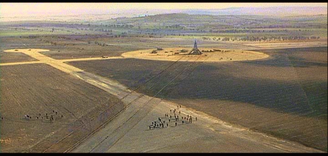
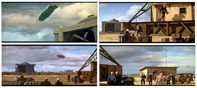
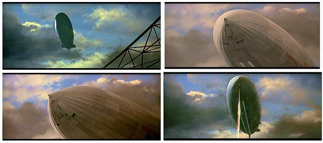
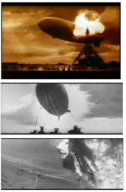
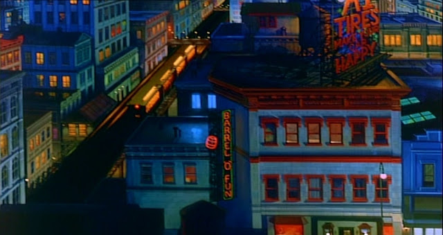
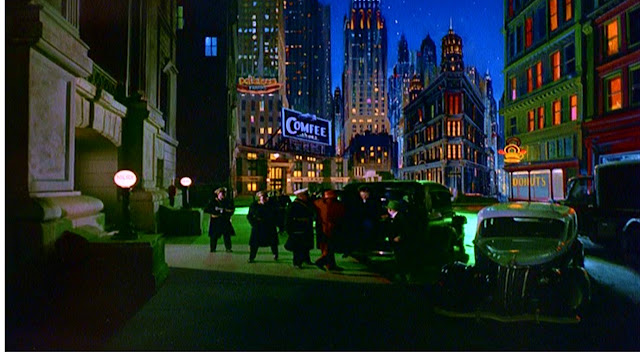
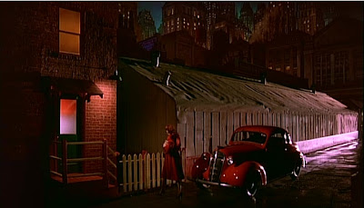
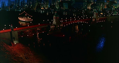
JIM DANFORTH:  Matte art's last individualist


It’s with great pleasure that I present today’s NZ Pete Visual Effects 'special edition'. 
 
For decades fanzines, journals and books have dedicated a great deal of effort – and rightfully so – in covering Jim Danforth’s iconic stop motion animation work as well as the convoluted circumstances surrounding the various un-realised features which Jim has tried so hard to get off the ground.  Regrettably, no article nor author to date had attempted to cover Jim’s other, quite considerable area of expertise – that being the highly skilled art of movie matte painting which has occupied a significant portion of Jim’s time professionally for around four decades. I suspect that most of Jim’s legions of fans possibly aren’t even aware of the major contributions and vast output that Jim has undertaken in his glass painting effects work.  Today’s article will reveal all.
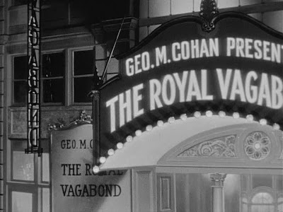
The following conversations originated as just a few isolated matte shot questions in the first instance and quickly developed into a full blown career interview.  It didn’t take long before my overly inquisitive ‘nosey parker’ line of questioning would be fulfilled by Jim’s comprehensive and detailed responses, where no cinematic stone was left unturned.  
 Jim lovesthe artform, probably even more that I do(!!), and loves to talk about not just his own matte shots but those of industry veterans and even classic effects films that we share a common respect for.  Jim’s enthusiasm was such that he “wrote off” at least one computer keyboard in the process of typing up material for me!  Now that’s dedication.

I want to thank Jim most sincerely for donating so much of his time to furnish this author with so many answers to matte matters I’ve always been curious about as well as many great anecdotes surrounding the personalities and politics of the movie business.  Not only was Jim generous with his time and knowledge, but also with diving into his substantial archive of 35mm frame enlargements and behind the scenes photographs, the great majority of which appear here for the first time anywhere.   


A word too of thanks to Jim’s wife Karen, who not only assisted Jim on many effects shots over the years, but tolerated his spending so much time on line to a certain blogger in the South Pacific while his dinners got cold.  Thanks are also due to David Stipes and Harry Walton for additional photographs and stories of "the good old days".
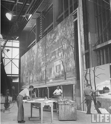
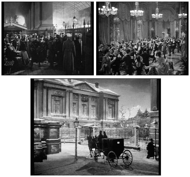
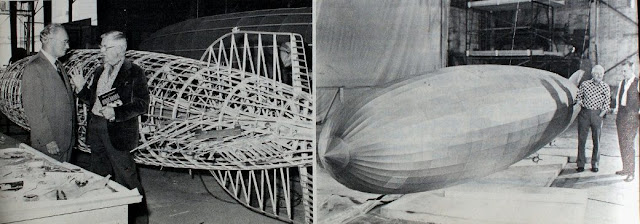
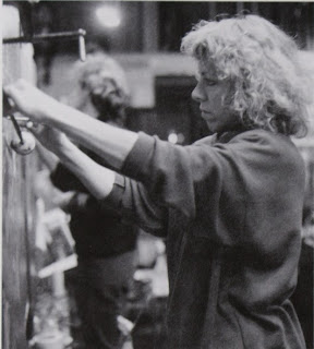
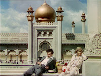
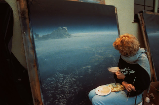
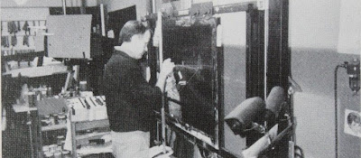
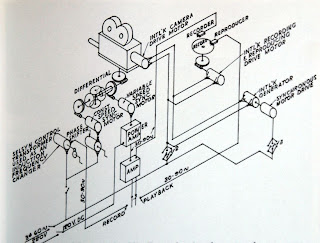
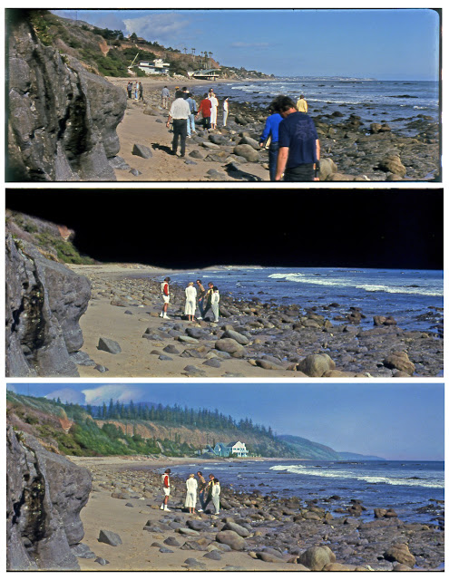
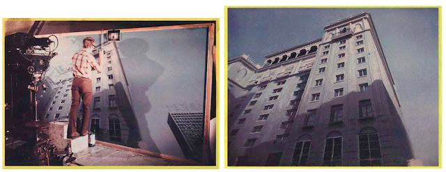
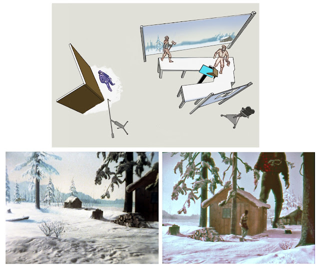
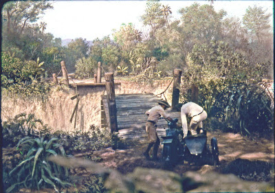
Jim Danforth and Karen Tuttle (before she became Mrs. Danforth) working on THE BLUE AND THE GRAY at their company, Effects Associates, Inc..  This shows Jim's very simple matte stand and his electro-mechanic controller that synchronized the camera and up to two projectors.  Karen is holding the miniature flag that was photographed in front of a real sky, with smoke blowing past it.  That image was projected behind the upper part of the painting, with the image of an Arkansas street and actors projected below.  The various elements are shown later in this article.


Q:        Firstly let me say what a pleasure it is to interview you Jim.  I’m most grateful for your time and willingness to share your cinematic experiences.
It goes without saying that I’ve been a huge fan for many years, with probably old, well thumbed through issues of Forry Ackerman’s Famous Monsters of Filmland being the initial exposure to your work as best I can recall, as it was for presumably tens of thousands of like minded film buffs.  Just before I launch into a multitude of matte and effects questions perhaps you’d like to comment on Forry and his huge influence on legions of not only genre fans, but fully blown effects people such as yourself and many others like Phil Tippett, David Allen and Dennis Muren?


JD:       Forry Ackerman was very influential for me and many others.  He was, for a long time, the only readily-available source of information about genre films and those who made them.


Q:        There really wasn’t any other source for us sci-fi and monster hungry youngsters to find info and behind the scenes pictures on visual and make up effects – even less so far away in the South Pacific isolation of New Zealand, I can tell you!  It has always been with great regret that I never visited The Acker-Mansion when I had the chance on numerous visits to California.  Of course it’s all gone now – dispersed to the four winds.


JD:       Yes, the Ackermansion was… well, unique.  Forry’s collection began to be dispersed even while Forry was alive—sometimes without his knowledge.  I’d like to know where some of his original Willis O’Brien art work is now (and a couple of my contributions, too).


Visiting the Ackermansion
Q:        Yeah… I’ve heard of occasions where irreplaceable movie memorabilia would vanish up under the sweaters of overly enthusiastic visitors!  Man, do I still love those FM covers!
Tell us Jim, what sparked ‘the film bug’ in you, and what was that first breakthrough movie which ‘lit the trick photography fuse’ as it were?


JD:       The fuse had been smoldering for a while with home-movie and stop-motion experiments begun when I was twelve, but the explosion occurred when I saw a reissue of KING KONG.


Q:        It really couldn’t have been any other.  A great many effects technicians,  including very prominent figures such as Ray Harryhausen found their inspiration (to put it lightly) in the Cooper/Schoedsack masterpiece KING KONG, while many of the next generation of effects people were seduced by Ray’s own films, most notably THE 7th VOYAGE OF SINBAD and JASON AND THE ARGONAUTS, which both seem to figure prominently in so many effects bios of guys like Bill Taylor, Richard Edlund and Dennis Muren.
A very early glass painting Jim made for his proposed version of 20'000 LEAGUES UNDER THE SEA.  The glass here is positioned so that a real sky and clouds show through.


JD:       Yes, which stop-motion film was most influential seems to be dependent on the age of the respondent at the time the influence was first exerted.  For me it was KING KONG, but THE 7TH VOYAGE OF SINBAD also had a big impact on me.   I was already working in the film business when I saw 7TH VOYAGE.


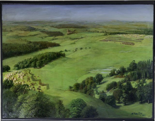
Q:        Pioneers such as John Fulton, Willis O’Brien, David Horsely, Percy Day,  Fred Sersen, Emilio Ruiz del Rio and Jack Cosgrove have entranced this author since I don’t know when.  Any personal views on these, or any other ‘old style’ effects men Jim?

Early Danforth multiplane matte art .

JD:       When I was younger, the work of the Lydecker brothers made a big impression… in addition to that of Willis O’Brien, Mario Larrinaga, Ned Mann, and Peter Ellenshaw.  David “Stan” Horsely was the cinematographer on JACK THE GIANT KILLER, a film on which I worked, but I didn’t have any direct contact with Mr. Horsely.


Q:        Yes, Howard and Theodore Lydecker were in a class of their own.  If I may, could I ask you your thoughts on successful trick shot design.  What makesa good shot work?  How do you ‘think’ out a prospective visual effect?


JD:       Since my primary interest has always been on making films with an emphasis on visual effects rather than effects just for themselves, I usually think first about the arrangement of a sequence—particularly in the case of stop-motion animation sequences—how the shots will be edited, what the tempo is, and so on.  But even with matte shots, I tried to interject some of my own philosophy about sequence design—tried but rarely succeeded.  It seems to me that having only one spectacular matte shot in a sequence calls attention to itself in an undesirable way and could result in what Al Whitlock referred to as “the JOHNNY TREMAIN problem”—small live-action sets combined with spectacular painted vistas.  My view was that it would be better to include one or two matte shots that weren’t spectacular—just enough painting to suggest that, the sets or locations were larger than they actually were.  In that way the ‘big’ vista would be less jarring.
A practice matte Jim did in 1959 just for his own education—no attempt to composite it.


Q:        I’ve had many industry people remark very positively about your VFX ‘shot design’ ethic.


JD:       I have heard a few of those comments—usually from other effects people rather than from producers or directors.


Q:        If I put a few effects film titles to you, I would be interested to hear your professional visual effects evaluation in a capsule:  THE INVISIBLE MAN….  IN OLD CHICAGO…. KING KONG….  GONE WITH THE WIND….  THIRTY SECONDS OVER TOKYO….  THE THIEF OF BAGHDAD…. QUO VADIS….  DARBY O’GILL AND THE LITTLE PEOPLE….  THE BLACK SCORPION….  20’000 LEAGUES UNDER THE SEA ….  GOLDEN VOYAGE OF SINBAD….  COLOSSUS – THE FORBIN PROJECT…..  BLADERUNNER.


JD:       Please keep in mind that my judgements tend to be harsh. 

THE INVISIBLE MAN: Crude but effective—crude when compared to the very subtle effects in DEATH TAKES A HOLIDAY, made at about the same time.
IN OLD CHICAGO: one of the very best ‘disaster’ films—along with THE RAINS CAME..  Beautifully integrated effects.
KING KONG: Ground-breaking despite some obvious effects flaws.  A triumph of shot design over some technical limitations.  Later refinements did not result in similar films with as much impact and artistry as KONG.
THIRTY SECONDS OVER TOKYO: Very well done, all around.
GWTW: Highly variable matte paintings, that result in an overwhelmingly wonderful cumulative  effect—one of my favorite films.  Nice design work by William Cameron Menzies.
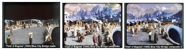
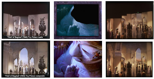
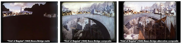
THE THIEF OF BAGDAD: Poetic, with utterly superb matte paintings and hanging miniature shots, plus the first-ever three-color traveling matte work (which permitted the story to be told, despite some technical flaws.)
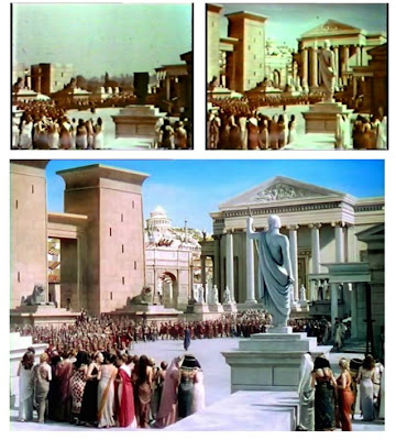
QUO VADIS: Spectacular, in all departments—superior matte paintings and traveling mattes.
DARBY O’GILL:  The best mixed-scale effects I’ve seen, plus beautiful matte paintings and real solarization effects.
20,000 LEAGUES UNDER THE SEA: In my opinion, the best-designed miniature ship scenes ever.  Great integration of painted tank backings and glass and matte art.  The Nautilus lying in wait for the nitrate ship at sunset is unforgettable.  But what else would one expect with Peter Ellenshaw and Ralph Hammeras collaborating—plus Harper Goff’s design of the Nautilus.
THE BLACK SCORPION: A great example of how to create mood with a restricted effects budget.  If only the ants in THEM had been as exciting as those scorpions.
THE TEN COMMANDMENTS:  highly variable effects, with some lacking in subtlety—the burning bush being an exception.  The excellent designs may have been beyond the capabilities of the time, although I think if Gordon Jennings had done the effects (as was planned), I would have liked the results better.
THE GOLDEN VOYAGE OF SINBAD: Disappointing, although the choreography of Kali is very well done.
COLOSSUS-THE FORBIN PROJECT: A very intelligent film. Whitlock’s daring original-negative computer start-up shot is famous in the world of matte paintings.
BLADERUNNER: Not a film I liked, although the matte work is excellently done.
I think the art direction and the paintings totally achieved the desired effect.  It’s just not an effect I happen to like.
Peter Jackson’s KING KONG:  I can think of nothing good to say about that film, except that I liked the introductory shots of New York.


Q:        Well, that was interesting.  Most of those I’d have similar thoughts, though I loved GOLDEN VOYAGE myself – a light year ahead of the very poor final Sinbad picture EYE OF THE TIGER, which followed it.   I actually really liked the latest KONG and thought Andy Serkis made an amazing and unique contribution to this and the recent Planet of the Apes picture.


There are many articles and interviews over the years with you Jim where the key area of interest has centered on your stop motion animation projects, yet very fewjournals (if any) have covered your quite substantial matte painting career.  I’d like to kick this off with the question I’d like to present to all matte painters:  if you’re able to recall, which was theglass painted shot which made that impact and triggered off that ‘love’ of the artform for you?  (film/shot?)


JD:       First, I think I should point out that my animation work got more attention than my matte work because animation is part of the story, which is what most people are interested in.  Secondly, animation calls attention to itself because it is inherently ‘phoney’ of theatrical.  A well-done matte painting recedes into the background, although mattes can be very memorable and evocative.
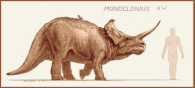
Monoclonius drawing is from Jim's production TIMEGATE.  The film was not finished.  Drawn in graphite and reproduced as a brown-line print for presentation.
But, to answer your question,  I suppose it would be KING KONG and the arrival at Skull Island shot.  The setting is almost a character in that film and was created largely by glass art.  Of course, when I first saw it, I had no idea how it was done.


Q:        Oh yeah, that shot is iconic, though I thought the similar establishing glass shot in SON OF KONG to be even better both in terms of composition and a far cleaner composite.  I just loved the Orville Goldner animated birds doubled into the former shot.
I absolutely adore the matte painted effects shots from The Golden Era, with probably late twenties through to late forties encompassing the artform at it’s most essential and‘magical’… the proverbial Dream Factory.  The use of the matte process was at it’s peak, with vast visual effects departments and large numbers of artists turning out hundreds of mattes per year.  Would you have liked to been a part of that era Jim where the painted matte was so extensively used and highly valued?


JD:       No.

A full frame matte that Jim painted for a television commercial where an actress would magically slide down the bannister via travelling mattes.  Jim expressed a degree of dissatisfaction at his perspective work here, though I can't see a problem.


Q:        You are generally acknowledged as one of the effects industry’s most ‘individualistic’ visual effects creators from my understanding, so would you feel comfortable as part of a large stable of matte painters, such as the Warren Newcombe unit at MGM or Ray Kellogg’s team over at Fox for example?


JD:       No.


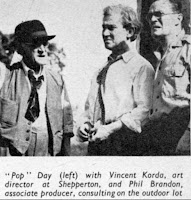
Q:        From my research, Walter Percy Day, England’s most eminent matte painter  based at Denham Studios, would control each and every step of the process for his stable of painters where they were required to paint only as expressly directed by the master with no room for individuality.  It was almost a ‘paint by Pop’snumbers or not at all’ scenario it seems.


JD:        I suppose the idea was to get the Walter Percy Day look that the customer was paying for, and only Pop Day knew how to get it—or thought so.


Q:        There’s no disputing Poppa Day was the master in my book, with a phenomenal catalogue of glass shots over a very long period, with much of his best work in the silent French cinema.  I lost count of how many ornate ceilings and ballrooms Day must have painted.


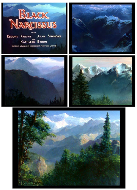
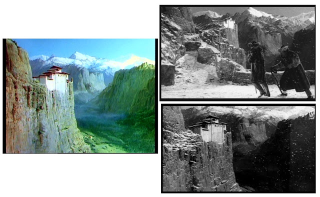
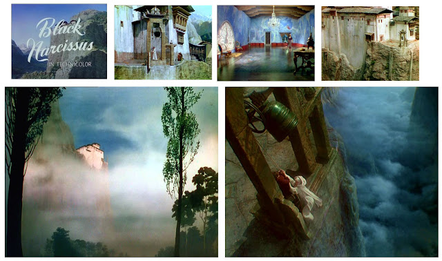
JD:       I wish I knew more about Day’s entire career.  I really, really like the work he did for Korda and on BLACK NARCISSUS, but some of his later work, such as THE BLACK ROSE is, in my opinion, not very good.

Jim at work on a foreground painted matte on hardboard for EQUINOXJim says he wasn't too happy with this painting, but again, it looks great to me and I'd happily own it.


Q:        I’m interested in your thoughts regarding the various Golden Era matte departments’ styles and technical methods? 

JD:       I think there was a certain amount of “not invented here” in effect during those years—meaning that methods  used effectively at one studio might be shunned by another.  In part that was due to the type of equipment in which a studio had invested.  In part it was due to the preferences of whoever was in charge of the matte department at a particular studio (which, of course, influenced the equipment that was constructed).

Clarence Slifer at MGM refused to believe that Al Whitlock did most of his mattes on the original negative, so Matt Yuricich phoned Al and put Clarence on the phone.  Al explained to Clarence how he did his shots.  After the conversation ended, Clarence turned to Matt and said “Well, maybe he does and maybe he doesn’t.”  What was an everyday  procedure for Whitlock was inconceivable for Slifer, even though Slifer had used the same procedures in earlier times.  Sometimes one can ‘brainwash’ oneself.

My understanding is that Jack Warner liked clouds in the matte shots of his fims, so that was an influence from outside the matte department.  Also, I was told that at Warner's it was common to use matte paintings to improve the apparent focus on the foregrounds of miniature sets.  When shots of miniature trains had out-of-focus foregrounds, the foregrounds were matted out and replaced with sharp, painted versions of the miniature.

The quality of mattes sometimes changed within a studio as the department head changed.  I thought the mattes done at MGM during the period when Lee Le Blanc was in charge were not as ‘artful’ as those done by the Newcombe department.

At Fox (and at Film Effects of Hollywood), precision-machined aluminum grommets were pressed into holes drilled in the hardboard panels on which the mattes were painted.  The holes in the grommets fit over pegs on the photographic easels.  At Universal, Al Whitlock simply slid his paintings into a channel on the matte stand and pushed them until the wood frames encountered a ‘stop’ on the matte-stand frame.  When Al did dupe composites, he used the un-illuminated opaque painting on glass as a hold-out matte when duping the live action from separations while photographing a brightly-lit white background positioned behind the painting.  Then the painting was illuminated and photographed over a black background to double expose it onto the film with the live-action dupe.  The painting and the ‘matte’ fit perfectly.         At Fox, registration pegs were necessary because the board with the painting was not the same board used to dupe the live action.  A duping board was created by placing the board with the painting on a tracing table with identical registration pegs, then lowering an aluminum frame, to which had been taped a large sheet of translucent plastic tracing ‘vellum’, then tracing the matte line from the painting board onto the vellum.   The painting board was then removed.  A new board, painted pure white and fitted with the same type of grommets, was the placed in registration on the tracing table, and the matte line position was transferred onto the duping board.  The duping board was then painted gloss black in the area corresponding to the area to be occupied by the painting.  The painting board was painted gloss black in the area to be occupied by the live action.  The visibility of the matte line was dependent on the accuracy of the tracing, transfer, and blacking in. Which system do you think was faster, the Universal system or the Fox?

RKO may have had the most versatile matte department, in the sense that they used different methods for the composites, depending on the requirements.  Linn Dunn told me that at RKO they had one artist who specialized in doing the blends for all the paintings.  As I recall, that artist was Paul Detlefsen (who later painted fine-art illustrations in a neo-Currier & Ives style).  
Many of the mattes at RKO were put together using the same rear projection process patented by Willis O’Brien in 1928 (granted 1932).

Disney utilized the ‘O’ Brien’ projection method for most of the matte shots done at the Burbank studio by Peter Ellenshaw (with equipment modified and/or engineered by Ub Iwerks) up until they switched to projecting separations (around the time that Alan Maley took charge of the department, I think)  But that was well past the ‘Golden Age’.

"Dreams of Power" is a wonderful piece of concept art for JONGOR—a 'pulp' jungle adventure property Jim optioned from the author's estate in about 1983.  The 'maguffin' is Lemurian levitating crystals.
Q:        Some studios seemed to hold the high ground, with Metro Goldwyn Mayer’s enormous resourses no doubt a prime factor in the quality of the output from Newcombe’s matte department.  Fox and Warners both had huge effects staff, with the latter employing some eight painters at their peak.  Universal on the other hand, by all accounts had a tiny matte department as far as I know, with just the one painter, Russell Lawson, for several decades.  Some of there large matte shows must have surely seen additional painters brought on board to turn out the number of mattes required, and I’m thinking here of Hitchcock’s wonderful and exciting SABOTEUR – a huge matte shot show.  I heard somewhere that well known Art Director John DeCuir may have painted mattes on that film with Lawsen?


JD:        I really don’t know anything about the mattes on SABOTEUR.  I thought they were variable in quality.  I remember the Statue of Liberty mattes as being very good.

Q:        There were an awful lot of mattes in that show, some really invisible such as the stuff with the ship at the docks as well as several ceilings.  Could you tell us a little about your own earliest experiments in glass painting Jim?
An early glass painting by Jim for a non-professional version of 20'000 LEAGUES UNDER THE SEAEven at a young age the skill is readily apparent, as is the drive.


JD:       When I was about fourteen or fifteen, I started  painting ‘tests’ for my own amusement and education.  Originally, I used water-soluable tempera paint (poster paint), because I didn’t know any better.  After the paint dried, it tended to flake off the glass.  I did some glass paintings for an amateur version of 20,000 LEAGUES UNDER THE SEA that my friends and I worked on for many months but abandoned before any ‘principal’ photography was done.  Then I did a painting on bristol board to be used as an establishing shot for a 16mm version of THE PIT AND THE PENDULUM (this was several years before Roger Corman made his film).  I based the layout on the famous painting Toledo in a Storm” by El Greco.  Holes were cut in the bristol board so I could backlight the windows of the buildings.  (This was before Al Whitlock taught me that was unnecessary—that if one painted in the correct key, painted lights would photograph bright enough.)    I abandoned PIT for a more interesting idea: GERALDINE IN JEOPARDY—a humorous 16mm silent serial set in the time of the American Civil War.  For that project, I painted a house on glass and also tents and a canon and a watch tower for a scene of General Grant’s camp.  The house shot was filmed in a local park, with ‘Geraldine’ running toward the non-existent house, but the glass of General Grant’s camp fell over and broke while we were setting up on location.

Then I did a “Hall” hardboard shot of a jungle setting which I  photographed in 35mm with me moving cautiously toward the jungle area.  This was for a test involving a phororhacos. 

Jim and Karen and part of the crew at Snowbird, Utah, filming the plate for a matte shot for John Carpenter's MEMOIRS OF AN INVISIBLE MAN.  Ted Rae was the cameraman.  That's his camera.
In between these projects, I experimented with projecting small areas of live-action into glass paintings, in the manner of KING KONG.  My results were not good.


Q:        Was there ever a time where you saw yourself as becoming purely a studio matte artist or were your cinematic interests far too varied to allow you to settle into just one creative slot?


JD:        I didn’t want to do visual effects; I wanted to make films (with visual effects).  Visual effects—particularly stop-motion effects—seemed to be the entry-level job most related to general filmmaking.


Q:        I’m very interested in your early ‘cold call’ encounter with Disney matte department head Peter Ellenshaw?  That must have beenone unforgettable experience?


JD:       Absolutely right.  I’ve described that experience in my memoir.  The three things that impressed me the most were: A) the realistic effectof Peter Ellenshaw’s paintings compared to their very loose style on close examination. B) Ellenshaw the man—very gracious and charismatic. C) The clarity of the rear-projected 8-perf. (VistaVision) images used in Ellenshaw’s department for compositing most of the mattes.

Not all mattes are spectacular.  This is from JOHN CARPENTER'S THEY LIVE. Jim added fictitious advertising paintings to several existing buildings.  The challenge in this shot was to get the effect of old, weathered paint that was slightly faded and absorbed by the concrete.  For the background of this Panavision film, Jim used dual-interlaced rear projection, which yielded more detail than a VistaVision frame would have for a 'scope extraction.  The advertising signs were camouflaged subliminal messages.  Those messages were also matte paintings that wiped on or were intercut when the protagonist used his alien dark glasses.


Q:        How many painters and cameramen did Ellenshaw have with him at that time?


JD:       In addition to Ellenshaw, the only other artist I saw was Al Whitlock, although I understand from your blogs that Jim Fetherolf may also have been at Disney during that time. Peter also introduced me to an assistant who worked in the room where the paintings were photographed.  I don’t remember his name.  Ellenshaw mentioned that the man had worked on KING KONG.


Q:        Was there ever the possibility of you taking up a matte painting position in Peter’s department?  Would you have done so had the invitation been forthcoming?


JD:        It was never mentioned, and I never thought about it.  Remember I was VERY inept at that time.  I was nineteen.  I suppose that if the opportunity had presented itself a few years later I would have jumped at the chance.

When is a matte shot a backing and vice versa?  Jim with a backing he painted for TIMEGATE— an uncompleted feature.  The backing didn't need to be detailed, because it got matted into the live scene at a reduced size—an example of the "big brush" approach.  The live-action scene with the area to be occupied by the backing matted out (from a faded daily print).  Test composite showing that backing ties into live action quite well.  The softness of the blend can be seen at the left, where the foreground cliff edge will later be sharped by a small strip of glass painting.
The backing was used so that miniature dust could be shown drifting out of the canyon, following a rock avalanche.


Q:        Peter’s son Harrison told me recently of an occasion in 1964 in which he temporarily worked as an intern in his father’s department and he got to know artist Jim Fetherolf.  Jim was, according to Harrison, an excellent artist, but sometimes very frustrated working at Disney.  Fetherolf would say: “I don’t know why I even bother to do this, as Peter will just walk in later and change it all with a big brush and make it better”.  As I understand the situation, Albert Whitlock had similar issues and wanted to break free.   
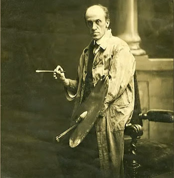

Peter Ellenshaw
JD:       Al never mentioned to me anything about Peter reworking Al’s paintings.  Al disagreed with some of Peter’s methods when it came to effects techniques, such as the pin-hole glasses used to add highlights to painted water.  Al was bothered by the fact that the sparkles reappeared in exactly the same place every time.  Al’s idea was to slide both the pinhole glass and the interrupter glass, so that the sparkles would seem more random.  Al had to wait until he got to Universal to implement ideas like that.


Q:        Harrison also mentioned to me that although various artists painted the shots on Disney pictures, there were probably few instances where the painting left the easel withoutPeter having dabbled away upon it with his brush or changed things.  How would this sit with the average artist I wonder?


JD:       Well with a fine-art painter, not well, but matte painting was more of a craft than an art, in some ways, so many junior artists probably accepted it.


Q:        Would I be correct in suggesting that the Disney effects operation was very much a tightly run factory with a  regimented and conservative structure with the accent on ‘pure painting’ and nothing more for the artists?


Albert Whitlock
JD:       I’m not sure about that.  I know that Al Whitlock made a lot of decisions on KIDNAPPED. I also remember him telling me that he had convinced Peter to rework one of the paintings Peter had done for THIRD MAN ON THE MOUNTAIN, because the rock face was too ‘geometric’.  Apparently another Disney person had said something similar to Peter about the same painting.  Peter said “Since I’ve heard this comment from two people, I’ll rework the painting”.  Al told me that during MARY POPPINS, Peter was having a problem with a green shift on the color of the projection of Mary sitting on the cloud .  Peter asked Al whether Al could see any green in the projection (he couldn’t).   When Al was painting mattes for the black and white TV show ZORRO, he disliked the shade of gray that resulted from mixing black and white paint.  Al started painting in green and white.  And, of course, Al did several Disney assignments on his own, such as TEN WHO DARED.  I’d say there was a certain amount of give and take going on in the Ellenshaw department.


Q:        I’ve heard that some Disney artists were also frustrated at the embargo imposed on trying new gags and styles, such as Alan Maley wanting to experiment with Front Projection for compositing and Al Whitlock wanting to develop his split screen moving sky animation, which of course he mastered once he moved over to Universal. 


JD:       I don’t know about Alan Maley’s frustration.  Possibly the reluctance to change was due to the investment in time and money that had been put into developing the VistaVision rear-projection and masking system, which I understand was perfected by Ub Iwerks.  Personally, I’d choose rear projection over front projection for a matte painting situation.

Q:        Were Disney still using oils to paint or was all of the matte work being painted with acrylics by this time?


JD:       In 1959, when I visited Ellenshaw, the paintings were done in oils.  As I recall, acrylic paints for artists didn’t make an appearance until several years later.

Jim Danforth and Tom Corlett painting a convention hall full of refrigerators for a projection pull-back shot as part of a Cascade TV commercial


Q:        You have had a long association with Gene Warren, Wah Chang and Tim Baar and their effects house Project Unlimited.  At a time where effects units were primarily big studio based departments with a considerable chain of command and power politics, was an independent operation like Project Unlimited seen as an oasis of creative freedom in what was then a very ‘front office and mogul’ run industry?


JD:       I suppose so, but then I’d had no experience at that time with the “mogul-run” industry.  Later, Project Unlimited did seem to have more freedom, particularly since the restrictive union policies of the major studios were not rigorously applied, even though Project was a union signatory shop and we all belonged to the IATSE.


Q:        Could you tell us about your role at Project Unlimited.  I understand you were involved with assisting Gene Warren on some of the special effects shots for one of my favourite films THE TIME MACHINE?


JD:       I didn’t assist Gene, except in the sense that all the employees assisted him to get the jobs completed.  Gene only rarely did any hands-on work by the time I started at Project Unlimited.  I did assist Bill Brace with some lighting manipulations during the TIME MACHINE, but I didn’t do any painting (except for a black matte with which I assisted Wah Chang).


Q:        Would you like to describe the facilities and equipment at PU?  Were they set up for all aspects of optical cinematography for example or were such shots farmed out elsewhere?

JD:       Project Unlimited could do NO optical effects when I started.  They were primarily a prop-making shop and stop-motion facility.  At first, all the optical work was farmed out to optical companies or sent back to the optical department of the studio making the film.


A Bill Brace matte from THE TIME MACHINE.
Q:        As much as I really enjoyed (and still do) THE TIME MACHINE I have always had issues with many of the visual effects shots.  Many of the Bill Brace painted mattes are iconic classics, such as the Eloi Temple – but the composite photography of most of the matte paintings is not of a high standard, with huge black ‘magic marker’ matte lines.  What went wrong there?  It was unusual to see such hard edged mattes (see right).


JD:       What went wrong was Project not having any compositing facilities, nor a thorough understanding of how to approach compositing.  That may sound like a judgemental view from a nineteen-year-old, but I had spent hours in the AMPAS library and other libraries, making a careful study of effects techniques.
Bill’s paintings that were intended to be composited with live action were painted on black and white photo enlargements.  They were photographed just as they looked, with the black and white photo visible.  The film of the painting was delivered to The Howard Anderson Company where a film matte was created to block out the live-action area.  A negative print of this matte was use to block out the area of the live action into which the painting would be inserted.  There was no way for Bill to blend his painting to the live-action photography.  All join lines had to be hard-edged.  Because of the nature of the shots, I don’t think it was necessary for Bill to make any composite tests.  All the color balancing and matte fitting was done on the optical printer.

TIME MACHINE split screen.
The worst of the “black-line” matte joins was one that was not really a matte painting but was a combination of two locations.  Perhaps Luis McManus had done a little work on that shot; I don’t remember.  The composite work for THE TIME MACHINE was  supervised by Phil Kellison of the Anderson company.


Q:        What method did PU favour for their matte composite photography?


JD:        Having someone else do it…until I convinced them otherwise for THAT FUNNY FEELING.


The destruction of London from THE TIME MACHINE
Q:        The depth of field issues in the lava flow disaster sequence in London were pretty unacceptable too.  From what I’ve seen the miniatures were reasonably large, yet for some reason the combination of artificial light and totally inappropriate focal length lenses were not the best decision.

 
JD:       I agree.  Those scenes were finished before I arrived, but then they wouldn’t have listened to me anyway.


Q:        The Academy oddly didn’t seem to mind – though I’ve had so many problems with strange AMPAS decisions over the years I suppose it doesn’t surprise me.  It’s still a great little film though.

JD:       It’s a film that didn’t capture the feeling or mood of the Well’s novella, but it became a nice film on it’s own, as did 7 FACES OF DR LAO.


Q:        I understand that Bill Brace did most of the matte painting for PU, with former Roy Seawright matte artist Luis McManus painting on some projects.  Did you ever undertake any matte painting during your time at PU?


JD:       Luis McManus did some paintings for JACK THE GIANT KILLER, but he did them for The Howard Anderson Company, as did Al Whitlock (who did three paintings that I can remember).

JACK, THE GIANT KILLER unused shot
I did a very simple glass shot as part of an animation scene for JACK. The painting added a ‘roof’ to a cleft in the location rocks, turning it into a cave in which a chimpanzee was hiding (see frame at left). The entire scene was cut from the film—not because of the painting but because the editor didn’t want to establish the precise location of the chimpanzee relative to the giant and the sea monster, who were visible outside the cave.  This was one of the shots I designed and directed (on location) when it was decided to expand the fight sequence.

Later, I convinced Gene Warren to let me do an original negative composite shot for THAT FUNNY FEELING.  I did the small amount of painting required by that shot.


Q:        I understand that Gene Warren had some background in matte painting, or to be more precise, matte ‘blending’ -having been taught the ropes by the once legendary Jack Cosgrove while working for Jack Rabin and Irving Block on zero budget pictures in the 50’s such as MONSTER FROM THE GREEN HELL.


JD:       I never heard so much as a whisper about that.  As far as I know, all the Rabin-Block mattes were painted by Irving Block.   Gene never revealed any interest in, or knowledge of, matte painting.  He was primarily an animator—a very good one.


Q:        Yes, Gene did some nice work in Tom Thumb as I recall.  Project Unlimited were constantly in demand throughout the 1960’s.  Were they perceived as being a sort of “ILM” of the day who weren’t afraid to tackle new and innovative effects that may have been outside of the sphere of the more traditional big studio visual effects departments?


JD:       Perhaps.  The studios didn’t get involved in stop-motion animation much, so Project got a lot of jobs that required stop motion.  Wah had a good reputation as a costume fabricator, so Project got jobs for Las Vegas shows as well as for film creatures.  Project made dummies for SPARTACUS, Shields for THE WARLORD, and costumes items for CLEOPATRA.  However, Project Unlimited didn’t do composite work, at least not initially.  The really big effects work was done at the major studios, as when Buddy Gillespie filmed the submarine shots for ATLANTIS, THE LOST CONTINENT in the tank at MGM.  MGM also handled the matte paintings for ATLANTIS. Project did only a few animation shots for that film..

A staff portrait of Project Unlimited - sans Jim.  Photo from Jim's 2011 memoir  'Dinosaurs, Dragons and Drama'


Q:        With so many studios closing down their special effects departments in the early sixties I guess there were a lot of matte artists seeking work.  The competition for freelance assignments must have been great?


JD:       I wasn’t aware of any of that because I wasn’t trying to compete as a matte artist.  The matte artist’s  union kept refusing to let me join, so, whenever an opportunity arose to paint a matte, I just went ahead and did it secretly.


Q:        So was the cave shot that was deleted from JACK THE GIANT KILLER your own first professional glass shot?
           

JD:       Yes.  Of those that actually made it up onto the screen, THAT FUNNY FEELINGwas my first.

Gigantipoids was a pre-production illustration for the last feature film that Jim contemplated, titled KRANGOA.  (the family of ape-like creatures)


Q:        In your own matte art are you an oil painter or an advocate of acrylics?


JD:       Originally, I painted all my professional mattes in oils.  About 1975, I developed some sort of allergic reaction to the paint chemistry and had to change over to acrylics.  That required a completely different technique and a re-learning process.
With oils, I blended skies by using cloth or polyurethane pads to pat the color after it had been brushed on in bold strokes.  With acrylics, I found I needed to use a spray gun, with cross-hatching or stippling in some areas.  My acrylic paintings (viewed in person) never had the impressionistic looseness of my oil paintings, but they photographed satisfactorily in most cases.
I’m now back to painting in oils without turpentine and without cobalt drier.  So far, no allergy problems, of course, I’m now painting ‘fine art’ not mattes.
A full frame painting from PRINCESS AND THE GOBLIN

Q:        Take us through the typical time frame of the average glass painting Jim.  How do you begin?  Do you project a 35mm frame onto the pre-primed glass and trace from original first unit photography or do you approach it differently?  Are there dip tests of short lengths of test negative and so forth?  How many tests are on average required until a final acceptable match?

JD:       There are many variables.  First, only a few of my matte paintings have been done as latent-image composites.  For those, I usually projected a developed film clip to trace off the blend-line position.  If architecture needed to cross the matte line, those features were also traced. 
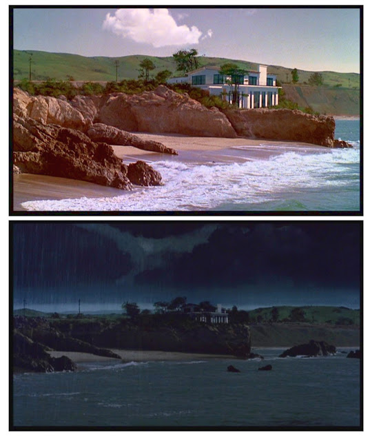
Tests were made each day as the work on the painting progressed.  Sometimes hand-developed dip-tests were made during the day to speed things up (but those produce only a monochromatic image).  The number of tests varied.  Usually, I could get a blend with four to six tests, but some jobs were problematic.  I think I did about twenty tests for the MEMOIRS OF AN INVISIBLE MAN beach-house shot, because the lab was having problems and kept shifting my jobs to different printers.  That caused major shifts in the overall color and made it difficult to evaluate the basic lay-in as to sky color.  Then the editor wanted changes, and so on.

MEMOIRS OF AN INVISIBLE MAN latent o-neg matte composite with the actual beach location seen at top.  John Carpenter kept 'jumping' Jim's cue for action when he was running the safety footage at the start of each take.  As a result, the test development required before each comp take (to be sure the 35mm neg is threaded on the correct perforation) showed that Ms. Hannah was already in action.  It was Jim's last latent action take—sweaty palms on that one.


The original matte painting for the above shot.
For rear projection composites, I usually looked through the camera and outlined the painted area with a grease pencil, then painted a white underpainting [ground] before starting to work in color.  For really critical alignments, I sometimes used a small  45-degree mirror in front of the matte camera to reflect a studio light placed 90 degrees to one side.  If I saw the light superimposed exactly on the camera lens when I stood at the matte glass and looked back at the camera, I knew my light beam was on-axis.  Then I could position my layout drawing on the glass by looking at the shadows my drawing was casting on the rear-screen image.
Sometimes, I painted on dark “greylight” glass.  This enabled me to put the process screen in contact with the back of the matte glass, so that there was virtually no parallax between matte glass and projected image.  The light illuminating the painting was reduced in intensity as it passed through the glass and was reduced in intensity again when the resulting ‘fog’ on the screen bounced back toward the camera.
But the image from the rear projector was reduced only once on its way to the camera.  Furthermore, the light on the painting went through the glass at an angle, making the light path for the ‘fogging’ light longer than for the rear-projected image, with the result that the glass had greater dark density for the front lights than for the rear-projected image.

Once proper filtration had been established for the system, the paintings could usually be balanced by eye, but some critical matches required film tests.

I did one two-projector composite with very little painting over one weekend, after an initial wedge test.


Q:        I’ve always been of the belief that a successful matte shot can only be as good as the cinematographer shooting the plate and tying the composite together.  Is that too simplified a statement do you think?
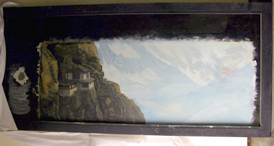


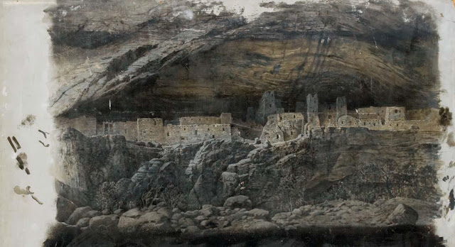
Hilltop monastery painting for the action film NINJA III
JD:       I think so.  First, I distrust having cinematographers “tie the composite together” unless it’s someone like Bill Taylor who completely understands what’s required.  When a creative camera person is required to sit all day doing nothing while the matte artist paints, then finally gets to ‘do his thing’ when it’s time to test the painting, there can be a tendency to get ‘creative’ with the photography rather than just shooting at the established settings.  When the matte artist sees the test composite the next day, the artist has no way of knowing whether any problems are due to artist errors or to unauthorized ‘adjustments’ by the cameraman.  That’s when the artist may find it necessary to test the cameraman by doing nothing to a particular area of the painting, just to see whether it reproduces the same way as on the previous test.
It’s really not the job of the camera person to ‘tie the shot together’.  The matte artist is responsible for the marry-up.  In most cases, the camera person is responsible for only the dupe and maintaining it’s consistency (unless one is foolish enough to be making the composites on an optical printer by using filmed black mattes and counter mattes).

I agree that the success of a shot may depend in large part on the original photography.  I have had to do some very ingenious ‘corrective’ printing to rescue live-action photography that was underexposed by the cameramen—even very good directors of photography.  I was able to do this on one occasion by bi-packing a ‘plus-density’ mask that restored shadow density on a shot that had been underexposed.  That may seem backwards, because “underexposure” sounds as though it would make the shadow areas darker.  Film has a limited density.  When a scene is underexposed, The highlights and mid tones get darker, but the ‘blacks’ don’t,  When the mid-tones and highlights get corrected back to a normal density, the ‘blacks’ become grays and require additional density to be added synthetically.
On another occasion, I had to print the projection plate with a special traveling matte that lightened only the underlit actors in the foreground.  In a similar case, I had to use a traveling matte to enable me to print the characters in shadow at one exposure and the meadow behind them (in sunlight) at an exposure that brought the two portions of the scene into a better balance.  All that must happen before the painting can be started.  If the artist doesn’t get these problems ironed out at the start, the artist can sometimes end up “Chasing the Dupe”—a phrase I first heard from Matt Yuricich.


An FX shot from the 'Hard Water' episode of the tv show SALVAGE 1 with painted iceberg and Whitlock inspired 'slit gag' effects for the approaching missiles.
Q:        I recently asked Matthew whether he recalled any ‘issues’ arising from whether a matte shot was controlled by those in charge being actual painters, such as Sersen and Kellogg as opposed to mattes being under the control of purely cameramensuch as Bill Abbott or Clarence Slifer.  In Matthew’s day there was a definite ‘cohesion’ when artists and painters were running the show compared to when technical people such as cinematographers and non artistic types running the show.  Anything in that Jim?


JD:       I would always bow to Matt’s superior experience, but as it happens, I agree with him completely.


Q:        I think you’ve tried to shoot as many of your own mattes personally.  Is that right?


JD:       Yes, for the reasons I just stated.  Plus, some of my procedures involved animation at the time the painting was being filmed.  It’s also less expensive.

A 16mm latent-image matte painted comp from Jim's THE PRINCESS AND THE GOBLIN reel.


Q:        Tell us how you met and became longtime friends with Albert Whitlock?

JD:       I met Al in 1959 when I visited Peter Ellenshaw at Disney studios.  Al was at work on a house painting for POLLYANNA, which I think was a latent-image shot.
I ran into Al again several times when he was painting for JACK THE GIANT KILLER at The Howard Anderson Company.

Painting a foreground glass for PAUL BUNYAN
Later, I purchased an option on a short story entitled “The Head Hunters.” I worked up a presentation of storyboards and artwork that included a large, framed oil painting of a key scene from the film.  I showed it to a Jim Pratt in the production office at Universal.  He was more excited by the painting than by the story, and he told me Al Whitlock was looking for an apprentice. I was reintroduced to Al and put on the Universal payroll (at a reduced salary compared to what I made when doing animation and  miniature work).


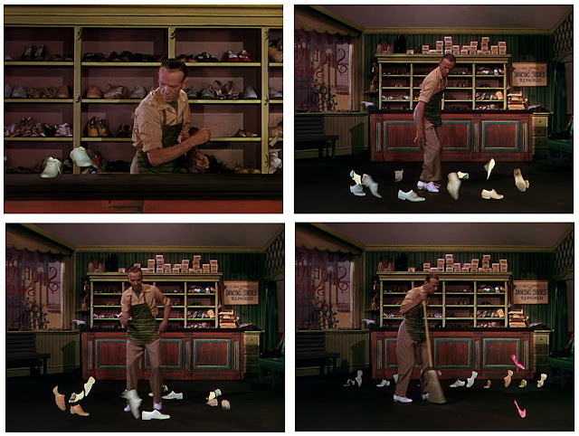
That job lasted only about a month, because Al got into a conflict with the Universal management about how to charge off my salary (Al was afraid that if my salary was charged against his matte shots—of which I was not yet painting any—he might lose out on jobs).  But Universal kept me on the payroll and shifted me to another part of the art department.  Al and I remained on good terms, and we began to discuss a project that each of us had been intrigued by independently: THE LOST WORLD. 

In addition to staying in touch with Al and having dinner with him and his wife on numerous occasions, I worked for Al again during I’D RATHER BE RICH (stop-motion animation of shoes) and, years later, when he was at work on DIAMONDS ARE FOREVER and was also doing matte shots for the GUNSMOKE TV series.

Al recommended me for several of the jobs I did over the years.

Q:        I’d love to have seen that Danforth-Whitlock LOST WORLD.


JD:        I thought I would too.  However, as the years passed, Al realized that the dinosaurs would inherently be more memorable than the matte paintings, so he took over the creation of the dinosaurs, and I was out. 

Another PRINCESS AND THE GOBLIN matte shot.
Q:        Even right up to his retirement from Universal Al was still hoping to make LOST WORLD I believe.  Albert took on many independent matte assignments, especially in the early sixties.  Butler-Glouner used Al on several films, always uncredited.  Did effects shops such as Butler-Glouner, Howard Anderson and Van der Veer have their own matte painting facilities do you know, or were the glass painting always prepared elsewhere?


JD:       The independent houses usually had a way to photograph the paintings, and a matte artist doesn’t take up much space.  I think Al painted at home on the Butler-Glouner jobs and on some of the Howard Anderson jobs.  But, on occasion, Al painted at Howard Anderson’s facility on the old RKO lot in Hollywood.


Q:        I think many of those Poe films from American International such as PIT AND THE PENDULUM and I think COMEDY OF TERRORS used Al’s talents to great effect.  I’ve often wondered too about another Butler-Glouner show THE DEVIL AT 4 O’CLOCK which has several mattes that look very much like Albert’s.


JD:       I never asked about THE DEVIL AT 4 O’CLOCK. 


Q:        Terrible blue screen work with Spencer Tracy’s silvery hair becoming totally transparent at times due to blue spill or problems pulling the mattes.  Great Larry Butler miniatures though and some pretty bold epic composites shots for the time.


JD:       The miniature volcano was built in large scale on Butler’s ranch.  It’s been said that Larry wanted a lake on his property, and dredging out the dirt to build the volcano was a good head start.
THAT FUNNY FEELING - An actual LA Freeway masked plate and the miniature of the traffic congested opposite lanes complete with off the shelf toy cars and some subtle glass painting to tie the model and location elements together in a brief tour de force effects sequence that is simply wonderful.


Q:        I’m very interested in one particular project you undertook, THAT FUNNY FEELING, which although a Universal film with photographic effects by Al Whitlock, your own contribution was through Project Unlimited as I understand it.  The opening LA freeway traffic jam effects shot was a stroke of genius Jim, not just in the wonderful stop motion, but also in the precisely calculated camera elevation done back at Project Unlimited on the miniatures as well as the flawless blending of live action freeway against your impeccably lit and photographed miniature set.  One of your best effects shots ever.  Would you like to tell us about that?
Frames from the final original negative composite with stop motion traffic perfectly lit, photographed and blended with the live action plate. One of Jim's best ever effects shots where each and every aspect falls into place with precision.


JD:       I was actually involved with two shots for THAT FUNNY FEELING—the head-on train crash, for which I painted a large sky backing and the traffic-jam shot you mentioned.    My main contribution to the traffic-jam shotwas to steer Project Unlimited away from their plan of turning the element over to some optical department to composite (no more giant matte lines, thank you).  I composed the shot, placed the black matte in front of the live-action camera, and did the minimal painting and the primary animation.  Other animators handled the background cars. Ralph Rodine did the lighting and camera work.  We looked through a film clip of the live-action scene that was placed in the movement of the animation camera, then moved the miniature set and the camera around until it matched the perspective of the real freeway lanesWhen the shot was finished, Gene Warren took it to Universal, where they spliced it into a loop and screened it over and over, pondering how it had been done.  Not bad for my first professional latent-image composite.
The miniature head on train collision by Project Unlimited from THAT FUNNY FEELING with Jim supplying the painted sky backing.


Q:        Not bad!……it was technically and artistically as good as it gets Jim.  Definitely one for the showreel and to be proud of.  Unfortunately I don’t know anyone who’s ever seen the film aside from me?

JD:       Well, of course I went to see it.  It was exciting to realize that, right in the opening sequence with the trains and the cars, there was also a great Al Whitlock painting of a New York Street.  My work was in good company.

Q:        As photographic effects supervisor, was Albert in any way involved in the design or ‘look’ of that shot, or was it totally sub contracted?


JD:       No, Al was not involved at all, except for the fact that I had recently worked with Al and felt comfortable about doing original negative work. 


Q:        You secured a short term apprenticeship in Whitlock’s matte department around 1965, which I imagine was an eye opening experience for you?  Can you share with us some of the effects work Al and his team were working on at the time?


JD:        As I recall, it was in 1964.  MARNIE was in work at that time.  I think SHIP OF FOOLS followed soon after.  THE WARLORD  was on the planning boards in the art department, but no filming had been done and Al hadn’t started on the mattes yet.   I visited Al during the time he was working on mattes for THE WARLORD.


From THE HIT MAN, a TV movie and pilot for Columbia.  Danforth added scintillating light patterns in the glass columns.  It's all painted except the trapezoidal room and walkway.


Q:        I’ve heard that one of Al’s mattes around the time you were there, the one of the ship docked with city background for MARNIE was reallydisliked by the head honcho’s at Universal for some reason and they requested Al pull those shots from his showreel.  Can you elaborate?


JD:       Yes, apparently there was a general dislike of that shot (and all the matte shots from MARNIE).  I thought it was a particularly nice shot except for the improbable ‘God’s viewpoint’, which Hitchcock seemed to use in several films.  (What is the camera supposed to be supported by?)  I think the real problem was with a dreadful ship cut-out in a forced perspective set used for lower angles.  Perhaps viewer complaints about a dreadful ship shot were not interpreted correctly.  If I owned that Whitlock painting, I’d proudly hang it on my wall. The effect of afternoon light was beautiful.
Also for MARNIE Al painted the interior of a tithe-barn stable with a bright glare of light coming in the window. The glare was very impressive.  It was just a thick streak of pure white paint).  The specific shot Al was primarily working on when I arrived showed Sean Connery and Tippi Hedron walking to the barn.  Al pointed out that the shake roof of the barn was created by alternating lines of reddish and greenish shades of gray.


Q:        That barn interior tends to slip by totally unnoticed.  The thing looks like almost all of it’s Al’s paint excepting the actors and horse?  Can you recall it?


JD:       My memory is that the painting showed the entire interior of the vaulted, beamed ceiling, plus the top third or so of the support columns.  My guess is that there was action filmed in the foreground of the set—later edited out—and which required more of the interior to have been constructed than would have been necessary for the shot as it was finally edited.

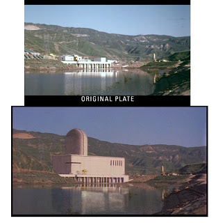
Q:        According to Bill Taylor quite the opposite occurred with COLOSSUS-THE FORBIN PROJECT where the studio brass were over the moon with that amazing ‘super computer boot up’ matte set piece and were keen to show it off.  Apparently that was Al’s most difficult shot from what Rolf Giesen told me.  I think it’s one of his best – and all on original negative too!


JD:       Yes, very impressive.  Al said that he missed the precise timing from his stop watch by about eight frames.  That’s so close that no one would notice the ‘error’.

Whitlock's 95% oils   /   5% real COLOSSUS matte shot
I also liked the shot of the couple sitting in mountain shadow on a lookout point above the distant Colossus facility in the sunlit valley below.  To get that effect, Al had the grips build an ‘awning’ over the young couple.  Al then matted out everything except the shadowed couple, a few feet of fence, and a little of the sunny valley beyond them.  Then he flawlessly surrounded them with the painted valley and the colossus facility.

Q:        I have a before and after on that matte shot.  The amount of paint is remarkable.  It must have been something like 95% Whitlock and 5% genuine set!  I think that must have been something Al possibly picked up from Peter at Disney – not to get fiddly with demarcations and preserving most of the ‘real’ set – just paint the whole damned thing, which Ellenshaw was a genius at.  So many of his Disney shots were ALL paint –right around into the immediate foreground with incredibly courageous brushmanship.  Peter would just ‘slot’ in the actors somewhere amid all that oil paint, and to beautiful effect.  Things like DAVY CROCKETT and JOHNNY TREMAIN are wonderful examples of this “ballsy” approach which most wouldn’t have the guts to tackle.


JD:       That’s certainly true.  Of course, the projection system used at Disney made it easy to place the actors and a small envelope of background into the paintings. (I once had to totally alter the set an actor was standing on, when the director decided to change the shot design after the live-action was filmed.  You can’t do that with a latent-image matte.) Al didn’t like the rear projection system, and he managed to do shots of type you’ve described with latent images.  But then he usually had great control of the photography and shot design.
Just when you thought mattes couldn't get any stranger...  A full painting of a baseball stadium Jim did for a heat pump commercial.  The idea was that heat pumps could be used to condition the air of many different kinds of buildings.  Jim painted four different buildings—all designed to somewhat resemble the outside configuration of a back-yard heat pump.  Jim also lit and filmed the actual product heat pump, then projected the contours onto four glasses and painted a 'bank' heat pump, a 'drugstore' heat pump, air 'airport-hanger' heat pump, and the 'stadium' heat pump.  All but the stadium had live-action that needed to be blended in. 

The 'Bank heat pump'...


The airport had two sections of live action (workers in the hanger and an airplane coming in for a landing, which Danforth created on film using a bas-relief plane on a sliding glass.  The stadium had moving crowd effects.  All four of the paintings were connected by dissolves made by Jim in the camera.  This short-schedule job was completed with a forty-hour non-stop stretch of work, during which Jim's wife Karen brought him breakfast, lunch, dinner, etc.  Some of the work (like pre-filming the plane landing and all the color balancing of the projection plates had been done prior to that.  Jim also filmed the background plates and printed them prior to that.


Q:        Didn’t Albert even ‘pirate’ some classical gallery masterpieces in his spare time so that his old pal Alfred Hitchcock could have duplicate paintings?


JD:       Hitchcock maintained two homes, but the original masterpieces in Hitchcock’s collection could be at only one location at a time, so ‘Hitch’ asked Al to duplicate the classic paintings.


Q:        A friend of mine in Germany (who’s also a big matte fan) actually owns an original Whitlock gallery piece, and it’s exquisite Jim.  Lucky guy!

JD:       One of my regrets is that I never asked Al if I could acquire one of his paintings.  He had two hanging in his home that I particularly liked—a view of the ship Cutty Sark under full sail, and a scene of a stately English home in late afternoon light.

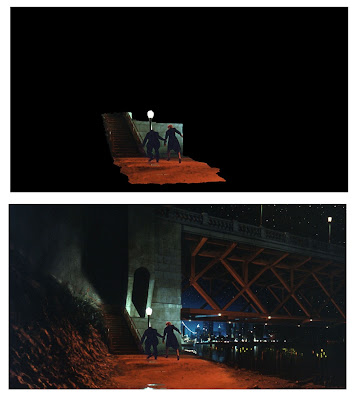
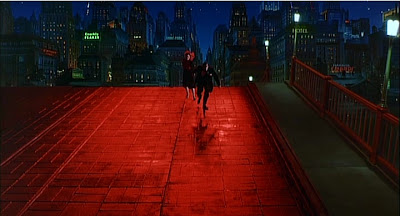
One of those "invisible" mattes— basically a split screen with only a little painting to make it blend.  THE SHADOW RIDERS.  Tom Selleck, etc. were filmed in Sonora, California, some miles from the ocean.


Q:        Virtually nothing has ever been written on Al’s long time cameraman, Ross Hoffman, who had been with the studio since the early thirties non stop through to EARTHQUAKE in 1974 – by all accounts, an amazingly versatile and skilled cinematographer who occasionally got an on screen credit.  If you can, please tell us more about Ross?


JD:       I don’t know too much more about Ross,  I talked to him a lot when I was working with Al or visiting him at Universal, but mostly I asked Ross technical questions, not about his career, per se.  Ross showed me the set-ups used for printing the rotoscoped mattes that were the norm at Universal for years.  The mattes were painted on cells, using opaque white paint.  The cels were placed on a frame with registration pins that was positioned between an optical printer and a large  studio lighting unit.  With the lighting  unit on, the silhouetted cel formed an aerial-image matte, printing the background scene threaded in the printer but leaving an unexposed area for the element to be added.    When the lighting unit was turned off and the cel was illuminated from the front, the cell printed the portion of the live-action scene that was being matted into the duped background.


Q:        I just think back to the huge numbers of mattes and opticals that Ross put together over 40 years and my mind boggles.  Aside from his many ingenious black velvet density matte opticals for all the INVISIBLE MAN sequels for John Fulton, his truly phenomenal SON OF DRACULA mist morphing transformation optical effect has to be one of the all time great trick shots.


JD:       I’m not a big fan of horror films so I can’t contribute anything to that topic.

Q:        Maybe so, but Ross was definitely one of Universal’s unsung heroes who more than earned his keep.  Gee Jim, how can you not love TARANTULA or THE INCREDIBLE SHRINKING MAN?

JD:        like THE INCREDIBLE SHRINKING MAN, but I don’t care much for TARANTULA as a piece of drama, and then some of the mattes are ‘keyed’ incorrectly, with the result that the spider doesn’t always fit behind the rocks correctly

A full painting which functioned as the background for a THEY LIVE travelling matte shot (a shot I could never locate in the DVD myself??)


Q:        It’s such a shame that the authors of the excellent book The Invisible Art – the Legends of Matte Painting didn’t interview Hoffman who lived on into the mid 90’s.  Can you tell us anything at all about the longtime rotoscope artist, Millie Winebrenner who  was also a mainstay at Universal for decades from those 50’s sci fi pictures through to EARTHQUAKE or THE HINDENBURG I think?


JD:       I met Millie but didn’t really know her.  I had worked closely with her former assistant, Nancy van Rensellaer during JACK THE GIANT KILLER.  The hand-drawn mattes at Universal were created on special drawing tables that had camera/projectors under them, projecting from the bottom the image to be traced.  This eliminated the shadows of the artist’s hand that occurs when the scene is projected downward onto a  drawing table from above. At Universal, when the cells had been painted and were ready to be photographed, the camera/projector was rotated from below the drawing table to a position above the table, permitting the artwork to be photographed.  Sounds like a major engineering challenge to me, but it obviously worked.

One of the mattes painted and composited by Jim for the tv series SALVAGE 1.  Several of the shots involved a sliding painting of the giant moving iceberg augmented with artificial 'wake'.  The sea is a plate of the Pacific Ocean and the tugboat is real.  Additional shots were achieved by Harry Walton with stop motion animated miniatures and process projection.


Q:        Al once wrote for American Cinematographer that Millie used to paint full size sheets of glass for some roto shots against his paintings, requiring sometimes 70 or so individual full sized matte glasses for a single pass in the days before cels.  That must have been some major undertaking?


JD:       The use of glass seems odd, since ‘cels’ have been around since before Al Whitlock started painting mattes.  Perhaps it was due to the heat of the lights.  I remember that when Al first told me he was going to try rotoscoping live action and matting it in front of his paintings using out-of-focus cels, I was dubious, because when I had asked Nancy van Rensselaer to make cels for an animated spilt screen during JACK THE GIANT KILLER we had gotten a very noticeable dark matte line because Nancy didn’t make complimentary cels with a gap between them as I requested (usually necessary when doing out-of-focus splits against light backgrounds).  I know that, initially Al planned to use only one set of cels.  I don’t know how he solved the non-linear reproduction of out-of-focus images.  One of Al’s tricks was to film the actors in front of a crudely-painted backing that had colors and tones similar to the matte painting in the area behind where the matted actors would appear.  That way, the slight intentional oversizingof the out-of-focus matte would not clip into the actors but would blend with the background.  It certainly worked well.


A pair of fully painted matteshot frames from John Carpenter's PRINCE OF DARKNESS.  The top image is a somewhat discoloured clip in Jim's collection that I have deliberately included here as the unique sun and moon view is clearly seen, whereas the release print as transferred to DVD below tended to 'blow out' all of the highlights, completely obliterating the whole narrative point of the matte painting.  Having compared the two images Jim leans more toward the upper frame as being closer to how he recalls painting the shot. Jim commented: "I saw the preview screening of PRINCE OF DARKNESS, and I would have gone ballistic if the scene had been printed like this second frame version.  My version still has a little too much green lurking around the sun, but it's MUCH closer to what I did for the film.  The overall tone was cool, not warm."  This goes to show just how shots can and often do show up vastly different on varying viewing platforms.

Q:        I found out recently that both incoming andoutgoing Universal matte painters, Al Whitlock and Russ Lawsen respectively, painted on the same 1962 feature – TARAS BULBA, which was Lawsen’s only on screen credit that I’ve ever been able to find.  The photographic effects were split between 3 providers: Universal, Butler-Glouner and Howard Anderson, so I’m not sure just where Whitlock fitted into this jigsaw puzzle as he worked for all three.  Al painted those chasm shots while Russ handled the city paintings I’m told by Al’s friend Rolf Giesen.


JD:       All I can add is that I saw one of Russ’s TARAS BULBA city paintings at Universal around 1964.  But I recall that Howard Anderson was involved with some of the chasm scenes, so it’s possible that Al painted for The Anderson Company on TARAS BULBA.


Q:        I’ve never met nor read accounts from anyone who has actually seen one of Lawsens’ paintings, at least someone who’s still around.  I don’t think even the authors of that terrific matte painting coffee table book came across any of them.  I asked Bill Taylor whether any of Lawsen’s mattes still existed at Universal and he told me that by the time he had joined in late 1974 there were no mattes that pre-dated Whitlock’s work.  My readers would be most interested in your memories of Russell’s matte if you can stretch your memory back that far Jim?


JD:       Regarding the Russ Lawson painting:  It didn’t make much of an impression on me.  I remember it as being smaller than Al’s paintings.  It wasn’t stashed in the back somewhere.  Al just reached down and lifted it up from somewhere near by.  It seemed to be ‘flat’ in terms of reflectivity, but that may be a trick of my memory.  Al’s paintings always seemed glossy (because they were).  I’m sorry I don’t remember more, Peter.  Like many things I’ve encountered through the years, if I’d known it was going to be of interest later, I would have paid more attention.  It was a wide view of a city.


An excellent example of Jim's rear screen process as applied to composite matte photography - with this scene from PLANET OF THE DINOSAURS.


Q:        I remember a fascinating story you told at the Visual Effects Society a few years ago for their tribute to Albert about his need to “fix” a certain SHENANDOAH matte painting – even though it was some time after the film had been released.  Would you like to expand on that Jim?


JD:       Apparently there had been something about that SHENANDOAH shot that Al felt was not right, even though he had approved it for use in the film.  Later he realized what the problem was and pulled the glass out of the storage rack and quickly made a correction.  As I recall it was a matter of the brightness of a house in the distance.  Al lightened it with a few deft strokes, stood back, looked at the painting and was satisfied, at last.


Q:        Can you remember the shot?  There were around six mattes in that film – one of the many shows he painted on for director Andrew V.McLaglen.

JD:       It’s the last one in the film. 


Q:        Oh yes, I know the shot very well – with the horsemen crossing the stream to the farmhouse, right?  Would you tell us the most valuable lesson(s) you learned from your time with Albert?


JD:       That’s complicated.  I cover that at some length in my memoir.  But in essence Al taught me to “befearless and to paint thetruth”.
Composite shot from THE STUFF.  The McDonald's stand is entirely a Danforth painting.  The other buildings are miniatures (because they blow up).  Jim designed this shot while his company Effects Associates hired the 'extras',and  filmed them in the parking lot of the industrial complex where they were located.  Jim directed the shot and did the composite.  (all rear projected.)

The Effects Associates crew with miniature set for THE STUFF
Q:        Bill Taylor said that Al always painted very “flat” – avoiding any build up of excess paint which might cause shadows or pin points of light.


JD:       Yes, the glints from the micro bumps in the paint were sometimes a problem for Al.  One of my first assignments for Al was to scrape down the surface of one of his paintings, using the flat edge of a razor blade, so Al could repaint that area.  That was fairly daunting, but it didn’t do as much damage to the painting as I thought it might.


Q:        I shudder at the thought Jim….new ‘green’ matte assistant armed with razor blade and doing his utmost not to do the unthinkable??  Must have been a palm sweating occasion? 


JD:        first time I did it I was very worried.


Q:        Come to think of it, I can recall several old time mattes, always colour shows, where ‘glints’ and ‘pops’ seemed incongruous with the painted part of the scene – especially in night skies.


JD:       Yes, it’s always difficult to get the lights at an angle where that doesn’t happen—probably impossible.  Of course polarizing the light helps (as is done in cartoon cel photography) but a lot of light gets absorbed by the polaroid filters.  During EARTH II at Fox, we oiled Matt Yuricich’s star-field paintings immediately before photography.  This helped eliminate any specks of dust that would show against the black of outer space.

A wonderful example of Jim's fine art - THE NAUTILUS UNDER CONSTRUCTION was painted for fellow Cascade staffer Tom Scherman.  Some time later the painting was returned temporarily to Jim for some artistic changes, at which time Scherman sadly passed away.  The artwork is now owned by miniature pyrotechnician Joe Viskocil.

Q:        To the best of your knowledge, was the original negative matte process utilized elsewhere at that time or was Al the only real advocate of the method?


JD:       Disney did someoriginal negative mattes on occasion (as in the shot in which Sean Connery and Janet Munro run down the hill in DARBY O’ GILL).  I had done a 16mm latent matte composite test earlier, and I started doing it again after working with Al.


Q:        Some effects departments such as MGM were staunch advocates of that complicated duplicating stock process weren’t they – the method later adopted by Doug Trumbull and co for Matthew Yuricich to use on all of those projects?


JD:       I think you are referring to color interpositive dupes a.k.a. color intermediate stock dupes.  There may be some confusion here as to the complexity.  Running a single interpositive is less complex than running three black and white separations in three separate passes—less complicated for the cameraperson.  However, for the artist, color interpositive dupes could be difficult, because that stock ‘skewed’ the colors and contrast of the painting.
 Clarence Slifer at MGM had an interesting variation on the use of this stock. That variation  originated before IP stock existed, when Slifer used positive Technicolor prints to dupe certain elements during GONE WITH THE WIND by photographing the aerial image formed by what amounted to a projector without a lamp house.  Later the interpositive stock yielded a better color reproduction than duplicating a viewing print.  It was also easier to repeat moves twice instead of four times, as would have been necessary if color separations had been used.  Clarence’s big ‘gimmick‘ was using the precision lens-move capabilities of an optical printer without a lamphouse to scan across the film being duplicated, and to then repeat the same moves with the interpositive and the printer movement removed from the printer, this time photographing only the painting.  The duping and hold-out mattes could be on a foreground glass (for soft blends) or incorporated into the painting as a clear area, through which a white duping board was  photographed with the painting in silhouette. Or through which a black background was visible while the painting was illuminated and being photographed.
Not many studios used aerial-image dupes (although those were popular for cartoon work).  More often, inter-positive stock was bi-packed in a standard matte camera, but moves on paintingscould not be made that way.

One of Jim's mattes from the film BUGSY.
I did only two shots on interpositive stock.  I found it very exasperating, because the contrast of the duping stock is 50% higher than camera negative, so the paintings had to be painted in low contrast (and in ‘odd’ colors sometimes).  Matt Yuricich was a master at this. 

Q:        Poor Matthew had to be!


JD:       Yes.  He occasionally complained about the fact that he was obligated to use that system in many of his employment situations.  I remember him saying that, to get the right shade of green trees he had to paint in “baby-shit brindle brown” tones

Q:        Yes, I’ve heard that delightful turn of phrase from Matthew.  I don’t think Windsor& Newton have that particular hue on the market any longer!  I sure don’t have any in my box of oil paints.    

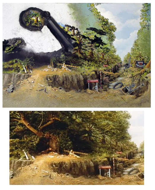
Jim's painted prison complex as seen in the excellent under rated Jon Voight film RUNAWAY TRAIN


Q:        Film Effects of Hollywood has been a major contributor on the LA effects scene for many years and I know you worked there for a time on IT’S A MAD, MAD, MAD WORLD.   Linwood Dunn had a long history at RKO with Albert Maxwell Simpson – did you happen to know Simpson by any chance?  I ask because there is so little known about the man and he was one of the veteran artists who, like Jan Domela who had an epic length matte career spanning way back to the twenties.  I learned recently that Simpson painted some of the many glasses on KING KONG, along with Henry Hillinick, who was Matt Yuricich’s mentor.


JD:       No, I didn’t know Simpson, unfortunately. 

Q:        Bill Taylor told me of a wonderful Al Simpson oil painting which used to grace the wall of Linwood Dunn’s office at Film Effects of Hollywood.  Do you recall that?


JD:       There was a painting from THE GREAT RACE that Lin said had been painted by Simpson.  That was on the stage and showed an Alaskan dock and trading post. .  In the front hall of Film Effects was a large painting from WEST SIDE STORY.  I don’t know who painted it.
By the way, the most impressive painting I ever saw hanging in a Hollywood office was a western landscape done by matte artist Jack Shaw (but this was a fine-art painting).  It was in the office of Producers Service Company—suppliers of optical and effects equipment.


Q:        Yes, Jim Aupperle has that GREAT RACE painting now, though the previous owner sawed off the black matte across the lower area.  A nice painting though. Jim sent me some great close ups of Simpson’s brush work from that one.  That show was jammed with good matte art.  On Jack Shaw, I wonder if that painting you referred to was one of the ‘War Eagles’ conceptual oil paintings which Harryhausen spoke of as being “still around somewhere”?  Apparently Jack painted a couple which totally impressed Ray and Willis O’Brien!


JD:       The painting at Producers Service Company was a view of a western plain, so don’t think it was for WAR EAGLES.  Perhaps it was something done for GWANGI, but I tend to think it was art for its own sake.


Effects assistant Roger Dicken, producer Aida Young and Jim at Bray Studios England for the lengthy shoot of WHEN DINOSAURS RULED THE EARTH - a film which would bring a second Oscar nomination to Jim.


Q:        Would I be correct in suggesting that WHEN DINOSAURS RULED THE EARTH was your first full on visual effects project?  Could you tell us, briefly about the origins of that assignment and how it evolved?


JD:       That very complicated story is covered in detail in my memoir, where it consumes many pages.  It started with Lin Dunn recommending me to Warners


Q:        To what extent did you have control over the design and direction of the sequences involving stop motion and other types of effects?


JD:       The screenplay had been almost completely written by the time I joined the film, so my control over basic content was limited.  However, I had a lot to do with the fine tuning of the sequences, including the shot design.  I was the second unit director.  I directed or co-directed all the scenes that would have stop motion added to them, and I also directed some scenes that did not involve animation (usually with doubles for the principle actors).


Q:        I’m aware of some misinformation surrounding the matte work on WDRtE, with even this very blogger getting the story wrong in a recent Hammer Films matte article.  based upon incorrect information published elsewhere.Could you clarify the situation for us Jim?


One of the many spectacular glass paintings Jim executed for WDRtE.
JD:       I learned of the misinformation only through your blog on Hammer Films.  Prior to that, I hadn’t realized there was any misinformation.  My short answer is that I did most of the glass paintings used in the film.  Les Bowie or his company did the final shot in the film.  No other paintings by Les appear in the film, unless he helped  Brian Johnson, who did the insert shots of the rising sun and the forming moon at the Bowie facility.  Ray Caple collaborated with me on one glass painting and did another entirely himself.  I did the composite photography.  The very wide establishing shot of the sand tribe village was done for me by the Shepperton matte department.  I don’t remember the name of the artist who did the painting.  That painting and the composite were very good.

Two different matte paintings executed by Jim for a particular shot in WDRtEThe first volume of Jim's memoir goes into extreme detail on the making of WDRtE (and is almost a book in it's own right).

Q:        That other artist was probably Doug Ferris as I think he’s included it in his filmography.  I was always under the impression that WDRtE was a stressful experience for you – having to wear so many hats.  How much scheduling pressure was there to pull off so many stop motion, matte and process shots?


JD:       The problem wasn’t having to wear so many hats.  Not being allowed to wear many hats is what creates stress.   The problem was not having enough time to plan and budget the production.  Six weeks is not enough time to plan a film with over 125 effects shots—particularly when, at the time I joined the film,  the script still needed much alteration to make things feasible.  There was enormous pressure, due to the addition of over twenty unplanned glass paintings.  The original plan was to have two or three.  Then, a high-speed water miniature sequence that I was told was scheduled to be filmed in a tank at Shepperton ended up being filmed by me in stop-motion because the cost of the tank lighting crew proved to be too expensive for the producer’s budget.  The delay that followed was not due to the stop motion but to the numerouslocation-scouting trips I was required to go on in an attempt to find a body of water where we could film in sunlight.  Eventually I refused to keep looking and did the shots with stop motion and rear projection.  And so on, and so on.

Foreground glass painting and stop motion set up for a scene ultimately deleted.

Q:        Ray Caple is a bit of an enigma for me.  I tried to do a profile on his career in one of my blogs, though information is hard to come by.  He apparently started as Les Bowie’s apprentice at age 15 and did much of Bowie’s painting on the Hammer films, always without credit.  Ray was reportedly a very private and insecure fellow who preferred to do all of his own camerawork and compositing at his home studio.  Can you tell us more about your interactions with Ray?


JD:       Well, I liked Ray a lot.  I wish Al Whitlock had recommended him sooner.  I think we would have had fun working on the film.  Ray didn’t seem insecure to me.  However, at the time of WDRtE, Ray was involved in some serious life problems, and I don’t think he was able to give his full attention to the work he did for me.


Q:        Ray was one of those all too familiar uncredited matte artists for much of his career, with I think THE BATTLE OF BRITAIN being his first on screen credit billing. 
Brian Johnson told me that Ray was an amazing painter and someone with a distinctly ‘Welsh’ sense of humour.  His ‘Fortress of Solitude’ painting for SUPERMAN is one of my favourites.


JD:       Yes, and other paintings of Ray’s I saw later were VERY impressive.

Q:        The workload on WDRtE was great and you were forced more or less to seek assistance with some of the mattes and other effects shots.  Among the people you sought the services of was Peter Melrose who had learned the artform alongside Al Whitlock and Cliff Culley back at Rank Studios in the very early fifties.  Could you comment on Peter and his brief tenure on your film?


JD:       The short answer is: Peter was a good artist—very professional.  He started a painting for me using the same stage at Bray Studios that I was using.  The producer laid him off during the Christmas holiday to save money—thinking she could rehire him later.  Peter was offered NICHOLAS AND ALEXANDRA.  He accepted that assignment and we lost his services.  This started my ‘never ending’ quest for other matte artists.


Q:        Peter was an occasional matte artist at Shepperton, alongside Gerald Larn and Doug Ferris.  Much of his work was as a freelancer who hired Wally Veevers’ shop and equipment for his projects.  His work on Polanski’s FEARLESS VAMPIRE KILLERS was phenomenal, with his multi plane massive pullback title shot being a real eye opener.  Did you manage to see that shot?


JD:       I saw the film but don’t remember the shot.


WHEN DINOSAURS RULED THE EARTH beach set piece, with Jim's glass painting seen at Bray.
Q:        You also met with artist Bob Cuff didn’t you?  At the time Cuff was painting with Caple and others on the huge matte filled western MACKENNA’S GOLD and all of the mattes were 65mm shots.  Do you recall that visit?


JD:       Yes, but I didn’t realize Ray Caple was working on MACKENNA’S GOLD.


Q:        I heard somewhere that Whitlock was initially approached to supply the many mattes for that film but had a major disagreement with either the director J.Lee Thompson or the production designer Geoffrey Drake over the bizarre script concepts where the sun rises over the valley and they wanted the shadows to become longerand longer the more the sun went up, which of course is ridiculous.  I think Whitlock’s own motto “never paint a lie” came into play here?


JD:       Exactly right.  The entire film was based on a colossal misconception.  I also thought the production design was terrible, but then I haven’t seen the film for many years—might have a different impression now.


Q:        Just getting back to WDRtE, I haven’t seen that in a long while and can’t find it on DVD, but I recall the stop motion as being terrific.  You featured some fairly complex set ups as I recall, with multi- element composites, such as the beach sequence.


JD:       Thank you.  The most “multi”-element shot was the establishing shot of the sand tribe village, as seen from the sea. I took that one to the Shepperton matte department for painting and compositing.  For that shot I had filmed four elements.  I combined the plesiosaur and one close shot of the village, then gave the Shepperton department that ‘precomp’, plus two other shots of villagers moving in the village set, plus a shot of the ocean I made in the Canary Islands.  They blended it all together with their painting, using miniature rear projection.  They did a good job of it, but I couldn’t use them on the other shots, because those had to be started and finished ‘in situ’, as part of the animation set-ups.


Q:        Now, I hope this isn’t treading on sacred ground Jim, but do the words “Unfair to men in Dino suits” register with you …  Tom Scherman…a foam rubber dinosaur suit and your Cascade cohorts at an airport?  Any comment?


JD:       Ha, ha, yes,  A bunch of my friends met me when I returned to the U. S. A. following WHEN DINOSAURS RULED THE EARTH.  I remember the dinosaur suit made by Tom Scherman, but I’d forgotten the protest sign until you reminded me.  The camaraderie of those days was wonderful.

A painting of a girl on a giant lizard was part of Jim's conceptual art for HIERO'S JOURNEY, a Columbia film, based on the novel by S. Lanier, that was not put into production.


Q:        WDRtE saw your second Academy Award nomination for special visual effects.  Did you see your picture as likely to take home the Oscar or was it a case of ‘bigger studio, more clout’ for the Disney co-nominee?


JD:       I thought WDRtE might have a chance, but I had to overcome some problems caused by Warner Bros desire to have ZEPPLIN win.

Q:        I never knew ZEPPELIN had been put forward?  Some good model work by Wally Veevers as I recall?


JD:       Yes, ZEPPELIN was submitted.  I remember thinking the effects looked good.  My frustration was that the editor at Warner’s didn’t want to cut the WDRtE reel for submission, because Warner’s wanted ZEPPLIN to win.  Nor did Warner’s do anything to promote WDRtE for the award.  Someone (I suspect Al Whitlock) paid for trade-paper ads after the film was nominated.


Q:        I liked the matte work in BEDKNOBS, but I’ve a real passion for Disney’s effects work anyway.  I think WDRtE was the better film though and had a good chance at Oscar time.


JD:       There were some who agreed with you.

From a commercial for the not-yet-constructed Texas Commerce Bank.  The clouds and sky are rear projected and 'colorized' from a black and white separation.  There is a small area of live action at the lower right (the church and parking lot.  There is another glass behind the main building, on which Jim painted the iron girders of the building.  Filming in reverse, the foreground painting was scraped off in sections joined by in-camera dissolves. This revealed the iron work, which was also scraped off in sections connected by dissolves, slightly trailing the building's 'skin'.  This was not a job for the faint of heart.  Jim's wife Karen couldn't stand to watch.  It all worked fine, and the building appeared to 'grow' upward, in a stylized way.


Q:        The effects committee made some strange judgement calls in those days.  Do you know who actually made up the VFX committee?  I ask because I’ve read some scathing reports of just how the AMPASoperated.  A wonderful Howard Lydecker picture FLYING TIGERS with John Wayne was a nominee in the early 40’s and apparently at the Academy screening of the fx showreel, Farciot Eduoart who was a member of the board of governors dismissed the miniature effects out of hand to Howard Lydecker as not even being miniatures, rather real airplanes and a waste of his time, which so incensed the Lydecker brothers that they stormed out of the projection room.


JD:       Because I was a member of the nominating committee, I did know who the members were when WDRtE was nominated, but it’s not really relevant.  There have always been problems of perception and politics within the academy. Some of Al Whitlock’s mattes for SHIP OF FOOLS were dismissed as miniatures.  Through the years, there have been many changes in the way the AMPAS worked with regard to effects awards.  As I’m sure  you know, originally the award was given in the name of the film that won, not to the creator(s) of the visual effects.  For many years the entire academy membership voted on the effects award (after it had been nominated by the committee).  I’m told that there were some influential members of the committee who were so upset that WDRtE failed to win that they got the rules changed for a while so that only the committee members could vote for the award.  The feeling was that the general membership would always vote for the more crowd-pleasing film rather than the film with the best effects. 
There had always been pressure to drop the effects award entirely because it (and some other technical categories) were perceived as slowing down the presentation show.  Eventually the Academy somewhat achieved that goal for a timeby having the effects awards removed from the main event. The technical awards were presented at aseparate, earlier event (which I referred to as “The Children’s Table”), then tape of that event was edited into the televised awards presentation.  I was lucky that I was nominated twice before those changes took place, I was permitted to attend the the main event both times.
Back to your point about Farciot Edouart and the Lydecker brothers: Some of the committee members seemed to have a very limited perception of things.  On the other hand some were very aware of what was going on. I guess that’s the nature of a committee.


Q:        The odd choice of winning sub-categories often gets me.  Prime example was BEN HUR which took home the effects Oscar but only for miniature, process and physical effects – with the matte art category omitted, yet this clearly was the most substantial and worthy effects contribution in the film overall.   Your thoughts Jim?


JD:       I think the introduction of the Petro Vlahos color-difference blue-screen system was equally important.  Of course a film like BEN HUR could not have been made without matte paintings (or, alternatively, hanging miniatures).  So, when the matte paintings were omitted, I suppose the implication was that they were not good examples of the craft, which does seem to be perplexing. As to the categories: There was a point system.  Categories got eliminated if they didn’t get enough votes, even though the film might have enough combined votes to qualify for a nomination.  For years, there was no category for stop-motion animation, and it was classed as “miniatures.”  After the award for TOM THUMB went to only Tom Howard (bypassing Wah Chang and Gene Warren), the apparent unfairness led to lobbying that resulted in having stop-motion animation included as a nominatable category.  When 7 FACES OF DR. LAO was nominated, my name was entered in the stop motion category, with other Project Unlimited and MGM people entered in other categories.  Only the animation received enough votes to qualify.  That meant that if the film had won, Wah Chang and others would not have received the award.  That, too, seemed unfair.

Jim's matte of the Clipper for the television series TALES OF THE GOLD MONKEY was one of numerous collaborations between him and former Cascade colleague David Stipes.

Q:        Of course, and you’ll agree with me I’m sure, DARBY O’GILL’s inexplicable absence from that illustrious line up of Oscar winners (or even as a damned nominee at least) is a crime against recognized excellence in creativity!  I cannot believethis show missed the boat….they don’t get much better than DARBY.


JD:       Now that you mention it, that must be the most egregious oversight of them all.  Perhaps Fox had a bigger block of voters than Disney, resulting in JOURNEY TO THE CENTER OF THE EARTH being the runner up—BEN HUR was the obvious choice for first place, in terms of the politics.  The JOURNEY effects were nice, but not groundbreaking.  Then again, there was no AMPAS category for “great leprechauns.”  They weren’t opticals.  They weren’t miniatures.  They were…  too mind-boggling to categorize.  So what could one vote for?  Matte paintings, of course, but that’s not enough to take the award.

Q:        While on ‘Oscar injustices’, one of the effects boys on NEVER ENDING STORY-PART 2, Steve Begg, mentioned an occasion where he observed Al Whitlock and Derek Meddings on the set, where Whitlock said to Meddings “You were robbed mate”, apparently in reference to Derek’s excellent miniature and optical effects for JOURNEY TO THE FAR SIDE OF THE SUN being rejected by the effects selection committee some two decades earlier in favour of the Hollywood space opera MAROONED, which to everybodys amazement actually took home the statue.   The manner in which Al casually commented suggests to me that it had possibly been a running ‘joke’ between the two effects giants for years.


JD:       When Doug Trumbull’s SILENT RUNNING failed to qualify in the projection process category, I said  “Doug, you were robbed.”  When Randy Cook was prevented from making an acceptance speech, Robert Redford said to Randy “You were robbed, pal.”  There seems to be a lot of ‘robbing’ going on at the AMPAS, but those are always subjective views.

A shot that Jim liked but which he did over for some reason for the tv show BRING 'EM BACK ALIVE 'Seven Keys to Singapore' episode.


Q:        Your feelings on the ludicrous AMPAS decision with the De Laurentiis version of KING KONG have been well documented.  Just before we move on, do you have any last word on that highly questionable event?  The mere thought of dual winners was incredible, not to mention outright misinformation on giant mechanical apes.
  

JD:       I’m not sure that having  two winners was, in itself, incredible, but those two…?  The nominating committee chose not to nominate KING KONG.  After some “pressure” from the De Laurentiis camp, the Board of Governors decided to override the nominating committee’s recommendation.  That is the prerogative of the Governors, but it would have been nice if they had told us before we read about the KONG award in the newspapers.
Re the mechanical Kong:  When I was asked to come in for a discussion re the effects for KONG, I told John Guillermin, the director, that there were several ways that the giant ape could be done and that each had strengths and weaknesses, but that the only way that would not work was a full-size mechanical Kong.  Guillermin said, “We have no intention of doing that.”  Later, I was on the set (as an extra) when the full-size Kong broke down and the shooting was cancelled.  After the film was released, John Guillermin was quoted as saying, “They told me it would walk down Fifth Avenue.”

Q:        In it’s favour, John Barry’s exquisite main title theme for KONG wassublime and among his best scoring work ever… but oh my God did I hatethat art direction with a vengeance!  Talk about a crude high school stage set for SkullIsland!  Pitiful Jim…just pitiful!


Conceptual art for a proposed film project DAGAR
JD:       Time magazine gave KING KONG their cover and a glowing review and told me (in response to my letter to the editors) that some people were incapable of appreciating the film’s virtues, due to their preference for the original version.  It was a period of massive brain washing.

Q:        Any idea of just what the other titles were which were in selection that year that never made the grade?  I think there were five?


JD:       I don’t remember.

Q:        Didn’t KONG matte artist Lou Litchtenfield work with you at one time?  I’m most interested in learning more about Lou.


JD:       Lou and I didn’t actually work together.  When I was in charge of the effects department at Cascade Pictures, I asked Lou to paint a matte that needed to be completed during the time that I was scheduled to be on vacation in Europe.IknewI   couldrelaxwithLouonthejob,duetohisyearsofexperience.  I liked Lou. He was always well-dressed and soft-spoken.  I thought of him as the ‘gentleman matte artist’.  Of course he was more than just a matte artist.


Q:        I’ve heard that too.  Matthew Yuricich said that when Lou was loaned out to MGM to paint mattes for AN AMERICAN IN PARIS he wasn’t even allowed to view the rushes of his own matte shots – such was the regime under Newcombe.  I’m told by Craig Barron that even after Lou’s very long career he never managed to save a single matte painting.


JD:       Late in Lou’s life, I asked him whether he was willing to do a filmed interview.  He agreed, but the producer failed to follow through.  Then Lou died.  Very sad—a missed opportunity.


Q:        Lou had an extensive background in film going back to GONE WITH THE WIND as a sketch artist, and later in matte work on MIGHTY JOE YOUNG and a lot of Warner Bros pictures.


JD:       I hadn’t heard about Lou’s GONE WITH THE WIND work.  I believe Lou was, for years, in charge of the effects department at Warner’s, including second unit filming and all other types of effects.

Glass painting in progress and the final invisible result as seen in THE SHADOW RIDERS.


Q:        I can sadly report that two of Lou’s more recognized 70’s glass paintings were accidentally destroyed in a matte storeroom mishap at Van der Veer Photo Effects.  The Skull Island wall painting from the ’76 KING KONG and the one of the Saturn V rocket on the launch pad from CAPRICORN ONE both hit the floor loudly and shattered into a million pieces when persons who shall remain nameless got a little too careless one day.  Upon hearing the almighty ‘explosion’ Frank Van der Veer rushed in with a loud“What the hell was that?”, with which the dazed, accident prone perpetrator responded in all sincerity“I can glue it back!”.  Frank and his assistant Barry Nolan just cracked up laughing despite it all.  The poor employee not only had to clean the mess up but was required to clean Frank’s Oscar each and every day for a time.  That’s a true story, told to me by the unfortunate fellow at the centre of it himself who has never lived it down.


JD:       That’s funny but sad.  Van der Veer used lightweight aluminum frames for their mattes.  So did I from about 1977 onward.  However, I think that if Lou’s paintings had been mounted in heavy wood frames of the type used by Al Whitlock, they might have survived the impact.


Q:        The fellow in the middle of that referred to the matte glasses as ‘shower doors’.


JD:       They weren’t actually shower doors, but they were made by a company that made shower doors.  The glasses were framed using aluminum shower-door moldings with vinyl gaskets that cushioned the glass (but apparently not enough).

The gigantic painting for PORTNOY'S COMPLAINT which sadly was left behind once filmed, no doubt due to it's immense size and fragility.


Q;        Among the freelance jobs you did after WDRtE was that amazing zoom out matte shot for the abysmal Richard Benjamin picture PORTNOY’S COMPLAINT.  I believe the painting measured some 12 feet across.  Was that matte executed at Film Effects of Hollywood?  Do you still have that beautiful painting by any chance?


JD:       That matte was executed on a stage on Western Avenue that I rented.  Film Effects of Hollywood was not involved in that matte shot.  I got the job due to a recommendation from Al Whitlock.  The production designer for PORTNOY was Al’s friend Bob Boyle. I no longer have the painting.  I left it at the rental facility.

Castle matte shot from EQUINOX


Q:        Typically, do you photograph all of your own mattes – both plate and composite?         


JD:       During WDRtE and then from about 1975 onward, I have photographed almost all my mattes.  I photograph the plates too, when can get away with it, which is not often, due to union regulations.  In those cases, I try to be on hand to ‘guide’ the set-ups.  Often I supplied one of my registration cameras to the Director of Photography for the production.  Some of the paintings I have done were for live-action scenes that had already been photographed before I got the matte assignment.

Full painting of the fort at sunset for the unfinished WEST OF KASHMIR.  For the actual shot, there was a hole scraped in the fort wall, into which Jim projected a horse tethered in front of the fort.  The matte 'hole' has been painted in for this photo.


Q:        I’m intrigued as to how you became involved with the Bond film DIAMONDS ARE FOREVER, especially with it being the ‘odd man out’ effects wise, from the rest of the series with an entirely new roster of effects people instead of the usual EON Films regulars John Stears, Cliff Culley or Derek Meddings.  This time around the visual effects were split between the UK with Wally Veevers and the US with Albert Whitlock and yourself brought on board to supply one sequence.  Can you tell us how this came about?


JD:       Not a clue, mate.  Al asked me to help him with some work at Universal, and it turned out to be DIAMONDS ARE FOREVER (plus the “Gunsmoke TV series).


Q:        There were several totally invisible Whitlock mattes in that film aside from those big missile battery shots.  Did you happen to see any of those in preparation?


JD:       Yes, most of them, including The Whyte House shot with the moving outside elevator.

The spectacular 'City of Light' matte with effects overlays from THE DAY TIME ENDED.  Jim wasn't terribly happy with the shot as it was done at a time prior to him having the equipment to print his own plates, though he did tell me the animated monorail seen in the distance helped to sell the effect.


Q:        I must be the only one in the world with this, but I often comment: “Music maketh the matte”– where in this example John Barry’s mesmerising score (“007 and Counting” on the soundtrack album for any other movie score buffs like me) totally sells Whitlock’s missile warhead mattes .  That particular visual and accompanying audio has stuck with me ever since seeing the film in 1971 with my father.


JD:       I agree that music is very important to films and visual effects. Try to imagine KING KONG without Max Steiner’s score. I think the pterodactyl sequence in WDRtE would have been far more effective if it had been scored.

Q:        You are so on to it Jim…. A masterpiece of film scoring.  The Steiner score together with those Larrinaga jungles will live on in my psyche forever.  Unforgettable.
Some of that same score pop up again in other RKO shows, did you know that?  I think BACK TO BATAAN is one?  As an aside, back in “the day” when I first saw KONG here on TV in the early 70’s I recorded the whole film onto my Dad’s old AIWA reel to reel tape recorder and would re-play this ‘film’ audio over and over – knowing all the dialogue, music cues and Murray Spivack’s sound fx cuts perfectly!  Now if only I had approached high school math and science with such gusto………….. My parents never forgave KONG.

JD:       I had similar ‘parental’ problems.  Isn’t some of the Steiner KONG score also heard in the Randolph Scott LAST OF THE MOHICANS?  I have a vague recollection that it is.

One of three paintings executed by Danforth for a Dodge Monaco commercial.  The idea here is that there is a road from New York to Monaco in the South of France.  The road is a VistaVision projection.  Ocean plates were added on either side of the road and Jim did a slight tilt down as the car approached.


Q:        There was a time where you worked in the 20th Century Fox effects department, I think around 1970.  Could you tell us a little about the project and some of your memories of what was one of the industry’s proudest photographic effects departments?


JD:       Howard Anderson had purchased the Fox Effects facility (as it had done with the RKO-Desilu-Paramount effects facilities).  I was hired by Howard Anderson to handle miniatures for a TV movie entitled EARTH II.  Then Howard discovered that the IATSE (union) wouldn’t permit me to work on the miniatures, so Howard assigned me to be the effects co-ordinator.  I communicated between the Fox miniature department and Art Cruickshank, who was handling the photographic aspects of that show for Howard.  We also did some of the work at MGM where Ed Hammeras was handling process projection, along with Carroll Shepphird.
At Fox, in addition to Art Cruickshank, there were Bill Abbott and Matt Yuricich, plus printer operator Jack Caldwell and assistant Eddie Hutton (with whom I had previously worked at Film Effects of Hollywood).

 An odd matte shot assignment for DOMINICK AND EUGENE.  Said Jim: "The object was to take a shot of the boys' room and put carefully-arranged covers on the bed at the left, which had been filmed unmade. This also required cleaning up a small amount of the carpet, as I recall".


Q:        Matt Yuricich remembers you there as being “that kid with the front projection”– or words to that effect.

JD:       Well, this “kid’ was thirty years old, but it’s nice that Matt remembers me. 
When I was at Fox I tried to be a responsible employee, with the result that I didn’t do what I probably should have done (posterity-wise), by which I mean slipping away to explore the recesses of the Fox effects department—a missed opportunity.
There were some old paintings lying around.  I remember only one in particular—a full ‘painting’ of the Eiffel Tower at dusk, which was a black and white photo enlargement that had been thinly overpainted with color glazes. 
I was told about, but didn’t see, the  Fox beam-splitter device for viewing superimposed three-strip Technicolor black and white separations in full color, nor did I see the special 35mm film enlarger with registration pins that enabled several sequential frames of static scenes photographed on motion-picture film to be superimposed to create grainless enlargements.
Bill Abbott told me of the ‘joys’ of using false-sensitized duplicating stock in the days before later forms of duplicating negative were produced by Eastman Kodak.  In order to get the maximum sharpness, the positions of the three color-sensitive layers were altered from what is now the norm, and non-complimentary filters were used to print each color layer.
During my younger days, the large backing of the Fox tank could be seen when one drove through what is now Century City (along with Fox’s real oil well).  I think by the time I worked at Fox, the tank had been moved, but the oil well remained for a while.

Upper frame: The television pilot for KUNG FU live-action exposure after it has had a black matte added in the optical printer by Bill Taylor.  Note that the matte slices through the set and location without following any precise edges. Lower frame:  Jim Danforth's painting double-exposed onto the latent dupe live action.  (From a faded 35mm print.)


Q:        Of course Fox had commanded the high ground on many big projects under Fred Sersen such as THE RAINS CAME and IN OLD CHICAGO – two amazing effects films which still stand up surprisingly well even today.  Bill Abbott worked on both of those and was still running the dept when you were there 3 decades later – quite an epic career.

JD:        It definitely was.  Actually, Bill wasn’t exactly running the department when I was there.  Howard Anderson was the ‘big boss’, with Art Cruickshank in charge below that.  Bill was in an odd position that I would call “genius emeritus.”  He was doing various optical printing jobs in an unchallenged way.  I worked with Bill briefly later on three other projects; JOHATHAN LIVINGSTON SEAGULL, PORTNOYS COMPLAINT, and  EXORCIST II: THE HERETIC

The Fox effects department apparently didn’t have miniature projection capabilities for compositing matte shots.  When Art Cruickshank was filming a Matt Yuricich painting for the Rod Taylor TV series BEARCATS, using black and white separation dupes, he said that the  better way to composite the shot would be with miniature rear projection, as was done at Disney (Art’s former long-term employer).  With the separation contact dupes, parts of the live action kept ghosting through the painting due to a phenomenon involving bounce light inside the lens of the matte camera (this is true for most lenses.)

Jim while at Cascade Pictures roughing in a painting on 'black' glass.  The dark glass enables the rear projection screen to be placed close behind the painting without the projected image being washed out by the lighting on the painting.  (photo courtesy of Harry Walton)
The completed shot for a detergent commercial—'proving' that life is sunnier for those who use the product.

Q:        In the early seventies, among the projects you engaged in were several television shows and tv movies with a range of matte work and other effects.  You seem to have been quite heavily in demand with other people’s shows while still trying to get several projects of your own up and running.  Could you tell us about the shows – both made and unrealized?


JD:       Unfortunately, I was never “heavily in demand.” But I did manage to eke out a living during this period by doing a variety of things.

I did a matte painting for Howard Anderson for JONATHAN LIVINGSTON SEAGULL  This was a painting about seven feet wide, done on a photo blow-up—in front of which I also animated very small stop-motion seagulls perched on a cliff.  My part of the job worked perfectly, but I don’t think the Anderson Company ever managed to get the composite finished—one of the experiences that made me dislike having others handle the composite work for my paintings. 
On the ‘upside’, this job was done at Anderson’s Paramount facility, so I was able to poke around in John Fulton’s old optical room, where there was still a box of filter set-ups and notes left over from THE TEN COMMANDMENTS.  Fulton and his optical team had installed pegs at the filter position of the VistaVision optical printers.  Small animation cells about five inches wide were punched to fit the pegs.  Each cell was designated for a particular shot set-up and had color-correcting gels glued to it in areas that corresponded to the position of the elements for that shot.  This enabled the filter set-ups to be precisely repeated every time a test was made or a shot composited.  I discovered that some of the TEN COMMANDMENTS shots were far more complex than I had realized.

THE TRUE STORY OF ESKIMO NELL:  The frame at left shows the release print version of the matte, whereas the frame at the right shows the prior unsuccessful attempt to do the shot as a dupe-latent composite where matte line blending issues necessitated altering the black matte on the masonite by painting over it (on a cel) with white snow for the final successful version.  In Volume 2 of his memoir Jim discusses ESKIMO NELL and numerous other matte assignments.
For Film Effects of Hollywood,  I did some pre-production art for a planned film entitled THE BLACK PEARL.  I don’t think this film was made.
Also at Film Effects, I did two paintings for THE REINCARNATION OF PETER PROUD.  These were done using the cumbersome Film Effects duping board system (the same as the Fox system).  Also at Film Effects I did matte paintings for THE LEGEND OF ESKIMO NELL and the TV movie KUNG FU.  All the matte painting jobs were done in conjunction with Bill Taylor, whom I think attracted the attention of director Richard Franklin and got us the ESKIMO NELL job.  For the latter two jobs Bill and I avoided the duping-board system.


Jim's original ESKIMO NELL painting prior to the additional snow on an overlying cel being added to facilitate a smoother blend.  Photos courtesy of Harry Walton.

Close detail of Jim's ESKIMO NELL matte.

 
A rare close look at Jim's colour handling.


 At home, I did some design work for a TV movie based on Asimov’s I Robot.  This was being produced by John Mantley, who had produced the seasons of GUNSMOKE for which Al Whitlock did matte shots.  Al recommended me to Mantley.  I ROBOT was canceled after I finished one design rendering and some preliminary robot design sketches.

Multi plane glass painting for 'Gift For a King' commercial.
For Cascade Pictures of California, I did several small matte painting jobs for various TV commercials.  One I recall was for Head and Shoulders shampoo and required a miniature train to be shot in stop motion in front of a large backing which I painted.  The backing contained the sky, telephone poles running in deep perspective and all the terrain.  The miniature was only the roadbed and track, plus the train coming straight at the camera.  We filmed in stop motion in order to stop way down, so everything would be in focus from the backing forward to the front of the track.  Other angles required some glass painting.
Another Cascade job was for Zenith radios and required a multi-plane shot of Neuschwanstein castle in Bavaria.  I did the painting.
Also at Cascade, I did a full painting of a lunar-landing module on the surface of the moon.  This served as the background plate for an infrared traveling matte of astronauts.  The shot was for a Fruit Loops breakfast cereal commercial.  While I was working on this painting, Al Whitlock dropped in, looked at my painting  and said “You paint better than anyone else in this town.”  I was speechless.  I’m still not sure why Al would have said that.  There were many matte artists better than I.
I also did a test for Cascade of a moving matte shot (the Shangri-la shot).
And during this time I was thinking about several projects of my own, including FARNSWORTH’S FOLLY, and TIMEGATE. 


Final composite of the Zenith 'Gift For a King' tv commercialThe foreground trees have been painted on a separate glass


Q:        Were you already at Cascade Films when the infamous FLESH GORDON came along?


JD:       Yes and no.  I was no longer on Cascade’s permanent staff, but I did work for them when they needed me.  Some of the FLESH GORDON paintings were composited at a small facility Cascade had set up for me on their property, in which I had done the Shangri-la shot.  I rented that facility for the FLESH GORDON work.


My favourite FLESH GORDONmatte shot.
Q:        I’m sure there are many readers who would like to know how this considerable visual effects assignment came together.  A number of luminaries were involved such as Jim Aupperle, David Allen, Dennis Muren, Laine Liska and Joe Viskocil among others.
I’m intrigued about your screen credit –‘Mij Htrofnad’….is there a good story behind that?


JD:       Initially the film was a hard-core porno film (but with laughs).  I asked the producers not to put my name on it.  The producers decided to use my name spelled backwards, and said I would probably be happy later to have the credit.  After the film was re-edited to ‘soften’ it, I was happier. 
FLESH GORDON:  Jim is seen here using a grease pencil to draw Dr. Jerkoff's rocket on the matte glass, using Greg Jein's miniature as a guide.  This shows the size of the matte glasses used for that film.  This painting had to match a full-size section of the hatch area, so that actors could be shown leaving the ship.
I believe FLESH GORDON began with a suggestion made by animator Mike Hyatt to director Michael Benveniste (Mike Light).  The production designer was Mike Minor, He was definitely not minor.  Mike was a major force behind the film.  Greg Jein made the miniature space ships.  Tom Scherman made some of the full-size props, such as the robot.  Joe Musso did some of the matte paintings.  Bob Costa did opticals on his unique printer and also printed plates for my shots.


I was originally asked to work as Mike Hyat’s assistant animator.  That wasn’t an assignment I wanted, so I declined.  Later the production got behind, so the producers asked me to do some of the animation for them, without Mike Hyatt’s supervision. 
This wonderful crew didn’t all work together in the same facility.  Tom, Dennis, Joe Musso and Joe Viskocil worked in a rented sudio in Eagle Rock.  I did some of my matte paintings there, some at Cascade, some at Raleigh Studios.  The animation I did was done on part of a stage at Raleigh Studios, next to the stage where the FLESH GORDON live action had been filmed.

The smoke rising from the brazier in the FLESH GORDON throne room matte shot is the smoke element Jim shot for the plesiosaurus sequence in WHEN DINOSAURS RULED THE EARTH several years earlier.


Q:        The film was shot on 16mm wasn’t it?  I’ve read that all of the effects material was shot on 35mm.


JD:       True, but some of the animation was initially done in 16mm.  Those shots were redone in 35mm.


Q:        Didn’t one of the producers take visual effects screen credit on FLESH?


JD:       I think Howard Ziehm may have.

Q:        Justified credit?

JD:       Let’s just say that without Howard the effects would probably have fallen apart.  There were a lot of effects personalities that had to be managed.


Q:        I loved the effects work, with the ‘Great God Porno’being a real giggle.  Were you involved with any of the stop motion for that sequence?  I believe the voice over by Craig T.Nelson was an afterthought – but it sure was hilarious.


JD:       I was involved with only some process composite set-ups, plus the animated rays fired by the passing space ships.  I animated the rays on glass while Jim Aupperle and Rob Maine were animating the Great God Porno.  In addition I animated all of the ‘Beetleman’ sequence.


Q:        Very ‘7th Voyage’ in style as I recall?


JD:       Yes, I suppose so—except that there are no laughs in 7TH VOYAGE.  I didn’t conceive or design that sequence.  Bill Hedge had directed all the plates before I took on the animation


Q:        Your glass shots are really great in FLESH GORDON.  Can you talk a little about those, especially the long shot with those massive trees and a river running beneath and the one with the spacecraft on the launch pad with the moon above.?


An atmospheric painted matte from FLESH GORDON

JD:       The matte paintings I did were inexpensive—$250 above my costs for each shot.  The shot with the trees that you mentioned was more difficult because I had to match the painted trunk to my cut-out painting of a section of tree trunk, in front of which Dennis and Tom flew the miniature space ship.
Another difficult shot was the tilt-down from the throne room to the cross-section view of the drainage system, into which I added Flesh and his friends swimming.  Also tricky was the “Royal Flush” shot, for which I had to create an expanding oval traveling matte in perspective, which I bi-packed in my projector while compositing the shot that showed the floor opening near the actors’ feet.  That shot also required me to create a floor ‘thickness’ painting that I had to expand in sync with the matte.  The producers got a lot of ‘bang’ for their buck.
Jim's  flaming Swan Ship scene for FLESH GORDON
The moonlight shot that you mentioned was fun because it was mostly painting  (the perspective of the launch pad is a little extreme).
 I particularly enjoyed painting the down angle of the palace tower that was supposed to evoke memories of a shot of the witch’s castle in THE WIZARD OF OZ.


Q:        Yeah… I liked that shot too.  What sort of time frame was given to you to finish all of those matte shots?


JD:       The film was sort of “on again, off again” so there wasn’t much time pressure for my work.  But at those prices, I didn’t want to spend much time on each shot. 


Q:        I’ve seen some good behind the scene stills of a couple of multi plane glass shots with miniatures.  Did Joe Musso paint those?


FLESH GORDON matte shot reminiscent of MGM's 'OZ'.
JD:       Yes.


Q:        The American Trade Unions, being what they are, have been a stumbling block for you as I understand it.  How easy was it to secure freelance effects jobs under such a regime?


JD:       I had to keep a very low profile, which made it difficult to attract jobs.  Sometimes I was given overflow work from a company with a union contract, so I suppose you could say I was a “ghost artist.”


Q:        I’m very interested in learning about Cascade Films and your tenure there.  Give us if you will, a summary of the talent pool of personalities you worked with at that studio.


JD:       The most famous was probably Tex Avery, Head of Cascade’s animation department, formerly an MGM cartoon director.  Phil Kellison, the head of the Cascade effects department, was formerly with Howard Anderson and George Pal. Roy Seawright was formerly Hal Roach’s effects guru. Max Morgan handled cell animation photography and  had formerly done animation camera work for Disney, including the very complex horizontal multi-plane work for the Ave Maria sequence of FANTASIA. 
The Cascade effects department was known as “Stage Six”.  On the Stage Six staff, at various times, were Ralph Rodine. (who also ran the camera department for the entire studio), Dave Allen, Dennis Muren, Bill Hedge, Mike Minor, Harry Walton, Dave Stipes, Jon Berg, Tom Scherman, Laine Liska, Ken Ralston, Tom Corlett, Sigbert Reinhart, and others. 
Cascade had full filmmaking facilities, including four sound stages, a large set-building ‘mill’, editorial department, sound recording facilities, a casting department, directors, producers, an optical department, a transportation department, plus secretaries and receptionists.
I worked there from mid 1965 until I left to do WHEN DINOSAURS RULED THE EARTH in late summer of 1968.  I then worked for Cascade intermittently from 1971 through 1974, at which point I replaced Phil Kellison as head of Stage Six.  I also directed several commercials for Cascade.


Q:        David Stipes worked with you at Cascade and on other later visual effects projects.  David was telling me in quite ecstatic terms of some of the matte paintings you made while at Cascade, with particular mention of the ‘Shangri-La’ styled glass shot for a Volkswagon commercial.  As David recalls it, the painting was made initially as a test shot from which the Cascade management sold the commercial clients on the already existing painting.  Is that correct?


Jim's oil sketch of the Shangri-La matte.  He would flop this viewpoint for the execution of the final matte after choosing the actual location where the bridge would be built and put up the small backing that covered the action of the actor on the walkway as shown in the frames below.
The VistaVision live action element of the Shangri-La matte shot.  The final effect would be a 180 degree 'panning' shot across the mountain pass, with Cascade effects staffer Laine Liska playing the part of the Ronald Colman-esque explorer.  Jim explains:  "We started with the camera looking through a notch toward a raging snow storm beyond (2nd projection plate). The man was visible at the left of the initial composition.  He was in an area sheltered from the storm. As he turns way from the storm and walks left, the camera pans to follow him.  He pauses when he sees something ahead, then strides forward.  The camera pans ahead of him and zooms back slightly to show what he saw—the trail leading to the monastery and the valley below.  The man then enters the scene again from the right and walks down the path.  You will see a small backing at the end of the pathway.  I added to this to give the effect of middle-distant mountains beyond the man.  Most of the panning motion was built into the VistaVison plate.  I panned the matte camera from the initial composition (two projectors) until I was copying the VistaVision plate at approximately 1:1 for four perf.  This left extra image area on the 8-perf plate, left and right of what the matte camera saw, so I could have painting overlapping the projected image without obscuring the primary copied area".


JD:       More or less correct, although I’d heard it was for a chicken restaurant commercial.As I understand it, what was sold was only a portion of the shot I did.  The original shot was a complex pan from a miniature snow storm seen beyond a cleft in a cliff, to follow an explorer resembling Ronald Colman in LOST HORIZON, as he walks forward, sees something ahead of him, then walks along a dangerous bridge-like pathway that clings to a cliff, as he heads toward the lamasery.  My conception was good, but my execution of the painting was not. 
My deal with Cascade was to do shots like this for less than my normal rate, with the understanding that I would get an additional payment if the shot was used commercially.  I never received any payment and only heard through the ‘grapevine’ that part of it had been used.  I don’t know which part.

The final part of the beautiful Shangri-La matte final composite.  Although not visible in this particular frame, the explorer character will come into the shot on the flimsy looking walkway at right.  Jim explanation continues:  "The painting of the monastery did not line up with the left side of the projection at the start of the shot, only the rock cleft lined up at the start, but we weren't yet copying the left part of the plate—only the part to the right of that..  I panned off of that initial composition until I was copying only the main part of the 8-perf projection. At that point, the pan incorporated in the background plate started.  I decelerated, then stopped the pan of the matte camera so that the panning speed seemed to be continuous with the pan incorporated into the  plate.  When the pan on the 8-perf plate slowed to a stop (man approaching left of frame), I again started panning the matte camera, slowly increasing the speed until it matched that of the plate during the main pan.  I also dollied the matte camera away from the screen and the glass to simulate a zoom back.  Then I brought the matte camera to a stop, with the man still visible (but on the right of the frame).  The end position of the pan incorporated into the background plate aligned with the painting of the valley.  That's what I call a MATTE ON THE MOVE (and people got all excited about Disney's later Matte Scan system.)  To do a shot like this, one needs a flawless rear screen (which I had)"  . Incredibly, Jim was far more satisfied with his direction of the live action than the actual painted matte which he felt was too overworked in the rock cliffs beneath the monestary.. Heck, I'd hang it on my wall!

Q:        Did a similar thing happen with David Allen’s King Kongtest stop motion footage?


JD:       That was slightly different.  Dave Allen did the shot on his own initiative, at his own expense, but using some of Cascade’s stage space.  When a King Kong-themed commercial came along coincidentally, Dave’s footage was shown to the agency and helped land the job.  At that point Dave was replaced as the creative force, and department head Phil Kellison took over.  The shot in Dave’s test reel was much better photographically than the shots filmed by Cascade.


Q:        What was the set up at Cascade?  Was it what could be termed a one stop shop for special visual effects?  Could you describe the facilities and the connection with former Hal Roach effects man Roy Seawright and his son Ron?  


JD:       The original principals were Barney Carr and Roy Seawright.  Another ‘major player’ at Cascade was Vaughn Paul, formerly with Universal Studios.  Vaughn was the one who seemed to run the company on a daily basis.  Ron Seawright came along later.   I previously described the facilities, but I failed to explain that Cascade did only TV commercials and industrial films, although there was always talk about producing a feature film.  Cascade certainly had the facilities to do so.  One of the feature projects considered was PAUL BUNYAN.  Interest in that subject followed a test I made to demonstrate an in-camera compositing system I had devised.

Two frames and a schematic diagram of the inventive use of the Shufftan process for 16mm tests for PAUL BUNYAN


Q:        Another name David Stipes mentioned often to me was that of Phil Kellison.  Was Phil with Cloaky or Cascade?


JD:       Phil was the head of Cascade’s effects department from about 1962 or 1963 until the latter part of 1974.


Q:        So many visual effects names who got ‘noticed’ through Cascade.


JD:       I don’t think many visual effects names got noticed becauseof Cascade.  I think they were at Cascade because they had already been noticed.


Q:        Although not a member of Cascade as far as I’m aware, visual effects cinematographer Bill Taylor worked closely with you on several projects as I understand it, such as ADVENTURES OF MAJOR MARS, DARK STAR and THE TRUE STORY OF ESKIMO NELL.  Of course this was prior to Bill becoming Al Whitlock’s cameraman.


JD:       I don’t think Bill worked on THE ADVENTURES OF MAJOR MARS, but certainly on the other two films you mentioned.


Q:        You seem to have had a long association with director John Carpenter – from DARK STAR through to THE PRINCE OF DARKNESS with several of his other pictures in between.  I take it that the relationship is very symbiotic?


JD:       Actually, my association with John Carpenter ran from DARK STAR through to MEMOIRS OF AN INVISIBLE MAN.  I liked working with John.

The marvellous opening shot from John Carpenter's THE THING with Jim's Earth painting, Sue Turner's miniature alien spaceship and in a few moments Peter Kuran's fantastic low-tech main title... and all to the repetitive yet haunting rythym of Ennio Morricone's score.


Q:        Among those Carpenter films, I really liked your painted Earth which opened THE THING – “painted squeezed over a weekend”according to Cinefantastique.  Wonderful motion control Sue Turner miniature spacecraft and Peter Kuran’s sensational low tech main title perfectly complimented by Morricone’s theme. It all looked fantastic up on the big scope theatre screen.   Did you get a screen credit there?


A 35mm film clip of THE THING's Earth painting.
JD:       I didn’t get screen credit.  Mine was a very small contribution.  I don’t recall painting the earth squeezed.   Nor do I remember doing the painting that fast.  I thought Peter Kuran and Sue Turner did a marvelous job on that shot.


Q:        Tell us, if you will, about the origins of your own effects house, Effects Associates.  When did you start the company and what sort of set up was it?


Jim during the CAVEMAN project.
JD:       I formed Effects Associates, Inc. in 1979 for the purpose of handling the effects for CAVEMAN.  Initially I had to set up the facility in distant Ventura County because after I accepted the job,I discovered that the producers had signed a union contract for all ‘post production’ work, so they could hire a union editor that they wanted.  That contract precluded me from doing any work in Los Angeles County.  Though distant, we had a very nice facility with a nice open-plan reception area and offices.  In terms of equipment, we had a VistaVision live-action camera, VistaVision optical printer, three VistaVision rear projectors, plus my original 4-perf rear projector, several 4-perf cameras set up for animation, lights, screening room and editing facilities, and so on. 
After CAVEMAN, I relocated Effects Associates to Van Nuys, which was where I lived.  The Van Nuys facility was less ‘grand’—
it looked like an industrial auto-body shop from the outside.  We eventually added a nice matte stand, a small effects track, and a very nice rotoscope stand that I custom made using my Bell and Howell 2709 camera.


The treasure vault painting (plus flame) for WEST OF KASHMIR in which Jim did a slight dolly-in.  The flame was a projection, but reflected in from a screen at the same distance from the 'ghost glass' as the painting.  That way both elements stayed together during the camera move.
A scene from WEST OF KASHMIR that Jim directed at Effects Associates
We also had enough stage space to build live-action sets (which came in handy when filming promotional scenes for one of my personal projects, WEST OF KASHMIR).  We also had sound transfer and editing capabilities as well as picture editing equipment and projection for dailies (rushes). My wife, Karen, is something of a computer guru, so when she took over the administration of the company, we bought an  excellent computer system, which was ‘state of the art’ for that time.  We used it for accounting and letter and script writing.  Our  effects equipment was not computerized (except for the optical printer which was driven by micro processors).  Our cameras and projectors were controlled and synchronized electro-mechanically.


A youthful Mark Sullivan
Q:        I know that Mark Sullivan worked with you for a time.  Mark has to be one of the best matte painters of his generation and his work is utterly inspiring I find.  Did Mark paint his first mattes at David Stipes Productions and then come over to Effects Associates?

JD:       I’m still astounded whenever Mark sends me images of things he is working on.  His work is definitely superb.  Mark painted his first professional mattes for me, starting in the summer of 1982.  He worked for Dave Stipes after that.  It was Dave (bless him) who suggested to Mark that he should call me.


Among the numerous mattes Mark Sullivan executed at Effects Associates with a great deal of finesse was this superb shot from BUGSY - a shot that Jim told me he loved.


Q:        Have you had a chance to view Mark’s marvelous 20 years in the making MRS BURMA stop motion short – or at least the small portion of it that’s finished?  Beautiful work and very hilariously Tex Avery inspired.  I just wish Mark would finish this one.


JD:       I have seen some of it.  I think it’s absolutely marvelous.  Mark has a delightfully quirky sense of humor, and the animation and paintings are perfect.

Mark Sullivan working on a painting for the TV series BRING 'EM BACK ALIVE at Effects Associates, Inc.  Both Mark and Jim worked on areas of this painting (but Jim says they didn't paint over each other's work).


Q:        David Stipes has very fond memories of engaging Mark Sullivan, Matthew Yuricich, Sean Joyce and yourself on some of his projects at different times.  “The good old days” I think he once called it. I don’t know where you made the shots – maybe at Cascade - but David mentioned some terrific tests you did for a project called A COLD WAR IN A COUNTRY GARDEN,  as well as PRINCESS AND THE GOBLIN.


JD:       Well I have fond memories of Dave.  The test for A COLD WAR IN A COUNTRY GARDEN was done on the same stage space I was using for some of the mattes for FLESH GORDON.  I made an arrangement with the producers to rent back the space for a few weeks while I did the ‘COLD WAR’  shot.  Bill Taylor and I were involved in that self-financed attempt to get work on the film.
Most of the mattes for THE PRINCESS AND THE GOBLINS were composited in my small ‘studio’ behind my parents’ garage.  They were 16mm latent-image composites.
One projection composite was done at Cascade.  All the shots I did for Dave were painted and filmed at my Effects Associates facility in Van Nuys, if I remember correctly.  He sent me one of the first jobs I did after I relocated to Van Nuys.  It really came at just the right time.

Q:        According to David, the footage you shot for COLD WAR IN A COUNTRY GARDEN was, in his words, “an amazing demonstration of shot design along with flawless rear screen projection compositing – just amazing design and execution”.


JD:       Thanks to Dave for his compliment.  Actually there were some flaws in the rear-screen work, caused primarily by the blotches inherent in sprayed-vinyl rear projection screens.  I had to do the shot in three passes (repeating the tilt moves each time, with the screen repositioned between each pass, to even out the blotches.  They were less noticeable, but they still showed.  Incidentally… well not incidentally, Bill Taylor not only made the initial contact with the producer of the film, he also was involved in live-action plate photography and in combining several images onto single plates, so I could get the effect of three projectors when only two were used..

Effects Associates' dual projector set up for matte painting compositing.  The shot, from the tv show BRING 'EM BACK ALIVE consists of a rear projected plate of extras photographed on the backlot of Warner Bros while the second projector contains the as yet un-projected water plate.


Q:        Effects Associates engaged in other types of visual effects in addition to matte shots didn’t they?


JD:       We did ‘everything’… well, almost everything I avoided doing blue-screen traveling mattes.  I handed those off to optical companies that specialized in that work—Illusion Arts when they were available, or Van der Veer.  I also didn’t do pyro work myself.  When I needed that done, I worked with Sue Turner or Joe Viskocil.  They had the necessary state licenses (in addition to being skilled).


Q:        This would have been right on the cusp of the boutique effects houses popping up everywhere – Dream Quest, Illusion Arts, VCE as well as the bigger outfits like Boss Films.  Was it tough going in that competitive climate, or were each of the smaller effects shops able to survive on their own niche specialty – such as Illusion Arts with matte art and Stetson Visual Services on miniatures?


JD:       Actually, I was doing free-lance work prior to the creation of Effects Associates and prior to the advent of many of the boutique effects houses.  I wasn’t aiming for the Big Shows but sometimes I stumbled into them.  When Warners asked me to be effects co-ordinator on THE HERETIC, I ended up having to do some of the work myself.  I filmed ‘locusts’ in my backyard (vibrating grass seed), and did a bunch of cell-animated locusts, some of which several of my effects friends helped me paint.  The animated locusts appeared—almost subliminally—over close shots of Max Von Sydow and other actors.Usually, when I got work on one of those big shows it was a referral from a larger, overloaded company.  In the case of MEMIORS OF AN INVISIBLE MAN, John Carpenter asked me to do several shots,  but most of the work on that show was done by ILM

Another stunning painting from BRING 'EM BACK ALIVE.  Mark Sullivan painted this matte, with Jim helping out on the palm trees.  Aside from the many mattes I've seen, I'd never heard of this show before.


Q:        That’s very interesting Jim…I had no idea you were involved with those excellent locust shots.  I’ve been told that the smaller operations survived a lot better than the big ‘magic factories’ where the overheads were massive.  I’m told that one particular high flying firm priced themselves out of the effects market completely by charging clients astronomical sums just to run showreels and meet prospective clients.


JD:        I’m not sure what firm you are referring to.  I was toldthat Doug Trumbull got so tired of going to meetings that resulted in no paying jobs that he started charging for meetings.  I didn’t blame him.  Much of the effort we made at Effects Associates resulted in no paying jobs.  For a King Kong-themed commercial, I flew to San Francisco (at my own expense)to photograph the planned locations, then did retouched-photo story boards.  I had a producer friend at Paramount do the budget (which included the costs for dropping a full-size car into a San Franciso intersection, and I arranged for the Talmantz aviation company to do the bi-plane fly-bys with full-size planes.  All this because the ad agency had said: “If you aren’t going to do this absolutely first-class, don’t even bid.”  When they got my bid, they said it was too high, and that they had never intended to use Effects Associates; they just needed a comparison bid.  The company that did the actual commercial filled a stage with a miniature set and had an actor in a gorilla costume walk around in it —not my idea of first class.


Q:        The firm I referred to did sensational work on Woody Allen’s masterpiece ZELIG and later on PREDATOR.


JD:       Normally, we tried to be very reasonable in our pricing.  I usually charged approximately one tenth of what ILM was charging for a matte shot—that’s about all my customers could bear.  When I was asked to do a few matte shots for MEMOIRS OF AN INVISIBLE MAN, I told John Carpenter that I had given him low prices on his independent films but that I wanted to get the going rate for this big Warner’s project.  I think John knew that we had almost gone out of business doing the optical, animation and matte work on THEY LIVE at bargain-basement prices, so John said “Okay.”  And, Karen got to produce a second-unit shoot in Utah for that film.  Sometimes things work out.


The sprawling mini series THE BLUE AND THE GRAY featured some fine work from Danforth.  This courthouse matte shot consists of  actors Geraldine Page and John Hammond on the Arkansas location, a  painted courthouse.  miniature flag and separate smoke elements.


Q:        At it’s peak, what size operation was Effects Associates and how many staff did you employ?


JD:       There were two ‘peaks’. Initially the Westlake Village facility was in a moderate size modern industrial building with nice offices—about 4,000 square feet of space, as I recall.  I had six employees, plus sub-contract machinists. The Van Nuys iteration of Effects Associates, Inc.was 2,400 square feet of space.  Our permanent staff consisted of me and Karen, except during the time Mark Sullivan was with us.  The number of employees increased as needed,  For an Effects Associates ‘underwater’ miniature shoot, we had to run the camera dolly tracks out the door, into the parking lot, and film at night.  We had about eight employees on that job.
For one project we probably had 20  employees, including the actors, camera and sound crew, and wardrobe and make-up people on our payroll.  That was for our subsidiary company Noonday Sun Productions. 
The first of two versions of the same shot from THE BLUE AND THE GRAY.  According to Jim: "This version with the sinking side-wheel steamer was rejected by the producer because it was "too drawy."  He was right—not impressionistic enough.  When the foreground cannon fired, it was necessary for me to scrape away the painting, so the smoke wouldn't be obscured.  the scrape-off is a little crude in this first take, but in the final version it is much better feathered' around the smoke puff".

The final version with modified painting. This was a two-projector shot.  The entire width was visible on the matte stand.  The matte camera simply panned across the composition.  Of course all the moves had to be repeated for the aerial explosions and the flames in the city.  The dark smoke from the mortar boat funnels was printed onto the plate, as was the dark smoke rising from Vicksburg.

The smoke and fire elements.


Q:        Of course it’s all different now.  Spread across the globe and linked via internet.


JD:       Different and, in my opinion, no fun.


Q:        It had initially been my ambition to get into this sort of work in the mid 70’s, but back at the time New Zealand had no film industry, let alone an effects industry, so it all never eventuated.  Now NZ has Peter Jackson and WETA and all of that, which is world class and then some…. But the new notions of ‘desktop workstations’, vast committee styles of visual effects interest me not in the slightest, and nor, in most cases, do the films containing them.  I gave up reading Cinefex years ago when it all turned Mac’s, bytes, rendering and the rest of it…. All the hands oninstinctive creativity has gone Jim with visual effects now so fatally over used by spotty faced film makers who’ve learned their trade on one music video or one television commercial.  I just can’t watch most of this junk nowadays.  I tried to watch AVATAR and was relieved when it was finally over whereby I put on Coppola’s brilliant THE CONVERSATION followed by John Frankenheimer’s astonishing SECONDS to remind myself of realfilm making at play…….  Anyhow, I digress….


Mark working  on the filming of a waterfall plate.  Effects Associates used this for several BRING 'EM BACK ALIVE shots (and other projects)  Mark built the cliff.
JD:       I agree completely.  The results are now, in many ways, better, but I can’t ‘smell the grease paint’.  The romance of filmmaking is gone. Peter Ellenshaw told me he felt the same way.


Q:        You were fortunate in 1980 to join one of your idols (for want of a better word) Ray Harryhausen on his CLASH OF THE TITANS.  Much has been documented on the animation aspects but I’d love to talk with you about the methods Ray employed for his matte and scenic composites.  Ray I think, has never been overly enthusiastic about matte paintings in his films, rather tries to utilize scale models and perspective foreground tricks, would that be correct?


JD:       I think so.  He got some really good results by using miniature in the way that painted mattes would normally be used.  One advantage was that equipment wasn’t tied up while a painting was being done.  The miniature was simply fused with the background using Ray’s usual rear-projection split matte techniques.
On some of the shows for which Ray used painted mattes, the results were not good.  I’m thinking of MYSTERIOUS ISLAND and THE VALLEY OF GWANGI.  With JASON AND THE ARGONAUTS and  FIRST MEN IN THE MOON, the results were better.

On this shot, Jim said to me:  "Okay, mate, here it is—the only matte I ever did for a New Zealand TV commercial: BP Petroleum for New Zealand.  It's not my best painting, but shooting the Low-Altitude Parachute Extraction drop on the salt flats of Utah was interesting—especially when they lost the load by mistake and heavy equipment crashed to the ground.  The idea was that planes were bringing pre-fabbed petrol stations to rural areas of New Zealand.
Does New Zealand even have terrain like that?"    (Pete- "No")
Q:        On CLASH Ray worked closely with British matte artist Cliff Culley and his assistant Leigh Took to create large establishing shots – mostly I understand as split screened miniatures and a few only as glass shots.


JD:       I wasn’t aware of the glass shots, but then I was on CLASH for only a little over three months, near the end of the production.  I believe it was Brian Smithies who did the split-screened miniature composites.


Q:        Cliff’s assistant, Leigh Took told me a very funny story about that temple miniature which gets devastated by the tidal wave.  They had spent days setting this thing up and had a huge dump tank positioned above it on the Pinewood backlot.  As things were slow going for other crew members one of the effects grips used to sleep up in the empty dump tank – out of sight – during the day.  Well, time comes when the shot is ready to go – the now vacated tank is filled – high speed cameras rolling – it’s ‘blast off’.  All went well, the temple collapsed and the shot was perfect….until that is the rushes were viewed the next day.  Right in mid shot was this giant bloody ‘Twix’ candy bar wrapper floating through the deluge, which nobody had noticed during the torrent of water.  Some very pissed off reactions, with the whole set requiring a rebuild and and costly reshoot!!


JD:       Oops!

An iconic matte shot to genre fans, George Romero's CREEPSHOW featured this memorable matte.  Jim told me about the assignment:    "It wasn't a shot I was involved with to any great extent.  I just made the painting and did the dupe and composite.  The point of this shot sub-contracted to me my David Stipes was to enhance the amount of vine growth.  One challenge was to get a green vine color that was alien and unnatural without it being so 'pure' that it looked implausible.  The painting and the location scene were composited on my rear-projection system.  The dark area on the right is not a missing element; it was a natural result of the sun position in the original photography."


Q:        Ray used mattes quite extensively back on MYSTERIOUS ISLAND but I’ve heard that he wasn’t terribly happy with those?


JD:       I certainly hope he wasn’t. But then a big part of the problem was Ray’s designs—same problem with THE VALLEY OF GWANGI.  It might have been better to give the artist some reference photos and then describe the mood that was needed.  That’s what I did when I had the Shepperton matte department do a shot for WDRtE .
With THE VALLEY OF GWANGI there was also the “JOHNNY TREMAIN problem.”  It’s pretty hard to have just one shot that is so different from any other in the film without it standing out in an undesirable way.


Q:        Ray’s GWANGI matte artist Gerald Larn told me he too had wished GWANGI would have utilized more mattes to expand the storytellers’ canvas.  Gerald was given a huge stack of photos of, I think, MonumentValley by Ray for reference of textures and form.  I believe mattes also were used in the arena sequence later on, mostly split screens by Doug Ferris to ‘fill the seats’. While on GWANGI I consider that exterior of the burning Cathedral miniature split screen to be a masterpiece.


JD:       If Willis O’ Brien had done GWANGI, it would have had many glass paintings.  They would have become the ‘reality’ of the lost valley.  The single painting Ray used clashed badly with the location photography.  I remember that painting sitting in the Shepperton matte department when I was working on WDRtE.  It made me worried about giving them any of the matte work, but the one they did for me was just fine.


Q:        Some nice ‘storybook’ artwork in MYSTERIOUS ISLAND, I believe by Ray Caple and Les Bowie – with a nice KONG-esque log over the ravine glass shot which was entirely painted with actors added via sodium matte.  I think what damaged the mattes in that film was the astonishing amount of grain and evidence of duping – quite extreme in comparison to most similar work.  I tend to think that the damage possibly came about as the mattes often occurred during dissolves, with an additional dupe being required to obtain that optical on top of the already duped painted comp.  Would that be about right?


JD:       I never noticed the grain, just the bad designs and washed-out color.  Of course, as you say, re-duping a dupe greatly increases the grain.  When I did mattes for TV shows where the work-print was ‘locked’ and showed that there was to be a dissolve to the next scene, I sometimes made the dissolve to the next scene, as an integral part of the matte composite.  To do that, one needs the co-operation of the producers, the editor, and the post-production department.  But first, I had to knowthat the improvement in quality was worth campaigning for.

One of Jim's mattes from THE DAY TIME ENDED. The mattes were painted squeezed and the anamorphic plates were projected with spherical lenses, allowing a sharper image quality.  Disney Studio's career optical effects cinematographer Bob Broughton once said "Cinemascope and all her variants was like shooting film through the bottom of a soda bottle and a nightmare for optical guys to contend with."


Q:        Of course JASON AND THE ARGONAUTS had a few, with the treasure vault under Talos being a favourite of mine.  I believe you were fortunate to view that painting in Les Bowie’s studio some years after the fact?


JD:       Yes, that was among the collection of paintings the Les had kept as a sort of portfolio of his work.  I noticed that a photo from a magazine or some other source had been glued down on the painting to add to the jewels.


Q:        7thVOYAGE OF SINBAD had two mattes, one of which was ‘borrowed’ from an old Columbia programmer – the one of Baghdad. I’m certain a shot of the headland with the ship coming around is a glass shot – or maybe I’m off track here?   FIRST MEN IN THE MOON also had some nice work by Bob Cuff and Ray Caple.


JD:       I remember only the stock-shot Baghdad matte painting in THE 7th VOYAGE OF SINBAD.   I originally thought the other shot that looked as though it might be a matte painting was actually a split-in miniature of Colossa.  The shot Ray referred to as a plastic model ship actually was later replaced by the stock matte painted shot of the headland and the ship.  You are completely correct on that shot being a matte shot, Peter.


Q:          I think things really picked up for Ray when he brought the great Spanish effects craftsman Emilio Ruiz del Rio on board for a few shots for THE GOLDEN VOYAGE OF SINBAD.  That wonderful foreground painting of the walled city is one of my all time favourites, and even has a camera move upon it while being shot latent image…. You can’t ask for much better than that can you Jim?


JD:       I agree completely about Emilio Ruiz del Rio.  And you might be right about that headland.  Ray told me the ship was a plastic model of the Santa Maria.

 George Romero's DAY OF THE DEAD required several additional buildings added between palm trees and on right. Moving palm foliage was retained from background plate—within painted leaves around edges.   In another cut, the zombies were painted out to give the effect of the same street deserted.


Q:        A constant stream of matte and visual effect contracts appear to have come your way from the late 70’s onward with a wide variety of genres and trick shots.  I’d like to ask you about  some of those, firstly the unusual request to matte over another matte for CONAN THE BARBARIAN – a film I did not care for in any way, shape or form.


JD:       For CONAN THE BARBARIAN, I wasn’t asked to paint over another matte shot.  I was given a roll of negative and asked to add shifting rays of dawning light and show sunlight flooding over the valley in the scene.  To do this, I needed to re-create the valley and the edges of the rocks in front of the valley as a matte painting.  As I studied the scene, I realized that the valley was already a painting.  It seemed to be a glass shot or a hardboard shot. I later learned that it had been done first by Emilio Ruiz del Rio.  His usual method didn’t make it possible to increase the sunlight in the valley during the shot.  But he probably could have figured out a way if he’d been asked.

The best part of CONAN.....'The End' (...and Jim's very Whitlock-esque painted matte of course complete with soft split screens to facilitate cloud and light movement)

Q:        I’m a hugefan of the work of Emilio Ruiz.  Truly a one of a kind matte, miniature and foreground shot exponent who’s intuitive eye and amazingly straight forward methods have proudly stood the test of time from the 1940’s through to the early 2000’s on hundreds of productions, with photo real results, even amid all of the digital technology we are surrounded with now.  Would you concur Jim?


JD:       Absolutely.


Jim kindly supplied me with this never seen before out take from CONAN, and he had this to say:  "Here's a weird-color frame from a faded print of my Conan test —no sun rays yet.  (Talk about a rare shot —with John Milius at the left.)  Before I get credit for a great sky: The sky is real. I went out after a rain storm and photographed the moody sky and some mountain tops in 'scope".


Q:        It’s so reassuring to effects fans like myself that Emilio’s honest in camera effects shots were still in high demand, even near the end of his long life.

JD:       One couldn’t ask for more.


Q:        You may like to know that there is a biography of Emilio’s long career in progress, and from the snippets I’ve seen it’ll be terrific and a proud part of my book collection.


JD:       Great news.  I’ll look forward to it.

BRING 'EM BACK ALIVE jungle bridge painting by Jim, with Mark Sullivan adding the foreground foliage.  To aid in blending Jim would utilise plastic ivy in shots such as this.

The final rear projection matte composite.


Q:        I read once that when Linwood Dunn was once asked who the best matte artist around was, his response was “Jim Danforth”.


The motorcycle is stop motion, gorge painted, waterfall flour!
JD:       It’s difficult for me to believe that your source was quoting Lin correctly, considering all the great matte artists Lin had worked with in the past and in the (then) present..
Let me give my most honest appraisal of my matte-painting work:  A few of my shots were excellent, but only a few.  Most were slightly better than adequate.  But many of my shots were decidedly substandard when compared to the work of Al Whitlock, Peter Ellenshaw, Mark Sullivan, Syd Dutton, Robert Stomberg,  Ray Caple, and so on. 


Q:        During the 1980’s and beyond you found yourself painting mattes for some big ILM shows such as EWOK ADVENTURE, NEVER ENDING STORY and MEMOIRS OF AN INVISIBLE MAN.  With Industrial Light & Magic having a large matte department, how did you become involved?  Were you an actual member of the ILM staff?


JD:       I was never a member of the ILM staff.  I was disappointed to see that ILM had stuck my name in with their staff matte artists for THE NEVER ENDING STORY, even though I did  my work at Effects Associates.  They got the credits right on THE EWOK ADVENTURE; that was also a subcontract to my company.  I had no connection to ILM during MEMOIRS OF AN INVISIBLE MAN.


A beautiful photograph of Jim's magnificent NEVER ENDING STORY painting of the Crystal Valley - definitely my favourite of his mattes.  This is one of five shots he painted for the popular show.


Q:        In my opinion, your NEVER ENDING STORY crystal valley matte is magnificent, and possibly one of your best ever glass shots.  I think it’s now at the Deutsch Film Museum in Berlin and I was hoping to see it in 2008 when I was there but it wasn’t on display at the time and was stored in the basement with several of Whitlock’s Hitchcock glass paintings, out of sight sadly.  The only matte on display was Chris Evans’ last traditional shot for TITANIC.  They did however have a large Harryhausen special collection on display, which was great.


JD:       Thank you.  The crystal valley shot is one of the few I’m very proud of from my matte career.


Q:        I love the remarkable feeling of transparency within that NES glass painting.  How did you achieve that?


JD:       By studying the way light refracts and reflects around inside glass-like shapes, then trying to reproduce that with paint.    One of the painted crystals was actually transparent, so that I could let the boy on the horse show through it.  I used thick glazes to create a slight distortion of the transmitted rear-projection image.


A comped frame from a non-anamorphic 35mm print.
Q:        Tell us about your standard compositing methods for your glass shots Jim.  I understand that you frequently utilize the rear screen process to tie together painting and often several live action plates?  Did you use VistaVision process or standard 4 perf?


JD:       I used both VistaVision and standard plates, depending on the job.  For the crystal valley shot I used the VistaVision plate that Brian Johnson had filmed (in Spain, I think), although I reprinted the plate that ILM sent to me, because it was not up to par.  I then filmed a stream plate in standard 4-perf. 


Q:        Does the resolution stand up?


JD:       The resolution of rear projection?  Yes, when it’s done correctly.  Eventually, I was able to improve things to the point where I was getting better results on the dupes than Disney was with their rear projection shots.  Several factors helped: The most important was my use of ‘unsharp masking’ when I printed the plates from the original negative.  This had the effect of increasing the apparent sharpness of the plate, in addition to reducing the contrast and slightly correcting the color, so that the plate reproduces more like the original photography.  (Disney often ran a black and white negative print with their color plate in the projector(s).  That made it possible to photograph the dupe so the shadow tones didn’t get too dark, without having the highlights ‘burn out’, but it did nothing to get more ‘information’ from the negative onto the plate.)  By using a black and white positivemask at the time I printed the plate from the negative, the color of both the highlights and the shadows prints ‘richer’ and more within the contrast range that can be reproduced in the dupe.  In addition to masking, I started using air-spaced camera lenses on my projectors (No glue to burn in the intense heat). 
Camera lenses are usually sharper than projection lenses.  I eventually settled on a 135mm Leitz lens.  Then I stopped using vinyl process screens and ended up with glass screens with a hand-applied emulsion.  Those screens were manufactured by Uniscreen.  Art Cruickshank told me Disney used a product known as “planished vinyl” sold by Cadillac Plastics.  When I bought some, I couldn’t believe how much grain and ‘hotspot’ it had. Then, for filming my paintings, I used a Nikkor 105mm lens—one of the sharpest in the Nikkor line at that time.  My final little trick was to focus directly on the process screen.  In my matte stand, the paintings were about a foot in front of the screen.  I used f stops that kept the painting in reasonably good focus but allowed the screen image to be slightly sharper.  Paintings are always too sharp compared to a duped image of any kind, unless something is done to soften the painting. The slight out-of-focus softness I used took the ‘curse’ off the paintingsand kept them from making the projection look soft in comparison.  When I had to do scenes in which the screen was immediately behind the painting (and in the same focus plane), in order to avoid parallax during a pull-back, it was always difficult to get rid of the harshness of the painting.

A panning composite shot from BRING 'EM BACK. ALIVE painted by Jim. The Mark Sullivan constructed waterfall plate appears in the distance (twice).
Q:        Most mattes it would appear tended to be assembled using YCM separations as a means of controlling colour balance and adding a degree of security over the final assembly, with very few practitioners going the Whitlock route of latent image first generation matte comps.  Was that purely a situation of original negative matte photography just being way too daunting an avenue to pursue for most matte people?


JD:       Too daunting today, perhaps.  Some effects workers have become ‘wimps’ compared to those who worked in the film business in earlier generations.  In the silent days, all dissolves and split screens were made in the camera on the original negative.  The out-going part of a dissolve was canned up, labeled, and stored until the in-coming scene was ready to be shot—perhaps weeks later.  Sometimes several scenes were linked together in this way.  It was the norm.
But one of the main reasons original negative, latent-image composites went out of favor was the loss of control that occurred when studios began to shut down their effects departments, and when directors became more in control of filmmaking.  With no one on the crew to control the making of the original exposure, how could an original negative matte shot be done.  I was shocked to learn that many camera assistants in the 1980s couldn’t even thread my Mitchell Standard registration camera.  In those cases (when I was on a union shoot) the Directors of Photography had to thread the camera instead of having the assistant do it, because they were usually older and remembered how.  We laughed about it.


Q:        I’ve read that many of the mattes in GONE WITH THE WIND were original negative composites shot in 3-strip Technicolor.  Given that this was 1938/39 and few Technicolor features had been made, I’d imagine this to be an incredibly challenging operation for Clarence Slifer and Jack Cosgrove to pull off?


JD:       Not at all.   Two-color Technicolor mattes had been done at Warner’s ten years earlier.  Walter Percy Day had done them in three-strip Technicolor the year before for THE DRUM, so had the matte department at Warners for THE ADVENTURES OF ROBIN HOOD.  I’d say it was standard operating procedure.  The big challenge during GWTW would seem to me to be the large number of mattes to be done.  Duping methodologies (if there had been any) would have been more time consuming than the original-negative system.  (Although I think Cosgrove’s rear projector saved them some time.)


Q:        Apparently Technicolor had a deal where they had total control of the cameras and film which meant that they and only they were allowed to rewind the negative at their lab for the next pass, which would mean an unacceptable day or so delay.  Cosgrove and Slifer took it upon themselves to pull the mags off and rewind the neg themselves in the Selznick Studio darkroom to keep the matte production line from grinding to a halt as the deadline was punishing.


JD:       Good for them.

The delightful painting and finished composite from THE EWOK ADVENTURE.  The painting-only photograph of the glass shows one area of blending with a translucent see-through stipple.   The painting was sold recently.


Q:        One aspect of matte art and it’s subsequent camerawork which has forever fascinated me Jim is the ‘blend’– that hopefully imperceptible ‘join’ between fact and fiction which can make or break a matte shot.  Could you talk a little about the processes you have used to blend plate to artwork and the challenges you have faced?


JD:       I like  your phrase “the join between fact and fiction.”  The method of blending depends on the shot.  An original-negative matte is usually a soft-focus split.  The standard procedure was to run the matte just insideany architectural edges, so that the hard edges of a building could be painted and didn’t need to be followed precisely by the matte.  With projection shots, you have several possibilities.  Paint strokes can be unconnected daubs of paints near the matte edge, so that areas of the projection can be seen between the paint strokes.  Disney seemed to use this approach.  I tended to use a razor blade to scratch cross-hatch lines in the paint, allowing some background to show through.  In order for this to work, it was necessary to avoid putting a heavy ‘ground’ under the painting.  On one occasion, I  used very transparent paint.  For a scene in which it was necessary to blend a small projected area of miniature flag and sky into a painted sky, I used heavy diffusion on a foreground glass to mix the two sky colors together.  I suspect this is similar to what was done in the shot of Gary Cooper standing on top of the building in THE FOUNTAINHEAD.

Q:  – a shot I’ve just learned from Matt Yuricich was worked on by Lou Litchtenfield by the way.  I spend so much time studying before and after images in my collection from old mattes, looking closely at where the paint trails off on the original art and where the cameraman has merged things so well in the final shot.  I have scores of ancient Jan Domela before and after Paramount mattes dating from the late twenties onward where the blends are quite amazing. 


JD:       Well, given enough time and money and skill…

One of the few surviving glass paintings that Jim still possesses - the highly detailed temple/monastery from the cheap  Cannon Films (remember them?) 80's actioner NINJA III - THE DOMINATION


Q:        I’m fortunate to own two old MGM Newcombe paintings from the late 30’s and mid 40’s respectively.  The older matte is a black and white painting of a manor home from an unidentified W.S Van Dyke film.  The artwork is interesting as it appears to be mostly pastel crayon – a favoured technique in the Newcombe department for decades.  The detail is quite remarkable Jim, although I’d imagine pastels to be fraught with problems camera wise such as tiny surface lumps and reflective bumps?


JD:      Lucky you!  The pastels I’ve seen seem to be very matte and not likely to reflect highlights.  They probably made graduations from one tone to another one easier to achieve than with oils.   I too, have been amazed that Newcombe’s department got such wonderful results with pastels.


Q:        The black matte on that Newcombe painting is quite bold, and passes through the painting in a very unusual way, not conforming to any straight lines or angles.  I’ve never managed to locate a composite of the painting so I don’t know how it shaped up, but knowing Mark Davis –Newcombe’s matte cinematographer for decades – I’d be sure it would blend perfectly on screen.  I look at those MGM paintings each and every day in awe.


JD:      First, the matte cameraman usually wasn’t responsible for the blends—just the dupes (if any).  Al Whitlock didn’t seem to worry much about following an edge—often going right through a sky.  On the dupe latent-image shot I did did for KUNG FU, Bill and I ran the matte through a roof and hillside without much concern. 

Filming promotional scenes for WEST OF KASHMIR on the Effects Associates stage.  That's Jim manning the camera.


Q:        I’ve seen some beautiful Matthew Yuricich glass paintings which David Stipes photographed and comped for THE THORN BIRDS that are wonderful studies in skillfully razor scraped oil paint, sort of fetheringof painted edges in irregular patterns which tie in invisibly with the location plates.  The final shots are invisible.  An artform all in itself I’d say Jim?


JD:       Yes.


Q:        I love the old style soft blends where such skill was evident that soft matte lines often ran straight across the mid frame, through trees, walls etc and yet the artists almost always blended the painting to plate perfectly – just how, I don’t know.  A true joy to study such shots, which of course Warren Newcombe’s unit at MGM were geniuses at.


JD:       Well, experience, plus many tests helps.

The Charles Band sci-fi show THE DAY TIME ENDED required several matte shots.  The unusual glow from these structures was introduced as a second exposure over the painting.


Q:        According to Slifer and Yuricich, veteran artist Albert Maxwell Simpson was the go to guy when it came to skilled blending.


JD:       I would trust their information more than my memory of what Lin Dunn said about Paul Detlefsen.


Q:        Some of those don’t even seem to follow lines of architecture, rather just ‘slice’ through the set, almost arbitrarily by the cameraman, with the artist left to ‘make it all work’ – which most of the time was staggeringly well done!


JD:       I think slicing through the set is the better way, in most cases, when working with latent composites.
           
Another of Jim's NEVER ENDING STORY mattes - and a terrific one it is too, though the release prints were less red!

Q:        Interestingly, so many matte blends of the fifties seem mismatched and stand out like a sore thumb to me, whereas the forties and thirties were more often precision marry ups by comparison.  Why was that Jim?


JD:       Wimps.  No, actually probably a matter of time and money.


Q:        Of course, Technicolor and Eastmancolor were not as generous in concealing matte lines, and hues seemed to jump all over the place on occasion, but I can’t but help feel that aside from people like Ellenshaw and Whitlock the artform hadn’t maintained that ‘quality control’.


JD:       For one thing Whitlock and Ellenshaw were the heads of their departments at a time when most matte shots were under the control of cameramen. But not all the older studio matte shots were better.  There is a painting of a house in Fox’s  HELLO, FRISCO, HELLO that looks decidedly like a painting (although that’s not a matte-line issue)..

Q:        Which brings me back to THE TIME MACHINE and the quite poor joins between Bill Brace’s glass art and the plates.  Would I be remiss to say those were inexcusably sloppy matte comps? 


JD:       I’d say you were exactly right (except that Bill didn’t paint on glass for any of he composite shots).        

The Danforth mattes far outclass the ILM mattes in NEVER ENDING STORY in my opinion.


Q:        The popular fantasy yarn NEVER ENDING STORY was, as I understand it, a very international affair with Brian Johnson supervising the effects in Germany, ILM supplying mattes from California, as well as several of your own glass shots appearing on screen.  How did this situation come about Jim?


JD:       I don’t know the history of the production arrangements.  ILM sub-contracted a few shots to me.


NEVER ENDING STORY
Q:        A number of the mattes resurfaced in the sequel a few years later, mix and matched with Al Whitlock, Syd Dutton and Leigh Took’s work.  I mentioned these to Bill Taylor once and he immediately responded “I thought some of Jim’s were better than ours”.


JD:       Nice of Bill to say so.  I thought so, too—if you will excuse my immodesty.  Generally my work couldn’t compare with that of Al Whitlock and Syd Dutton, but something seemed to go wrong on that show.


Q:        Of course you had worked with N.E.S effects supervisor Brian Johnson way back on WDRtE at Bray.  Brian, like Ray Caple and many others was one of “Les Bowie’s boys” who found fame through Kubrick and George Lucas.


JD:       Brian deserved the fame.  And he’s a nice fellow.


MEGAFORCE painted cliffs and sky.
Q:        You have some unfinished projects such as TIMEGATE and THE PRIMEVALS  – which is one I’d love to see.  Is there much chance we’ll ever see those completed?  I remember trade ads for an intriguing show titled ZOO SHIP where you and Syd Dutton were billed with special visual effects.  Was that ever shot?


JD:       Whoa,  THE PRIMEVALS  was a Dave Allen project. 


Q:        Ooops…sorry Jim.  Could have been a worse example, like “Attack of the Crab Monsters Meet The Killer Tomatoes” or something like that.


Schwarzennegger's COMMANDO
JD:       The rights to TIMEGATE are owned by Mel Simon’s holding company. At one point Charles Schneer showed interest in acquiring the rights but didn’t follow through.  JURASSIC PARK, although a different premise, has enough similarities to TIMEGATE to make my (earlier) screenplay redundant.

ZOO SHIP was never shot, to my knowledge.


Q:        You did a number of effects assignments for Charles Band didn’t you?  What other notable matte work can you tell us about from this period?

JD:       I don’t think I did any mattes for Charles Band.  Oh, wait.  Did he produce THE DAY TIME ENDED?  I did four mattes for that film.


”Notable” may be the stumbling block here.  I did several for a two-part TV episode of SALVAGE 1 entitled HARD WATER.  Quite a few for the series BRING ‘EM BACK ALIVE  (of which Mark Sullivan did many).  One for a TV show called MANIMAL.  One or two passed to me by Illusion Arts for the TV series BEAUTY AND THE BEAST.

TWILIGHT ZONE painting and camera sideways mounted.
I did some for THE STUFF.

I did a full painting of a city at night which I filmed in VistaVision.  I don’t remember what the film was.  The job was subcontracted to me.

I did a complicated painting and composite for TWILIGHT ZONE: THE MOVIE.  Mark Sullivan did some of the painting and all the miniature work on that job


Pre-comp on TWILIGHT ZONE shot.  The top third is a separate painting fused to the lower third with a very soft split.  Danforth dollied over the lower painting, but held the top stationary—a variation on Al Whitlock's moving cloud system.  Jim did the top painting.  Mark did most of the lower painting with all the lights.  Jim then matted wispy clouds over this (on which they also dollied).  On top of this pre-comp, was matted a miniature wing (made by Mark) which had moving shadows on it.  More cloud was added on top of that.  Slit gags were used to create moving lights on the runway


Karen Danforth working with the fiber-fill clouds used for the matte shot of the approach to the airport for TWILIGHT ZONE—THE MOVIE.

I did several paintings for  Pacific Art and Title, including one minimal one for the logo of CASTLE ROCK FILMS, and one for one of the many remakes of INVASION OF THE BODY SNATCHERS.

The Ultimatte assignment: a full painting for chromakey.
I did a large number of shots for TV commercials, and several shots for my project WEST OF KASHMIR.  I think the last painted matte composite I did was for PROPHECY: GOD’S ARMY.  The last painting I did (a full painting) was for an Ultimatte trade-show demonstration of their electronic matting process.  My painting was of a teenager’s bedroom and was used as the background ofthe live composite.


Q:        As the industry turned it’s head on the conventional methodology and went down the digital route, did you find things tough?


JD:       The “tough” had more to do with changing studio attitudes, politics, and federal laws affecting film financing, rather than the newly emerging technologies.


Q:        Given the fate of so many magnificent works of art from matte departments over the decades, did you manage to save many of your glass paintings?  I know of a few from FLESH GORDON and ESKIMO NELL which are still around – how about any others?


JD:       I have a few stored in my garage. Two were auctioned last year by Profiles in History.

Jim's painting of the Los Angeles cityscape for the end of JOHN CARPENTER'S THEY LIVE.  The light brown area above the buildings is actually board behind the glass painting showing through the clear area when this photo was taken.  For the process plate the sky lights up when an explosion goes off on the roof of the Cable 54 building.

A frame from the 35mm print just prior to the 'action'..... though considerably more 'action' than Jim would prefer, as he explained:.... "When we were filming the explosions at night, a sniper started shooting at us.  All I heard was a strange whizzing sound, but a vet on the crew said "Get down!. we're being fired at."    I've been in the seedier parts of LA myself and this does not surprise me one bit!


Q:        Any professional regrets Jim?


JD:       Only that I never managed to get any of my film projects completed—got close though with TIMEGATE.  At least I sold my screenplay and got signed to direct and co-produce the film.  I worked on the film for a year or so, including doing a lot of location filming, plus some miniature scenes, some of which included my painted backings.  To attract funding for my proposed production WEST OF KASHMIR, a period film set in India, I directed quite a few live-action dialogue scenes, plus some matte shots and stop-motion animation.  That was a lot of fun
An invisible hanging miniature shot for WEST OF KASHMIR built on the badminton court of Karen's mother's house.


Q:        How would you sum up your career, and what would be your high point?


JD:       Well, I actually achieved all the things I wanted to do when I was a teenager, except finish a complete professional film.  Many of the things I achieved were things that detractors told me I would never be able to do or be permitted to do.
I don’t know what I would consider the high-point to be.  It’s all part of the pageant of life.

An exquisite glass painting for MEMOIRS OF AN INVISIBLE MAN.   The resulting composite would be undetectable.

MEMOIRS OF AN INVISIBLE MAN chalet shot.  This is a rear-projection composite projection shot filmed in 'scope but using a flat, four-perf plate (because the action area was a reduction).  Jim, Karen and a small crew went to Utah for this shoot.  Just as they were about to leave, the producer asked Jim to get some non-effects shots to fill out the last sequence.  Didn't have time to rent Panavision equipment, so they used the same Kowa anamorphic attachment that Jim used for filming paintings. It tested sharper that the Bausch and Lomb scope attachments).  All skiing shots were directed by Jim and produced by Karen.  They have end credits running over them.  Jim tried to get the dark 'alpine' sky that he had remembered from one of Peter Ellenshaw's paintings for THIRD MAN ON THE MOUNTAIN.


Q:        With current visual effects in my opinion seriously overplayed, exasperatingly ill conceived and just plain over the top I feel the ‘special’ we once anticipated in a big film back in the day just isn’t there – or maybe I’m feeling my age?


Private art now in the hands of a collector.
JD:       Well you may be expressing your age in the sense of having experienced films that were better balanced, in terms of the relationship of story to effects.  I feel the same way.


Q:        Could you offer us your opinion on just where you feel the visual effects industry is at right now?


JD:       Technically, at a high point.  Artistically, at a low point.


Q:        Do you still paint for pleasure and have you had any gallery shows?


NINJA III - THE DOMINATION
JD:        I paint for pleasure every day, whenever possible.  I haven’t had any shows, but I have sold several paintings to friends


Q:        Well, I’d better let you get back to your easel then.  I want to thank you most sincerely Jim for your generosity in sharing all of these memories, events and  matte painting images with us.  It’s so important that visual effects history is recorded and not lost to the sands of time, don’t you think?


JD:       That’s why I like your blogs.

Do you ever feel, Peter, like one of the monks in LOST HORIZON—attempting to preserve knowledge until civilization needs it again? 

One of Jim's fine-art paintings:  NAVAJO LAND—SHIP ROCK.  This is actually a giclee´ print - he sold the original.

                       
Pete here.... I'll be taking a well earned vacation so things might get pretty quiet around here for a bit... but I will be back.


MATTHEW YURICICH - In His Own Words

$
0
0
Pete's editorial:

It's been a while I know, but I did promise you guys I'd be back, and back I am!  I've been touring Europe and Scandinavia with my family and enjoying all manner of cultures and landscapes, ranging from Venice to Lisbon and Tunisia to Copenhagen and Stockholm to Budapest, and then some.  It's official.... Barcelona, Spain is THE most beautiful city in the world!  You heard it here first... a wonderful place to visit.... and I've been around the globe a fair bit over the years.  The only downside were the astonishingly fascist cops there who seemed to relish busting innocent street artists and performers everywhere we looked, as if the joint were still under General Franco's iron fist.  Still, a great place, fantasticly insane Dali-esque architecture, super book stores for film and art, beautiful sights and nice people.  If it weren't for the fact that it takes around 30 (yes, thirty) hours to get there from New Zealand, I'd go again next month. Living down here at the arse end of the globe can have it's advantages for sure, but travel ain't one of them!

I was recently invited to compile a list of the 10 best mattes of all time for the online magazine Shadowlocked.  Well, 10 proved just a tad too lightweight for me so I upped the ante to 50, and that article may be found right here.  I wanted to avoid the obvious, popular mattes where possible and have a wide range of genres and era's as an educator to the non matte savvy general reader to appreciate just how mattes can slip by totally unnoticed so often.  The editor of Shadowlocked even agreed to install movie clips of several key matte shots as those special shots were difficult to appreciate as a mere static image.  I expected all sorts of angry responses to my list (but only got one to my surprise).  Regular readers of this blogsite will not be surprised at many of those finalists,with a great many vintage shots in there.

If any readers out there happen to have copies of old (and I mean OLD) American Cinematographer or British Kinematograph with articles on special effects, I would be your friend for life if any kindly souls would contact me in hopes of getting a scanned copy of particular articles.  Am.Cine did alot of FX profiles in the 40's especially, with articles on Fulton, Sersen, Kellogg, Ries, Haskin, Dunn and Lerpae - all of whom are of great interest to your humble author.  I thank those who have already sent me copies of fantastic articles such as the rare Whitlock article in Film Maker's Newletter among others.  It's all very much appreciated and is so helpful for my research.

Anyway, the sad news of Matthew Yuricich's passing eventually caught up with me while between foreign locales so I counted my blessings as it were, that I'd had the unique opportunity to present a great many questions to Matt just a month or so before his death.  What follows is a candid, often amusing and always revealing insight into the world of the matte painter as told in his own words.  I hope you enjoy the journey.

________________________________________________________________________________


MATTHEW YURICICH: 
IN HIS OWN WORDS


A few months ago I was contacted by Craig Barron, visual effects supervisor at Matte World Digital and principal author of the indispensable tome The Invisible Art – The Legends of Movie Matte Painting, whereby I was  presented with the once in a lifetime opportunity to have a candid Q &A with legendary matte artist Matthew Yuricich.   Naturally I leapt at the chance, though the vast geographic distance between California and New Zealand proved to be a quandary as I’m not a telephone guy (I never use ‘em) and Matt wasn’t an email guy.  Just as such a unique once in a lifetime opportunity started to look as though things wouldn’t pan out, an extremely generous solution was quickly formulated by Craig with Matt’s friend, visual effects cameraman Peter Anderson.  I am most grateful to both gentlemen for their solid support and really going ‘beyond the call of duty’ to facilitate the ’on site’ interviews with Matt at his retirement home in Los Angeles. 

Since this conversation took place in April of this year, Matthew sadly passed away on  28th May 2012 at the age of 89, so this document is more than likely his final interview, and I for one feel proud to have been invited to 'chew the fat' with Matt.


The following article presents Matt’s recollections of his introduction to art and then into the photographic effects world,  told entirely in his own wordsThe topics discussed with Matt were wide ranging, the many personalities colourful – to say the least, the behind the scenes info revealing, and the chronicle of one of Hollywood’s foremost matte painters - in all probability, the last of the Golden Era studio matte practitioners, are priceless.  It is my hope that this article will be enjoyed by the many matte art enthusiasts out there – be they industry professionals or armchair archivists.  As I’ve been told by numerous people who knew and worked with him, Matthew was indeed ‘one of a kind’.

 None of the following chronicle would have been remotely possible, as outlined above, without the help of Craig and Peter, to both of whom, I am deeply indebted.  A big thank you too to Michele Moen for kindly agreeing to write the foreword on her memories of working for Matthew, and a thanks too to Richard Edlund, Virgil Mirano, David Stipes and Gene Koziki for kindly supplying additional photographs. Lastly, I’d like to acknowledge Robert Welch for allowing me to use very rare material on Matt from the A.Arnold Gillespie collection.

______________________________________________________________________


MICHELE MOEN REFLECTS ON MATTHEW - MENTOR & FRIEND:

Matt's protoge and close friend Michele Moen at work on a matte at Boss Films.
Matt Yuricich  hired me by asking me, in his down-to-earth manner, if I’d like to wash some brushes and then through the years as my mentor, he became my life-long friend.  He was very loyal, most of all to his family and then to his friends.  Every Christmas he’d buy all the ladies at Boss Film Studios a little gift, usually a bracelet or some type of trinket and have it boxed with a ribbon and then he’d hand me a paper bag of the gifts and tell me to distribute them after he’d gone home.  He said he was too shy (with a twinkle in his eye).  He didn’t want a big fuss to be made over him yet he was filled with generous and caring gestures.  He was a proud gentleman who was a master at his craft.  He taught me that matte painting was a craft that one learned and practiced.  He was also a very talented artist who, in his free time, painted beautiful landscapes for art galleries but he never really advertised or promoted himself.

 I began as an apprentice on Bladerunner and the way Matt taught me was to have me sit on a stool behind him and just watch.  He’d come in to the studio really early in the morning, sometimes at 4:30 or 5 a.m. and do the most important sections of the painting before the rest of us came in.  I’d be in before dailies at 9 a.m. and after dailies I’d watch Matt paint for 2 hours or so and he’d explain process or point something out.  He was a good teacher and patient and I am lucky to have had that kind of training.  By 3 he’d show me an area on the painting that he wanted me to fill in or continue painting on.  He showed me how to look at the film frame through the loop every few minutes while I was applying a stroke to make sure the blend was successful.  Look through the loop, look at the painting over and over until I knew exactly what I was looking for. 

On Bladerunner, the matte paintings were shot on a particular film stock so that to get a black color on film, the paint had to be a muddy, murky grey-green but once a series of dabs of color stroked on the side of the matte painting were filmed and we could see the result, we knew what to mix to get that color.  It was all in relation to the film; the painting itself was not a pretty picture to hang on the wall.  Matt painted with Winsor & Newton long-handled sable brushes and made short dabs of color almost as an impressionistic style.  He said the film would bring it all together and it did.  He smoked cigarettes then and would leave the cigarette burning in his mouth until the ash fell onto the oil painting; that was added “texture” which was O.K.  Razor blades scraping away the top wet layer of a lighter brown would become a dirt road or a tree trunk; random texture that would photograph as realism.  I would draft out in pencil the next painting or project a film clip onto a board or glass and trace in pencil the details so that Matt could come in the next morning and start a new painting.  Also, I’d clean off his glass palette every night and lay out fresh oil paint in the same order that he’d been working with for years so that he could reach for a color without looking.   At the end of the day, I’d wash often as many as 50 brushes with an Ivory soap bar in warm water and then place them carefully in a drying cabinet.  If one of the brushes was a little stiff and not washed properly, Matt would toss it back into the turpentine-filled container to be washed again. 

Other than visiting Matt and talking to him on the phone, the last big, recent, fun outing together was when I took my nephew and Matt took one of his grandsons to The Academy Awards in a limousine.  I think he took all his grand kids and his kids one at a time to the Awards.  I wish he was still here; he had wanted to live to 100.
I really miss his stories; he remembered everything about every movie he worked on.

Michele Moen 
July 20, 2012
__________________________________________________________________


MATTHEW YURICICH – IN HIS OWN WORDS

One of the many Oscar nominated mattes from THE GREATEST STORY EVER TOLD (1965)


EARLY FORAYS INTO ART:

I was always interested in art.  I can remember my father taking me to school back in Ohio with 8x10” coloured sheets of paper and pencils because I was drawing since I was at least 2 or 3 that I can remember.  I couldn’t speak a word of English then, that’s why he took me there, although I was born in this country, and it just went on from there.  I’m very proud of the fact that the very first thing I did commercially or professionally was a contest in the paper for, I think, Flash Gordon.  It was a whole city and you had to paint it and I won first prize.  I was 12 years old or something.  In The Depression years that was really something.

THE EGYPTIAN (1954)


ARTISTIC TRAINING & UNCLE SAM:

I had no formal artist training.  I was doing the stuff through high school and I even got permission to take two years of art because you had to take one year and a year of physics and chemistry and all that, but the art teacher thought that I showed so much promise… then I went into military service and served in the US Navy on the USS Nassau in the Pacific theatre of war.

Fred Sersen with his glass shot artists on the Fox lot.
When I got out of the service, I took aptitude tests, trying to get into anything BUT art, because at that time I was reading books on it and it was like ½ of 1% of all graduating art students all over the United States ever ended up in the art field as a career.  That was the days of painting illustrations and covers for magazines, which were popular in ads and everything until photography took it over.  I enrolled in the school that became fine arts – it was painting and illustration before that – and I finished school only because I met my wife to be there, and I then came out here to California.


The grand CinemaScope costumer PRINCE VALIANT (1954) was one of many big Fox shows that Matt painted on.


HOLLYWOOD BY DEFAULT:


Matt & Betty. A guy in uniform always gets lucky.
I knew actress Betty Grable. She was a close friend.  I met her during the war years through the Hollywood Canteen, and I used to go to the studios all of the time so I’d see these guys illustrating for movies.  They had illustrators who did a lot of work for the designers.  I thought I’d love to do that stuff.  I’d never heard of matte painting.  Well, I had my application in everywhere and I remember one place at NBC and the guy looked at my portfolio and he said “you’d be wasting your time here”.  He talked me out of it.   The guy that got it ended up as my neighbour – a big producer, multi millionaire, designing sets for early television.


Animated airplanes and tracer fire fx from Matt and Jim Fetherolf for DESTINATION GOBI (1953)
One day 20th Century Fox called me and they wanted to hire me for six weeks of frame by frame animation (rotoscope) work.  I didn’t know what the hell that was…I’d never even heard of ‘24 frames a second’ and all that jazz, but I quickly found out it was tracing and carefully inking figures, taking them out of one scene and putting them in another (by hand drawn traveling mattes).  This was about 1950 I think.  I also was assigned to make the duping boards (for duplicate matte compositing) at Fox. 
The 20th Century Fox Special Photographic Effects department in 1953 under Ray Kellogg.
  
We never did originals (original negative mattes) there in those days.  We’d have a white board and black out an area, then you’d have to trace out that area and reverse.  It was very critical because that line has to be perfectly matched.  Everybody else had lines that looked too heavy, and I could never understand that.  I always tried to leave a little separation so the stuff blends together in the shot.  That was one of the things I was doing there under Fred Sersen all the time. 

One of Matt's earliest assignments as VFX roto/animator for DAY THE EARTH STOOD STILL (1951)


Jim Fetherolf
My friend Jimmy Fetherolf and I started at 20th Century Fox on the same day. We made seventy something dollars a week.  There were three of us newcomers that day.  It was the only time I’ve ever seen somebody without thumbs…that third kid… he was born without thumbs!  I forget his name, that other kid, but he didn’t last more than 2 or 3 days because he just didn’t do well. I watched this poor kid flounder… they had to let him go… he just couldn’t grasp the pencil, and you had to trace accurately do succeed in this sort of work.

NIAGARA (1953) which Matt assisted Emil Kosa on.


We were working on a picture with Clifton Webb and John Payne – in the film they both died and were sent to heaven.  We had to make rotoscope mattes for their ghosts walking through walls and that sort of thing, and I remember for some reason I had an affinity for this stuff.  Both Jimmy and I did real fine, even though we had some problems with the frame by frame animation, we both traced accurately.
I did a lot of that rotoscope work back then that people will never know.  I learned a lot of useful stuff right away at Fox.   

TITANIC (1953) multi part split screen composite.
On the 1953 picture Titanic, we were moving big blocks of people to fill out a scene.  They only had a small line of people on the railing which we kept moving and changing them around to put them on the whole ship (by split screen mattes), but there’s really only a little piece of them.  Of course now you can do it all with computers.


One of Matthew's most iconic shots - LOGAN'S RUN (1976)


TEAM PLAYER FOR A SUPERSTAR:

Around this time I wound up on Marilyn Monroe’s softball team.  We won the championship.  She was going out with Joe DiMaggio at the time.  That party up at her house was something…she chased me all over the damn house.  She liked men.  I was rather a stick in the mud in those days, and very naïve…I wouldn’t even dance with another woman because I was married.  I still wake up and have nightmares of being so stupid.   I may have kept my integrity there, but I’d sure like to have lost my integrity with Marilyn!
Marilyn had a bad reputation on the set, but she was a really great gal as far as I was concerned, and to the guys on her team.  She really was alright… she gave us a baseball autographed by the World Series champion, The New York Yankees and Joe DiMaggio and Marilyn Monroe.  My wife threw it into the incinerator!!!


A wonderful, unused matte composite prepared for SOYLENT GREEN (1972)


FRED SERSEN & RALPH HAMMERAS:

Ferdinand 'Fred' Sersen
They did everything there in the Fox special effects department.  There were miniatures, matte paintings and the scenic department in that building.  Bill Abbott was there with James Gordon, and Fred Sersen was the head of the department then.
Sersen was good, and all the credit to him.  Ralph Hammeras was an old friend and Ralph was the head of the matte department in the earlier days at Fox before Sersen took over from him, and Ralph was just pushed aside, I don’t really know why.  Ralph had some very interesting stories and he was almost killed in a bad automobile crash one time.   
Ralph Hammeras (at right)
He did miniatures as well as matte painting.  Ralph was a good artist.  They got rid of Ralph because of some personal stuff and Ralph then worked for Fred.  They brought Fred, and Fred brought Emil Kosa – both Czechoslovakians, so I guess there was a little something there that I didn’t see.  Fred was one of those guys like a real quiet Santa Claus type, but really rough though.  The man will fool you completely.  He was a very tough guy and very knowledgeable.

Gary Cooper's GARDEN OF EVIL (1954)


THE MATTE DEPARTMENT PECKING ORDER:

THE DESERT FOX (1951) on which Matt assisted.
At both MGM and Fox there was no monkey business.  Fred would come over to us and see what was going on, and he smoked his cigars, and the problem was that when he told you or gave you orders, he was chomping on his cigar.  You couldn’t tell what the hell he was saying (laughs)… but when it was clear then you paid attention – I remember that part very well.

I’d occasionally put my two cents in, not knowing anything at all, but I’d never heard of a suggestion box, if they’d had one at Fox.  They sure never had one over at MGM.  He (Warren Newcombe) would never go for that just because of principle because he was the ‘Lord and Master’.

Fox FX cameramen with head Ray Kellogg 2nd from left.
I was at Fox for about 4 years, and then one of the other artists went to MGM.  They needed some help.  They called saying they needed an assistant and I was being laid off every month at Fox for a week or two.  Ray Kellogg tried to get me back.  I knew where everything was in the department, all the paintings and stuff.  I did everything, I did the paintings… they didn’t realize until I was gone for a week.  They hired two guys after me – another matte artist – he did a lot of the western paintings.  He was probably my age then.  Then they hired an assistant to him just to wash the brushes.

The not terribly entertaining DEMETRIUS AND THE GLADIATORS (1954) which recycled many mattes from THE ROBE


EMIL KOSA, JR – ADVERSARY & ANTAGONIST:


His old man smuggled him out of Paris to get in here.  His father (Emil Kosa senior) was also a matte artist, but his father was nothing like him, either as a painter or as a person.  He (Kosa snr) was nicer, and although I met him I never worked with him.  Kosa jnr was a friend of Ray Kellogg’s, who became head of department, and Ray befriended him pretty well.

Emil Kosa, jnr
I’ve had some run in’s with Kosa jnr…as a matter of fact I’ve had a lot of run in’s with him.  He was a big mother…6 foot 2 and 220 pounds and stuff, but I almost killed him one day, like the one time I dragged him across the table, he said “Remember your position”.  I had just had it up to here with him.  I was only an assistant matte artist I was just starting there and Jimmy Fetherolf was shouting to me “Hit him, hit him”… can you imagine this?  I started laughing like crazy and then I let him go.  That was our introduction.  It was brutal when I started.  Jimmy just hated Emil.  Kosa took charge of everything there and he just didn’t care for me because I beat him at push ups (laughs)… he didn’t even look at my portfolio…never saw it…or my college degree and all of that stuff.  Emil only affected my work in the sense that whatever he said we all paid strict attention to it.

Kosa in self portrait.

Emil was an excellent portrait painter, a real traditional artist – but he was very bitter at that time because the abstract stuff that was popular was really hitting the traditional art world hard and I saw Emil try some of those things and I thought they were great.  I told Emil that what he should do is to paint something different.  Here I am, a little assistant telling him.  He came upon his traditional ways when his father smuggled him out of Czechoslovakia in a potato sack...he started as the artists did for the last 400 or 500 years… they learned to grind their own paints and all that stuff in Europe.  His father was a great artist too with a great traditional background.  Emil’s ballet dancer paintings were just as good, if not better than Degas…and his portraits were just excellent.  His matte shots were very good, though at times they’d be a little too tight.  He was a prolific painter in mattes.  He did most of the work and he was fast.  Emil’s private life was kind of sad.  He’d lost both his wife and his 11 year old daughter – both of them died.  That daughter was his only child.

Matthew again assisted Kosa and Kellogg on KING OF THE KHYBER RIFLES (1953) with VFX animated dust storms.


KOSA & YURICICH – AN UNEXPECTED APPRECIATION:

Emil Kosa jr plein air painting - late 1940's
I never had anybody tell me or show me how to paint.  When I didn’t have anything to do at Fox, I went upstairs and I had Harry, the camera operator sit there, and I painted his portrait, and if I must say so myself, it came out real good.  Here comes Emil with his palette and stuff, and I’m there painting… There’s windows along one side, it was the north side, and he looks at my painting and looks at the subject, and he says “Here…I want to sit here   So I had to move to the other place.  He painted…and then I painted…. Usually he was always giving me hell for painting portraits instead of painting rocks and trees and stuff.  He said “Ray Kellogg is going to be upset”… I told him I have nothing to do.  I would think that he’d be glad that I’m doing some painting of some kind… so he sits down because he could never get me to stop, and we paint together.  My portrait was much better.  This is Emil who was a great portrait artist.  He was commending me on my work and all that, but then he tried helping.  He’d pick up a brush and he’d paint a little over my painting;  This is what you should do there…”, and “… try this colour here”… He was screwing up my damn painting!  I don’t know if it was deliberate or if he was trying to help me. 

Kosa's gallery art which Matt admired.
I was after him to take me painting with him on locations to paint gallery stuff and he never would.  Kosa must have thought I was capable because he came to MGM one day years later and looked to see what I was doing there, and I was doing Mutiny on the Bounty – squeezed (for CinemaScope) ships and all that, and he was quite impressed.  And then I went to one of his art lectures on La Sienna Avenue, and he’s painting a subject and describing it and he spotted me and my brother in the audience and he stopped and he said “I’d like you to meet one of the finest portrait painters” and “here is Matthew Yuricich.”  I had to stand up and everybody clapped and all that.  Later when I got to talk to him I said “How can you say all that stuff…you never let me paint… you never let me do anything… you don’t know what the hell I can do”  Emil said, he saw my work at MGM on Bounty and he remembered that portrait I did back at Fox.

Both Scope frames from THE ROBE (1954)


TRANSITION INTO MATTE PAINTING:

Yuricich glass shot set up: UNDER THE RAINBOW (1983)
Well it got to where they needed some really good mattes made, and Jimmy and I got into it little by little from there on to where Emil would leave us to go on location and we’d get to paint.  Then Emil would take it off you right away when he got back…he’d just take it off us, but Sersen would come back into the department and he’d say: “Leave them alone”.  He knew you had to start somewhere.


CALL ME MADAM (1953) - Ralph Hammeras matte shot.
When I first started in mattes, I said to Jimmy “What the hell…we’re never going to be able to do that kind of stuff”.  We worked some dupes and the tests they would give you just a black and white piece of negative, and it was all reverse image and you have to learn all that.  And then they started us with the 3-strip.  At the time, Jimmy and I were 26, and the next guy up was in his fifties.  Emil tried to keep me off the mattes as long as he could, and he told Ralph Hammeras, who then told me, “it’s no use cutting your own throats”.  Kosa wanted to control everything … in fact he did control everything.  I guess in those days they had more leeway.  Anyway, Ray Kellogg took over and he put me on paintings right away.  Emil would take me off of them when Ray wasn’t around…all that stuff.  When I had free time I’d be up there painting portraits.

Fox Artist Menrad von Muldorfer (left)
They had good artists at Fox… Max De Vega, Clyde Shears, Emil Kosa jnr, Menrad von Muldorfer, Gilbert Riswold, Cliff Silsby…a big department with a lot of artists painting there.  Fred Sersen gave 3 or 4 of the guys ‘assistant head of the department’ cards, and they didn’t mean a thing.  There were more chiefs than there were Indians there!   I knew that you could learn the art…you just keep doing it, and that’s what I was told by Clyde Shears – he was 80 and still working at Fox.  “You just keep doing it, and one day you can see you’ve got a style”.  I remember also later asking Henry Hillinck.  He said, “It’s easy…after 500 paintings, you’re going to find out that you’ve got a way to paint, which means experience.  Keep doing it, and keep finding out.”  It’s really building upon everything you’re learning and absorbing.

The very dull bio-pic DESIREE (1954) with a miscast Marlon Brando as Napoleon.


THY MATTE PAINTER SHALL PAINT, AND ONLY PAINT:

Lee LeBlanc at Fox
We (the artists) were never allowed to see our finished matte shots projected on a screen, and then later Bill Abbott started to show the guys their matte shots and Ray Kellogg did a little too.  At MGM it would be Newcombe showing the shots only to the director and the head of the art department.  They wouldn’t let you (the matte painter) ever look at them.  It doesn’t make any sense…you’re relying on this person to do this painting, this matte shot, which is important especially back in the old days because we had more matte shots than we have today.  Ceilings, skies, clouds – almost every interior was done by a matte shot and it’s very important to the picture, because most movies were made on the lots in the old days.  The matte artist was very important, and to not let him see his own work defeats the whole purpose because, if there’s something wrong, the matte artist has to go by someone else’s verbal instructions form his own visual sighting.

Intended matte shot final design for BEN HUR (1959)
I really admired hearing about guys like Mike Pangrazio and Craig Barron building little things (rudimentary models) and then throwing light onto it just to see how things would work out to paint the shot.  They would never stand for that sort of stuff where I was working.

POLTERGEIST II - THE OTHER SIDE (1986)
When Lou Litchtenfield came to MGM to do An American in Paris he was surprised that they’d not let him see his own shots up on screen.  The artist is the one that then has to make this all work, but he cannot see it.  I’d like to see them do that to Albert Whitlock or Peter Ellenshaw…I mean, Albert would have had a heart attack if somebody tried to do that with him.


Dazzling, flickering neons from LOVE ME OR LEAVE ME (1955).  My own personal favourite matte genre...sublime!


DAZZLING NEONS & SPECTACULAR SHOWCASES:

Those big theatre marquees….I did a lot of them.  I tell you, I must have worked on 50 theatre fronts and animated the lights.  I was drilling out the holes for the bulbs and backlighting them.  We did all that stuff for movie marquees and we did an awful lot of that as double exposure and we used to use the punched holes.  Mark Davis was doing most of this sort of work at MGM, he really liked that stuff.  
Reverse side showing drilled out 'bulbs'
 I’m trying to think of these other matte artists.  One of them had a bad back or something and he was doing a lot of scenic work too.  He designed and built a motorized chair on rails so he could roll back and forth while painting matte shots and different things.  His name was Lazini or Muselini or something like that.  We did all the marquees and signs, they were all painted, even those with 1000 bulbs glittering underneath.


FIRST MATTE PAINTED SHOT:

Matt's first actual painted matte - from CALL ME MADAM
I did a little work on a lot of mattes but the first full shot was a show called Call Me Madam around 1953, and it was a circular spiral staircase coming down into a wine cellar.  Emil took it off of me as soon as he got back so I didn’t get to finish it then, but several old timers stepped in…I can’t think of their names...and helped me out.  They all knew what a bully he (Kosa) was.  Ray Kellogg said “leave him alone”… it was one of those things.  I did eventually get to finish it and had to draw it off, which was not easy to do and probably not accurate, but it worked out well.  I remember Sersen as being very precise with the mattes, and your drawing had to be precise.  We were trying to work it from geometric (theoretical) design and stuff, but even the real thing wouldn’t look that precise when you’d study a circular staircase.  I remember studying that and saying “This is ridiculous”and I never did get it down right, then Ralph Hammeras came over to help me and he says “Just paint the damned thing”.  It was true, but Fred Sersen had everybody scared because if it was off….watch out!  But this was so complicated that nobody could tell.  If it didn’t look right, then they could tell.
 
If I was painting one of those big ornate ceilings, if you painted as though you were doing the actual plastering of all of those curly Q’s and fleur de lis and all that stuff, and all very precise, it would look like a polished piece of painting…that’s what it would be like.  Your eye might go to it.  Well, there were a lot of paintings where I had to do that though.  I had to paint it so the painting looked like a finished shot.

If you’ve got a good design, things go and will fit.  Some paintings fall into place.  If you’ve got a lot of vegetation or foliage, that takes a lot of good expertise which Albert Whitlock was good at and Mark Sullivan is fantastic at and as I say, he’s the best in the business right now.  They really had a feeling for that stuff.

Matthew at MGM puts final touches on twin opening shot paintings for MUTINY ON THE BOUNTY (1962).  Note the other finished painting for the sequence where Bounty sails on her voyage propped up behind Matt's leg.              *Photo courtesy of Robert Welch from The A.Arnold Gillespie Archive


WARREN NEWCOMBE – ECCENTRIC OVERLORD:


Warren Newcombe, circa 1930's
Newcombe had a lot of power, because when he got going, that was a mystery department at MGM.  He just didn’t let anyone know just what he was doing, so they figured out they’d just better not get him angry, because he was weird (laughs)…to say the least!  You just couldn’t come on up there to see what we were doing for him (Newcombe).  From his desk you could see through the door and anybody who came upstairs he just wouldn’t let them come in.  Even the windows were painted over in black. 
Mark Davis became the cameraman for Newcombe, but Newcombe treated him like something else – poorly in fact.  He would take Mark out on location to shoot the plates and he (Newcombe) would take his brushes and clean them on Mark’s hair!  Mark put up with a lot, though he was a real clever guy and was able to figure out a lot of technical stuff.  He used to tell me that his wife used to get mad at him for letting Warren do these things to him.  Mark was very creative and would take a lot of junk from surplus stores and he would create things (effects gags) and they would work.  He was inventing stuff and he turned out to be a good cameraman but he still got ‘beat up’ by Newcombe.  I don’t think Newcombe ever knew any of those technical things.  Mark came in to MGM when Newcombe was assistant boy there and he left the studio about ’56 or ‘57.
Newcombe fine art
Did Newcombe make suggestions to us?…he left the guys alone and every now and then he’d make suggestions, but we never followed his instructions (laughs)… he was‘The Mad Hatter’, exactly that!
Newcombe did paint mattes back at the beginning in the 20’s, but to me he couldn’t paint and wasn’t really a top artist…his own paintings were all very stylized, but he was a painter and would hold the brush like a hammer.  He did some lithographs and stuff.  In the old days the matte shots were done by his friend that he brought with him from New York – hewas a real artist… he did all the work.  They had some 20 other guys there they hired during the war while the regular matte artists had to go away, and their mattes were atrocious.  There were a lot of artists in those days who were matte artists only because they were the first ones to know about it.
I’d like to look into Newcombe’s death and backtrack to see what happened.  He was murdered in Mexico…he’d warned me to stay away and that it was all pretty dangerous and in his letter he tells me not to come down because it’s very dangerous in Mexico…though I sure was curious.


Period costumer matte shot from THE KING'S THIEF  (1955)


HENRY HILLINCK – MENTOR & TEACHER:

Henry was a superb artist… he was the head of the scenic department at RKO or somewhere… a very good craftsman… he was the president of the union local. He could draw well.  He was in the scenic department so he had some background in it.  A lot of the scenic artists turned out to be good matte artists.  Henry let me do a lot of stuff when I first started there.  He said “just keep painting”.  I remember when I first painted and when I was doing paintings for myself, but practicing matte shots while at MGM, and I talked to him about it and I said, “What do you think?”  He said, “Put it away and look at it after you’ve painted another 100 paintings and then you’ll see where it fits”. 


 He taught me the razor blade technique for texturing the painting…it was just beautiful.  I’d wanted to go into painting for galleries using that razor technique, but it would have taken forever to do a painting that way, so I continued using it just for matte shots as there were no other matte artists using it.  I picked up a lot from Henry Hillinck. The razor blade is great for ground texture like in Forbidden Planet… it was great because you had these phony looking mountains in it and you have your grain on the masonite.. you just put paint on it and just scrape it to create texture.  You couldn’t use it at all times, just for certain places. I painted some of the rocks and stuff… I was lucky there because Henry would let me paint and it looked great to me then and I was thrilled because I got to work on it, though when I look back it looks a little stiff.  Michelle (Moen) picked up the razor blade technique too… she’s like a veteran with it.

Henry was more of a loose painter, although he could sometimes be very tight in style.  I remember when he used to fight Newcombe all of the time on this ‘modern painting’ thing…abstracts were all garbage… anybody could do it.
Henry Hillinick full painting from FORBIDDEN PLANET (1956) which Matt assisted with some of the rocks.

I remember one of Henry’s mattes that he was experimenting with painting impasto– real thick. These hanging chandeliers, they had a half dome, and instead of painting them in 3D, he actually put thick, sculpted paint to see if it was any different than painting in the 2 Dimensional.

Close detail of Henry Hillinick's matte painting.
Henry would grab a big bristle brush just to show that he could not be ‘precise and controlled’.  I never had the nerve to paint a complete painting with a big bristle brush, except where it called for it…I’m talking about really finely detailed stuff, yet I had done paintings for galleries where I only used a big wide bristle and used the end of it like a chisel.  I liked to chisel the end of it, and you never saw anything photograph so realistically in your life.  It was a complete impressionistic painting done with a big bristle, but I never had the balls to do it in a real matte shot.

Atmospheric closing shot from BEN HUR (1959).


HOWARD FISHER – GENTLEMAN MATTE ARTIST:


Howard was a really nice guy… he was an MGM matte artist and also one of the nicest guys you’d ever find – a very nice gentleman.  Howard must have been around 65 back in 1955. They hired Howard away from some other studio.  There was a lot of jealousy in those days.


Howard Fisher's iconic FORBIDDEN PLANET shot.
Both Henry and Howard would paint on drawing drafting tables tilted down.  They were 2 or 3 feet away from it.  Their jobs were on the line to do really good matte shots.
Now Howard was more of a photo realist in his painting, Henry had the feel and could paint it as though he were standing 10 feet away.  At MGM when I first got there you were so close to the painting, you couldn’t get further away.  Each camera stand was enclosed and the easel was just out about 5 feet.  You couldn’t paint that loose as you could from if it was 10 to 15 feet away.  That’s what most artists can do.  Warren once said to me: “I want you to copy Henry’s painting here…I want to see how good you do with a painting.”.  He couldn’t tell them apart when I got through. 

When they ran matte shots in the projection room at MGM, they didn’t loop it (spliced onto a continuous 35mm loop).  They cut the matte in with a production shot before and a shot after and ran it that way.  You’d be surprised how many times people watching these said what are we supposed to be looking at?  They didn’t know.  But if you run the matte on a continuous loop you’re going to see every disease that there is in there, and the painting at it’s best is no way close to looking real.


DESTINATION GOBI  (1953)
THE MONSTER SQUAD matte shot for Boss Films.  Michele Moen also painted on this picture.


NEWCOMBE AND THE DUPY DUPLICATOR:

LOVE ME OR LEAVE ME
The first thing done (with automated matte camera move) on the Dupy Duplicator was a commercial.  The MGM sound department (developers of that equipment) under Douglas Shearer kept us away from the Duplicator, which got Newcombe really angry as Doug Shearer wanted full control.  Then they had a movie with that short guy, James Cagney, where we panned and tilted up onto a matte painting … things that had never been done before … it was pretty good stuff.

The Dupy camera set up at MGM
Doug Shearer was a general sound department technologist, and, like most of those guys he was a politician too… they have to be… and of course the fact that his sister was the actress Norma Shearer didn’t hurt either.  I didn’t blame him for getting upset with Newcombe.

Mark Davis & Newcombe


The camera moves were recorded on a wax disc by the sound department and they wanted control of it all, and that’s what really fouled up Newcombe… he didn’t like that, as it was a ‘matte shot’ and Newcombe wanted full control.  Each department was a kingdom in it’s own, and the Dupy Unit was a separate unit (Olin Dupy was the MGM sound technician and inventor)… but at least they were trying something new.  That was probably the earliest motion repeating system ever built.


THE EGYPTIAN (1954)


ANAMORPHIC ANTICS WITH CINEMASCOPE & CAMERA 65:

The Robe was at Fox…I did a big glass shot where the donkey is riding towards the city of Jerusalem.  They had two big pieces of glass framed in wood and we’re in the middle, we had a tree so it hid the frame. I had done mattes before that but never a true ‘glass’ shot.  I had never seen a glass shot until then.  We didn’t paint our mattes in the studio on glass in those days – everything was done on masonite or over photo enlargements but I did it plenty of times since then I tell you.
One of the magnificent mattes from KING OF KINGS (1961).  Among the best mattes of the Biblical genre.


It was very difficult to paint squeezed, and to get your perspective correct and all of that.  When I started on the first anamorphic picture, The Robe, the scope lens was being used on the main production (**image photographed in a vertically compressed format and later projected theatrically through an anamorphic lens to horizontally uncompress the original image to usually 2 ½ times the normal frame width) .  They had colour problems with that process too.  Everything was going red, I don’t know why.  That was another enigma with Emil Kosa on The Robe… we had a big glass shot and Jim Fetherolf and Lee LeBlanc started painting walls and rocks.  I came in with the second crew with Emil and he say’s “Wash it off!”  I said, “What?” He said “Wash it off!”  Jimmy was what you’d call a photo realist and Emil was trying to get me to wash it off because you’re never going to see it (so much detail).  Emil had me mix some great colour and hepainted the whole thing.  Emil’s paintings were up and down in consistency and some on The Robe were so stiff – the architecture was too rigid.
Both this and above matte are from BEN HUR (1959)

The very first week I started at MGM, Cinemascope had just come in and MGM still wasn’t sure about scope so all of the matte shots were done two ways – in scope and regular –  I got to paint the regular…while Henry and Howard worked on the scope.  I complained that we didn’t have enough space.  If you paint full paintings for 65mm we needed about 20 feet just for the matte stand, so everything had to be painted squeezed for Clarence’s photography.  Later on Ben Hur we shot in MGM’s Camera 65 format.  On the sides of the frame it had a lot of squeeze, which flattened out toward the middle of the frame.  The squeeze had something to do with quality, but to me there would be more quality in a straight spherical lens than in that widescreen process.
Matthew at work on his grandest painted matte - for BEN HUR.  Mattes were split between Lee LeBlanc and Matt.

The big matte shot in Ben Hur, we had real troops for some of it – they marched up and turned right.  So I took these real troops and reduced them, and reduced them and then painted more, so there’s like 3 or 4 columns of the same troops, repeated optically, and the rest were just painted people.  On each side of the procession were real soldiers.  We had to make several tests because we could see problems in the tests.  Lee insisted on painting the 3-point perspective stuff, with the columns painted almost leaning over to accommodate that squeeze, and Clarence would scream at him and say it doesn’t look right, and Lee would say “Well that’s the way you’re photographing it”.  He said that it’s the goddamned lens, it isn’t the human eye at fault.


I remember in Ben Hur, Lee painted this shot with these statues of horses rearing up on the right hand side.  So I’m telling Lee, who’s my boss, “Lee, you’re too dark and those horses on the side are going to have asses 3 feet wide in anamorphic.”  He didn’t allow for the correct squeeze.  So on the test, those horses butts were clear across the room and blacker than a piece of coal.  Of course it was a learning process too for Lee.  I don’t know why Lee didn’t know because he had been painting mattes for years.

Barely detectable matted in city, lake and mountain range from THE DUCHESS AND THE DIRTWATER FOX (1976)


UNIONS, POLITICS AND DEADLINES:

The Hollywood strike of 1957, Henry said you’re in the union and you can’t paint and all that stuff, and I said “I’m not going to, but Henry, you told me yourself in 1945 when the big strike was on, you got a building across the street or somewhere, and you guys did the matte shots over there.  What’s the difference?”  Well, as it turned out Ray Clune, head of productions who I knew from 20th Century Fox called up Lee LeBlanc… things were slow, and he knew everybody, he said “You’ve got to lay Matt Yuricich off.”  And I remember Lee, he said,“I can’t do that.  He’s doing a lot of work”.  There was some kind of…. it wasn’t really a strike, but there was a problem and I had to go.  I went to Columbia in 1957 and I worked with Larry Butler.   Because he wanted me back, Lee called, and I said “I’m not going back to that place.  I’m doing full matte work here as a first assistant.  At Columbia, these people let me do it”.
ATLANTIS - THE LOST CONTINENT (1960)
Larry’s partner, cameraman Don Glouner, he was a nice man.  He says “Come on back, I’ll get you your first union card as full journeyman matte artist”. At that time in the industry with the union, you couldn’t paint unless you were ‘first assistant’.  Newcombe in the end got me promoted in an around-about way.  He got to where MGM was insisting on promoting me. That’s the only reason I came back to MGM.  I wasn’t gone long.  I was bitter though that the guy (Clune) named me by name to lay me off.

One of Matt's last trick shots, for UNDER SIEGE II (1995).  The entire upper half of the frame is painted on glass.


MEMORIES OF FELLOW MATTE ARTISTS:

Ray Kellogg
Ray Kellogg…  Ray Kellogg started as a matte artist but he was really Sersen’s right hand man.  He was a tough guy and a very strong, aggressive individual.  He did all of the shooting on the sets of all of the shots for Fred and he eventually took over the department.  Ray would say things to me like “How many push ups can you do?”  and being young and not very tactful, I said “one more than you can do”.  This is unheard of to talk like this to the guy.  He jumped down and did 25.  I could never do more than 10 in my whole life.  My muscles just….. I did 26!  When Fred retired they kept him on as a sort of advisor because they weren’t sure Ray could handle the whole department.


Jim Fetherolf fine art
Jim Fetherolf… When he first started on mattes, Jimmy would paint in every speck of marble…every detail… painting it just right.  It would be a beautiful painting, but it photographed just like a beautiful painting.  I didn’t like to use acrylic because I’d mix the colour and it would be dry already.  The only ones I ever saw use it later on were Peter Ellenshaw and Jimmy Fetherolf. All the painting Jim ever did for galleries he painted in acrylic because he could get it done and then he could paint with oils over it.  I didn’t like it because it would be dry on the pallet before I could even use it.
Jim would go on to work later with Albert Whitlock over at Disney.  Albert liked Jimmy too.  Apparently they were very friendly.

Lee LeBlanc… I helped him at MGM and he was enough of a politician to eventually make it to head of department.  I don’t know how he did that… he just felt that he was top artist, and that wasn’t hard for him.  I remember on one black and white picture at Fox, Viva Zapata, Lee was having some problem, he was painting this particular shot of a ceiling, and he was arguing with somebody who said the ceiling isn’t quite right and you can’t see the design properly.  Lee painted in two dogs screwing and things like that up there.  They photographed it and it looked just like a beautiful, ornate ceiling.

Menrad von Muldorfer… Yes he was at Fox.  His dad actually built the studio, so I guess he got in through that end.  Von Muldorfer worked on all of those early big Fox films… The Rain’s Came and In Old Chicago and later on Cleopatra and others… they were all big shows.

Albert Maxwell Simpson… In the old days, Al Simpson was another big matte painter. He was one of the real old timers and he was used mainly to ‘work’ the matte line.  They had soft blends and he had the patience to sit there and green by green touch up and eliminate that whole matte line that was showing.  That was all pretty tricky work where he’d view the tests with the painting overlapping the live action.  There was always something to it…he’d go in and it’s amazing just how well that worked.  You’d get there with patience, and Simpson was known for that, and that’s what they used him for – a sort of a ‘pinch hitter’ for solving the blend…exactly that.

Cliff Silsby at Fox
Cliff Silsby… Oh yes, I remember Cliff.  A mousy little guy… yeah I remember him pretty well.  He was a good matte painter and would take a lot of it quite personally.  All us matte painters were loners doing our thing, and they didn’t mind us bringing up some things sometimes.  Emil of course would go on in to bug the artists and everybody resented him.  Emil was something else… I don’t think he realized the damage he had done (with the artists). 

Max de Vega… Another one of the real old timers.  I knew him though there’s no real special story.  He gave me a lot of the background on the previous Fox matte artists.  He helped me out a lot and taught me the tradition of the art.  He gave me a lot of information  about staying far away from Kosa, that’s for sure (laughs).  Fox had a big department with a lot of resourses, and I utilized it and learned a lot of stuff.

Jack Shaw…  Jack and I were pretty good friends.  He committed suicide.  Jack could not take the constant direction from everybody, and Clarence Slifer told me that he did have one failing thing that he’d just keep on painting – that they’d have to pull it (the matte painting) away from him!  I saw him paint and what a good matte artist.  I wanted to find out more about the matte painting and stuff and Jack was telling me it’s just too difficult when you have people that don’t know anything about painting telling you how to paint.  It bothered the hell out of him.  He was a good man.

Lou Litchtenfield… Lou had started with Paul Detlefsen and Mario Larrinaga at Warner Brothers before the war…I knew Lou pretty well.  I’ve seen a lot of his work and it was pretty good.  He went to Warners and set up an optical department.  Warner Bros had quite a contingent of good matte artists, and Lou told me that when he was working on The Fountainhead and there was a big, tall building that he’d designed and all that, and he was going to paint it in oil and he used lacquer thinner and the oil paint ‘ran’ by mistake.  Lou called Mario and he came in and they worked all night to repair that matte painting.  I can imagine the problem.

George Gibson  (Scenic Artist)…
George’s thing at MGM was head of Scenic Art, and it’s just unbelievable how good these guys were (scenic art department).  You come up there to look at those backings and you can’t tell a thing.  The brush strokes are 4 inches wide and you step back just like it was designed for…I mean it was just unbelievable how great the finished thing was.  When you’re painting a thing like that, you are 2 or 3 feet away, you have to know what you’re doing even though it looks like you can’t tell what you’re seeing.  That’s the same thing with matte shots.  You’re painting for the camera and those who have the advantage of painting that same way and same distance for their whole career, they can do it standing backwards, and the same thing with painted backing.  Henry Hillinck had that experience although his backings were nothing compared to George Gibson.

Irving Block… I found paintings in storage from Julius Caesar that I tracked down that Irving had done, maybe in 1950 or thereabouts…mainly painted over photo blow ups as I recall. He would always be huddled over his painting whenever anyone came into the room. He’ll be painting it like he’s hiding in a corner.  He’ll be turning with his back, so if you walked by you only saw his back, but he was always doing something.  I later worked for Irving and his partner Jack Rabin on that race picture, Death Race 2000.

Rocco Gioffre…  I brought Rocco out here from high school in my old hometown in Loraine, Ohio for Close Encounters, and I got him started. I didn’t know him back in Ohio.  When later on I worked with Rocco, we did it all on original negative, and we could make them match right there, and it kind of took me back.  I had kind of forgotten it all.  There’s nothing better than the original negative… it’s like comparing night and day.  You can take the same painting that doesn’t look too good on a dupe, and it works fine as an original.


Jack Cosgrove... Clarence Slifer would tell me about Jack Cosgrove, because he worked for Jack for years and he said that he was the sloppiest painter.  He’d drop his cigarette ashes and they would be all in the painting, and there was dirt and everything in it, and he said “But boy, it sure looked good”.  At Selznick when Clarence was there with Cosgrove, they had terrific matte paintings.

Spencer Bagtoutopolis… Spencer was an older man and, painting wise, he was the best because he’d had 60 years experience of painting that way…there was no impressionistic stuff to his work… everything was precise and done right and with a feel, yet done fast…the guy was training all his life and he didn’t know it.  Living in a time where guys weren’t photographing, he had to get these illustrations out real fast.  There were assignments Spencer was painting for the King and Queen! He was sent all over the world, especially India.   He was 80 when he was working for Clarence.  Spencer and Clarence (Slifer) had some sort of big falling out though.

Peter Ellenshaw… Peter Ellenshaw was a master.  My then wife and I were once driving by The Laguna Beach Art Museum, and the road is quite a ways from the gallery windows and entrance, and there are paintings there in the windows.  I said “Stop the car!”  She says, “What’s the matter?”  I said, “There’s a matte shot artist that has some paintings in there!”  She then says “Those are all seascapes”.  I said, “I don’t give a damn…I know a matte shot technique when I see one”.  It was Peter Ellenshaw’s work.  From 200 feet away I could tell there was a matte painting technique there.  You look at Peter’s stuff that he did for Spartacus and Quo Vadis… what beautiful shots  Peter used a lot of the old tricks on Darby O’Gill.  He’s a guy that not only paints matte shots, he supervised that whole thing and it was fantastic.  I envy him having Percy Day show him how to paint.  Peter was able to learn the craft and carry it on.  Peter saved some of his paintings, and I had one of them at MGM…it was on glass, already cracked, from Quo Vadis.

Michele Moen… I remember Michele was painting a city thing, and she wanted to do the toughest shot.  She was a very aggressive gal, very ambitious and very talented.  She said “There’s something wrong with it.”  I said to her, “Step back here.”  I could see the problem as I walked by and I thought I’d let her sweat it out, as it’s the only way to learn.  Well, a third of the painting or more, the buildings looked like they were down into a 100 foot hole.  It was a very simple thing and when I showed her she corrected it because you tend to get so used to your painting while you’re painting, and you look at it and it looks fine, and until you see it on a screen, you then look at it and it ain’t fine.


EARTH II (1971)
Jim Danforth… Jim is one of the top talented people in the special effects business.  He can do everything, he knows it all.  He’s a kind of a rebel in a sense and he was hot headed.  Jim and I got along pretty good.  We were working together at Fox and he was hired to do some space stuff at MGM, he was doing all this front projection. I had to paint this sputnik thing going over the United States.  Art Cruickshank was there and I remember I had to do a couple of matte shots, not for the space thing, but one was a trestle bridge and sky, and Jim says he never thought he’d see anybody paint a sky so fast since he saw Albert Whitlock doing it.  He couldn’t believe that I was doing it.   
Jim got to know my work and I had seen his, and then what happened was that we’d get lulls and there was nothing to do, and I’d go into the little camera room, which was all glass and you could see in there, and Art Cruickshank came up to me in the room and said “It would be smarter if you went somewhere where you can’t be seen when you’re reading a book”.  I said, “Art…I got nothing to do right now, if you don’t need me let me know and I’ll leave…I’m not hiding for anybody.  If I have work, I’ll do it…..if I don’t have it I’m going to do……” And Jim just started clapping.  He loved that.

The unfathomably bizarre Audrey Hepburn vehicle, GREEN MANSIONS (1959)


THE LIFE AND DEATH OF VINTAGE MATTE ART:


I knew every painting that was left at Fox.  It broke my heart to burn most of them up.  Of course 9 out of 10 it didn’t matter.  There were some good ones.  The only ones that were left were the ones they happened to paint on glass or masonite or things like that, and they had quite a few because this was from years of collecting.


When I went through these old pictures, I mean the matte paintings in storage, there were close to 4000 – everything was numbered – there were no titles on them.  It seemed like they neglected the matte shots and there were superb paintings, and some of them that go way back.  They had a lot of cutouts and painted mountains and stuff like that, pastels, and I used to take them home for my kids’ train set and put them all around it.   When I was working I knew the shots by their numbers.  I’m working on 1342 or 4031 and production number with it.  During one of the lay off periods, when things were very slow I set up a system of filing these paintings because now we could save them.  In storage, each one had a nice tissue paper over the top and was protected and slotted and everything else.  It’s all gone forever.
I remember when MGM opened up the hotel in Las Vegas, they had a lot of paintings and they had a sort of studio thing in there then.

Painted sky and island split screened with a gentle optical ocean roll comp for MUTINY ON THE BOUNTY (1962)


MATTE SHOT PREPARATION:

At that time at MGM there was Henry, Howard Fisher and Bill Meyer who was a draftsman that drew in the matte shots when I first got there, and I thought Bill did a great job.  So he would mostly draw architectural stuff.  He would draw the buildings and everything…all he did was to draw these things in, and the lines were like an indelible blue… they would bleed through.  Bill did nothing but draw this stuff and then you just filled in the spaces.  Then Bill was gone and I’m trying to think of who else was there before… of course Lou Litchtenfield was there for a while, but not very long.

THE WIND AND THE LION (1975)
When I got to MGM the artists there would make sure it would take at least three weeks to finish a matte.  Some were intricate, but there were a lot of shots that I, as an assistant, could bang out in three days – unless you ran into problems.  Sometimes you could do it in one day and then do three weeks worth trying to fix the one thing that was wrong  We had this one at MGM with lights drying it.  I got to where I was using a spray fixative.  You had to be careful – it’s like doing 10 coats instead of 2 – sometimes the heat would crinkle the painted surface.  It would start drying and already start crinkling.  That was a matte artist’s dilemma when he just had to get things done.  Nobody understood that it takes time to dry.  None of our mattes were original negative.  All matte shots were done as opticals.

The big STAR TREK-THE MOTION PICTURE (1979) money shot, which Doug Trumbull kept bugging Matthew to add more and more and more detail - most of which would be invisible to the viewer in the first place.


CLASSIC ERA PASTEL MATTE ART AT MGM:

Incredibly fine detail achieved with sharp pastel pencil and crayon.
Early on, somebody at MGM wanted to do them all in pastel crayons – all of those paintings were pastels.  They thought that blending would be easier with pastels.  There happened to be other artists that Newcombe would hire, and they’d work in pastel.  We tried pastels later but found they weren’t worth it. They were so soft we found that we just lost the entire composition.  Newcombe had this one guy who was doing all his work and all in pastel, and then I’m sure it was Lou Litchtenfield that started him on oils when he came there for a short while.  I still have the pastel pencils somewhere…white carbon pencils…you can’t get them anywhere that good.  Sharpened pencils, they were needlepoint sharp…they had white and black pastel pencils, but mostly white.  They were the greatest pastel pencils in the world and you could draw with them.  The others today look like they have glycerine in them or something.  There were boxes of these things, and I did take a couple of boxes because I used them at home.  They weren’t using them there when I worked at MGM – they were used in the old days.  Nobody needed them and I used them for laying in drawing stuff over my painting when it was dry.
MGM matte painter Rufus Harrington in 1939 working with pastels on a typical Newcombe shot.  Note the pastels laid out to the right of this photograph.   *Picture courtesy of Craig Barron


ICE STATION ZEBRA (1968)


TOO MUCH DETAIL AND NOT ENOUGH FEELING:

I’m trying to think of the movie…I remember a movie we were on about Vikings (Prince Valiant) with a Viking ship out at sea and we’d painted a whole fleet of these and every one of these the sides were decorated with shields, and on the shields we painted tiny detail that you could see with a magnifying glass.  Emil Kosa had us paint it over and completely start again.
PRINCE VALIANT

UNDER THE RAINBOW
If you do a matte shot where it’s not called for, like the ornate castle…I did this Disneyland like castle for one of those Little House on the Prairie things…a dream sequence.  They are riding on the carriage, there’s the castle right on the knob of the hill…well you know that’s not really there so it doesn’t ring true.  Well, a lot of the matte shots that DO work…thousands of those…are the ones where you wouldn’t expect that they had a matte there.

Paris in THE 4 HORSEMEN OF THE APOCALYPSE (1961)
Impressionistic matte painting was something that Peter Ellenshaw and Albert Whitlock were masters at, but it didn’t work too well when I started with Clarence because I was working on 5253 duping stock, and the contrasts were built up by a third just in the photography using that film stock, so you had to paint real sharp.   
I talked to the old time artists doing everything very precise because, evidently, the clarity of the film and stuff wasn’t as good then.

For the 1983 tv miniseries 'V' Matthew painted numerous shots.  *Photos courtesy of David Stipes.


SHAMELESS LOSS OF THE ARTFORM:


When Kerkorian finally closed down the art department at MGM, all those paintings were taken by three guys, one guy from MGM’s library and the other two were outsiders from a salvage company.  These guys took them and they were trying to sell them, they were going to build a museum for motion pictures.  They took them… it irritated me.  I wanted to get some of the others that I really liked such as Mutiny on the Bounty.  I’m very sorry that I was so weak minded not thinking of these things and trying to grab them.  They wouldn’t let me take even a brush out of that building!  In the meantime the salvage company came down and took down the whole place, and they took those paintings and everything.  So much stuff was taken. 
Greg Jein got two of those miniature Russian Mig jets from Ice Station Zebra, and he was telling me what those guys were taking… all the old illustrations and sketches were stored in one of the old stages upstairs.  Well, some of these people found stuff and were lifting it.  People who didn’t even work on the lot got away with them.  That was tragic.  The only ones they didn’t get are the ones that I saved to help me with other paintings.  We had pastels from the old days, and there was about 3000 of them.  They kept everything on file.  When people wanted to know what I did, they’d show the steps that were shot before the black matte on it, and then the whole drawing, and the partial painting, and the completed painting.  They had hundreds of those things around.  I remember the ones that thrilled me to death from those Tarzan pictures.

THE PRODIGAL (1955)
As a matter of fact, I was working there in another place that was just above the film library and I had the matte stands taken out.  Bob Hoag, who was head of optical, saved them.  He set up a matte room in there and saved an easel and stored the others.
ATLANTIS - THE LOST CONTINENT (1960)

I saved some like the Las Vegas casino painted ceiling mattes for an Elvis Presley picture and a bunch of others.  I even managed to grab one of Albert Whitlock’s paintings of the Gemini rocket on the launch pad and I saved that, maybe from Howard Anderson’s company.  Linwood Dunn had a garage full of mattes at one time, including a bunch of Albert’s Star Trek paintings.  I think all of those were sold.

A very rare DUEL IN THE SUN (1947) Cosgrove matte.
When Selznick’s was closed down, some guy there took most of the matte shots and he used them to make an inner wall by nailing them in his garage.  That’s where they were.  He nailed them against the wall… instead of plastering the wall, he nailed these matte shots that Clarence, Jack and Spencer were doing at Selznick.  Clarence and I couldn’t get any of those things away from him. (*many of those were later recovered and sold to private collectors.  A number of those have featured in my Cosgrove blogs – Pete)


PLEASE DON'T EAT THE DAISIES (1960) - tilt down matte shot.


HANDLE WITH CARE – GLASS MATTE MISHAPS:

STRANGE BREW (1983)
I remember painting on glass once at one of the film labs.  They had a matte department that I didn’t know about – a big place and they had some old glass and stuff, and I think I was painting something for the TV film The Nightstalker with Darren McGavin.  I got most of this glass painting done and all of a sudden I hear this sound, and the glass was cracking in front of me.  It’s an old piece of glass that’s been used 100 times or so before and had been there for years and years, and the paint when drying started to contract and the glass would just crack in front of me.

YOUNG FRANKENSTEIN (1974)
And then the one I painted for Young Frankenstein, where I painted the castle – well that one cracked too.  I glued a piece of glass on the back with silicone…I was finding everything out…I didn’t know that you could do that, and I puttied the big cracks in the painting with regular putty and then sealed it and painted over.  You can see it (the repair) when you look at it from the sides, but it worked out fine on screen. 


Another thing I was doing for a commercial… it was about the size of a table top – a square or rectangle.  I got the thing done and I wanted to do a little more on it, so I was going to carry it out in the sun and I picked up the painting and it just fell into 1000 pieces!  You’ve got to use real good glass, and it can’t be aged!

There was another one… on one of the Peter Sellers things, one of the Pink Panther series, they didn’t like the matte shots done in England and I had to redo some, and it’s always when you think you’re done, and I think the paint has something to do with it, just a little tap, and you snap it!

KING OF KINGS (1961)


THE YURICICH METHOD:

Let’s say there were some buildings in the original dupe, and I start with one building and draw the line up, if I wasn’t working on the enlargement already which had the building there.  I’d work on that part, and I’d work another part and it was the main structure of the shot, whereas if I were to do it now, or in the last 25 years, I’d work on a building, but I’d paint that in real quick, in paint – not draw it unless I had to be very precise.  I’d go all the way across and that would give me a feel when we shot a test as to where I was headed.  If there was a sky, then I would make the sky…I would get that in.  That was my ‘key’ and I would paint some of the building and I would move over here so that instead of working on one end and sweeping across, I would be jumping from one to the other, and keeping everything in continuity so that one side wasn’t too strong or a contrasty green and the other side a recurring red, or whatever.  You just keep doing it and it keeps centering in, then you start picking from your tests the stuff that makes it come alive.  You’ve been doing it all along, but now you’re gonna do the things that give it that sparkle and give it the ‘life’. 


All photos here from THE THORN BIRDS (1983) beautifully demonstrate Matt's invisible trick work to add a non existing beach house to a Greek Island.  The close up detail nicely shows Matt's free and loose brush work, colour handling and most importantly, his sense of light - which can make or break a matte shot.  * Original matte photos courtesy of David Stipes, who shot and composited these effects.
Of course, everything is predicated on what the dupe looks like.  If it’s wrong, I wipe it off and then do it again.  I’ve found that a lot of times I’m painting ‘mud’.  I have to paint and match to what I’m painting to.  It’s the live action part.  If it’s a dull colour, that’s what I paint to.  I had no problem with those things.  You had to have a feel for it for that kind of work.   I remember one time, Henry got so carried away with a painting for Raintree County that he fell in love with the upper part of it.  It actually looked like two shots in one painting – one was set way forward and the other went way back.


One of the less noticeable matte shots from GHOSTBUSTERS (1984)


PHOTO ENLARGEMENT MATTE SHOTS:

THE WORLD, THE FLESH & THE DEVIL
At the time (early 50’s) they often worked on photographic enlargements and we’d paint directly onto that photo print to make our matte shot .  It could be a real time saver.  They would make an enlargement of the scenes and they didn’t have to draw it out… I didn’t see why anybody else didn’t do it.  You didn’t have to draw a damn thing… you just made a big black and white photo.  The reason they kept me on was that when they first started doing this, you had to glue photographic paper in a dark room onto a large board and they would add Shellac.  You had to leave the Shellac exposed so that it would evaporate and then you’d glue the photographic paper on and right next door is the darkroom where the lab guys develop a print.  This was all on about a half inch thick plywood.  If the photo was too contrasty, when you painted on it, it would show through… you had to get it just right.  That’s where I learned it…all that stuff in the paper comes right through your paint.  I don’t know how I made tests with it. 


LOGAN'S RUN (1976)
The photo blow up method drove me crazy on Logan’s Run because they were colour enlargements.  I ended up painting the enlargement because there was red dye or something, and it was coming right through.  My green ivy was brindle brown and Bill Abbott was saying “God damn Matt, can’t you paint green?”  I was using cyanide green – it was as green as it could get!”  I explained it to him and he finally came up to see where I was painting and he said, “Oh for Christ’s sake.”  I tried to explain to him that these colour enlargements are no good.  If you are going to use colour enlargements, then use the colour enlargement, period, like an insert – just shoot it without anything on it and it’d be fine.  You control the colour when you’re developing it.  I repainted the enlargement over again.  At first I tried glazing over with very poisonous green, because  that red that came from the photo enlargement was showing through…the green ivy was going ‘baby shit brindle brown’….I’m not exaggerating.
 
In several pictures we did an awful lot of it. The World, The Flesh and the Devil with the three people left on earth and everything is abandoned, so New York City has no traffic, buses overturned – we used all real photographic enlargements of the library and stuff and have to paste them down using this technique, and then paint the stuff to tie it in.


WORLD, FLESH, DEVIL photo blow up matte technique.
When we got into CinemaScope and the bigger stuff where Emil and I would find little bumps here and there.  We had a little iron that we’d prick it and heat it and just flatten them out.      And then later (when the photo board was required again) when you took it off you had to use a blowtorch and learn how to heat it until you got the consistency where you can peel it (the now no longer required photo painting matte)… you could peel it right off.  But of course, when I first got into that I was tearing everything to pieces.

Another example of Matt's photo enlargement technique, this from DAMNATION ALLEY (1976).  Upper photo shows Matt's original significantly reworked photo mural on board, and below the finished shot in the film.

One of the many wonderful expansive painted mattes from THE GREATEST STORY EVER TOLD (1966)


CLARENCE SLIFER – OPTICAL GENIUS:


Back row: Matt & Clarence
When I started with Clarence, he understood matte paintings and everything else.  When he developed his aerial image optical printer he had his machinist, Oscar Jarosche, standing there, and as he thought of something that he wanted built, he just told Oscar and he then built it for Clarence.  I’m not that technically minded to follow the physics of Clarence’s aerial image system… it’s a motion control sort of thing.   


When they were making this printer, Clarence was there supervising and seeing that it was done, and they’d have one of these electronics experts and Clarence could talk with any of them and beyond!  He knew not only machinery, the camera, the electronics, the whole bit.

When we were doing animation, he kicked the optical printer operators off.  I had to sit on the camera photographing these things…. it used to drive me nuts….  I hate boring stuff.  And near the end, if you goof up, you’ve got to start all over again.  That was in the 50’s.
Of course we always did moving people gags.  We had Clarence’s thing with a screen and painted jagged coloured things and holes in the paintings, and it would move in an oscillated form behind the hole wherever the people that were painted were.  This was a real popular at MGM over the years.

An elaborate Clarence Slifer motion shot from BEN HUR, beginning as a brief dolly forward with Chuck Heston, followed by a tilt upward onto the matte painting. 

Lee LeBlanc and Clarence Slifer left Fox and came to MGM on the promise that they were up to the latest technical advances.  The very first shot they were going to do there was for The Brothers Karamozov.  They wanted a 360 degree pan around shot with a guy lighting a lamp, the camera is on him, and the horseman comes by and you follow him all the way around the village until you come back to the lamp – a full circle with mattes and live action combined.  Lee went to the meeting and said “Oh yeah, we can do all this stuff”.  He comes back and tells Clarence, and Clarence says “it can’t be done”.  Lee says we have to go out and try it because this is what we sold to the director.  So we filmed this shot and we got that back and Clarence looked at it and said it’s not going to work.  Lee asked why.  He said we didn’t use a Nodal Point camera!  What did we know about Nodal Head camera’s at that time?  Well, I painted, and I don’t know how we doctored the ‘slippage’ – or marry up between the set and the painted elements.  I’ve forgotten the whole technical thing, but I know we matched the tree trunks and pretty soon, the buildings too.  I tell you, that was the most successful shot… impossible to do, but we pulled it off.  I wish I still had the paintings.
That very impressive Slifer-Yuricich aerial image 360 degree pan from THE BROTHER'S KARAMAZOV (1958).

Clarence would tell me something and then when it didn’t work out he’d say to me, “Well, I don’t know why you did it that way…”  I said, “Clarence, you told me to do it this way”.  He’d say, “No I didn’t!”, and I started to write down what Clarence wanted, and he’d sign it and I’d keep it.  It was the worst thing in the world to do, but I was upset and tired of being blamed.  So Lee LeBlanc said to me not to do that anymore.  He said “We know Clarence”.

Clarence was so innovative.  Every shot for him was a new way to figure out how to do it.  You wouldn’t believe the set ups we had at MGM…the printer way over there, running a wire this way and all the rest of it….. and he really was a creative genius, really, but Clarence needed the assurance that it was all going to work even from somebody like me, and I didn’t know 1/100th of the technical end that he did.  Clarence was really ahead of his time…I’ll tell you this, it wouldn’t take him any time at all and he’d know all about today’s digital computers and  he’dmake improvements.  I tell you, right now he’d be ecstatic…giggling like a baby.  The guy was something else.  In Ice Station Zebra they had these miniature Russian Mig’s flying, and you can see all the cables.  Clarence did something where he optically shifted over just a little bit on the printer, trying to get rid of them so that the sky would be doubled in to obscure those cables, and it worked.  I don’t know who shot the miniatures, but they must have used 4 inch housers for God’s sake.
Another Slifer aerial image composite, from BILLY ROSE'S JUMBO  (1962).  The shot starts on Matthew's painted circus (with matted in people walking by) and pans across onto a live action train on the MGM lot and then tilts down and pushes in onto the principal characters.  Slifer had this trick down pat, and would use variations of it over and over on films like THE UNSINKABLE MOLLY BROWN,  MUTINY ON THE BOUNTY and THE GREATEST STORY EVER TOLD.

On Forbidden Planet there was this partially built set of the saucer with a considerable amount of painting done on it.   
So there was Arnold Gillespie, head of special effects, who was going to do all this with process projection, and he and Clarence were fighting all the time.  Gillespie was a sharp guy, but he was a politician – another guy that got about four or five Oscars.

Clarence had his friend come in, J.MacMillan Johnson, who was an art director and a good one, and a good illustrator.  They had worked together on Gone With The Wind and he was doing sketch illustrations.  Mac took over the MGM effects department.

Controversial matte shot from ICE STATION ZEBRA where the director insisted on having artificial snow blow through!
I miss Clarence alright.  As much as he drove me nuts, he was never wrong and I just got tired of being the fall guy on all this stuff.  Everybody knows Matt’s not going to tell Clarence how to run that camera because they know I wouldn’t have the foggiest idea.  It seems that when you work with geniuses, you’ve got to cater to their whims and stuff, and us mortals just get to do our job, and that’s it.

NEVER SO FEW  (1959)


CINEMATOGRAPHER VS. MATTE ARTIST – DIFFERING VIEWPOINTS:

The cameramen running things (matte dept) always had a different perspective than the painters.  The artist has a better chance of making it work.  For good matte painting you had to have a feel for it – not only to be able to paint it, but to feel that’s the way it should go – and not all could do that.
Almost all the artists that I started with there (at Fox) were also cameramen because in the olden days they had to do their own camera work.  They’d do the painting and then they’d photograph the painting.  The unions would come on in, and they (the matte staff) had to separate – are you going to be a matte artist or are you going to be a cameraman?  At that time, the matte artists were the ‘top dog’ on the pole, and just what is there to ‘photograph a painting’, is the way they looked at it.

Before and after Yuricich matte shot for 'V' (1983).  *Frames courtesy of David Stipes.

Yuricich matte shot from THE LAST CHASE  (1981)
 Jim Liles was at MGM in optical, and I had some real trouble with him.
 I knew more about shooting matte shots than he did, and where you place your camera and all of that stuff.  We had some shots in The China Syndrome – the reactor shots - and the camera moved.  We’d have to make a soft matte line and split the painting in… the camera wasn’t properly locked down, which was what I complained about at the time.  The director then insisted on doing things my way.  
THE CHINA SYNDROME (1979)

I had several paintings to do – long shots of the reactor and all that stuff, and there’s no character, no shade – everything in the plate was ‘blah’.  You’d think that the cameraman would know, and Jim Liles would fight me.  His assistant could never believe that a matte artist could know anything about a camera, which is the most ridiculous thing.


Matthew's extensive opening matte from BILLY ROSE'S JUMBO  (1962)

A NEW BOSS AT METRO – J.MACMILLAN JOHNSON

On Billy Rose’s Jumbo the circus tents are all painted, as well as some of the trees.  It was all like the English countryside it looked to me.  The tent is halfway down before they raise it up to the centre pole.  I’d put the pole in – it was just a slash with the brush and the pole was painted – and Mac, this little short guy, was watching me and he went bonkers again, “You didn’t even try to draw it in or anything!”  I said “It doesn’t need it”.  Again, he was not convinced until he saw it on the screen.  Now if I would have painted a pole with the little knots in it and everything, and it was a foot’s distance away, it would have looked like a steel beam out there.


Mutiny on the Bounty was where I had to teach Mac Johnson about matte shots.  He was a good artist, but being a good artist has nothing to do with being a good matte artist.  I’m painting these ships in the harbour and I’m painting The Bounty, and it’s got to have portholes.  Now I’m putting the cannons in and I just give the brush a little dark colour and I just slap them in.  .
On the painting I just went with the bold strokes and didn’t even bother to line them up.
Some were a little higher, some were elevated, and Mac says “You can’t do that?”  I said “Why not?”  He says that there’s no holes in the ends of them.  I said “When you see it on the screen, people will look there, and their mind will say those are cannons”.  He just couldn’t believe it.
THE GREATEST STORY EVER TOLD - a beautifully atmospheric matte, and one the Matthew was proud of.

The Greatest Story Ever Told had a lot of photographic enlargement matte stuff.  Jan Domela came in and helped us out on some of the mattes on that film.  Mac Johnson loved colour, and he’s say “Matt…with these canvas awnings in this shot you’ve got to paint some in a little different colour.. that’s all drab and blah”.  I said “Mac, the whole shot is drab and blah!  If I change the colours it’s going to jump and hit you like a damn neon sign!”  So, I get pissed off.  I painted it bright yellow, bright orange and bright red and we see the test and look at it, and it looked gaudy.  Mac just turned to me and said “I get your point”.  So I went back and did it the way it should be so everything has to fit.

MUTINY ON THE BOUNTY- setting sail for adventure.  A seriously under rated epic.

L.B ABBOTT – PHOTOGRAPHIC EFFECTS CINEMATOGRAPHER:

Bill was the First Cameraman (Director of all Effects Photography) at Fox and later he became the Head of Department after Ray Kellogg left and he did some really amazing stuff. He was more than a cameraman… Bill Abbott was studying art and all of that stuff, and I said “Bill, the books aren’t going to do a damn thing for you.  They’ll tell you how to make a cube or the shadows from the light and stuff”.  He wanted to know more about that end of it because he knew the technical end of it backwards and forwards, but the artistic side, he knew he was lacking in that.  He was such a nice man, I’ll tell you… the nicest guy I’ve ever worked with.  He was a great guy to work for… he helped everybody.  Bill was responsible for me getting an Academy Award, of course and for getting me a screen credit too.  I should have been screen credited much earlier with him and a couple of guys…Emil and another one who came from Disney, Art Cruickshank.  He put them up (on screen credits) on the pictures where they did the most work.  Art… he was a nice guy too, and he had a chance to get an award too.
LOGAN'S RUN

Lenwood Ballard (Bill) Abbott
For Logan’s Run they come up these ivy covered White House or Lincoln Memorial steps, and the small set with stairs was the only thing they shot.  I said you’d never see the people walking up the steps because they’re just too small.  I could see that immediately when they were shooting the plate.  Just the steps with some ivy on it…everything else was a painting.  The first one they did, they couldn’t even see the people.  So they did it over again, and I said they were still too small, but they used that one.  I’ll bet 50% of the people that saw the movie never even saw them walking up there.  And the long shot of Washington, the producers look at this shot, and I had a matte line that wasn’t matching the painting, and Bill says “That’s good”,and I say “No, it isn’t Bill”.  It’s the first test and they take it and I say no, you can’t do it – and they did it, and it’s still in the picture.  It’s hard to see, but maybe I was a perfectionist…I don’t know.

Before and after Yuricich matte shot from THE WORLD, THE FLESH AND THE DEVIL (1959)

CREATIVE CONFUSION & THE WHIMS OF THE FILM MAKER:


For The Poseiden Adventure they had this set, a little piece built.  I painted the whole ship upside down sticking up out of the water.  The helicopter’s coming and they climb out of the hatch.  William Creber was art director and a good friend, and Bill Abbott was on effects.  One of them wanted barnacles and everything on the ship’s brass propellers, and the other one wanted it shiny and clean because it was a new boat!  It was five different times where one of them would come in and say “God damn it Matt, I told you this…” and I’d have to remove that and every time I’d remove it, when you repaint it you’ve got to tie it into your painting.  Finally I said “You guys have to settle on one thing because I’m screwing up the whole painting!”  They didn’t want to talk to each other, but they wanted me to do their bidding.

I remember the picture The Great White Hope, I was going to have to paint the stands of Wrigley Field for the boxing match and that stuff, and there was the director and producer and I just casually said, “What point of view – am I out in centre field looking toward home plate where there is like five levels...or am I going to be on the home plate photographing out?”– and each one took the opposite view.  They ended up fighting it out with each other right there.  They never did the shot in the end.

Painted foreground and sky- ICE STATION ZEBRA
I’ve done Ice Station Zebra, and I’m there with John Sturges, a real famous director, and we’re on a stage and Clarence says “I have stuff to do Matt, would you go over to see Sturges… it’s right near us on Stage 30”.  Clarence was just scared of everybody and everything because this was one tough director.  We had a platform from maybe 8 feet with a camera on it and a partial set, and I was going to have to paint the ice.  Sturges says to me “I want to have snow coming down”.  I said, “No, you can’t have that in this shot.  We can put it in for you later.”  He then says, “What do you mean I can’t have snow?”  I say “You’re going to get snow, but if you have it dropping down there it’s going to end up with a line where it’s going to fall from a line in the middle of the shot from where I have to paint.”  He didn’t understand that concept and he was fighting with me.  I was a little hot tempered and I argued and fought back with him.  I said I’d shoot it with the snow falling, but “IS EVERYBODY LISTENING…. When the shot doesn’t work, you don’t blame me!”  He looked and looked at me and said “OK, we’ll shoot it your way”.  We shot it my way and before I could get off he said,  “I want it lit with snow falling”– He still thought he could do it.  This constant stuff like that…I’m sure Peter Ellenshaw and Albert Whitlock never had problems like that.  Nobody told them how to paint.  You can see how important it is to get the matte artist out there with the camera and make sure it’s done right.

STRANGE BREW  (1983)


On Ben Hur, they would not send anybody from the matte department across to Rome.  They were shooting off 50 or 60 foot parallels or higher, and Eddie Carfagno told me to check all these shots.  He said he couldn’t get them to tie down the matte camera.  Eddie knew all this stuff and he was the art director but he had his own problems to watch over.  He warned us… every shot jiggled!  A big picture like that….. it cost them 1000 times more in the long run for us to take the jiggle out later!  I had to plot the jiggles – vertical and horizontal – on the matte stand, and I had to move it right down to the half millimeter and so on.  This was something else.  We’d photograph it, and I had to move it frame by frame.  Clarence wouldn’t trust anybody else.

I remember on a big Lincoln TV series, and at this time MGM had closed and I was working everywhere.  This was with Howard Anderson’s company and it’s just the White House with columns – muslin for the roof because I was going to paint it in.  What happens is this carriage comes up and drives by, and gets in front of the steps and Lincoln gets out.  I said, “Howard, you can’t do it”.  He say’s why not?  I said “that carriage is going to come out of one of those columns – it’s going to be like one of these cartoons where the wolf disappears and sticks his head out and this and that”.  Howard says “what are you talking about?”  I said, “there is nothing to back up the carriage driving up.  You’re only going to see it coming out of the first column from the inside… it comes from nowhere!”  I painted the White House on the right and on the left, so where’s the carriage come from??  So I sent him back to the studio to get some big sheets of plywood, the biggest they had, and paint some colour on and put it on the right hand side- just blank and put some bushes so there’s stuff there.  I had to put in some windows right there on the spot so it would marry up with the matte.
Painted oil drilling platforms from THE LIFE AND TIMES OF JUDGE ROY BEAN  (1972)

Paul Newman’s western, The Life and Times of Judge Roy Bean, I remember I painted the car and there is oil derricks there and I have to paint in the background and this car – the old Model T – and I’ve got to paint back there and everything and the production is blowing smoke up there…it goes right through where the painting is going to be!  I just can’t believe the problems these people can create for you and you don’t do a good shot.


CONQUEST OF THE PLANET OF THE APES (1972)
On one of the Planet of the Apes films…I worked on all of them except the first one… I did all the paintings on the others, and talk about interference there!  One of them, Conquest of the Planet of the Apes, I was on location at Irvine, and young Bruce Surtees was a cameraman and a real funny guy.   

KISMET  (1955)

These apes are walking around and I’m supposed to paint Century City back in the middle.  J.Lee Thompson is the director, and in the shot there is a lot of activity.  I’m just standing there.  I’d come to do a matte shot but they’re handling it and I’m going to watch that nobody goes through the matte line.  Thompson turns to me and says “Boy, that looked good…what did you think Matt?”  I said “Everything looked fine.  There was this dog that came wandering through, but I don’t think it bothered anybody.”  He says “Oh shit!  There’s no animals alive at this time in the story!”  If I weren’t there, they would have printed that and they couldn’t have used the shot because their whole concept was that there were no domesticated animals left alive, which is why everybody had pet apes.

THE GREATEST STORY EVER TOLD

TRICKS OF THE TRADE – MAKING THE SHOT WORK:

I got to where I was just using my mirror all the time.  I had a mirror behind me when painting.  Reverse image is an old portrait painter’s trick going back to before Rembrandt.  If you reverse the image, I remember somebody showing me how each half of your ace is completely different.  Now with the mirror, you get so immersed in that, when you look in the mirror you find the eyes – one is an inch above the other, one ear is lower, distortion becomes more apparent because you have a different image now.  Of course, the mirror throws it back twice as far too, but it does give you a completely different picture.
GREEN MANSIONS  (1959)

BATTLE FOR THE PLANET OF THE APES  (1973)
If you could paint at a certain distance from the camera lens, you would get proficient enough that you wouldn’t need a mirror because you know how much your brush strokes won’t show.  But if you’re doing like I had to do, I worked from 4 feet, from 10 feet, from 15 feet, and at Howard Anderson’s, there I finally couldn’t, so I worked quite a few things.  I made my own matte stand.  There was a wall with 2 nails and a nail stop…that was it.  Basic!  But I could register and make a counter matte.  As a matter of fact, after I stopped doing the aerial image when Clarence retired and then went back to painting on normal film stock, I had a difficult time getting contrasts in my paintings.  I had to test and get that contrast back in there because I got so used to the 5253 stock that you had to paint it kind of flat.
SILK STOCKINGS  (1957)
For that big interior shot in Forbidden Planet, I did all the animation on that when they walk out from that door into the matte painting, which was done by Howard Fisher.  I told Newcombe that you’re never going to see the actors there…I never know why people don’t know these things… including Howard and Henry and everybody else.  So they shoot the shot from way up, and the actors come through the door…you can’t see them…your eye is on all the other futuristic stuff everywhere and you don’t even know the door has opened!  I said, “Newc… you’ve got to have a light over the door.”  Then I changed it to go one step further.  I said, it’s still not enough… we know what it is… we should have the light blinking on and off (to catch the viewer’s attention) and that’s what they did, as an animation overlay.


Res Square in Moscow painted for the Arthur C.Clarke sequel to 2001, 2010  (1984)


Almost every sky that I got to paint, I learned from Emil by watching, and he’d have Jimmy and I…Jimmy was shorter and I was taller, and we had to both work on stipples with a big brush.  We’re passing each other … I’m over him, he’s under me.  Most people who saw my paintings insisted that I had airbrushed that sky, but no… no airbrushes.  Clouds have always been hard to paint.  Clouds are tricky.  If you stopped in the middle of a cloud, you’re going to get a cotton ball.  I would always lay them in coloured and use my big brush to move them around and wait for those ‘accidents’ to happen, then I’d highlight it a little bit here and work it.


HARLEY DAVIDSON AND THE MARLBORO MAN
I did something years ago for Rocco, and it was this building and inside were all these fluorescent lights and stuff, (see frame at left), and when I painted the fluorescent lights I just jabbed a bunch of white…they weren’t even all the same length and weren’t all the same width, and this guy…this art director who’d become a special effects supervisor came by, though I wasn’t there at the time, but Paul Curley (matte cinematographer) told me… this guy came to within a foot of the painting and he says to Paul, “I didn’t think that Matt was this lousy a painter!”  He said that none of the things are even the same size or anything.  Paul tried to tell him “that’s what Matt does…he does this on purpose”.  This painting had a little life to it instead of a clean, beautiful image of a building with lights in it and all that.  That guy couldn’t see past his nose on those things.  I was a little upset about that because he’ll tell somebody else and there I go again!

KING OF KINGS (1961) -  a great shot despite the very noticeable cutting off of the Roman's spears as they all pass through the matte line at left - an almost identical screw up appears in BEN HUR near the start with much chopping off!


MONUMENTAL MATTES FOR ALFRED HITCHCOCK:


Matt's establishing shot matte painting.
One of my brothers from Ohio came out to LA when I was working on North by Northwest.  I had to work on a stupid shot looking down from behind the heads of the monument… and you can’t actually seethe heads from behind… there isn’t a ‘behind’ on the monument.  For movie purposes we had things they wanted put in.  We put a house up there and the whole thing.  My brother, he saw what I had been painting at the time and he said “I just saw the movie, and boy, I could tell they were just a painting…it wasn’t that good up on screen….I hate to tell you this, but it was so obvious that it was a painting”.  I said “Yeah?”  I started naming other shots in the film and asking him how they looked.  He said “Were those paintings?”  He hadn’t seen the paintings I’d done for those other shots so never thought about those scenes when they came up on screen.  That’s why I don’t want the producers and people to see the painting because now they’re going to have an idea of what it is.  When it comes up on screen, it’s like a pimple on your nose… everybody focuses right there on that matte, and that was the perfect example to me.  The paintings that my brother saw me doing there he thought looked like paintings.  The paintings that he didn’tknow about, he had no idea.
Lee LeBlanc's painting for a closer shot of the house.
They wouldn’t let us in there (the Mount Rushmore National Park) to film.  For some of those monument shots we took photographic enlargements and they would shoot a set piece, just a little set piece, and we would matte that in and paint around it to ‘sew it up’.   I painted all of those heads for the drive around bit.  That was all my painting because they would not allow…that’s twice now…Logan’s Run and North by Northwest… they would not allow you to photograph a national monument.   

Both Lee and Matt worked on this shot.
Matt's vast interior painting of the UN.
In Logan’s Run, Dan Guriae, our illustrator and a very good artist – he went out there as a tourist and used a 4x5 format camera and he would snap pictures.  That’s how we got the enlargements and stuff.  On North by Northwest we just had to do it.  None of it was real.  You just couldn’t go up there and photograph it.  I don’t know how they got the photos, but they didn’t let any camera crew up there.  Maybe as a tourist… everybody’s got cameras anyway.  There was no problem there.  As a matter of fact, when I was later working on Dances with Wolves I went with Bob Bailey, who was the cameraman, and I went on location in South Dakota, and these locals were talking about how they made the picture North by Northwest just over there, and how it was shot in the mountains and all of that, and Bailey turned to them and says “No it wasn’t…He’s the one that did it” and he pointed to me.  They had no idea that all these things were paintings!


The first two shots of the house are two different paintings.  Lee painted the closer one and I painted the long shot with the stone gates Cary Grant goes through.  On the close shot I said “Lee, this has too much orange in here”.  Lee painted reflected light underneath the windows.  He was always very broad and strong in that way.  On another wide shot both of us painted on it.  Lee painted the trees and rocks.  The other shots, like when Cary’s running away with the Mercedes and all that stuff, I had to paint the Mercedes emblem and the hood and stuff…it was all painted.   For the United Nations scene Lee painted the outside down view and I painted the inside lobby and high ceiling.  I had a problem there, and although it doesn’t look it, but the columns wouldn’t line up.  I don’t know if the plate was moving or not?.

The art director would come around…a very knowledgable guy…and he would relay requirements from the director and we never got a complaint from Hitchcock.  He liked it all.  There were some shots that he didn’t even know there was a painting on it.  Airplanes chasing Cary Grant down the road…I had to paint all this scenery on the side with the fields and horizon.

“We never looked at our shots with Hitchcock.  They took them all across to Paramount and he viewed them there where he had his office.  He wasn’t on the MGM lot.

Lee LeBlanc painted this downview of the United Nations.
A lot of times we got illustrations to work from.  When I started at MGM you had good sized illustrations, maybe 2 x 2 ½foot size, done in the art department.  You can make a whole matte painting from this and it looks good, but if you’re going to shoot something and then fit that there, it doesn’t work.  Trying to get it changed was almost impossible… too much bureaucracy.  When I worked independent I could do my own stuff.

The Oscar winning hit epic, DANCES WITH WOLVES  (1990)

STRANGE BREW

SEAGULLS AND CONDORS:

I remember the work I did frame by frame to add birds flying on Mutiny on the Bounty.  We had seagulls and we were going to put silhouettes because we weren’t going to make travelling mattes.  We were drawing each frame.  I remember when we started, I said “Lee, these birds are too big.”  Here we go again I thought…I don’t know why nobody else can see this.  Lee’s been doing matte work for 20 years more than I have, especially animation and stuff.  He said “No, no..we had to figure out the size and we’re doing the roto mattes on white cardboard”.  Well, we put that with the silhouettes flying over and it looked like condors flying across…half the size of these sailing ships.  We had to cut it down in size to make it work.


GEORGE PAL & EXECUTIVE INTERFERENCE:


DOC SAVAGE - THE MAN OF BRONZE (1975)
I remember we were doing Doc Savage at Warner Brothers, and we had 25 beautiful illustration sketches that I had painted.  George had different ideas for the look of it and he had no idea on perspective and the horizon and where you were standing and all of that, and I had to paint some cruddy stuff.  They called me in to see Ed Maury, he was the production manager at Warners.  I was already on another picture then, with Yul Brynner - another science fiction picture, The Ultimate Warrior.  Maury was referring to these shots for Doc Savage, and George controlled every one of them and they were all corny and bad.  Some of the shots I did fairly well despite him, though he had troubles with the art directors and George fired them because they wouldn’t listen to him…but anyway, now we’re going to work on another picture and Ed Maury says to Bill Abbott, “I don’t want that artist from Doc Savage because that’s all such rotten stuff.” 
Bill Abbott says “You’re crazy!”  He said you’re lucky to get him.  He’s talking about me! 
Well, I went in for an interview and Ed was complaining about my shot of the landing of the lost world in Doc Savage and he said “Why didn’t you make a sketch or something first?”  I said that I did, and that there were about 25 others.  George didn’t follow them.  Now I’m getting angry, which was not uncommon, and I said, “That’s it…I’m not working on another science fiction special effects picture, period, ever again!”  Well, this one was set in the future with Yul Brynner, I had to paint an abandoned New York city.  Anyway, Maury said,  “No...wait a minute”  He now reversed his position.  “Don’t make up your mind like that…we need you.”  All of a sudden they need me!
New York, year 2012...THE ULTIMATE WARRIOR (1975)
Anyway, I wound up working with Frank Van der Veer on it.  Maury said we were going to come up and have a meeting with the producer and director, which we did.  Ed said he’d be coming and sitting in and listening.  So, sure enough, I made some sketches, and they’d okay’d them, and just before we were going to start on the thing, one of the producers said “I don’t think you should do this…I think this should be whatever…”  Ed Maury’s sitting there, and I turned to him and said “You see…I think we’re lucky we didn’t do the matte shot yet!”  Anyway, this producer or whatever he was gets madder than hell and says “I used to be an art director…an artist, and all of that”   And I said something about “You must have been a shitty one!”  Ed finally said to the guy – I forget his name – he said “For Christ’s sake, SHUT UP…you’ve okay’d these things before”.  So I do the matte shots, and if I must say so myself, they looked pretty good.  They’re running it in the projection room at Warners – Ed was there but I wasn’t there - and this guy started off again, and Charlie, the head man of all of Warner Brothers was sitting there and he finally turned around and told this guy to shut up because it looks damn good.

Matt's painted Battleship Row in Pearl Harbour for the excellent TORA, TORA, TORA  (1970)


A STINT ACROSS TOWN AT DISNEY:

After MGM, Clarence was retired and then I freelanced.  I worked everywhere.  I even did a little work with Alan Maley at Disney on Island at the Top of the World.  Alan maybe wanted me there because he had trouble with the union because they hired Peter to work and he’s not in the union anymore and all that.  For the picture, there was a lot of ice and I was painting a matte of the whale’s graveyard.  I was a huge fan of Peter Ellenshaw’s…I used to go to Peter’s shows and other stuff and the galleries and I thought he was just fantastic. I asked Alan “Is Peter still around?” Alan went into a tirade…he said “I’m the head of department and Peter is just an officer…he has nothing to do with this.  I run all this”.  I said, “Okay, okay”.

Disney matte man Harrison Ellenshaw still clearly remembers Matt painting this shot of the Whale's Graveyard in a week.


I ended up working when Peter was there and Alan was there, and these English guys were funny.  Very biting comments…they have this dry sense of humour, and all of a sudden you realize that they are saying the funniest things, but it’s all in a straight delivery.  They’re bantering back and forth constantly, and I’ll be damned, they are the funniest people.  You are so used to this English stiff upper lip that you wouldn’t suspect.  These guys have a sense of humour that’s out of this world, and it was said in such a way that if you weren’t paying attention, it would pass you by. 


Painted ceiling and upper walls for THE UNSINKABLE MOLLY BROWN  (1962)


GETTING HIRED & THEN FIRED BY SPIELBERG:


My brother Dick is very knowlegable  and he can anticipate problems, so he talked to Doug Trumbull one day and they hired me as an insurance policy on Close Encounters of the 3rd Kind.  I ended up doing matte shots all over the place, with not one planned.  As a matter of fact Spielberg fired me once because I told him to stay out and stuff.  I like to lay in the whole shot - it might take me an hour, but when I see that lay in together on film I know where I’m heading.  So I was laying in a tree here and the rocks scattered and coloured swatches of perspective, then I’d photograph it, put it together and take a look at it and I would tell my brother, Dick, I said, “Don’t let Doug and Steven see this because they won’t understand no matter what you tell them.  I’ve been through this…when they see something up on screen, to them they’re looking at the final thing in their mind…  they might say that the’re not, but they are”.   
The matte that nobody notices, in CLOSE ENCOUNTERS (1978)
Sure enough, one of the first things I did was a tree and rocks and stuff, and Steven had some comment about the tree is leaning too much and something else, and I blew my stack!  Here we go again and I didn’t have the freedom!  I understood his part of it because he hadn’t worked with matte shots before and he was curious, that’s why he’s a genius.  When I got to yelling and stuff like that, Spielberg told my brother that he wanted me out of there and wanted me fired.  My brother talked him out of it and tried to explain what I’m trying to do in this process, and from then on we were very close friends because he started to understand.


In Close Encounters, I put everybody’s name – my ex wife and my lawyers (laughs) – all around the rim of the mother ship at the top.  You wouldn’t really see it because it looks like texture. Anyway, what’s happening is here’s this mother ship with all these lights on, and nothing is being lit down below on the ground.  It was a faux paux in the planning stage – they had no time.  My brother called me and said we’re going to have to do big board animations here.  These are tremendous size boards – sixty of them – painting on each one frame by frame?  I said, I can do it for you in one painting.  He says, how?  I said, “I can do it”.  I had never done this before.  I took the dupe of the set and my matte painting – there was a matte painting with this shot – this ship has to come down over both.  So, as it’s coming down, what I did was make a copy of my matte painting and original together, and try to trace everything just exactly right.  I painted it as though it were real ‘hot’ – the light and stuff like that.  It had to match everything else that was there.  I said to my brother, now, as it comes down, you intensify that light on the painting, so the light gets stronger as the ship gets lower, and I’ve painted it so that it filters out to the trees all the way to the side.  I did this shot in one day. 
 
I had to come up with an answer.  The next day my brother came to me and said they loved the shot…it looked terrific and all that.  I said “Wait a minute – how can you do this?  I want to see that.  I didn’t think I’d get it in one crack”.  I think I was entitled to see this thing in case I have to do some more painting”.  My brother blows his top.  He says come with me, and he goes to Spielberg’s office and says “Matt’s pissed off at all of you because he feels he should have been able to see the damn shot.”  Spielberg says, “Matt…it was great.  It looked good”.  I said, “I’m not interested in quantity, I’m interested in quality, and I don’t like anything that I’ve done to get out simply because they have to have it”.  He says, “You and Rocco go down to take a look at it”.  I was really mad and they all knew it, and everybody was stone quiet.  Rocco and I go look at it and I said, “Geez, it does look good”.  So we walked back and as I walk into this room, everything is deathly quiet still, and I said, “The shot looked good – I don’t know what the hell all the fuss is about”.

On Close Encounters the easels were large – more than six feet across.  Fox had much the same size for CinemaScope…they were essentially miniature scenic backings.  I’d sure like to get a hold of some of those.
CLOSE ENCOUNTERS OF THE THIRD KIND  (1978)


Spectacular night time cityscape full painting from BRIGADOON (1954)


GHOSTBUSTERS – MATTHEW ON BOTH SIDES OF THE CAMERA:


On that big, wide shot looking down the building, I said to Neil Krepela (matte cameraman), “Neil…those cars down there aren’t moving”.  I’d painted the cars and everything else.  I said “We’ve got to get some animation in there”.  There is some movement in this blown out room with people walking up I guess.  Neil says “Why don’t we photograph somebody and put a balcony in there?”  I painted a balcony and Michelle and I went out and we would stand there waving things and Neil photographed us and matted us into the painting… just a little movement out on that balcony.

Richard Edlund sold some paintings from Ghostbusters.  My brother and my son have some too.  Michelle called me to say there’s a lot of them that were left from Ghostbusters and some other stuff that I wouldn’t use to line my garage.  All the good ones were gone.  Richard  has some other stuff of mine that I didn’t even know he had.  Well, we used to have them in the hallways at BOSS.  I had several from that stupid picture Masters of the Universe that actually weren’t bad, considering the cruddy stuff.

THE MONSTER SQUAD  (1987)

New York of the future - SOYLENT GREEN  (1972)

HAPPY ACCIDENTS & SATISFYING OUTCOMES:


Irwin Allen's MAN FROM THE 25th CENTURY pilot.
Some of the best things that I’ve seen others do, or that I’ve done myself, were accidents.  I have this sketch somewhere – a sketch for a pan shot on Ice Station Zebra.  It was all the ice around the conning tower of the submarine that’s just busted through the polar ice cap.  In this case, this was done just a guide for doing the shot.  Clarence photographed it anyway, and I don’t know how, but he got the most out of it.  It was a pan and they projected it up on the 80 foot front projection screen… we projected this little damn painting.  No one ever knew it was a painting, which is why I kept that one.


LOST HORIZON  (1973)
I  remember working for Larry Butler for Lost Horizon…the second one made of course, they come through the snow and through this passageway and there is the temple down there, and I’m going to paint everything – the temple, mountains, sun shining and beautiful greenery.  My first test I had rocks on the right hand side.  I would always try to get the test back right away to see it.  I’d painted some rocks on the right and I just used squiggles… real rocks didn’t look much better than that, and these were just to have something there.  I didn’t get into it fully yet and I could never understand why that photographed so well.

CANNERY ROW  (1982)


CREDIT WHERE CREDIT IS DUE:

LUCKY LADY (1975) - possibly one of Matt's films?
I never have asked for screen credit or anything.  Well I think Doug Trumbull raised hell with somebody several times, even in American Cinematographer.  There was an article there, and I had just done, maybe it was Logan’s Run or Bladerunner – I don’t recall – a tremendous amount of work and not even a mention of my name!  Everybody else’s name.  Doug went to the editor to raise hell, he said “How the hell can you do that?  You talk about all of these paintings and stuff and you don’t even mention the guy who did it!”

YES GIORGIO  (1982)
I never had much control over where you add things to a matte shot and have miniatures in front of it and stuff like that.  Even at MGM with Mac Johnson they wanted me to take over the department when Lee LeBlanc left, and I asked them up front “Do I have full responsibility?”  They said “Yes.”  I said “Do I have full responsibility of Clarence because Clarence spent all the money in the world”.  They said “Clarence would run the camera department and you’ll have the mattes”.  I said, “No…either I have total control, or I don’t want it.”
I don’t think I ever got to paint one matte shot at Boss Films that I had full control of… well maybe just a couple of them.

LEGAL EAGLES  (1986)

DAMNATION ALLEY  (1976)

HELL AND HIGH WATER  (1954)


MORE MARQUEES ON MY FAVOURITE YEAR:

MY FAVOURITE YEAR  (1982)
I remember in later years going to New York on My Favourite Year with Peter O’Toole and Richard Benjamin, who was the director.  They called it a ‘period’ film, which was like the late 40’s and 50’s era.  Some of the theatre marquees were different and my job was to paint the new marquees, based on the designs of what was there then, as well as New York as it was in the background.  I painted the whole hotel front, and had to guess what was on the other side.  I painted a kind of aged brick and they loved it.  Anyway, we’re shooting out from under a marquee and I’m getting on with doing the lights and Richard Benjamin says to me “Wait a minute.  What are you going to do?...All those lights are off over here…and what about that white truck over there?”  I said “No problem, we can matte right over the top…we can do it all as a matte shot”  He then says “My God, we could have stayed back in LA and done it there!”  I say, “Absolutely”.  All I did back in my beginning days back at Fox and MGM was paint theatre marquees and add lights.  You couldn’t screw it up.

DEATH RACE 2000  (1975)


MASTERING SOMEONE ELSE’S UNIVERSE:


On that Masters of the Universe there’s one shot, and I said to the director, “Have you ever directed before?” He says, “Hell no!”  These guys have all this confidence, and I admire them.  He want’s to paint these bubbled buildings…. He’s talking it all up…there’s no sketch or anything, and the more he talks the more I realize this wouldn’t even look good as a miniature, and he wants light illuminating from the inside or something like that, and I said it’s not going to work.  What you’re saying there, I think you should build a miniature.  You can control different lighting and all that stuff.  He said “No…I’ve got the picture right here in my head.”  I said to him, “You’re not going to get the picture that’s in your head…you’re going to get the one that’s in my head, and I don’t know what the hell you’re talking about!”  I did something different.  That’s the thing… when somebody’s got a visual thing in their own head, you’d have to do a thousand illustrations before you got close to what’s in theirimagination.  That’s hard work… but the painting is easy.
MASTERS OF THE UNIVERSE  (1987)


BLADERUNNER – RIDLEY’S AFTER DARK ALTERATIONS:


Ridley Scott was an artist, and so was Tony – they were both artists …I love Ridley…I know he’s tough, but he was funny.  I would go home at 3 or 4.00 and then they would bring in Rocco.  Rocco was at Dream Quest then, and when they couldn’t get me to do what they wanted, they got Rocco to do it.  They were paying Rocco more money than I was getting.  I didn’t know that until I walked out on them.  A couple of scenes of balconies, Ridley wanted sharper edges, so he had Rocco paint and outline things, and I see this shot the next day and it’s different and I’d scream “What happened here?”  I could tell right away they were making a mockery of a matte shot.  Rocco had to paint wider and sharpen it for them because that’s what they wanted.

All the paintings that I would have liked to have kept from Bladerunner, all the stuff that were good paintings and good matte shots…and the one matte that I wanted, I understand Alan Ladd jr took it.  He was the producer on it I guess.


THOUGHTS ON THE DIGITAL MATTE REVOLUTION:

BILL & TED'S BOGUS JOURNEY (1991)
Well, I had talked to Syd Dutton at one of the Academy things a few years ago, I said “How the hell can you paint on that (computer) thing?”  He said he’d gotten to where he paints stuff traditionally and scans it in and then works on that.  Syd says “It works, but there ain’t no fun in it”.  I think that’s a very important observation, because real, true artists get pleasure out of the painting, and if it’s really working, man, you’re having orgasms all over the place because it’s really working.

SOLAR BABIES  (1986)
Years ago, Rocco was busy and needed someone to come in and do some shots, so I’d go to LA and do the shots.  The producer and somebody else came over one day to see the set up – and they were just young kids…they’re 21, 22 or 23.  They wanted to know where the digital computers were.  Paul Curley worked for Rocco there as handyman, cameraman and everything.  He said to them that they don’t do that (digital), they do it all the traditional way.  These guys all insisted that you just cannot do mattes shots withoutusing the computer!

I remember I met several young digital matte artists they called themselves, and they’d heard about me.  If you’re grey haired and old they figure you did alright.  One guy was studying to be a representational matte artist, and he was taking fine art lessons.  I said, hey, that’s great , but I was thinking to myself that it’s extremely difficult to go from the computer type of thing and then become a traditional artist, unless you happen to be artistically inclined to begin with.  You’re not going to get a Mark Sullivan or a Mike Pangrazio or any of those guys that didn’t have that ability already.

An unfinished test and the final matte composite from the tv miniseries 'V'  (1983)  *Frames courtesy David Stipes
BLADERUNNER  (1982)

REFLECTIONS ON PERSONAL PAINTING:

FIELD OF DREAMS  (1989)
Boy, I gave a lot of paintings away to relatives, and if I could sneak in at night I’d get them all back and throw them away.  They all know me…they won’t let me near the paintings.  Some of them are just awful, but they love them!  On my art, mostly the pleasure of it would come from realizing that things are just working out. When I got divorced I pulled all my paintings out of galleries in Arizona and Wyoming.  I had already given away about 100 of my paintings.  People liked my painting, and I was really impressed by that, and I gave it to them if they wanted it.
My family still have some really early stuff…old sketches I did of movie stars.  I always felt I had it in me to be a matte artist, I was destined to do this stuff, though there were some artists I knew and worked with who didn’t have it in them.

BENEATH THE PLANET OF THE APES  (1970)
Matthew working on a wonderful, though ultimately unused matte for STAR TREK  (1979)


MATT’S LAST WORD:

I could have told you some real raunchy stuff you know!   (much laughter)


BLADERUNNER  (1982)


                       MATTHEW JOHN YURICICH

                                  19th January 1923  -  28th May 2012


It Never Rains, But It Pours in Ranchipur

$
0
0

Pete's editorial:

What's on and what's coming up:

Today's blog will be a retrospective look at the many photographic, matte and miniature effects featured in the big 1955 20th Century Fox epic THE RAINS OF RANCHIPUR... but first, some updates on what's happening in NZPete's world of trick shots.


Future blogs will be a Disney Double which will look back at two of the biggest effects movies produced by the Disney Studios - IN SEARCH OF THE CASTAWAYS (1962) and ISLAND AT THE TOP OF THE WORLD (1974).  Former Disney matte artist and visual effects supervisor Harrison Ellenshaw has graciously agreed to tell us all about these two huge films, and I know alot of people out there have a fondness for both films, so all things going well, next 'issue' it'll be Disney on a grand scale.

As if that weren't enough, I'll be featuring a vast and comprehensive career piece on Harrison and his many, many films in a significant interview where we'll be discussing many and varied aspects to Harrison's chosen career such as the 'Royal Lineage' of  Pop Day and Harrison's dad Peter, through to working with visionary film makers such as Nicholas Roeg, George Lucas and others.  Harrison's a great guy to talk to and has alot of wonderful stories to tell. Stay tuned. 

I have a retrospective on the action packed war film TOBRUK (1967) due soon too.  Lots of terrific Oscar nominated Albert Whitlock shots and thrilling Howard Anderson miniature battles.  Solid stuff, all of it.  I just cannot understand how this show lost out to that awful DOCTOR DOOLITTLE in the effects stakes!!
Lastly, I've come across some rarely seen material on the late and enormously talented British special effects man Wally Veevers, and this too will form the basis for a one off article on his life and achievements.

Who was Neil McGuire?

I was most pleased with the response to my last article, Matthew Yuricich's Oral History, and I thank all of those who have commented and written to me on Matt.  As is often the case with these things, a sort of Murphy's Law as it were, important tidbits, photos and historic fact sometimes comes to hand after I've published these mammoth blogs - and this is the case with my Yuricich article.

First off, in the section of the interview on MGM's early matte painters, Matt mentioned a mystery figure who was Warren Newcombe's effects partner and matte artist for many years, having been brought out to Hollywood from New York, though not surprisingly this artist's name eluded Matt (and everyone else too it seems).  Well, as a true fanatic when it comes to sorting out just who did what and when, in the effects world I was absolutely delighted when Italian cinematic historian extraordinaire, Federico Magni sent me that very information the day after the blog was published.  Federico has a proven track record of digging up the most obscure, lost, forgotten and unobtainable motion picture trivia, especially in the arena of special visual effects, and for quasi-historians like your humble author, this info is pure gold.  Here is Federico's research:

McGuire (left) & Newcombe (right)
NZPete blog: 'Newcombe did paint mattes back at the beginning in the 20's, but to me he couldn't paint and wasn't really a top artist.[.] He did some lithographs and stuff.  In the old days the matte shots were done by his friend that he brought with him from New York - he was a real artist. he did all the work.'

Federico:  "I think the 'real artist' Yuricich made reference was Neil McGuire. I've attached to this mail a page from the Motion Picture Studio Directory and Trade Annual 1921 (Published by MOTION PICTURE NEWS, INC., 729.7th Avenue, New York) related to Newcombe and McGuire's art effects company.  From the same source, the brief profile of Neil:"

McGUIRE, Neil Elwood, art director; b. Santa Maria, Calif.; educ. Univ.of Calif, and Art Students League; screen career, Universal, Triangle, Thos. H. Ince, art title director, Famous Players, Selznick, recent productions: "Passion," "Inside of the Cup," "Vendetta."  Neil Elwood McGuire was born in Santa Maria, California, on October 17, 1896. He died there on January 8, 1972. In 1942 he was employed at Fine Arts Studios, Santa Monica Boulevard, Hollywood.

Federico adds: "This is the text of McGuire's Variety obituary (Daily Variety, Feb 14, 1972)":
Neil McGuire, special effects technician who started his film career
during silent pix, died in Santa Maria, Calif., Jan. 8, it was learned over weekend. He had made his home there, where he was reared, since retirement in 1965. McGuire was with Universal early in career, later also active in tv. He produced a number of educational films, including "Lincoln's Gettysburg Address." He specialized in scenic effects and miniatures.


I'm most grateful to Federico for this information (and numerous other past discoveries) on a pioneer in the matte art field whom I'd never heard of.


--------------------------------------------------------------------------------------------------------
More on Matt:


I never suspected this as a matte, till now!
While on Matthew's blog, I will take this opportunity if I may to illustrate a few of Matt's outstanding, invisible matte shots he made for the excellent nuclear thriller THE CHINA SYNDROME (1978).  All I had on file till now were lousy VHS images as I'd never been able to track down the DVD - until now!
It's far too tricky an affair to go back into those big blogs to 'fix' things without the damned thing falling apart - possibly due to the sheer size of my blogs, so here are those wonderful mattes which Matthew spoke of.

Incidentally, the blogger stability issue really came to a head recently while I was looking back at a few old articles and to my utter horror discovered about two thirds of my BIG War Film Special Effects article had simply disappeared without trace!!!  I spent a lot of time putting that together a few years ago, so naturally I'm very bloody annoyed.  I'll try to resurrect as much of it as I can remember, which ain't easy as it's not as though it's a one off 'click', but more like uploading the hundred or so frames all over again and adding text.
As usual, I digress.........................

Anyway, here are those CHINA SYNDROME mattes in all their glory..... Enjoy!
Matt had artistic and compositional  issues on this production with photographic effects man James Liles, but the finished mattes are really first class and are always utterly convincing.

Al Whitlock often remarked: "The true special effect is the one that nobody ever notices".  That credo is flawlessly observed here in what is a major trick shot with almost everything added by Matthew's brush.

A great before and after for the fictional nuclear power plant.

Now, I'd never noticed this invisible matte until a few days ago.

Matthew wasn't happy with his work on this shot and was self critical of his perspective drawing for the cooling towers.  The entire shot is painted except the stairs that Jack Lemmon walks down.  Jim Liles intoduced an optical zoom in and back out with the painting remaining on screen for a relatively long duration.


_________________________________________________________________________________

It Never Rains But It Pours in Ranchipur:  
The Special Visual Effects of THE RAINS OF RANCHIPUR


I've always been a sucker for the disaster picture, and not just the ones we all remember from the so called disaster cycle of the 1970's.  A great many more cropped up in early times, and I've discussed many of those here in past blog articles such as IN OLD CHICAGO, THE RAIN'S CAME and others.
THE RAINS OF RANCHIPUR (1955) was in effect a near shot for shot remake of Fox's earlier, and better Tyrone Power show THE RAINS CAME (1939).  My earlier article on that film may be found here.

A glossy, big budgeted CinemaScope love story featuring Lana Turner and a badly miscast turbaned Richard Burton, set (and partly shot, by the looks of it) in India, the picture is punctuated by an earthquake and a colossal flood, much of which looks pretty good still today.  The picture was a 1955 Oscar nominee for it's photographic effects, which were supervised by 20th Century Fox veteran effects man and matte artist Ray Kellogg.  Interestingly, the earlier film THE RAINS CAME did win the Academy Award for special effects - and deservedly so.  This remake has several good painted mattes, excellent miniatures and impressively well scaled deluge shots must have looked sensational back in the day on the huge Scope screen. The many optical combination shots suffer as one would expect from the anamorphic lens format and travelling matte shortcomings of the period. Until recently I'd only ever seen Ranchipur on tv in awful cropped down pan & scan format, though come to think of it, I actually don't even think it was scanned at all - just dead centre with much periphery action just not seen and Lana's nose at screen left and Burton's nose at screen right in dialogue scenes.  Jesus!

Well, the film looks and sounds great on DVD  with an excellent anamorphic transfer and little or no grain, which is rare for a classic Fox film on DVD, and I have a number of spectacular set pieces here to show you....so put your raincoats on, sit back, and prepare to get soaked..................................


Special Photographic Effects:  Ray Kellogg
Matte Painting Supervisor:  Emil Kosa,jr
Visual Effects Cinematographers:  L.B Abbott, James B.Gordon, Walter Castle & Harry Dawes
Matte Artists:  (most likely) Menrad von Muldorfer, Max De Vega, Cliff Silsby


I still love the old Scope logo and fanfare.  It really meant something as a kid at the movie house to see this!

The opening matte painted shot -  a sprawling vista of Ranchipur, India.

I'm not sure if this is a matte or a genuine location shot?

A stunning matte which may have been achieved by painting over a large photo enlargement, as was common at Fox.
Painted Indian fortress matted in.
The quake begins.  Exceptional integration of miniature collapsing building with live action and possible painted left side of the street.  This is the sort of shot set up that the Fox FX dept were well versed at over the years.
The next shot in the sequence where tons of miniature rubble and architecture falls onto fleeing Indians.  An excellent and well assembled travelling matte with presumably a significant hand drawn rotoscoped aspect involved.
Some frames from the original RAINS CAME for comparison.
Extras and miniature collapse all beautifully tied together by travelling mattes which being in black & white help conceal technical issues better.


One of the few 'hokey' shots.  Extras atop of matte painted gash in earth, with left and right action separated by a very visible split screen whereby both sides 'shake' up and down optically.  Quite poor when compared with the same scene in the 1939 film (see below) which was a mind blower of an effects shot.
The same action as depicted in the earlier film, where the earth suddenly drops away with crowds of people falling into the abyss.  To this day this effect blows me away with it's violent ferocity and flawless execution, which I'm still not sure how Fred Sersen pulled it off so effectively?
And the rain keeps falling...............  A wonderful painted matte shot augmented with rain overlay.

"I canny hold her together anymore Captain...she's breaking up"
The same footage as it appeared in other Fox shows, such as one of the James Coburn FLINT movies for memory and maybe even some Irwin Allen tv shows.

The rains came, and came, and came!  Good miniature work and 'scaled water'.  Having the disasters occur at night helps to lend a more realistic look to the shots and darkness can hide a multitude of sins, or so I'm told!

Live action/miniature travelling matte combo.  The people all seem so unconcerned though.

People hit with a sudden surge:  a fairly weak FX shot when compared with the same event in the first film (see below)

Same event in the 1939 film.  One of the greatest shock effects of all time, and one executed with such skill as to be utterly convincing and terrifying in the same instance.  I'm not sure how Sersen did this, but would bet this was an entirely miniature set with the people matted in very believably and then removed with an articulated hand drawn matte as the water envelopes them?  One jaw dropping special effect.

I've lightened up this frame to better see the construction of the very elaborate and realistic composite of elements.  I think the water and the street are two separate elements filmed at different times and beautifully combined on the optical printer, with the people at right yet another element, split screened in.  The whole sequence may be seen below.

The raging floodwaters in action.  The best effects shot in the film with a very high standard of compositing.

The same set piece in the 1939 film, with miniatures, matte art and live action all flawlessly combined, and the well earned winning Oscar special effects picture that year.  Most of the RANCHIPUR effects people worked on RAINS CAME too such as Ray Kellogg, James B.Gordon, Bill Abbott and Menrad von Muldorfer.
The hazards of the travelling matte process in the fifties, especially on CinemaScope shows where film element shrinkage is exacerbated by the stretched anamorphic process which magnifies matte lines on the left and right thirds of the widescreen.  Still, this is as good if not better than the almost identical FX shots done some 24 years later for the huge $20 million epic METEOR (1979) which is infamous for having the all time worst photographic effects ever!!!

Again, I've lightened up this frame to better demonstrate the miniatures and badly washed out (no pun intended!) travelling mattes.
This optical works really well, and again is 100 times better than the same abysmal TM in METEOR

Another good multi part effect which I would suggest is largely a miniature set with dump tank deluge, live action people matted in and I'm sure the upper part is a painted matte to extend the set.

The reverse angle on the same sequence, which I've lightened up a little so as to see the components of the shot.  Aside from some peculiar transparency on the upper people and the highly evident TM lines against white water this actually looks pretty good on screen in motion.

Another view which really works well.  What I like about these shots is that the Fox effects guys must have used every inch available of the Sersen tank to obtain such well scaled water effects - not an easy task by any stretch.  The 'physics' and weight of the water, not to mention the foam and spray in these FX composites really is superb and among the best of it's type.  L.B Abbott would eventually make a name for himself on many shows for his tank shots.  I always felt he deserved the Oscar for 1941.... but don't get me started on bloody Oscar injustices at this time of the day!

The bridge gets hit.  Miniature bridge and dump tanks, and I'm just guessing here, but maybe mechanised toy people 'running' to safety?  If it were an MGM film I just know that Arnold Gillespie would have done it that way.  The sequence looks exciting here but once again, the Sersen variation of it for the original film is better (see below).

The sequence as seen in THE RAINS CAME (1939) with the added realism factor of real people carefully matted into  some shots, and on other angles having miniature water matted onto the people with articulated mattes.
Extras swept away with TM water.  Probably not such a good idea.  Dump tanks on stuntmen would have worked better.


The rains subside....
The floodwaters recede.... a glorious matte painting.

The people return to Ranchipur.  A mostly painted matte shot with some perspective irregularities.

A full screen painting with just a small slot with the car driving off into the distance.


Till next blog... 


Peter

IN SEARCH OF THE CASTAWAYS - Ellenshaw goes all out.

$
0
0


*I’d like to especially thank Harrison Ellenshaw for participating in this and other forthcoming articles on my blog, answering my incessant questions and for kindly granting me access to a healthy chunk of images, showreel clips and other rich material from The Peter Ellenshaw Archive.                I thank you sir.


Glorious Peter Ellenshaw ice cavern glass shot.
For this writer, the age old ‘trek’ adventure has always held a particular attraction, with IN SEARCH OF THE CASTAWAYS easily fulfilling the prescribed expectations.  As a child in the 1960’s, my friends and I would happily spend much of our weekends ‘reinventing’ such motion picture spectacle and timeless notions of discovering lost lands and so forth in the vast, densely bush clad mountain behind our house in Auckland.  The fact that the mountain was in actuality a dormant volcano – one of around 30 in the Auckland region, just added credibility to our imagination fuelled ‘re-enactments’.  Shows like JOURNEY TO THE CENTRE OF THE EARTH, ROBINSON CRUSOE, SWISS FAMILY ROBINSON, VALLEY OF GWANGI and even Irwin Allen’s LOST IN SPACE were 100% Aces in our book, with plot-line threads, sense of danger and characters recycled endlessly.  Try to tell today’s kids this and if they can tear themselves away from their Play Station 3 for a split second, they’ll stare at you blankly.

Maori village matte with bottom of easel visible in shot.
When it came to grand adventure, the Disney organization was surprisingly well equipped for a studio that didn’t have anywhere near the resourses of other, somewhat more substantial Hollywood production houses to step up to the mark and deliver big screen spectacle, albeit always within the carefully predetermined ‘safe’ framework dictated by Walt himself.  Though primarily recognized as a first class producer of animated films (though I'm more of a Chuck Jones man myself), the studio had embarked on several live action projects from the early fifties with their United Kingdom production arm of the organization with films such as THE STORY OF ROBIN HOOD AND HIS MERRIE MEN, ROB ROY- THE HIGHLAND ROGUE and THE SWORD AND THE ROSE.  In 1954 Walt Disney took considerable risks with bringing the grand Jules Verne adventure 20’000 LEAGUES UNDER THE SEA to the then new larger than life CinemaScope screen. This was to be the first live action outing to be put together at the Burbank based studios in California.  The film was a hit, both commercially, and most deservedly, critically. 

CASTAWAYS tells the story (in a most formulaic Disney fashion) of a couple of kids searching the world for their missing father -  a search which takes them from mid 19th century Glasgow to the South American Andes to colonial New Zealand, with stops in between.  Along the way they escape avalanches, volcanic eruptions,  savages, a giant condor, a tsunami, fire and pirates.  It's a decent enough yarn saved by outstanding production value which is all up there on the screen and looks a lot more expensive than it most probably was.


Peter Ellenshaw with animal trainer Jimmie Chipperfield
The Jules Verne formula was so well received by 20'000 LEAGUES audiences that after a string of fairly standard westerns and lightweight family pictures, in 1961 Walt initiated a second period Verne story adaptation, IN SEARCH OF THE CASTAWAYS.   In this, the second of three large scale adventure epics the studio undertook (the third being THE ISLAND AT THE TOP OF THE WORLD somewhat later on in 1974 which will be our next blog topic) the mammoth, effects heavy production would be Disney’s biggest film since 20’000 LEAGUES –  in terms of complex special photographic effects, miniatures, optical composites and especially matte paintings. The film, in all likelihood would stand as one of the biggest special effect assignments in the studio’s history.
Naturally, no Disney live action project of such scale could even be contemplated without the vital pre-production input of resident chief of special photographic effects, Peter Ellenshaw.  I’ve written much about Peter in past blogs, in particular his jaw dropping work on the vastly neglected DARBY O’GILL AND THE LITTLE PEOPLE which still stands up today as one of the absolutefinest trick shot shows ever made.  Disney had many resident geniuses in various departments, from art direction and cell animation through to songwriters and matte artists.  Ellenshaw left his mark on a great many of Walt’s projects, and also on a high percentage of the pictures made after Walt’s death.  Peter was much more than a 'matte artist for hire' - he was a vital creative cog in the overall Disney machine.


One of Ellenshaw's trademark breathtaking skies.
Interestingly, although it had been five years since Disney had utilized Great Britain as a production base, the CASTAWAYS picture would see a return to England with the entire shoot and post production taking place at Pinewood Studios.  Many of the regular Disney stalwarts such as Ub Iwerks, Eustace Lycett, Albert Whitlock, Jim Fetherolf and Danny Lee had no involvement with CASTAWAYS and remained Stateside working on other projects.  This time around, the visual effects crew were entirely British, with a number of Peter’s helpers being key members of the Pinewood Matte Department such as Cliff Culley, Roy Field and Martin Shortall.  Future Shepperton Studio and subsequent Disney Hollywood matte artist Alan Maley was also a member of Peter’s matte unit working mainly on scenic backings for the many miniature sets. 
Ellenshaw with FX cinematographer Godfrey Godar
Sadly, Disney films were never known for memorable cinematography – quite the opposite.  The majority of the shows made under the Disney label featured unimaginative, lackluster camerawork coupled with harsh, television sitcom style lighting, even great films such as MARY POPPINS look incredibly dull, photographically.  Well, surprise of surprises, CASTAWAYS actually looks good.  Lighting cameraman here was British DOP Paul Beeson, and I’d rank it as Disney’s best photographed film (probably their only good entry in this field!) with a good deal of care obviously taken in setting up and lighting each shot, with even the process shots looking great.  Oddly enough, Beeson would later go on to shoot (very badly) one of Disney’s worst films ONE OF OUR DINOSAURS IS MISSING in 1975, so I’m guessing that the one off, out of the bag semblance of photographic style for CASTAWAYS was probably squashed after the fact by Walt who it seems liked it all to look ‘flat, dull and featureless’.


For me, the film excels in it’s special effects, with a large proportion being most impressive indeed with some of the best miniature photography ever seen in any Disney picture.  Even now decades later I find the model shots, beautifully lit by effects cinematographer Godfrey Godar, to be first class work, and of a noteworthy standard above similar work seen around that time such as the pitiful model shots in THE TIME MACHINE made a year earlier, which inexplicably took the Oscar for effects!  Even the couple of shots that Peter himself disliked intensely, notably the sleigh ride on the glacier, to me look terrific as much due to good lighting, swift camera pans and quick cuts.  CASTAWAYS has an astonishing number of painted mattes, with several set pieces featuring wall to wall matte art.  Not only are the paintings themselves quite exquisitely rendered – largely by Peter Ellenshaw himself – but also extremely well composited with a high standard of colour matching, balance and contrast.


Well assembled glacier sleigh ride travelling matte.
Optical compositing work in CASTAWAYS is also of a particularly high standard for the day.  The waterspout and inferno sequences in the tree are standout examples of flawless marrying of soundstage set and carefully staged miniature effects.  I think the sodium vapour travelling  matte system would have been used in the film as it was a Pinewood staple for composite photography under Vic Margutti with assistants Jack Mills and Roy Field.  The earlier sequences with the principals added into miniature backgrounds suggest the sodium process as fine details such as star Hayley Mills’ wispy blond hair matting very successfully into the background plate.  Oddly, later scenes on board the ship have a completely different, almost sloppy look with a harder, ‘cut out’ matte line around the performer’s heads – opticals which Peter Ellenshaw’s son, Harrison termed as “dirty opticals, but still better than almost anything done by the optical unit at Disney, Hollywood”.
So, aside from some flimsy narrative construction and a tear your hair out irritating Maurice Chevalier (is he ever anything else?)…. Let’s take a look back at the many, many special effects shots from   IN SEARCH OF THE CASTAWAYS.

Peter Ellenshaw at work at Pinewood Studios on an in camera glass shot for the ice cave sequence.


Special Photographic Effects:             Peter Ellenshaw
Special Mechanical Effects:                Syd Pearson
Matte Photography:                            Martin Shortall
Miniatures Photography:                    Godfrey Godar
Effects Camera Operator:                   Michael Sarafian
Asst. Effects Photography:                 Michael Reed
Optical Cinematography:                    Roy Field & Jack Mills
Principal Matte & Conceptual Artist: Peter Ellenshaw
Matte Department-Pinewood:             Cliff Culley, Alan Maley, T.W Stubbs & L.Boyes
Special Effects:                                    Howard Hicks, Bert Pearl, Brian Gamby, 
                                                              Jimmy Harris, Garth Inns, Jimmy Ward
SPX Unit-Production Manager:         Clive Reed
SPX Unit-Assistant Directors:            Ron Jackson & Grania O’Shannon


One of Ellenshaw's many evocative concept oil sketches which are mini masterpieces in their own right. Peter never signed his concept art, though in a few cases was persuaded in his later years to 'make his mark' on some of his original sketches.

-----------------------------------------------------------------------------------------------------------------------
 

HARRISON ELLENSHAW REMEMBERS IN SEARCH OF THE CASTAWAYS.


Q:        It’s a real pleasure to be able to quiz you on this, and several other of your father’s films, Harrison.  It may be a bit of a stretch on your memory due to the five decades having passed since Peter set to work on this project, and you were of course somewhat younger yourself.

A:        Yes, in fact a LOT younger.  I was a teenager attending high school in California at the time, but I was fortunate enough to spend my summer vacation in England while my father worked on CASTAWAYS.

Q:        I feel this is one of Disney’s more neglected ‘big films’, and to my knowledge practically nothing has ever been written about the production, aside from some very interesting information from Peter himself in his wonderful memoir ‘Ellenshaw Under Glass’– a book I’d encourage all devotees of traditional effects, fine art and the Disney film factory to read.

A:        Let’s face it, for so many reasons the film is not very good. Proving once again that good effects do not make a good film.  It’s all about story and casting, but maybe I’m being too simplistic.


Continuity capers?  Peter on location.
Q:        Let’s start at the beginning.  When did Peter commence work on IN SEARCH OF THE CASTAWAYS?

A:        I’ve just checked Peter’s passports and Peter arrived in UK on May 5, 1961 and left the UK on Dec 6, 1961. Only seven months!  [He does mention the seven month period in his memoir Ellenshaw Under Glass, but I always thought this was an exaggeration.]  He returned to the UK to 'time' the answer print on September 28, 1962.  This process would have taken about one week.  The film was released on December 21, 1962; four days before Christmas (seems a bit of a strange choice).  A year between the end of production (including effects) and the release date was not unheard of back then.  Oh, how times have changed!  Wasn’t CG supposed to make everything easier and cheaper???

Q:        Interestingly, Christmas time is the time when big films get released here in the Southern Hemisphere.  Your father was renowned for ‘wearing many hats’ with these Disney films.  Tell us about that if you will.

A:        Peter had main title credit as ‘Special Photographic Effects’.  Back then ‘Visual Effects Supervisor’ wasn’t a title and if you used ‘Matte Artist’ it implied you only painted paintings and had nothing to do with compositing them or shooting plates, etc.

Q:        I presume much, if not all of the conceptual artwork for the film was assigned to Peter?  Your father really had a flair for designing a given set piece or effects shot by way of his exquisitely rendered oil sketches.  I believe he could knock one of those out in mere minutes with his quick brushstrokes immediately selling a concept.
Another wonderful pre-production oil sketch for the major, effects heavy sleigh ride sequence.


A:       As I have said before, my father was hugely prolific. He so enjoyed painting and creating a visual story/concept that he would do sketches that would often truly design the production by doing hundreds of sketches for each film.
When my father did pre-production concept sketches he never signed them. It just wasn't done especially at Disney.  My father thought it was "tacky" to do so.  Fortunately some of the works that he saved we had him sign in his later years.
 

Q:        Although Disney had made a couple of CinemaScope pictures prior to this such as 20’000 LEAGUES, THE GREAT LOCOMOTIVE CHASE and SWISS FAMILY ROBINSON for some reason the decision was made to shoot this show ‘flat’, rather than widescreen.


A:      In those days, doing composites in anamorphic (scope) was very difficult to do.  So even with 20’000 LEAGUES there are relatively few effects shots.  The film, CASTAWAYS was shot 35mm, Academy center non-anamorphic, composed to 1.75:1 and protected to 1.33:1.  The DVD advertises “Full Screen (1.33:1)”, but to me it looks like it is not really “full screen”, but a bit ‘smaller’ (slightly zoomed-in and slightly off centre) version.  I don’t think any of the effects plates were shot in VistaVision, but they were probably shot 35mm Full Aperture.

Q:        I’d agree with your ‘full aperture’ comment, as there is a most unusual moment later on in the film where the entire lower inch or two of the matte stand is visible on screen below the painting, which probably only fellows like me tend to notice.  Do you think the picture could have benefitted from the anamorphic process, given the spectacle and potential to design mattes with scope in mind?  It would have looked sensational.

A:       If shot anamorphic it would have much more costly and would have taken much longer to produce.

Q:        At the time Castaways was made there seemed to be a brief departure of sorts, from the Hollywood based Disney production house back to Great Britain for a few shows such as KIDNAPPED, THE PRINCE AND THE PAUPER, THE FIGHTING PRINCE OF DONEGAL and this one.  Do you think Walt may have been trying to re-establish his former successful live action production base there, which had proven itself with the four early adventures TREASURE ISLAND, SWORD AND THE ROSE, THE STORY OF ROBIN HOOD AND HIS MERRIE MEN and ROB ROY?

A:      I hate to admit, but I have never seen all of KIDNAPPED or THE PRINCE AND THE PAUPER.  But then maybe I did and I can’t remember either movie. I don’t know  Walt’s motivation to have these UK based productions at this time.  Perhaps it was taking advantage of using “frozen” funds in the UK.  I do know that for many years there were Disney offices in Soho and at Pinewood.  Hugh Attwooll was ensconced on the Pinewood lot for many many years, decades in fact.  At least up until 1981, when I went to Pinewood to do the reshoot shots for WATCHER IN THE WOODS and Hugh was still there to production manage. I think he retired a few years later.


Q:        The sheer volume of effects shots in CASTAWAYS seems pretty daunting to me, with the number of painted mattes alone way up into the high double digits.  What are your memories of your father’s schedule on this picture to deliver such a vast number of shots?

A:        I agree, while I was watching the film, I lost count of matte shots at over 50+.  My memory is that this was a typical situation with my father,  in that he did so many things on this and many other Disney films: production design, visual effects supervision, effects producer, a lot of 2nd unit work, all of the miniature supervision and photography, main title design, lighting consultant and perhaps most important, hundreds of production illustrations. He was tireless. He also worked at night at home on paintings for galleries.

Iver Grove, near Pinewood.
Q:        Did you and your sister and mother all relocate to England during this shoot, or was Peter going it alone?

A:        Lynda was four years old and she and my mom lived there for the whole seven months.  I visited for about 2 months in the summer.  For this film he had rented the top floor of a large country house (Iver Grove) close to Pinewood. I visited in the summer of 1961, I was attending high school in California at the time, so that was all I could afford time wise to be away from California for my school summer vacation.  I have a couple of photos of the house at Iver. Not exactly what you need for the blog, but interesting nonetheless. The Ellenshaw family stayed on the 3rd floor, I believe it's called the 2nd floor in the UK (and NZ). The house was built in 1722. It's still there we believe, but cannot be seen from the road outside. Only about 15 minutes from Pinewood. In the one picture is the car my father borrowed from the studio, a (yellow) Ford Consul. Being only 15 at the time, I got a kick out of driving the car back and forth on the gravel driveway. 

Q:        As a youngster did you find this sort of illusionary work that your dad did ‘special’?

A:        At the time I wasn’t necessarily impressed by what my father was doing, because that’s what he always did... it was “normal” to me.

Q:        I notice the film was shot mostly at Pinewood Studios, and I’m aware of a number of British special effects people involved in the shoot, such as Syd Pearson who looked after the many mechanical, or physical effects requirements.  Pinewood’s own photographic effects staff also seemed to have a hand in things, with people like matte cameramen Martin Shortall, Roy Field and one of your own future SUPERMAN IV effects collaborators, Godfrey Godar photographing effects shots here too.


The CASTAWAYS effects unit on the miniatures stage at Pinewood.  Alan Maley can be seen crouching next to Peter's elbow and matte artist Cliff Culley can be seen at the far left, and I think that's optical cinematographer Roy Field immediately behind Cliff.  Somewhere there is physical effects supervisor Sydney Pearson.
A:             I remember Godfrey even back then, he was the cameraman in Cornwall, for the ocean plate shoot that would be used for the tidal wave sequence.  It was summer then, so my mother, my sister and myself went down to the Cornwall location as well. Godfrey also shot many other effects on the show. He was such a gentleman, my father loved him, because he was always polite and egoless; happy to take suggestions. As opposed to the 1st unit DP, Paul Beeson, who was a rather prickly fellow, as I understand. The crew nicknamed him “Beastly Beeson”.


Godfrey Godar lines up for the 'tidal wave'.
Q:        A veteran of the British optical effects trade,  Jack Mills I believe was responsible for the optical cinematography on putting together the travelling mattes.  Of course he worked with Peter, Pop and Wally Veevers on the original THIEF OF BAGHDAD.  The effects business must have been a pretty small, intimate one, especially at that time where everyone knew each other, unlike now where hundreds of names feature in a VFX credit roll alone?

A:      It wasn’t until I viewed the movie this week, that I even realized the opticals must have been done at Pinewood.  They look really good and I think it might have been using sodium screen, but then did Pinewood have a working sodium camera?    A few of the opticals are rather dirty, but that was typical.  [There’s one good thing about digital: dirt/dust removal.]

Q:        I think I read in Peter’s memoir that Alan Maley was also engaged on the show, though not on mattes, more on painted backings for miniatures and so forth?


Peter sketching out the Condor rescue fx sequence.
A:    Alan did work on the painted backings for the miniatures and my father was very impressed by his work.  But I doubt that Alan did much on the matte paintings, since they all look like Peter’s handiwork.  Alan might have blocked some in if time permitted.

Q:        Do you think that this association with Peter and Alan may have lead to Alan’s subsequent recruitment as first assistant matte artist on a great many Disney shows based at the Disney Studios in Hollywood?


A:        Yes.  And I know that Alan asked to come to Burbank to work. Get away from that awful English weather.

Q:        I believe that longtime Pinewood matte painter Cliff Culley may also have been involved in some of the Castaways large roster of shots?  Do you know anything about that, and to the best of your knowledge would regular Disney matte guys like Jim Fetherolf or Deno Ganakes have played a role, or would they more than likely have been busy on Stateside Disney projects at the time?
           
A:        My guess is that back in the US, Albert Whitlock may have been in charge of working on Stateside Disney films.  I know for sure that Jim Fetherolf and Deno Ganakes did not work on CASTAWAYS.  I know that all the matte shots on CASTAWAYS were done by my father in England.  Yes, there may have been other members of the matte department, but my father always at least finished (though usually doing most "from scratch") every matte shot for every film he worked on during his tenure at Disney.   Yes, everysingle one.  

Talk about 'America's Most Wanted' - none too flattering joke mugshots of the Pinewood CASTAWAYS matte department .  Second from left is long time head, Cliff Culley; forth is matte cameraman Martin Shortall and far right is matte artist Alan Maley.  I don't know the other two fellows and suppose them to be Culley's assistants or camera operators.
                                              
Q:        Is it correct to say that a great many of Disney’s mattes at this period were executed as large foreground glasses, photographed in camera?  I believe most of 20’000 LEAGUES mattes were classic in camera glass shots, just the way Pop Day had been doing it as far back as the 1920’s, and I must add, with remarkable success.

The reverse side of the above 'matte dept. mugshots'.
A:       Using foreground glass shots after 20,000 LEAGUES was very rare. 20,000 used glass shots because it was shot in the new Cinemascope anamorphic format.  After that it was better to not use glass shots, too much time to set up and paint an entire matte painting, while the crew stands around waiting. Of course for CASTAWAYS there is the photo of my father doing the ice cavern foreground glass painting and there may have been a couple more in that sequence.  But he did those because he wanted to get shots done by any means in a short time, by Christmas  so he could go home to California.


Q:        Yes, we’ve all seen that marvellous photograph of your father painting that massive foreground glass for the ice cavern sled ride sequence.  What are your recollections on Peter’s preference (or not) for the old ‘in camera’ matte shot, with it’s immediacy and on the spot production value being presumably much appreciated by the producer and director?

A:       Peter’s only preference was to please himself first and then Walt.  Because the massive workloads for effects and because of Peter’s insistence that he control the look and photography of so many shots, it was a matter of being both efficient and excellent.  When the ice cavern miniatures were first shot, they were shot high speed in order to slow down the action and make the sequence look ‘full scale’.  Walt thought that the result was too slow and boring, he wanted the action to be fast and quick, not unlike the Matterhorn ride at Disneyland.  Peter reshot it at 24fps. So that is what is in the film and it looks like a miniature (which it is), my father never liked that sequence, but Walt was the boss.


Ellenshaw ponders miniature sleigh, which looked fine.
Q:        If your memory is up to it Harrison, what can you tell us about the painted mattes that Peter made for CASTAWAYS?           Run us through Peter’s process as best as you can if you will.

A:        Storyboard panels and production illustrations were very important to determine the “look” of the film as preparation for the final shots. That way the filmmakers decided what the film would look like and make final script decisions before the first day of production.  It was very rare that changes were made after that point.  Unlike today where indecisionis the rule, right up until the last (literally) moment.  Don’t even get me started!!!


Q:        I remember seeing it first as a kid in the 60’s and loving it.  I think that despite some strange plot turns and a few too many songs, the show still stands up well today as grand old fashioned family adventure.

A:        In my humble opinion, it is not a very good film.  What I call “trek films” because of their nature usually suck (sorry!).  Even a  film like AROUND THE WORLD IN 80 DAYS  is pretty damn boring. 


Miniature ship in Pinewood tank.

Q:        I’d agree on 80 DAYS.  It hasn’t held up well at all, and is quite boring. Personally, I love the genre though.  JOURNEY TO THE CENTRE OF THE EARTH is still a winner for me.

A:        JOURNEY is a very good film, even if it is a ‘trek’ film.  It must have been the casting.  CASTAWAYS has major structural problems. There is no real hero with whom to identify.  Maurice Chevalier has nothing to do most of the time, but mug for the camera.  Not his fault, it’s in the writing (though let’s face it, he was never a great actor), considering we know nothing of his character’s emotional backstory.  E.g. why does he consort with these two children?  His character serves no purpose to the story. Additionally the character has absolutely no backbone, you just want to punch him in the face by the end.


Q:        I wanted to punch Chevalier the first scene he’s in….but there’s just something about that actor that grinds my gears.  That perpetual all knowing smirk gets to me.  Aaaaaargh!

 A:       Yeah, it’s a bit sad.  I think he was just cast in the movie to sing but there  aren’t that many songs in it, it just seems like there are!  It’s over one hour into the film before the villain (George Sanders) shows up.  By then no one cares.  Even though he is the most compelling character in the film (mainly because he is George Sanders after all), he is given no action to indicate he’s a baddie, we just hear that he is bad because he says he is... that is not enough.


Q:        I’ve always liked Sanders as an actor and I’d liked to have seen much more of him too.  As a New Zealander, I, and many others here, were most intrigued (some were quite baffled in fact) by the wild and wacky matte shots depicting Maori villages here perched atop high pinnacles of rock….sort of Monument Valley type shots.  Not something at all even near accurate, but kind of fun none the less.  I wonder how many tourists at the time would try to seek out those ‘amazing’ formations only to discover none ever existed.  If you can, tell us how Peter would have come up with those concepts?

Concept art for New Zealand sequence.
A:        Peter relates in his book E.U.G that Walt wanted to give him something to do at the studio with his free time, so he made Peter read Verne’s book and come up with some production concepts to inspire the screenwriter.  Maori villages on high pinnacles of rock and having rope bridges to a prison shack is more fun than the reality of real Maori life.  In a sense it is by today’s standard highly non-PC.  But that’s one of the reasons (amongst others) that studios don’t want to make Westerns that depict the “red-skins” killing white people for the sake of killing for killings sake.  Imagine the uproar!  Make a costly overwrought “epic” about comic book characters or fairy tales instead.  That’s safer.

Q:        Don’t get me started on bloody ‘Political Correctness’…. It grinds my gears more than Maurice Chevalier does!   Back to the mattes, I loved the mountain passage sequence which is all to wall matte art- and very ‘Ellenshaw’ if you’ve seen Peter’s gallery pieces.

A:         I agree.

Q:        My favourite matte is the fork of the tree shot where the actors appear to be the only real element doubled into a most beautiful and extensive painting of a giant tree with the POV through the tangled branches – all painted.  Love that shot.  Also, a few astonishing mattes where Peter runs the blend through sky – not something that every matte artist would be comfortable or skilled enough at – merging painted sky with real sky, and the results really looks like a million dollars.  I’m referring to the top of the mountain pass as the characters come around the rocky bend on donkeys, and a later shot as they approach the huge tree in late afternoon light.  Beautiful painting and compositing.

 
A:         Peter was the master of composition and using foreground painting to help tell the story.  It’s all about giving a sense of depth to the visual image.

Q:        As so often happens, mattes may be finished or nearly complete when someone somewhere makes the decision to abort a particular shot or sequence, with the result being many long man hours wasted in painting and sometimes photographing a trick shot.  Do you know whether this occurred at all on CASTAWAYS, and if so, what typically would have been Peter’s reaction?

A:        Shots were very rarely cut from the final movie.  If they were, Peter wouldn’t take it personally.

The only CASTAWAYS matte painting known to survive. The small black matted portion near the cabin has been touched up and filled in by Peter prior to his giving the painting away to friend Jimmie Chipperfield, who was in charge of all of the animals on the show.  A few other vintage Disney mattes were given away under similar circumstances, such as the opening view of Nashville and the full painting of The Alamo from DAVY CROCKETT a few years earlier.
Q:        To the best of your knowledge, do any of these Castaway paintings still survive?  

A:        Sadly I don’t know of any of the matte paintings surviving aside from the one with the hut atop the precarious ledge.  After this was comp’d, the ‘live action’ part was ‘painted in’ without the actors to use as an establishing shot.  That final painting was given by my father to Jimmie Chipperfield.  In addition to handling the animals on the production he was also owner of Chipperfield’s Circus. I think it may still be with his family. His son contacted me in 2006 asking for a valuation.  As far as I know this is the only painting left in existence.  However many of the production illustrations still survive, either stolen or in many cases given by Peter to crew members.

Q:        To the best of your knowledge was CASTAWAYS ever submitted to the Academy for special effects consideration?

Peter's concept painting for the inferno sequence.
A:         I’m not certain what the Academy rules were back then.  Most likely they are as they are today, in that the producers submit a film that is then considered in all technical categories by each of the Academy’s different technical branches such as sound, editing, cinematography, effects and so on.  So if CASTAWAYS was put on the eligible list for that year, then not receiving a nomination for visual (special) effects meant that the committee didn’t thing it was worthy.


Q:        Finally, you made mention at the start of this conversation of the ‘timing’ or ‘grading’ process, which of course is vital before a negative is locked and 35mm prints struck.  Could you explain that process and the workings therein?
 

A:        Color ‘timing’ is the process that makes the colour and exposure of all the shots in a movie match scene to scene.  Before digital, when cameras used film to shoot a scene, the exposed negative was then developed and printed at a laboratory [Technicolor being one of the best known] and the prints shipped to the film editor on a daily basis (hence the term ‘dailies’).  The resulting prints could range in different colour shades and exposures according to a large number of factors including: developer temperature, amount of time in the developer, chemicals, printing lights (one each for red, green and blue), light intensity and emulsion type.

A gift from the British special effects team.
Once the production was finished shooting and the editor had cut together all of the printed scenes, the negative was also cut to correspond to the (work) print.  This negative was then eventually printed onto intermediate print (IP) film with timings based on ‘educated guesses’ of various light intensities and color filters to achieve a consistent ‘look’. It could be an agonizing process since the results of these ‘guesses’ would not be seen until a test print (answer print) was projected the next day. Usually it would take three answer prints to find the correct and final timings for the whole movie. These final timings were then printed into a final IP which was then contact printed onto intermediate negative (IN) film.  From this timed IN final release prints for worldwide theatrical projection were produced.  One IN would usually yield about 2,000 to 3,000 prints.


With today’s digital technology, a timing process still takes place but usually on a computer operated by a ‘colourist’ who gets immediate feedback on a computer screen according to his/her adjustments, making it much more efficient.  The term ‘digital intermediate’ (DI) has now become part of the filmmaker’s lexicon.  But not all theaters throughout the world have converted to digital projection, so an IN (for film prints) needs to be made from the digital files for every major theatrical release.
Having been involved in timing and grading both before and after digital, I can say that digital is a lot easier, however sometimes having a director hanging over your shoulder giving bad input at a computer screen can be extremely frustrating.

Q:        Sounds technical?


Answer print timing and the joke telegram (Telegrams... remember those?)
A:        It is both technical and artistic. It takes lots of experience and an “eye” to do it well.  It is a bit like driving a racecar.  You have to know how the car operates; what makes is run, yet it still takes practice and talent to drive fast. It took me many years to understand what amount of a slight shading of a color would bring a shot in line with the rest of the shots in the film.  Not everyone has that. It is very subtle.

Q:        Well I just want to thank you Harrison for sharing your knowledge of your father’s work in bringing CASTAWAYS to the screen.  I look forward to your recollections on the making of ISLAND AT THE TOP OF THE WORLD in the next blog.  I know you have a few dozen stories to share on that one!  

        
A:         Thank you, I look forward to your next set of questions.

---------------------------------------------------------------------------------------------------------------------

It was impossible to grab frames of Peter's moody matte art behind the titles, so this is the best I can do.

And so it begins... an excellent establishing matte shot with nice composition.
At first I thought the frame at left was a matte shot but on closer inspection feel it's a really nice painted backing which works very well with Paul Beeson's sound stage lighting design raising this show a cut above the normal Disney stage bound picture.  The shot at right is a matte, albeit a minor one just to block out the stage lighting rigs.  Harrison Ellenshaw commented:"There is very little painting here. In my opinion it is timed too light on the DVD and hence reveals that it was shot on a sound stage.  Bit too flat lighting (nit picking)".

Miniatures merged with beautiful painted backing.  The wave scaling at left is better than the millpond harbour seen at right

Misty mountains and valley is but a brief throwaway shot but consumate Ellenshaw in terms of backlight and density

Some of the wall to wall matte shots comprising the mountain trek sequence.  I asked Harrison for his opinion on these shots and in reference to the frame at left he said: " Beautiful shot, but it does look like a matte painting.  I would have framed the action a bit more to the center, rather than overloading it so much to the left. I know it’s a story point, but as I see it, too 'on the nose'.”

A spectacular tilt up matte composite from the mountain trek sequence.  I am still in awe of the level of compositing on this show.  Practically every painted matte shot is remarkably well tied into the live action with no 'jiggle', skillful blending of hues and barely a matte line detectable.  And all this for 1961.  Harrison Ellenshaw tends to think that most of the mattes were rear screen composited, though not by way of Disney's stateside preference for VistaVision plates, rather 35mm Academy framed flat plates. Harrison said: "I wonder if the plate was shot outside with doubles since there are sharp shadows, which helps it look so real.  Nice how there are shadows from the right side mountains".  The one drawback with this tilt shot shown above is the mechanical looking camera move.


One of my favourite mattes in the show - and a brave, supremely well executed merging of plate and artwork.

In addition to the matte shots, CASTAWAYS is a winner through and through for it's excellent miniature photography.  This brief shot of a rockslide is typical of the remarkable lighting and depth of field - both uncommonly seen in a film of this age.  I can't get over Godfrey Godar's simulation of 'natural light' with studio tungstens - always a dead giveaway with bad model shots.  Just remember, only a year earlier THE TIME MACHINE took home the Oscar for effects and was infamous for the shoddiest miniature photography since the old FLASH GORDON serials!
Shot at left is a set augmented by matte art while I'm pretty certain the frame at right is a beautifully lit and framed miniature although Peter's son Harrison is of the opinion it's a painting: "Beautiful sunrise. Probably extra burn in for the sun in addition to another full frame painting".

The ledge shakes loose from the earthquake. More top shelf miniature work helped immeasurably by Oscar worthy cinematography and lighting.
The rock sleigh starts it's downhill thrill ride.  A daffy concept for sure but it works, and the painted additions to the miniature set are glorious. The matte line is evident but it all happens so fast it slips by.  According to Harrison, Peter was never happy with these shots due to Walt's insistence that the action be 'sped up' as opposed to overcranked to create a smoother motion.  To me, it looks fine and once again benefits from Godfrey Godar's careful lighting and choice of lens.

Peter and his miniatures crew on the glacier set for the above shots.  Note the track in the snow to guide the model sleigh

Another exquisite, though all to brief miniature with painted backing from the sleigh ride sequence.


Several frames from the sleigh sequence, some miniature, some matte painted, some a mixture of the two and one a large in camera foreground glass shot (lower right).  The upper right frame is a good example of the sodium vapour travelling matte process in dealing with wispy strands of Hayley Mills' blond hair blowing in the breeze (see frame earlier in this article).  Although a badly directed shot (nowhere near enough wind and bumpiness and Chevalier's irritating smirk....aaaaargh!) the optical assembly is especially good.

Ellenshaw examines the rigging for the miniature rock sleigh.  We can appreciate just how much matte art was added to this pretty minimal set to add considerable breadth and depth to the action.


The ice cavern - all painted!  Harrison commented: "Good shot, but it does stretch believability. Now ice is round not vertical.  Excusable, especially considering the schedule was crazy short and so much interest had to be created outside of the dreadful dialogue and lame story".


More nice effects work from the same sequence.  On the bottom right frame of the giant condor Harrison remarked:
"Typical of my father, his ability to make the plate (with the condor) with the very plain background integrate so well wit the sky/clouds is remarkable.  Few people could do something like that, then AND now!"

The giant condor swoops down to save the falling boy.  A quick but really impressive FX shot with, presumably a real condor doubled into a miniature set(?)  Really nice shot that's totally convincing.

Two more equally effective painted shots from the condor sequence.

An extensive matte painted shot with minimal live action plate.


Another magnificent Ellenshaw shot, beautifully designed and carried out.  Again, the blending of painting to plate is astonishingly good with an invisible join hidden with the tree (a nice touch) and low cloud.  A great deal of skill comes into play here to bring off such a bold shot so successfully. It's amazing how just a few brush strokes can be so effective.  Bravo Peter!


I did say this show was loaded with superb matte shots didn't I?  All painted except a small slot surrounding the trekkers on horseback.  The sheer volume of painting, let alone photography, tests and the rest of it is mind boggling - and all in seven months!  My God, Walt got his 'pound of flesh' from Peter with this show, though I get the distinct impression from Harrison that his father wouldn't have it any other way.

And they just keep on coming - shot after shot after shot.  Yet another beauty in terms of 'long lens' composition, time of day, receding daylight and masterful blending.  Says Harrison of this shot: "The match in the sky is genius".  I'd certainly go along with that.


Arrival at the tree, and all is not as it seems.  A prelude to disaster.  Extensive use of matte art with at least two of these frames being full frame paintings, with the upper left shot having an actor added in via travelling matte.

The tide has turned..... tsunami alert!  Multi part trick shots with matte art, separate seaside plates (see location photos at the start of this article) and split screened in actors. Harrison remarked to me that the matte line join is very visible in the long shot of the characters running up the beach and that the stars are a dead giveaway that it's a matte shot.  The lower left frame is one of Jack Mills' optical composites of high speed photography of very feeble English seaside breakers looking sufficiently engulfing.  Mills worked on THIEF OF BAGHDAD with Peter and Pop Day.

The instructions said 'Don't over water'... but what did they do!  Seriously, classic Ellenshaw clouds are a trademark of Peter's brushwork both in cinematic art and his gallery art and I'm convinced this quite expressive style directly rubbed off on Albert Whitlock and can be seen in many of his shows.  I'm a great lover of painted skies (might do a blog on matted skies!) and Peter was at the top of his game when it came to these atmospheric occurances.

Alright...I know I may have said it before, but THIS really is my favourite matte painted shot in the whole show.  Such bold, up front design and fearless expanse of oil paint right up to the nose of the audience.  Only Ellenshaw could be so courageous in designing and completing a shot like this.  All paint except two small areas of live action projected in.  Such a romantic vision.

The evening brings forth even more surprises.  Note the stunning sky at right.  Damn, that's good.

Jaguar on the rampage with cast combined through clever travelling mattes.  The raging inferno is also expertly designed, controlled (by Syd Pearson) and photographed.  When combined seemlessly with live action plates of the actors and the jaguar a most thrilling sequence results. Just look at those jaguar set ups above.  Again, production design complimented by a surprisingly artful lighting cameraman (for a Disney project!) really sells this show.  DOP Paul Beeson shot other Disney films but none had this degree of skill by a long shot (no pun intended).

Well, wouldn't 'ya know it.... the raging inferno is extinguished by a rogue water spout (it is a Disney show after all).  Shown above is the filming of the impressive waterspout sequence in the Pinewood tank.  That's Peter hanging on to the camera mag and looking decidedly saturated.  How the man managed to oversee all of these varied special effects sequences AND paint most of the 60 odd mattes is beyond me, especially under Britain's archaic heavily unionised workplace of the day whereby trade unions dictated that all work cease at precisely a given hour (I think it was 5 or 6pm) and not a second longer, no matter what was in progress at that moment.  The plug was literally 'pulled' and all the power would go off and workers would wander off home.  I know what I'm talking about here as New Zealand inherited that same unfortunate industrial scenario back then which did so much damage...thankfully long since done away with!

The water spout extinguishes the fire.  I bet Peter and colleagues scratched their collective heads over pulling off this sequence.  I don't exactly know how they did it but the results look great. Probably reverse filming somehow integrated with a burning miniature tree and stormy skies.  Some good process combination shots here too.  I suspect a hell of a lot of takes and experimentation came into play for this one.

Now, with such a good run of matte shots there had to be at least one that failed, and for me it's this one of the port of Melborne.  The colour palette is odd and the shot has forever bugged me with it's strangely flat 'tungsten' look to the entire image, almost as if incorrect colour correction filters had been used during photography on the matte stand.  The shot really is at odds with the rest of the mattes almost as if it were done by someone else altogether and doesn't have any of Ellenshaw's identifiable hallmarks of shadow, backlight and sense of depth.

Miniatures in the tank.  The travelling matte comps in this portion of the film look quite substandard when weighed up against the generally impressive similar shots in the first half of the film.  The figures all tend to have a hard cut out quality with ill fitting mattes, as opposed to the superior and quite fine TM's seen earlier.

And so we arrive in New Zealand... well Jules Verne and Walt Disney's version of NZ.

The Maori village perched precariously atop rocky outcrops are wholly from the realms of fantasy but do make for a pretty spectacular setting.

More views of the Maori village and detention centre.  I like the shot shown at right...nice touch with the volcano.

More painted set extensions for the escape sequence, some of which are barely detectable.  On the escape via swing rope (top right), Harrison commented: "My biggest problem with this shot and the 'swinging sequence' is that we in the audiece are not quite sure what’s going on and then, without warning the young boy is very close to the rock. Despite the lack of continuity the effects are super".


Now this shot is indeed interesting.  A nicely designed and executed matte painting with stuntmen doubled in climbing the rope.  Even Peter's son Harrison was gobsmacked by the very visible bottom strip of easel where obviously the painting ended well within the confines of the 35mm frame!  The optical overlay of the fuse burning it's way up the rope can be seen superimposed 'out of shot'.  In all likelihood this mistake would never be seen by audiences as the film would have been masked during projection to conform to a 1.77:1 or 1.85:1 theatre ratio.  It is amazing how often this sort of thing does show up though.  In non scope 16mm, VHS and TV prints of the Tarzan movie, GREYSTOKE. we were treated to the top of Albert Whitlock's easel clearly visible in the shipwreck matte shot.  I used to work in local film distribution here in NZ and I recall panic when theatrical prints of GREMLINS arrived with all of the puppeteering stuff visible well within the frame.  New footage had to be prepared with a black mask covering the rods and FX guys' hands.  But, as usual I digress.........................

A stunner of a matte shot - eerily atmospheric and superbly painted, which Harrison regards as "More corny stuff, yet another excellent shot and composite".  It dumbfounds me as to how this picture never received a nomination in the Oscar's visual effects category as the work is uniformly excellent and among the best overall effects work from the Disney studio.

Peter with an unidentified crew member on the miniature volcano set.


The volcano blows her top.  I regard this scene as sensational.  Fantastic though simple matte art with a terrific optical overlay of (I suspect) an actual stock footage eruption.  The optical line up has some slight jiggle, which may have been corrected frame by frame, but considering the origins of the footage, which would, out of necessity have been photographed with an extreme telephoto lens, image weave is unavoidable.  Despite this, the shot is very impressive and looks far better on screen than one would expect. The lower frames with the fast approaching lava work well too because unlike most films this lava really looks like lava (and may in fact BE real lava?)

The Maori chief and his warriors run for their lives.  Travelling matte composites shot on the stage at Pinewood with an actual eruption well utilised as background footage.  The stock footage is remarkable and I applaud whoever was responsible for going through hours of stock shots to select the final CASTAWAYS plates.  Job well done.

The escape from New Zealand.  Largely painted with real ocean and small area of beach.  The ship and sky are also painted.  Harrison told me he'd have brought the horizon line down a bit on this shot.


For the shot of the canoes paddling to the ship mechanised miniature boats with moving oars were utilised. Until Harrison Ellenshaw gave me this photo I had no idea I'd been tricked!  Damn special effects guys!
The flawless miniature shot as it appears on screen. 


And they sail off into the distance.  Moody Ellenshaw cloudscape which Harrison considers "One of the nicest shots in the whole show".


Well, that's it for now.  I know there are people out there who really like this film and it's outstanding special photographic effects work (yes Thomas...I know you'll enjoy this retrospective).  Tune in again real soon for part two of this Disney Epic Double Feature with a look at ISLAND AT THE TOP OF THE WORLD.

Enjoy

Peter
Viewing all 101 articles
Browse latest View live