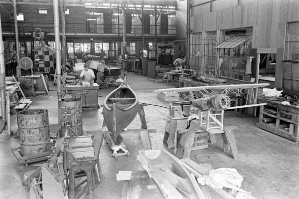
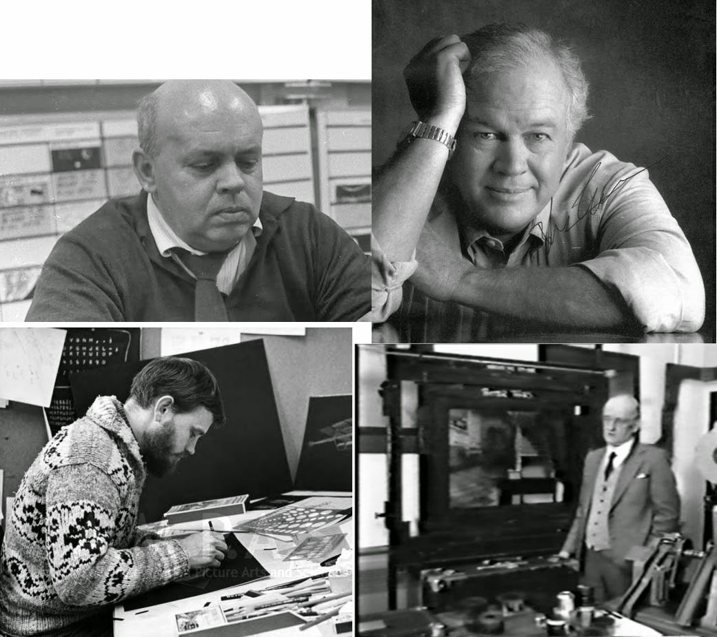
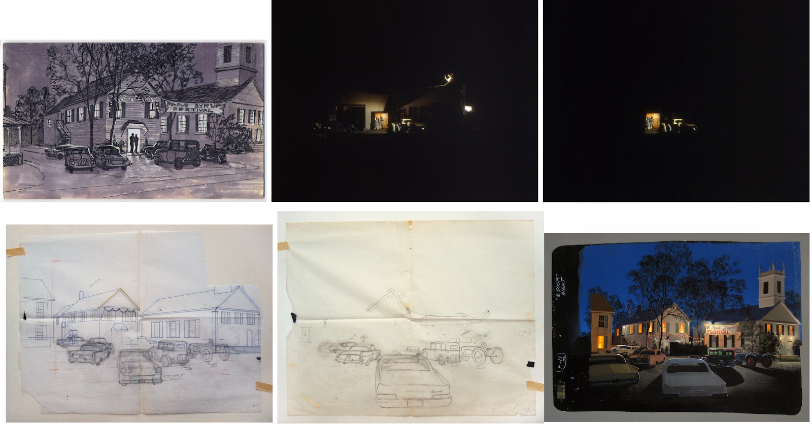
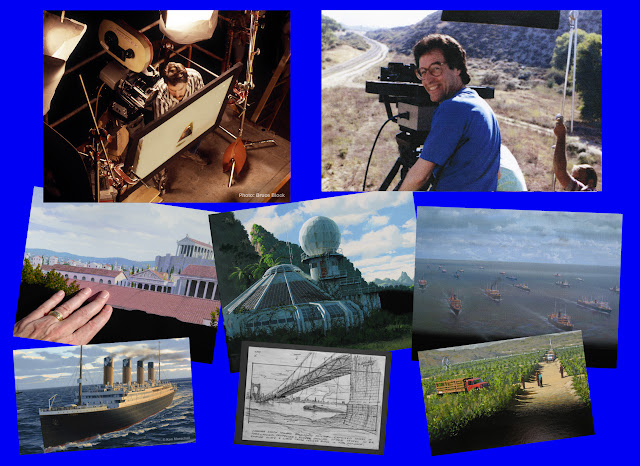
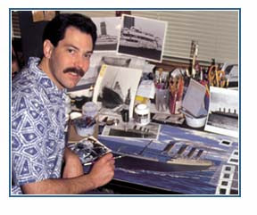
Bruce Block (left) on location in 1990 to shoot a plate for a matte in the film NOTHING BUT TROUBLE, and Ken Marschall with a glass painting done in 1987 for a Disney-MGM Orlando Tour demonstration film. Also shown here are some of the original matte paintings from WHAT’S LOVE GOT TO DO WITH IT, STAND BY ME and MOBSTERS.A COMPANY CALLED MATTE EFFECTS:
THE WORK OF
KEN MARSCHALL & BRUCE BLOCK
Part One
It probably wouldn’t be too much of an overstatement when referring to the illusionists featured in this edition of NZPete’s Matte Shot as two of the truly unsung heroes, as it were, of the latter period of the traditional hand painted matte shot era. Matte painter Ken Marschall and cameraman collaborator Bruce Block laboured quietly without publicity nor self promotion for nearly two decades producing a sizeable number of matte painted effects shots from the early 1980’s onward through to the end of what we might call the ‘photo-chemical era’on what would amount to a considerable catalogueof productions from James Cameron’s big breakthrough hit THE TERMINATOR, the Emmy Award winning effects shots for the highly regarded television miniseries THE WINDS OF WAR, the coming of age classic STAND BY ME and a number of genre movies such as FRIGHT NIGHT 2 and the deliriously wacky KILLER KLOWNS FROM OUTER SPACE among many others.
Ken and Bruce would operate quietly under the radar on scores of features and commercials – so far under the radar in fact that their anonymity extended beyond the average movie goer and would even slip by unknown to many within their own industry.
I’ve been wanting the opportunity to profile Ken and Bruce’s career for some time, and after an extended period of email exchanges I feel privileged, now that both gentlemen have some spare time, to be in a position to speak at length with Ken and Bruce about their respective careers and take an in depth look at the wonderfully invisible trick work the duo have been responsible for, often without screen credit and always without fanfare.
![]() Readers of this blog and fellow lovers of traditional matte work will be astounded with the caliber of the matte shots featured in this comprehensive career Q&A, of that I’m certain. As a researcher and matte historian myself I am all too frequently deflated by the lack of existing artwork, photographs, film clips and memorabilia still available from this once essential though now sadly lost artform. I can happily report that this is NOT the case with Ken and Bruce’s career. Ken has carefully retained allof his original matte paintings – with only a few exceptions where art may have been given to a director upon completion of the shoot. I am delighted that Ken has also kept the majority of the 35mm film clips, before and afters and layout drawings as well. There is literally so much material that as it stands, this article will be a two (or maybe three) part blog post – and even then not all of the projects can be covered. You will be impressed.
Readers of this blog and fellow lovers of traditional matte work will be astounded with the caliber of the matte shots featured in this comprehensive career Q&A, of that I’m certain. As a researcher and matte historian myself I am all too frequently deflated by the lack of existing artwork, photographs, film clips and memorabilia still available from this once essential though now sadly lost artform. I can happily report that this is NOT the case with Ken and Bruce’s career. Ken has carefully retained allof his original matte paintings – with only a few exceptions where art may have been given to a director upon completion of the shoot. I am delighted that Ken has also kept the majority of the 35mm film clips, before and afters and layout drawings as well. There is literally so much material that as it stands, this article will be a two (or maybe three) part blog post – and even then not all of the projects can be covered. You will be impressed.
![]() Most images in this blog are from Ken’s or Bruce’s personal collection. Others are credited on the picture. Scanned motion picture frames are from original film test clips in Ken’s and Bruce’s files, and although these may technically be the property of the various studios that commissioned the work, this blog is intended to be a respectful homage to these films, and we trust that their posting will be considered flattering. A few other images were found online and are seen so often, without credit, that they are assumed to be basically public domain and that no toes are being stepped on by including them here.
Most images in this blog are from Ken’s or Bruce’s personal collection. Others are credited on the picture. Scanned motion picture frames are from original film test clips in Ken’s and Bruce’s files, and although these may technically be the property of the various studios that commissioned the work, this blog is intended to be a respectful homage to these films, and we trust that their posting will be considered flattering. A few other images were found online and are seen so often, without credit, that they are assumed to be basically public domain and that no toes are being stepped on by including them here.I’d also like to extend my gratitude to Gene Warren jr. for his valuable and sincere contribution to this article.
----------------------------------------------------------------------
Q: I'd like to welcome you both and say that I appreciate your time and efforts in getting this career retrospective off the ground. Let’s start with you Ken. Tell us a little if you will about your background prior to entering the movie industry.
KM: Art isn’t something I kind of gravitated to as I matured. I was creating as far back as I can remember, whether it was building something with Lincoln Logs, cutting up cardboard to make an imaginary spaceship, drawing with crayons or colored pencils or of course painting. My mom used to tell the tale of how, at around the age of three or four (c. 1953-4) in our home in Whittier, California, I got into her supply of Jello and sprinkled the different colors in designs on the carpet like a sand painting. I was apparently just about to add water to the creation to deepen the colors when she appeared and stopped the fun. Although she stifled that particular creation, she was otherwise encouraging of my artistic inclinations and even got me oil paint-by-number sets as early as when I was in about second grade. I can still close my eyes and smell that paint in those little plastic tubs. By fourth or fifth grade I had my own set of “adult” oils in tubes and was painting on canvas boards. And I drew a lot. I had a particular fascination with trains, planes and ocean liners.
Q: It seems you were literally ‘born to paint’.
![]() KM: I have many other interests –– archeology, astronomy, architecture, photography, science in general –– but I’ve always fallen back on art as the mainstay. I have a perfectionist trait, so I naturally tend toward accuracy, detail and photorealism. My best friend as a child, Rick Parks, whom I met in second grade right after we moved to La Cañada, California, and who was a gifted artist, lived only a few blocks away, and we routinely painted, drew, built models and dreamed up various projects together. Constant creativity. While my brother busied himself playing ball, I had to be quietly creating something. I remember I loved relief maps and made several while in elementary school, carefully painting the various hues for mountains, deserts, ocean and so on. I recall making a diorama of a Viking ship in a cardboard box, with painted sea, wake and sky with clouds, done around third grade.
KM: I have many other interests –– archeology, astronomy, architecture, photography, science in general –– but I’ve always fallen back on art as the mainstay. I have a perfectionist trait, so I naturally tend toward accuracy, detail and photorealism. My best friend as a child, Rick Parks, whom I met in second grade right after we moved to La Cañada, California, and who was a gifted artist, lived only a few blocks away, and we routinely painted, drew, built models and dreamed up various projects together. Constant creativity. While my brother busied himself playing ball, I had to be quietly creating something. I remember I loved relief maps and made several while in elementary school, carefully painting the various hues for mountains, deserts, ocean and so on. I recall making a diorama of a Viking ship in a cardboard box, with painted sea, wake and sky with clouds, done around third grade.
As I matured in the “let it all hang out” ’60s, Rick tried to get me to loosen up and just splash paint on canvas in an abstract expressionist way, to paint what I “feel.” But it was nigh impossible, way too accidental, not nearly enough thoughtful deliberation for my liking. To this day, careless splashes of paint proudly shown off as profound, high art irk me. Sure, the colors might go well with a carpet or sofa, but aside from that they are a pretentious excuse for art. To me, art, at a minimum, must be conscious and requires at least a degree of intent. Throwing paint over your shoulder at a canvas and then rolling around in it is little more than a messy accident. And when accidents become art, when graffiti vandalism is celebrated as art and considered just as valid and worthy of analysis and praise as, say, a da Vinci, then anything can be art, and fine art loses any specialness. Without ugliness there can be no beauty. It’s highly insulting to the great masters to give any sort of equivalency to some of the careless modern art we see.
Q: As a lover of ‘traditional painting’ myself, I couldn’t agree more with that summation Ken.
KM: I recall a segment on Dateline or 20/20 not too long ago where a bunch of first graders were each given a canvas and asked to paint whatever they wanted. A selection of the resulting works was then put in expensive frames, and a phony gallery exhibit opening was advertised and staged in an upscale area of Manhattan. An actor pretended to be the artist, touted as New York’s newest undiscovered sensation, and Fifth Avenue prices were slapped on the pieces. Hidden cameras rolled as he mingled with the patrons and made up ridiculous stories about the profound inspiration behind each of the works. It was hilarious to see the public fawning over his “sensitive” brushstrokes, identifying with the deep meanings behind the “unique” paintings, how he had conveyed his angst so successfully. At least one connoisseur made an expensive purchase, eager to get in on the action before the artist’s prices climbed, the buyer later confessed.
It’s a sting I’d hoped for years to see, proving exactly my point –– that anyone can throw paint on a canvas and that so much of the art scene is pretentious silliness. Jackson Pollock himself admitted in an interview once that his work was “not to be taken too serious.”
Q: I can just see the self righteous pretense in that room dissolving and oozing out under the door as those ‘connoisseurs’ realized it’s game over.
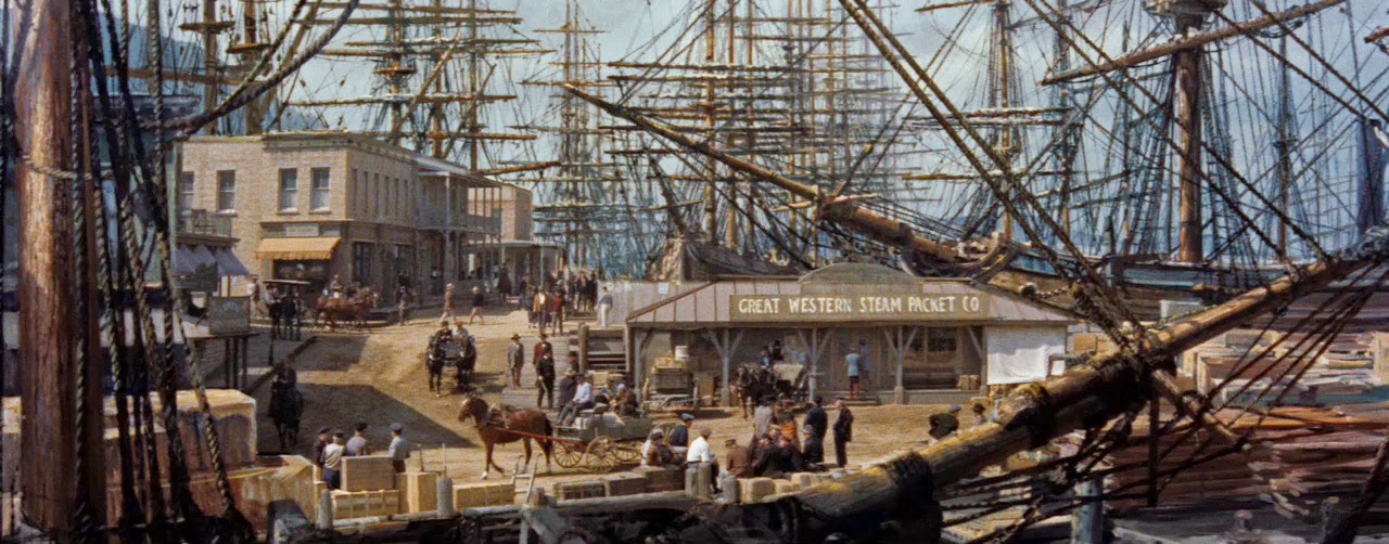
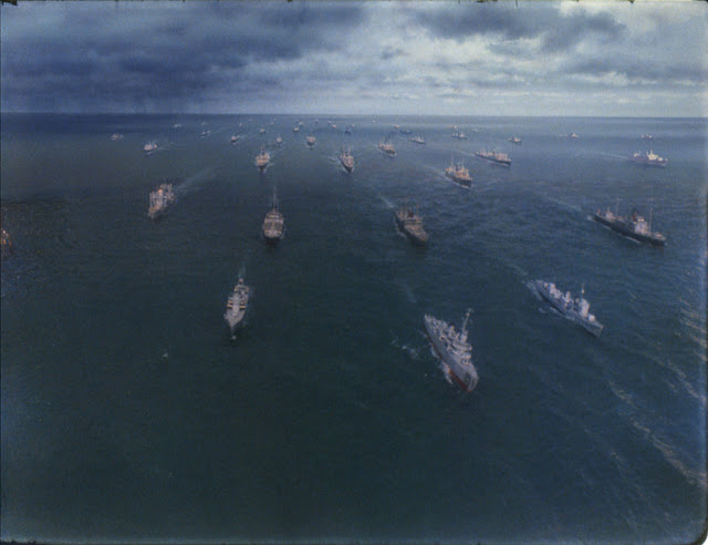
![]() |
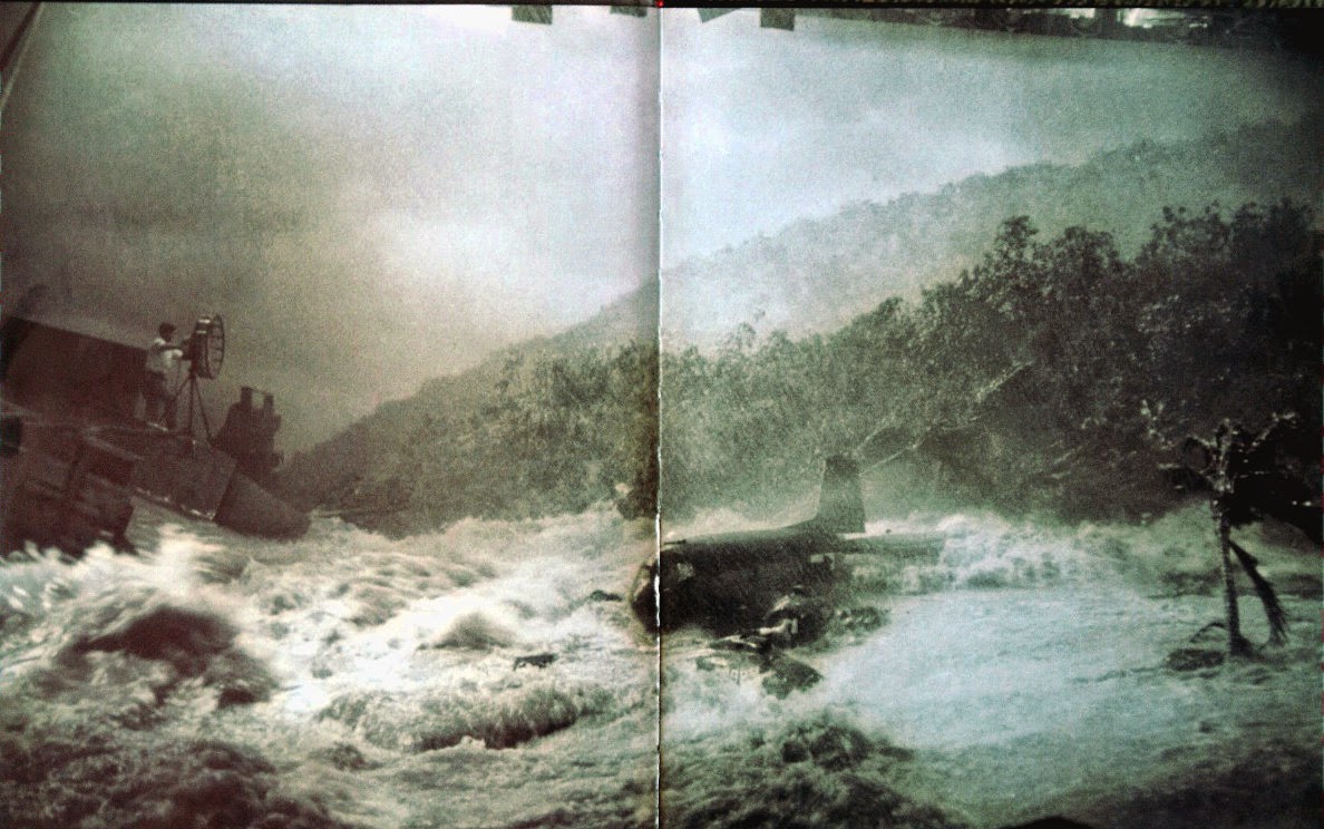
One of the effects scenes showing the large miniature used in 20th Century Fox’s 1953 classic TITANIC. It was visions like this one that pulled me into the magical world of special effects. |
KM: My art teacher at Pasadena High School, Rollie Younger, offered eye-opening lessons that have stayed with me through the decades. His mantra when teaching the more realistic drawing and painting was “Observation. Take in what you’re really seeing, not what you think you see. Get past your preconceived ideas. Is that shadow really just ‘grey’? Where’s the key light coming from? How about bounce light? What reflections do you see? Where are the vanishing points?”
My interest in photography grew, and soon a friend helped me disable the shutter mechanism in my old Brownie Starmite camera so that I could actually take time exposures. I was fascinated by this new-found ability and soon purchased a Pentax Spotmatic SLR camera, had my own darkroom and developed black-and-white film and prints. Later, I processed and printed color.
Q: Yes, a great deal of fun, but for me colour processing was a nightmare and I gave it up in despair. So Ken when did the realisation of ‘special effects’ or trick photography in motion pictures hit you.
.
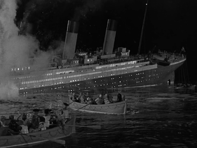
KM: I was always riveted by special effects in movies, creating what never existed or, even more interesting to me, re-creating what once was but is now lost. It was pure magic to me. How did they do that?! One effects movie unexpectedly set me off on a lifelong career path. Around 1965 I happened to catch the 20th Century Fox movie TITANIC on TV, the one with Barbara Stanwyck and Clifton Webb, and although I had heard of the ship before, the film stopped me in my tracks. It captivated me. The largest liner in the world, said to be unsinkable, on its maiden voyage, carrying the wealthy and influential of two continents on a mirror-flat ocean, glances against an iceberg one moonless night and vanishes in less than three hours with the most horrific loss of life of any peacetime sea disaster. It was the most evocative, gripping, incredible tale I could imagine, a story so audaciously amazing and unlikely that even at the tender age of 14 or 15 I doubted it could have really happened that way. Surely this was pure Hollywood.
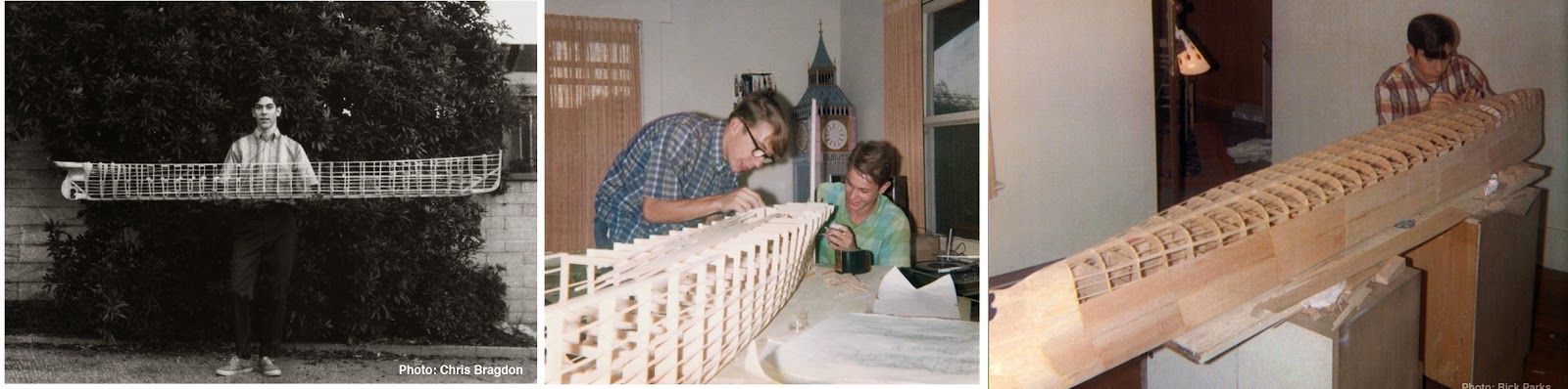
![]() I quickly got a copy of Walter Lord’s acclaimed book A Night to Remember, a minute-by-minute, you-are-there account of the disaster, and discovered that, in fact, the substance of the movie was no exaggeration. It was true history. With my passion for recreating what has been lost, a spark was ignited. My original, beat-up copy of that book, purchased at Vroman's bookstore in Pasadena in 1966, is shown at left. I felt compelled to build a large model of the ship. Along with a friend I’d met in junior high, Chris Bragdon, I embarked upon the balsa-wood model project, researching Titanic’s deck plans and appearance as best we thought we could using the local library. My old friend Rick occasionally helped, as well.
I quickly got a copy of Walter Lord’s acclaimed book A Night to Remember, a minute-by-minute, you-are-there account of the disaster, and discovered that, in fact, the substance of the movie was no exaggeration. It was true history. With my passion for recreating what has been lost, a spark was ignited. My original, beat-up copy of that book, purchased at Vroman's bookstore in Pasadena in 1966, is shown at left. I felt compelled to build a large model of the ship. Along with a friend I’d met in junior high, Chris Bragdon, I embarked upon the balsa-wood model project, researching Titanic’s deck plans and appearance as best we thought we could using the local library. My old friend Rick occasionally helped, as well.
![]() |
The first photo shows initial progress on an eight-foot balsa-wood model of Titanic built with two friends, Chris Bragdon and Rick Parks. The Polaroid was taken in the fall of 1967. Second image: Chris and Rick work on the stern upstairs in my room in December of that year. A partially completed model of Big Ben stands in the corner. In the last photo, shot in January 1968, I’m working on “plating” the overturned hull. |
I struck up a correspondence with Walter Lord himself who graciously engaged this inquisitive teenager with my endless questions, supplied information and further shipyard plans to assist us and who put me in touch with others of like mind. When the hull of our eight-foot-long model was nearly complete we discovered even more plans of the ship which showed that hopeless mistakes had been made in our model’s contours. Being that perfectionist, that was the end of that.
But hell, I thought, I can paint. Why not paintthe ship instead? I did a small 16 x 20-inch oil of Titanic at sea, steaming along happily in bright sunshine. Someone saw that and asked me to paint a much larger scene of the ship –– my very first commission. That was in 1969.
![]() |
Here I am, age 18, standing in my room next to my first Titanicpainting (in the frame), one evening in March 1969. Above it is a small proposal painting, or “maquette,” for my first commission. |
Before long, word was getting out that I could do decent paintings of the legendary liner. They appeared in various magazines, then in books, and I soon had a budding career bringing Titanic back to life with my brushes. A stickler for accuracy and detail, my research into the subject grew, and model kit companies asked me to help with technical advice on their projects.
Q: So, even at that young age you appear to have been the ‘go to guy’ on The Titanic. Where did this passion lead to next.
![]() |
| Albert Whitlock presenting one of his all day seminars, circa 1982. |
KM: In late 1975 or early ‘76 a friend and I learned of a course in motion picture special effects being offered at the University of Southern California (USC). We signed right up for the spring session. Each week guest lecturers spoke of a different aspect of the craft –– building miniatures, using hanging miniatures, stop-motion, scenic background/backdrop painting, makeup, prosthetics and appliances, breakaway “glass,” explosives and squibs, and of course matte painting, my favorite, which I believe was discussed over several sessions. I got to meet and speak with Al Whitlock and Bill Taylor, Harrison Ellenshaw, Matt Yuricich and L. B. Abbott (LOGAN’S RUN was in the final stages of post production), all of whose demo reels were astounding, utterly magical and jaw-dropping. The experience was unforgettable. And I thought, I could do this. I reallyshould do this.
Q: I’ve heard some marvelous accounts of those matte painter lectures and would dearly have loved to have been in a position myself to get my foot in the door. Whitlock’s seminars were always highly acclaimed.![]()
KM: During one of the matte painting demos a scene came along where a telephone pole or electrical wire could not be removed before an expensive shot was filmed, and had to be painted out later by the matte artist. It was mentioned, however, that new technology was being developed for the film industry that, just like with the Mars Viking lander, could one day pixelize film into tiny squares that could then be adjusted or blended using a computer, and such things as an unwanted pole, wire, or a “Roman” extra who forgot to remove his wristwatch could be easily stitched out using this process. The class gasped with a mixture of surprise and awe. What a miracle, and a revolution, that would be, we thought… to digitize film and make any changes you want!
In 1977, at the age of 26, I was hired by Director Stanley Kramer and Production Designer Bill Creber as the advisor on a gigantic 55-foot miniature of history’s most famous liner for the film project RAISE THE TITANIC, based on the best-selling book by Clive Cussler. Designed and constructed at CBS Studio Center in Studio City, California, this model would be “the largest Titanic since the Titanic,” as I proudly told anyone who would listen. (The one built for the 1953 film was about 28 feet.) ![]() It was my first hands-on foray into the film industry. I worked at the studio for six months, doing my best to be in several places at once, trying to make sure that no mistakes were made in the miniature that could be avoided. “We want to get this right,” Creber said, “so what Ken says goes –– within reason.” You can imagine how thrilled I was to be given that kind of authority and expecting that, finally, for once, a Titanicminiature would be built accurately (the ’53 one built by Fox left much to be desired). Most of the time I was tolerated by the set designers and construction crew, but of course I didn’t always get my way. And, because there was only one of me and I couldn’t be in several places at once, some minor mistakes were made. But generally I was quite proud and excited about the progress.
It was my first hands-on foray into the film industry. I worked at the studio for six months, doing my best to be in several places at once, trying to make sure that no mistakes were made in the miniature that could be avoided. “We want to get this right,” Creber said, “so what Ken says goes –– within reason.” You can imagine how thrilled I was to be given that kind of authority and expecting that, finally, for once, a Titanicminiature would be built accurately (the ’53 one built by Fox left much to be desired). Most of the time I was tolerated by the set designers and construction crew, but of course I didn’t always get my way. And, because there was only one of me and I couldn’t be in several places at once, some minor mistakes were made. But generally I was quite proud and excited about the progress. ![]() |
Posing next to the bow of the 55-foot miniature being constructed for the movie RAISE THE TITANIC in the fall of 1977. Some wag has affixed a champagne bottle to the prow. |
Creber told me to try my hand at storyboarding the prologue of the film. When I presented my sketches to him, he actually liked them. I thought he was just being kind to a young kid, but he surprised me with his sincerity. “No, I’m serious,” he said. “This is good. I’m gonna use this.” In the end, though, the screenplay went through several rewrites and the entire original prologue went away.
![]() |
I took a bunch of photographs of the nearly finished miniatures on March 10, 1978, my last day on the job showing the scale of the 55-foot hero model and close views of the Boat Deck with some details yet to be painted. In the distance are several U.S. Navy vessels. |
Stanley Kramer left the project when the model was about half completed after Lord Lew Grade refused his entreaties to increase the film’s budget. He told Grade that he simply couldn’t do justice to such an epic tale for $7.5 million (if I recall the figure), with all the effects his team envisioned and the story demanded. Grade told him that was fine, he’d find another director. After Kramer departed, crew was let go, group by group, person by person, as production slowed. A core bunch of us working on the huge miniature (and other models of U.S. Navy vessels in the same scale) were kept until the final shutdown happened in earnest. On March 10, 1978, I took one last set of color photos and then said goodbye to my baby, which was nearly finished. I had been told that of course I would be rehired just as soon as a new director had signed on and production resumed.
![]() |
Production Designer Bill Creber and I during the model construction phase of RAISE THE TITANIC, fall 1977. He's vamping for the camera, pointing out some water detail in a slide showing miniature work from THE POSEIDON ADVENTURE, a film on which he had also served as production designer.
|
The promised call never came. Jerry Jameson would be the new director, and the model was completed by a crew apparently unfamiliar with the ship. When the film premiered in 1980 I was stunned and disappointed to not see my name anywhere in the credits, while someone else, and his organizations, were given the plaudits for the research and technical advice –– with no less than three lines of credit. Ah, welcome to Hollywood.
Q: Hollywood……Some things never change.
![]() |
One of my very first assignments at Graphic was to paint a background aerial view showing the clouds of Venus and a spacecraft on a cel, which would be animated frame by frame by Ray Bloss working the animation stand and camera. The photo at right shows Ray shooting another scene with the camera, a still shot of the Jet Propulsion Laboratory (JPL). |
KM: This didn’t dissuade me, though, from wanting to work in the film industry, in the art field. In early 1979 a friend of a friend directed me toward a small studio called Graphic Films Corporation, in Hollywood, an intimate operation that produced photo-real animation and model shots for science documentaries, mostly NASA and the Jet Propulsion Lab. The potential existed for matte work down the line, so I eagerly prepared a small portfolio. Bruce worked there, and that’s when our paths came together. He was the one who interviewed me. My long interest in astronomy, space, science and art made it the ideal fit. Apparently Les Novros and George Casey, the bosses at Graphic, felt likewise, because in April I was hired. It was a fortunate synchronicity. I had shown up on their doorstep at exactly the right moment; their chief artist, Don Moore, had recently left suddenly, and the company was in somewhat of a lurch.
Q: Oh that’s very interesting Ken. I’ve recently put out an extensive blog on 2001: A SPACE ODYSSEY where Graphic Films methodology and expertise played a major role in the success of the Kubrick picture.
KM: Yes, that was a marvelous blog, just wonderful. I loved it. Anyway, I was immediately put to work painting backgrounds and animation cels of planets and galaxies that would be filmed on an old-fashioned Bowles-Acme animation crane, building Styrofoam models of asteroids and lunar landscapes, miniature spacecraft and so forth. My mentor there was J. Gordon Legg, approaching age 70, who had been an animator and art director with Disney decades before. He told me how he did light glows and shadows in SNOW WHITE and worked on FANTASIA. I learned a lot from him. He taught me the airbrush, something I knew I would have to learn, but being non-mechanical and non-technical, I feared would be a great struggle. But Gordon was a good teacher, and in one day I had it basically mastered.
![]() |
Graphic already had one very large oblate sphere model of Jupiter when I was hired, but they wanted one at a smaller scale that was easier to handle for certain applications. So I was put to work on a much smaller model airbrushing the planet’s distinctive cloud patterns, referencing the latest Voyagerimagery that had just arrived. We had a direct pipeline to JPL where Voyagerwas being controlled, and it was always very exciting to see the breathtaking, high-resolution prints being delivered fresh from JPL’s lab, often before they appeared in the media. |
![]() |
One of the Jupiter models with a foreground moon model built up of Styrofoam and modeling paste.
|
![]() |
Airbrushing a large view of Saturn at the plane of the rings. |
![]() |
This shows the scale of the painting. Gordon sits at his desk in the background at an original Disney animation desk, one of several in use at Graphic Films. A former Disney employee going way back, he always wore a sport coat to work. |
![]() |
Painting a galaxy which will be very subtly rotated during photography. |
![]() |
I don’t remember any details, but somehow Graphic must have been bidding on effects work in 1981 for the TV movie GOLIATH AWAITS. Here’s a very early matte proposal I created to show how a relatively simple foreground could be turned into an impressive scene inside the sunken but somehow still-airtight liner, illuminated in an eerie phosphorescent green. This may have been the very first matte-painting-related thing I did at the company. (I don’t believe my matte idea went anywhere; I didn’t produce a finished painting, I know that.) |
![]() |
Another Saturn painting on a cel, to be animated, this one quite small. I recall the planet itself being no more than about two inches across. |
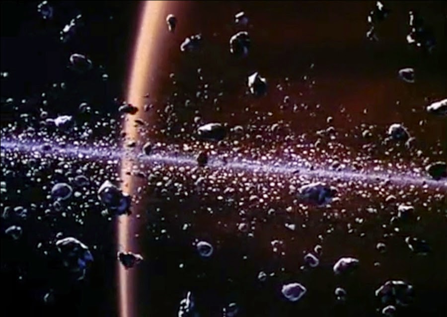
![]() |
For the trailer for the movie SATURN 3 I did yet another background painting, then we set up several sheets of glass in front of the artwork and glued little chunks of Styrofoam to them. The pane of glass closest to the camera had the largest chunks, and vice versa. Then we filmed, at a very tiny aperture, bright light and long exposures to keep all the planes and planet in focus, moving each glass pane at a different speed to simulate the vast depth of the ring particles. This scene, or another very similar that we did, was so convincing that it is still occasionally used in documentaries all these years later. |
![]() |
For another sequence in the SATURN 3 trailer Gordon and I created a foreground moon landscape and then, with the camera locked down, photographed it in three or four stages of fading backlight. Here’s Gordon standing next to our light which is blocked by a flag. |
![]() |
I painted a background of the planet and various animation cels showing stages of the Sun being occulted by the planet, all of which appeared behind the slowly cross-dissolved sequential photographs of the moon miniature as it faded into darkness. Saturn’s clouds were even made to move, giving the sense that the planet was very slowly rotating. |
![]() |
For the Omnimax film TOMORROW IN SPACE, produced by Graphic Films in 1982, I painted a large Earth background for various scenes in which miniature spacecraft hovered in the foreground. |
![]() |
I did a lot of storyboarding for the film, as did Gordon. |
![]() |
My mini Space Shuttle, a new technical phenomenon at the time, and painting a spacecraft miniature. |
![]() |
Gordon and I built, from scratch, an extravehicular mobility unit (EVU) prop for the film. Or maybe I did the whole thing myself. I can’t remember. |
![]() |
Various moonscapes and asteroids were needed, built from Styrofoam and modeling paste. I’m stunned when I look at some of these snapshots today, all these years later. We made some pretty cool and very realistic models. |
![]() One of the things I did during my first year at Graphic was create an Earth model for STAR TREK: THE MOTION PICTURE. It’s seen briefly on the Enterprise’s huge monitor about two-thirds or three-quarters into the movie. I had been a huge STAR TREK buff in the ‘60s, so to have contributed anything at all to the movie was beyond thrilling.
One of the things I did during my first year at Graphic was create an Earth model for STAR TREK: THE MOTION PICTURE. It’s seen briefly on the Enterprise’s huge monitor about two-thirds or three-quarters into the movie. I had been a huge STAR TREK buff in the ‘60s, so to have contributed anything at all to the movie was beyond thrilling.![]() |
Airbrushing the Earth globe for STAR TREK: THE MOTION PICTURE, and a shot I took of the finished model against a black background (not the scene in the movie). |
Q: So, how long did you stay with Graphic Films.
KM: I was with Graphic for four and a half years, and it was while Bruce and I were still there, in 1981 to be exact, that we began quietly practicing our own matte work on the side and assembling a demo reel. The next year we founded Matte Effects and had business cards printed up. We wanted to stay on the down-low, so the bosses at Graphic didn’t even know.
![]() |
|
![]() |
For our demo reel I wanted to do an imagined scene where a guy (me) climbs down the side of a mountain toward the camera, turning to look back up at the ancient stone ruin atop the hill. My interest in archeology prompted this one. |
![]() |
| Double-exposed cloud highlights, catching the setting sun, were painted on a separate piece of black card and moved laterally an inch or so during the shot. Rather silly, unrealistic cloud highlights, looking at it now, decades later. Cringe. |
![]() |
To demonstrate a great height we shot Sean Phillips, fellow Graphic employee, in an interior side office within Graphic’s shooting stage while I pretended to stand on a narrow ledge. Bruce undercranked the camera to allow enough exposure in the dark room, and Sean and I tried move at a slower speed to compensate. We flickered the backlit distant lights of the Hollywood Hills with a moiré and made the red beacon atop the tower go on and off. |
![]() |
Sean’s VW Beetle was used for this one. We just spread a couple of bricks and grey dust around on the asphalt, and I painted the rest. For the scene, Bruce and I stood around, gesturing, feigning rage and frustration at the careless accident. |
![]()
![]() |
At USC we found a good location and had some more fun. Bruce walks out the door toward the camera, ending by leaning on the stone balustrade. He had to be careful to walk a straight line yet appear casual, or he’d go behind the matte. |
![]() |
A USC library was used for this demo. The scene starts at the distant door where Bruce comes running through the room carrying a stack of books and bumps into Sean, knocking him down and spilling the books to the floor. He then runs past the camera as Sean stands back up and we survey the damage, wondering who the hell that was. |
![]() |
There’s a church near the University, and we decided to shoot a matte scene where Bruce is pacing around in front, at the foot of the steps, and I come out the door and down the steps to meet him. In preparing this blog I searched every possible nook and cranny for original paintings, and while I found most of them, only my very first demo painting turned up. So, unfortunately, I haven’t been able to include photos of the artwork themselves. |
![]() |
Once we felt we had an impressive demo reel to show around, we had business cards and stationery printed. Bruce handled all the business end of things, and, in the end, I’m not sure I ever had occasion to hand out a single card. I still have the box-full of them. |
Q: And how about you Bruce, what was your background and how did film work come about.
BB: My original background was in theatre and photography. I had worked off Broadway and in regional theatre as a director and designer. I had also worked as a freelance photographer in advertising. I started working part time at Graphic Films Corp. in 1973. Graphic Films had a long history of making films for museums, the US Air Force, NASA and the Jet Propulsion Laboratory (JPL) in Pasadena, CA. Stanley Kubrick had done some initial planning on 2001 with Graphic Films and it was there that Kubrick stole Doug Trumbull, Colin Cantwell and Con Pederson to help make 2001 in England. John Dykstra had also worked at Graphic Films prior to my arrival.
Graphic Films was a wonderful little company. The entire staff was less than a dozen people. When I arrived, most of the photography was done by an excellent documentary cameraman named James Connor. The animation stand was run by Ray Bloss who had worked at Warner Bros. for decades shooting Looney Tunes cartoons (Bugs Bunny, Daffy Duck, Porky Pig, etc.).
Q: So, somewhere around this time did you manage to attend one of those visual effects seminars that Ken discussed.
BB: I had seen Al Whitlock’s lectures and demonstrations. I thought his work was astonishing and tried to interest Graphic Films in trying to do our own. Graphic Films had one in-house artist, a background painter named Don Moore. Don was extremely skilled but wasn’t really interested in doing matte paintings. Eventually, Don left Graphic Films to do backgrounds for animated feature films.
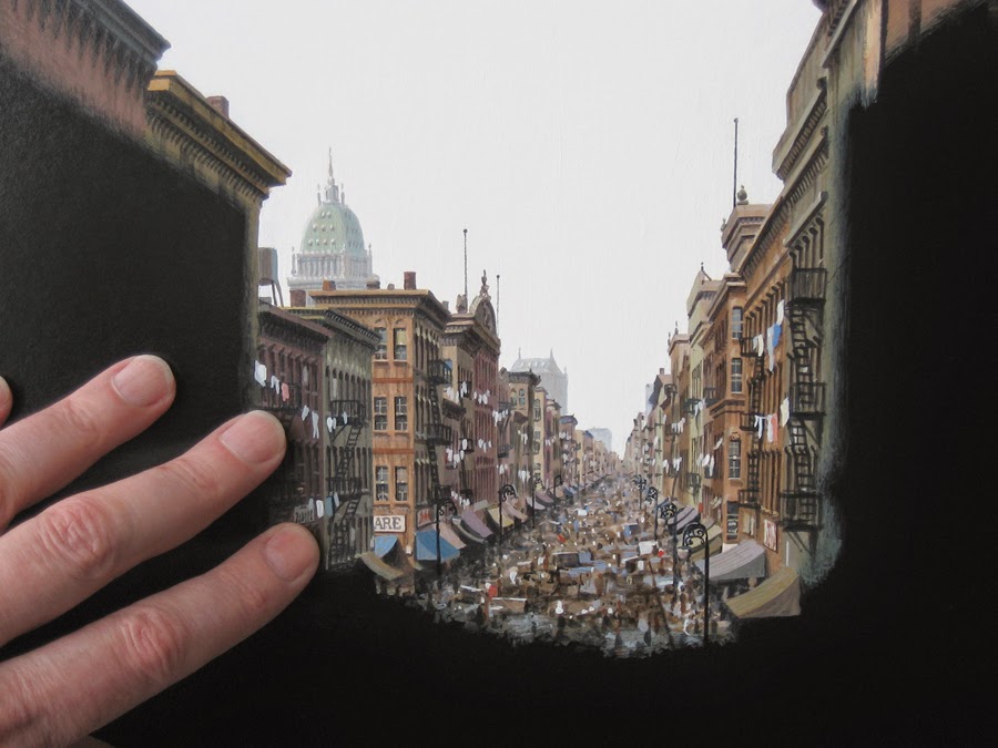
At the time, Graphic Films was doing some visual effects for Columbia Pictures Television. I was directing and supervising the effects. One of the post-production assistants at Columbia mentioned that a friend of hers was a ‘good artist and was looking for work in film.’ This friend turned out to be Ken. He came for an interview and I gave him the same assignment we had given all the interviewing candidates: Take a photo of an interesting location in Los Angeles and then, like a matte painting, change the photo’s location into something else. Usually the candidate never returned or submitted mediocre work. Ken returned in a week with a large photo of Main Street at Disneyland which he had extended into a full 1900 St. Louis downtown. It was impressive, and he got the job. That’s how we met. Then we started testing original-negativematte painting shots. It took us two years to really understand the technique.
![]() |
My Disneyland matte demo, simply three 8x10-inch prints of a photograph I took circa 1970, painting a black matte over one of them and adding the city background over another. I did the example in early 1979 to show Bruce what I could do. |
Q: So, a question I pose to all of my interviewees – what triggered the initial ‘trick photography’ bug or visual effects interest, and was there any particular film perhaps that you may have seen at an earlier time in your lives that may have formed an indelible impression upon you and set that career path.
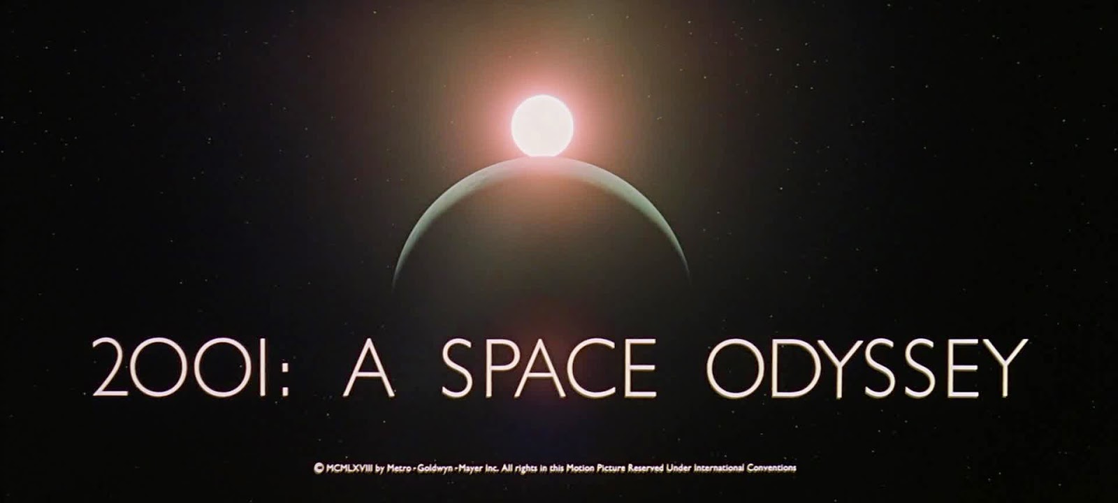
KM: A giant flying saucer landing on the Mall in Washington, D.C., in THE DAY THE EARTH STOOD STILL. Fantastic visions of a dreamlike land in THE WIZARD OF OZ. An alien world and futuristic underground structures in FORBIDDEN PLANET. DESTINATION MOON, THIS ISLAND EARTH, WHEN WORLDS COLLIDE, THE TEN COMMANDMENTS, THE TIME MACHINE, among others, all held me spellbound with their amazing visual effects. Even the original GODZILLA (the American release), relatively simple as it was, had me nearly lying awake nights with its terrifying visions. Effects reached a then pinnacle of realism with 2001: A SPACE ODYSSEY, a film that played continuously in all its sweeping “Cinerama” glory at the Pacific Warner Theater in Hollywood for what must have been close to two years, as I remember. I went to experience it –– savor it –– nine times there, if I recall my count.
I remember fondly the thrill I always felt sitting in the best seat in the house, every time, when the curtains parted and that deep rumble of Richard Strauss’s Also Sprach Zarathustra began… and the hairs stood up on my arms. They still do. The epic movie profoundly influenced my fascination with visual effects.
![]()
One of the many slides I took, along with friend Chris Bragdon, of SPACE ODYSSEY projected on the vast screen of the Pacific Warner Theater in 1968, in an age long before home video, DVDs or Blu-ray. Chris and I both brought similar SLR cameras with us that we had rented after a search for ones with the quietest shutters. Our diligence paid off because no one ever complained about our cameras. Most of our shots were of the breathtaking effects scenes, but I include this brighter one to show all the heads in the foreground to better advantage. It’s a moment captured in time, when the film was in its first-run heyday and playing to large audiences. (I was cleaning house recently and came thisclose to tossing all these ancient slides. Then I thought, nah... I just can’t do it. Call me a hoarder.) I believe we used Ektachrome 160, and I remember that 1/8 second gave us the best exposure (at f/2, stopped down two stops from wide open to increase sharpness a bit). Obviously we had to sit back in our seats and hold the cameras quite still, but it worked. About 80% of the shots were steady and sharp. As you can imagine, walking out of the theater we felt like we’d defied the gods and escaped with priceless booty!
BB: There was not one specific moment when I decided I liked visual effects. I can’t remember a time when I wasn’t interested in it. As a child I was fascinated with magic tricks, photography and puppetry. I was playing around with special effects from an early age. As soon as I discovered the visual manipulation you could do in a darkroom, I was hooked. I liked watching special effects in movies and figuring out how they were done. As a teenager I always read the credits on movies and TV shows…people I had never met and didn’t really understand what they did. To this day I remember the names. I worked with many of these ‘names’ when I got to Hollywood. I grew up in the Midwest so I had no direct exposure to any kind of filmmaking. I’d see a visual effect on TV or in a movie and go home, experiment and try to figure out how I could do the same thing. A friend and I made Super 8 movies and we’d build miniatures that we’d blow up with homemade pyro effects (so dangerous and I can’t believe we never had an accident). I would make hi-con mattes in my darkroom and composite stills to make scenes that didn’t exist in real life. I played around with in-camera double exposures, developed my own film, etc. In high school I built an animation stand for photographing cell animation. It had a double column vertical track camera mount, a glass platen and polarized lights. My high school films were very elaborate. I had a used Bolex camera and I exploited every feature on it. I always liked everything about the theatre, photography and movies.
Q: What matte shot shows made by other technicians do you especially admire and inspired you once you were involved in the industry yourselves.
KM: Although other matte artists produced some wonderful work, Al Whitlock in particular had me with his stunningly believable skies in THE HINDENBURG, realistic cityscapes inTHE STING,and so many other films. These movies came out long before I was doing mattes myself, but Whitlock’s work stuck with me and influenced me most of all. It was his innate understanding of light and atmosphere, his penchant for evocative backlit scenes, sweeping dramatic vistas that were completely convincing. While others often painted pretty scenes that looked like Christmas cards, Whitlock seemed to effortlessly resist the natural human tendency toward patterns and order and be able to create scenes that were marvelously casual and accidental, not painterly at all, looking utterly real on screen.
Once I was actually working in the field I can’t really say I had a contemporary favorite. I always harked back to seeing Whitlock’s magical demo reel and strived to even remotely approach his level of excellence.
Q: There was a significant boost in matte painting talent in the early 1980’s, with the generation that included people like Mike Pangrazio, Syd Dutton, Mark Sullivan, Paul Lasaine, Frank Ordaz and Chris Evans.
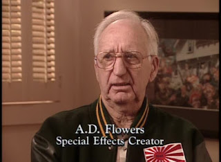
BB: Like so many other newcomers to visual effects, it was Al Whitlock’s demo reel that knocked me out. Whitlock’s methods were such a simple technique. I had met many old timers in effects like A.D. Flowers and Bob Mattey. I apprenticed with a couple of them and liked physical effects, but I found effects photography and matte painting far more interesting. As it turned out, I didn’t have the patience or precision for optical printer work, but matte painting and photography fit my interests perfectly.
Q: Correct me if I’m wrong here, but I’ve always been of the opinion that a great matte shot is as much the contribution of the effects cameraman as it is the matte painter (and no, Bruce isn’t paying me to say that). Bad matte photography and compositing can kill potentially the best matte painting. I’m thinking of the old 1960 THE TIME MACHINE as a prime example where the matte art was just murdered by terrible, magic marker, big black matte lines that really were inexcusable. The science was far enough advanced by that time so there really was no excuse… and it received the FX Oscar to boot! Still a great film though.
KM: There were some unfortunate matted scenes in that film. Although a huge favorite of mine at the time, I look at it now, see how dated it is and think of what fantastic sequences could be done today. When I first heard years ago that a remake was in the offing I was so excited, thinking that surely all the stops would be pulled out and we’d see years and millennia whirring by with jaw-dropping, realistic CGI. Alas, there was far, far too little of this in the remake. Quite a missed opportunity and disappointment to me in that regard. And although Alan Young made an appearance, neither Rod Taylor nor Yvette Mimieux had even a brief cameo. I was so hoping to see them in the remake. I hope they were at least invited.
Bruce was a great matte cameraman who knew what he was doing. There were times when I wasn’t there on location to personally apply the black camera tape to the glass in the matte box or position black flags (fabric shields) in just the right spot, and Bruce did so perfectly, understanding exactly what I would need and not need in the shot. Soft matte lines were obviously created closer to the lens while for a harder edge we’d sometimes use a flag, shaded so as to make it as dark as possible.
![]() |
The following three captions were written by Bruce:
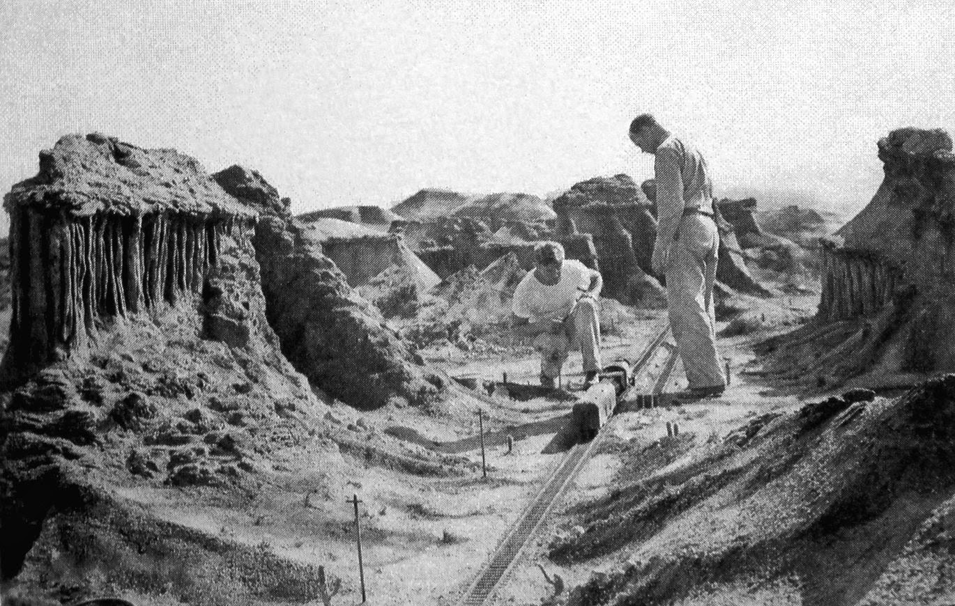
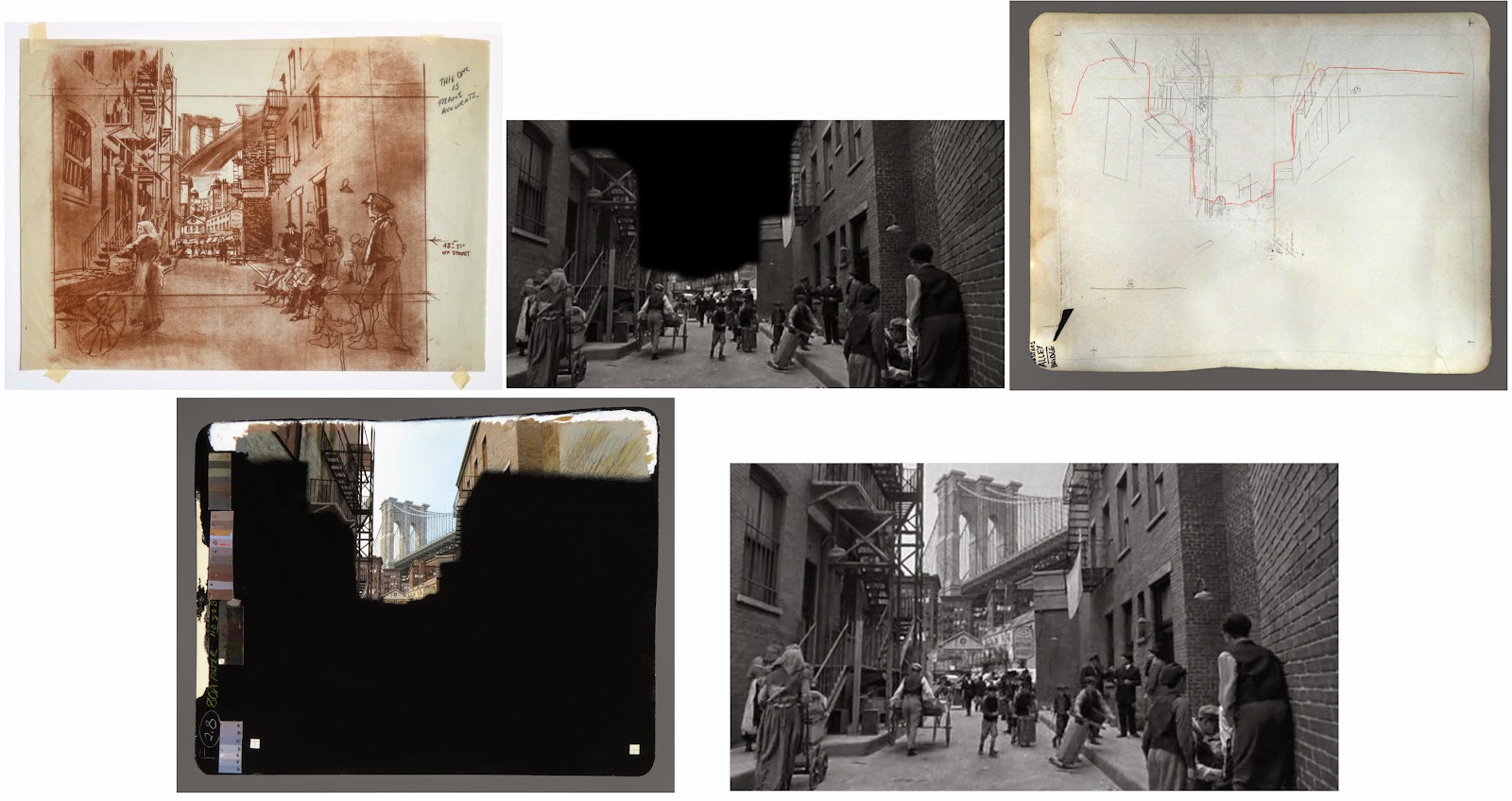
Occasionally, but rarely, I was unable to go on a distant location for original negative matte photography. My first choice for a substitute was John Huneck, a very talented cameraman and special effects jack-of-all-trades. John and Ken went to Rhyolite, Nevada, and photographed some of the second unit, original-negative matte shots for the movie CHERRY 2000. I wrote these instructions as reminders for John who always did a great job. |
![]() |
This specific list of step-by-step camera instructions reveals precisely what had to happen during photography of an original negative matte. Even with instructions like this, changing day exterior lighting conditions or temperamental directors often forced me into running extra test footage between takes so Ken could have additional test footage to match changing lighting or weather conditions. Original-negative matte photography required cooperation from all key crew members. |
![]() |
A few years after we started our company, we had so much work that systematic organizing was necessary for keeping accurate technical records. So I designed and had printed an original-negative camera report that allowed me to keep track of everything I was doing during original photography. I would often be working alone, and it was critical that every step of the photography process was carefully recorded for reference. (The report is considerably longer than in the cropped photo above.) |
In the matte room Bruce was just as attentive when it came to the rock-steadiness of the camera and the perfect repeatability of the alignment of the painting, which was portable. We used old-fashioned animation peg bars, punching a piece of heavy, coated paper card stock (later Mylar) to fit securely over the pegs. The paintings, which were done on that heavy card stock, were taped to those punched pieces and then hung in front of the matte camera.
If there was any misalignment of the matte in the test footage, I would usually just fix the painting. But once or twice there was such an inexplicable misalignment that I plotted exactly how much to re-peg it and then untaped the piece with the alignment holes and repositioned it.
Bruce also set up the two lights, polarized them, and had a clever voltage dial so that color temperature could be adjusted. He can better explain all of this than I.
BB: Again, one of the most impressive aspects of Whitlock’s work (or any original-negative matte painter) was the simplicity. No optical printer, no generation loss, no special, complex machinery, etc… it was all fascinating to me. You really only needed a pin-registered camera, some lights and a great painter who understood color, perspective and film…and that was Ken. When we started making original-negative matte painting tests, we used a borrowed rack-over Mitchell NC camera. We’d go out on a weekend and film two or three scenes, then mount the same camera on a very makeshift stand and, over the next few months, film the test paintings.
Once we left Graphic Films and started Matte Effects, we bought our own Mitchell camera from Armstead’s, a wonderful old camera rental house in Hollywood (they had the camera that filmed CITIZEN KANE). Our first matte painting photography stand was set up in my garage. I met Gene Warren in about 1980, and a few years later he invited us to work at his facility, Fantasy II Film Effects, in Burbank. We had our matte photography room there until we closed in 2000.
Q: I’ll admit Ken and Bruce to really not knowing a lot about you both nor your work in any substance until a wonderful and revealing conversation I had in an online matte painting forum some years back with fellow matte artist Rick Rische where the proverbial ‘shutters’ were opened to shine a great deal of light upon the extent of your contributions in the field of matte work, a great deal of which I was unforgivably ignorant of till then. Among other things, Rick very generously described looking through and examining your filed away matte paintings from many productions when he worked with you for a period at Matte Effects, and being utterly blown away to say the least.
KM: That was kind of him to say. We did keep a low profile. From the beginning Bruce and I wanted a comfortable amount of work, not to be overwhelmed, have to hire others and complicate our lives. We looked at it as a sort of professional hobby, I think. We wanted it to stay fun and interesting, not for it to become a burden, an obligation that we resented.
Q: We’ve touched upon it butcan you tell us more about the company you both set up, Matte Effects.
BB: When Ken and I felt comfortable that our matte painting tests were good enough and we had a small but competent demo reel, we opened Matte Effects. By design, Matte Effects was an almost unknown company. We got all of our work, and it was constant for 20 years, through word of mouth and Fantasy II. Gene Warren gave us space at Fantasy II and we became his in-house matte painting department. Based on our desire to “keep it simple,”Matte Effects only had two full-time employees: Ken and myself. Matte Effects never advertised and didn’t even have its own phone number. Our stationery and invoices listed a post office box, not a street address, and the phone number was my home phone. We just did our work, and the studios would call us back again and again. We never wanted to accept more work than we could handle and we had a great time. On a very few occasions, when deadlines were changed, we did have to hire an additional artist like Rick Rische.
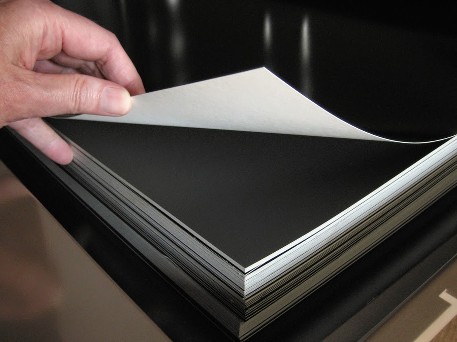
Q: Rick described in detail your set up at Gene Warren’s Fantasy II studio right down to the minutiae of the specially prepared art board you would import from Europe for your matte paintings and so forth. I was surprised to learn that you always painted on board, rather than glass, and, as Rick told me, these painted mattes were comparatively small in dimensions where other practitioners painted much larger mattes. I believe you prefer to paint small.
KM: I much prefer a more manageable, convenient size, something that will fit on my table in front of me. I paint flat, always have. This was dictated by the amount of reference material I usually had scattered all around, often laying right on the painting for ease of access. I didn’t want to have to turn away from a vertical easel and step to the side to consult a reference photo. In fact, I often painted through a “hole” in my reference material. I also kept my water and palette (usually an old pie tin or a piece of illustration board) right next to and sometimes on the painting, too. I have a couple of old photos showing me at work on early mattes back in the ‘80s, and you can see the small scale. On average, unless they were for VistaVision, the paintings themselves are only about 18 x 22 inches, with the unpainted borders extending a bit farther around the perimeter, to about 20 x 27 inches.
![]() |
A crooked shot of me working on one of the HANKY PANKY mattes on my dining room table, 1982, giving a sense of the small scale I’m comfortable with. |
People are surprised, but I don’t know why. Classic movie mattes were often astonishingly small back in the old days. I’ve never understood the lumbering size that so many matte artists seemed to prefer in the ‘70s and ‘80s, and I always had to laugh at the photos of them diligently at work, invariably showing them using long brushes, held nearly at the top of their handles! I could never paint like that. I guess this is why their paintings had to be so huge; they couldn’t exert a lot of fine brush control with their hands 10 inches from the painting.
![]() |
Matt Yuricich and Al Whitlock in the typical pose of so many matte artists, painting upright on a huge board or glass and using a long brush held at the very end. |
![]() |
I couldn’t possibly paint like most matte artists did, at least as they posed for photographers. I paint flat (on a desk), small, and use small brushes, held close to the tip. The Brooklyn Bridge matte is for MOBSTERS, painted in 1991. |
![]() |
The card stock we always used, perfect for the purpose. |
I painted compactly, and only on glass a couple of times, for several reasons: I’m comfortable working small and tight, always been a “detail person;” the substrate that we used was a heavy card stock, manufactured white on one side and a fairly glossy, deep black on the other, so it made for the perfect, ready-made “matte” area of a painting; and our routine of driving and meeting halfway between our homes to exchange paintings for the latest test footage (we live about 20 miles apart) demanded easily transportable artwork. Glass would have been a heavy, arduous, risky headache. We made large carrying sleeves to transport the mattes around. It worked great.
The card stock that we used came in sheets 23 x 35 inches. I still have a file drawer full of the stuff. In the early ‘80s, when we started, its black surface was really good, with a certain finish to it. Around 1990 the company that made it discontinued their earlier process and started using a different black surface that we found slightly less advantageous. But we made it work.
Q: I’m astounded at how little you and Bruce actually needed in order to make a convincing matte shot. The most basic of materials and a somewhat unconventional work space - not at all what I had expected to see as your painting studio.
KM: Sifting through the old paintings now, I’m surprised by how wonky and carelessly trimmed the cards’ edges are, with little concern for perfect right angles or anything. But as long as it was outside the painted area, it didn’t matter, so when starting a painting I’d just cut the cards quickly and loosely. I learned in the beginning to round off the corners so that they were easier to slide in and out of the large carrying sleeves.
If I had commuted all the way to Burbank and painted in or near our matte photography room at Fantasy II, I could have used glass, of course, but I can’t imagine the point. Just the risk of someone accidentally hitting and breaking it would scare me away from the notion. There was no need or reason whatever for it. With the camera lights polarized, we achieved perfectly dark blacks. The few times I painted on glass, I think, were for a Toyota commercial (shot at Fantasy II, if I recall) and another replicating an iconic scene from THE WIZARD OF OZ (shot at Culver Studios) for a Disney-MGM Studios Orlando Tour effects demonstration filmwhere the setups called for old-fashioned glass shots. But I much preferred to work at home in my studio and not under the gun on a stage, or worse –– outside with the lighting changing by the minute.
![]() |
Glass painting done for Disney-MGM Studios Tour in Orlando, Florida, shot at Culver Studios, Culver City, California, August 1987. I painted the scene at home but did some touchups around the matte line before shooting. |
Q: The resolution holds up extremely well, even on BluRay HD format on a 55 inch LCD screen. Your paintings seem very detailed from what I’ve seen. I was always surprised at how much artists like Whitlock, Cosgrove, Maley and Ellenshaw could get away with in the final scene when I’ve seen their often very loose and impressionistic matte art, quite broadly painted yet maintaining a level of believability often more so than tight, finely rendered pieces. The classic DUEL IN THE SUN made in 1947 has amazingly loose, almost carefree brushwork by Jack Cosgrove, yet the Technicolor mattes look tremendous on screen and are among my favourites.
KM: That looseness in so many matte paintings has always astonished me, as well, and I envy artists that ability. But then, of course, their paintings are usually twice or three times the size of mine. At the scale I painted I just couldn’t afford to slop paint on with large brushes, leaving obvious brush strokes, even though I knew it often wouldn’t quite show on film. Mastering that looseness, knowing what to emphasize and detail and what not to, is a skill that I barely learned. For one thing, because of our frequent transporting schedule, I never painted a matte in oils which allows you to blend and nuance all day long. They had to be acrylic which dries almost instantly. This means that skies, after an average base color had been applied, were often airbrushed to achieve a smooth blend, as were distant mountains or whatever to add haze. I used the same acrylics in the airbrush, by the way. Worked fine. Whitlock said he couldn’t stand using airbrush because it would always seem to spit at just the wrong moment, ruining the work, but I had good luck with it. I couldn’t imagine not having my airbrush at the ready.
Q: I’m fascinated with the old Warren Newcombe matte department at MGM where, for decades, they achieved amazing matte results using pastel crayons and mixed media.
KM: I also sometimes used a lead pencil, colored pencils, Sharpie felt pens for super rich blacks, and often acrylic gloss medium over certain painted areas to increase saturation and darken slightly when needed.
Q: I’ve had the good fortune of chatting over time with other former Fantasy II effects guys such as Spencer Gill and Ernie Farino both of whom also have nothing but praise and admiration for what you fellows achieved…and all in a matte room no bigger than a broom closet, or so I’m told.
KM: Well, maybe a verylarge broom closet. Gene Warren, Jr., supervised the building of the room in a corner of the sound stage, making the door light proof, and Bruce did a marvelous job setting the whole thing up, rigging the matte and camera stands, the lights, and a large storage cabinet. You know, both Bruce and I are incredulous that we apparently never bothered to take a single photo of our setup. I was never far from my camera, always the avid shutterbug, and I can’t believeI never took any pictures in that room. I’ve searched, and I don’t find any. How we regret it now.
BB: I was determined to keep everything at Matte Effects as simple as possible. Ken painted on the special black cards he’s described, and the size wasn’t very large. The paintings were registered to the artworkstand using traditional Acmeanimation pegs. We stopped using the Mitchell NC camera for the artworkphotography and indulged in a specially designed animation camera built by John Monseaux. He had designed and built a similar camera for Apogee. The camera accepted standard Acme 4-perf and 8-perf VistaVision movements. The maximum speed was two frames per second, but I could slow the camera down if we needed blur effects or very long exposures. The camera used standard Mitchell magazines and had bipack capability. Itran forward and reverse, of course. We don’t have a photo of the matte room but our matte stand was a horizontal rig. The camera was bolted to a very heavy platform,and about six feet away was a vertical artwork stand for Ken’s paintings. The camera and art stands were welded together with heavy steel beams so there was absolutely no chance that either unit could independently move.
The camera was mounted on its stand like a VistaVision camera so thatin the 4-perf modethe artworkwas mounted sideways for photography. We had both front and back lighting for the artwork. All the lighting was run at 75 volts to extend the life of the lamps, work at a comfortable f stop and keep the room cool. The camera was fitted with a Nikon mount. We had one lens for the matte camera, a Nikkor Macro lens with the focus locked to the artwork distance. That never changed. We had a whole range of diffusion filters and color correcting filters that I’d use depending on the job.
Additionally I had builtseveral mechanical rigs for moving moirépatterns, clouds and animated artworkfor multiple-pass, in-camera effects. I really didn’t have the patience for single-framephotography, so I built motorized rigs to do the work. All of them had adjustable gear reducing mechanisms that could move at imperceptible speeds if needed.
Using these rigs and multiple exposures, we could simulate moving clouds, water ripples and flows, crowds, moving foliage, distant cars, city lights, aircraft, etc. I would run wedge tests to find the correct exposure, and often Ken would color the moiré patterns with bits of colored gels from swatch books that we kept on hand. The colored gels, along with the moiré patterns would give us a wide variety of colors and brightnesses which were needed for animating crowds. Gordon Legg at Graphic Films had taught Ken how to designmoirés to create the moving patterns, and we kept a library of them that I could rig to my mechanical devices.
![]() |
Here’s a peg bar like the one we had mounted to the stand in front of the matte camera, and one of the heavy Mylar punched female pieces that was secured with camera tape to one end of each matte painting and fitted over the male peg bar. This allowed the paintings to be easily portable and re-positioned (hung) exactly in front of the matte camera, with perfect repeatability, for each test and the final shoot. |
![]() |
Several moirés that we used. Some were hand painted (black Cel-Vinyl paint on Mylar or Acetate and then scraped off where we wanted light to flicker through), and some were done with a black felt pen on white paper before a stat was made on Acetate. |
Q: Describe for us if you will the usual photographic steps on a typical matte shot.
BB: Our basic method for producing mattes was incredibly simple. We would travel to locations or the studios with our Mitchell rack-over camera, Nikon lenses and a bunch of grip gear. Sometimes Ken would come, otherwise I’d bring an assistant. After photography, I’d go back to Fantasy II’s dark room and break down the film. Most of it went into a freezer in my house but a short, ten-foot test strip would go to the lab. I’d always request the lab print our dailies at the same mid-range standard that we preferred. Using mid-range dailies guaranteed that our original-negative mattes could easily be timed to match into the first unit’s photography. Our Monseaux-built matte camera had a rotoscope head, so Ken or I would roto the shot and then Ken would take the art cards home to begin layout and color testing.
About the time we started Matte Effects, I began producing and second unitdirecting feature films, so I was usually unavailable during the day. When Ken was ready for a test, he’d call me. We would usually meetafter dark and sometimes quite late,in a vacant parking lot near the Los Angeles airport. Ken would give me his matte paintings in a large cardboard folder. If an undercover cop had been watching, our late-night meetings absolutely looked like an illegal drug deal. After the late-nightartwork pick-up, I’d drive to Fantasy II in Burbank, shoot the paintings and get the film into the lab before the 2AM deadline. The next evening I’d pick up the dailies, meet Ken at night in the same parking lot and give him the dailies and the artwork. Ken would go home, paint,and when he was ready for another test, he’d call me and we’d meet again in the parking lot. We worked this way for 20 years. I’d produce movies during the day and film the matte paintings at night.
Q: Give us an impression if you can of the Fantasy II facility. This was one of those great little boutique fx houses that were around in the 1980’s with a remarkable output that all effects fans vividly recall, none of which I believe exist any longer.
KM: It wasn’t huge, on an obscure side street in Burbank. You could drive past it and not even know it. I don’t even remember a sign out front. But they accomplished a lot there. It was a family, really. Although a few employees came and went, the vast majority hung in there with Gene and his partner Leslie Huntley for years and years, through thick and thin. Dedication and loyalty. Real teamwork. Gene was always scurrying around, full of energy and enthusiasm, while Leslie was in the office handling business and scheduling. She was the den mother. Although there were tense times when deadlines loomed, there always seemed to me to be a casual, familial, understanding feel there. If you needed to take off and be someplace else, it wasn’t a problem, so long as the work got done in time. I miss it all, and them, a lot. Gene was always so supportive and complimentary of me. When I thought I had just done an “okay” job, he’d rave about how the scene looked perfect.
Fantasy II is nothing but a memory now, though I understand Gene still has a lot of material stored someplace. Tragically, he lost Leslie to an illness last fall, and he fell seriously sick himself shortly after. We’re happy to report that he’s doing fairly well as of this writing. As I told him during a visit in October, he should write a book. Just imagine the tales he could tell.
BB: Fantasy II was a great place, and I miss the facility and the people who worked there. Gene Warren (actually Gene Warren Jr.) was a second-generationvisual effects supervisor. His father, Gene Warren Sr., was a partner in the independent effects company ProjectUnlimited from the 1950s-1960s and worked on dozens of movies and commercials. Gene Jr. is an old-school effects supervisor who knows everything about miniatures, small-scalepyrotechnics, water work, hanging miniatures, forced perspective, in-camera effects, stop motion, opticals, front and rear projection, etc. As computers came into use, Gene adapted to the new technology and combined it with the old methods. He’s really incredible. Part of Fantasy II was a full optical printer department (Image 3 Optical Effects) and traditional down-shooter animation stands for titles, roto and conventional animation. There was also a rubber workshop where they created creatures and prosthetics for movies and TV shows. Over the years the Fantasy II facility expanded and contracted to meet the needs of their work. At a nearby location in Sun Valley, they had a large water tank that Gene specially designed for miniatures and stunt work.
The Matte Effects room, which Gene built for us, was about 12x15 feet. It held our matte stand, our camera gear and all of our matte work. It was small, but it was all we needed. When we required a larger rig or motion control, which was rare, we’d use some of the Fantasy II stage space.
Q: From an artist’s point of view, describe for me if you will how you see the matte process, as it was. What overall, really makes a matte work. What would you each describe as ‘the key’.
KM: Obviously believability is paramount. It can’t be cute and pretty and look like a Thomas Kinkade painting, or you instantly give it away as being phony. And what makes for a “pretty” scene is order, tidiness, repeated patterns, predictability, along with saturated colors and contrast. Nothing betrays a matte painting quicker than clouds, trees, mountain tops or rocks that appear consciously spaced, like wallpaper. “Hmm, there isn’t a cloud over here, so I’ll add one.” Big mistake. The scene has to have a natural, casual, understated, accidental, random, almost boring look, one that doesn’t draw undue attention to the painting and distract from the live action.
That’s one of the biggest challenges for a matte artist or any photorealist –– to avoid the natural human inclination to make order out of chaos. Nature is random and accidental. Reality is usually dirty and gritty, with flaws, disruptions, and variations in hue and tone. Even though the side of a large brick building may at first seem all the same, it’s not. Subtle differences in color, value, sky reflection, aging and so forth all add to the realism and believability. Painting the whole side of the building exactly the same color and value would feel odd, fake, to an audience, even though they might not know why.
One of the things I learned from my old friend Rick Parks was to constantly try to override that tendency toward “order.” When painting the edges of rock cliffs in a matte or waves in a maritime painting, I’d find myself repeating Rick’s words in my head, “Variety, Ken. Variety. Break it up. Randomness.”
![]() |
Rick and I painting on my kitchen table on a warm, late summer evening, 1976. |
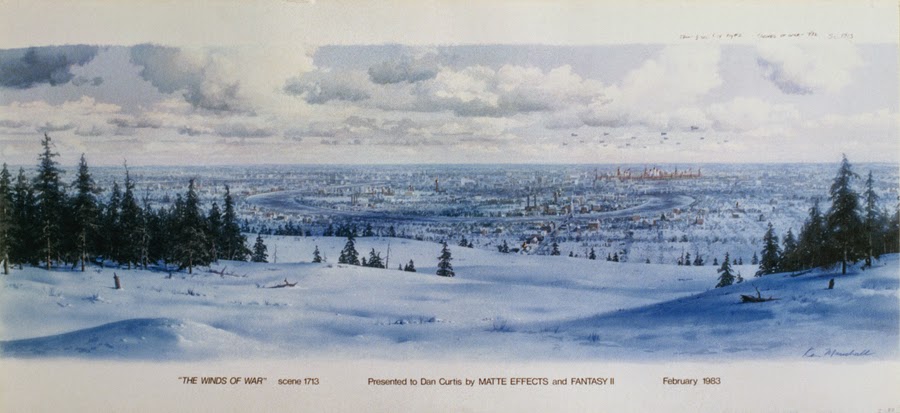
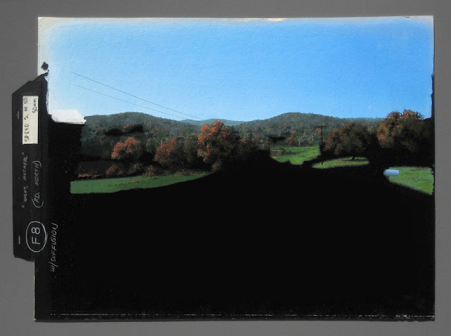
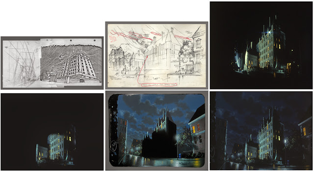
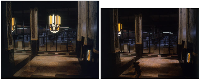
As alluded to earlier, atmosphere and a sense of distance is key. Bruce often added a diffusion filter over the matte camera lens to help in that regard. A scene where a distant structure is too crisp, with too much contrast, and too warm in hue, will scream “matte painting.” I remember one of the paintings I did for THE WINDS OF WAR where a distant Moscow is observed through binoculars from nearby hills. Director Dan Curtis wanted the Kremlin, which was miles away, to look more red. “It’s Red Square…the ‘Red Army.’ It has to look red.” He was in charge, so I had to adjust it despite protests until he was satisfied, but of course Bruce and I knew that it reduced the believability of the scene.
Q: I don’t think that ‘redness’ even showed through in the final scene as I recall.
KM: In the end I may have played it down, despite what the director wanted.
![]() |
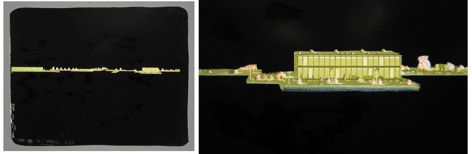
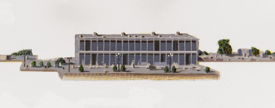
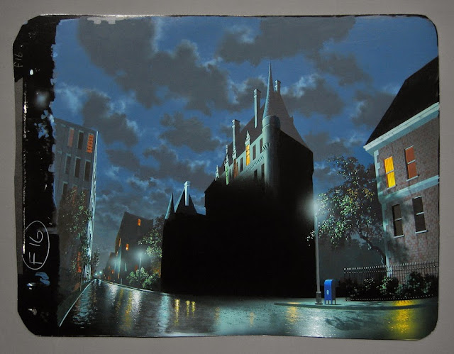
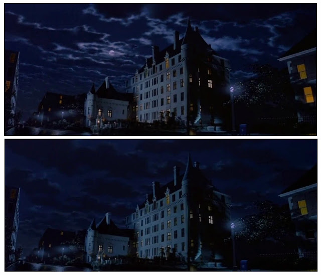
The distant shot of Moscow and the Kremlin from nearby hills, for THE WINDS OF WAR, painted June-July 1982.
My final painting, shown here, was titled and presented to Director Dan Curtis after filming. |
![]() |
The original concept art for the above panoramic scene, artist unknown. |
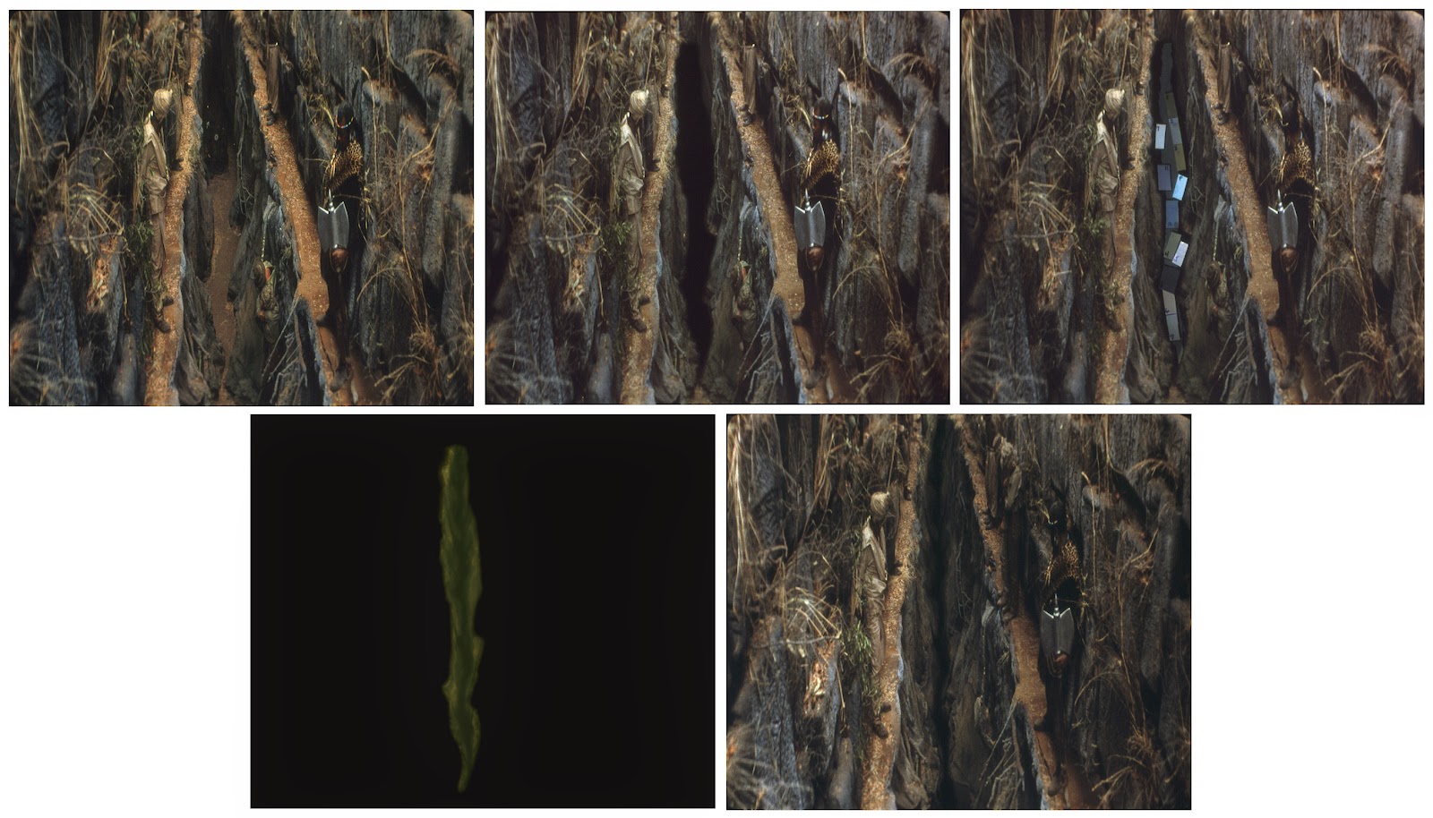
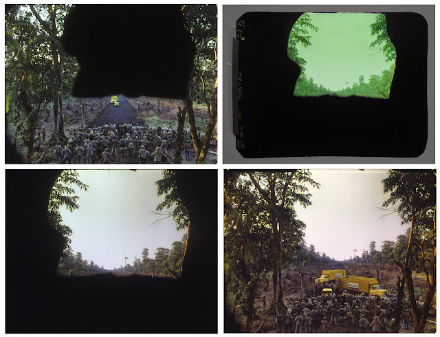
![]() |
| These two images show how the pan was done, through simulated binoculars. Foreground miniature trees were placed in front of the artwork for the pan and showed some slight parallax shift, and Fantasy II’s optical department added smoke or steam coming from a few tall chimneys and a wonderful lens flare. |
![]() |
| You can get an idea of the size of the matte painting seen here leaning against my ’71 Fiat Sport Coupe. |
KM: Clouds are hugely important. When present, they have to look convincing. Silly looking clouds, too cartoony or evenly distributed, with too much contrast, will be a dead giveaway. Painting realistic clouds, as I said, was one of Whitlock’s great talents. It came so easily to him. He could paint skies with stunningly realistic clouds in an hour, that I could only hope to emulate after a day or two of fussing.
Q: Peter Ellenshaw was also a master at skies. His fine art always inspired me as much as his film work.
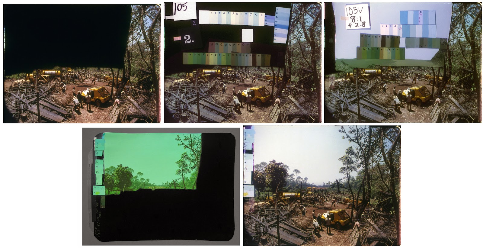
KM: Sky brightness is another important factor. Often you’ll see skies in matte shots, particularly old, classic ones, where the sky and/or clouds are simply not bright enough, far below the exposure you’d get if photographing a real scene. It’s something Bruce and I learned early on. If the shot was pointing anywhere toward the direction of the sun, even pure white paint didn’t expose bright enough, and to get that white bright enough meant opening up the lens, which started to flare and make the painted foreground too light. So, to get around that I’d create a matte on thin Mylar to cover everything in the painting but the sky, and Bruce would run the film through the camera again, adding a sky double exposure (DX). We didn’t use a platen or anything to hold the Mylar flat against the artwork. What we did was to simply rub it with an old cotton T-shirt or similar, creating a static charge that held it beautifully against the painting, even during long final production shots. These sky DXs would of course be tested, shooting what Bruce called a “wedge test” (I tended to call it “bracketing”), where he’d shoot a frame wide open, then close the aperture down one stop for each successive frame until we had virtually no DX at all. When the test was processed we’d pick the best one and go forward.
And last, movement naturally will help seal the deal with a matte shot. This wasn’t much of an option in the old days, although with moirés we animated a lot of little things that really helped, as mentioned. Now with digital effects the sky’s the limit. It’s a whole new world today, part of why the old traditional art of matte painting is so very, very dead. Movement. Not only adding CG figures and/or vehicles in a matte but employing sweeping camera moves, the very thing that made a matte shot utterly impossible only a few years ago.
BB: Ken has really summed it up, but my concern was always the “accidentals”as I called them. Ken was painting to duplicate real life, not a picture-perfect, fake world. So I’d always insist on adding all kinds of ‘accidental’ things that would happen on a real location. I was spending most of my time producing movies on locations so I knew what could and could not be controlled in first unitphotography.
![]() I always pushed Ken to add things to the paintings that would occur in real life. Various changes in the color temperature of the lighting, junk that people leave around their property, things that need repair, evidence of utilities, pipes, wires, weathering and aging and distant unwanted architecture are just a few things we’d add to make the paintings look more real.
I always pushed Ken to add things to the paintings that would occur in real life. Various changes in the color temperature of the lighting, junk that people leave around their property, things that need repair, evidence of utilities, pipes, wires, weathering and aging and distant unwanted architecture are just a few things we’d add to make the paintings look more real.
Q: Having made a great many mattes over the years can either of you recall that first matte.
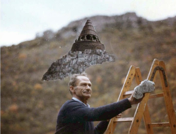
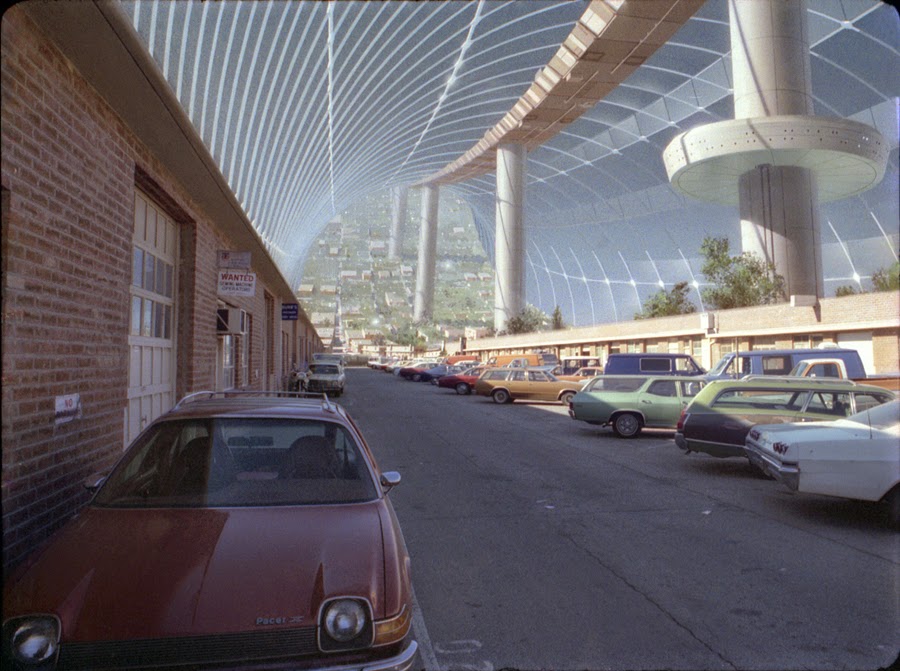
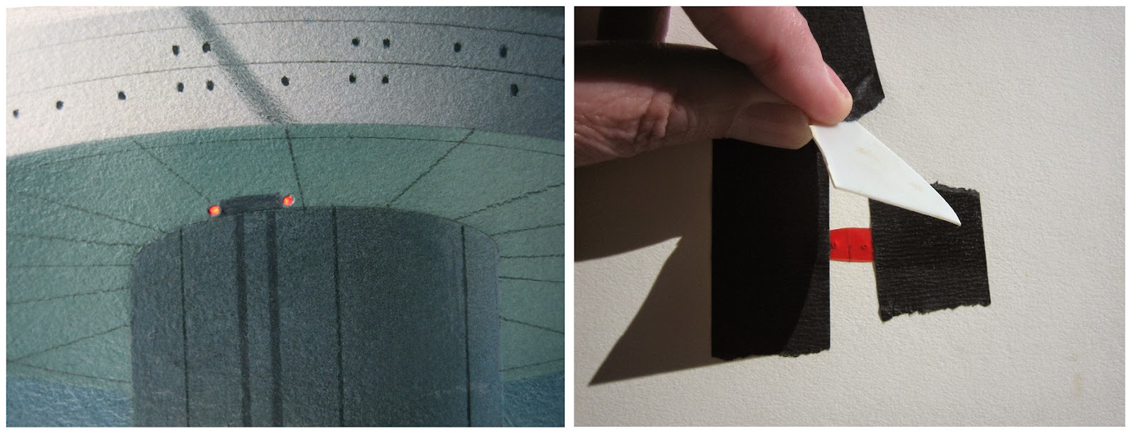
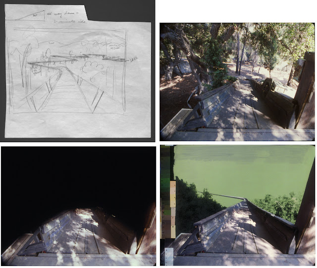
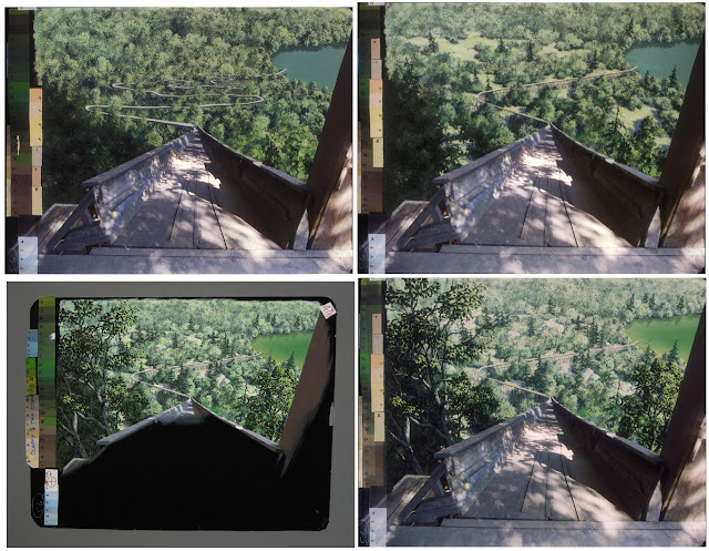
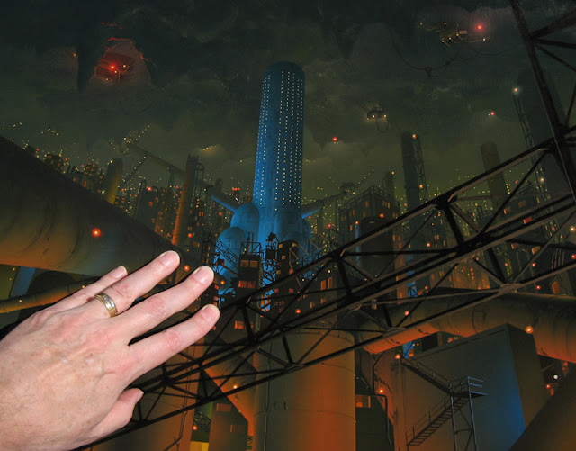
KM: Oh yes, it was the first one we tried for our demo reel, around mid-1981. We shot it out at the Graphic Films annex, outside the shooting stage, looking down the parking lot and matting off the top part so that I could add a painted futuristic space “torus” city extending off into the distance and upward, à la the fantastic visions of Gerard O’Neill (basically a gigantic revolving donut in space). The painting was done on 1/16th-inch illustration board, and I poked two holes in it so that we could animate flashing red lights. It’s the smallest matte painting I ever did.
![]() |
The first matte painting I ever did, in 1981. Very tiny. |
![]() |
| Close up photographs show the holes I poked in it and the red gel I taped to the back, covered by a milky diffuser. We flashed the red lights on and off. |
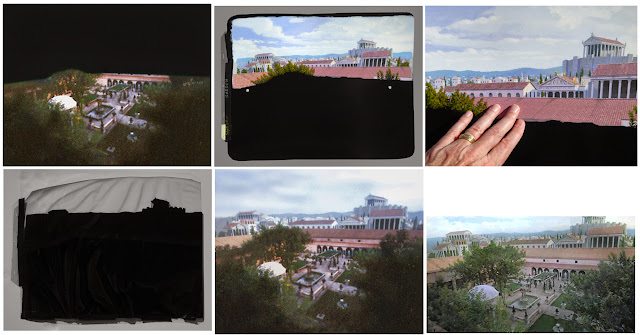
Shortly after, I finally got to paint 13 matte scenes for Graphic Films, for our Omnimax film TOMORROW IN SPACE, which was a challenge. Most were of the interior of a spherical control center in space, but one was an exterior of a lunar surface complex, and I had to paint in a very distorted way in order for the fisheyed view to appear correctly on the domed screen. I never did get to see how the film turned out, in an Omnimax theater. Oddly enough, this very early job would remain the largest number of matte paintings I ever did for a single project.
![]() |
Eleven mattes for TOMORROW IN SPACE pinned up on walls at Graphic Films, April 1982. |
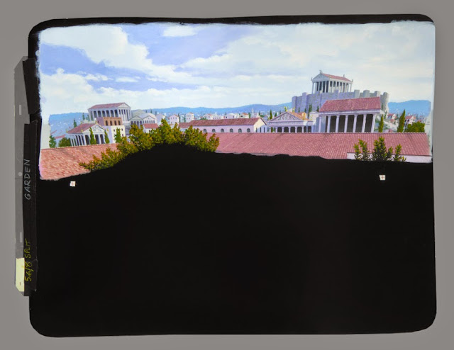
![]() |
I was asked to play a “controller” in the foreground of this shot. The first image shows the scene before any mattes were placed; the second, with mattes positioned; the third is my painting; and the last, the final scene. |
![]() |
Another of the shots. The first image has the matte already in place. My layout drawing is next, where a red line can be seen indicating the extent of the Omnimax screen. Some animated imagery may have been added to the blank screens on the second level, but I don’t remember. |
![]() |
And one more, a wide view of the control center. I have no memory of acting for these scenes, or shooting the mattes, at all. I don’t even remember if we shot these at Graphic’s stage or where we did it. The three circular work stations are really only one. After shooting the foreground station the film was rewound, the camera moved to another position farther away, and the film shot again. Then this was repeated a third time. I’m guessing those upper-level monitors were filled with interesting animation, but I don’t have a clip of the final image. |
![]() |
A wildly distorted painting of an outpost on the Moon, designed to properly project onto a domed Omnimax screen. This wasn’t really a matte but a full painting. I’m sure we added a faint backlit star field above. I remember we made a miniature of this moon facility, too. |
As the years passed, missing savoring the fruits of my labors on the big screen proved to not be unusual. I never saw many of the films for which I did mattes. I remember legendary matte artists saying the same thing during the course at USC, and I could hardly believe it at the time. How could they not see the finished films with their wonderful matte paintings?! But by the time a movie is released you’re already two or three projects ahead, you’re busy working, and it’s easy to miss seeing some of them.
![]() |
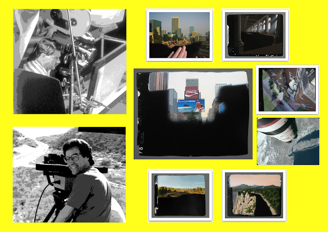
| Bruce Block shooting a VistaVision plate. |
BB: The only thing I remember about our first mattes was I didn’t have the matte painting camera locked down properly, and every time we did a test the alignment changed. It made Ken crazy. I quickly learned that if everything wasn’t welded together, something always moved. Removing every technical variable from the system was extremely important. Nothing should ever change except the painting itself. The camera, lens, lighting and physical shooting situation of the matte painting must never vary. The same is true when shooting the plates for the matte. There can’t be any variables on the set when doing an original-negative mattesuch as clouds moving over the sun, etc. I would get very aggressive with directors and cinematographers when setting up and shooting the live action. Sometimes egos would get in the way, but I never compromised and we were always invited back.
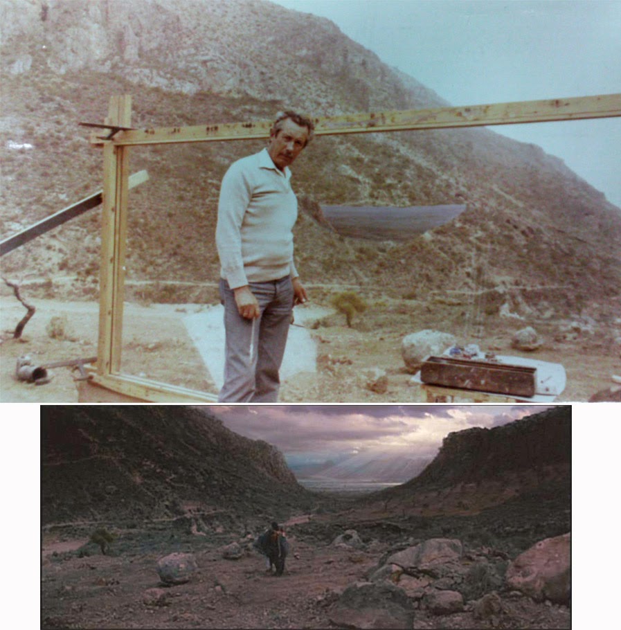
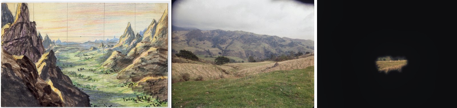
Q: I noticed you shared a credit for mattes with British artists Bob Cuff and Doug Ferris on Rob Reiner’s THE PRINCESS BRIDE – was that final shot of the valley yours Ken.
KM: Yes, that’s it. Ugh. Talk about “cute” and “pretty.” Certainly not one of my favorites in terms of realism. We did a separate DX to brighten the sky, but oddly it doesn’t seem to show much in the final film. Here’s a perfect example of where the painted sky was not bright enough and had to be enhanced, and we’re not even looking toward the sun in the scene.
![]() |
THE PRINCESS BRIDE: First, the concept rendering; the original photography (plate) before the matte was positioned; and then, the matte in place. |
![]() |
First, the painting in progress, April 1987, with a few color chips taped to it while I continue to test colors and brightnesses; the final artwork; and a near-final test scanned from film. We felt the sky wasn’t bright enough, so I made a black mask for everything but the sky, and Bruce shot a wedge test double-exposing the sky over the painting to determine an exposure that looked right..
|
![]() |
| Painting in progress |
![]() |
| Finished matte painting. |
![]() |
| A near final test frame. |
Q: I’m told that Bruce and yourself tended to work a lot on smaller films with the sort of subtle matte work that didn’t call attention to itself, rather than big so-called ‘tent pole’ showy FX movies.
KM: I would have loved to work on the biggies, but they would have likely entailed an overflow of labor and the crushing deadlines that would have made the jobs stressful. Bruce sent our reel out to a few other studios, but most of the work came to us through jobs that Fantasy II had. To be sure, there were times when I regretted not pursuing the big effects houses, but honestly, as the years went by and digital took over, I saw how stressed a lot of other artists were at these places, with literally sleeping bags under their work stations and toothbrushes on their desks. I realized, no, I’m not 25 or 30 anymore. I couldn’t live like this.
BB: Back in the 1980s there were a lot of independent effects houses both large and small. Since we were such a tiny company, we could never compete, but we had all the work we could handle. In 1986, on CHERRY 2000, we used Apogee to print down and scan our VistaVision shots to 4-perf. John Dykstra and optical printer supervisor Roger Dorney had no idea our company existed and were astonished by Ken’s matte paintings. Like everyone in town, they had never heard of Matte Effects. But we never wanted to expand. Ken had all the work he wanted plus time to do his Titanicresearch, and I was producing movies. More work would mean we’d have to hire additional people and we never wanted to do that.
Q: There must be a number of projects that you worked on together where you never received a credit, and I’m thinking of shows like THE JOSEPHINE BAKER STORY which had some beautiful work indeed, especially that glorious night shot outside of The Stork Club with everything painted except the principal actors. I was astounded when you told me that even the taxi, driver and reflections were part of your extensive matte. Probably my favourite Marschall shot of all! I saw that on tv over 20 years ago and was wondering for years who did these mystery mattes.
KM: “Jo Baker,” as we called the project, was one of the biggest jobs we had. I wasn’t credited for that? Go figure.
Anyway, the nighttime Stork Club matte is neat, I agree, although the front of the foreground taxi is too fisheyed and tweaked. Bad planning on my part. But I liked the night cityscapes which required multiple DXed lights and flashing red beacons above roofs.
![]() |
The nighttime matte shot of the Stork Club for THE JOSEPHINE BAKER STORY, starting with the concept rendering. I don’t seem to have a clip that shows the original photography before the matte was placed. Next we see the matte in position, with the head of a man on the right who would be a cab driver. Then, the painting and lastly, the final composite. Although I don’t remember, we probably made some of the distant neon signage blink on and off. |
![]() |
| Original matte painting for The Stork Club sequence in THE JOSEPHINE BAKER STORY |
![]() |
| Close up of detailed brushwork. |
![]() |
Another scene for “Jo Baker” is this night view full of neon. The first image is the original photography without matte. The second, with matte. Third, sign backgrounds positioned. Fourth, each of the individual elements which were variously flashed on and off, etc. These were each on individual lightproof cards with high-contrast Acetate stats of the neon artwork, each gelled with the desired color. And last, the final composite. |
![]() |
| A series of 35mm clips with backlight neon exposure tests for the above matte. |
![]() |
| Close up of one of the backlit neon elements. |
![]() |
| Final multi-element composite. |
We first tried the flashing neon in one of our earliest demo mattes –– “Terry’s Desert Oasis Café.” We had the word “Terry’s” in green neon and made the “s” sputter, flashed the word “Café” on and off in red (with the “A” burned out), lit the word “Cocktails” up in pink and had a bunch of yellow lights in an arrow. It totally brought the scene to life.
![]() |
One of my all-time faves, and it’s just a very early demo, not even done for a movie project. We shot behind Columbia College in Hollywood (a film school). There was this exterior wall set piece with a door. I had painted a circular Coca-Cola sign on thin illustration board, gave it a faux rust and age treatment and put it on the door. Someone had a neon beer sign for the window which flashed on and off, and we hooked up a few lights. We shot the scene at dusk, which is of course risky because the light is changing by the minute. Bruce drove his car in on the right and parked in front of the café, while several people (including my old pal Rick and his wife Pam) exited the café and walk around the car. Bruce got out of the car, along with another friend of mine on the passenger side, and they headed toward the café’s door. Lots of good action. I love the vast, open air of the desert, love “magic hour,” and this hypothetical scene had it all. |
![]()
“Jo Baker” is an example of a rare job that was overwhelming, and we had to bring in another artist to assist with a few of the paintings. I’m ashamed to say that I don’t recall who, probably Rick Rische, although he doesn’t seem to have this project listed in his filmography.
![]() |
This New York scene with the Stork Club across the street was shot in Eastern Europe along with most of the others. The sequence of images here is self explanatory. You can see the rotoscoped layout on the back of the painting, the matte line indicated in red pencil. Note the bottom left of the layout where I carefully sliced my painted Chrysler Building to lower it in the field so it would show, instead of repainting it. Call me lazy. I seem to recall someone saying that the building was so tall that its iconic top was out of frame, and could I lower it? This was another advantage to painting on this card stock; it was easy to slice with a blade and shift something around without have to laboriously repaint something. |
![]() |
| My fingers are included in the closeup shot of the painting to show the actual scale of the work. |
![]() |
Another matte from JOSEPHINE BAKER that I like, showing the great liner Normandie at dock in New York –– right up my alley! The painting is very magenta, and I don’t recall why that had to be. The roto is included here again where my layout for the painted area can be seen. The ship itself must have been drawn up elsewhere and transferred. |
![]() |
| My hand, again, shows the scale of the art. |
![]() |
One more shot from that project that I thought I’d include, showing the Copa City nightclub in Miami. Following reference material I was given, it’s considerably reimagined from what the original looked like. |
![]() |
| Close up detail of the Coca City matte art. |
BB: On THE JOSEPHINE BAKER STORY, I went to Budapest where the film was shooting. The original plan was for me to supervise all of the shots and do them as original-negative mattes. What I ended up doing was teaching the crew about original-negative mattes and then being sent back to California. They ended up shooting all of the plates without me and everything was done as an optical. We worked with that director, Brian Gibson, on several of his movies.
Unfortunately, credits back in the 1980s were not yet evolved into the endless, everyone-on-the-movie triple-column lists that we see now. We never got credit for a lot of our work, and even on the Internet it’s impossible to find an accurate list of the movies and TV shows we contributed to. In doing this interview, I realize therearedozens of matte paintings I don’t remember at all.
Q: There are, or should I say, were a number of processes available to the matte shot cameraman in completing a composite shot with artwork married successfully with live action plate: bi-pack, dupe separations, rear process projection as preferred by Disney, interpositive duping stock as favoured by the Doug Trumbull organisation and of course, the old and for a time largely neglected latent image technique using all original negative, as strongly endorsed by Albert Whitlock. What was your particular method for achieving such excellent matte comps.
BB: Due to our association with Fantasy II, we got involved with all kinds of processes. Gene Warren had a lot of rear-screen projection equipment, and he used it all the time for stop-motion work or miniature composites. Ken was occasionally called in to add a sliver of a matte painting to cover a seam in all kinds of shots. Occasionally Ken did paint in the orange-base process to reduce the number of optical printer generations in a complex composite shot.
![]()
![]() |
Here’s an orange-base, optical patch job to blend a miniature with foreground live action for THE WINDS OF WAR, painted in late 1982. First we see the small concept, done by someone else. I don’t have an image of the original photography before the matte was placed. A burning table-top model was shot for that part of the scene, then placed optically into the upper right of the scene. A new matte was created covering the bad match between the miniature and the foreground, and my oddly colored orange-base painting was done. I added an airbrushed haze to the top part to soften and lighten an overly contrasty miniature. I wished I could have had a soft matte line to work with, but this was impossible with the optical printer, so I had to try to carefully fit my painted “sliver” into the matte, which was quite a challenge, as you can see from the next-to-last image. In the last frame the matte line can still be detected here and there, but we had reached a point of diminishing returns. |
![]() |
An orange-base “sliver” was required to extend a bottomless pit for ALLAN QUATERMAIN AND THE LOST CITY OF GOLD. The scene was shot anamorphic and fortunately was able to have a soft matte line. You can see various color chips placed in the earliest test. |
![]() |
| This last image shows the final scene approximately as projected. |
We favored original negative for all the obvious reasons. Often, we’d do an original-negative shot and then as a latent image, turn it over to Gene’s optical department who would add moving smoke, mist, occasionally a waving flag, etc. If we had enough film for testing, we could do multiple passes in the matte camera, additional work on an optical printer and still stay on the original negative. I could bipack hold-out mattes during the original-negative matte photography, too, if necessary. Our matte camera room had a special window port behind the art stand. I could open the port, and that gave us access to using a single-frame rear projector that was actually mounted outside the matte room and projected onto an RP Screen directly behind Ken’s artwork. But a rig that complex was extremely rare for us. That was one of the great advantages to being at Fantasy II. Gene encouraged everyone to do whatever it took to get the shot right.
KM: There was nothing like in-camera original negative. Whitlock was right. No better way to keep the grain down and preserve all the light and shadow detail and color of the original photography, both live action and painted. Several of the jobs I worked on were optical composites, and although necessary, the results were never as good. Bad things happen when you “optical.” A VistaVision matte I painted for CHERRY 2000 showing a collapsed Hoover Dam matched the live action perfectly when we delivered it, but today, watching the thing on YouTube or one of the video sites, after optically cropping in tight on the live action area, the color match is awful, terrible. I have no idea what happened.
Q: There’s a phenomenal night time matte you did for the Diane Keaton film BABY BOOM with the entire frame painted except the people – with buildings, trees, cars and even all those party balloons and lights completely matte art that looks first generation. If ever there were a definition of the term ‘invisible art’ then this one is it!
KM: Thanks. I’m proud of that one. Two of the painted cars in the foreground belonged to friends. The salmon-colored ’57 Chrysler Windsor just left of center belonged to my then roommate, and the antique black car once was driven by a dear friend, Edwina (Winnie) Troutt MacKenzie, who survived the Titanic disaster and had recently passed away at the age of 100. It was my little tribute to her. We ran a moiré behind a light DX to make a string of lights twinkle on the house.
BB: The BABY BOOM matte painting is my favorite. I was a producer on BABY BOOM, and when the movie was edited we realized we needed an establishing shot of the barn dance location. We couldn’t go back to Vermont so I suggested we do the matte. About 90% of the scene is painted. The live-action plate was shot in the parking lot of Fantasy II with a bare minimum of lighting and the Fantasy II crew as the extras. Everything except the doorway, one truck and a few people is Ken’s painting.
![]() |
The night party scene in BABY BOOM. The images are self explanatory, I think, starting with the small concept rendering. Layouts, in this case, were done on tracing paper. I included at least two cars that belonged to friends. We made the strings of lights twinkle by moving a moiré. |
![]()
![]() |
One of two mattes intended for BABY BOOM but cut from the project when I was almost finished with them. The last image shows the last test we did, unfinished. The scenes were shot in winter with bare trees, but they were supposed to be during a sunnier, warmer time of year. So my job was to leave all trees and house in their same configurations but make the sky blue and the trees leafy. |
![]() |
The other dropped matte shot for BABY BOOM, canceled before it was finished. |
Q: I take it there were times when the shot required additional generations or integration with other elements where duping was unavoidable. Were there any tricks that you Bruce would initiate in order to maximise image quality and not compromise Ken’s art through contrast build up and grain.
BB: We always knew in advance if a matte scene was going to get too complex. We would do just about anything to keep it as an original negative. This meant pre-planning multiple in-camera exposures or handing off the latent image original negative for a few passes on an optical printer. Occasionally we’d shoot VistaVision so we’d begin with a bigger negative that could go through the optical and not sacrifice image quality. We’d rent the VistaVision camera from Paramount who still had a couple of their old VistaVision non-blimped cameras. They were clumsy to use and unbelievably heavy, but they had been refurbished and the movements were extremely steady.
Q: I’m thinking of a shot such as the crane down camera move over the town in THE LADY IN WHITE with the painted cityscape in the distance, likewise a push in to what appears to be an extensive painted night shot of The Whitehouse and street for THE NAKED GUN 2 1/2; were these motion control shots.
BB: The LADY IN WHITE shot was a Fantasy II contract, and Gene Warren supervised that big crane shot which combined rear projection, Ken’s matte painting and a miniature. I honestly don’t remember how we did it.
![]() |
Optical matte shot for LADY IN WHITE. The first image shows my concept proposal, a retouched photograph. The other two are the final footage with my distant horizon city painting and foreground miniature which lowers out of the shot, revealing the view. |
The NAKED GUN 2 1/2 scenes were all original-negative VistaVision lock-off shots. Pacific Title did moving scans using a motion control optical printer to add the camera movement and reduce the shots to 4-perf.
![]() |
For NAKED GUN 2 1/2: Original concept painted on a print of a frame grab, two shots of the matte painting itself, and a Bluray screen capture of the final scene. As this was an optical, I never got a clip of the final composite. |
![]() |
| Close up detail of painted matte. |
![]() |
This one, also for NAKED GUN 2 1/2, was original negative. A backlot street needed to be transformed into Pennsylvania Avenue in Washington, D.C. The third image is my small proposal/concept, painted on a cel over a print of a frame grab. Then the matte painting, which was determined to not have bright enough highlights, so we did a separate pass, with a mask, to brighten the sunny side of the buildings and the sky. Last, the final composite.
|
![]() |
| Close up photograph of detail from the above matte. |
![]() |
Another from NAKED GUN 2 1/2. Initial rendering (not done by me) showing an early concept of the scene and the painting. |
![]() |
| Close view of the painting. |
![]() |
| A pair of Bluray frames of the final composited scene as seen in the film with streetlight burned in and rain and lightning effects added. |
Q: Studying mattes of old I’m forever fascinated with the choice of blend in bringing together the painted and actual elements. For decades mattes mostly appeared to be soft edge blends, which to my mind were far less visible and really impressed me no end as to how those veteran matte exponents were so successful in running a soft matte straight across the frame regardless of foliage or architectural considerations, not in the slightest conforming to hard lines of fences, walls and what have you, yet still managed to somehow bring it all together so skilfully with the artwork. Jack Cosgrove at Selznick, the guys at Warner Brothers in the 30’s and 40’s were so good at this and it seems just second nature. I’d imagine colour matching to be some sort of instinctive ‘know how’ on the part of the artist.
KM: It’s all in the careful rotoscoping of the live action, which we did by placing the negative in the matte camera and projecting it onto the white side of the card I was going to paint on, so it was at the exact scale of the required painting. The card was hung from the pegged backing and carefully taped down at the sides to assure that it stayed put.
![]() |
An example of the roto done on the back of the card, for an early 20th century city street scene in MOBSTERS, painted in February 1991. The punched animation peg-bar piece has been removed from the left side of the painting, since we routinely reused them on later paintings. The matte line is in red pencil. I wish I had the original photography before the matte was added. The third image shows in-progress. One of my favorite mattes. |
![]() |
| Extreme close up showing photo-real detail. |
![]() |
| Final on screen composite taken from a high definition source. |
![]() |
And the other matte I painted for MOBSTERS, starting with a stat of the concept sketch done by another artist. I have found no film test clips for this matte at all, so I harvested a greyscale YouTube grab to help complete the painting sequence. Another of my favorites. |
![]()
![]()
![]()
Then, if the scene was a daylight one, mostly painted and had little black live-action area, I would often just paint directly on that white side of the card. For the area where the action would go I used Cel-Vinyl black (made by Cartoon Colour which, amazingly, is still in business). I found that to be the darkest black available after coating it with gloss acrylic medium or varnish to really make the black as deep as possible. Polarizing the painting during shooting made the black completely dark. On the other hand, if the majority of the painting was to have the black, I’d carefully transfer the rotoscoped tracing (perspective, horizon line and other relevant details) onto the black side of the card, making sure that the peg holes were in the same location, and then paint on that side, leaving the glossy black surface alone as it was quite black when polarized. As the painting was punched before the rotoing, it always went back and hung on the pegs in the exact same spot for shooting the tests.
In scenes with man made structures I followed the perspectives in the live action while getting closer with the colors in each test until the match was right. I always started out by painting a bunch of color chips and taping them along the matte line to see which was closer. Each test narrowed down the options, and I got closer to the perfect match. It’s not as difficult as you might think. Just takes a few tests. With a soft matte line you play with that edge until it disappears in your tests. With a hard matte line, alignment is more critical, of course, and again, it’s just a matter of improving it with each test. And you’re definitely using the finer brushes when finessing a hard matte line.
![]() |
Here’s a good example of how I used small color swatches in the beginning of the painting process to nail down the best color matches, in this case an orange-base job for THE BURNING SEASON, for HBO. After the first few tests several of the color swatches usually ended up stuck to the side of the artwork where they remain today. The painting is one of two orange-base mattes for this project, done in 1994. Once again, unfortunately I don’t have a film clip showing the original scene before the matte was placed. |
Q: Talk to us about colour matching.
KM: Matching colors is easy for me –– with normal film and processing. What was challenging was when we had a job that required the “orange-base” process where I had to paint in low-contrast yellow-greenish hues, yet the tests came back from the lab in normal colors. There were several of these orange-base jobs. I think the most difficult one for me should have been the easiest –– a simple soft-edged patch for a matted-out spot in the middle of a distant scene in ALLAN QUATERMAIN. Looking down into a valley, a featured stone wall structure needed to be added. Trying to get the exact hue of the surrounding landscape, and to blend it properly in this bizarre, alien orange-base process, was next to impossible. Test after test after test. I’d use colored pencils for some of the subtlest of hue shifts in an effort to get a match. First an area was too magenta. Then with the slightest of green tint the next test showed that it was now too yellow. So I tried a subtle tint of aqua, but that proved to make the spot too purple. And so it went. I never did get it perfect. You reach a point of diminishing returns. I got it “close enough” and abandoned it when it just got too risky to try another change.
![]() |
The small, troublesome orange-base spot/patch matte done for ALLAN QUATERMAIN in 1986. A number of paintings were done for this film, all orange-base and all anamorphic. The last image above shows the scene as viewed by the audience. |
![]()
![]() |
Another of the orange-base, anamorphic QUATERMAIN paintings, this one quite successful, I think. |
![]() |
| Final composite as shown theatrically. |
Then there was one matte that I had to paint in negative, if you can imagine that. It was for a Japanese cigarette commercial, if I recall. This was one of the ones that Gene would rave the most about, as if I were a miracle worker, but really, it was just a methodical process, one step at a time. It’s all doable, if a lot more challenging. Except for that wretched spot in that QUATERMAIN scene. That one seemed cursed.
![]()
![]() |
Painted in negative, this “sliver” matte was for a Japanese cigarette commercial called “Jump Jet.” It blended a plate of a real city skyline at top with live action shot elsewhere at the bottom, perhaps miniature work (there was a bay or wide river in the foreground with some action taking place, as I recall). I have no memory of why the painting had to be done as a negative, but I imagine it saved a generation in the optical work. The last image shows a close-up of the painting inverted, as it looked in the final commercial. I have no film test clips for this project at all, only the painting. |
Q: Please give us a ‘picture’ of the blending process. How many tests would be required for example until the elements would fit seamlessly. How much adjustment to the painting might be needed to tie it all together successfully.
KM: Sometimes we were just lucky and everything came together in a remarkably few number of tests. Oddly, the matte camera shooting log book (yellow binder) that Bruce kept has, sometimes, only a few entries for some mattes, yet I have test clips for those same mattes showing numerous different dates. So I don’t think we can count on the log book to give us a true number for the lowest number of tests. Bruce might remember a number and even a particular painting.
On the flip side, a few mattes required as many as a dozen or more tests, as with THE TERMINATOR, particularly if a director had second thoughts and wanted changes or a scene required animation DX passes and/or cloud movement.
BB: When we were working on several paintings at once, Ken could match the correct colors in two or three tests. He has an amazing eye for color and I was astonished how quickly he could work. Sometimes we’d do our late night pick-ups for three days in a row and then he’d tell me he had all of the color matching done. Ken would go home for two weeks and practically finish the paintings without any more testing. The original-negative method allows the painter to blend over matte lines, double expose an area or back off any area of the painting…something you can’t do when it’s an optical. We became extremely deft at understanding when a hard or soft edge matte was needed.
Q: Of course the maestro’s Peter Ellenshaw and Albert Whitlock were masters of all facets of not just making a good matte, but knowing what will or will not make a good matte. Whitlock would never compromise the photographic quality of a shot to appease an over eager director. I think there’s a lot to be said for the era when the matte painter alone – such as Peter or Albert - had enormous control over the design, photography and execution of a matte shot as opposed to the layers of VFX Producers, VFX Supervisors, Coordinators or what have you who all want to have a finger in the creative pie, with the actual painter and matte cameraman way, way down the food chain, even on relatively small effects assignments with just a handful of mattes.
KM: Typically I had a good amount of freedom to create what I wanted in my mattes. Sure, I did little concept sketches or mockups to show my ideas and get a director’s feedback, but most of the time I was given the go-ahead with few to no changes. Bruce would suggest more adjustments than directors usually did. There were a few who were fussy, analytical and wanted to be quite involved, but then if I were paying the bill I would be, too. Sometimes a studio artist would do a concept drawing that had been approved and I was to follow, which made things easy.
I don’t recall too many times when a director wanted me to change something that I knew shouldn’t be changed. The redness of the distant Kremlin was one such example. The phallic “silos” painting for SPACEHUNTER originally had two moons in the scene, as rendered in Mike Minor’s approved concept illustration, but late in the testing it was decided to remove them both. This was a challenge because of the airbrushed sky, of course. I think I had to repaint almost the whole sky.
![]() |
| Mike Minor's conceptual art for the silo shot from SPACEHUNTER: ADVENTURES IN THE FORBIDDEN ZONE. |
![]() |
The “silos” matte for SPACEHUNTER, painted in the spring of 1983. You can see the progression of the process, beginning with the concept artwork, shown above, done by Mike Minor at Fantasy II. The scene was originally to have two moons, but after painting them (I thought they turned out great), the decision was made to remove them, which required considerable new airbrush work. The closer silo, painted on a cel, was made to appear slightly closer than the distant mountain range in the 3-D movie by shifting the cel laterally a tiny bit. |
![]() |
| The matte as initially prepared with dual moons. These moons would ultimately be painted over due to conceptual revision. |
![]() |
| The newly repainted sky. |
![]() |
| Close up detail. |
To be continued...The amazing work of Ken Marschall and Bruce Block will resume next issue where we'll take an in depth look at the trials and tribulations of painting mattes for James Cameron's TERMINATOR, creating historic vista's for ATTILA THE HUN, invisible period matte magic for the TINA TURNER biopic, stunning mattes of Area 51 for ROSWELL, the post apocalyptic world of CYBORG, and painting with an anamorphic eye for FRIGHT NIGHT 2 and more. Gene Warren jr of Fantasy II Visual Effects will speak with us on the long standing collaboration with Ken and Bruce on a number of films. In addition, we'll be taking a fascinating real life journey with Ken speaking to us enthusiastically about his experiences at the bottom of the Atlantic ocean visiting the world's grandest passenger liner.

 Among the many aspects of miniature effects work delved into was the particularly interesting 'big budget versus small budget' section where to my surprise, most of the participants revealed a far greater love for the modest and low budget jobs over the mega million contracts. Really fascinating. Sadly, several of those interviewed are counting down the days when miniaturists such as themselves will no longer be required and it'll all go the way of traditional matte painting...down the gurgler and into a godammed computer program! Can it possibly get any worse than that???


 Our scenario, set in 1907 – a good period for high adventure - revolves around a somewhat mismatched group (aren’t they always?) of intrepid explorers – the requisite dashing American archaeologist (the hopelessly wooden and monotone David Hartman who in every scene suggests he’s narrating a Disney trailer), a wealthy Englishman (a very irritating Donald Sinden), an eccentric French inventor (quintessential French character actor Jacques Marin) and an Eskimo (Mako, taking a break from Korean POW’s on MASH) on a trek to the North Pole, or thereabouts, in a frantic search for Sinden’s long lost son. Their quest brings them to a lost Shangri-La world of Vikings, volcanoes and the storied Whales’ Graveyard. All good stuff in a very Jules Verne-esque tailored adventure. The basic plot here has plenty of potential, and I can’t help but feel much more could have come of it in better directorial hands. My conversations with Harrison Ellenshaw have been entertaining to say the least. Seems Harrison isn’t anywhere near as forgiving as I am and found a re-screening of the DVD to be a tedious and pedestrian affair with about a hundred too many reaction shots, endless exposition and Donald Sinden, who chews the scenery like a HarryhausenRhedosaurus, though without the Beastly charm.


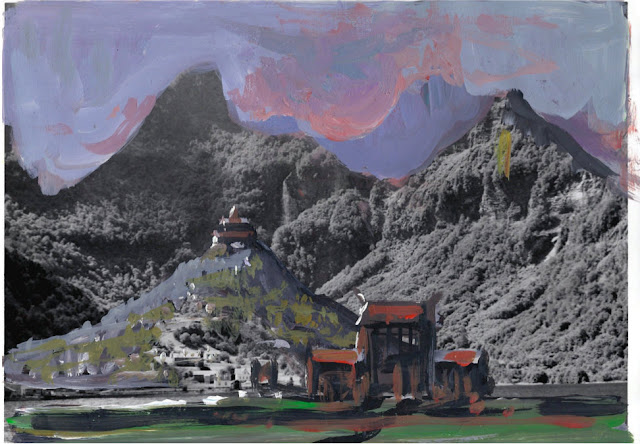


 ISLAND was a prolonged and drawn out affair, production wise. As early as 1968 a pre-production trailer emerged and this included quite different concepts such as a very interesting ‘dual-airship’ notion which I rather liked. These early concepts were the work of an unknown Disney art director. The official pre-production for the film commenced at Disney late 1971 or early 1972. The Norway 2ndUnit photography took place in July 1972. Main production shooting started at the Disney Studios in Burbank in April 1973. The picture was released in November 1974 with it’s UK premiere, though not a Royal Command Performance as some are, attended by Queen Elizabeth and two of her sons in December 1974. When asked, Harrison told me; “It’s a long timeline, but that was typical in those days”.


 A: For me, it was “baptism under fire.” I had been in the Disney matte department as a lowly apprentice for only about a year when pre-production began on ISLAND. I felt that I would barely be able to contribute in any meaningful way. But the department head, Alan Maley (shown at left) gave me plenty to do besides wash brushes.
 A: Actually, except for the fact that I thought the final film was not very good, it was a wonderful experience. I was so fortunate to be working for Alan who taught me so much about filmmaking and painting. My father was also the production designer and visual effects supervisor, so although I was at the bottom of the ladder, I would see him often. I learned a tremendous amount on that show.


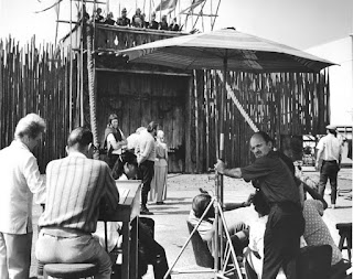


 Q: Now I’m sure this was confusion on Matthew’s part, but he did say that Albert was there, though I can’t think for the life of me what he was doing there. Are you able to clarify whether the ‘Albert’ Matt spoke of was Peter’s former assistant Albert Whitlock, or another ‘Albert’ altogether? It would seem so strange if Whitlock were at Disney then??
 Q: Speaking of Albert, he had his own big airship effects showcase to contend with the following year with The Hindenburg – itself a pretty staggering achievement, and even more so for a tiny matte department. As you did on your show, Albert used a lot of photographs of their miniature zeppelin pasted on glass as well and combined these very successfully with paintings and other atmospheric effects. He said once that to paint the damned zeppelin from scratch for so many shots would have been so tedious and the use of hand coloured photographic stills were a godsend if they ever hoped to complete the film in the required timeframe. Sound familiar?


 A: We had over a year for post production. In those days you finished all the work with plenty of time left before the release date. Part of the reason was that back then the studios had show all films as completed movies to theater owners well before the release date. The theater owners would then competitively bid against each other for the right to exhibit the film.


 A: Often outstanding artists are ambitious, they look to have more influence in the visual storytelling process. The three that you mention are definitely the cream of the crop. I admire what each has achieved. Doing mattes will teach you all manner of things having to do with filmmaking.


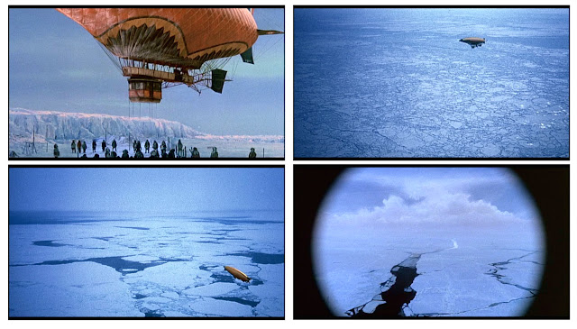


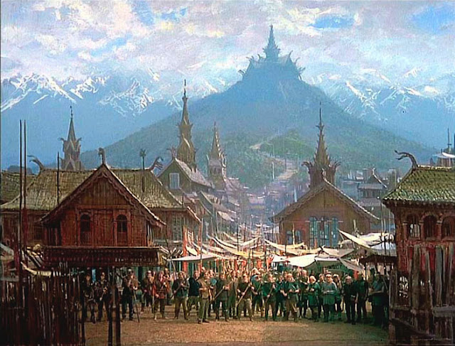


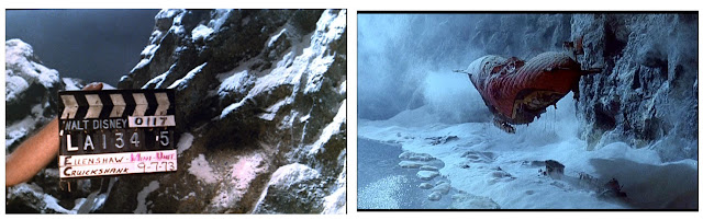


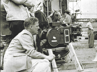


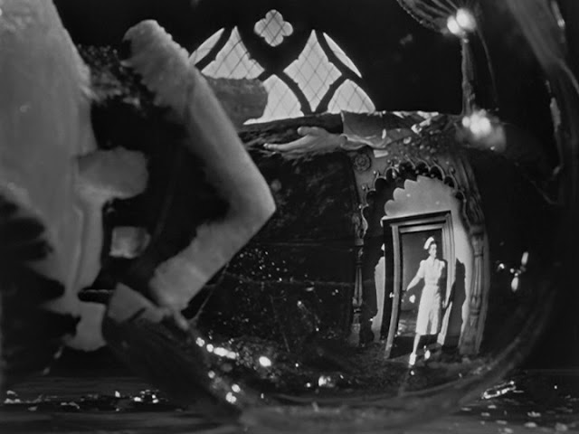


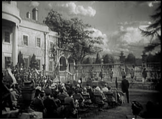


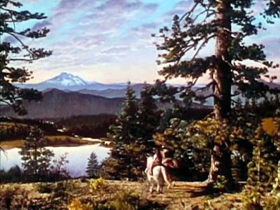


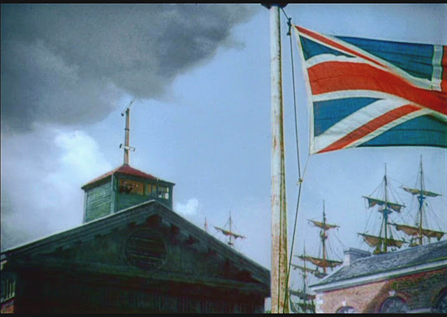
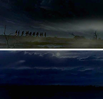


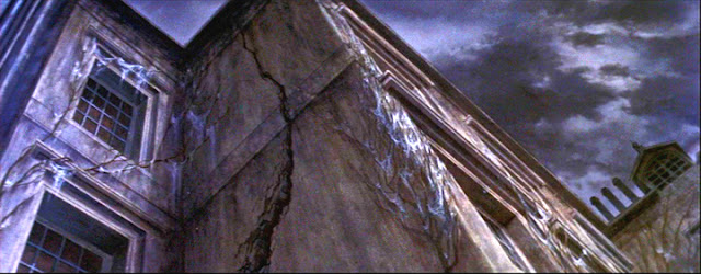

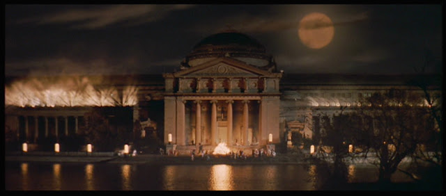


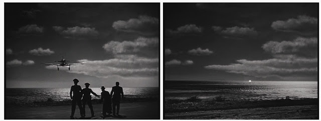


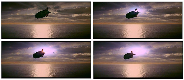


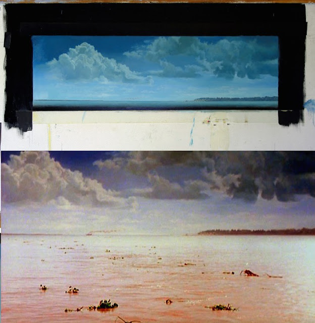


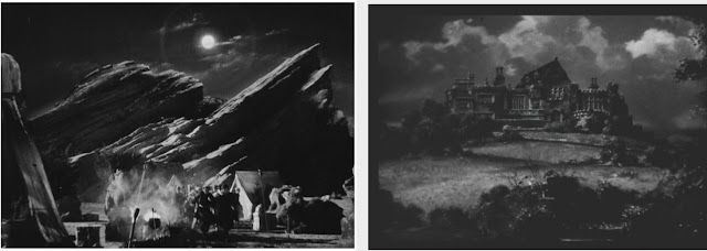


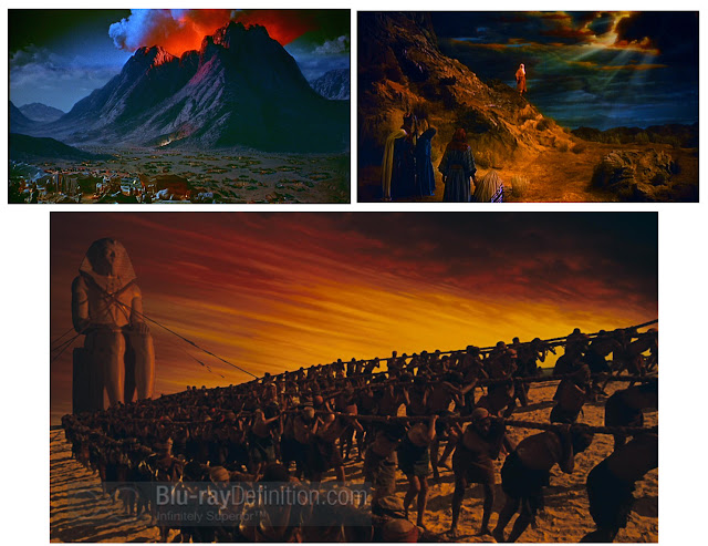


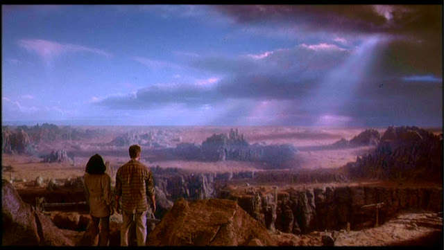


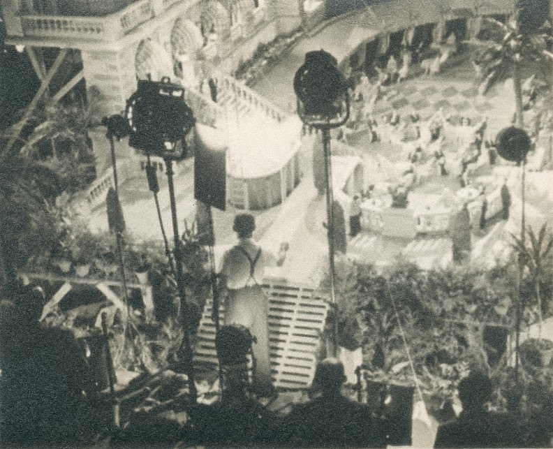


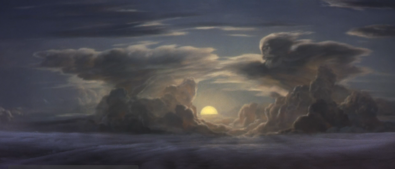


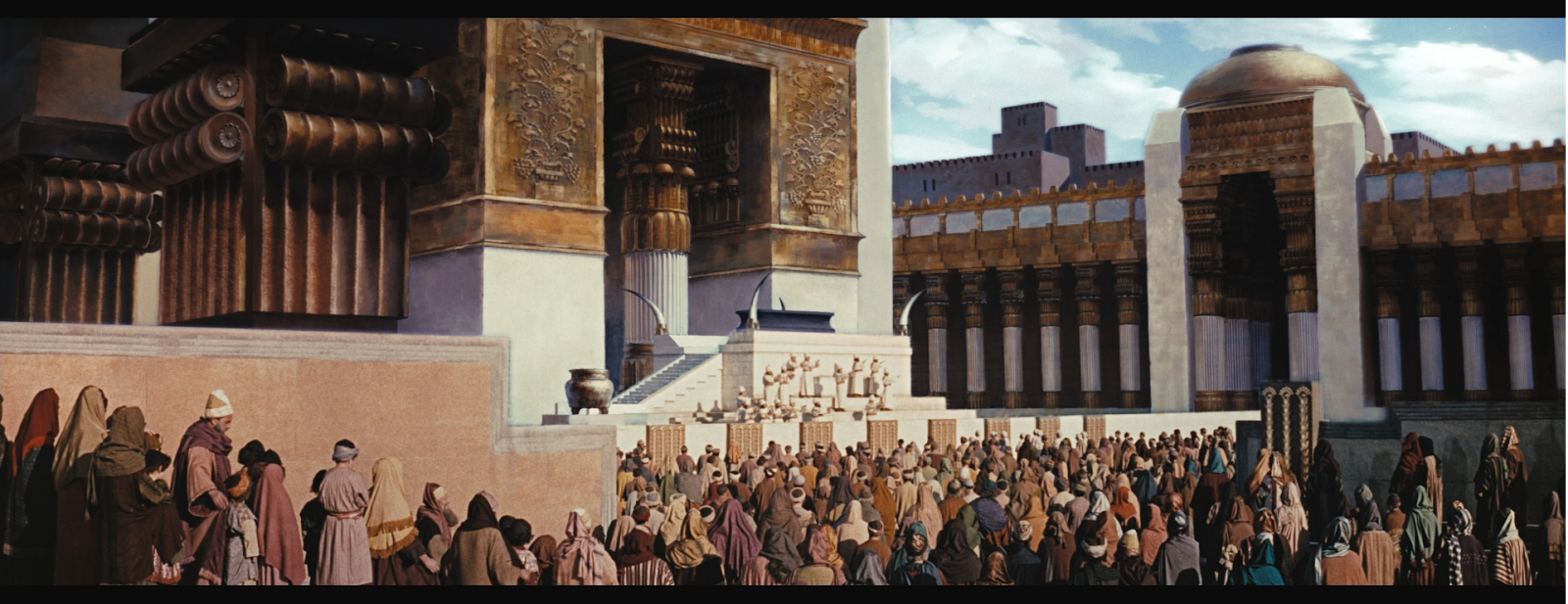


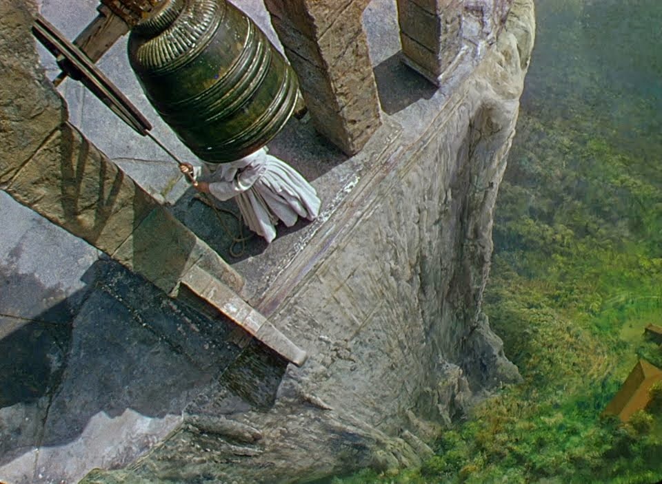


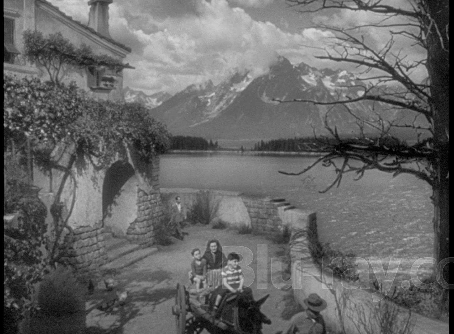


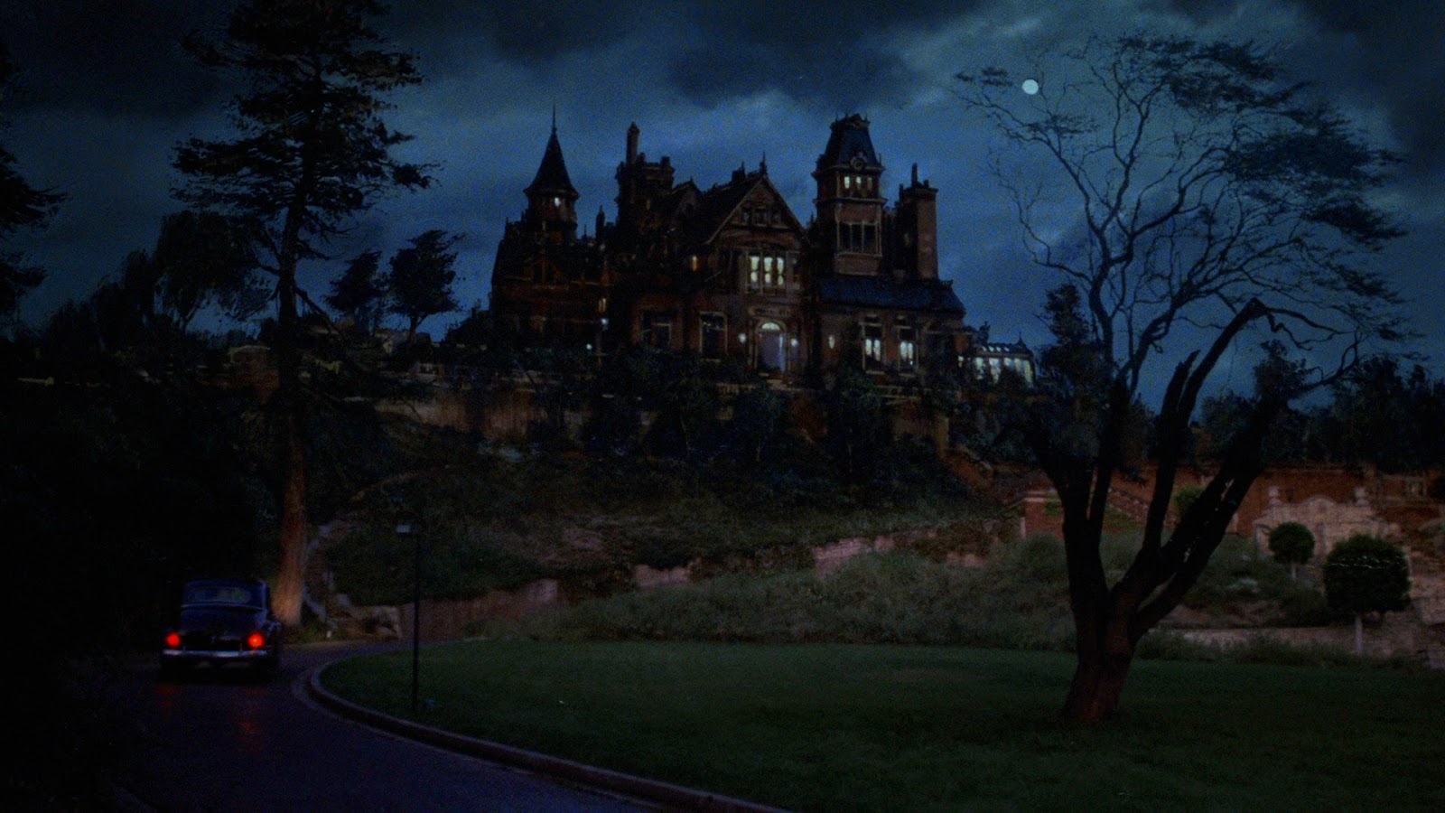

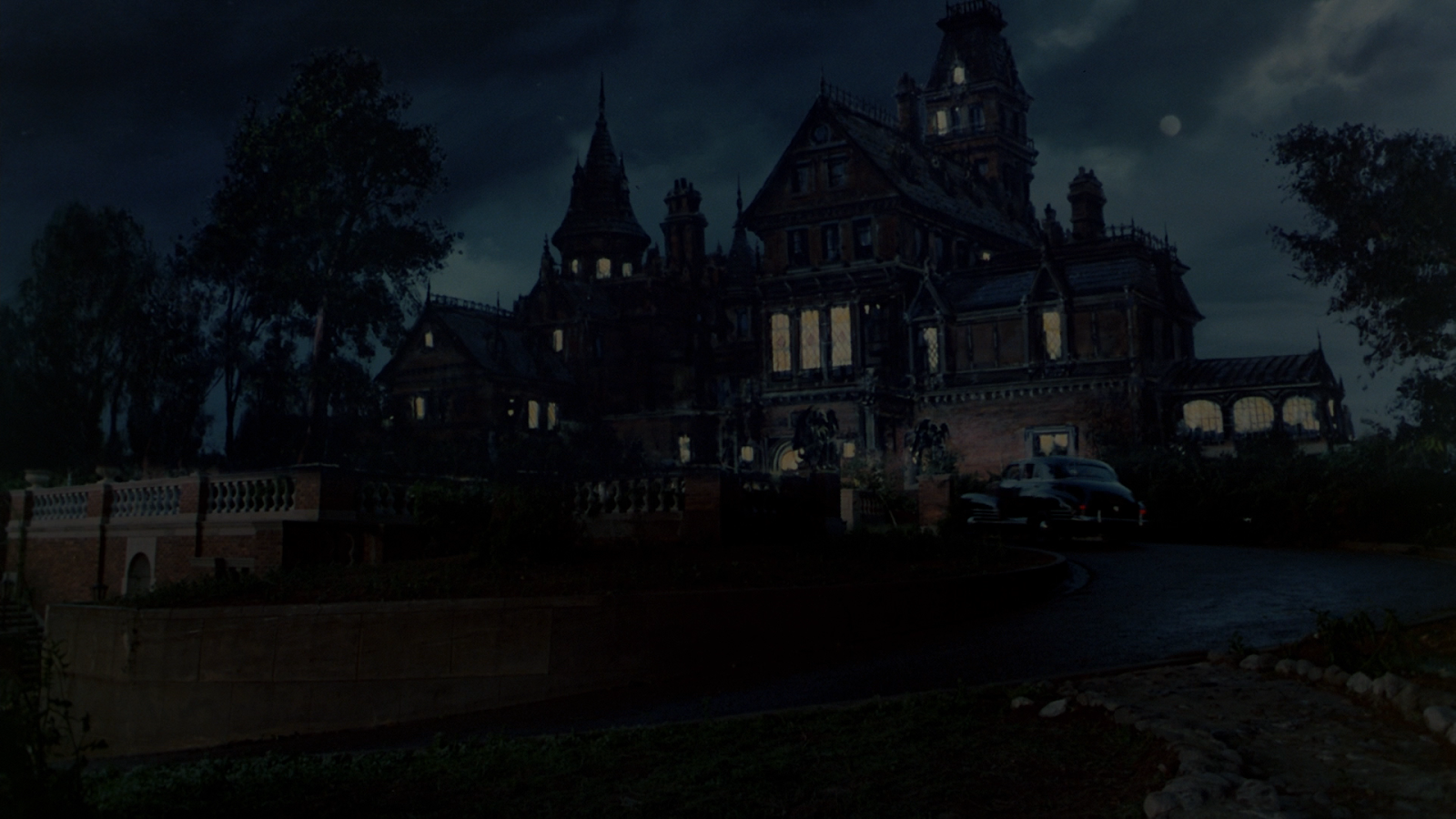
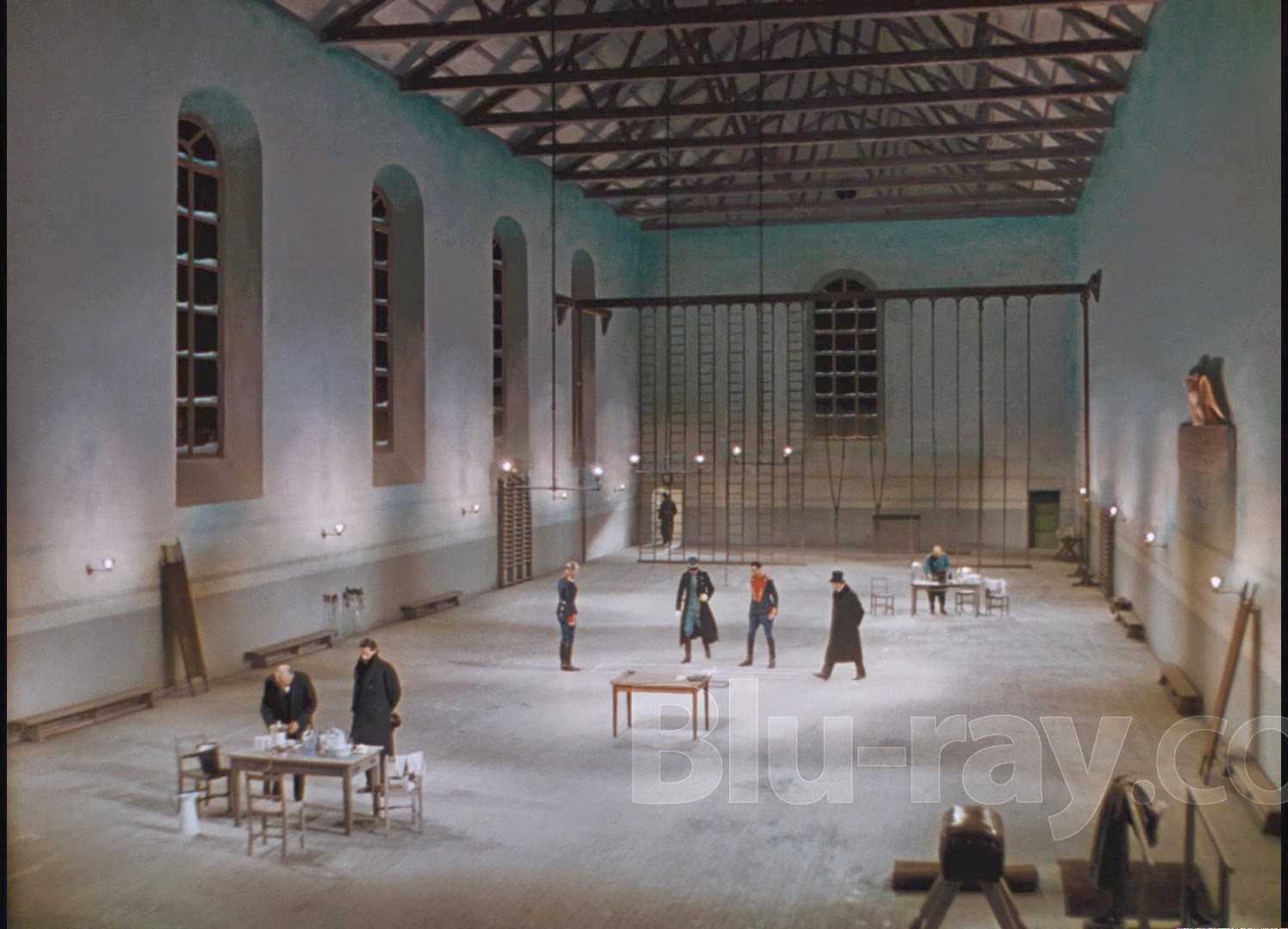
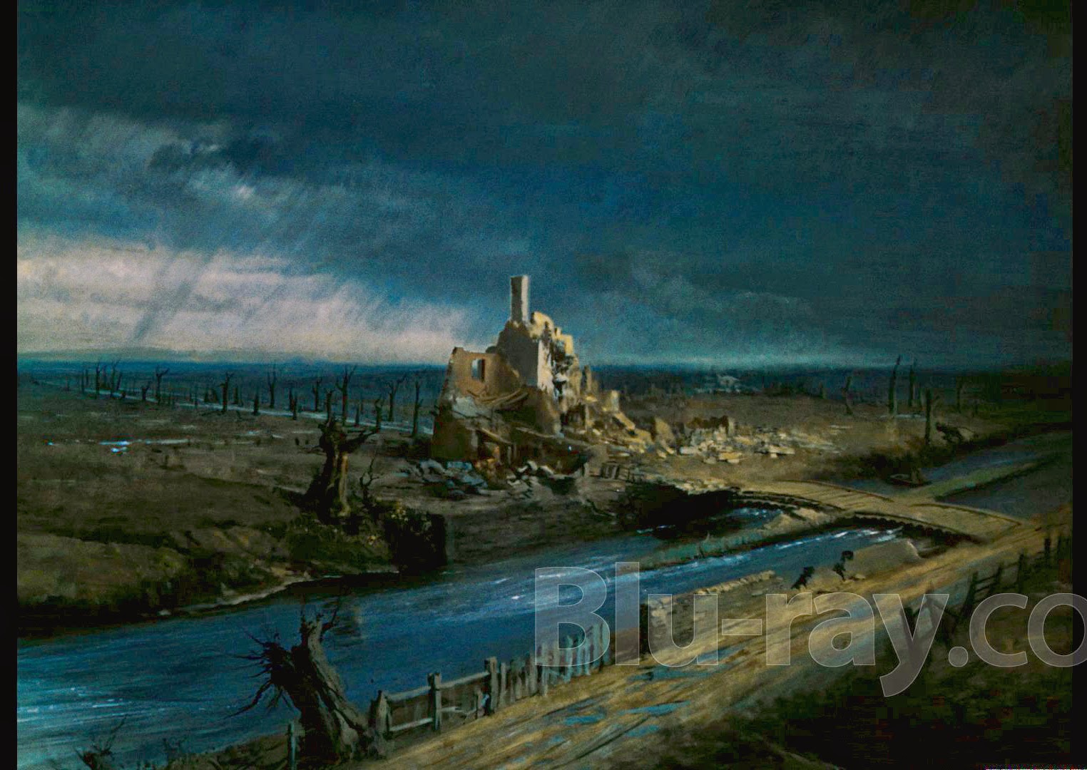

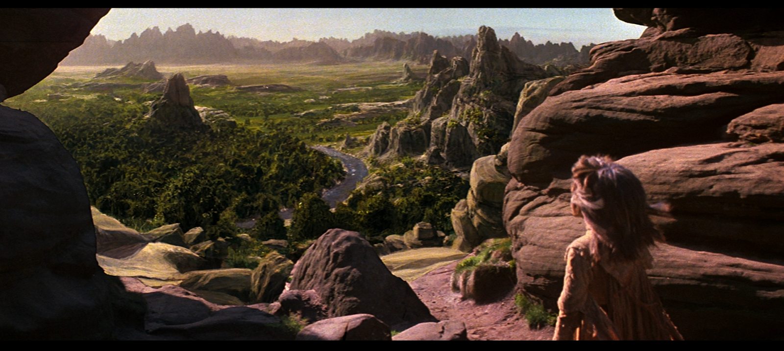


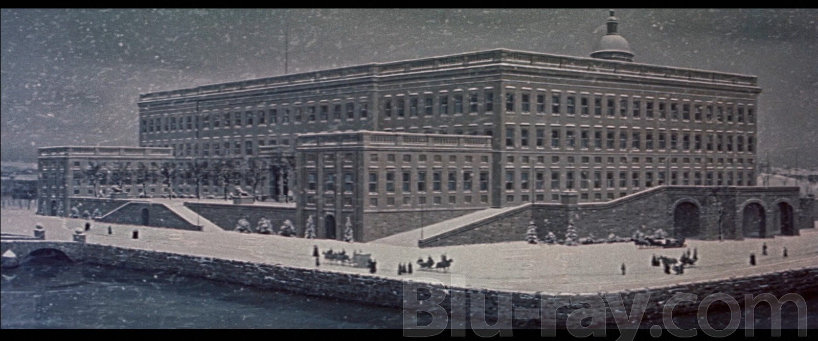

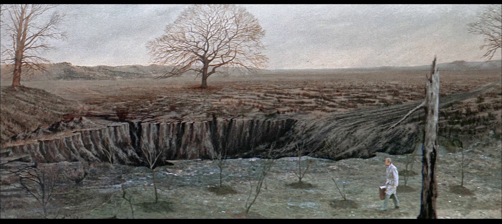

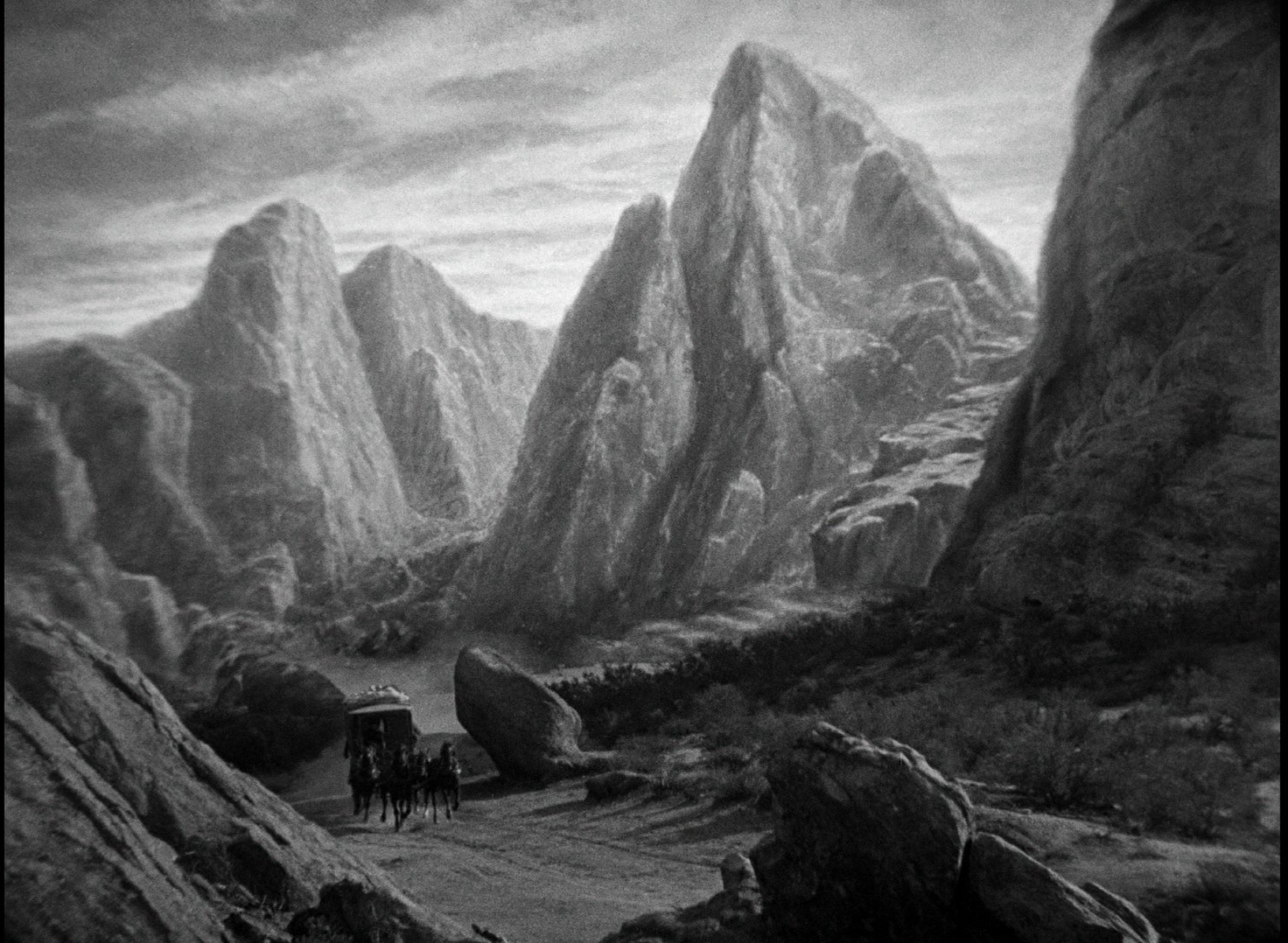

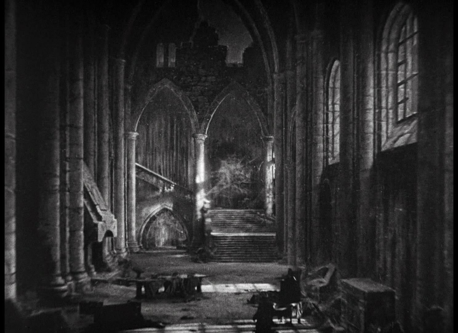

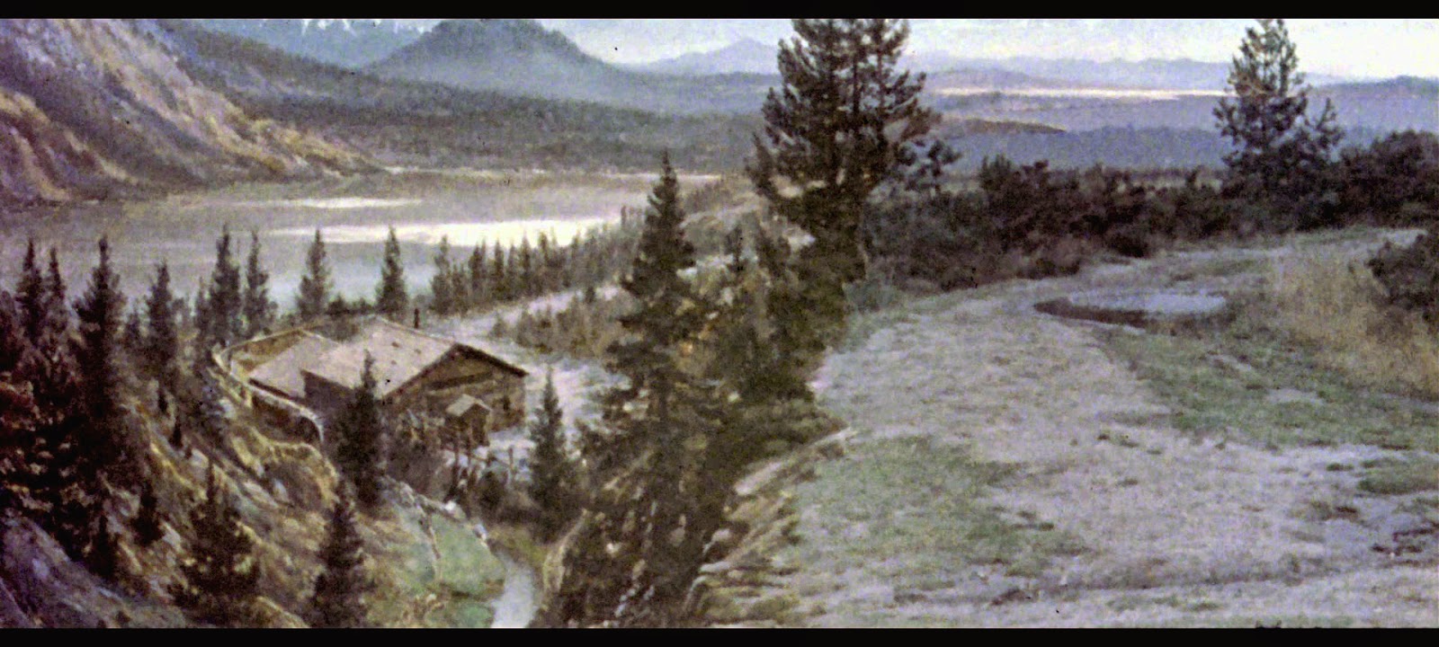
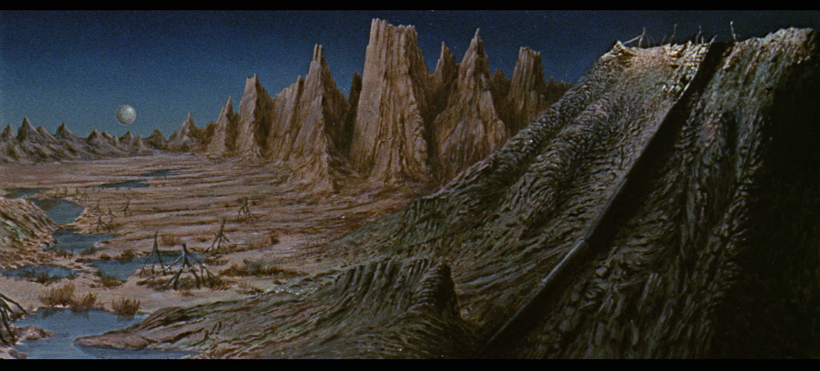

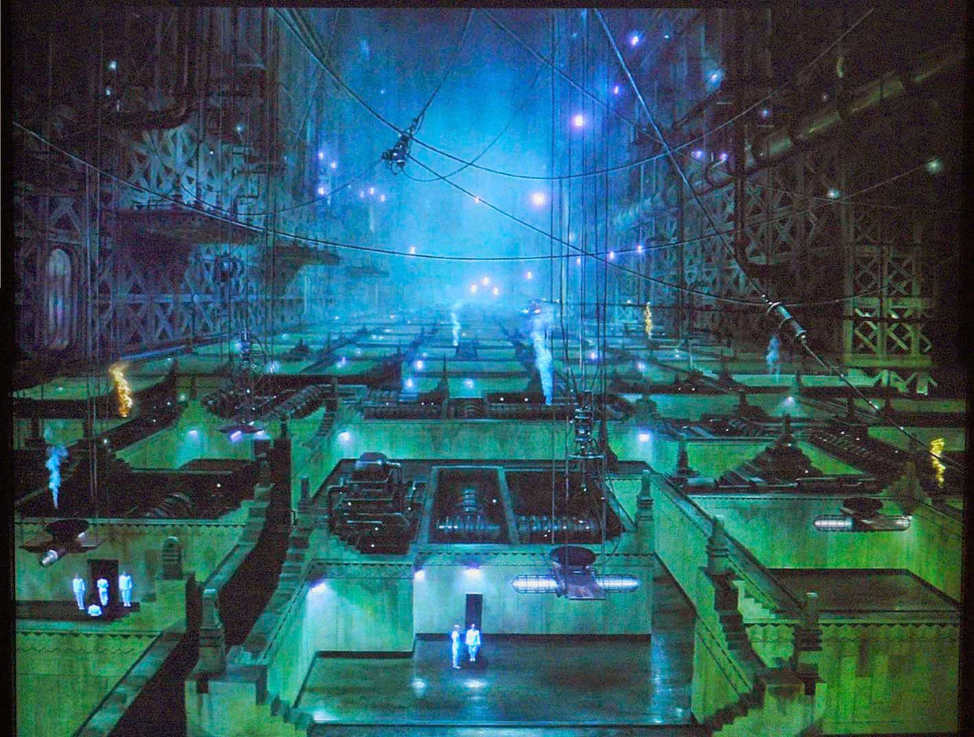

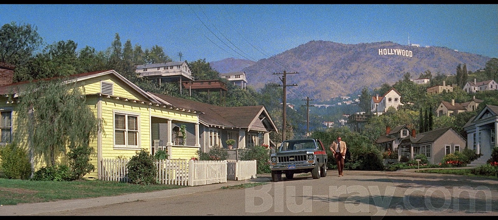
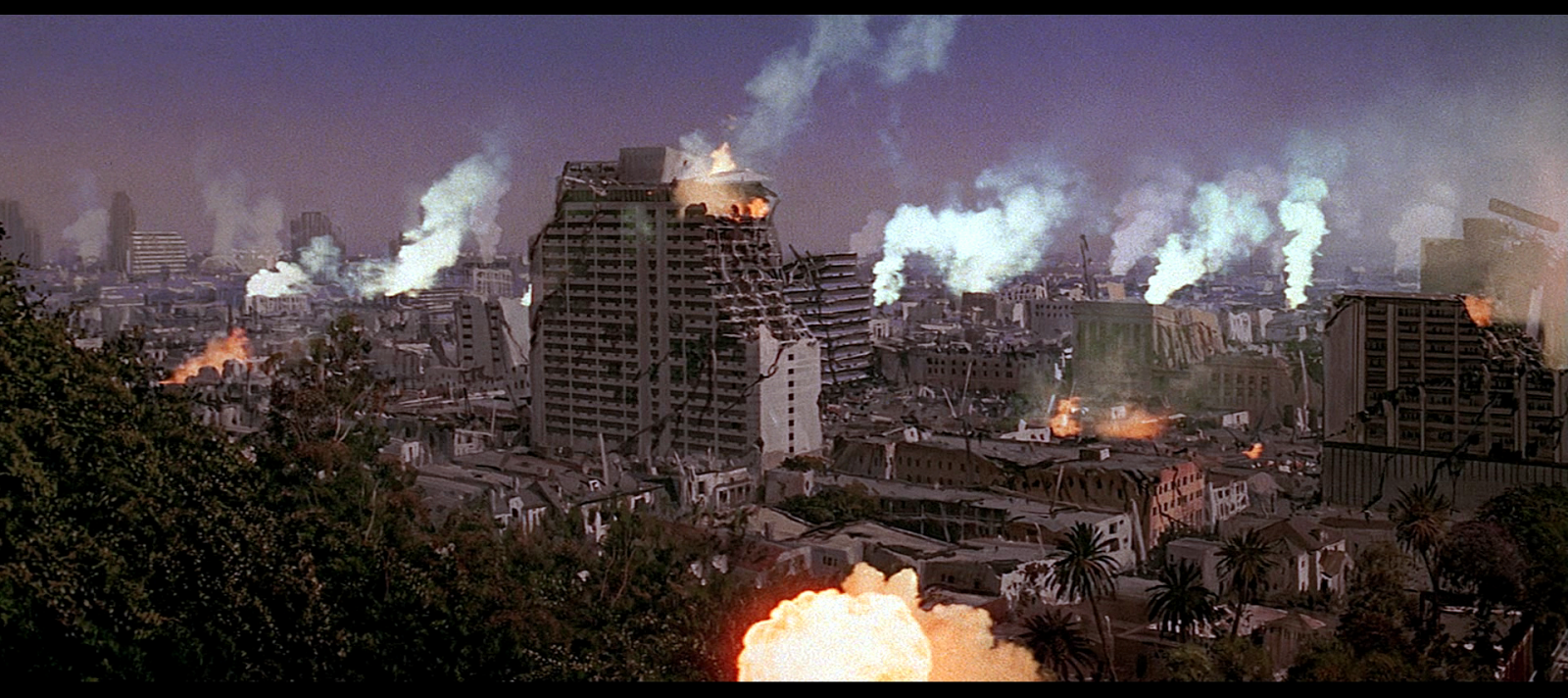


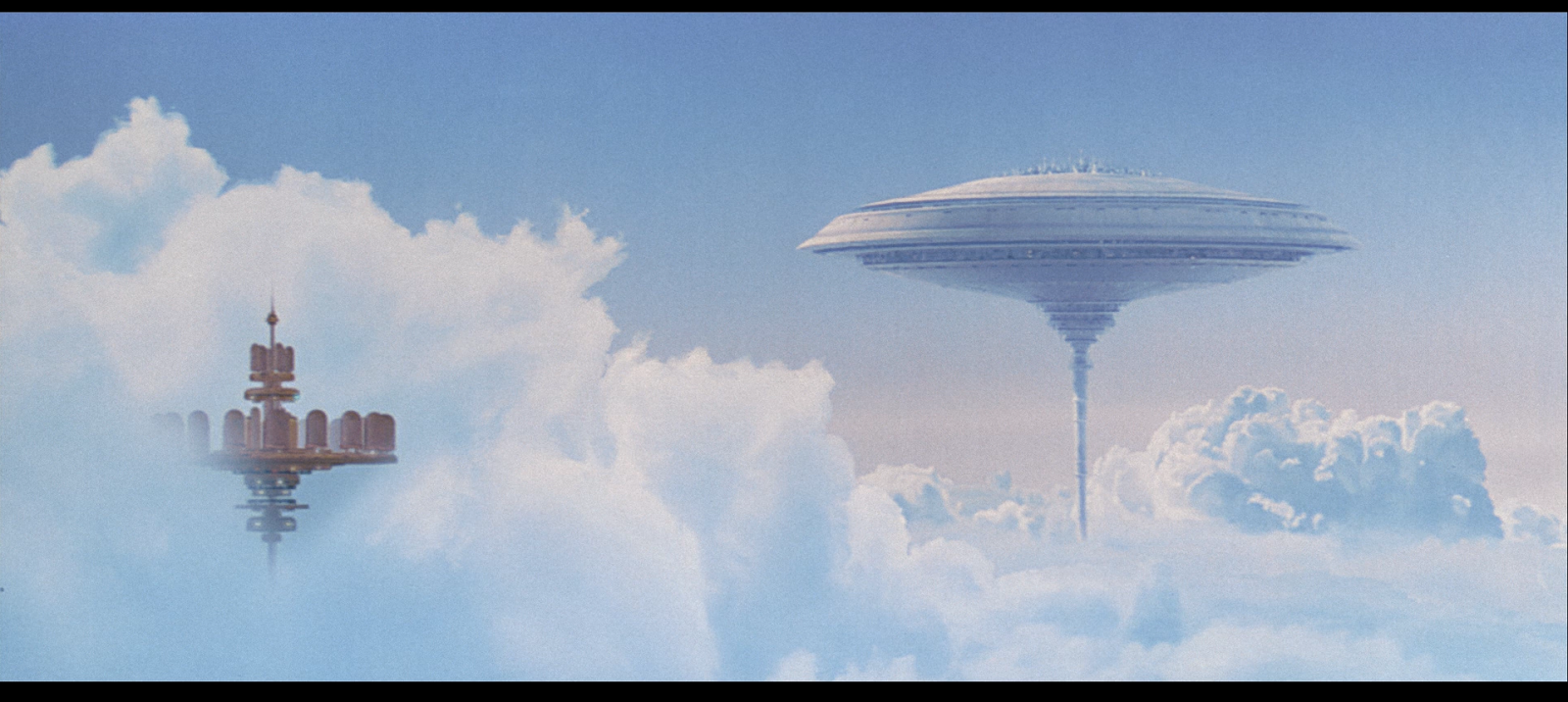


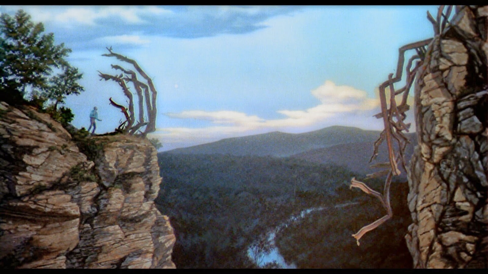


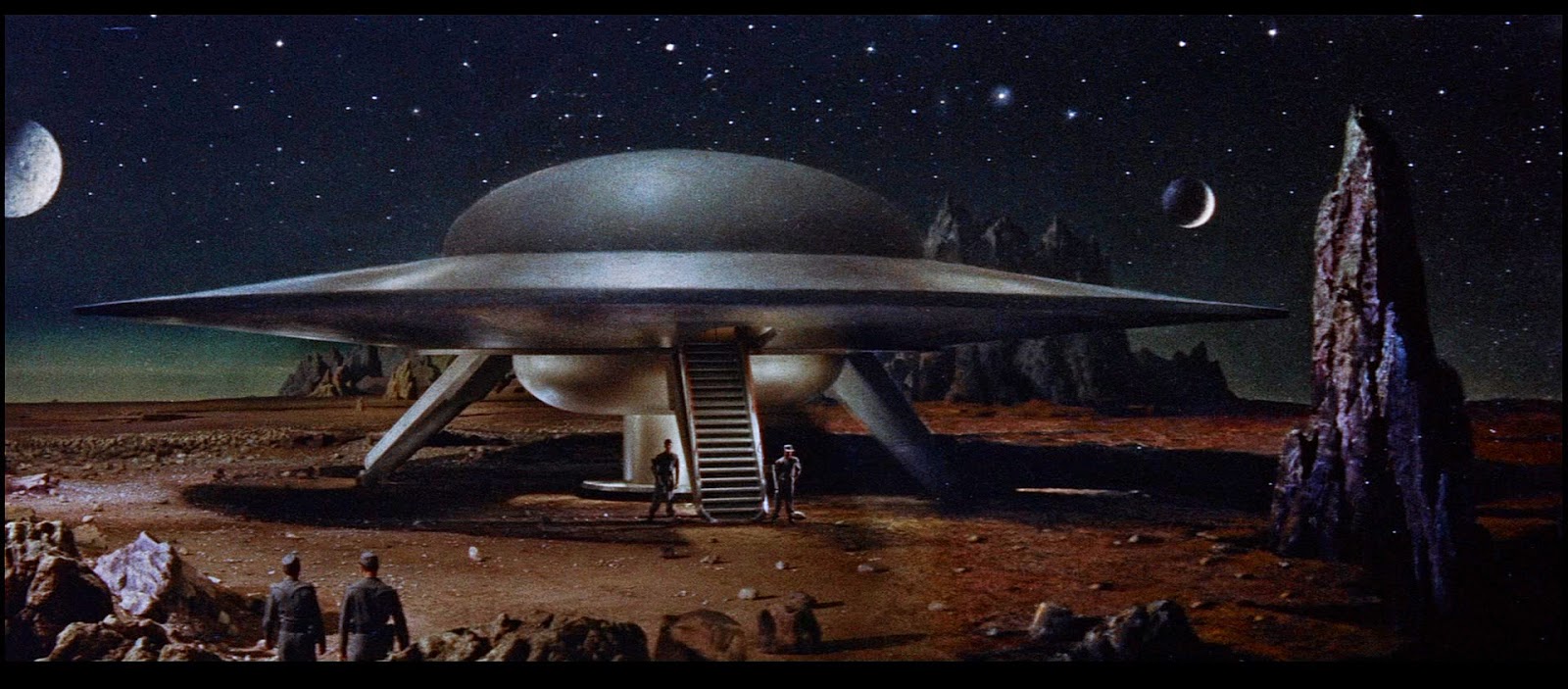
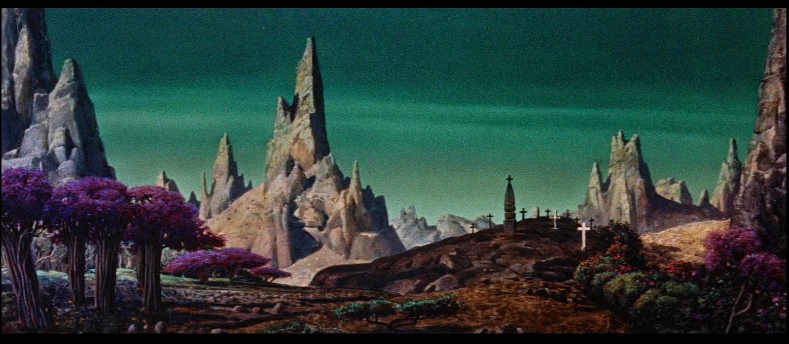
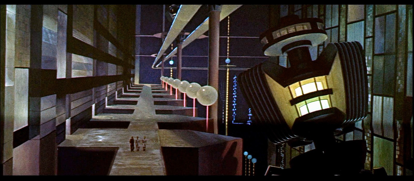
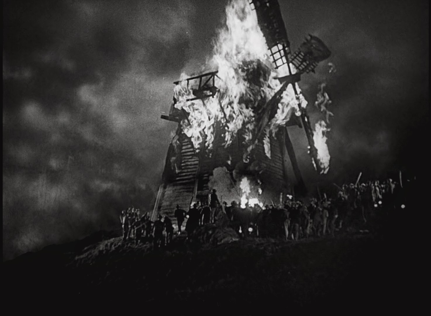


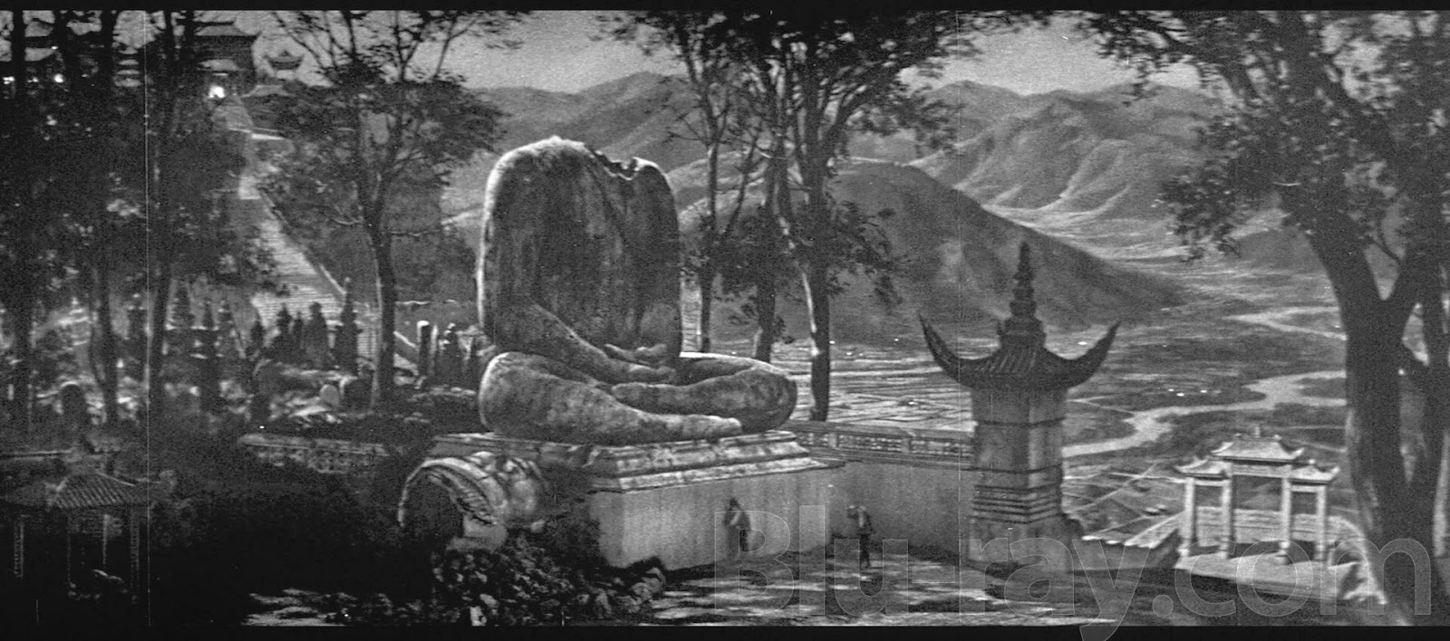


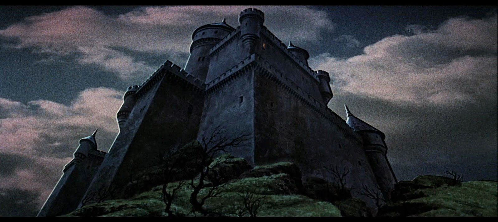

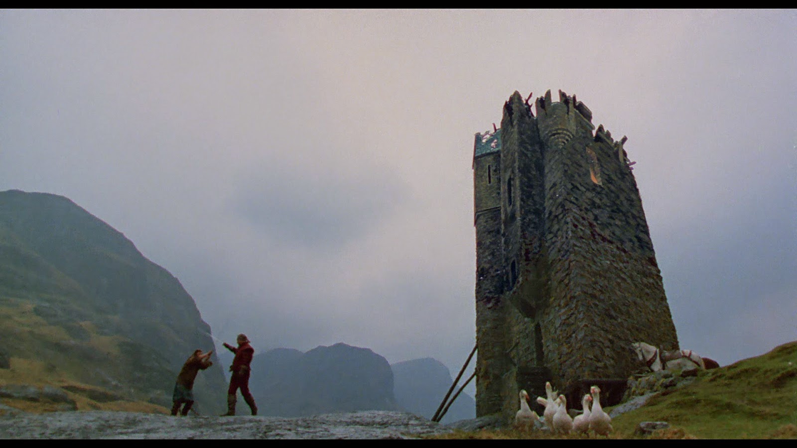


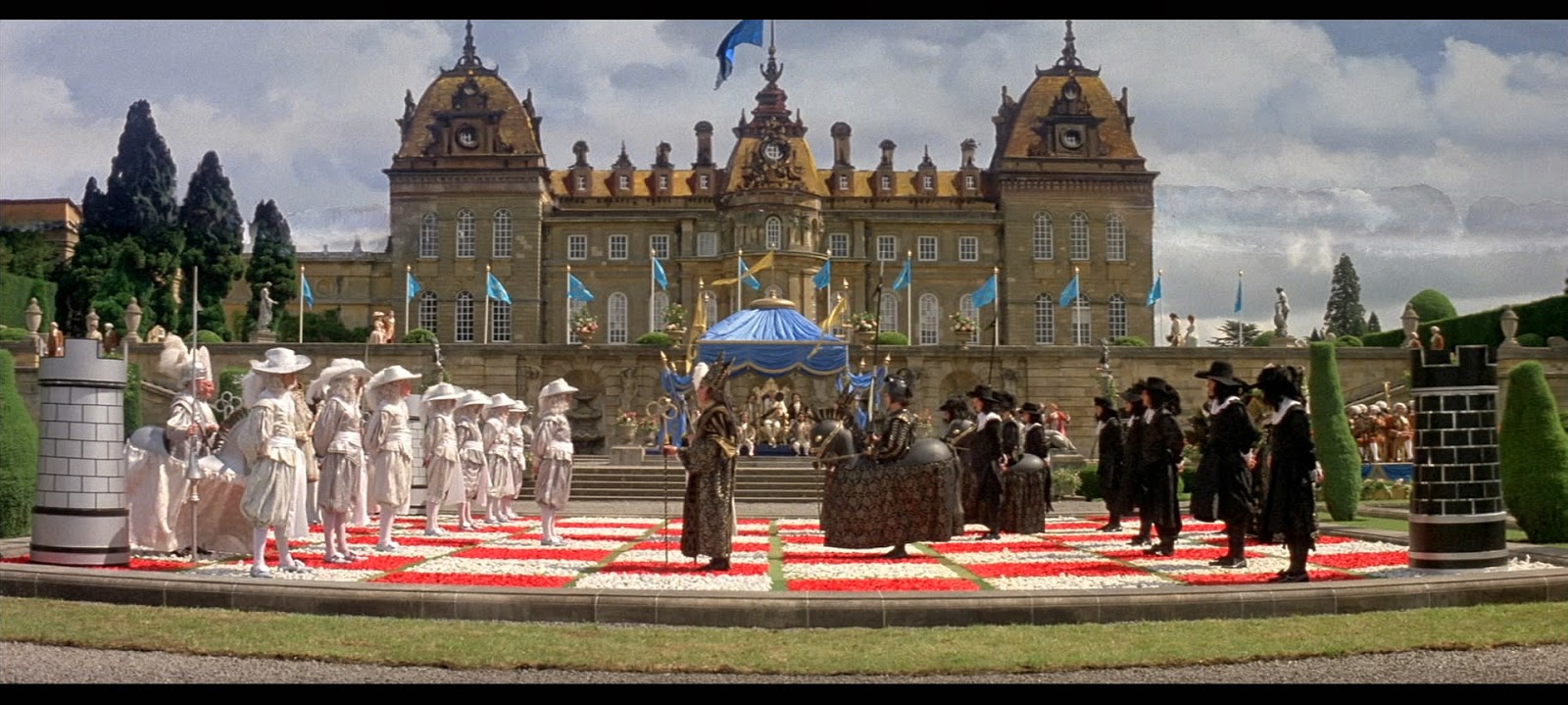

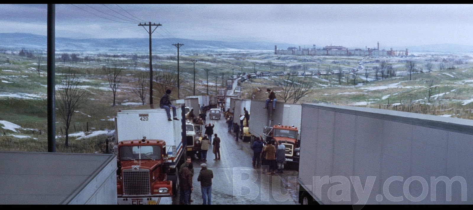

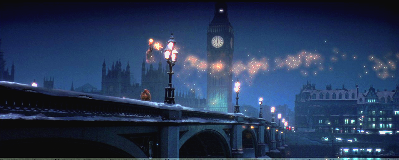

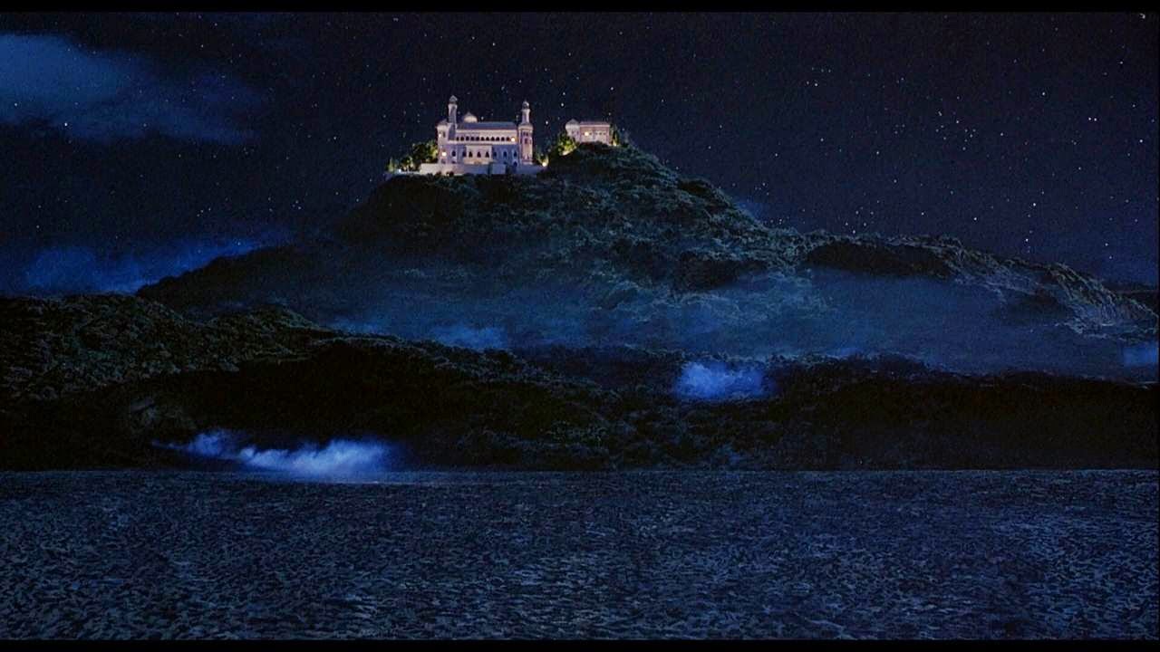
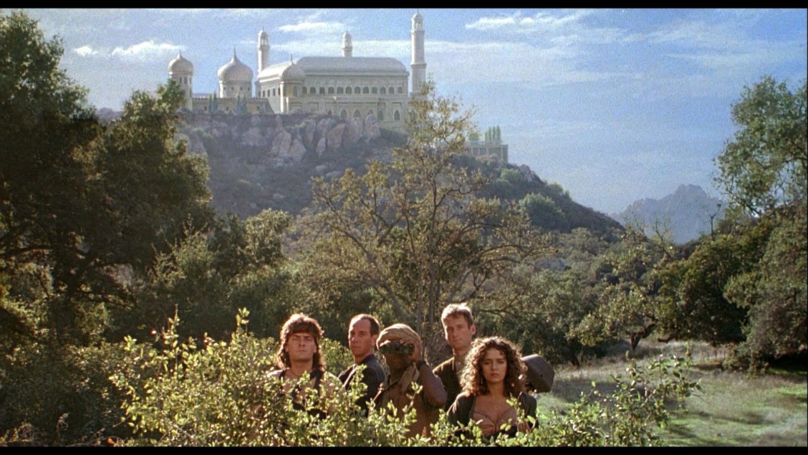


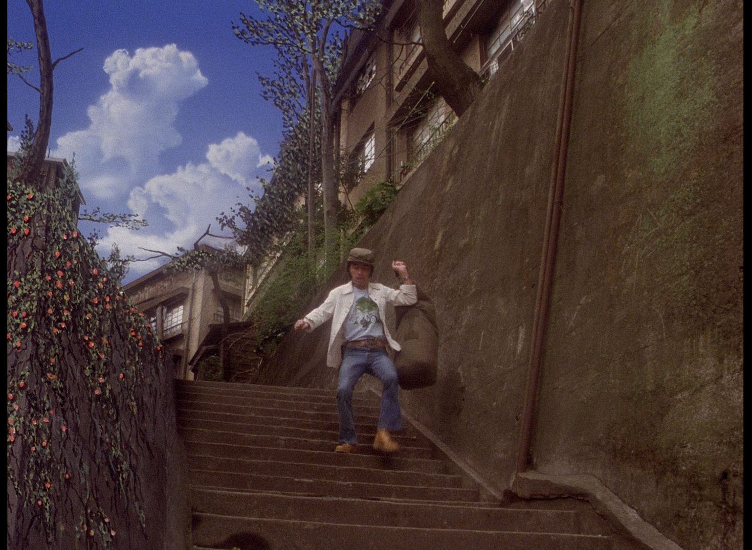


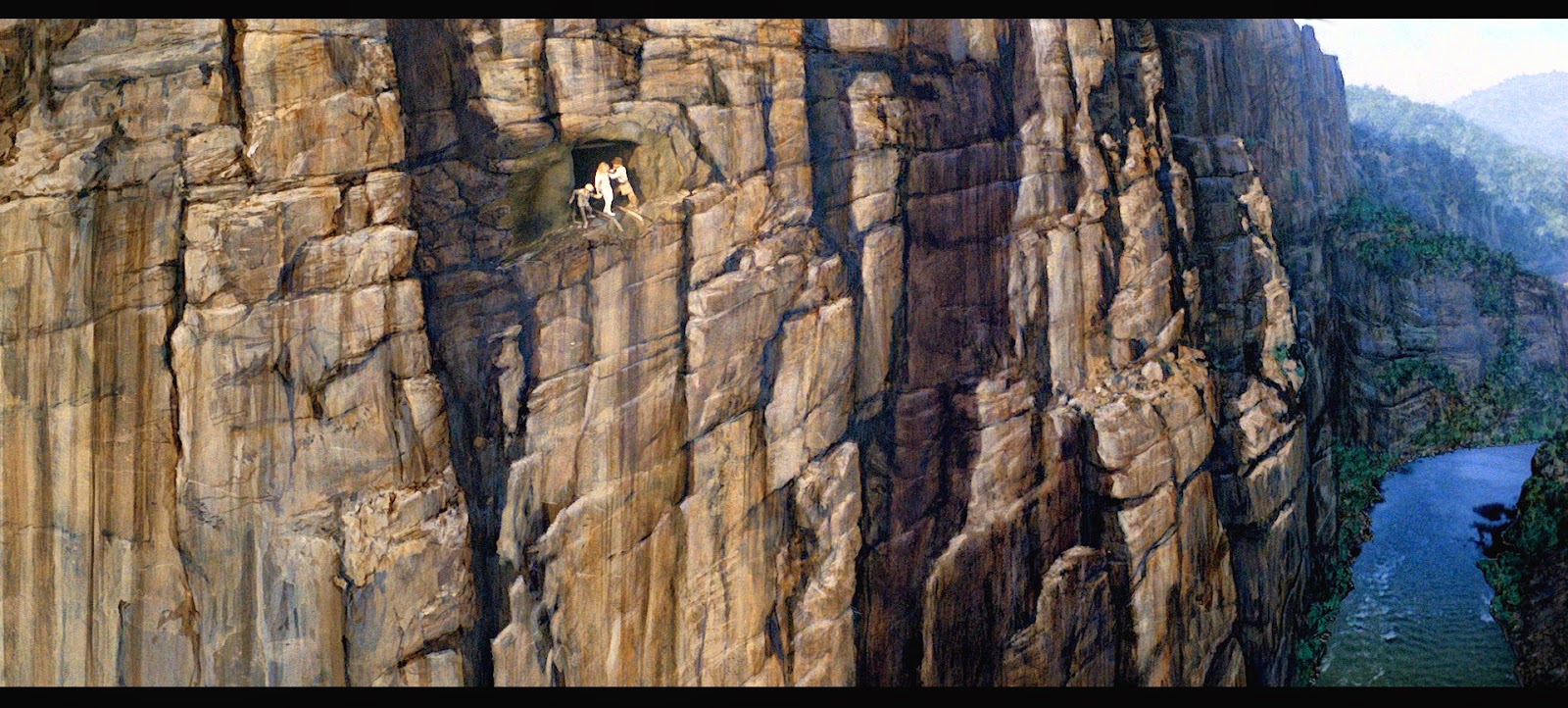

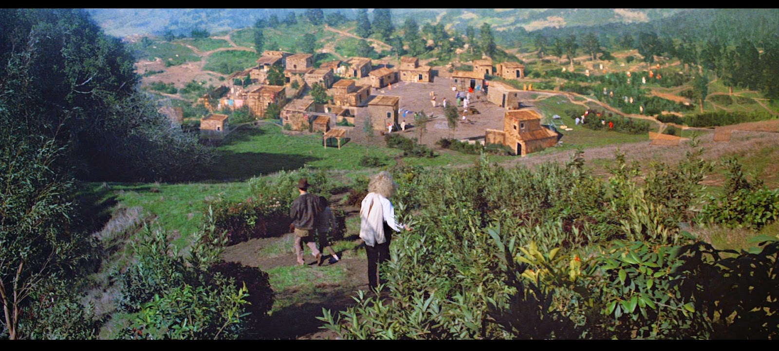
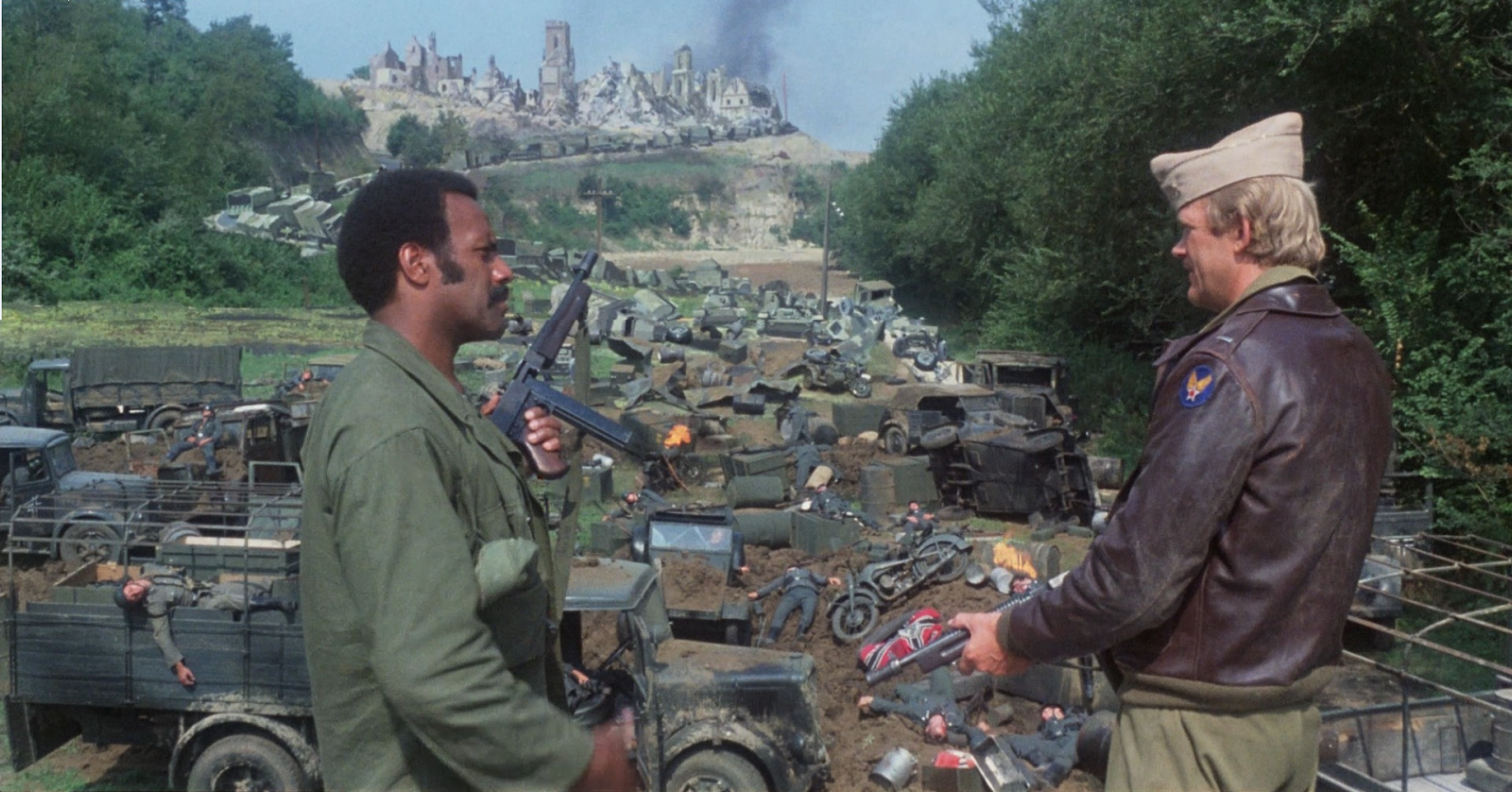


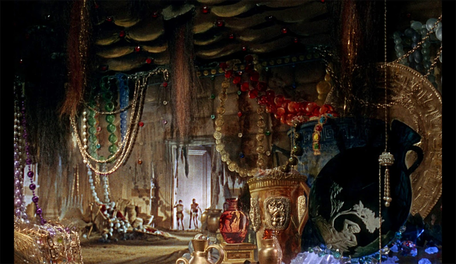

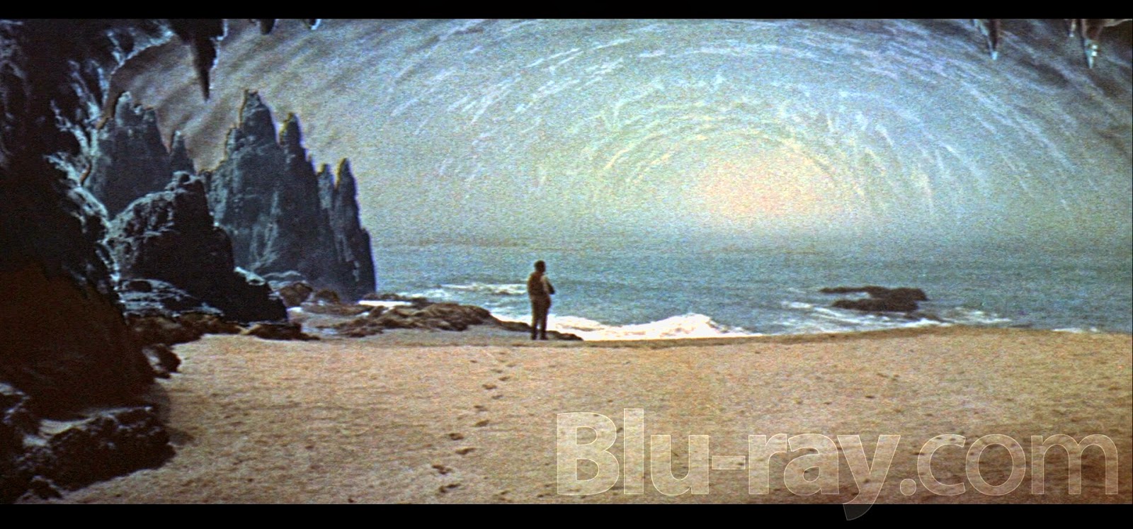


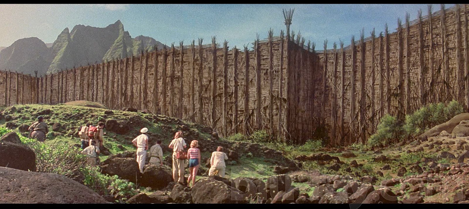


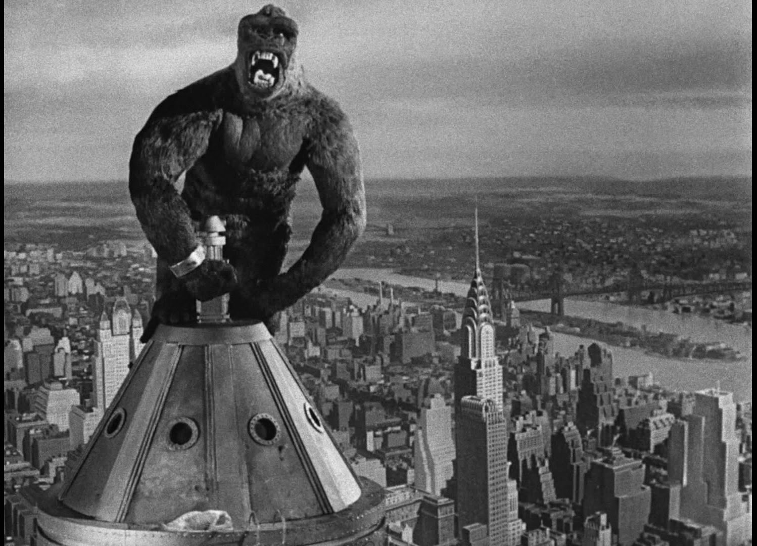


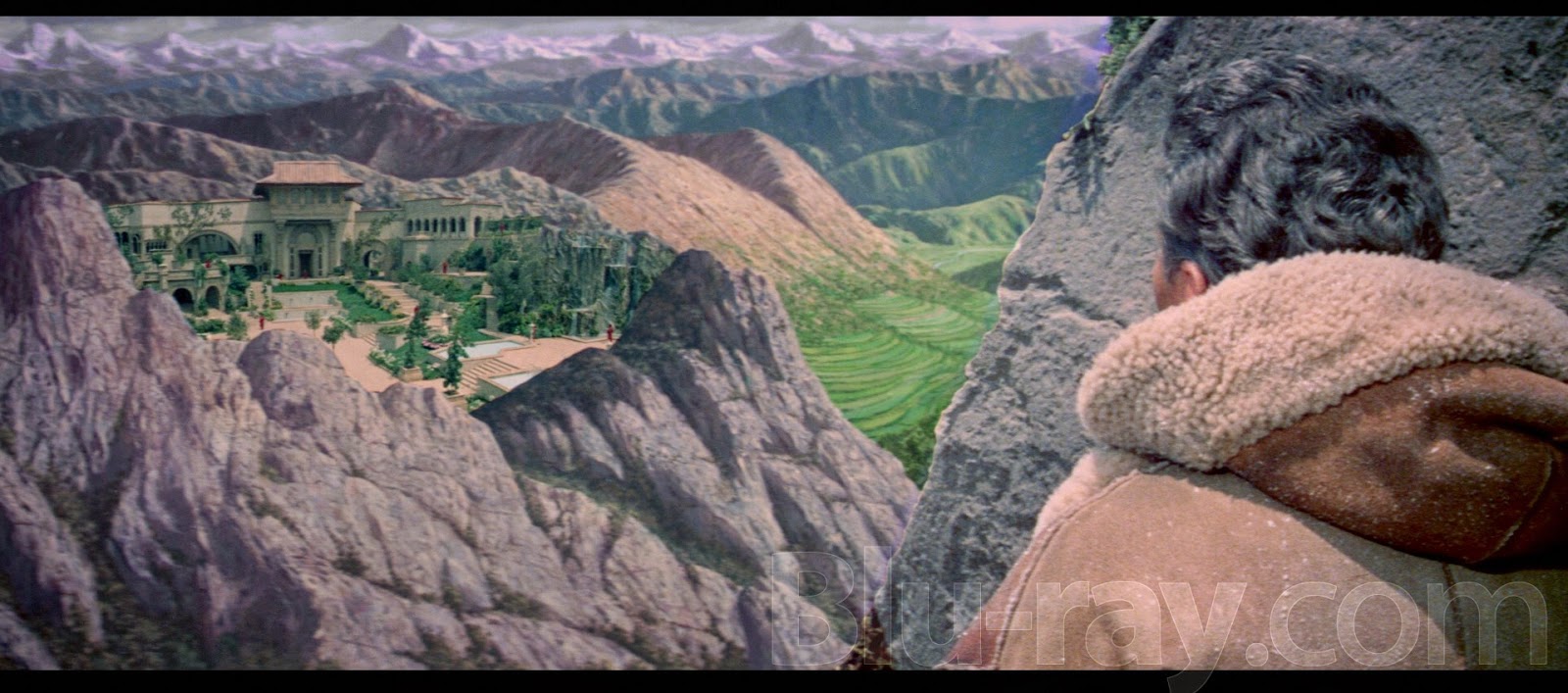


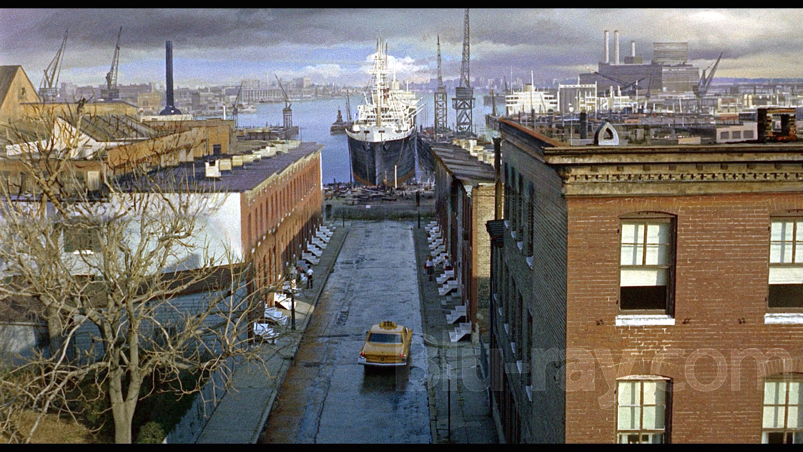


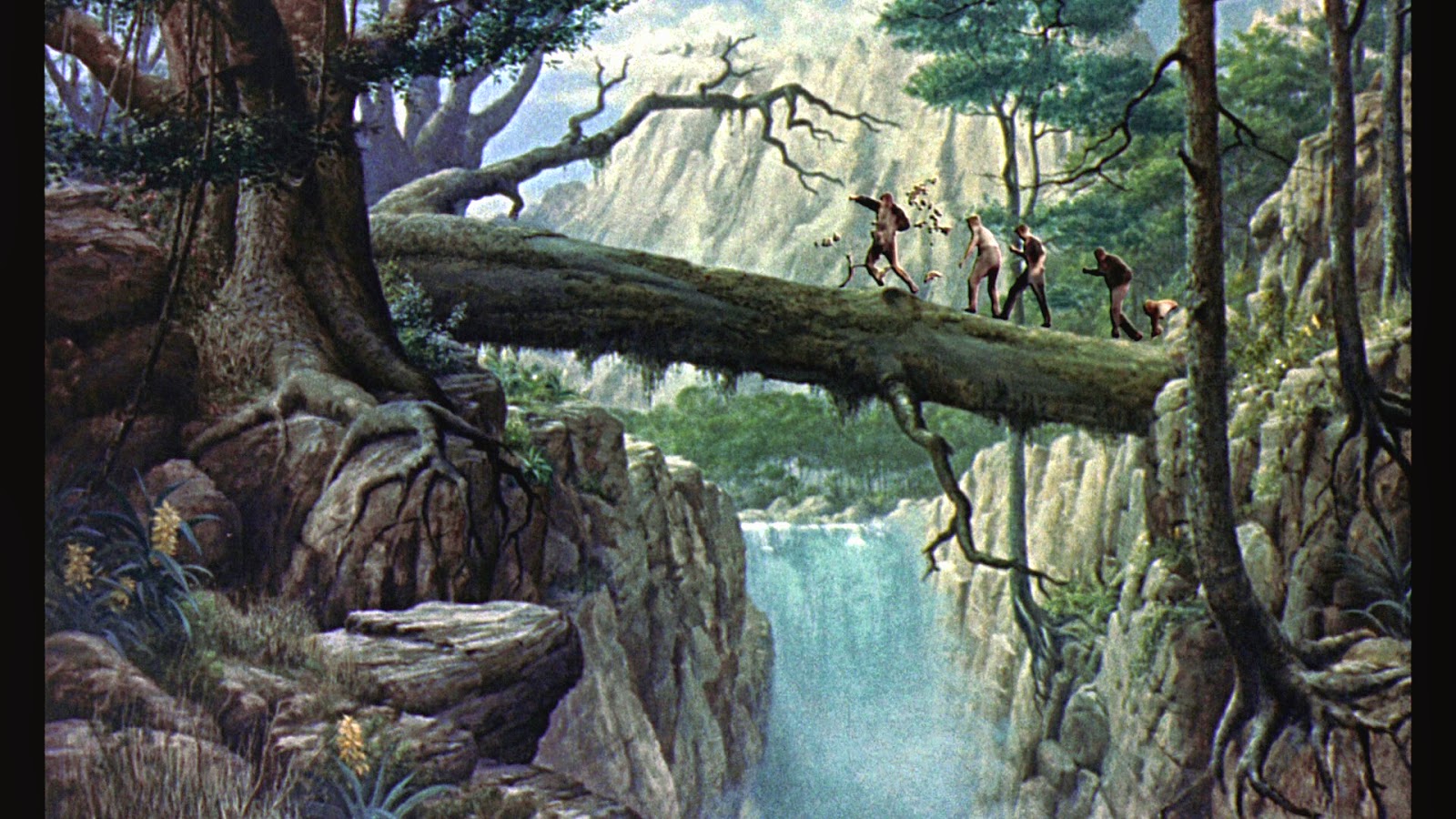


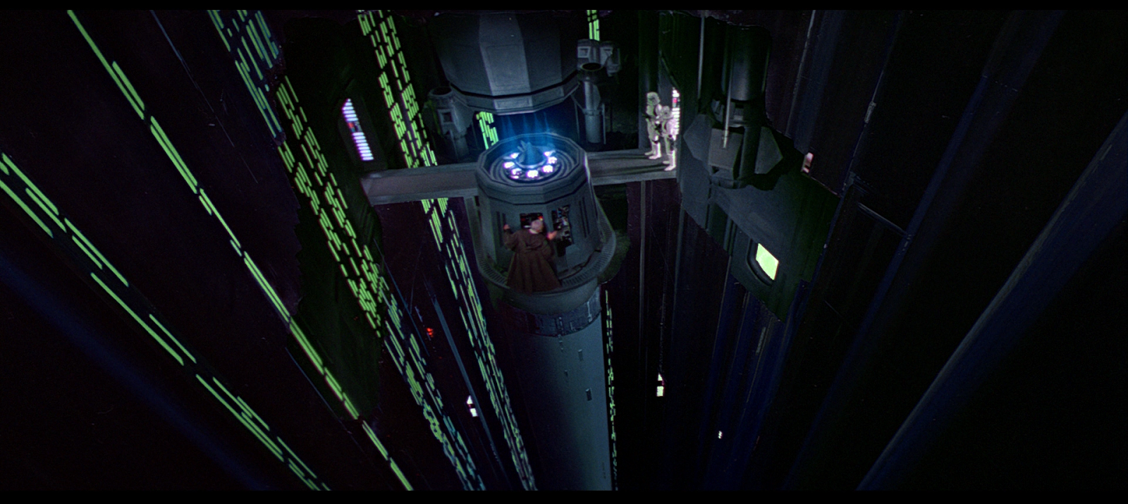

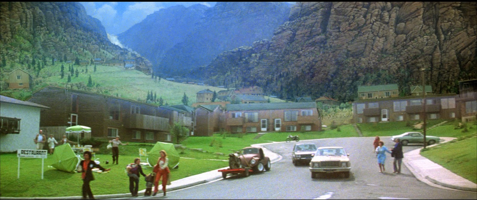


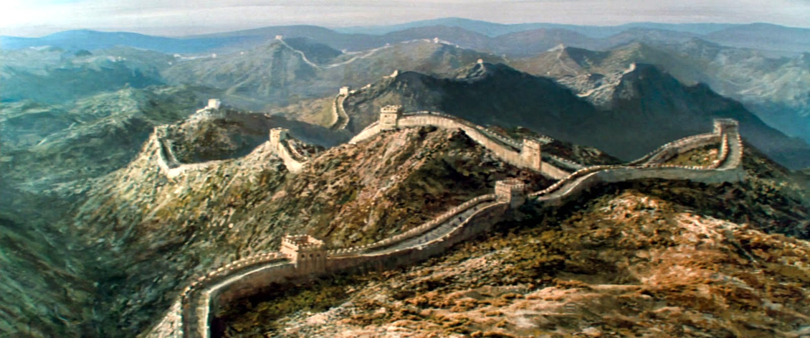
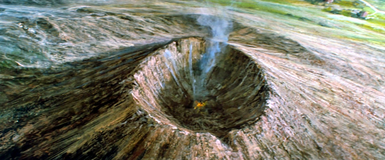


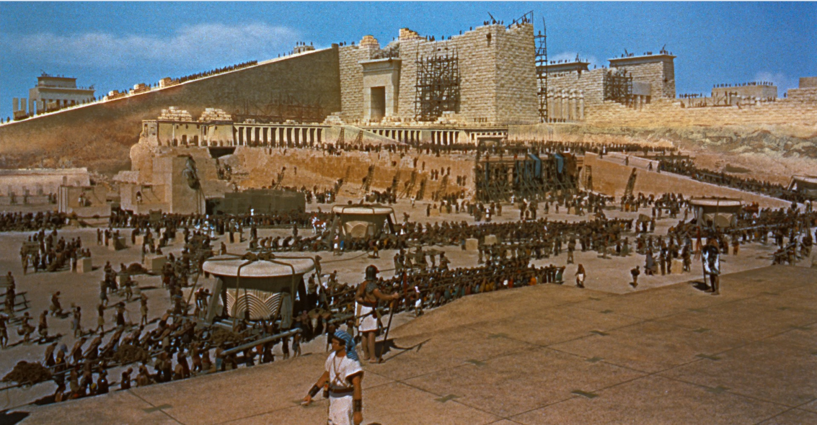


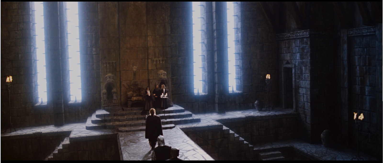


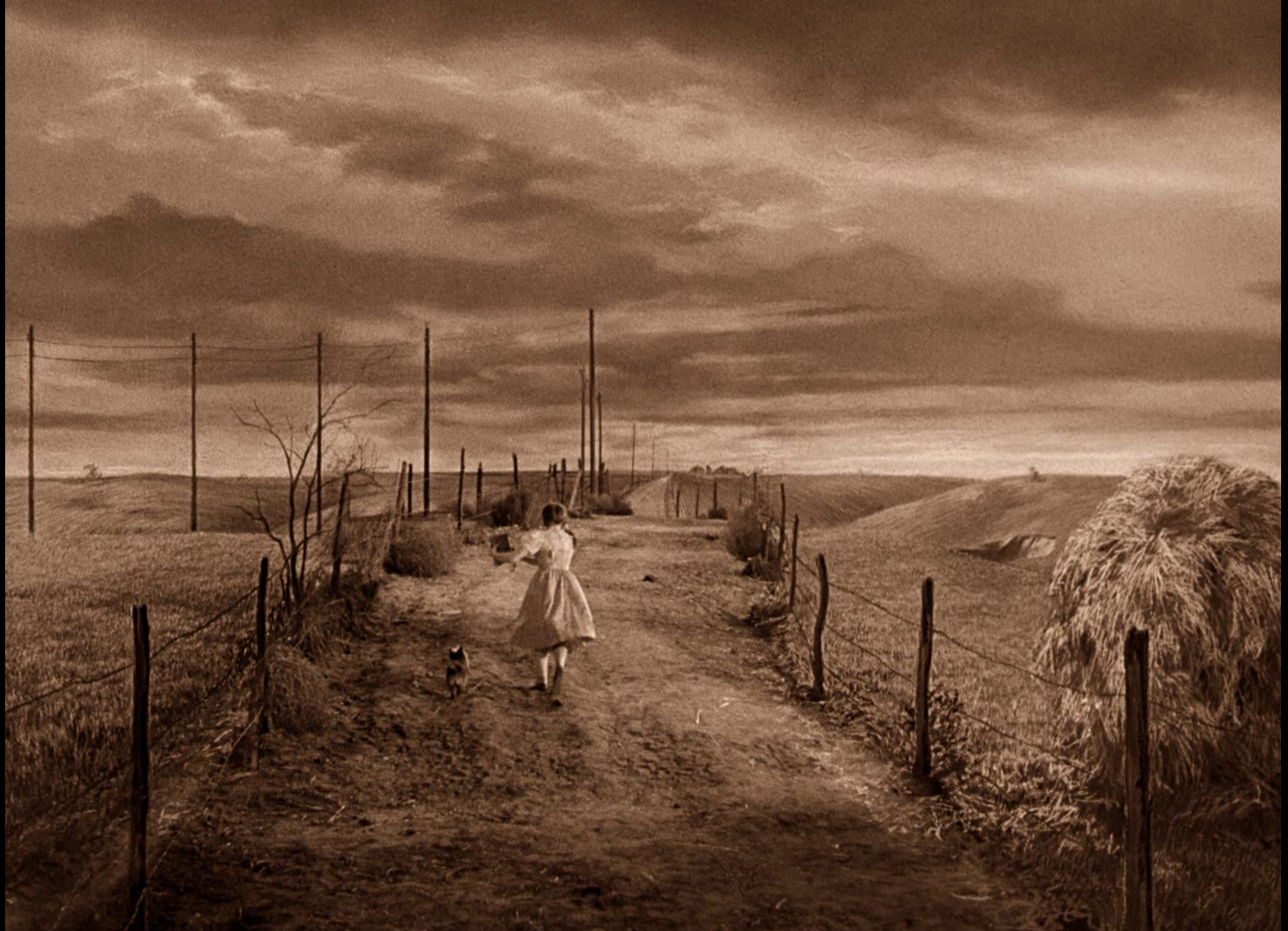


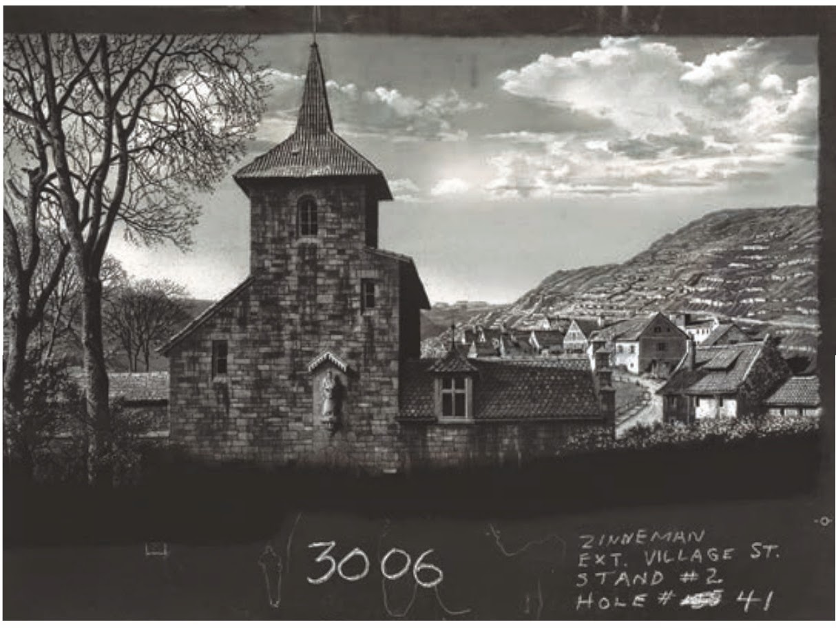


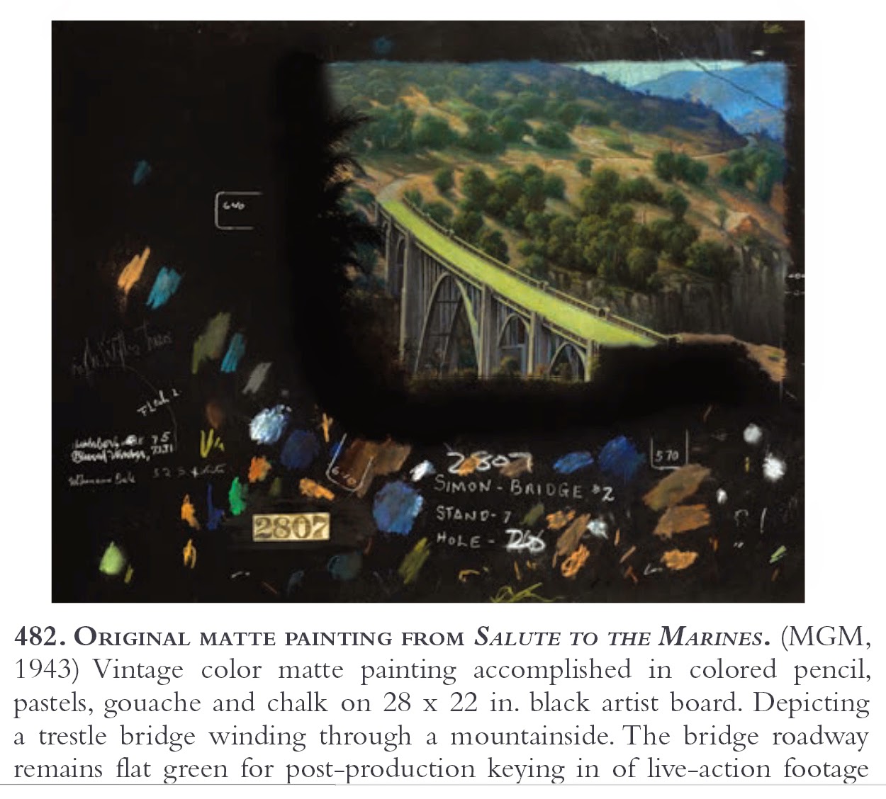


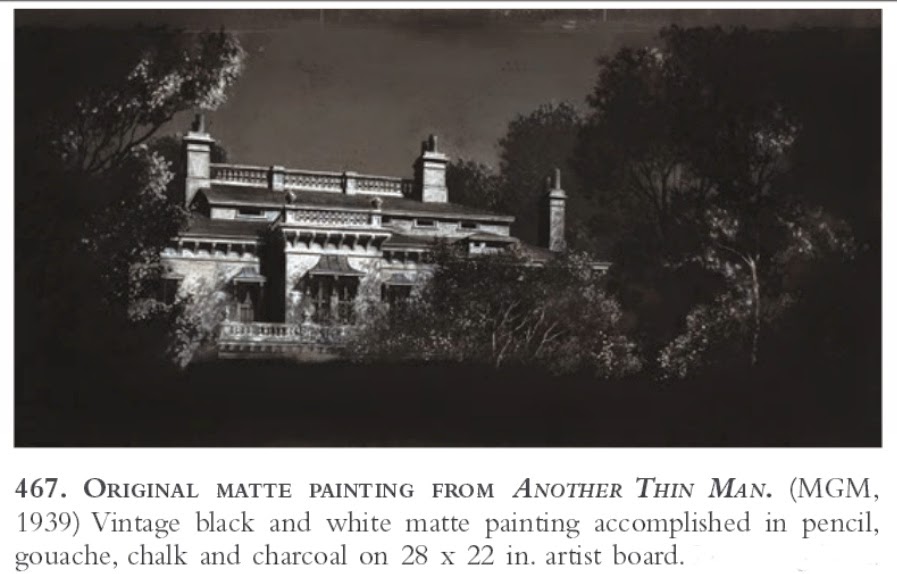


 )
)